Quick look: 10375 Toothless
Posted by Huw,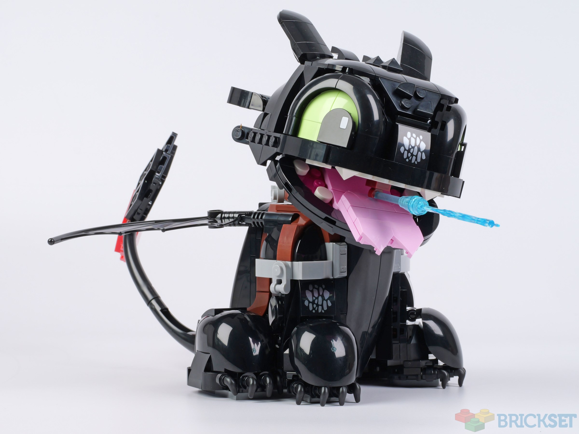
Dreamworks' live adaptation of its popular animated film How to Train your Dragon is currently in cinemas and receiving good reviews.
Rumours of LEGO's plans to release a set of the titular beast were also met with a positive response but, when 10375 How to Train Your Dragon: Toothless turned out to be chibi-style rather than something more realistic when it was revealed, it was met with some disappointment.
Summary
10375 How to Train Your Dragon: Toothless, 784 pieces.
£59.99 / $69.99 / €69.99 | 7.7p / 8.9c / 8.9c per piece.
Buy at LEGO.com »
Not what we might have expected but charming nonetheless
The set was provided for review by LEGO. All opinions expressed are those of the author.
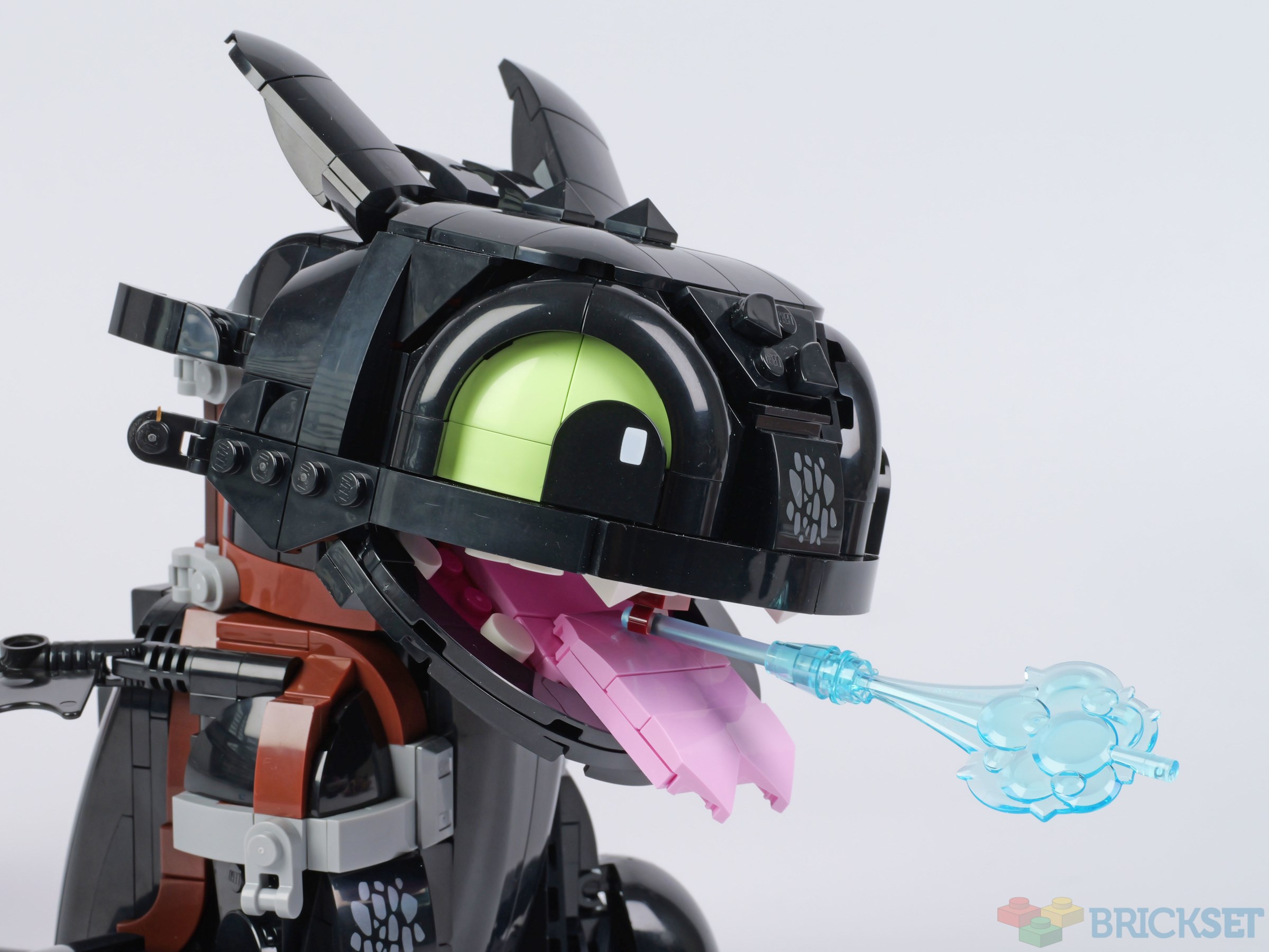
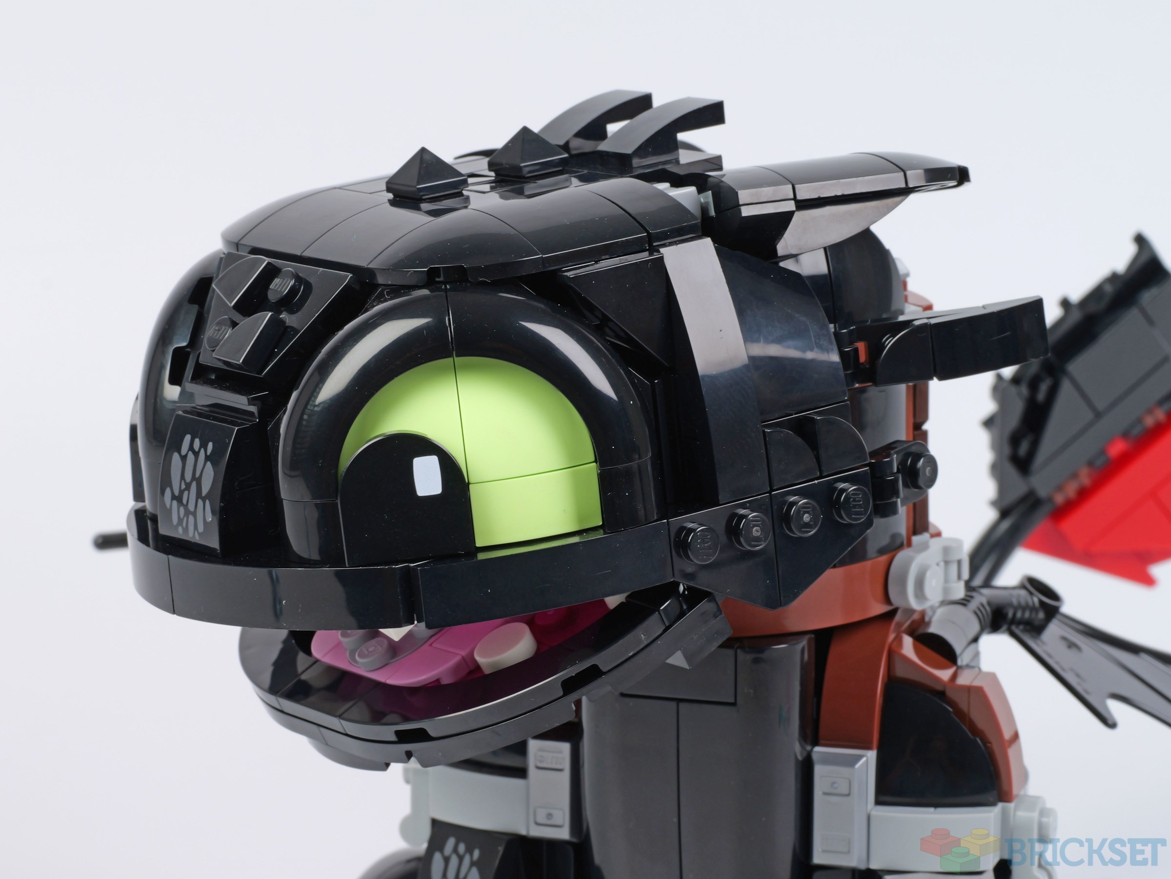
Although the model is proportionally nothing like the dragon in the film, it does nevertheless capture Toothless' cuteness and child-like playful personality, and overall it's quite adorable!
It's about 16cm tall so won't take a lot of space on your table or shelf, and other than a small fish accessory, it's not accompanied by any superfluous side models.
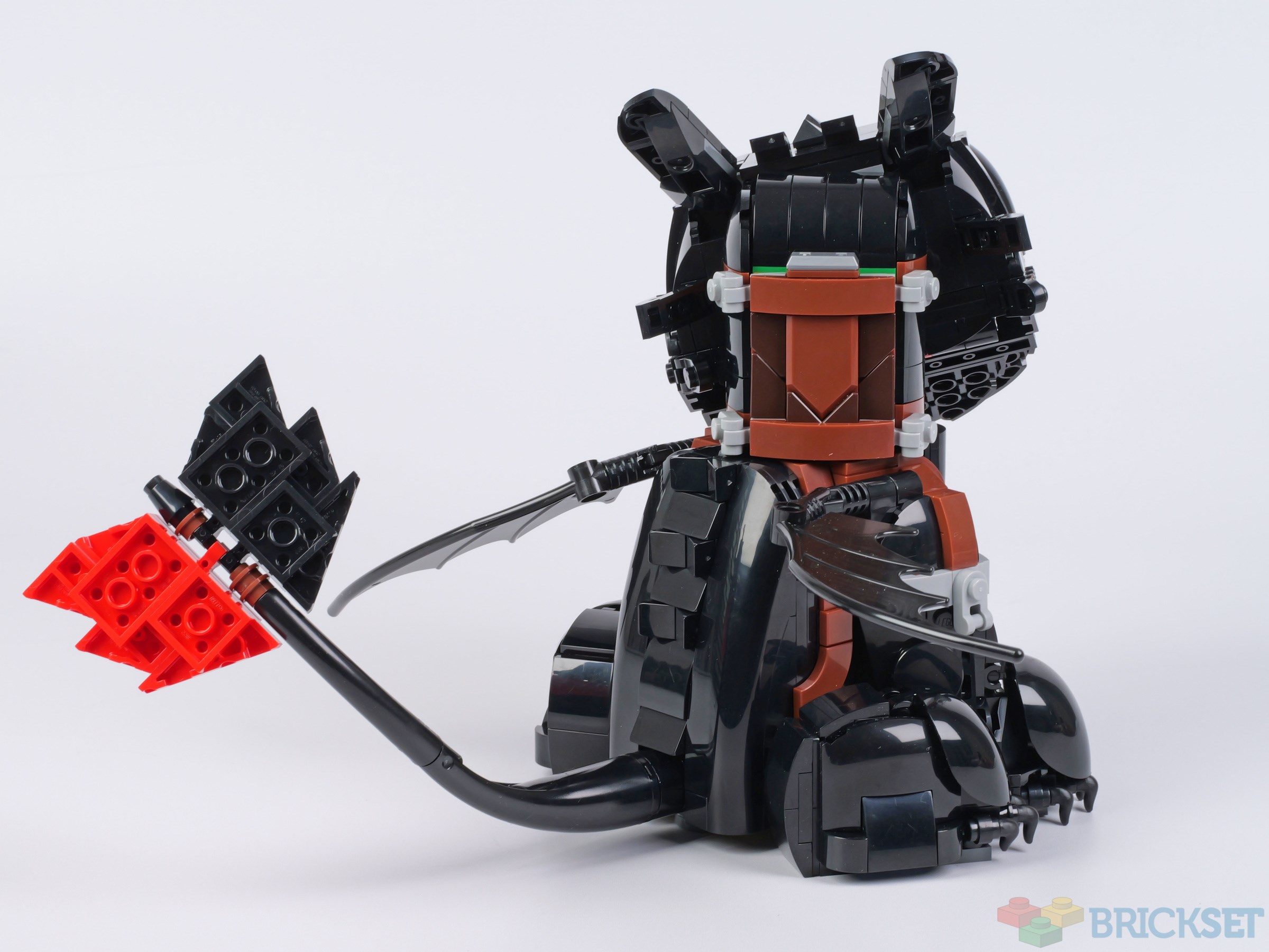
The figure has some articulation, although it's limited. The neck can be rotated fractionally and the head tilted. The wings can be twisted and turned, and the tail tweaked. Importantly, his ears can be laid flat to give the young dragon a fiercer look.
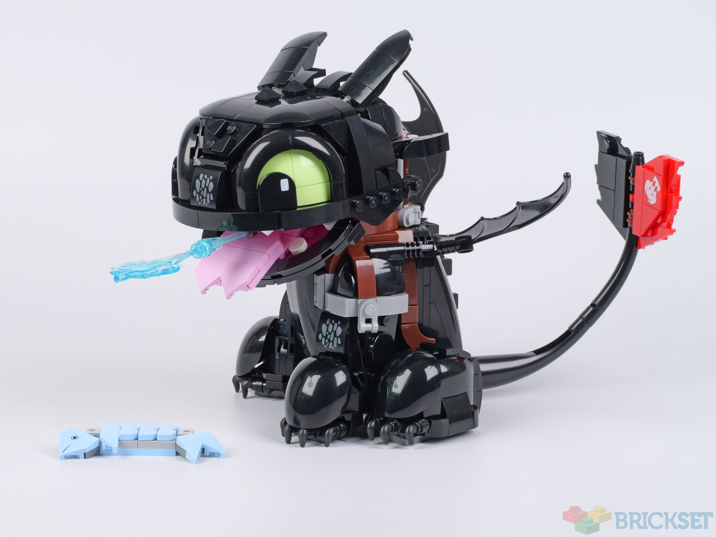
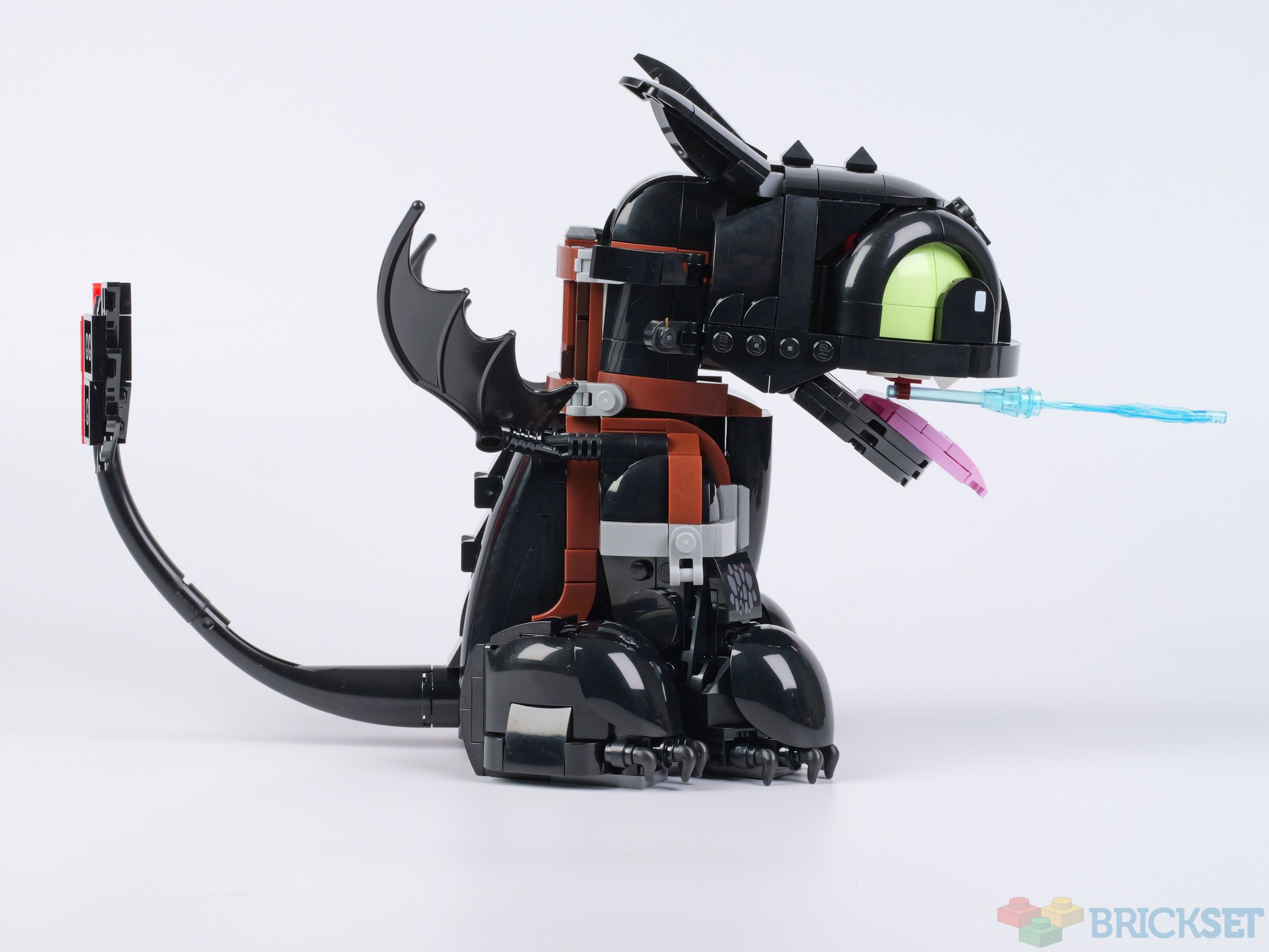
He's fitted with a harness and saddle and the brown straps and grey fittings help break up the black of his body to add visual interest. His red prosthetic tail fin is also present, correctly decorated with a white skull symbol. Incidentally, all the decorated elements in the set are printed, which is unusual in 18+ sets at this price point.
I particularly like the way his legs have been constructed using curved shell pieces, and with the correct number of claws sticking out from underneath each one.

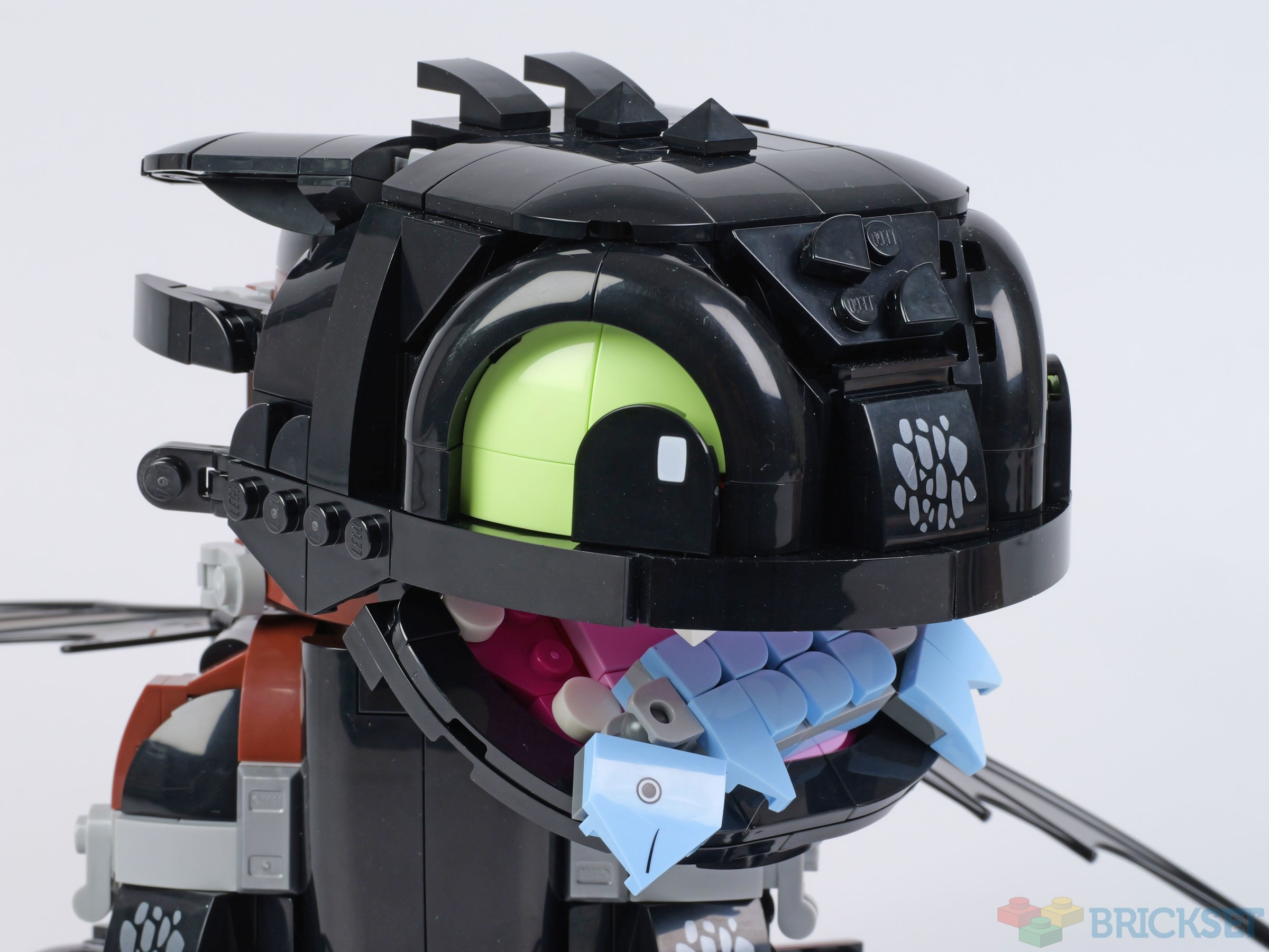
The 'smoke' emanating from his mouth can be removed, along with his tongue although, even when the clip holding the smoke in place is removed as well, the mouth doesn't quite close fully.
A 2x2 turntable holds the tongue in place, and it can also be used to hold the fish in his mouth instead.
It's not what we might have expected a model of Toothless to turn out like but, nevertheless, it's a charming set that conveys the young dragon's personality effectively.
When released on July 1st, the 784-piece set will sell for $69.99 / £59.99 / €69.99, so won't break the bank. Its 18+ branding is a little bewildering, though, given the model is more likely to appeal to kids than adults.
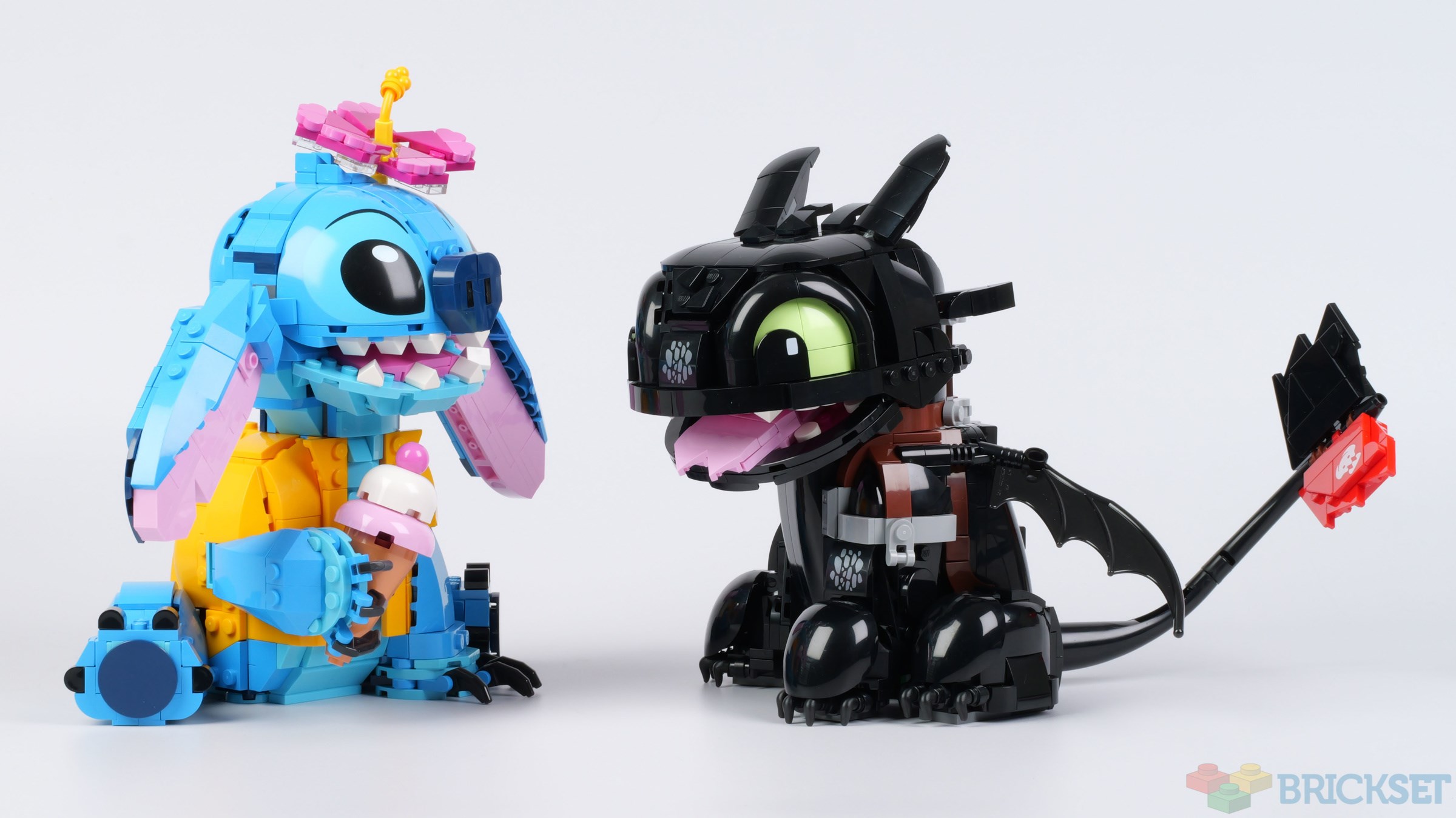
It displays well with the star of another recently released live-action update:
Thanks to my daughter Chloe for building Toothless while I was on holiday.
95 likes
28 comments on this article
If they could have done what they did with Simba or the dalmatians where they release it alongside a bigger more realistic one, that could have been better. Because this isn't bad by any means for what it's supposed to be, but you can't help but feel very disappointed
One of the most disappointing sets of all time in my opinion. An 18+ set of a beloved animated dragon, designed to look like a child's stuffed animal? The price and part count would have been perfect for a minifigure-scale and accurately proportioned Toothless. He just looks like a black puppy. What a shame.
Cute enough, although the proportions are a bit strange, especially the wings are too small, really need a new piece or something similar to the Ninjago dragons.
I like this set, but it’s fair to say it’s not quite targeting any audience properly. The oldest Lego fans would probably appreciate something more detailed and larger-scale, while the youngest ones might get on better with something smaller or minifigure scale. As such, I’d argue it’s more of an odd duck than a dragon.
It reminds me of a tamagochi rather than a dragon. It's cute, but I'm not that interested.
If you did not know of how to train your dragon. you would not be able to tell it's a Dragon.
Looks like a big version of brickheadz.
Also the wings are like 2x,3x,4x the size of the body not 1x1 or half size of the body.
What's funny is they know how to make dragons, are they trying to make it look more friendly young kid friendly.
Does look cute though.
Feels like this is a victim of mixed intentions - maybe some studio meddling from DreamWorks as well? LEGO certainly understands that their product isn't just targeted as kids, but it seems like sometimes those outside the company don't really get that.
Or maybe it's a case of "This is the best the designer could do with the proposed pricepoint." A more faithful Toothless would CERTAINLY have been a larger, more complex construction that might not have been doable sub-$100.
At any rate, given the fandom's somewhat irate reaction to this model, I think TLG has received the message that fans want something more deluxe, more accurate to what we see on-screen.
I think we can al agree: great for what it is, just not what most of us wanted.
I really like this set a lot; it's a fun build, and captures the cute aspects of Toothless really well; I also like the various accessories that he comes with to vary display options. As a huge fan of this franchise, I'm definitely going to be getting this set at some point; however, I do agree that the 18+ branding is odd, and I don't want this to be the last HTTYD set we ever get. I'd like some more deluxe sets and cheaper playsets (with minifigures!) in addition to this one.
I would also like to point out an interesting detail about the tail: the graphic is based on the 2nd and 3rd movies, not the design seen at the end of the 1st (and in the TV series), which I thought was interesting.
It's cute. I might buy it for my daughter.
We bought her a minifig-scale (ish?) Toothless off of Build Better Bricks years ago - I sourced the parts from Bricklink and gave her everything in a box for Christmas or her birthday.
This one could've been like that - TLG has lots of experience making dragons - but this one's fun, too.
It suddenly occurred to me that, while the red tailfin cements this as Toothless, the design looks very much like it was inspired by his Nightlight offspring from the very end of the third film.
@BabuBrick said:
"I I would also like to point out an interesting detail about the tail: the graphic is based on the 2nd and 3rd movies, not the design seen at the end of the 1st (and in the TV series), which I thought was interesting."
So you’re saying they pulled a Dark Knight Trilogy? Well, not quite, I guess, unless Inmissed the scene where Hiccup crafted throwing weapons in the shape of this logo during the first film.
@PurpleDave said:
"It suddenly occurred to me that, while the red tailfin cements this as Toothless, the design looks very much like it was inspired by his Nightlight offspring from the very end of the third film.
@BabuBrick said:
"I would also like to point out an interesting detail about the tail: the graphic is based on the 2nd and 3rd movies, not the design seen at the end of the 1st (and in the TV series), which I thought was interesting."
So you’re saying they pulled a Dark Knight Trilogy? Well, not quite, I guess, unless Inmissed the scene where Hiccup crafted throwing weapons in the shape of this logo during the first film."
I didn't understand that reference (I haven't seen TDK Trilogy).
Quick pass.
What are the white things in his mouth? I thought they were teeth, but that can’t be right?
@gunther_schnitzel said:
"What are the white things in his mouth? I thought they were teeth, but that can’t be right?"
Toothless has retractable teeth.
@Studnotontop said:
" @gunther_schnitzel said:
"What are the white things in his mouth? I thought they were teeth, but that can’t be right?"
Toothless has retractable teeth."
Nice. Misleading name though.
Personally I think it’s really cute but I don’t have any attachment to HTTYD, so I can’t fault bigger fans who aren’t super pleased by this. I guess I can imagine the disappointment of a Shrek set coming out and it’s just a bobble headed Donkey instead of anything more substantial.
@BabuBrick said:
" @PurpleDave said:
"It suddenly occurred to me that, while the red tailfin cements this as Toothless, the design looks very much like it was inspired by his Nightlight offspring from the very end of the third film.
@BabuBrick said:
"I would also like to point out an interesting detail about the tail: the graphic is based on the 2nd and 3rd movies, not the design seen at the end of the 1st (and in the TV series), which I thought was interesting."
So you’re saying they pulled a Dark Knight Trilogy? Well, not quite, I guess, unless Inmissed the scene where Hiccup crafted throwing weapons in the shape of this logo during the first film."
I didn't understand that reference (I haven't seen TDK Trilogy)."
Batarangs.
@gunther_schnitzel said:" @Studnotontop said:" @gunther_schnitzel said:
"What are the white things in his mouth? I thought they were teeth, but that can’t be right?"
Toothless has retractable teeth."
Nice. Misleading name though."
Toothless' teeth are retracted when Hiccup sees him up close for the first time, which makes Hiccup say, "Huh, toothless." Then the teeth come out. The name sticks.
@TheOtherMike said:
" @BabuBrick said:
" @PurpleDave said:
"It suddenly occurred to me that, while the red tailfin cements this as Toothless, the design looks very much like it was inspired by his Nightlight offspring from the very end of the third film.
@BabuBrick said:
"I would also like to point out an interesting detail about the tail: the graphic is based on the 2nd and 3rd movies, not the design seen at the end of the 1st (and in the TV series), which I thought was interesting."
So you’re saying they pulled a Dark Knight Trilogy? Well, not quite, I guess, unless Inmissed the scene where Hiccup crafted throwing weapons in the shape of this logo during the first film."
I didn't understand that reference (I haven't seen TDK Trilogy)."
Batarangs."
Does he not use Batarangs in the Trilogy?
It's definitely cute, but also definitely not what I wanted. It will be an easy pass for me, though I will long for what could have been.
@BabuBrick said:
" @PurpleDave said:
"It suddenly occurred to me that, while the red tailfin cements this as Toothless, the design looks very much like it was inspired by his Nightlight offspring from the very end of the third film.
@BabuBrick said:
"I would also like to point out an interesting detail about the tail: the graphic is based on the 2nd and 3rd movies, not the design seen at the end of the 1st (and in the TV series), which I thought was interesting."
So you’re saying they pulled a Dark Knight Trilogy? Well, not quite, I guess, unless I missed the scene where Hiccup crafted throwing weapons in the shape of this logo during the first film."
I didn't understand that reference (I haven't seen TDK Trilogy)."
Are you at least familiar with the logo associated with the TDK trilogy? So they produced Batman Begins, and started promoting that film with a new and very distinct logo, which is notably visible in the film with a closeup of a batarang that he’s finishing up hand-crafting on a grinding wheel. And it ends up being incorporated into the batsuit, which got turned into several minifigs:
https://brickset.com/minifigs/sh0002/batman-(comic-con-2011-exclusive)
https://brickset.com/minifigs/sh0064/batman-dark-bluish-gray-suit-with-copper-belt
https://brickset.com/minifigs/sh0791/batman-black-suit-with-copper-belt-and-printed-legs-(type-2-cowl)
https://brickset.com/minifigs/sh1021/batman-black-suit-with-copper-belt-cowl-with-white-eyes-flexible-rubber-cape
But the second movie, with Heath Ledger’s Oscar-winning performance as Joker, and the third movie, with all the complaints about Tom Hardy’s Bane voice, got so much more attention than the first film did (plus, they both had the advantage of coming off a good Batman movie, which Batman Begins most certainly did not), that most people never noticed that the batsuit’s logo in that film was entirely different from the film logo:
https://brickset.com/minifigs/sh0132/batman-black-suit-with-copper-belt-(type-2-cowl)
https://brickset.com/minifigs/sh0781/batman-black-suit-with-copper-belt-spongy-cape
They had a solid logo for the costume, and did something a little different for the batarangs, and it was the latter that got used for the film promotion, so suddenly everything had to get shifted over to that logo design. And especially now, when the films are frequently sold in a combo package, they consistently stick to that flat-top bat symbol that started out as a handmade batarang.
@PurpleDave said:
" @BabuBrick said:
" @PurpleDave said:
"It suddenly occurred to me that, while the red tailfin cements this as Toothless, the design looks very much like it was inspired by his Nightlight offspring from the very end of the third film.
@BabuBrick said:
"I would also like to point out an interesting detail about the tail: the graphic is based on the 2nd and 3rd movies, not the design seen at the end of the 1st (and in the TV series), which I thought was interesting."
So you’re saying they pulled a Dark Knight Trilogy? Well, not quite, I guess, unless I missed the scene where Hiccup crafted throwing weapons in the shape of this logo during the first film."
I didn't understand that reference (I haven't seen TDK Trilogy)."
Are you at least familiar with the logo associated with the TDK trilogy? So they produced Batman Begins, and started promoting that film with a new and very distinct logo, which is notably visible in the film with a closeup of a batarang that he’s finishing up hand-crafting on a grinding wheel. And it ends up being incorporated into the batsuit, which got turned into several minifigs:
https://brickset.com/minifigs/sh0002/batman- (comic-con-2011-exclusive)
https://brickset.com/minifigs/sh0064/batman-dark-bluish-gray-suit-with-copper-belt
https://brickset.com/minifigs/sh0791/batman-black-suit-with-copper-belt-and-printed-legs- (type-2-cowl)
https://brickset.com/minifigs/sh1021/batman-black-suit-with-copper-belt-cowl-with-white-eyes-flexible-rubber-cape
But the second movie, with Heath Ledger’s Oscar-winning performance as Joker, and the third movie, with all the complaints about Tom Hardy’s Bane voice, got so much more attention than the first film did (plus, they both had the advantage of coming off a good Batman movie, which Batman Begins most certainly did not), that most people never noticed that the batsuit’s logo in that film was entirely different from the film logo:
https://brickset.com/minifigs/sh0132/batman-black-suit-with-copper-belt- (type-2-cowl)
https://brickset.com/minifigs/sh0781/batman-black-suit-with-copper-belt-spongy-cape
They had a solid logo for the costume, and did something a little different for the batarangs, and it was the latter that got used for the film promotion, so suddenly everything had to get shifted over to that logo design. And especially now, when the films are frequently sold in a combo package, they consistently stick to that flat-top bat symbol that started out as a handmade batarang."
To answer your first question, no, I'm not. I'm not much of a Batman movie fan, and even less of a DC fan, and have always preferred the Marvel universe.
Thanks for the explanation. I wasn't aware of the logo differences. Like I said, I don't really follow Batman outside of LEGO and the Classic TV series, so I was genuinely curious.
@BabuBrick:
Just remembered they did something similar with the Burton Batman films. While TDK used something similar to an establish logo for the Batman Begins batsuit, and came up with something original for the marketing, 1989 Batman used something close to the Silver Age logo for marketing, and gave it a triple-pointed tail for the costume. When Batman Returns hit theaters, they’d dropped the original costume logo and incorporated the marketing logo into the batsuit. But that stuff always gets messy with Batman, because he easily has the most variety of logo designs of any superhero out there.
The definition of shelf hugger.
It looks like 40 Euro worth of stuff. 50 would be a stretch, 70 is plain ridiculous.
Plus, like others have said, why 18+ branding? Which adult would be interested in something like this?
I showed it to my kids, who loved the movie(s), yet they found it looked like it was aimed at toddlers. Zero interest from them.
@AustinPowers said:
"The definition of shelf hugger.
It looks like 40 Euro worth of stuff. 50 would be a stretch, 70 is plain ridiculous.
Plus, like others have said, why 18+ branding? Which adult would be interested in something like this?
I showed it to my kids, who loved the movie(s), yet they found it looked like it was aimed at toddlers. Zero interest from them. "
I'd be surprised that stores (except LEGO stores) would want it on their shelves in the first place. Unless it is forced as part of a package, I would imagine most toy store and supermarket stock buyers would have spotted the difficulty with this one.
Very disappointing. Doesn't look like Toothless at all.
All of these statue sets are disgusting in my eyes. Why not make fully posable models?
Even if you're willing to accept the chibi look it still has some major problems, particularly how the bottom of the head is *way* too flat, especially when seen straight from the side (like in the third pic here or the size diagram on the box) - it looks like a mix of a cartoon vulture and E.T.
Also, this style of "cute" arched eyes only work on teddybear-like characters where the snout obscures the lower half - with the flat-bottom head and no snout to speak of there's nowhere for the bottom of the eyeball to go and it reminds me more of that gawd-awful hole in the back of adjustable baseball caps.