Review: 21109 Exo-Suit, part 2
Posted by Huw,
In part one of the review I looked at the box, its contents and the instructions. I had intended to complete the review in part two but I haven't quite finished post-processing the photos as I've had other commitments this evening, including helping to run a kids' computer club at my local community centre.
This part then will cover the minifigs, the peripheral components of the set and the construction of the Exo-Suit. I'll publish part three tomorrow morning which will cover the completed model and my overall opinion.
Here are the parts tipped out ready for building. As you can see, if you look past the green minifig parts and yellow barrel parts, it's mostly light- and dark-grey, and a few in metallic silver. There are quite a few trans-yellow plates too which I believe Mark added to make it a bit more interesting and easier to build.
Mark stated on Reddit that he had limited colour changes available for the set. I'm not sure exactly which parts are in new colours but I believe the 2x2 inverted dome in light grey is one of them.

The minifigs look fantastic. It great to see a classic space logo on a real minifig again. The male head is a Ninjago head, I'm told, which actually looks pretty close to Pete's expression when he's deep in thought :)

They are not printed on the back, but then you wouldn't expect them to be. The eagle eyed among you might spot, in the picture of the parts above, that there's a spare green airtank backpack included for some reason.

The first item to be constructed is the 8x8 base and barrels. Mark has provided us with eight 2x2 curved slopes, which is a new part, so they are very welcome.

Next, the turtle is built. The inclusion of a turtle was a great surprise, given that it didn't form part of the original Cuusoo submission. Pete has been building armies of turtles like this for years, and it's become something of a signature model of his.

This particular one is true to Pete's original design except for the head which utilises a 1x2 clip plate rather than Pete's usual 1x1 to hold the head on, and it has two 'eyes' rather than the usual one.

The 3x3 metallic silver dish used for the turtle's shell looks excellent. It seems to be a fairly common piece although it's the first one I have seen (I've not built my VW camper yet, which uses them for hubcaps).

Here are all the peripheral parts in the set.
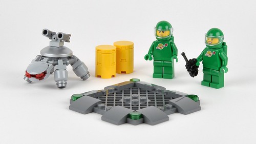
Is the baseplate a turtle docking or charging bay, or somewhere to store the barrels? You decide...

Construction of the Exo-Suit begins with the body. It's a complex structure with studs pointing in all directions. It takes 20 steps to get to this stage.
The Technic ball hip and shoulder joints are attached to the body using four '2X1 St.Ø4.9 Hole W. Half Beam' which I remember Mark telling me when it was new what a useful part it would be.

The front of the cockpit has been added here. It looks suitably greebly.

A view of the bottom of the body. The 2x2 inverted tile is printed with a 'hot engine' pattern that's been used before.

Before completing the body, the two legs are constructed, which are identical. The ankle, knee and hip joints use ball-and-socket joints thus making them very poseable and able to withstand the rigors of play.
The foot can also be rotated on the blue pin/axle connector which provides a degree of movement not normally possible in official LEGO models of this type. A good job has been done of disguising the large ball and socket pieces with plenty of greebling.

Once the legs are attached, the arms are built. As you can see the barrels hide a Technic axle connector which facilitates the wrist connection. Many have complained about the use of barrels here but I think they look OK.

The back has details that were not present on Pete's original, including the metallic silver flexi-hose and wheel hub caps.
One thing I didn't mention when discussing the instructions in part one was that, as has become common in Ideas instruction books, there are small snippets of information scattered throughout it which in this case describe various features of the model. One of them tells us that the hub caps are, apparently, 'excess heat radiators'

Construction is completed by the addition of the claws, minifig protective cage and more greebles. Please come back tomorrow for photos of the completed model. Sorry to keep you waiting so long...
4 likes
37 comments on this article
WOW. The not-quite-completed pics look even better than the box art. Maybe because there's not such a messy beckground?
Is that burner on the bottom a printed "boat tile" or a sticker?
do you know how much it costs?
^^ Printed inverted tile.
Interesting to see the two 1x3 tiles on the back of the cockpit. Hope this means there are plenty of studs behind them to attach such things as backpacks, engines, rocket launchers, flame thrower canisters. Looking forward to getting this and adding some serious hardware.
Anyone else planning on making Peter Reid's boomsticks for this behemoth?
^^ All 6 studs are available for fixing additions to it.
It's awesome already! Bring on August 1.
Thank you for this review! What an awesome set, I will get it on the first day immediately.
@Huw I think you assembled the shoulders wrong, they are one axlehole too high
I must say, I really like the addition of dark grey to the colour scheme and the trans yellow highlights. One of the things I didn't like about the original model was how it was almost entirely one colour.
And the turtle is great!
I love this set. But I must say, I wish it had two things:
A space logo on it somewhere, and at least one blue highlight in keeping with the classic space color scheme.
Mind you, I think it's AMAZING as-is, and honestly can't complain. I would only want those things if they could be added while retaining the high-quality domination currently present.
@the werebrick, i too want to add the "Boom Stick" to this once i can get my hands on this.
and @commanderVideo, there is a blue pin on the ankle :P see they were thinking about you all along!
I STILL WANT ONE!!!!!!!!!!!!!
@commandervideo: Actually, the color scheme is already fairly similar to the classic space moon rovers (grey with red wheels). A lot of people forget that even when the blue, grey, and tr. yellow color scheme was in vogue, it wasn't being used for everything.
Mark (the designer) actually said he considered adding blue, but was convinced not to by both Pete (the original project creator) and the LEGO Ideas team, who felt that a grey exo-suit was more faithful to the project people had supported.
Gee, I'll have to work those new spring-loaded shooters into a weapon this thing can wield! 'Cause the one thing scarier than an Exo-Suit, is an Exo-Suit WITH GUNS!!! :)
It's a cool mech to be sure, it's just too different from what we voted for.
I'm kind of especially disappointed in the use of trans-yellow. Although it's an acceptable Classic Space color choice, part of the whole aesthetic of the Exo suit was the fact that it was (mostly) monotone. Why this betrays the original is most easily seen in the legs. With the original, part of what made it impressive was that you weren't sure what you were looking at, and it merged into one big shape. With the 2 tone legs it's obvious they're ball joints with stuff slapped on. These seemingly little differences are what made the original special, and I'm sad to see how they didn't translate to the finished model.
And WHY the blue connector pegs? Do they really think adults are going to be THAT confused about which part they're looking for? When they're completely hidden that's one thing, but did Lego accidentally make too many blue connector pegs or something?
Other than that, the barrels. I have a feeling those barrels will go down in infamy. There has to be a better way, and I'm sure a lot of people will search for it as soon as they get their hands on this thing.
Above all, I hope Lego learns from this simply for their own mechs, this is head a shoulders above anything that's come before. Even so, it had enormous shoes to fill and maybe this outcome was inevitable.
As an aside, does anyone know which Ninja Turtles green was used for the minifigs? Is it the more kelly green of Donatello and Michelangelo or the slightly darker green of Leonardo and Raphael?
What is a greeble/greebly?
@DanRSL: Blue connector pegs are probably color-locked like Nabii describes here: http://www.reddit.com/r/lego/comments/29w5q7/exo_suit_side_by_side_original_submission_vs/ciprt9a?context=3
I honestly don't mind. Complaints about connector pegs have always seemed kind of silly to me (and believe me, as a BIONICLE fan, I've seen MANY such complaints). Generally, they don't have a very big impact on a model's appearance. And besides, real-life machines often have colored spots like those anyway, whether they be warning labels, color-coded wires and other functional parts, or just accents.
I prefer the set with both the multiple greys and the colored accents. Monochrome sets and MOCs bore me. Accents help make the details of a model "pop", and I think that works to this set's advantage.
@Aanchir
Ugh, for the pegs. I get it, the official reason is just a bad reason in my opinion. I don't ever remember being bewildered by Legos when I was 7, I think they don't give kids enough credit these days.
"Back in my day we didn't have no stinkin' numbered bags!" (end of geezer rant)
@Nicknak Thanks!
@recce - this will explain it http://en.wikipedia.org/wiki/Greeble
Back in my days, we didn't have colored technic connectors. It was black and gray, all the way.
;)
@The Werebrick This set costs $34.99 and contains 321 pieces
@Bard the Bowman -Thanks! :)
I was originally not into this set. I admire mech builds, but they're not really my thing. Seeing the final product though, I'm sold. Mostly because of the classic space figs in green. I think LEGO played a smart business move there to get classic space fans (or people who love Benny) into wanting this mech even if it wasn't a must-have previously.
I also wasn't a particular fan of the monotone, but there are enough pieces here that do come in different colors that you could palette-swap it. It will be exciting to see the custom-colored versions of this set that people can come up with.
I presume most folks will swap out the barrels on the arms. The original piece was much better and looks like heat sinks. This set is perfect for modifications, like arm cannons, shoulder mounted cannons, etc. The weapons/armament possiblilies are endless!
I've never heard the word "greeble" before, but it is quite common these days :)
Now that I see what's inside the barrell, it is something like I imagined - after Nabii explained on reddit why it was necessary. I want that turtle so much! Please make a polybag with it!
Totally crazy about this robot - Huw, you should post a robot modding contest! (Similar to the Mixels contest)
That would be fun!
@Yooha - the turtle is so adorable! I have already made green, black, white, clear, and blue variants!
I knew I spotted 3 air tanks :-)
I'm so looking forward to this set! The custom options are immense. I fancy a plain grey version, then a CS blue version, a white CS minifig, ...
Now, can I get to Bluewater on preview day, that's the big question :-)
Thanks DanRSL for the link, I thought it's some kind of AFOL terms :-)
@q_159, well spotted! Yes, in my haste I did have them too high at this stage. That became apparent when adding the greebles and I corrected it for the next set of photos.
I love that this ended up basically being a constraction Set with a bunch of system Greebling. As someone who really tries to encourage MOCers to not sneer at constraction and look down their noses at us(You know full well it still happens) this will be a great example to show some kind of midground between the two systems of build which many of you like to say have nothing in common. Now I have a beloved set of yours to point to and say "Oh really?"
Thanks for the part two review Huw, I'm quite enjoying the longer more drawn out review process as it's helping to eat up the time until August 1st!
Bring on part 3 tomorrow!
@DanRSL I agree I think its a crap reason to not have color appropriate Pegs and bits. Technic has gone rampant with this whole color coding things. Its atrocious to anything trying to have a tight color scheme. I understand it for sets geared towards kids, but at least have some sets where they're color corrected. This comes down to A, Lego's color coding for dumb children, and B, and probably the biggest reason they don't budge from it, production costs/constraints. Its easier to just make every friction pin from now until infinity blue. :/
@Aanchir, Scott, are you ever going to not use "I don't mind" and "I prefer" as a counter point to anyone's complaint about anything? YOU don't mind it, big woop the rest of us do. Some of us don't want blue or tan pins on our all black, all white or tightly color controlled MOCs. On certain MOCs and especially small MOCs, they have a big enough impact. Dan's and everyone else's complaint about the pins is a valid one.
Now I personally wouldn't even mind it so much if they just made them available in some sets, like these or ones geared towards adults, that way they're at least in production in colors that we can utilize and not have to pay ridiculous prices on the secondhand market.
I thought that CUUSOO/ideas sets were not allowed to have new pieces in them? Or does that only apply to the initial proposal not the final product?
Mark Stafford explined that LEGO Ideas designers are limited on how many parts they can recolor per set. He also mentioned that recoloring and new prints are in the same category under the same limit. That is why the minifigs don't have dual sided heads. He already used up his budget towards recoloring some parts, which he felt was more important.
@3rdeye88: If other people share their opinions I don't see what's wrong with sharing mine. Though I was mainly replying to answer DanRSL's question since I had read a related post from Nabii on Reddit just that morning. I apologize if I sounded dismissive, but honestly I don't think six blue spots do any more harm to the model than six black spots would have.
Furthermore, I know a lot of people who would likely get frustrated digging around for just the right part, and they're not just "dumb children". Back when I was a kid I had my LEGO sets sorted by color, with one exception: I had separate bins for Technic parts. It was VERY irritating to try to dig around for the few +/O friction pins I had in a sea of regular O/O friction pins that were the same size and color. So my preference in this case comes from personal experience. It's rather disingenuous to insult or stereotype other LEGO fans just because the LEGO Group chooses to accommodate them.
I've been examining some frowning eyebrows and I think Pete's head is probably Zane's from Ninjago, am I right?
http://brickset.com/minifigs/njo106/Zane-Titanium-Ninja-with-Flat-Silver-Armor
@renevd: Yep, that's correct. It's kind of funny seeing so many Ninjago minifigure parts appearing in other themes (and vice-versa) this year, after the LEGO Group seemed to avoid it in previous years. The new Nya minifigure from 70728 uses the same head as Rootbeer Belle from the LEGO Movie sets, and Sensei Wu's torso from the past two years is used in 10243 Parisian Restaurant.
I don't mind, though. Unlike, say, Exo-Force, Ninjago minifigures generally adhere very strictly to the usual minifigure design considerations, so unless it's, say, a torso with extremely distinctive Ninjago-specific logos on it, then I think it's fine for minifigure parts to be shared between Ninjago and other themes.