Review: 5009806 Retro Space Explorer
Posted by CapnRex101,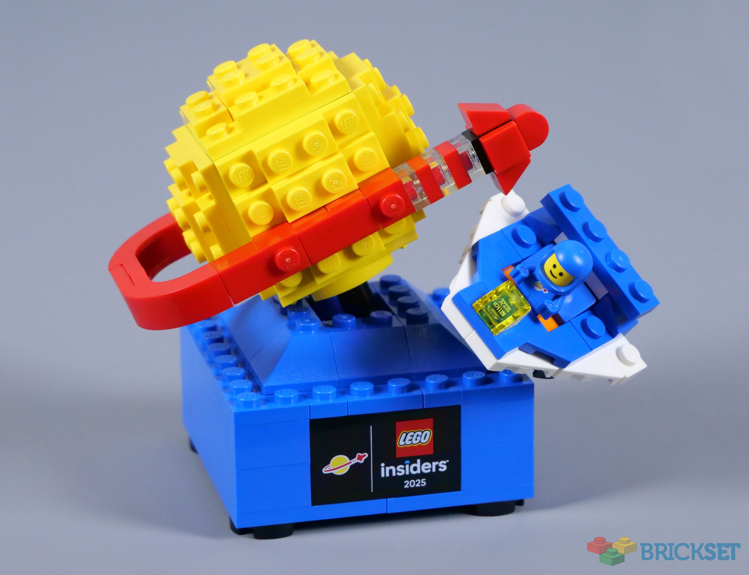
The Classic Space logo has become a symbol of LEGO history and appears on many minifigures and sets, particularly nowadays. However, there has never been a model focused completely on the Classic Space logo, until now!
5009806 Retro Space Explorer will be available starting on November 22nd and valued at 2400 points in the Insiders Rewards Centre. I think the logo itself translates well to three dimensions, though the base underneath seems rather bland. Also, the same blue astronaut has appeared twice before, so the chance for a unique colour has again been missed.
Summary
5009806 Retro Space Explorer, 150 pieces.
5009806 Retro Space Explorer is not bad, but could be easily improved
- Nice composition for display
- Classic Space logo looks good
- Extremely bland base
- Odd choices with the spaceship
- Needed a new astronaut colour
The set was provided for review by LEGO. All opinions expressed are those of the author.
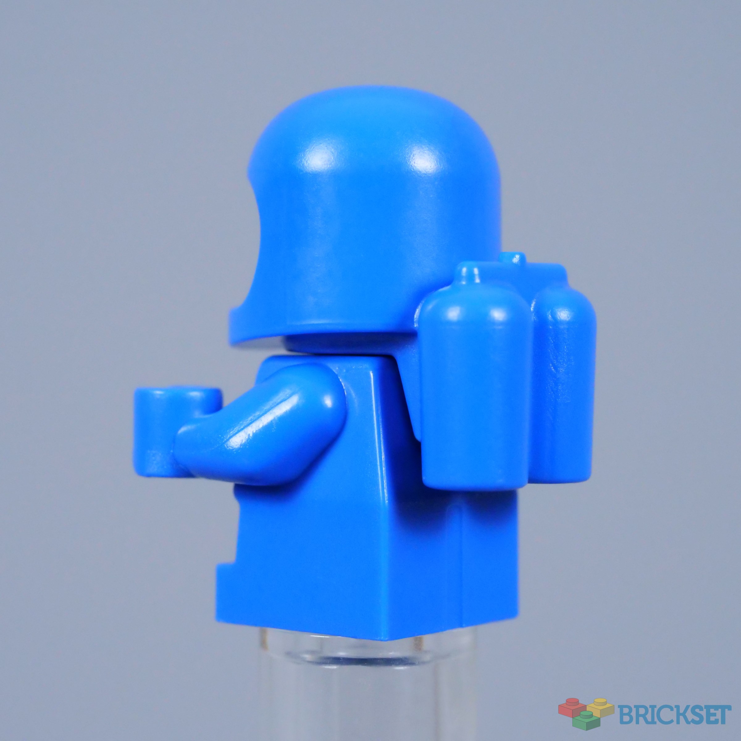
Microfigure
The delightful Spacebaby debuted in 71037 Collectable Minifigures Series 24 a couple of years ago and similar figures with the standard smiling faces followed shortly afterwards. I always like these microfigures, including tiny air tanks and the Classic Space logo, but we need some other colours. Blue is a particularly poor choice here, as a later addition to Classic Space sets.

The Completed Model
Smaller sculptural models like this are relatively rare, but I find the composition quite attractive overall. I can envisage a bigger version of the Classic Space logo and perhaps that would look even better, but the spaceship provides a great visual balance and I appreciate the clear colour distribution between the base, the spaceship and the logo.
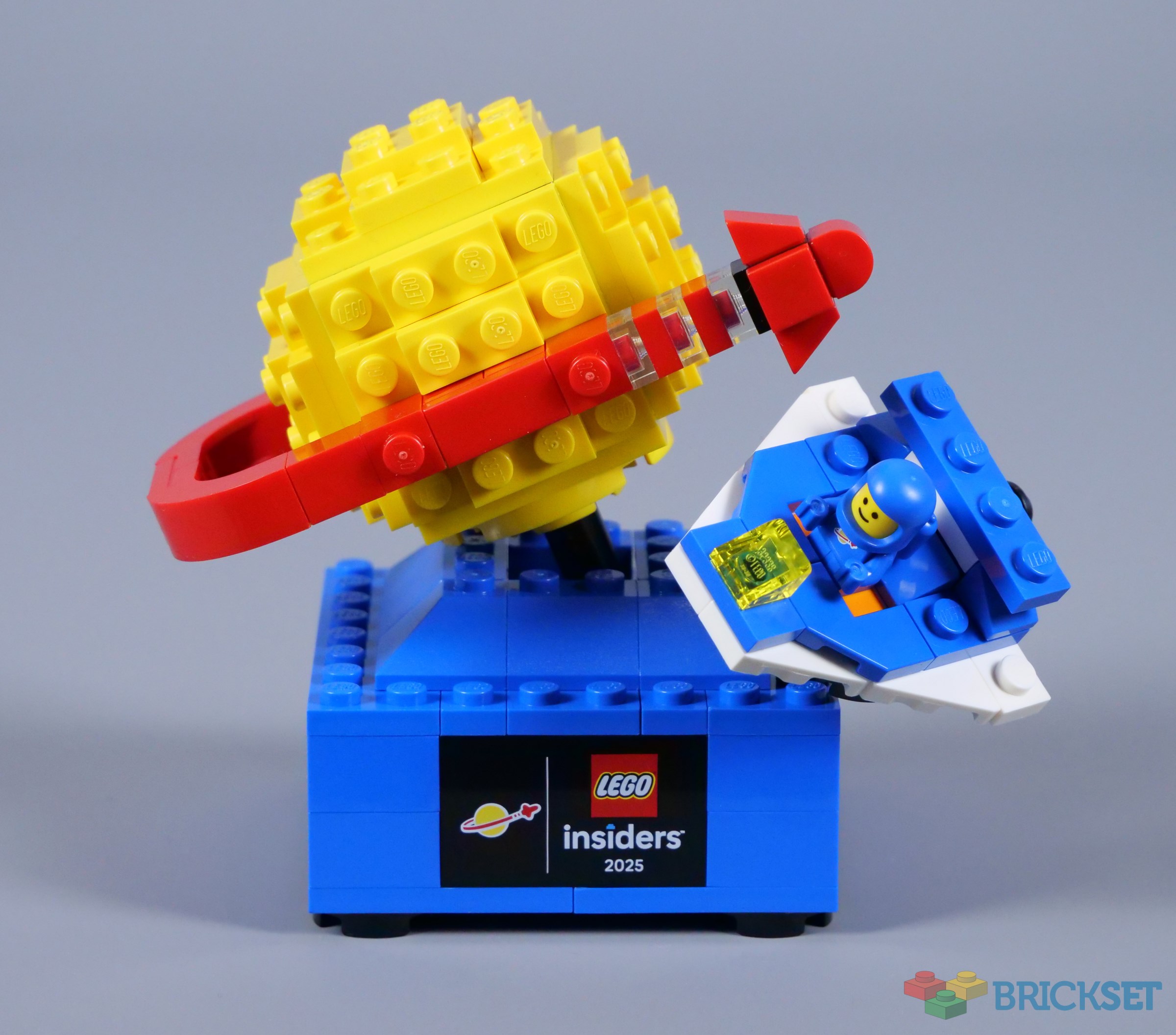
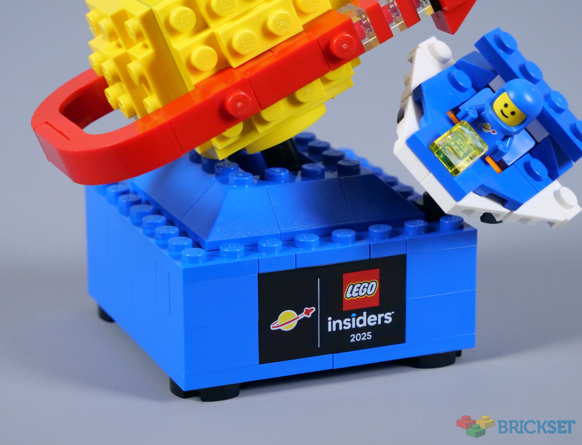
However, the base is very simple. I assume the designer was trying to reflect the blocky style of early Classic Space buildings, though there is a fine line between a simple design looking clean and looking bland. This leans more towards the latter, for me. Also, I wish there was some relief around the printed plaque, which is arguably not necessary anyway.
The back is blank, as expected. While not necessarily accurate to Classic Space in its original form, a smattering of mechanical texture would have been welcome. Even a few trans-red and trans-green lights at the corners could improve the situation, in my opinion.
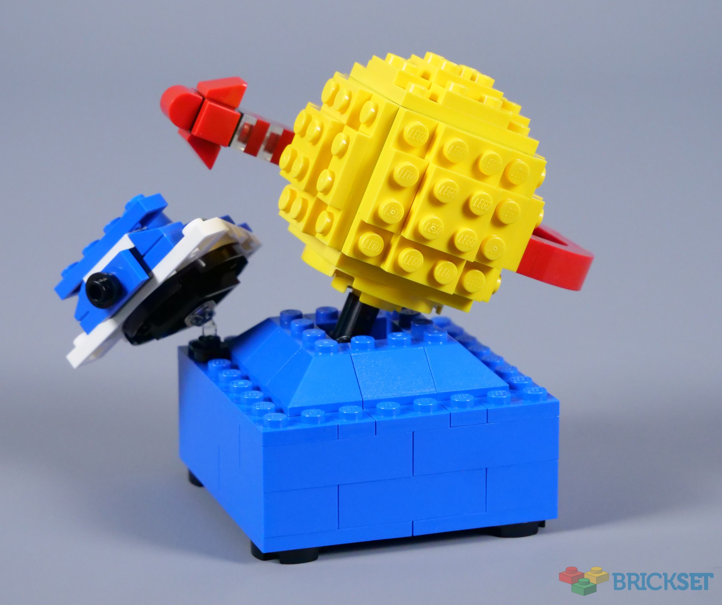
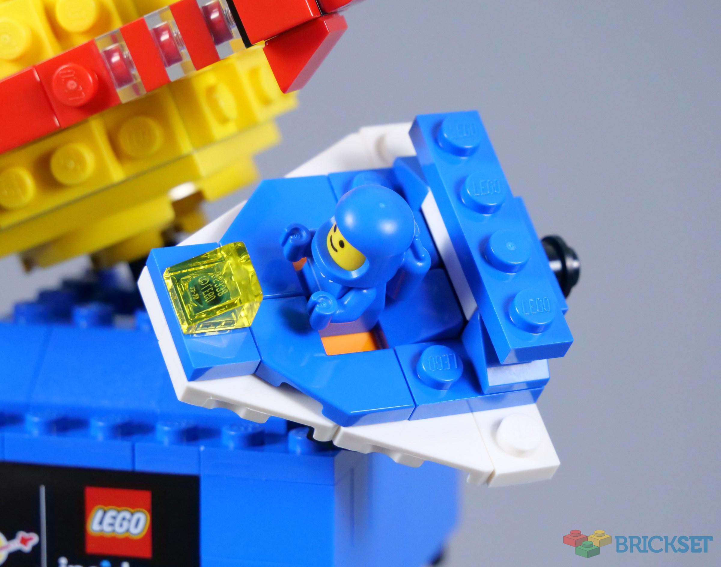
The spacecraft is unusual, deviating from the expected blue, grey and trans-yellow colours, as white is used instead of light bluish grey. While plenty of Classic Space vehicles featured white parts, they nearly always included trans-blue windscreens and canopies. Moreover, orange is a strange colour choice for the 1x2 jumper plate beneath the astronaut, since orange only joined the LEGO colour palette in 1998, long after Classic Space.
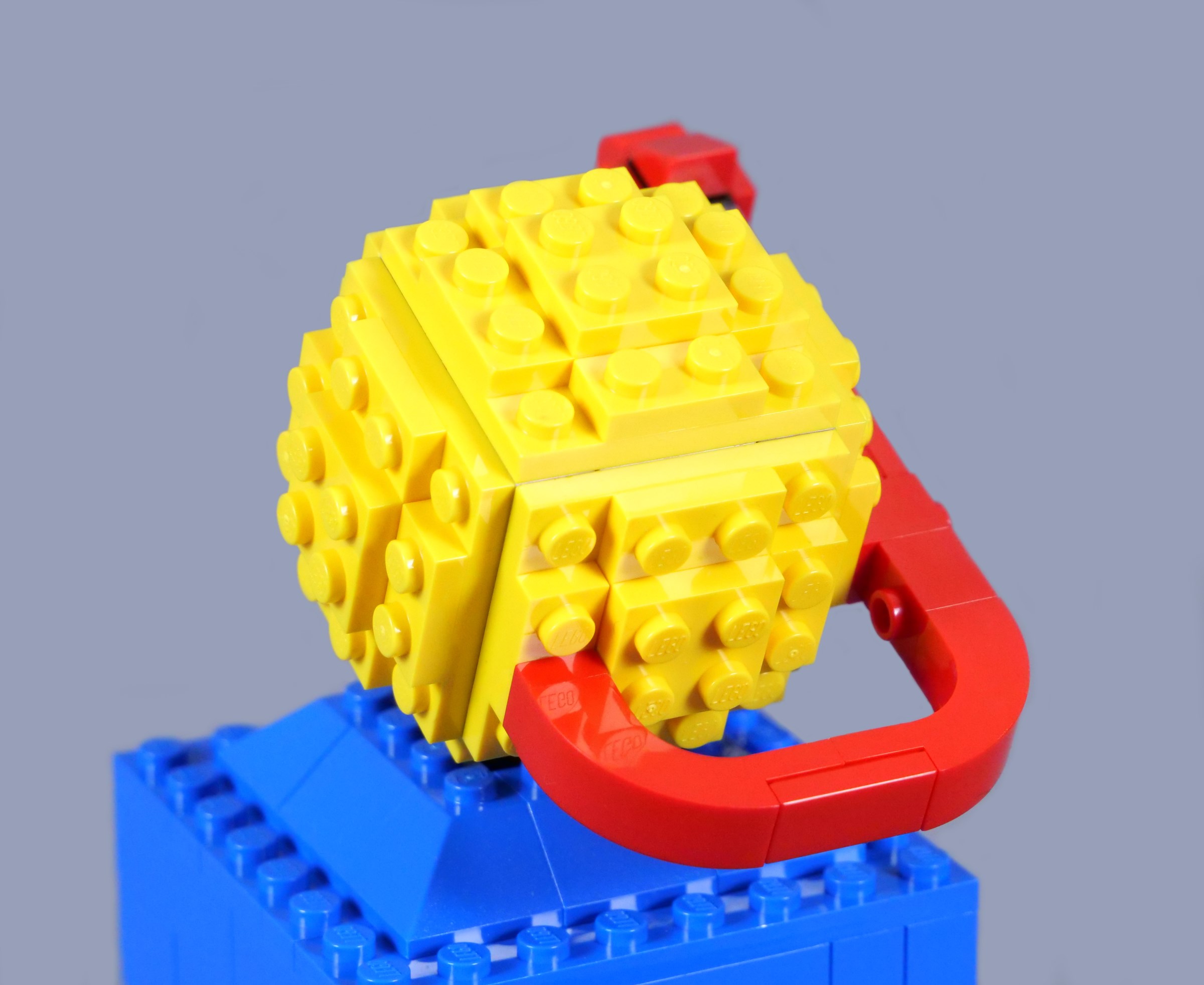
Fortunately, the logo itself fares substantially better. The planetoid is constructed with layers of plates attached to each side and looks perfect in yellow, circled by a red orbit. I particularly like the trans-clear gaps in the trail directly behind the spaceship, exactly where they appear on the original logo.
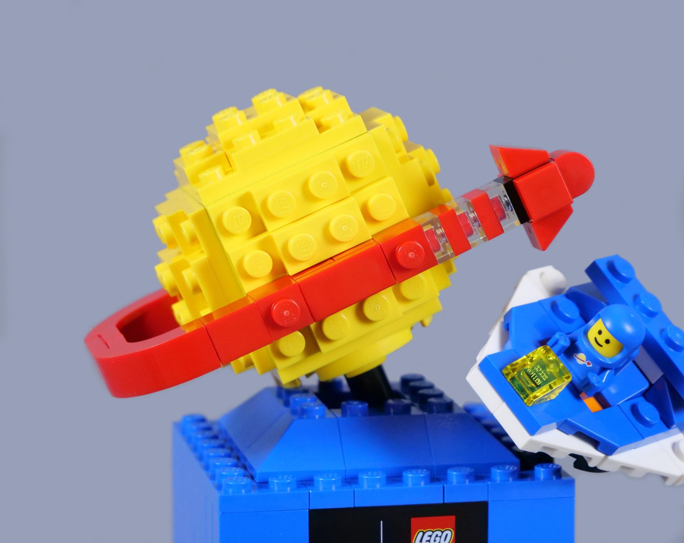
The curvature of the orbit could be smoother though and I have always imagined it continuing and vanishing behind the planetoid. Even so, this design works to translate a two-dimensional image into three dimensions.
Overall
I like the idea of the famous Classic Space logo becoming a three-dimensional model, but its execution is mixed. The composition of 5009806 Retro Space Explorer is fairly appealing and the logo is certainly the highlight, as it should be. However, strange decisions have been made with the spacecraft and base. The base in particular desperately needs some texture.

The repeated blue astronaut microfigure is disappointing too, while 2400 Insiders points seems quite expensive compared with other rewards. That equates to about £15.00, $18.50 or €16.00, which is not bad, but feels high relative to the 2250-point 40786 Micro Command Centre, which was released earlier in the year.
108 likes
44 comments on this article
Counter to the downvote for the astonaught figure point - If it were any other colour than blue, it wouldn't be as iconic. It's to represent classic space, and what better way than with the main space fig, good ol' reliable blue. Yes it's a later edition BUT the most iconic colour when thinking classic space
I would have wanted this if the microfigure was red.
I can see myself getting this and changing the spaceship to be more 'classic', and adding greebling to the base.
Not sure I like 'insiders 2025' being on the plaque either - the Lego logo and the Space logo are perfect just as is.
I like the plaque, especially if it means that they will do further Insiders sets with plaques to tie similar types of sets together. If they do a Castle and Pirates one over the next two years, I think they'd look nice together.
I'm not a fan of the ship and I don't really like the space babies. I'd prefer a classic figure even if they have been done quite recently. That would also help tie them into a series if they do it as above, since they could do a classic pirate and knight minifigure in the next sets.
As it is, I'll probably display the planet without the base on top of a building for now to make it a Classic Space HQ.
@Hollandsglorie said:
"I would have wanted this if the microfigure was red."
I agree. This would've been the perfect opportunity to introduce a red Space Baby. Not only would it be more appropriate for the early days of Classic Space, but would have contrasted nicely with the spaceship.
The blue Space Baby should have been red. I guess I'll swap it with a white one:)
A Classic Space homage?
Blue, Gray and Trans Yellow?
With a Galaxy Explorer model?
Daring today, aren't we Lego?
s/
Looking closer, it's white, not gray. At least they shook it up a tiny bit. In later CS sets they sometimes used white-blue-trans yellow (6985 is the most iconic one), but none of those had the triangular shape. Still, a step in a slightly bolder direction. Slightly. Very slightly.
I'd rather prefer a playable set. A real toy reminds me more of great childhood themes than a Logo of those.
@8lackmagic said:
" @Hollandsglorie said:
"I would have wanted this if the microfigure was red."
I agree. This would've been the perfect opportunity to introduce a red Space Baby. Not only would it be more appropriate for the early days of Classic Space, but would have contrasted nicely with the spaceship."
I guess the downside is if the baby was red, it would draw the eye away from the yellow planet and red swoosh of the CS logo.
Is it just me, or should there be an extra red 1x1 plate on the rocket? It feels a bit too stubby. It’s hard to imagine a recolor in a insiders reward (non-Ideas one, in this case), but it would be nice if it had one, and that will have to change if this becomes a series. I’m also a little surprised that they didn’t do white, because that one would be slightly more desirable. Still, I’m sucker for printed tile, and I already got both prior additions to the “series.” One more thing, I think the base should be tiled off. The studded base feels low-effort. What should I expect?
I think this looks pretty perfect... including the blocky base!
While Classic Space is my favorite of the classic Lego themes, I'd *love* to see Rewards sets of the other themes, including Baby Castle figs and Baby Pirate figs!
Thought it was going to be a kiddie ride build. Decent set, but I wish they added a mechanical motion to the logo for more playability. And, the black plaque is out of place. Who cares if it's from Insiders 2025, just put the OG logo on a blue brick!
Do I like it? yes
Worth €16 in points? Tough call
@Ottozone said:
"Thought it was going to be a kiddie ride build. Decent set, but I wish they added a mechanical motion to the logo for more playability. And, the black plaque is out of place. Who cares if it's from Insiders 2025, just put the OG logo on a blue brick!"
We've had that 6435201
@VaultDweller_197 said:
"Counter to the downvote for the astonaught figure point - If it were any other colour than blue, it wouldn't be as iconic. It's to represent classic space, and what better way than with the main space fig, good ol' reliable blue. Yes it's a later edition BUT the most iconic colour when thinking classic space."
I disagree. I think red and white at least are more iconic to Classic Space fans. Blue has been popularised by Benny to some extent, although plenty of Classic Space purists seem to push back against that characterisation of the range.
@watcher21 said:
"Do I like it? yes
Worth €16 in points? Tough call
@Ottozone said:
"Thought it was going to be a kiddie ride build. Decent set, but I wish they added a mechanical motion to the logo for more playability. And, the black plaque is out of place. Who cares if it's from Insiders 2025, just put the OG logo on a blue brick!"
We've had that 6435201 "
moreso a kiddie right for the classic astronauts, not for lego city is what i imagined
The first classic spacemen were white and red. It is highly debatable figuring out which of those two colours came first (probably only the original designer at Lego can answer that - I believe he is no longer with us). We already have white - so it should have been red. Remember the Legoland flag? Yellow, red, blue, white, black - those are the colours of the original spacemen (but not in that order).
Lego has new wedge plates which would have allowed for this ship to be 5-wide and look a lot less blocky.
CDN$24 is too expensive for what this is. With a red spaceman, I would have bitten.
Looks nice, but don't have the points and likely never will. But seems like a perfect set to just build from the pieces I already have. With a nicer base.
As for the Space Baby, a new color would abviously have been nice, but even the white one would have been better here. Everything but its face pretty much disappears in all the other blue now.
@CapnRex101 said:
" @VaultDweller_197 said:
"Counter to the downvote for the astonaught figure point - If it were any other colour than blue, it wouldn't be as iconic. It's to represent classic space, and what better way than with the main space fig, good ol' reliable blue. Yes it's a later edition BUT the most iconic colour when thinking classic space."
I disagree. I think red and white at least are more iconic to Classic Space fans. Blue has been popularised by Benny to some extent, although plenty of Classic Space purists seem to push back against that characterisation of the range."
1978: red & white (blue/lgrey/tyellow era)
1982: yellow*
1984: blue & black
*thus, sets 0012, 0013, 0014 and 0015 have all the wrong release years
I like it overall
The base doesn't bother me, though I'd rather it be in black instead of blue, so it looks more like a base.
I hope we get the classic space logo as a bigger model. I wouldn't want it as a globe, but just a larger display piece.
Printed logo is not correct! Looks like a bootleg!
I have seen this ‘balloon animal’ version in some video games, but mainly in bootleg merch.
Anyone know if it has official origins? Or have the design team accidentally used a fake file?
Maybe this is the Offical ‘small size’ version. But in my view it could be a lot closer to the true shape of the ship.
I love the blue CSfolk, including Benny, but like others here I think the baby would have been better in just about any other color. Between 71037-3, 40712, 40786, 31142, and possibly other things I’m overlooking, we’ve had several opportunities to get blue Spacebabies (with one face or the other), but just one apiece for white and pink, and diddly-squat for any other (not counting the giant red, of course). I also would like the red swoosh a little more elegantly curved.
That said… darn it all, I think this is another I need.
Before anyone gets the idea of 'Oh there is that other lately-negative-sounding-guy again...' Sure, anyone can agree to disagree with me. I'm just here to state my personal, from-the-Classic-Space-heart opinion. Nothing more, nothing less. Classic Space -and LEGO Space in general- always was, still is and always will be the most important LEGO genre for me. So yes, I'm a critic!
This Insiders Reward seems to be designed by someone who wasn't around at the time of Classic Space and/or didn't do his/her homework. I say this as someone who was (you can check my profile and my collection of CS sets if you like and/or if you doubt me.)
To me personally, almost everything about this CS 'vignette' looks off and I agree with @CapnRex101 on the minus points, but I wholeheartedly disagree on the 3D Classic Space logo looking good:
*The choices for recreating the little red orbiter in the logo look weird to me: Why is the black SNOT brick not red? (Yes, it exists in red) and since they chose to make the 'wings' silhouette angular, then so should the nose of the orbiter be IMO, plus it should be longer... or else they should have made the wings using rounded pieces, just like the nose. The combination of angular plus rounded -when the orbiter in the actual logo is all rounded- equals hesitation.
*The yellow planet itself: why is the bottom using rounded plates (yes, I know they had to have a Technic hole for connecting to the base) Then make the top and sides rounded as well! Or make it all square (there's a simple solution for the bottom to connect to the base w/o the need for the rounded plates) Again, the combination of rounded plus angular looks off to me.
The printed(?) 1x4x2 panel(?) in black with CS logo and LEGO Insiders 2025 on it look 'OK' to me but as already has been mentioned, that 'Insiders 2025' text doesn't add anything 'special' (not to me anyway). It detracts from the CS logo!
Further, I agree with opinions on the little spaceship and color of the Space baby:
*This would have been ideal to introduce a red Space baby (or even a black one to match that black sign on the base. And if they simply didn't want to, I would have preferred another white Space baby. IMO blue ones are overrated since Benny from TLM.)
*The wings -plus the white plate in the back- should have been Light Bluish Gray IMO
*The engine on the back should have been a bit bigger (or 2 smaller ones instead of just the one) and Light Bluish Gray IMO
*What's with the rounded pieces underneath in black? Light Bluish Gray please (and less prominent)
*And indeed the orange jumper plate should have been another color; Light Bluish Gray or maybe even white, that one piece!?
*The Trans-Yellow windshield should not have been at the front end of the little ship; too much of a 'cab forward' design. It looks really weird (but not in a good way).
The base itself? It doesn't look that bad to me, but it is indeed very bland (the plus point of it is, it indeed doesn't detract from the CS logo which however -as pointed out- doesn't look right to me.)
In conclusion: Could have been worse, but could have/ should have(?) been so much better!
As a true LEGO Space and CS aficionado I'm not going to spend Insider Points (or money on the seconday market) on this thingie.
But of course, for those who like or even love this little tribute to Classic Space, please do enjoy it (and ignore my purist opinions.)
Glad Brickset is back from its Cloudfare closing.
I agree with all the points in this review. It was well thought out. The review, that is.
I'm solidly on the fence, but will probably cave.
@Hollandsglorie said:
"I would have wanted this if the microfigure was red."
I want this, and will get it as soon as it becomes available, but I agree that a red microfigure would be superior.
@8lackmagic said:
" @Hollandsglorie said:
"I would have wanted this if the microfigure was red."
I agree. This would've been the perfect opportunity to introduce a red Space Baby. Not only would it be more appropriate for the early days of Classic Space, but would have contrasted nicely with the spaceship."
But then there would be complaints from the usual suspects about locking an exclusive red spacebaby behind a GWP paywall and how scammy LEGO are for doing this, especially as you can only get one and not army build, etc.
This is a very boring and bland item. I'll use the points needed to get this elsewhere.
This doesn’t look great. I was thinking about using some points for it this weekend, but blue white, trans yellow and orange? The thruster on the back isn’t even gray.
Honestly it feels like a low key insult. And you guys know I’m a big SPACE fan.
@Wallace_Brick_Designs said:
"Is it just me, or should there be an extra red 1x1 plate on the rocket? It feels a bit too stubby. It’s hard to imagine a recolor in a insiders reward (non-Ideas one, in this case), but it would be nice if it had one, and that will have to change if this becomes a series. I’m also a little surprised that they didn’t do white, because that one would be slightly more desirable. Still, I’m sucker for printed tile, and I already got both prior additions to the “series.” One more thing, I think the base should be tiled off. The studded base feels low-effort. What should I expect?"
What series? This is the first set to bear such a plaque, which means it should be the inaugural set, not the third one.
@Bengh_Zeran said:
"Before anyone gets the idea of 'Oh there is that other lately-negative-sounding-guy again...' Sure, anyone can agree to disagree with me. I'm just here to state my personal, from-the-Classic-Space-heart opinion. Nothing more, nothing less. Classic Space -and LEGO Space in general- always was, still is and always will be the most important LEGO genre for me. So yes, I'm a critic!
This Insiders Reward seems to be designed by someone who wasn't around at the time of Classic Space and/or didn't do his/her homework. I say this as someone who was (you can check my profile and my collection of CS sets if you like and/or if you doubt me.)
To me personally, almost everything about this CS 'vignette' looks off and I agree with @CapnRex101 on the minus points, but I wholeheartedly disagree on the 3D Classic Space logo looking good:
*The choices for recreating the little red orbiter in the logo look weird to me: Why is the black SNOT brick not red? (Yes, it exists in red) and since they chose to make the 'wings' silhouette angular, then so should the nose of the orbiter be IMO, plus it should be longer... or else they should have made the wings using rounded pieces, just like the nose. The combination of angular plus rounded -when the orbiter in the actual logo is all rounded- equals hesitation.
*The yellow planet itself: why is the bottom using rounded plates (yes, I know they had to have a Technic hole for connecting to the base) Then make the top and sides rounded as well! Or make it all square (there's a simple solution for the bottom to connect to the base w/o the need for the rounded plates) Again, the combination of rounded plus angular looks off to me.
The printed(?) 1x4x2 panel(?) in black with CS logo and LEGO Insiders 2025 on it look 'OK' to me but as already has been mentioned, that 'Insiders 2025' text doesn't add anything 'special' (not to me anyway). It detracts from the CS logo!
Further, I agree with opinions on the little spaceship and color of the Space baby:
*This would have been ideal to introduce a red Space baby (or even a black one to match that black sign on the base. And if they simply didn't want to, I would have preferred another white Space baby. IMO blue ones are overrated since Benny from TLM.)
*The wings -plus the white plate in the back- should have been Light Bluish Gray IMO
*The engine on the back should have been a bit bigger (or 2 smaller ones instead of just the one) and Light Bluish Gray IMO
*What's with the rounded pieces underneath in black? Light Bluish Gray please (and less prominent)
*And indeed the orange jumper plate should have been another color; Light Bluish Gray or maybe even white, that one piece!?
*The Trans-Yellow windshield should not have been at the front end of the little ship; too much of a 'cab forward' design. It looks really weird (but not in a good way).
The base itself? It doesn't look that bad to me, but it is indeed very bland (the plus point of it is, it indeed doesn't detract from the CS logo which however -as pointed out- doesn't look right to me.)
In conclusion: Could have been worse, but could have/ should have(?) been so much better!
As a true LEGO Space and CS aficionado I'm not going to spend Insider Points (or money on the seconday market) on this thingie.
But of course, for those who like or even love this little tribute to Classic Space, please do enjoy it (and ignore my purist opinions.)"
All very good points. I will get this but not from Lego. I will build it with my own parts and fix a great many of the points you mentioned. I strongly believe (since the space baby is 1-stud wide) that the spacecraft should be 5 wide and I already started looking at how to do this (yes Lego does now have the wedge plates to do this = in the right colour (i.e. light blueish grey)). As for the pedestal, look no further than the helmet collection - with a few tweaks to attach the spacecraft. The concept idea is great, the finished product, not so much, but with a few(lots) mods and a white spacefarer, this will look fantastic!
@CCC said:
" @8lackmagic said:
" @Hollandsglorie said:
"I would have wanted this if the microfigure was red."
I agree. This would've been the perfect opportunity to introduce a red Space Baby. Not only would it be more appropriate for the early days of Classic Space, but would have contrasted nicely with the spaceship."
But then there would be complaints from the usual suspects about locking an exclusive red spacebaby behind a GWP paywall and how scammy LEGO are for doing this, especially as you can only get one and not army build, etc."
All but the CMF spacebaby have been GWP/Insider sets, haven’t they? Anyone complaining about that is going to be complaining anyway, so no point avoiding it on those grounds. I think it likely that these are popular enough to keep throwing the classic space bone but not popular enough to put a recolour in as an Insider reward - maybe next time there’s a GWP version? I have a completely unsubstantiated suspicion that GWPs push more sales than Insider points kits do so if I’m right that would make more financial sense.
@PurpleDave said:
" @Wallace_Brick_Designs said:
"Is it just me, or should there be an extra red 1x1 plate on the rocket? It feels a bit too stubby. It’s hard to imagine a recolor in a insiders reward (non-Ideas one, in this case), but it would be nice if it had one, and that will have to change if this becomes a series. I’m also a little surprised that they didn’t do white, because that one would be slightly more desirable. Still, I’m sucker for printed tile, and I already got both prior additions to the “series.” One more thing, I think the base should be tiled off. The studded base feels low-effort. What should I expect?"
What series? This is the first set to bear such a plaque, which means it should be the inaugural set, not the third one."
Not identically styled, but 5006746 had a similar plaque. Given the differences between the two plaques, I wouldn't call it a "series," though.
@PurpleDave said:
" @Wallace_Brick_Designs said:
"Is it just me, or should there be an extra red 1x1 plate on the rocket? It feels a bit too stubby. It’s hard to imagine a recolor in a insiders reward (non-Ideas one, in this case), but it would be nice if it had one, and that will have to change if this becomes a series. I’m also a little surprised that they didn’t do white, because that one would be slightly more desirable. Still, I’m sucker for printed tile, and I already got both prior additions to the “series.” One more thing, I think the base should be tiled off. The studded base feels low-effort. What should I expect?"
What series? This is the first set to bear such a plaque, which means it should be the inaugural set, not the third one."
I was just referencing the previous classic-styled space baby sets. I hope for a future series each year of these for different themes, but I was just saying the series of classic-styled space baby sets from remakes and other things.
I just don't care for this space babies stuff.
It reeks of the same failed marketing push from the 90s where everything was suddenly babies for some inexplicable reason.
I could have gotten on board with microscale stuff, but this just doesn't sit the same way.
Also a blue astronaut in a galaxy explorer? Really?
Cmoooon.
I loved the Galaxy Explorer upscaling, but beyond that, the slop thrown at us space fans has been a drip feed of astronauts in various colors, all at some unhinged premium tied to unrelated, overpriced sets, and that just makes me stop caring. I'm not going to buy the vending machine for hundreds of dollars just for a few figs, it feels extortionate.
So this stuff just flies past me and I can't be bothered.
Now if you're a castle fan these days...
@VaultDweller_197 said:
"Counter to the downvote for the astonaught figure point - If it were any other colour than blue, it wouldn't be as iconic. It's to represent classic space, and what better way than with the main space fig, good ol' reliable blue. Yes it's a later edition BUT the most iconic colour when thinking classic space
"
Blue? For classic Space? For myself, buying the very first LEGO Space sets in the 70’s, I only think of Red and White.
If any other color, then go with Yellow! Why? Because it was the first new color to join the line-up. My friends and I, way back in the day, upon seeing the first Yellow Spaceman appear in catalogues, imagined this new Yellow Suit to be superior, for going into deep space, perhaps… We couldn’t wait for him to be unleashed. After that, we expected other colors. Black was welcome as we were seeking a Darth Vader-like villain as Star Wars was all-consuming at the time. Reason, I shifted all toy buying cash from LEGO for Kenner by 1983, until…1999.
Other aspects of the model, that were off, that others have pointed out too - the ship should have been true to the LL928: Blue, Trans Yellow with Black and Yellow on the Gray wings.
@krysto2002 said:"I'm not going to buy the vending machine for hundreds of dollars just for a few figs, it feels extortionate."
I didn't buy it for "a few figs." I bought it for *all* the figs, and the mechanism. Looking forward to building that and seeing it in action. Besides, it's not "hundreds of dollars. It's less than two hundred dollars, at least US dollars.
I'd rather spend my points on 40789.
"
The curvature of the orbit could be smoother though and I have always imagined it continuing and vanishing behind the planetoid.
"
If we consider that the spaceship accelerated to surpass escape velocity before completing its first orbit, I think that the trajectory from the planetoid surface to infinity may be reasonably accurate
@BrickAnomie said:
"I'd rather spend my points on 40789."
I already have that one and 40786, but I still have a bunch of points, because I started hoarding them when the results of the competition that led to those two were announced, so I'll be getting this.
This is lovely, and we’ll be getting it. 15 quids worth of insiders points seems fine. Thanks for the review of it, we’ve missed the odd insiders model so it’s helpful to hear about them here
The nice thing about Lego is, if you feel a model isn’t all it could be, you have the means to improve it.
Try doing that with your Funko Pops or anime figurines (no, really, don’t; it won’t end well).
@stefwaffles said:
"This is lovely, and we’ll be getting it. 15 quids worth of insiders points seems fine. Thanks for the review of it, we’ve missed the odd insiders model so it’s helpful to hear about them here
The nice thing about Lego is, if you feel a model isn’t all it could be, you have the means to improve it.
Try doing that with your Funko Pops or anime figurines (no, really, don’t; it won’t end well)."
It can be done to some extent with Nendoroids.
Red or Yellow would have been more ideal, since we've already gotten white and blue.
The logo looks good, but not at all impressed by the rest. Even as a CS fan, I think I'm going to pass.
Having grown up just past the classic space era, I associate classic space with Blue probably because of Benny. I didn't grow up in the thick of it, so can't say what color of 'nauts are best representative.
I liked this upon initial viewing and considered getting it, but for $18.50 I could likely build the logo out of pieces I have on hand instead and save the money for something else. Baby figures are fun, but I just don't need another blue one considering I have several from the CMF set. If it was a full size blue one without Benny faded logo, I'd be all over it.