Review: 10356 Star Trek: U.S.S. Enterprise NCC-1701-D
Posted by CapnRex101,
Like the Borg, The LEGO Group has assimilated new licensed properties with remarkable speed lately. LEGO Star Trek was once considered near-impossible given the continuation of LEGO Star Wars, though the magnificent 10356 Star Trek: U.S.S. Enterprise NCC-1701-D proves otherwise.
I am surprised Star Trek: The Next Generation was chosen as a starting point over the classic Enterprise, although the Galaxy-class spacecraft is undoubtedly iconic and crewed by equally popular characters, nine of whom are included! The minifigure selection and the vehicle itself both appear excellent to me.
Summary
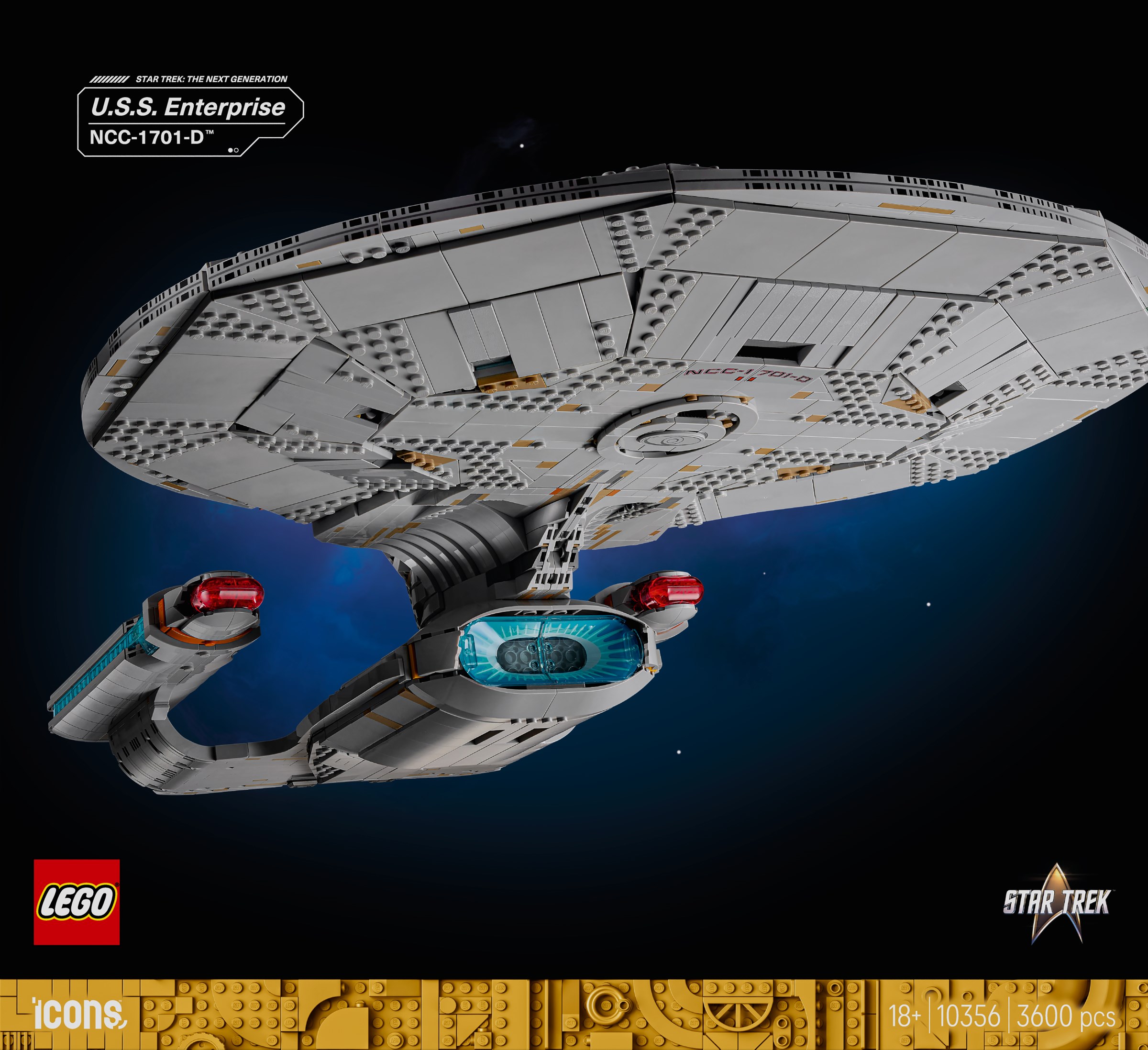
10356 Star Trek: U.S.S. Enterprise NCC-1701-D, 3,600 pieces.
£349.99 / $399.99 / €379.99 | 9.7p, 11.1c, 10.6c per piece.
Buy at LEGO.com »
LEGO Star Trek launches in spectacular fashion, despite some inevitable compromises
- Incredibly accurate proportions and shape overall
- Remarkable engineering
- Plenty of accurate details
- Clever saucer separation function
- Outstanding minifigures
- Some compromises with curves
- Too many dark tan pieces
- Quite expensive
The set was provided for review by LEGO. All opinions expressed are those of the author.
Box and Contents
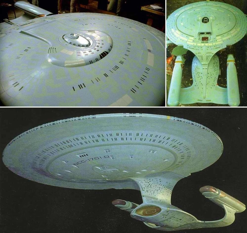
Apart from the bland uniformity inherent to 18+ packaging, I am not convinced by the angle chosen to present the Enterprise-D on the box. Admittedly, the ship is often shown from low angles like this onscreen, including in the opening credits, but the apparently jagged edges of the saucer on the LEGO model are exaggerated and a section of the saucer is cut off.
There are thirty numbered bags and two instruction manuals inside. The first few pages provide some information about the vessel, which is generally accurate, but not faultless. The maximum warp is incorrectly given as 9.9 and the 'famous missions' listed seem pretty random, particularly since there are other episodes where the Enterprise itself performs a pivotal role.

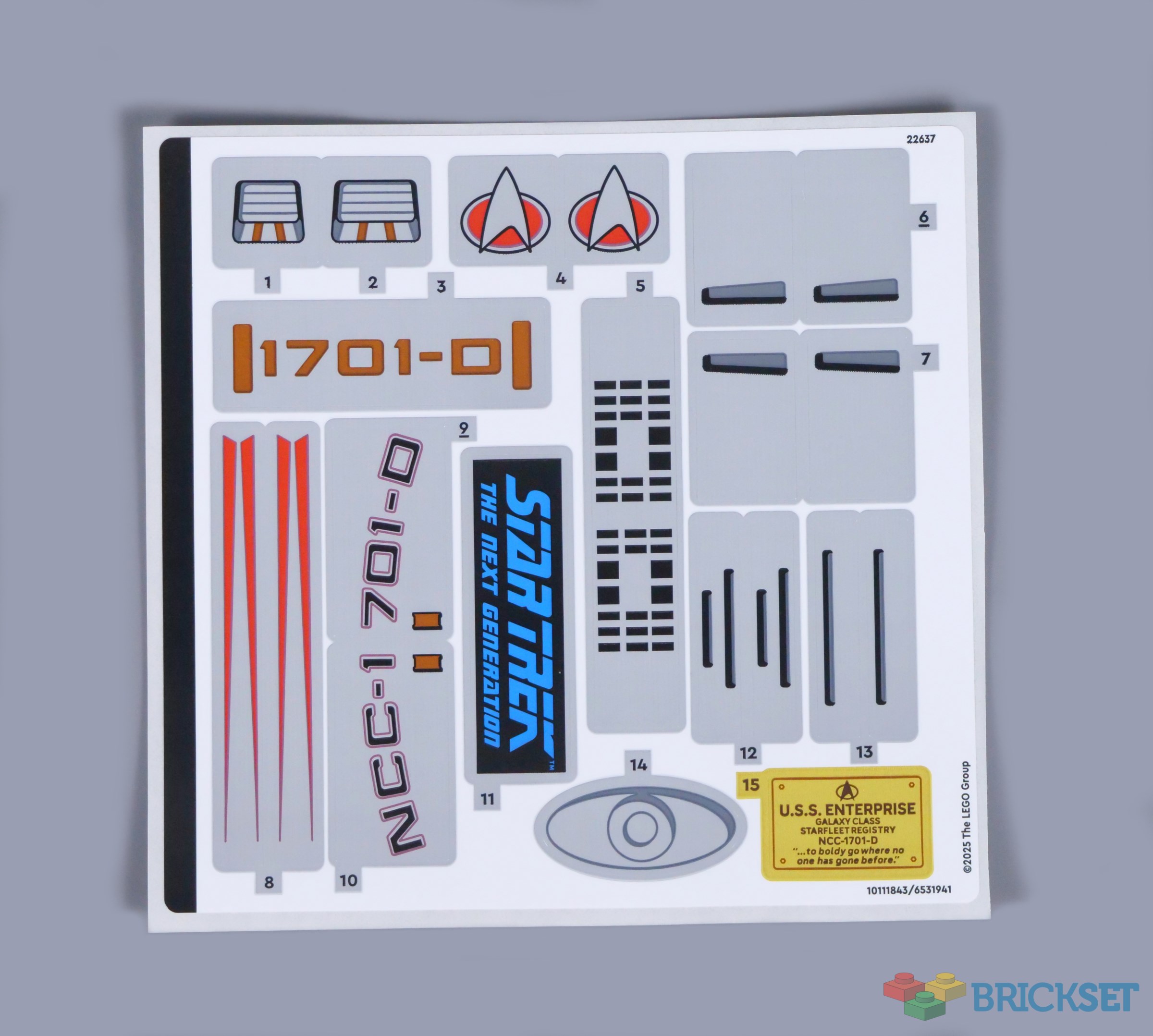
A substantial sticker sheet is also included, unfortunately. Plenty of printed pieces are supplied and I expected some stickers, although I wish a few more exterior details had been printed. On the other hand, the colour matching seems better than it has been in other recent sets.
Minifigures
Nine minifigures are included. I published a speculative article about LEGO Star Trek last year and envisaged fewer figures in a set like this, so this selection seems quite generous. Captain Jean-Luc Picard leads the group, dressed in the normal dark red and black command uniform, with a Starfleet combadge. I think a bald head was a good choice for Picard, but maybe some hair should have been printed on the back.

Picard's faithful second-in-command, Commander William T. Riker, wears exactly the same uniform, including accurate details on the shoulders. The rank pips that would distinguish the pair are missing, which is a shame, but understandable because those pips are on the collar, arguably beyond the scope of a minifigure torso.

Commander Riker's post-season one facial hair looks great and I like his serious and cheerful facial expressions. The commander enjoys playing the trombone and is equipped accordingly with a brick-built accessory, while Picard carries a dual-moulded glass representing his famed Earl Grey tea.

Lieutenant Commander Data is generally assigned command of the Enterprise when Picard and Riker are indisposed and tan is an excellent choice for the android's skin tone. The yellow eyes are accurate too and I love Data's smiling expression, with raised eyebrows capturing the innocence of his personality. Also, this hair piece matches the style onscreen.

Though he has many friends aboard the Enterprise, Data's closest friend is Lieutenant Geordi La Forge, who becomes the ship's chief engineer in season two and is therefore dressed in his gold operations uniform here. I think flame yellowish orange works for the uniform among LEGO colours, although its true shade is a little more muted.

Geordi was born blind and wears a VISOR, which enables him to see beyond the visible light spectrum. The metallic gold and silver device printed on Geordi's head seems pretty accurate and just the mouth is enough to convey emotion on either side of the head. Naturally, the chief engineer is equipped with an engineering case.

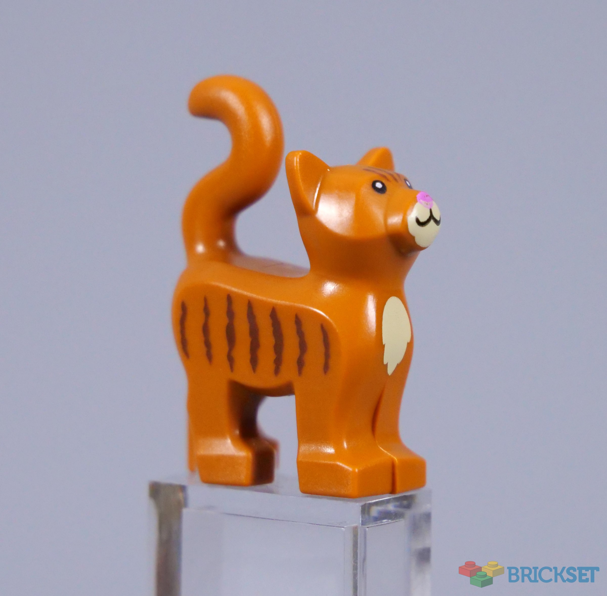
Spot, Data's pet cat, accompanies her owner. The mould was marginally altered last year, but this dark orange cat with brown stripes is common and not wholly appropriate for Spot, whose fur is a much lighter colour in the television series.
Lieutenant Worf is the chief of security aboard the Enterprise, again from the second season onwards. The dual-moulded head and hair component looks brilliant for the Klingon character and his double-sided head is marvellous, particularly the trademark snarl on the reverse! Also, the torso includes Worf's distinctive silver baldric, complete with the proper badges.

As the counsellor on the Enterprise, Deanna Troi stands out among the bridge officers in her lavender garb. The jumpsuit's exact shade is hard to translate to LEGO colours because dark bluish grey is arguably the closest modern match to the mauve onscreen, but the classic sand purple memorably used for Zam Wesell would be ideal, so it is a shame that could not return.

However, the hair element created for Izzie from DREAMZzz suits Troi well and the counsellor comes with a PADD, or Personal Access Display Device. The holographic brick is a nice touch, while Worf wields a phaser, incorporating a printed 1x1 slope. Spares of both the slope and the angled accessory holder are provided, so you can arm a second minifigure.

Dr. Beverly Crusher rarely needs a phaser, as the Chief Medical Officer aboard ship. The hair component developed for Ms. Marvel is new in dark orange for the doctor and looks perfect, as does the sciences uniform. Dr. Crusher normally wears a jacket over her standard attire, but the torso without a jacket is much more adaptable, should you wish to create other personnel.

The doctor joins the starship with her son, Wesley Crusher, a scientific prodigy and eventual ensign, before departing for Starfleet Academy. The minifigure wears a stripey jumper seen in The Next Generation season one, which surprises me because his provisional officer's uniform appears more frequently. However, I like the red, gold and blue stripes representing the three Starfleet divisions.

In addition, Wesley's handheld tractor beam generator only appears in a single episode during season one, so at least this corresponds with the figure. The brick-built details are quite simple, albeit reasonably faithful to the device in the show.

Dr. Crusher is equipped with a medical tricorder, represented by a printed 1x2 tile. The various screens and controls reflect the TR-560 tricorder model exactly, capturing remarkable detail for such a tiny piece.

Guinan is perhaps the most surprising inclusion, but very welcome! The mysterious bartender running Ten Forward is outside the bridge crew, though her sage advice is often important and Guinan translates well to minifigure form, incorporating a new hair and hat piece inspired by the character's most common attire.

Similarly, the torso is nicely decorated with lavender and metallic gold highlights and I think the plain legs are fine. Guinan's typically friendly expressions look superb as well, as the bartender rarely looks anything other than happy, except when Q visits.

I believe the trans-green bottle is intended to depict Aldebaran whiskey, which makes sense as one of Guinan's favourite drinks. However, the liquid should really be lighter than trans-green to match its appearance in the show.

Reference

Source - memory-alpha.fandom.com
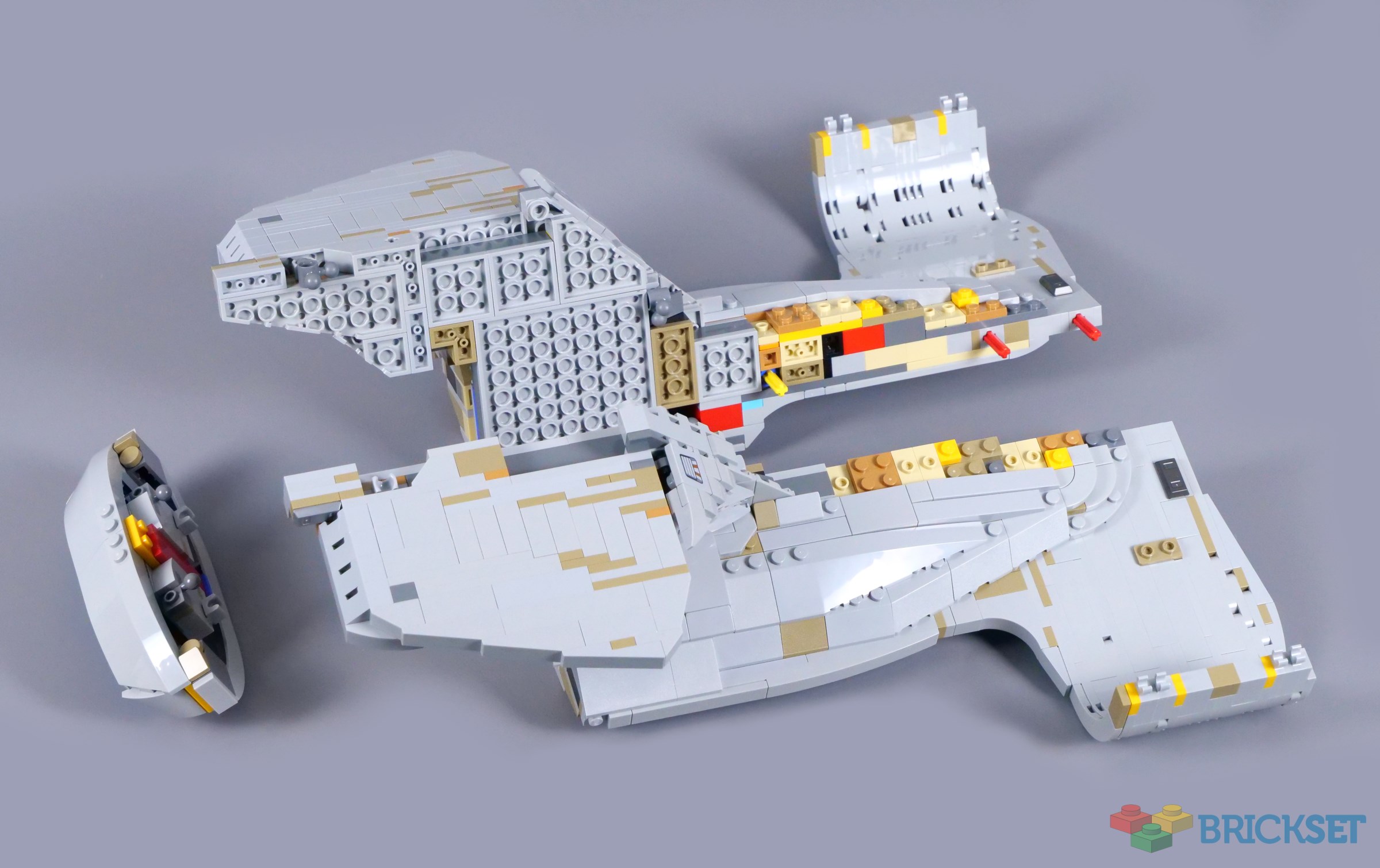
The Completed Model
A display stand is supplied for the characters, consisting mainly of Collectable Minifigure bases. You can space the minifigures out evenly, but the instruction manual shows them arranged with extra room for Spot and Riker's bulky trombone accessory, as pictured below.

Unfortunately, the 2x6 tile in the middle uses a sticker, contrary to what I think the press release implies. Even so, the presentation stand looks nice and captures the clean simplicity associated with technology in Star Trek: The Next Generation.

I am less certain about the information plaque. The silver Okudagram styling is attractive, but I wish there was a bit more colour to match the interfaces in The Next Generation. However, the blue silhouette of the Enterprise looks lovely, striking a balance between similarity to plaques in Ultimate Collector Series sets and having its own character, distinct to Star Trek.

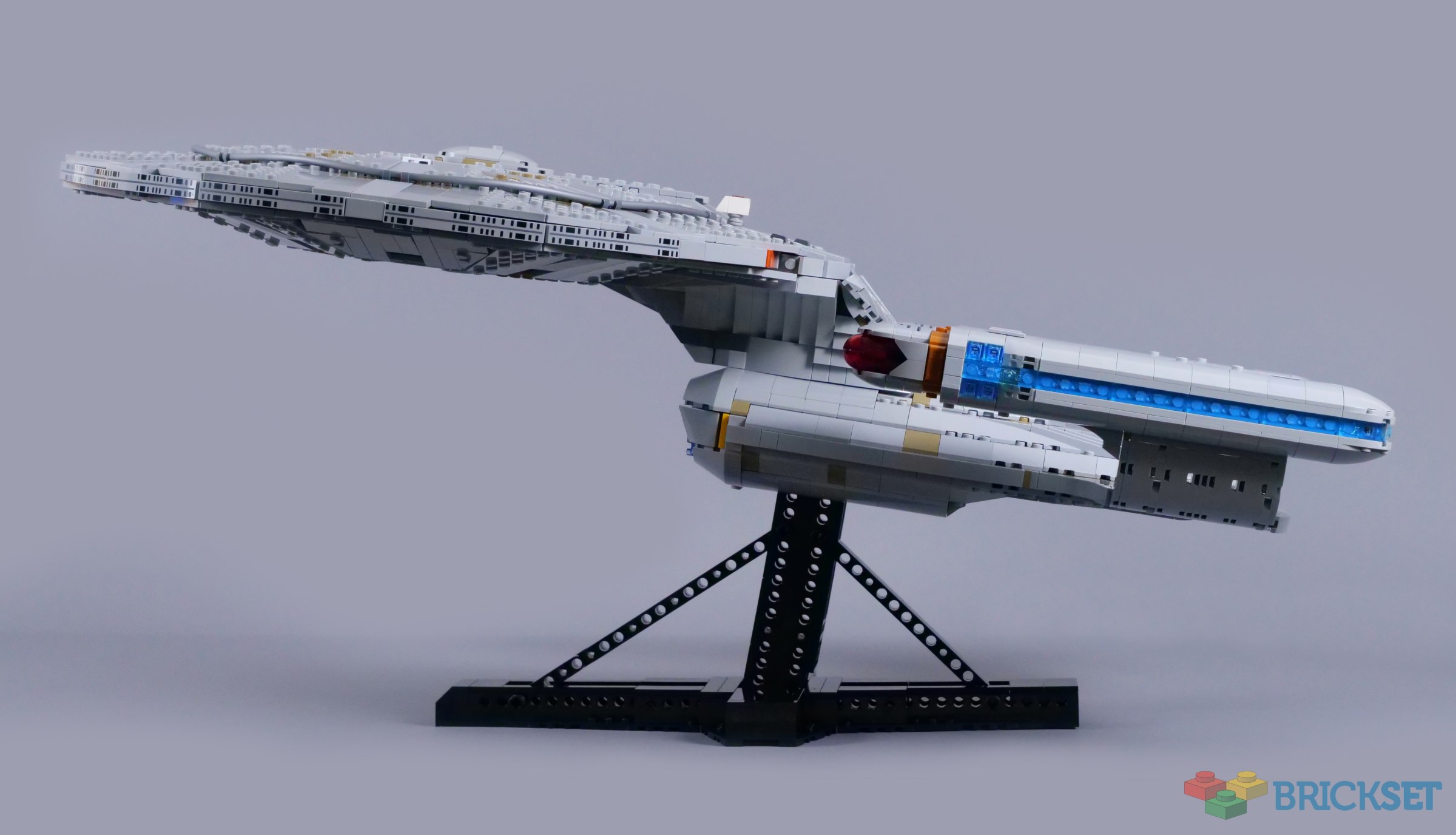
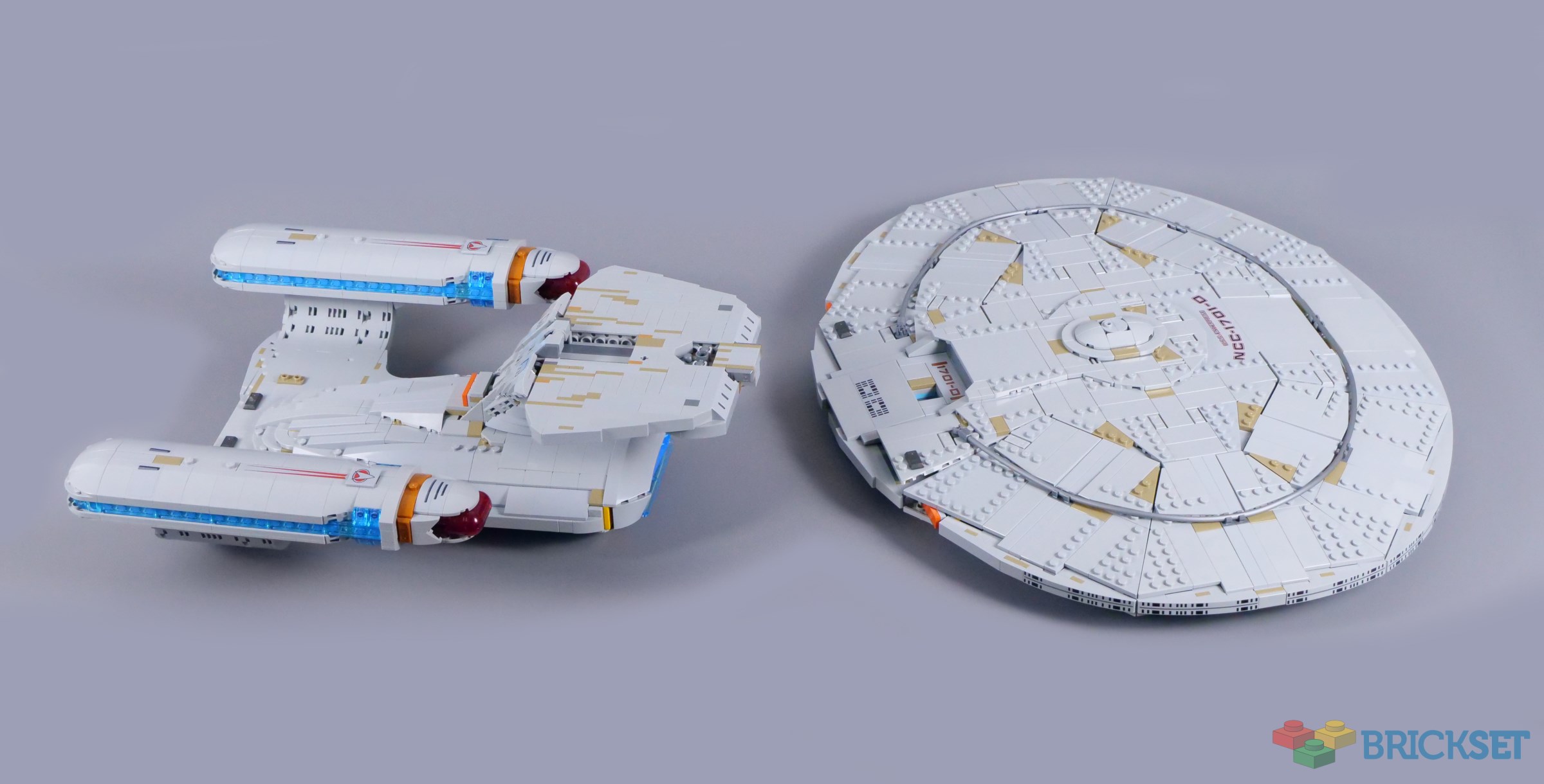
Certain vehicles seem inherently suitable for a LEGO recreation, like the angular shuttlecraft in 40768 Star Trek: Type-15 Shuttlepod. The Enterprise NCC-1701-D is quite the opposite though, packed with compound curves. Given the challenge of building those curves without resorting to highly specialised pieces, I think this model looks outstanding on the whole.

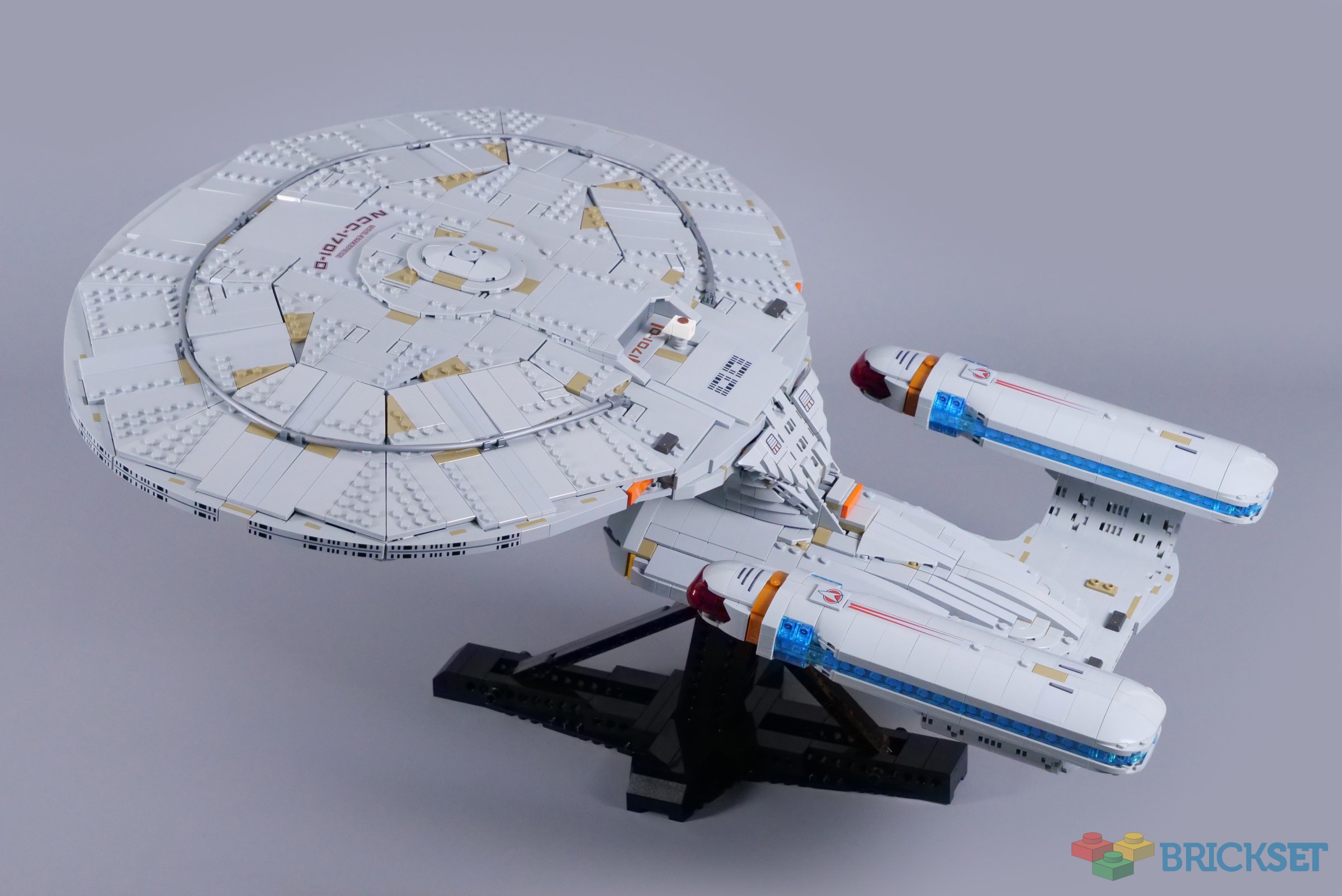
The vessel measures 62cm in length, which feels like a sensible size, having definite presence on display while remaining manageable to handle. I think the angled display stand works nicely for the Enterprise-D, providing a great view of the navigational deflector and approximating how the ship sweeps past the camera in the show's opening sequence, as the box illustrates.
That being said, I wish the display stand was slightly more refined. Its strength is evidently the priority and the Technic structure satisfies that need, which is no easy task with so much mass overhanging, particularly at the front. Nonetheless, the sharp edges appear out of place beside the actual starship and its rounded form.

Perhaps the base could have been adapted to the shape of the Starfleet insignia or the MACO star, for example. Regardless, the stand looks decidedly functional and includes two prongs on top, which extend quite a long way into the ship's hull to ensure its stability.

You can reverse the Enterprise on its display stand for a better view of the saucer section. The base was clearly designed with the normal orientation in mind though, as while the model feels fairly secure even in this configuration, the display stand seems to be under some strain.
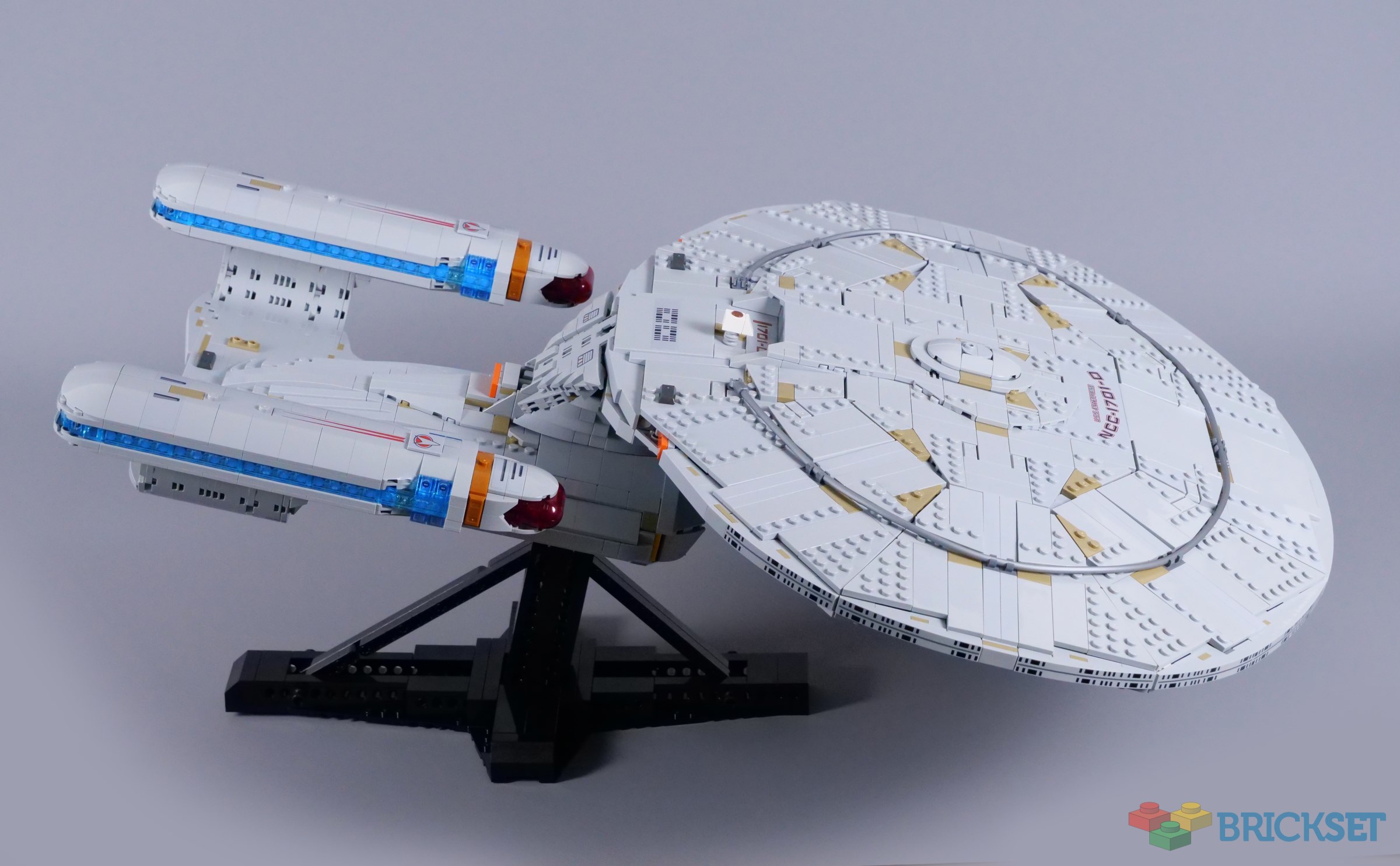
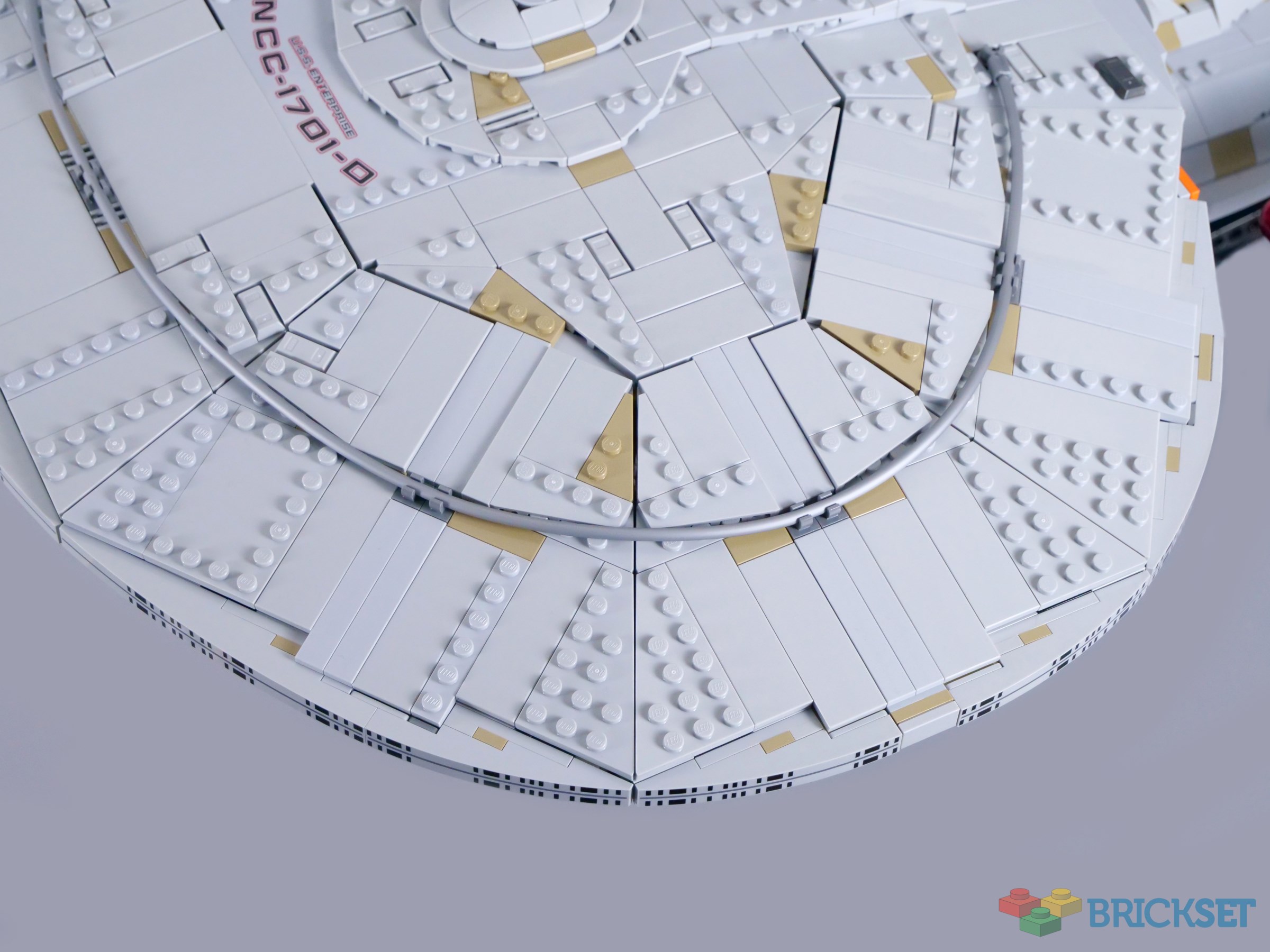
Galaxy-class starships feature an unusual oval saucer section, constructed in eight segments. While some angular features are identifiable, the seams are fairly well disguised and the pearl silver hoses comprising the dorsal phaser array help to convey the curved shape as well. I find the dark tan highlights strange, however. Federation ships are far from spotless and scattered accents are appropriate, but these markings seem a bit strong.
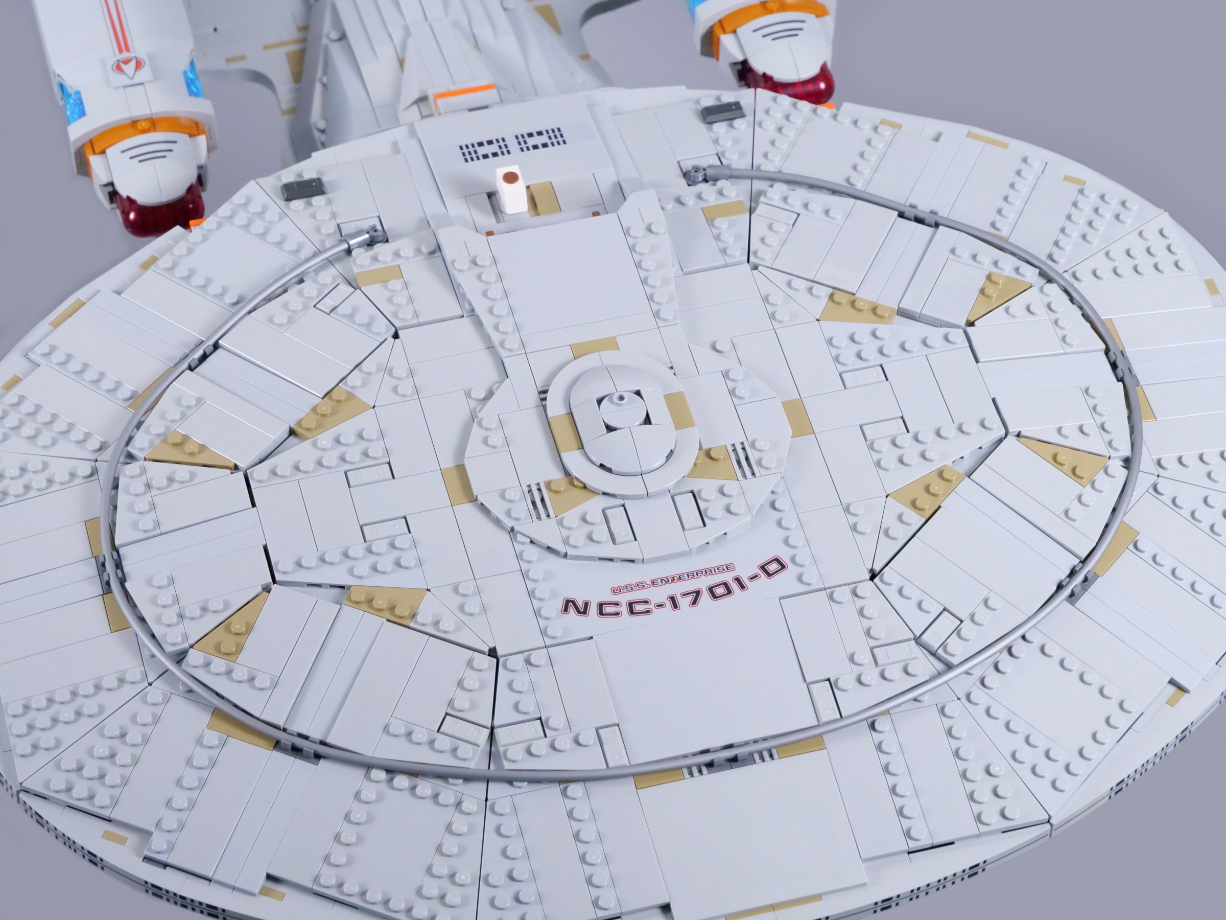
The texture on the hull surface looks splendid though, using ingots, grille tiles and the natural seams between LEGO pieces. The vessel's name and registration are both printed on a 6x12 tile and the bridge dome is accurately positioned just aft of the saucer's centreline. The stud on top also reflects a circular detail found on the original filming models.

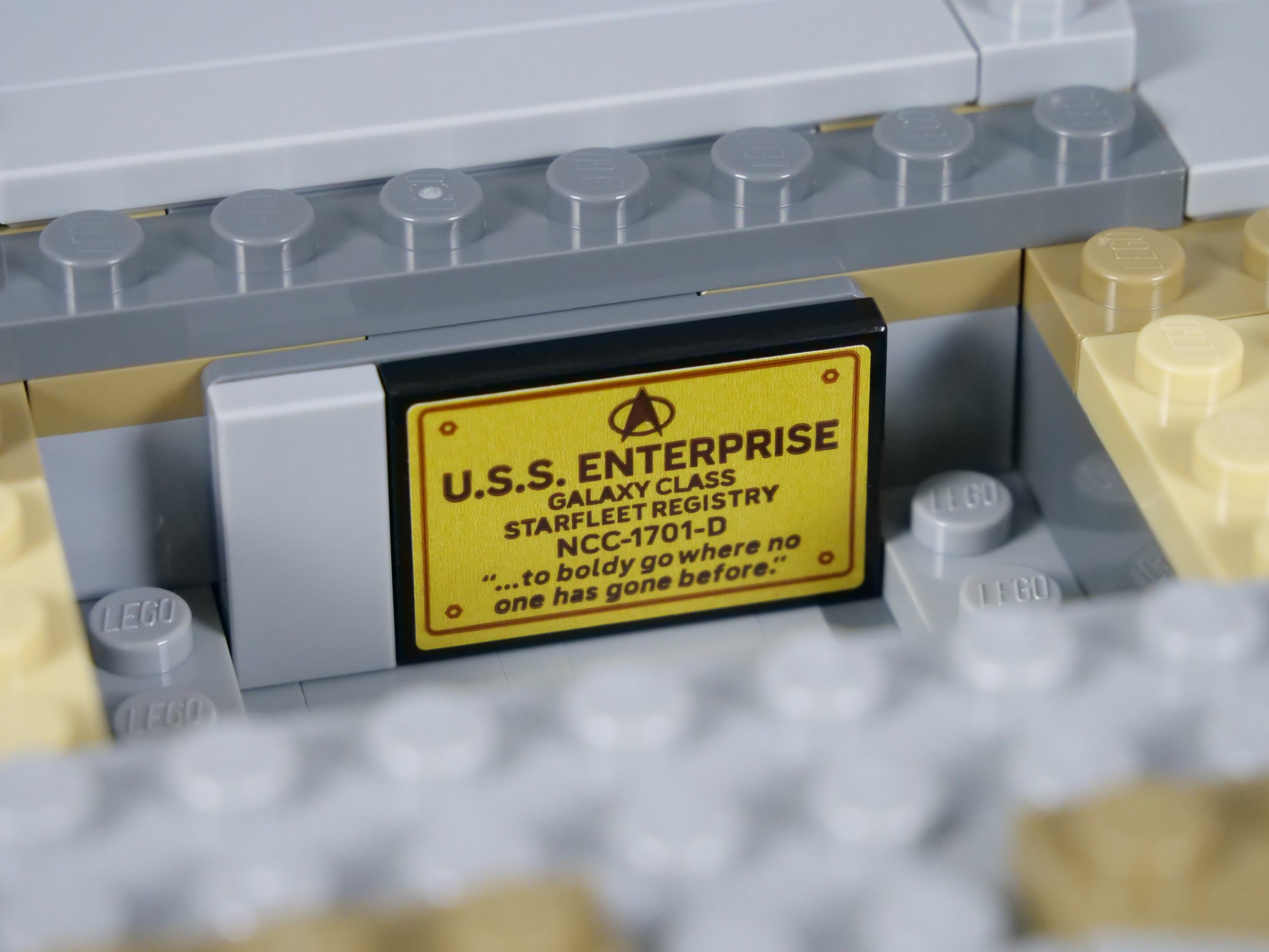
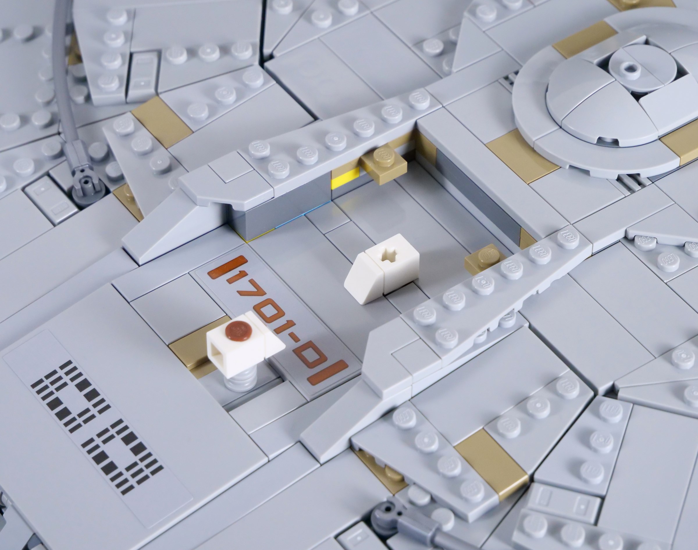
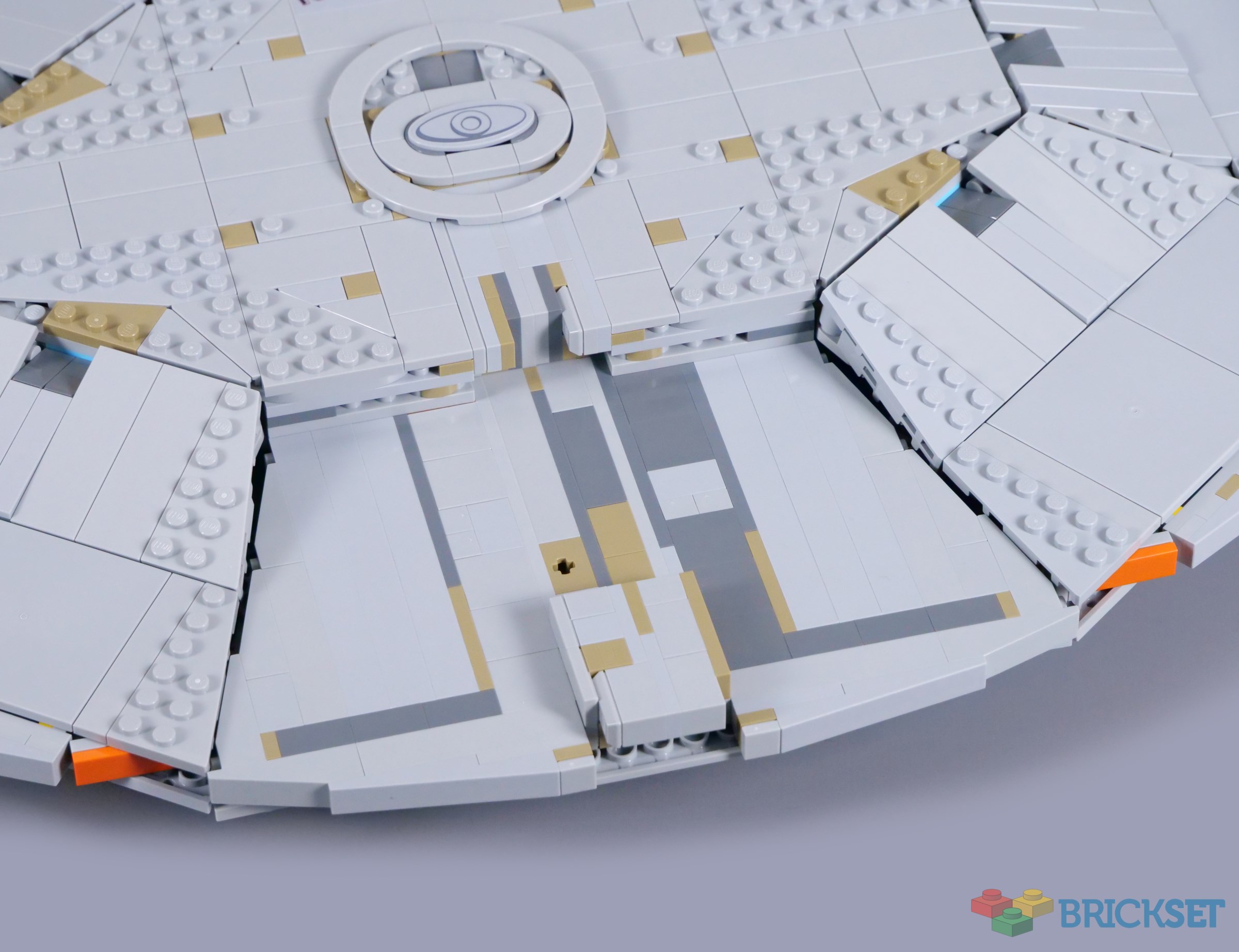
I was a bit disappointed to find no microscale recreation of the bridge inside the saucer. There would obviously not be space for anything nearing minifigure-scale, but there is a small hollow area housing the ship's dedication plaque. Picard memorably studies the plaque while delaying before accepting a hail from the alien Sheliak in The Ensigns of Command.
Brickset member sipuss has noticed an error on this sticker, which reads 'to boldy go...' rather than 'to boldly go...'. This is quite an embarrassing mistake, as an iconic Star Trek line.
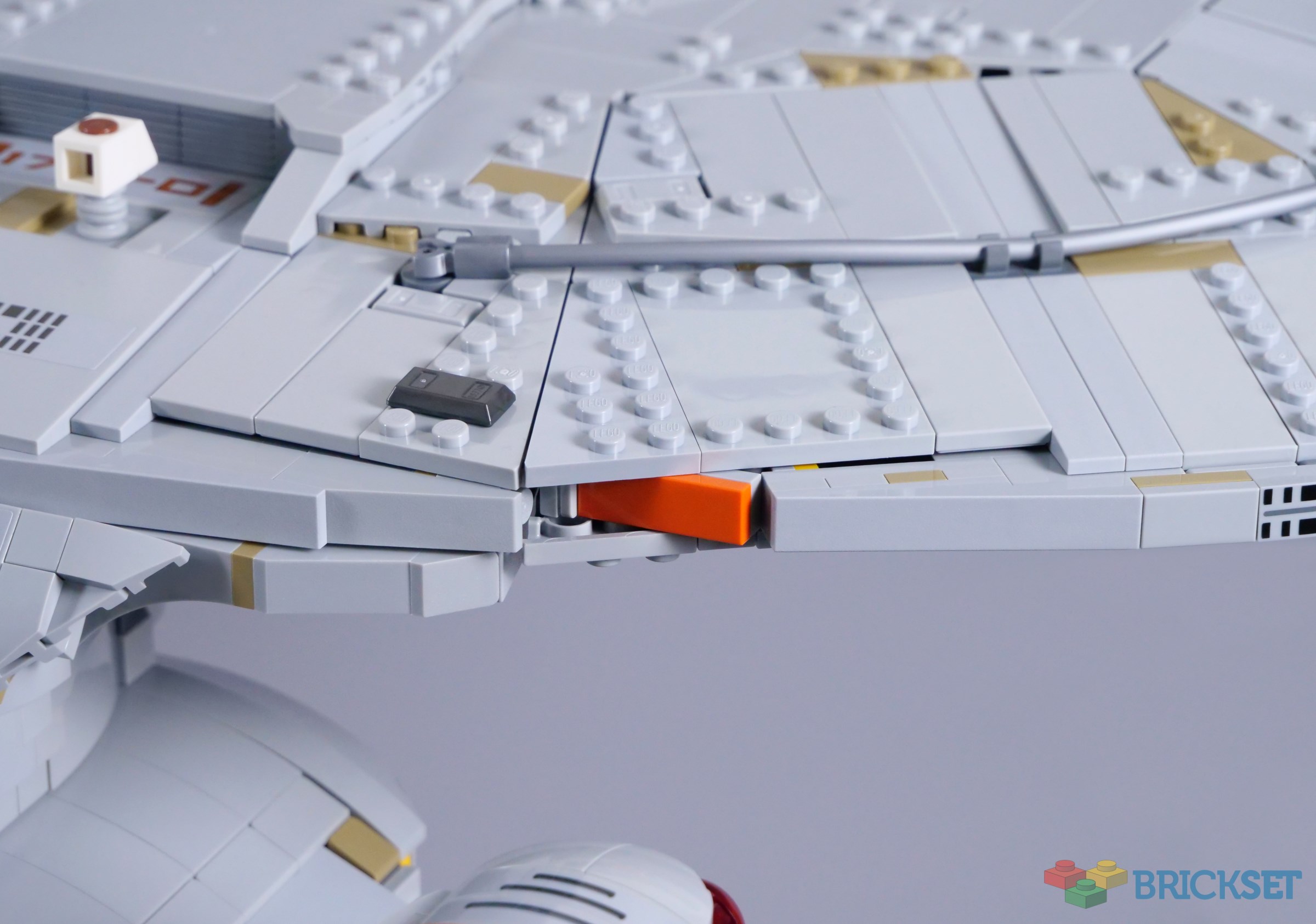
While the central structure is relatively simple, the slender edges of the saucer are assembled around six spokes, with layers of plates linked to clips in between. The result feels surprisingly rigid despite the lack of internal supports, completed with a series of new curved slopes around the edge.

Two curved slopes have been created specifically for the Enterprise, a 1x8x2 2/3 piece and a 1x10x2 2/3 version. These create a nearly uninterrupted curve around the edge of the saucer and both elements are decorated with windows. A couple of yellow bands located towards the bow, visible in many episodes, are missing though.
The transition between the panels on the top and bottom and the slopes around the edge was never going to be entirely smooth and the joins are noticeable, though not as much as the box artwork suggests. The shape blends together when viewed from a distance, especially with the softer shadows of natural light.
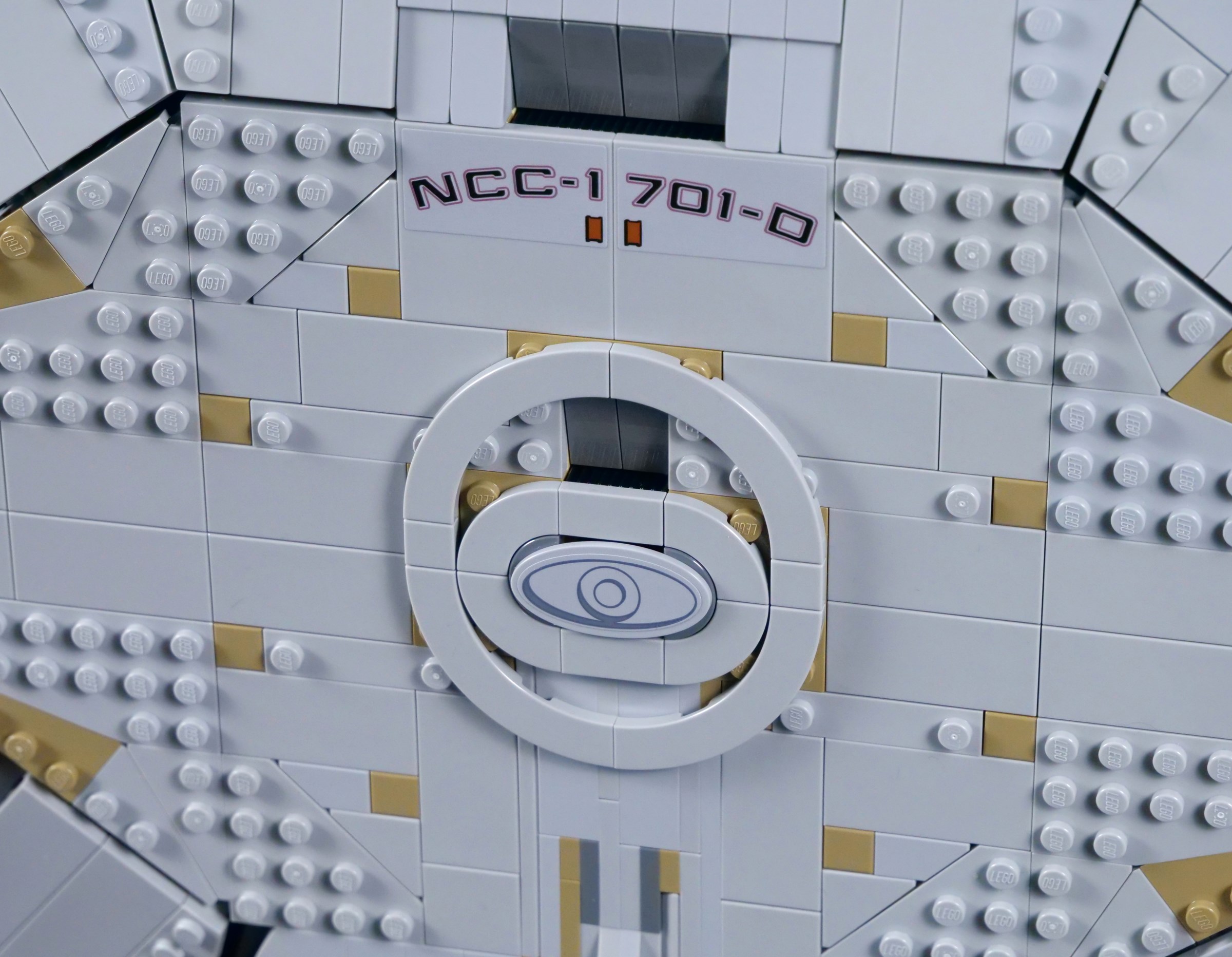
The underside is different, as the saucer flattens towards its edges. The octagonal structure is more apparent here, but again, I am not sure what alternative there was. Moreover, this model lacks windows, which is a little disappointing. On the other hand, many windows were bound to be omitted because they cannot be printed on studs, so I can understand leaving the windows out completely, rather than adding them in some areas, but not others.

Stickers are used for the registry on the ventral surface and the colour matching here is rather poor, sadly. The sunken details around the saucer are effective though and I like the captain's yacht, represented by a shield accessory. This ship is never deployed in The Next Generation, but it is removable here because the shield is only attached to a clip.
Reddish orange tiles form the impulse engines, including two on the saucer section. These are rarely activated onscreen, but their position is correct and I like the dashes of colour. The pearl dark grey ingots should be placed further back on the saucer, however.
A sticker represents the distinctive arboretum windows and another is applied outside the main shuttlebay. Though I wish all the details on top had been printed, the stickers look fine and their grey colour blends in reasonably well.

One shuttlepod is approaching the shuttlebay entrance, while another is already landed inside. Despite comprising just two pieces each, they are easily recognisable as the Type-15 and help communicate a sense of scale. The shuttlebay interior seems rather bland though, without floor markings or any other details.
The main shuttlebay is rarely seen in the television series because a set would have been so expensive to build. The two smaller bays found on the 'neck' of the stardrive section therefore make regular appearances and require a couple more stickers here. The bodywork around the bays is not as smooth as I would like, but compound curves are again difficult to recreate.

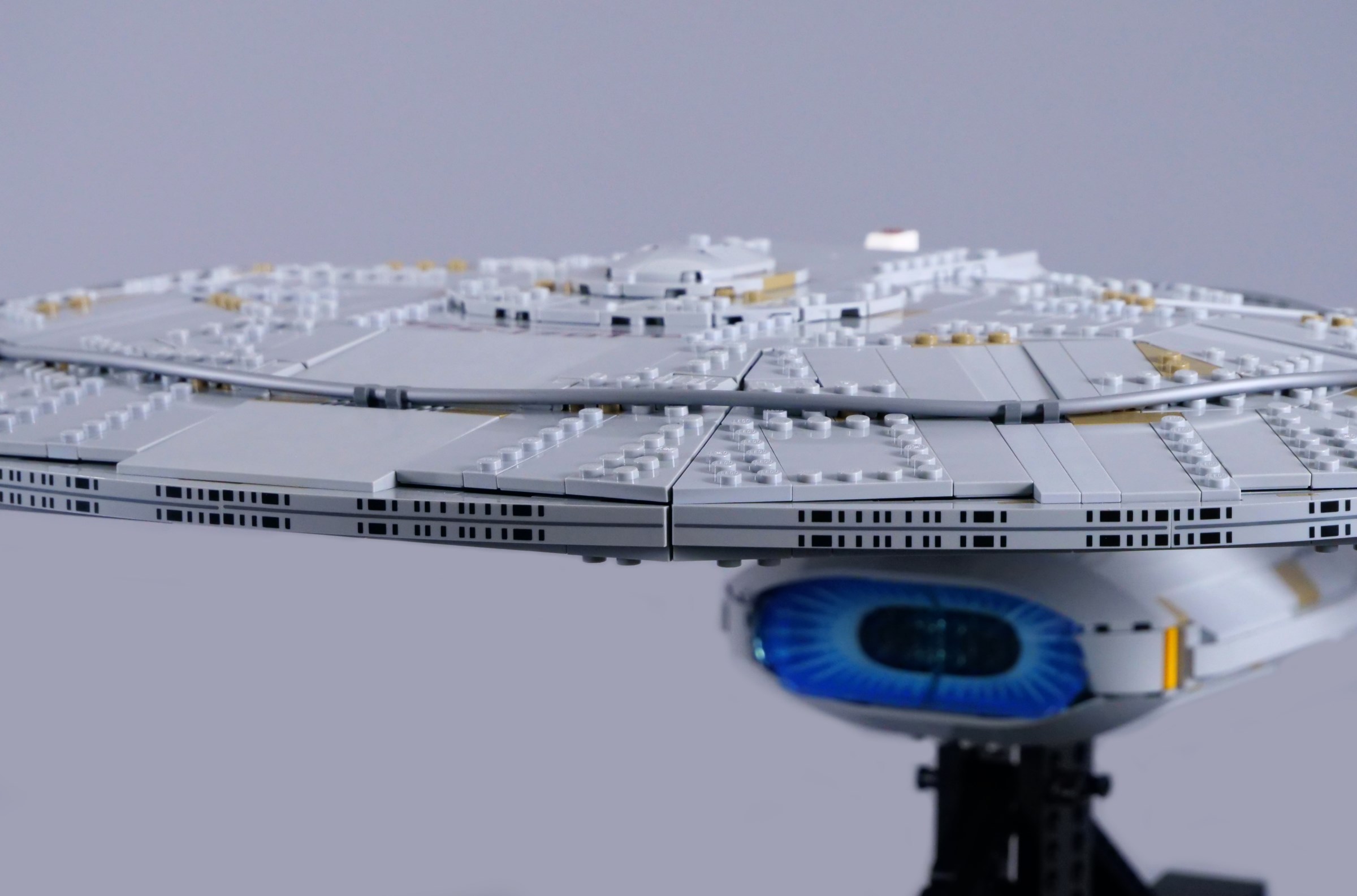
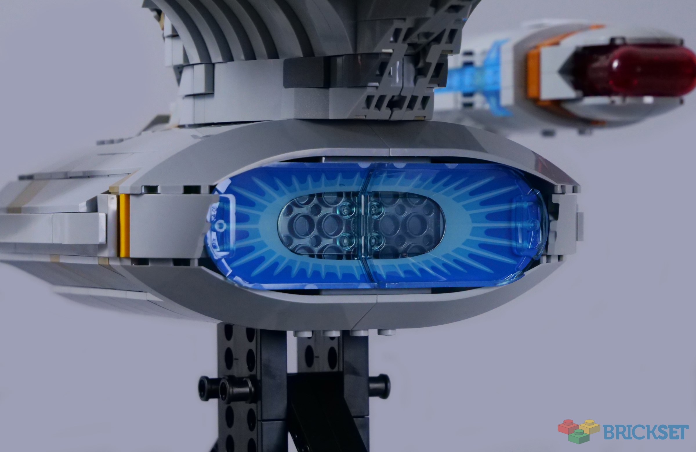
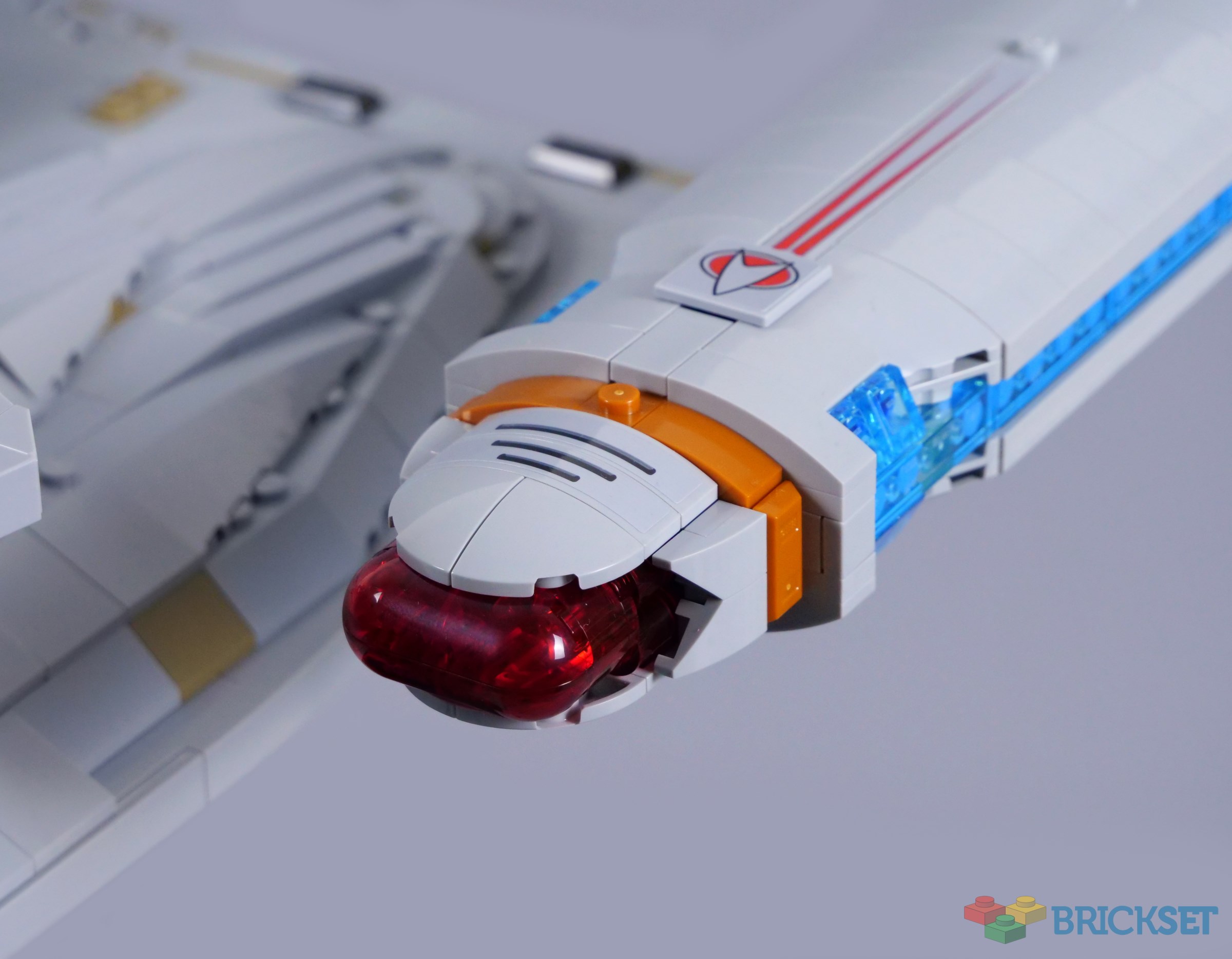
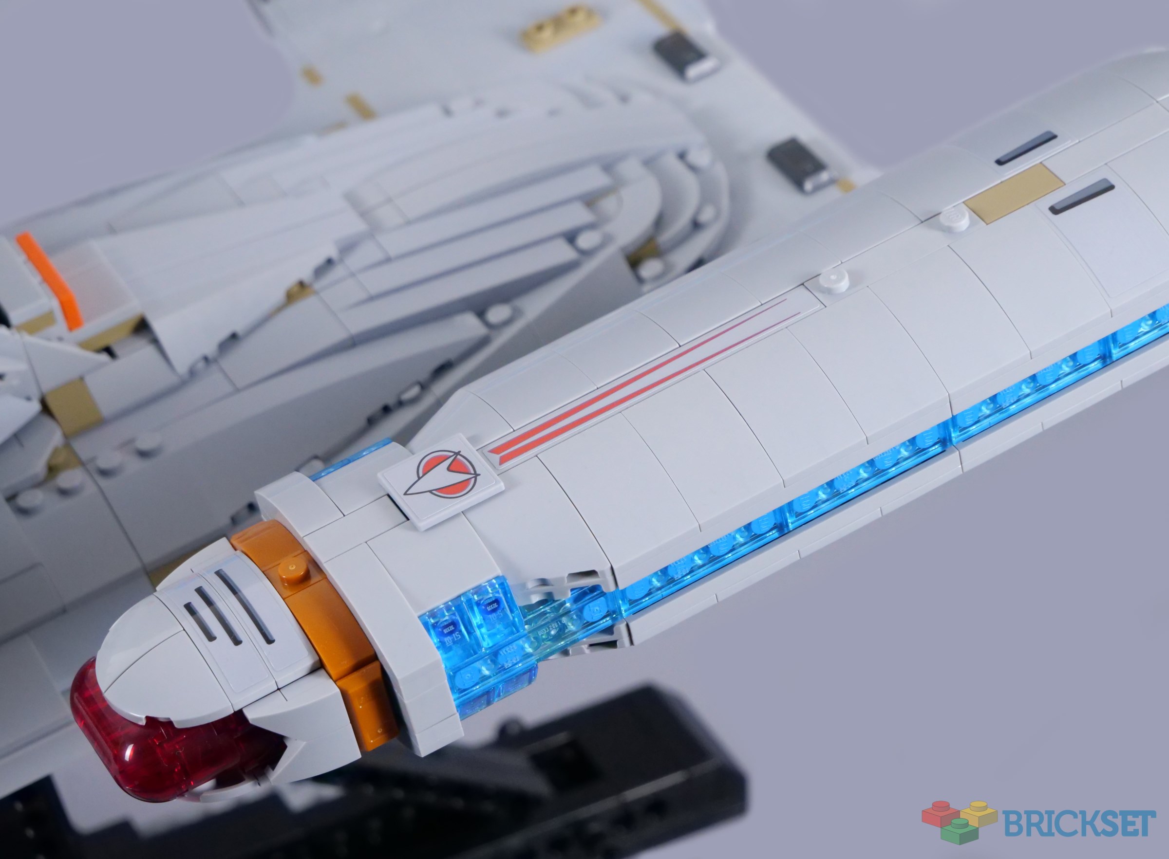
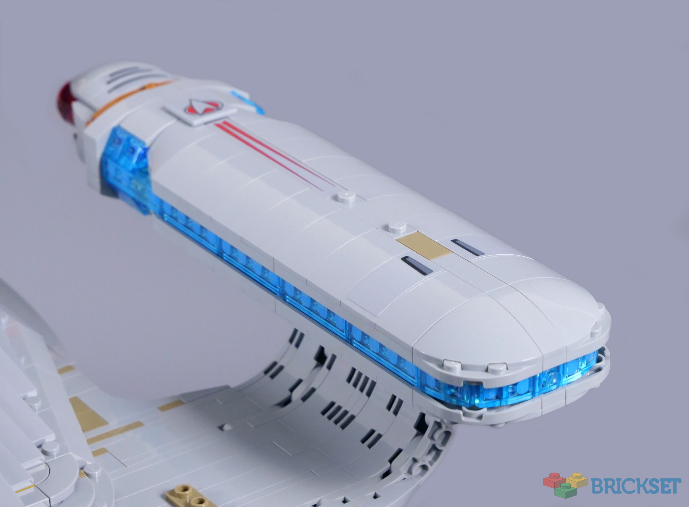
Navigational deflectors are vital to faster-than-light travel in Star Trek, protecting starships from collisions with space debris. Galaxy-class vessels are equipped with an interesting eye-shaped deflector dish and though the shape is not absolutely accurate, I think 4x6 windscreen elements work extremely well.

The windscreens are decorated on the outside, although the patterns show through the trans-clear plastic and certainly create a nice glow. The bodywork around the navigational deflector could potentially be improved though because it should flare out a lot more. At least the yellow bands beside the deflector dish are represented.
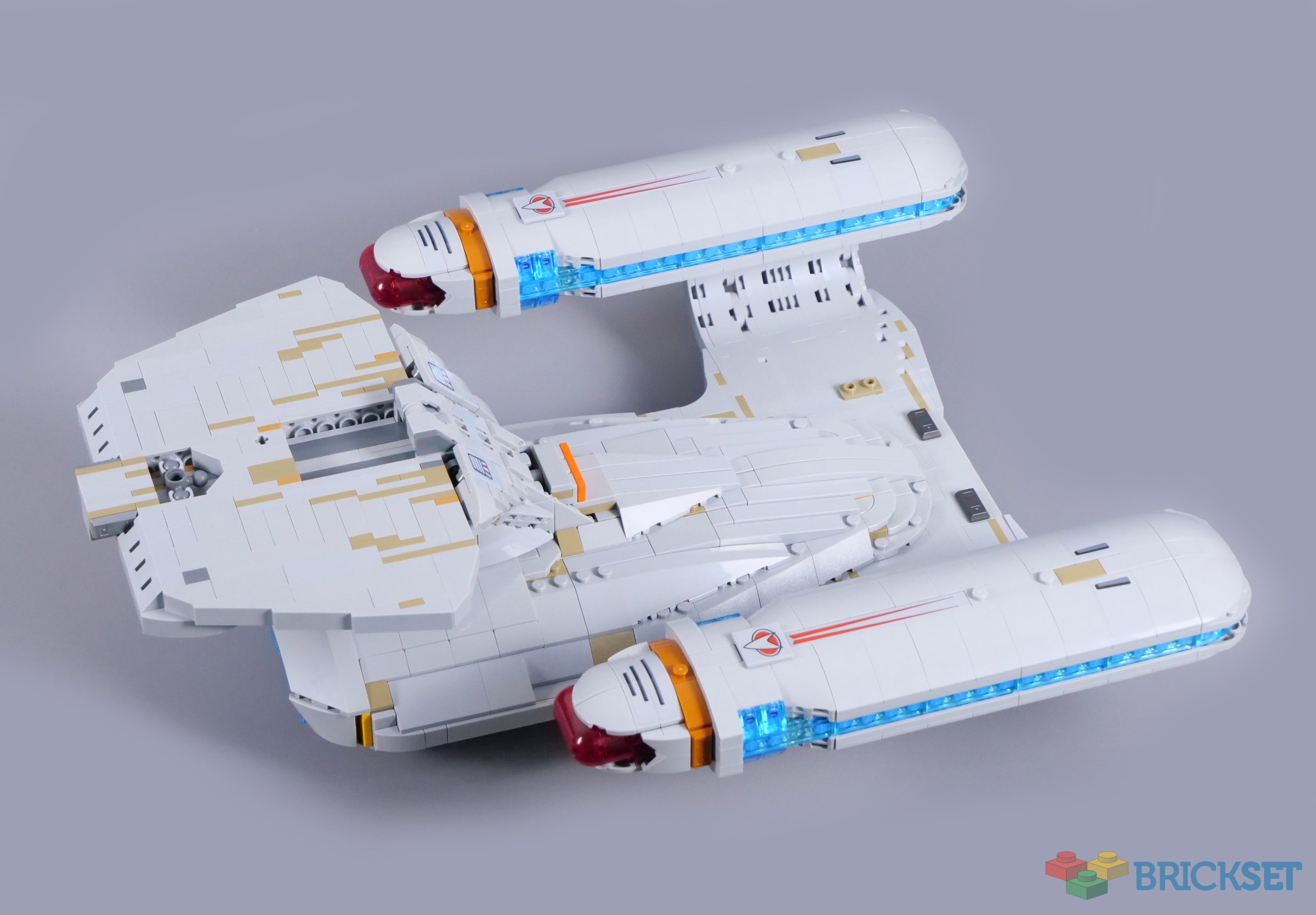
Unsurprisingly, the teardrop shape of the stardrive section is a nightmare to translate to LEGO form! I think building layers of curved slopes was probably the best solution, as the ridges look consistent and the overall form is close to the source material. I much prefer this technique to a mess of curved wedge slopes with gaps in between, like on 7663 Sith Infiltrator.
The hull is constructed in two main sections, connected with Technic axles and ball joints along the centreline. The deflector dish then attaches at the front to reinforce the whole structure and such strength is absolutely essential, given the considerable weight of the saucer and the warp nacelles.
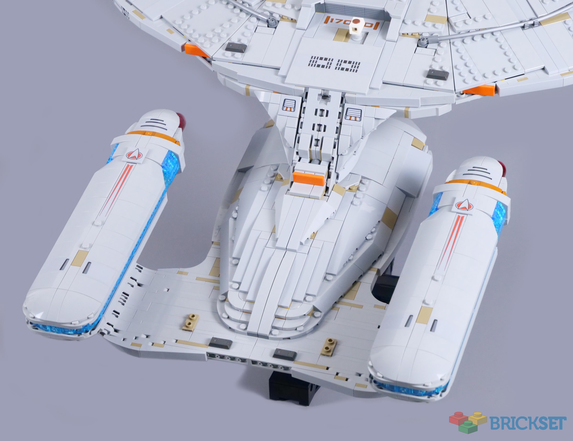
4x4 curved bricks form the warp nacelle supports and feel very sturdy, so I am not concerned about them drooping over time. The warp nacelles themselves look superb, leaving few studs exposed and featuring the proper splashes of colour, with the trans-red bussard collectors and blue warp field grilles. Dark azure plates and trans-light blue tiles look stunning together.


I love the trans-red 1x4 rounded bricks, originally produced for Donkey Kong's mouth, forming the bussard collectors. Their curvature works perfectly and the adjoining bodywork reflects the onscreen vessel as well, including stickered stripes on top and dark orange bands around each warp nacelle.
It seems Octan will have a continuing presence in the 24th century, as the company's famous stripes can be found inside the warp nacelles! In addition, a small Octan drum is placed under the impulse engine on the stardrive section.

Starfleet symbols and red trails decorate the nacelles, requiring a couple more stickers. I have never had a major issue with stickers, though I wish these and the secondary shuttlebay doors had been printed, given their importance. Fortunately, the warp engine grilles are brick-built and the wider areas behind the bussard collectors look good.
Technically, the nacelles should widen towards the rear, but there are already curves in several directions, so I think simplifying the structure a little is fair. Additionally, the rounded corners are attractive and the avoidance of studs helps considerably with the streamlined design.
Apart from illustrating the ship's size, the shuttlepod outside the shuttlebay functions as a key, which locks the saucer and drive sections together. A single Technic axle passes through both sections of the Enterprise and they feel solidly connected with the axle in place. In fact, the two parts remain together when tilted back on the display stand even without the pin because you need to slide them apart.

Saucer separation happens twice in season one and is mentioned a few more times in the first season and beyond, but is rarely seen again in the television series. Nevertheless, the function is welcome and its implementation is basically faultless. Both sections are very swooshable and the structural engineering feels all the more impressive with this feature included.
That being said, I doubt many people will display the Enterprise like this. While the flat area on top of the stardrive section is fairly detailed with dark tan streaks, it should be curved and lacks required features like the battle bridge. Realistically, there would be no way to capture its actual shape without providing another assembly to attach in place of the saucer.
It might not be practical for display, but I am still pleased with this function and particularly how the saucer and stardrive sections slot together, with hooks on each sliding into the other. There is nothing complex about the mechanism, nor a need for Technic apart from the aforementioned axle, but it works brilliantly.

Overall
10356 Star Trek: U.S.S. Enterprise NCC-1701-D faces considerable pressure, as hopefully the first of several LEGO Star Trek sets. Thankfully, the Enterprise is easily capable of meeting any pressure and I think this model looks fantastic, despite the challenges inherent in building a ship defined by curves! Other than developing highly specialised shell pieces, I struggle to envisage how the shape could be much better.

A microscale bridge inside the saucer and a few more printed elements would have been ideal, but I have very few complaints with the model otherwise. The nine minifigures are great as well and I honestly expected fewer. However, all this comes with a hefty price of £349.99, $399.99 or €379.99, which feels expensive, relative to the size of the ship. Even so, the design quality and the gift-with-purchase would make the Enterprise-D a day one purchase for me.
204 likes
139 comments on this article
"...to boldy go where no man has gone before."
Really, LEGO? Boldy?
@sipuss said:
""...to boldy go where no man has gone before."
Really, LEGO? Boldy?"
Good Spot!
Was not aware that Mr. Data was actually a Sith, so I guess you learn something new everyday.
Thank you for the extremely detailed and excellent review @CapnRex101, always a pleasure to read these in-depth write-ups.
@sipuss said:
""...to boldy go where no man has gone before."
Really, LEGO? Boldy?"
That's a shocking error, and one our reviewer appears not to have spotted :-)
This is a fine review, but I have a small correction to suggest. Saucer separation was used in the two-part episodes ending season 3 and starting season 4, "The Best of Both Worlds" parts one and two. I think saucer separation was used in the second part.
Clearly should have been "to baldy go"
@sipuss said:
""...to boldy go where no man has gone before."
Really, LEGO? Boldy?"
Good point; I have always been distracted by the split infinitive where that line is concerned, but 'boldy' is a bad mistake.
Yeah...
My wallet is NOT safe. First big set like this to be a day one purchase for me ever.
I like how sets like this manage to work in references to Lego itself, like the brick on the PADD and the Octan stripes. Helps to give the set a bit more personality.
Nice review for a really nice rendition of the ship. I think they did as well as expected in terms of recreating the shape, certainly better than the MOCs I've seen. I'm not a ST fan so I wondered why the separation feature was a feature...now I know! I had no idea! Overall the price seems awfully steep for what you get, especially without a bridge component, which obviously is impossible at this scale. Will be interesting to see the other ships modeled, which are surely coming at some point soon. How long until they offer a corrected plaque?...What a horrible oversight.
@sipuss said:
""...to boldy go where no man has gone before."
Really, LEGO? Boldy?"
I had to google the quote to determine where the typo was. My brain just seemed to auto correct the error such I couldn't see it, even with the prompting.
@sipuss said:
""...to boldy go where no man has gone before."
Really, LEGO? Boldy?"
Shocking.
It should of course have read "baldy"
@CCC said:
"Clearly should have been "to baldy go""
Dang, I just noticed that you beat me to it.
I am NOT a merry man!
Lego needs to send out replacement stickers for that one, just crazy for a premium product
Stewart isn’t bald-bald. Picard should have been given the old man bald cap, which has a fringe of hair around the back.
@iwybs said:
"This is a fine review, but I have a small correction to suggest. Saucer separation was used in the two-part episodes ending season 3 and starting season 4, "The Best of Both Worlds" parts one and two. I think saucer separation was used in the second part."
Plus, in that episode it was actually used as a major plot point, even more so than the use in Arsenal of Freedom.
Some things just don't represents well in lego, saucer has too many studs and not enough roundness, the hull on the other hand looks fantastic!
@sipuss said:
""...to boldy go where no man has gone before."
Really, LEGO? Boldy?"
“Only the best is good enough”…
LEGO, you KEEP making these mistakes, y’all need to add a few more employees to your QA department…
@AustinPowers said:
" @iwybs said:
"This is a fine review, but I have a small correction to suggest. Saucer separation was used in the two-part episodes ending season 3 and starting season 4, "The Best of Both Worlds" parts one and two. I think saucer separation was used in the second part."
Plus, in that episode it was actually used as a major plot point, even more so than the use in Arsenal of Freedom. "
And, of course, the final saucer separation in Star Trek: Generations, shortly before the stardrive section is blown to smithereens, and the saucer crash lands on Viridian III. Don't worry, they pick it back up again in time for Picard Season 3!
@hawkeye7269 said:
" @AustinPowers said:
" @iwybs said:
"This is a fine review, but I have a small correction to suggest. Saucer separation was used in the two-part episodes ending season 3 and starting season 4, "The Best of Both Worlds" parts one and two. I think saucer separation was used in the second part."
Plus, in that episode it was actually used as a major plot point, even more so than the use in Arsenal of Freedom. "
And, of course, the final saucer separation in Star Trek: Generations, shortly before the stardrive section is blown to smithereens, and the saucer crash lands on Viridian III. Don't worry, they pick it back up again in time for Picard Season 3!"
And a good thing the USS Syracuse had a spare engineering section to donate ;-)
Might have to get my old Mega Bloxs version out for fun.
LMAO this is the ONE time a sticker is better than a print, imagine having to retool the machine because they so BOLDY went ahead.
It’s pretty simple, if TLC isn’t willing to make exclusive prints for these premium collector’s edition sets that cost a premium price, then they’re going to lose at least one loyal fan/customer. Come on Lego.
@dimc said:
"LMAO this is the ONE time a sticker is better than a print, imagine having to retool the machine because they so BOLDY went ahead. "
Like they did on the first BttF DeLorean…
At this point I think Lego purposely includes errors on their stickers like this just to keep the gag running.
It looks like the torsos are printed yellow, but the sleeves are yellowish orange.
I saw someone else already mention it, but the separation plays a pivotal role in "The Best of Both Worlds Part 2". As that is easily one of the most famous TNG episodes of all time, the feature is an appreciated inclusion by me.
Picard's head should have hair printing on the back and sides.
The sticker error is pretty egregious. I would think that Lego will be willing to send out a free small replacement kit that contains the corrected sticker and a tile to place it on.
I enjoyed this review and being able to see the faults of the set. That said, combined with the GWP, I'll be purchasing this as soon as it's released.
@monkyby87 said:
"At this point I think Lego purposely includes errors on their stickers like this just to keep the gag running. "
Hahahaha you might actually be on to something!
@Huw said:
" @sipuss said:
""...to boldy go where no man has gone before."
Really, LEGO? Boldy?"
That's a shocking error, and one our reviewer appears not to have spotted :-)"
Ouch. I think I'll hold on applying that sticker until Lego provides us with a replacement.
@Boettner_Builds said:
" @dimc said:
"LMAO this is the ONE time a sticker is better than a print, imagine having to retool the machine because they so BOLDY went ahead. "
Like they did on the first BttF DeLorean…
"
I'm not familiar; what did they do?
I don't understand the gripe about the dark/tan accents. A quick image search reveals there are dark/tan accents on nearly any scale model of the ship, representing variations in the color of the "skin" panels, and windows/viewports. They don't look out of place to me at all.
@dimc said:
" @Boettner_Builds said:
" @dimc said:
"LMAO this is the ONE time a sticker is better than a print, imagine having to retool the machine because they so BOLDY went ahead. "
Like they did on the first BttF DeLorean…
"
I'm not familiar; what did they do?"
Made a spelling mistake on a printed part.
@markyman20 said:
" @Huw said:
" @sipuss said:
""...to boldy go where no man has gone before."
Really, LEGO? Boldy?"
That's a shocking error, and one our reviewer appears not to have spotted :-)"
Ouch. I think I'll hold on applying that sticker until Lego provides us with a replacement."
Of course the error is in a review set. Still 4 weeks to supply corrections, if they haven't already.
I kind of hoped it would be an actual theme, not only yet another 300+ euro one-off. That said, I know very little about Star Trek so idk if a normal theme is feasible. Star Wars is barely coherent theme anymore btw. No cohesion between a wave of sets half of the time.
That typo on the ship's dedication plaque has got to be fixed. I'm going to hound customer service until I get a fixed sticker.
@dimc said:
" @Boettner_Builds said:
" @dimc said:
"LMAO this is the ONE time a sticker is better than a print, imagine having to retool the machine because they so BOLDY went ahead. "
Like they did on the first BttF DeLorean…
"
I'm not familiar; what did they do?"
The original Back to the Future Delorean had a misprinted piece for the flux capacitor, saying “Sheild eyes from light”, misspelling the word Shield. I think early buyers could ask for a correctly-spelled replacement piece from LEGO directly.
Great to see on YouTube @CapnRex101 questioning the LEGO team about this set!
1:05 onwards: https://m.youtube.com/watch?v=xsJBpfgoXQg&pp=0gcJCQMKAYcqIYzv
I have been a Trekkie since 1987 and JUST NOW learned that Wesley's rainbow stripes on his jumper represent the different divisions of Starfleet Uniform colors. I just thought he liked rainbows. I love the look of this set and cannot wait to build it. I hope we get more ships, a CMF Star Trek series, DS9 especially and some playsets with the Bridges, Transporter Rooms and standard Alien Landscape filming sets from every series. This is a galaxy as big and possibly more developed than that of Star Wars which I have also been a huge fan of since 1985. I spent one of my entire paychecks from CD Warehouse on the first wave of SW LEGO Sets in 1999. We finally have Star Trek LEGO and it is glorious.
@dimc said:
" @Boettner_Builds said:
" @dimc said:
"LMAO this is the ONE time a sticker is better than a print, imagine having to retool the machine because they so BOLDY went ahead. "
Like they did on the first BttF DeLorean…
"
I'm not familiar; what did they do?"
They forgot the 'I before E except and C rule' grammar rule when they printed the Flux Capacitor's sign "shield eyes from light". They eventually fixed the issue in subsequent production runs of the set.
@xris said:
" @sipuss said:
""...to boldy go where no man has gone before."
Really, LEGO? Boldy?"
I had to google the quote to determine where the typo was. My brain just seemed to auto correct the error such I couldn't see it, even with the prompting."
Indeed, that same thing probably kept the graphic designer from catching it, as well; I could easily have done the same myself.
That said, I’m surprised autocorrect didn’t catch it (though given the odd suggestions the autocorrect / autofill functions sometimes give me on my phone, perhaps not as much as I once might have been).
________________
Nice review, Rex!
At this scale, there aren’t really many play features that could have been incorporated. The saucer separation is easily the most sensible and doable; a microscale interior bridge (or engineering, sickbay, holodeck, whatever) could have also been a thing, but would be both waaaay too small for minifigures, while simultaneously way too large to be in scale with the exterior (and accurate placement would surely have to displace needed internal structure. Opening shuttle at doors would be so small as to be pointless, and the only other thing I could think of to add would be lights, which are a significant feature of Enterprise-D’s look but which would require so many lights emanating all over the ship, in multiple colors, as to complicate the build (and perhaps the structural stability) significantly, and jack up the price that already garners complaint. Build-wise, then, this looks like about as perfect a Galaxy-class Enterprise as we could get at this scale. The sticker typo, and the fact it *is* a sticker, like many of the other element decorations, seem to be the only places to really improve. Those notwithstanding, I think this looks like a great set. Still an (too?) expensive one, but as a fan of Star Trek as well as LEGO, I really can’t pass this up. I plan to get it and the Shuttlepod on day 1.
WHAT!!! NO INTERIOR???!! Lol
Is this the first Whoopi in Lego? If so, it's pretty good!
Aside from the tan pieces, three other small improvements I think could have made this a lot better. 1. Ventral phaser array. They have the phaser array well represented on the dorsal side, just do the same, but a smaller diameter, on the ventral side. 2. A red oval in the middle of the deflector array. I understand not wanting to print red on the top of the windshield canopy pieces, so why not just put a red/dark red piece on the front where the anti-studs are? 3. I was looking at the yellow colors available and wonder why they didn't use the new Ochre Yellow for the Operations uniforms. I think it looks closer to the mustard/gold yellow shown on screen than Flame Y-O does.
Will they fix the sticker sheet before release tho? Thats the question
It does look very impressive. A day 1 purchase.... Just as soon as they've made the correct ship and the correct crew!
One advantage of the use of stickers is that it means you can print different stickers and make one of the various other Galaxy-class ships. It should also make the process of reworking this into a Nebula-class easier.
@LukeSkywalker said:
" @dimc said:
" @Boettner_Builds said:
" @dimc said:
"LMAO this is the ONE time a sticker is better than a print, imagine having to retool the machine because they so BOLDY went ahead. "
Like they did on the first BttF DeLorean…
"
I'm not familiar; what did they do?"
The original Back to the Future Delorean had a misprinted piece for the flux capacitor, saying “Sheild eyes from light”, misspelling the word Shield. I think early buyers could ask for a correctly-spelled replacement piece from LEGO directly.
"
Ha! Whoops....
@Cergorach said:
"Is this the first Whoopi in Lego? If so, it's pretty good!"
Can we modify it so she's dressed as the nun in 'Sister Act'?
I don't need any of these minifigures.
https://brickset.com/minifigs/col420 disagrees. https://brickset.com/minifigs/col420 really, REALLY wants me to get that Whoopi Goldberg minifigure.
"Too much tan" is not what's wrong. The problem is not having enough tan. Unfortunately, adding more in the right places would require splitting a lot of those panels into smaller pieces. I'm guessing that would greatly reduce the structural integrity if they did, depending on what exactly the underlying layer looks like.
When it comes to Star Trek vs Star Wars, I'm in the 'why not both' camp. I like both Science Fiction and Space Fantasy. When LEGO came out with the first wave of Star Wars sets, I was just coming out of my Dark Ages and I was there for it. However, I've never bought the Full-Sized Falcon or Death Stars.
The Next Generation was "my" Star Trek series, so LEGO has finally figured out how to put a direct tap into my wallet. With the GWP, I will be buying this day 1.
Resistance is Futile. Your wallet will be assimilated! (Now to make a Borg Cube on this scale LOL)
@JavaBrix said:
"I don't understand the gripe about the dark/tan accents. A quick image search reveals there are dark/tan accents on nearly any scale model of the ship, representing variations in the color of the "skin" panels, and windows/viewports. They don't look out of place to me at all."
Fair enough. It is a matter of opinion to a degree and I agree that some dark tan accents are necessary, although they should be subtler. While they are relatively prominent in true colour shots of the filming models, they are less so in the show.
@sjr60 said:
"Of course the error is in a review set. Still 4 weeks to supply corrections, if they haven't already."
I expect it will take a lot longer than that and I doubt they have already noticed the mistake, otherwise they probably would have informed us and confirmed that a corrected sticker will be issued.
That being said, they will almost certainly update it and I have no doubt owners of the set will be able to request a corrected replacement.
@monkyby87 said:
"At this point I think Lego purposely includes errors on their stickers like this just to keep the gag running. "
Or it's a test to see if LAN members are paying attention!
I still say Riker's accessory should have been a chair.
@Cergorach said:
"Is this the first Whoopi in Lego? If so, it's pretty good!"
The first minifigure of her but not the first LEGO representation of a character she portrayed. She voiced Stretch in Toy Story 3 which is represented in 7789-1.
If one purchases it, will LEGO send a replacement sticker sheet with the corrected spelling?
Love the review.
I have been making attempts at building this ship out of LEGO for 30 years, but have never come close to this amazing set.
I agree that the dark tan doesn't quite work. There is tan on this ship, especially for the escape pods, but I think sand blue would have been a better choice to reproduce that "Aztec" panelling effect.
Definitely buying this day one.
Concerning the erroneous sticker:
Take a currency bill (any country will do) if there are no errors or misprints on it, its worth will be its nominal value. If there is a clearly visible mistake on it, suddenly its value appreciate quite a bit sometimes substantially.
If I were to buy this, I would now hope to get the one with the misprint and then ask Lego for a corrected sticker. Having both is probably the way forward now. As a first set for the theme, you want to have all the 'lore' that comes with it.
My partner is a Star Trek superfan and I was grimly gearing up for saving up for this, but - both to my relief and sorrow - their initial reaction at least is that it just feels way too expensive for what it is, plus a few concerns with accuracy, and they’re fine with living without it.
I will have a bit of a go seeing if I can pick up the shuttlecraft on ebay/bricklink for them, but I have my doubts about whether it will hit a price point I’m happy with.
It looks like if it isn’t a one-off this’ll be another LotR style thing where nothing is ever affordable. Bit of a shame. I think if it had been closer to the midi Star Wars ships - or even just… slightly sub 200 quid, honestly - we’d be getting it day one.
@Binnekamp said:
"I kind of hoped it would be an actual theme, not only yet another 300+ euro one-off. That said, I know very little about Star Trek so idk if a normal theme is feasible. Star Wars is barely coherent theme anymore btw. No cohesion between a wave of sets half of the time."
A theme is totally feasible. There is a phenomenal amount of content that Lego COULD draw from to make sets -- big UCS-style display sets, minifig scale playsets, dioramas, alien scenery, etc. Not to mention an enormous cast of characters spanning many shows and many decades (60 years next year).
The key difference with Star Wars is that Star Trek generally lacks single-figure fighters that work so well at mini-figure scale. There really is nothing equivalent to an X-Wing or TIE fighter. Most of the ships in Star Trek are enormous capital ships that wouldn't work at minifig scale. Even to do something like the Star Destroyer with opening flaps to reveal a simple interior wouldn't work very well because ships in Star Trek tend to be ... spindly, for lack of a better word.
I'm very curious to see what Lego does with the license going forward (if anything). It's exciting to envision a theme of mini-fig scale playsets spanning multiple shows and crews. But who knows. I thought the same thing after the D&D set last year ...
Space, the final frontier. It amazes me that the Star Trek and Star Wars figures will be able to see each other in the Mos Eisly Cantina. Same thing with the Guardians of the Galaxy
@JDawg5 said:
" @Binnekamp said:
"I kind of hoped it would be an actual theme, not only yet another 300+ euro one-off. That said, I know very little about Star Trek so idk if a normal theme is feasible. Star Wars is barely coherent theme anymore btw. No cohesion between a wave of sets half of the time."
A theme is totally feasible. There is a phenomenal amount of content that Lego COULD draw from to make sets -- big UCS-style display sets, minifig scale playsets, dioramas, alien scenery, etc. Not to mention an enormous cast of characters spanning many shows and many decades (60 years next year).
The key difference with Star Wars is that Star Trek generally lacks single-figure fighters that work so well at mini-figure scale. There really is nothing equivalent to an X-Wing or TIE fighter. Most of the ships in Star Trek are enormous capital ships that wouldn't work at minifig scale. Even to do something like the Star Destroyer with opening flaps to reveal a simple interior wouldn't work very well because ships in Star Trek tend to be ... spindly, for lack of a better word.
I'm very curious to see what Lego does with the license going forward (if anything). It's exciting to envision a theme of mini-fig scale playsets spanning multiple shows and crews. But who knows. I thought the same thing after the D&D set last year ... "
That’s my concern (though considering the wallet-draining potential of extensive regular LEGO Star Trek releases, perhaps I should be less concerned than relieved…). LEGO does an awful, awful lot of licenses these days, but very few of them seem to be really fully explored - Star Wars, the Wizarding World, maybe Marvel and DC, but most other licensed themes based on characters and narratives have significant omissions.
That said, a $400 Icons-type set is surely going to remain in production for over nine months… which means TLG will still have an active Star Trek license when the 60th anniversary of the franchise arrives next year. I have a hard time imagining that they wont release at least *something* else around that time to more fully take advantage of the milestone than they can do by just pointing out they still have this set from late 2025.
@CapnRex101 said:
"It is a matter of opinion to a degree and I agree that some dark tan accents are necessary, although they should be subtler. While they are relatively prominent in true colour shots of the filming models, they are less so in the show."
Sorry to have to correct you, but that is just plain wrong. There are absolutely zero tan accents on the filming models. Neither on the original three, and even less on the updated paint scheme they did for Generations.
The original colour of the so-called aztec pattern is various shades of duck-egg blue. The transporter emitters are a light gold shade with a grid pattern, the lifeboats are a shade of very light grey, with black/dark blue and red detailing.
For generations they gave the update far more detail for the big screen, and the duck-egg blues were replaced by various shades of light blue.
For reference:
https://myenterprised.com/the-six-foot-model/
I think LEGO missed an opportunity to do something interesting with the leadership status dots. A simple neck piece - similar to a beard or something like this:
https://brickset.com/parts/6250480/mini-armour-no-13
would have made it possible to interchange command levels with various minifigs.
@PurpleDave said:
"Stewart isn’t bald-bald. Picard should have been given the old man bald cap, which has a fringe of hair around the back."
I think that piece is too shaggy to look right for Picard. A printed "stripe" might have worked, if Lego did that. My hair-related gripe is that Worf and Data's should have been dark brown, rather than black.
@HOBBES said:
"As a first set for the theme, you want to have all the 'lore' that comes with it."
No, that's Data. Easy mistake to make.
I don't think Kre-O ever made this specific version, but is it some kind of record that there have been officially-licensed Enterprises released by four different construction brick companies?
Damnit Jim!!
Computer, spellcheck.
I heard that in times of great danger Guinan‘s hat can operate independently from Guinan, her nose having a (battle) bridge making this possible
Perhaps this is for Picard:
'Baldy gets to go.'
@AustinPowers said:
" @CapnRex101 said:
"It is a matter of opinion to a degree and I agree that some dark tan accents are necessary, although they should be subtler. While they are relatively prominent in true colour shots of the filming models, they are much less so in the show."
Sorry to have to correct you, but that is just plain wrong. There are absolutely zero tan accents on the filming models. Neither on the original three, and even less on the updated paint scheme they did for Generations.
The original colour of the so-called aztec pattern is various shades of duck-egg blue. The transporter emitters are a light gold shade with a grid pattern, the lifeboats are a shade of very light grey, with black/dark blue and red detailing.
For generations they gave the update far more detail for the big screen, and the duck-egg blues were replaced by various shades of light blue.
For reference:
https://myenterprised.com/the-six-foot-model/ "
The precise colours of the original models are irrelevant because you cannot translate them directly to a LEGO model. Not only are there no direct equivalents for certain shades in the LEGO colour palette, but you need to adapt colours from one medium to another due to lighting. For example, the original filming model of the Imperial I-class Star Destroyer is almost white, but it looks grey onscreen and I would always want the LEGO models to be grey.
With that said, there are many shots of the Enterprise throughout the series showing sandy-coloured patches on its hull. Lots of the patches are actually Pantone 565, a shade of green, but they appear closer to tan or dark tan in the show. I just think the designer has overdone those tan highlights a little.
The colours as painted on the Enterprise-D filming models are listed here: https://memory-alpha.fandom.com/wiki/Galaxy_class_model
The set looks phenomenal. But I've only seen a few snippets of the show growing up, so I don't have any real ties to it. If I had an extra $400 I'd buy it no question, as of now, I'll have to skip it since I can't be so bold with my funds these days. Maybe if I don't buy any other LEGO next year I can pick it up. But if I only can buy one set, would this be it? Always the questions, never the answers.
‘Some compromises with curves‘.
The hobby summarised lol.
With respect I do know how you mean- consistency is everything to a design where pieces allow.
sorry to all Trek fans but the saucer shape is extremely goofy, and the drive nacelles feel like they're too short… I mandela'd myself into thinking the general shape of the Enterprise from TOS was kept the same for all its iterations, but others have already pointed out my ignorance in yesterday's thread.
Oh, how I wish I had the space for this. I love some of the little details, like the Octan barrel in the warp drives, the "key" to lock the saucer section (I'd been wondering how it locked down!), and all the character accessories. Particularly loving Guinan's bottle. "It is... green." I'm hoping this means midi-scale sets down the line, because *those,* I might be able to find room for.
@CapnRex101 said:
" @sipuss said:
""...to boldy go where no man has gone before."
Really, LEGO? Boldy?"
Good point; I have always been distracted by the split infinitive where that line is concerned, but 'boldy' is a bad mistake."
There's actually no problem with split infinitives in English. The problem is that some grammarians decided a long time ago that English should follow the rules of Latin (where split infinitives aren't actually possible), and had enough influence that people just accepted that spurious "rule." So I'm going to fearlessly split all the infinitives I care to, thank you very much!
@HOBBES said:"Concerning the erroneous sticker:
Take a currency bill (any country will do) if there are no errors or misprints on it, its worth will be its nominal value. If there is a clearly visible mistake on it, suddenly its value appreciate quite a bit sometimes substantially."
One of the most prized stamps in philately has an error: https://en.wikipedia.org/wiki/Inverted_Jenny
@Lordmoral said:"Space, the final frontier. It amazes me that the Star Trek and Star Wars figures will be able to see each other in the Mos Eisly Cantina. Same thing with the Guardians of the Galaxy "
DC's given us a few space-going characters, too. Just to name two sets with them, 76025 and 76003. Throw a Lego spaceman or two in there, as well. Doesn't really matter from what subtheme.
@TeraMedia said:"I think LEGO missed an opportunity to do something interesting with the leadership status dots. A simple neck piece - similar to a beard or something like this:
https://brickset.com/parts/6250480/mini-armour-no-13
would have made it possible to interchange command levels with various minifigs."
I'm having difficulty picturing a piece (even an entirely new mold) that would actually look good. Better to just leave the pips off.
@RogueWhistler said:"I don't think Kre-O ever made this specific version, but is it some kind of record that there have been officially-licensed Enterprises released by four different construction brick companies?"
I know of one non-brick construction toy rendition. https://www.reddit.com/media?url=https%3A%2F%2Fpreview.redd.it%2F23h4rmj6wlze1.jpg%3Fwidth%3D1080%26crop%3Dsmart%26auto%3Dwebp%26s%3D0af8189c2b956d9d1393fccbeea9e581515be681 I used to have that, but unfortunately, it was in storage when I forgot to pay my storage bill for too long.
I'm disappointed that the minifigs don't have printed legs. /s
@CapnRex101 said:
" @AustinPowers said:
" @CapnRex101 said:
"It is a matter of opinion to a degree and I agree that some dark tan accents are necessary, although they should be subtler. While they are relatively prominent in true colour shots of the filming models, they are much less so in the show."
Sorry to have to correct you, but that is just plain wrong. There are absolutely zero tan accents on the filming models. Neither on the original three, and even less on the updated paint scheme they did for Generations.
The original colour of the so-called aztec pattern is various shades of duck-egg blue. The transporter emitters are a light gold shade with a grid pattern, the lifeboats are a shade of very light grey, with black/dark blue and red detailing.
For generations they gave the update far more detail for the big screen, and the duck-egg blues were replaced by various shades of light blue.
For reference:
https://myenterprised.com/the-six-foot-model/ "
The precise colours of the original models are irrelevant because you cannot translate them directly to a LEGO model. Not only are there no direct equivalents for certain shades in the LEGO colour palette, but you need to adapt colours from one medium to another due to lighting. For example, the original filming model of the Imperial I-class Star Destroyer is almost white, but it looks grey onscreen and I would always want the LEGO models to be grey.
With that said, there are many shots of the Enterprise throughout the series showing sandy-coloured patches on its hull. Lots of the patches are actually Pantone 565, a shade of green, but they appear closer to tan or dark tan in the show. I just think the designer has overdone those tan highlights a little.
The colours as painted on the Enterprise-D filming models are listed here: https://memory-alpha.fandom.com/wiki/Galaxy_class_model "
The only details slightly reminiscent of tan are the transporter emitters, and those are not in the places of the tan accents on the LEGO rendition.
By the way, I have now decided to get the LEGO version and do what I suggested earlier, namely creating a mashup of this with the BlueBrixx one.
@TheOtherMike : off topic, but I am curious about that storage unit situation. Since I love watching shows like storage wars I have always wondered how on Earth one can "forget" to pay bills, especially recurring ones like those for a storage unit? Over here regular bills are paid by standing order. Unless your bank refuses to fulfill the standing order because your account is in the red, there's no way to forget to pay a bill.
@RogueWhistler said:
" @PurpleDave said:
"Stewart isn’t bald-bald. Picard should have been given the old man bald cap, which has a fringe of hair around the back."
I think that piece is too shaggy to look right for Picard. A printed "stripe" might have worked, if Lego did that. My hair-related gripe is that Worf and Data's should have been dark brown, rather than black.
@HOBBES said:
"As a first set for the theme, you want to have all the 'lore' that comes with it."
No, that's Data. Easy mistake to make.
I don't think Kre-O ever made this specific version, but is it some kind of record that there have been officially-licensed Enterprises released by four different construction brick companies?
"
Well this is the first "Lego" set of this "new" theme for Lego. I do not count any other brands as they are obviously not Lego. Just like the upcoming Pokemon which has been made by many others - to me that will be a first. I do not own - nor have any desire whatsoever to own - any other brands. I suppose we could say I'm a purist but I'm certainly not a fanboy because I could go ad nauseam about the decline in quality (part fits, sticker colour match, parts colour, brittleness, etc., etc.) over the last few years.
@JoshuaMauk said:
"I have been a Trekkie since 1987 and JUST NOW learned that Wesley's rainbow stripes on his jumper represent the different divisions of Starfleet Uniform colors. I just thought he liked rainbows."
I thought he had really specific taste in civilian clothes, like Adrian Monk. I do remember someone who outranked Picard gave them grief over Troi not wearing a proper uniform, and I must have blended the two together in my mind.
@Murdoch17 said:
"They forgot the 'I before E except and C rule' grammar rule when they printed the Flux Capacitor's sign "shield eyes from light". They eventually fixed the issue in subsequent production runs of the set."
That is so weird. Sorry, wierd.
@AustinPowers:
In the US, some services allow you to sign up for automatic billing, but it's a bit risky because it's easy to forget you're paying for something that you really don't need anymore, and you might not be aware when price increases kick in. Otherwise, the four standard payment methods are credit/debit, personal check, cash, and money order. Cash is a bit risky as there's no paper trail to prove you made your payment, but there are a lot of "bankless" people who deal exclusively in cash, or rarely in money orders when cash is simply not an option. And those are the two payment methods that are impossible to set up recurring payments for.
@TheOtherMike said:
" @CapnRex101 said:
" @sipuss said:
""...to boldy go where no man has gone before."
Really, LEGO? Boldy?"
Good point; I have always been distracted by the split infinitive where that line is concerned, but 'boldy' is a bad mistake."
There's actually no problem with split infinitives in English. The problem is that some grammarians decided a long time ago that English should follow the rules of Latin (where split infinitives aren't actually possible), and had enough influence that people just accepted that spurious "rule." So I'm going to fearlessly split all the infinitives I care to, thank you very much!"
I know and I am being a bit facetious, as there is no grammatical reason to avoid them. Even so, I challenge myself not to split infinitives as a stylistic choice.
@AustinPowers said:
"The only details slightly reminiscent of tan are the transporter emitters, and those are not in the places of the tan accents on the LEGO rendition.
By the way, I have now decided to get the LEGO version and do what I suggested earlier, namely creating a mashup of this with the BlueBrixx one."
I disagree; I think tan is a reasonable colour for lots of the hull panels seen in the opening credits, among other scenes.
https://tng.trekcore.com/gallery/albums/screencaps/credits/credits-s3/credits-s3-33.jpg
https://tng.trekcore.com/gallery/albums/screencaps/credits/credits-s3/credits-s3-34.jpg
https://tng.trekcore.com/gallery/albums/screencaps/credits/credits-s3/credits-s3-35.jpg
Tan or dark tan is not a perfect match, but I think it is the best option among LEGO colours.
Love the model, but am disappointed in the spelling error; that's not ok.
"Like the Borg, The LEGO Group":
Resistance is futile. Your wallet will be assimilated. The rest of you is unworthy of concern.
@CapnRex101 said:
" @TheOtherMike said:
" @CapnRex101 said:
" @sipuss said:
""...to boldy go where no man has gone before."
Really, LEGO? Boldy?"
Good point; I have always been distracted by the split infinitive where that line is concerned, but 'boldy' is a bad mistake."
There's actually no problem with split infinitives in English. The problem is that some grammarians decided a long time ago that English should follow the rules of Latin (where split infinitives aren't actually possible), and had enough influence that people just accepted that spurious "rule." So I'm going to fearlessly split all the infinitives I care to, thank you very much!"
I know and I am being a bit facetious, as there is no grammatical reason to avoid them. Even so, I challenge myself not to split infinitives as a stylistic choice."
So would you say they are a thing up with which you will not put?
@PurpleDave said:
" @JoshuaMauk said:
"I have been a Trekkie since 1987 and JUST NOW learned that Wesley's rainbow stripes on his jumper represent the different divisions of Starfleet Uniform colors. I just thought he liked rainbows."
I thought he had really specific taste in civilian clothes, like Adrian Monk. I do remember someone who outranked Picard gave them grief over Troi not wearing a proper uniform, and I must have blended the two together in my mind."
Pretty close. It was actually someone with the same rank, who temporarily replaced him. In the sixth-season two parter “Chain of Command”, Captain Edward Jellico, commanding officer of the U.S.S. Cairo, was assigned to replace Captain Picard as the captain of the Enterprise when Picard was assigned to an undercover mission, and Starfleet decided the Enterprise needed someone with more experience dealing with the Cardassians than Commander Riker (who would presumably have replaced Picard otherwise) had. Jellico immediately set about doing things differently from Picard, to the point of having some friction with the remaining crew. One of the better-received changes he implemented was his “suggestion” that Troi wear a standard duty uniform, saying he preferred “a certain formality” on the bridge. From that point in the show, Troi was far more frequently seen in a regular blue Starfleet uniform than the character’s unique-to-her wardrobe. IRL, it actually happened at the request of Deanna Troi actor Marina Sirtis, who wanted to ditch Troi’s dresses and get the uniform.
@Montyh7 said:
"Love the model, but am disappointed in the spelling error; that's not ok. "
But it’s tradition!
@CapnRex101 : I guess you mean the lifeboats (which to me still don't look tan at all, but be that as it may), but those are following a regular pattern and are not strewn around randomly along the saucer like on the LEGO version.
Let's just agree to disagree. You find these tan pieces acceptable, I don't. And I fully intend to replace them with with more fitting parts once I build mine. If one really wants to imitate the lifeboats as tan, one could use tan 1x1 square tiles (even though the lifeboats (or rather the hatches, which is what you see from the outside) and arrange them in a circular pattern around the hull where they belong. As it is it looks as if the paint is flaking off the saucer in places.
Oh and another area that could be improved is the "yellow" uniforms which should rather be olive green than yellow as that's the closest LEGO colour to the attire worn onscreen:
https://static.wikia.nocookie.net/startrek/images/9/90/Data2366.jpg/revision/latest?cb=20070502183229
In some instances and under different lighting the uniforms sometimes look olive green with a golden tint, but never are they yellow, let alone such a bright one.
For something that is so curved in design, this model looks amazing. It was never going to be perfect because of the challenges with curves, but the designers did a great job capturing the overall feel.
I never expect things to be exact when translated to LEGO and this is one of the better translations.
I wish there was a Q and Tasha Yar but overall the minifigures are great.
@AustinPowers said:
" @CapnRex101 : I guess you mean the lifeboats (which to me still don't look tan at all, but be that as it may), but those are following a regular pattern and are not strewn around randomly along the saucer like on the LEGO version.
Let's just agree to disagree. You find these tan pieces acceptable, I don't. And I fully intend to replace them with with more fitting parts once I build mine. If one really wants to imitate the lifeboats as tan, one could use tan 1x1 square tiles (even though the lifeboats (or rather the hatches, which is what you see from the outside) and arrange them in a circular pattern around the hull where they belong. As it is it looks as if the paint is flaking off the saucer in places.
Oh and another area that could be improved is the "yellow" uniforms which should rather be olive green than yellow as that's the closest LEGO colour to the attire worn onscreen:
https://static.wikia.nocookie.net/startrek/images/9/90/Data2366.jpg/revision/latest?cb=20070502183229
In some instances and under different lighting the uniforms sometimes look olive green with a golden tint, but never are they yellow, let alone such a bright one. "
Looking at that image, there is the new colour 424 Ochre Yellow, which might be a better fit.
While I agree there's no orange in the original one, I don't see that green tint of Olive Green there either.
And of cause there was the old Duplo "Curry", but that's gone almost as long as Sand Violet.
The saucer is a bit rough-looking, but not terrible, considering the limitations of building with LEGO elements and not using custom pieces.
I feel like a phaser strip could be added to the saucer's underside, maybe using clip tiles, to soften the jagged look.
Seems to me that a mod could be built to cover the flat surface of the stardrive section to include the battle bridge and the top phaser strip. This would require displaying the saucer section separately, but a stand could probably be built.
@CapnRex101 said:
" @TheOtherMike said:
" @CapnRex101 said:
" @sipuss said:
""...to boldy go where no man has gone before."
Really, LEGO? Boldy?"
Good point; I have always been distracted by the split infinitive where that line is concerned, but 'boldy' is a bad mistake."
There's actually no problem with split infinitives in English. The problem is that some grammarians decided a long time ago that English should follow the rules of Latin (where split infinitives aren't actually possible), and had enough influence that people just accepted that spurious "rule." So I'm going to fearlessly split all the infinitives I care to, thank you very much!"
I know and I am being a bit facetious, as there is no grammatical reason to avoid them. Even so, I challenge myself not to split infinitives as a stylistic choice."
Quite right! I consider it my life’s goal to carefully avoid split infinitives ;~P
@StyleCounselor said:
""Like the Borg, The LEGO Group":
Resistance is futile. Your wallet will be assimilated. The rest of you is unworthy of concern. "
We will add your bank account to our own. Your money will adapt to service us.
So lucky to review this, and great review too! I unfortunately wish I could afford it, but it's too much. I love Star Trek, but I can't, in good conscience, buy this.
@Blondie_Wan said:
" @Montyh7 said:
"Love the model, but am disappointed in the spelling error; that's not ok. "
But it’s tradition!"
Sadly, so true !
Is that a 7x8 plate?
Great review. I liked the set even more. But, I'm still saving for that elusive Thunderjaw set to come...
Something just occurred to me. The Worf minifigure is our first Michael Dorn minifig, but it's not our first Lego representation of a character voiced by Dorn, since he voiced Mata Nui in Bionicle: The Legend Reborn.
Sorry but 400$ for set with no playfeatures, no insides, 6 printed parts and no lights?
@StyleCounselor said:
"Damnit Jim!!
Computer, spellcheck."
I'm a doctor, not a proof-reader!
It is such a stupid mistake given it is one of the show's most famous catchphrases. It makes me wonder if they did it on purpose hoping to get viral advertising for the set from people posting the Picard facepalm meme. It seems too coincidental that they make a mistake in the incredibly well known catchphrase for a TV series containing a character that has probably the most famous facepalm meme.
"Only the bare minimum is good enough". Thank goodness it's just a sticker error or they would need to reprint all those "iconic" tiles like in the Orient Express. You'll need to order a second sticker sheet anyway, because first the greys won't match, second you'll most likely fail to apply a 1.5x7 sticker centered and aligned on a 6x8 tile and third they'll all peel off from the curved slopes in a couple of years.
@eureka1947 said:
" @StyleCounselor said:
"Damnit Jim!!
Computer, spellcheck."
I'm a doctor, not a proof-reader!"
I don't care, Bones. You've got to make this right. That's an order.
@TheOtherMike said:
" @StyleCounselor said:
""Like the Borg, The LEGO Group":
Resistance is futile. Your wallet will be assimilated. The rest of you is unworthy of concern. "
We will add your bank account to our own. Your money will adapt to service us."
Credit card declined. StyleCounselor saves the universe (as we all knew someday he would)!!
Fantastic set, but just a bit too expensive for what it is (and what it isn't). The typo of boldly does it for me, not at that price, I'll pass unless there is a big discount at some point..
@Zander said:
" @CapnRex101 said:
" @TheOtherMike said:
" @CapnRex101 said:
" @sipuss said:
""...to boldy go where no man has gone before."
Really, LEGO? Boldy?"
Good point; I have always been distracted by the split infinitive where that line is concerned, but 'boldy' is a bad mistake."
There's actually no problem with split infinitives in English. The problem is that some grammarians decided a long time ago that English should follow the rules of Latin (where split infinitives aren't actually possible), and had enough influence that people just accepted that spurious "rule." So I'm going to fearlessly split all the infinitives I care to, thank you very much!"
I know and I am being a bit facetious, as there is no grammatical reason to avoid them. Even so, I challenge myself not to split infinitives as a stylistic choice."
Quite right! I consider it my life’s goal to carefully avoid split infinitives ;~P
"
To badly split infinitives... and beyond!
Way too many stickers for my liking, and not just any stickers, essential stickers with registry numbers and the like.
Hopefully someone will sell printed pieces.
I think that the main issue of the set is the lack of interiors. The Bridge, at least.
I can understand that the dish is too slim for that, but this absence relegate this set to a mere display item.
Besides, the price point don't help.
@xris said:
" @sipuss said:
""...to boldy go where no man has gone before."
Really, LEGO? Boldy?"
I had to google the quote to determine where the typo was. My brain just seemed to auto correct the error such I couldn't see it, even with the prompting."
Same. Even with the review actively pointing out the typo my brain was going “should say “to boldly go” but it actually says “to boldly go”? But those are the same, what do you mean there’s a mistake?” for a good few read through as before I twigged. I think the quote is so famous the brain just autocorrects any slight errors like that
@StyleCounselor said:
" @TheOtherMike said:
" @StyleCounselor said:
""Like the Borg, The LEGO Group":
Resistance is futile. Your wallet will be assimilated. The rest of you is unworthy of concern. "
We will add your bank account to our own. Your money will adapt to service us."
Credit card declined. StyleCounselor saves the universe (as we all knew someday he would)!!"
Bank account, not credit card.
@Brickalili said:
" @xris said:
" @sipuss said:
""...to boldy go where no man has gone before."
Really, LEGO? Boldy?"
I had to google the quote to determine where the typo was. My brain just seemed to auto correct the error such I couldn't see it, even with the prompting."
Same. Even with the review actively pointing out the typo my brain was going “should say “to boldly go” but it actually says “to boldly go”? But those are the same, what do you mean there’s a mistake?” for a good few read through as before I twigged. I think the quote is so famous the brain just autocorrects any slight errors like that"
Which is probably the explanation of how it happened. No "they made it bad on purpose" conspiracy theories needed.
@Calabar said:
"I think that the main issue of the set is the lack of interiors. The Bridge, at least.
I can understand that the dish is too slim for that, but this absence relegate this set to a mere display item.
Besides, the price point don't help. "
If you could take the lid off and there was a very small scaled bridge diorama inside, would there really be any more play value? It might be a little Easter egg, but I don't really see how it would add play value.
@CCC said:
"If you could take the lid off and there was a very small scaled bridge diorama inside, would there really be any more play value? It might be a little Easter egg, but I don't really see how it would add play value. "
I think that even a bridge diorama only changes the whole concept.
My hope was for more playable locations anyway, in a similar way to the millennium falcon, but the space is thiny.
@ra226 said:
"I still say Riker's accessory should have been a chair."
"Not this time."
@PurpleDave said:
" @StyleCounselor said:
" @TheOtherMike said:
" @StyleCounselor said:
""Like the Borg, The LEGO Group":
Resistance is futile. Your wallet will be assimilated. The rest of you is unworthy of concern. "
We will add your bank account to our own. Your money will adapt to service us."
Credit card declined. StyleCounselor saves the universe (as we all knew someday he would)!!"
Bank account, not credit card."
It doesn't really matter. Borgego is determined to overly extend all lines of credit and to crudely split all infinitives. Resistance is futile.
I really wish Star Trek, LOTR, POTC, and Zelda weren't being kept behind the price tags they have. Such a shame Lego doesn't even have options for people who aren't skipping meals to afford their toys.
Boldy may be a first run misprint If they correct that it will be a variant for collectors.
Why would LEGO choose to highlight the worst angle of the set for the box art? It makes it look like a “stop sign basking shark” lurching through space at 1/4 impulse.
@yellowcastle said:
"Why would LEGO choose to highlight the worst angle of the set for the box art? It makes it look like a “stop sign basking shark” lurching through space at 1/4 impulse."
The Enterprise-D is frequently depicted from that angle in promotional images. I guess because it's the angle that gives the best view of the most of its features? I always thought it looked better from above, but evidently someone at Paramount disagrees.
Another con is the box art front of box.
Why have the side of the Enterprise cut off.
Just slightly reduce its size to fit full frame on box, and enlarge slightly the title and to fill the larger lower right empty space - enlarge the Star Trek logo there.
Then don't have that blue glow so pronounced but instead have a more prominent noticeable starscape background.
If you see the shuttle gift with purchase front box art, that fills the frame and balances nicely.
@PurpleDave said:
" @JoshuaMauk said:
"I have been a Trekkie since 1987 and JUST NOW learned that Wesley's rainbow stripes on his jumper represent the different divisions of Starfleet Uniform colors. I just thought he liked rainbows."
I thought he had really specific taste in civilian clothes, like Adrian Monk."
I thought it was just Starfleet's standard uniform for annoying precious kids who get handed the job of being part of the senior staff and steering the flagship just for the sake of their educational enrichment.
This reminds me of my favorite moment in Galaxy Quest: the Thermians are hosting a dinner with the crew, and everybody has a glass of a light blue beverage (à la Romulan Ale) except for Lieutenant Laredo, who has been given a glass of milk.
@AllenSmith said:
" @PurpleDave said:
" @JoshuaMauk said:
"I have been a Trekkie since 1987 and JUST NOW learned that Wesley's rainbow stripes on his jumper represent the different divisions of Starfleet Uniform colors. I just thought he liked rainbows."
I thought he had really specific taste in civilian clothes, like Adrian Monk."
I thought it was just Starfleet's standard uniform for annoying precious kids who get handed the job of being part of the senior staff and steering the flagship just for the sake of their educational enrichment.
This reminds me of my favorite moment in Galaxy Quest: the Thermians are hosting a dinner with the crew, and everybody has a glass of a light blue beverage (à la Romulan Ale) except for Lieutenant Laredo, who has been given a glass of milk."
I remember hearing something about how great it would have been to have Wil Wheaton in the movie as a fan saying that a kid piloting a starship was ridiculous. I think the idea was Wheaton's, although I'm not certain of that.
Where the minifigs for Tasha Yar and dr. Pulaski?
@ra226 said:
"I still say Riker's accessory should have been a chair."
With alt "Na'vi" tall legs cast in black.
@Binnekamp said:
"I kind of hoped it would be an actual theme, not only yet another 300+ euro one-off. That said, I know very little about Star Trek so idk if a normal theme is feasible. Star Wars is barely coherent theme anymore btw. No cohesion between a wave of sets half of the time."
Were Star Wars sets ever coherent within a wave? When a new movie or show came out, there would be a brief period of thematic homogeneity, but the theme has a long history of being all over the place due to the sprawling nature of the Skywalker Saga.
@BrickAnomie said:
" @Binnekamp said:
"I kind of hoped it would be an actual theme, not only yet another 300+ euro one-off. That said, I know very little about Star Trek so idk if a normal theme is feasible. Star Wars is barely coherent theme anymore btw. No cohesion between a wave of sets half of the time."
Were Star Wars sets ever coherent within a wave? When a new movie or show came out, there would be a brief period of thematic homogeneity, but the theme has a long history of being all over the place due to the sprawling nature of the Skywalker Saga."
There's been bits of coherency, like when the Hoth AT-ST, UCS AT-AT, and Snowtrooper battle pack were all available at the same time. But no, they've dipped into multiple movies with most waves, even when new films prequel films were coming out. I can't recall what they did with the Disney stuff, but certainly when Ep1 was coming out, they released five OT sets alongside all the Ep1 stuff to launch the theme.
No Kirk and Spock = Hard pass
I've been a Trek fan for years and when this was announced I was excited until I saw the pictures.
This is an easy pass as there's too many things that haven't been done right.
All the smooth plates on the hull should have printed windows on them
No phaser ring on the underside of the saucer.
Terrible accessories for the figures, the phaser looks awful and using a 1x2 tile for a tricorder is a cop out.
Where's Worf's Bat'leth?
Why not have Wesley in his Starfleet ensign uniform?
No bridge inside the saucer section.
Lego, if you're going to acquire the license for something as big as Star Trek then do something with it like making new accessories for the figures that are a little more accurate.
Personally, I would've preferred a bridge playset to this.
Ships should be kept in a scale much like the Star Wars starships collection and the rest should be playsets and small vehicles.
The only good thing about this set is the GWP and there is no way I'm paying aftermarket prices for that.
Hopefully N.C.C.-1701 will be better but in the mean time, that's £350 saved :)
@PurpleDave said:
" @BrickAnomie said:
" @Binnekamp said:
"I kind of hoped it would be an actual theme, not only yet another 300+ euro one-off. That said, I know very little about Star Trek so idk if a normal theme is feasible. Star Wars is barely coherent theme anymore btw. No cohesion between a wave of sets half of the time."
Were Star Wars sets ever coherent within a wave? When a new movie or show came out, there would be a brief period of thematic homogeneity, but the theme has a long history of being all over the place due to the sprawling nature of the Skywalker Saga."
There's been bits of coherency, like when the Hoth AT-ST, UCS AT-AT, and Snowtrooper battle pack were all available at the same time. But no, they've dipped into multiple movies with most waves, even when new films prequel films were coming out. I can't recall what they did with the Disney stuff, but certainly when Ep1 was coming out, they released five OT sets alongside all the Ep1 stuff to launch the theme."
That’s a common thing they frequently do, whenever they launch a new licensed theme connected to an entertainment franchise that’s been around for years before ever getting a LEGO theme: have an initial launch wave to “prime the pump” consisting of sets from prior entries, and then a large(r) wave to fully capitalize on the release of the new movie or whatever, featuring sets mostly or entirely from the new installment. IIRC, Star Wars was kicked off in 1999 with an *initial* lineup of five sets from the original trilogy, *followed by* eight exclusively from the then-new Star Wars - Episode I: The Phantom Menace. Star Wars’ younger sibling in the Lucasfilm family, Indiana Jones, began with a January 2008 launch wave of four boxed retail sets from (a couple of) the earlier films, followed a few months later by a “new movie” wave from Indiana Jones and the Kingdom of the Crystal Skull totaling five retail sets (if one includes the shared vendor exclusive released a couple months after the other four). Two years later, Toy Story joined the LEGOverse with a launch wave of sets of either general, non-scene-specific TS iconography like a big buildable Buzz, or specific scenes from the first two films, followed a few months later by a wave of sets that was (not quite, but almost entirely) devoted to the new Toy Story 3. And a couple years after that, LEGO began its treatment of Middle-Earth with a wave of sets based on the decade-ish-old Lord of the Rings films, before following that with a wave of Hobbit sets alongside the first of those new films. It’s not that each of those times they just did a mishmash of sets from across the tapestry of each franchise all at once; those all had initial waves based on “the old stuff” followed by second waves tied to the launches of new films. It’s not limited to LEGO; lots of toy makers and other licensees will sometimes do their big product launches in this manner.
That said, it doesn’t seem to be what they’re doing here; these two TNG sets, one of them a GWP for the other, might technically qualify but are probably not what most of us think of when we think of a LEGO “wave”, and I doubt the next wave of sets will be tied to the new Starfleet Academy series debuting in a couple months (though hey, you never know)…
@Blondie_Wan said:"Indiana Jones, began with a January 2008 launch wave of four boxed retail sets from (a couple of) the earlier films..."
More than four, and they covered all three of the original trilogy. 7195, 7622, 7623, and 7683 for Raiders of the Lost Ark, 7199 and 7682 for Temple of Doom, and 7197 7198, and 7620 for The Last Crusade.
@TheOtherMike said:
" @Blondie_Wan said:"Indiana Jones, began with a January 2008 launch wave of four boxed retail sets from (a couple of) the earlier films..."
More than four, and they covered all three of the original trilogy. 7195, 7622, 7623, and 7683 for Raiders of the Lost Ark, 7199 and 7682 for Temple of Doom, and 7197 7198, and 7620 for The Last Crusade."
It was just four, as the initial wave was 7620 Indiana Jones Motorcycle Chase, 7621 Indiana Jones and the Lost Tomb, 7622 Race for the Stolen Treasure and 7623 Temple Escape. Those sets were released in January and the first wave of sets from Kingdom of the Crystal Skull followed in May.
Looks nice, but for the money? A sticker sheet and a sticker with the wrong spelling for one of the most iconic phrases in the franchise? Oh boy....
I'd love a copy but there are enough negatives to put me off of it. But really stickers on a set that costs this much and is a display piece? Common.....
@CapnRex101 said:
" @sipuss said:
""...to boldy go where no man has gone before."
Really, LEGO? Boldy?"
Good point; I have always been distracted by the split infinitive where that line is concerned, but 'boldy' is a bad mistake."
You know who else made fun of that split infinitive? Douglas Adams:
“And all dared to brave unknown terrors, to do mighty deeds, to boldly split infinitives that no man had split before--and thus was the Empire forged.” - The HHGTTG, speaking of the formation of the Galactic Empire.
@sipuss said:
""...to boldy go where no man has gone before."
Really, LEGO? Boldy?"
Well, a lot of us go boldy. Er...baldy.
@Quietelk said:
" @CapnRex101 said:
" @sipuss said:
""...to boldy go where no man has gone before."
Really, LEGO? Boldy?"
Good point; I have always been distracted by the split infinitive where that line is concerned, but 'boldy' is a bad mistake."
You know who else made fun of that split infinitive? Douglas Adams:
“And all dared to brave unknown terrors, to do mighty deeds, to boldly split infinitives that no man had split before--and thus was the Empire forged.” - The HHGTTG, speaking of the formation of the Galactic Empire. "
That sounds like exactly the sort of thing up with which Winston Churchill will not put.
Thank you for the nice and detailed review.
Warp 9.6 is maximum sustained speed
Warp 9.9 is maximum short time speed (12h)
The numbers changed a bit through out the series.
@Gimmick said:
"Thank you for the nice and detailed review.
Warp 9.6 is maximum sustained speed
Warp 9.9 is maximum short time speed (12h)
The numbers changed a bit through out the series."
I believe the fastest the ship travels in The Next Generation without outside interference is warp 9.65, in 'Q Who?'. Sonya Gomez describes that as the design limit and it seems to be straining the warp engine in the episode, so 9.6 is usually recorded as the maximum speed and even that can only be sustained for a limited period. I am not aware of any time the ship reaches warp 9.9 under its own power, but I could be forgetting something.
I wonder how hard it would be to make nebula class starship from this set.
@Dannygast said:
"I wonder how hard it would be to make nebula class starship from this set."
Probably pretty easy, if you're MOCing skills are up to snuff.
Has anyone from LEGO confirmed if they’ll be fixing that ‘Boldy’ as a running change? …It should be possible for later copies to be correct. …and you’d hope LEGO would be supplying corrected stickers to buyers. $400, and get that wrong… woof!
Hello everyone,
I'd like to announce my new blog, Prequel Bricks. I'll be sharing the latest leaks, detailed reviews, and tips on where to buy and how to customize clones. The site is brand new, so subscriptions are much appreciated.
https://prequelbricks.wordpress.com
Thanks,
Prequelfan_14
@xboxtravis7992 said:
"Yeah...
My wallet is NOT safe. First big set like this to be a day one purchase for me ever. "
« …to boldy go where no wallet has gone before. »