Review: 21359 Italian Riviera
Posted by Huw,
Alex Salhi's Ideas submission The Italian Reviera gained 10,000 supporters in 2023 and passed review in August 2024.
It's easy to see why it was successful: it's a well-designed and very attractive model that is full of authentic details inside and out, and the buildings have the 'well worn' look beloved by AFOLs.
However, at first glance, it looks as if much of its charm has not made it into 21359 Italian Riviera, so let's find out if that's the case.
Summary
21359 Italian Riviera, 3,251 pieces.
£249.99 / $299.99 / €279.99 | 7.7p / 9.2c / 8.6c per piece.
Buy at LEGO.com »
This is an attractive and evocative model but it lacks some of the charm of the Ideas submission
- Authentically detailed inside and out
- Interesting colours
- Aspects of it compare unfavourably with the original model
- Expensive, especially in the USA
The set was provided for review by LEGO. All opinions expressed are those of the author.
The Ideas submission
Alex's model comprises three waterside buildings with an alleyway between them on a square base. One has an angled front to add interest to the overall composition. A small patch of beach and sea occupy the front right corner, and the bright yellow canoe propped up against the contrasting coloured wall helps makes the scene pop.
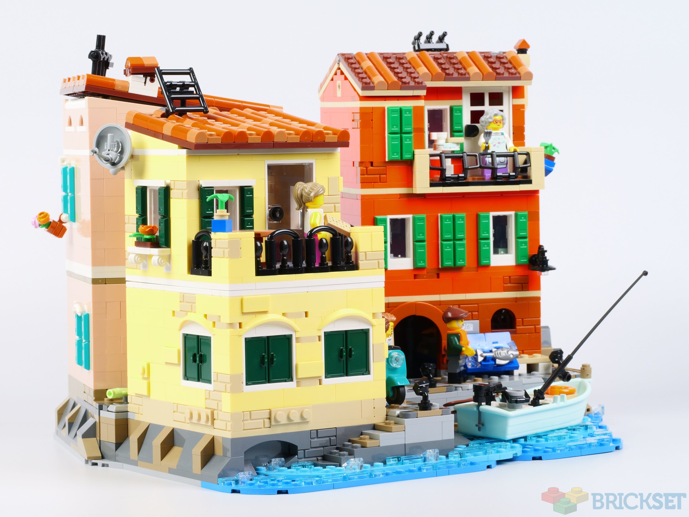
The completed model - Exterior
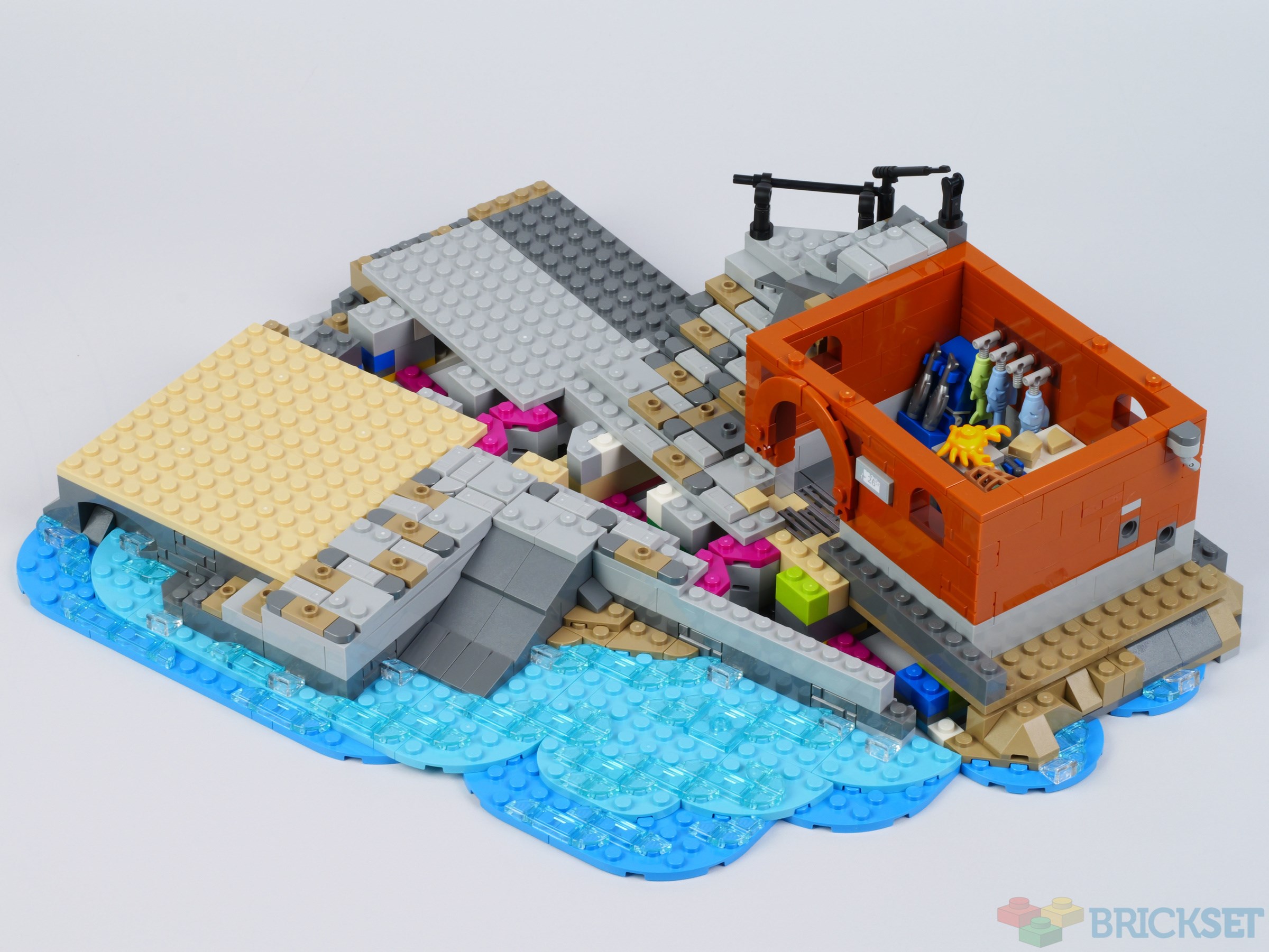
The composition of the resultant set is similar, although the base has a more interesting shape, formed by connecting two angled sections together as you will see in a photo further down the page.
The section of sea is larger, and the beach has been dispensed with. Instead of a canoe, a small fishing boat is provided, tied to the jetty.
Rather than use the 1x1 round brick roofing technique favoured by AFOLs and seen in the original model, this version uses the relatively new 1/2 curve pieces attached to plates which, of course, results in a more robust construction, but it does not look as good!
One of the sloping roofs is now a gable, and television aerials have been added to them, which is perhaps unfortunate because it dates the model to the late 20th or 21st century. In fact, there's also a satellite dish on the back of one of the buildings which dates it even more precisely.
The shutter pieces used in the original model have, I presume, been retired because they've been replaced with 1x2 ingots here and, while they look OK, they are nowhere near as aesthetically pleasing.
Some effort has been made to add detail to the walls with masonry bricks and other techniques, particularly on the yellow building, but they look much plainer and far less interesting than those on the original submission, unfortunately.
I believe this is the first System set to use reddish orange so extensively, and it's the perfect colour for an Italian riviera building. The one in the corner is grey in the original model but light nougat here, and the third one at the front, cool yellow. They are all attractive, sought-after, and relatively rare colours, so it's good to have a lot of basic bricks and plates in those hues included in the set.
The model lacks any real 'nice parts usage' and is predominantly a studs-up construction, although there are some unusual techniques used to angle the rocks around the base of the reddish-orange building.
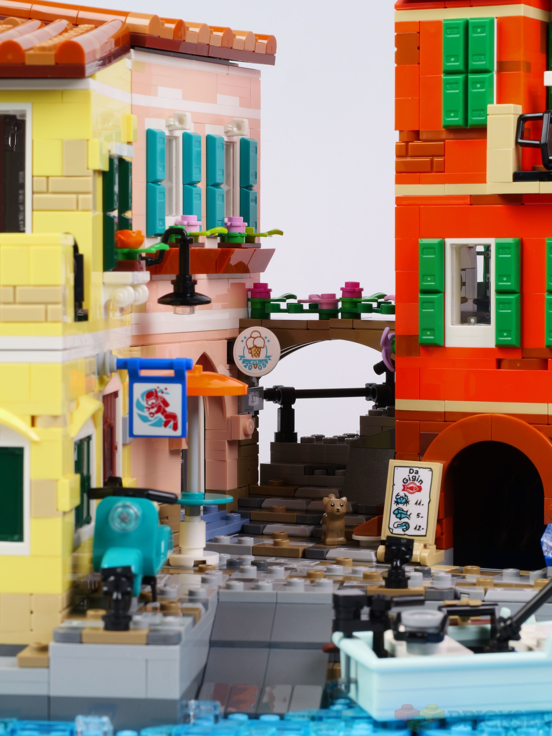
What's also unusual is that it looks good from every angle, and rewards 360-degree viewing with unique details on all sides. There are no open backs, plain walls, or odd patches of colour anywhere.
There are amusing scenes to be found in every nook and cranny...
This top view shows the layout of the base and buildings.
The upper floors and rooves can be removed to access and examine the interiors, which are just as detailed as the exteriors, it not more so.
Interiors
While some of the charm of the buildings' exteriors has been lost in translation, that's not the case with the interiors, which are full of delightful details. The LEGO designer (who, incidentally, is not named in the instructions) has incorporated some of the fan designers' ideas and vastly improved upon them.
The ground floor of the reddish-orange building houses a fresh fish shop. There are fish hanging from hooks, a crab on a set of digital weighing scales, a cut piece of fish fillet on the counter, and a sink against the back wall.
The first floor of this building is accessed from a door in the alleyway which opens into a kitchen. The ingredients for pasta dishes -- rolled-out dough, basil, and olive oil, can be found on the worktop, and the finished meal of Trofie set out on two plates, is a new printed 2x2 tile.
On the other side of the room, stairs lead to the second floor and, what I presume is a set of mechanical scales, is stowed underneath.
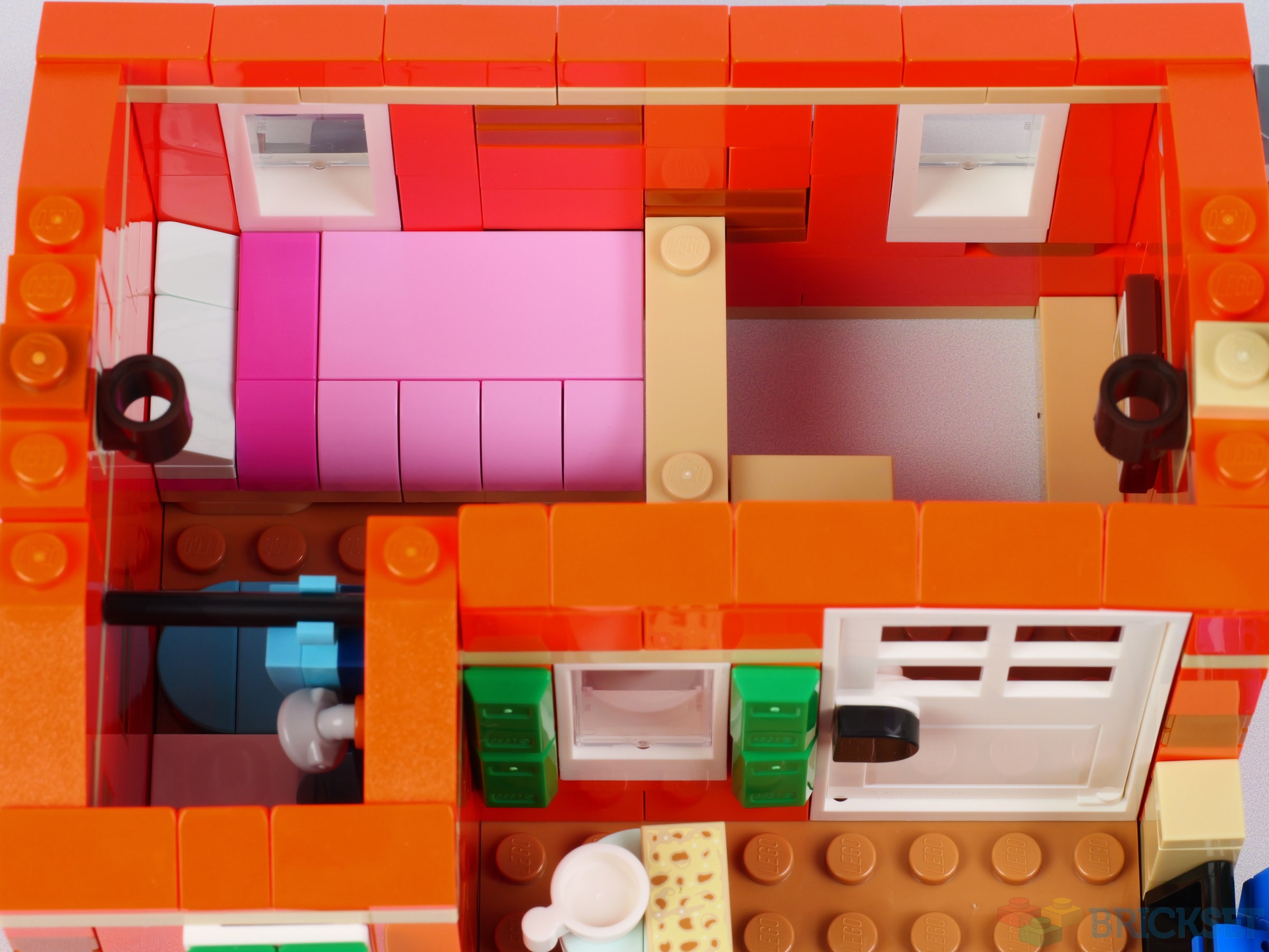
The interior of the second floor is smaller than those below it due to the balcony but, nevertheless, a bed and shower have been squeezed in.
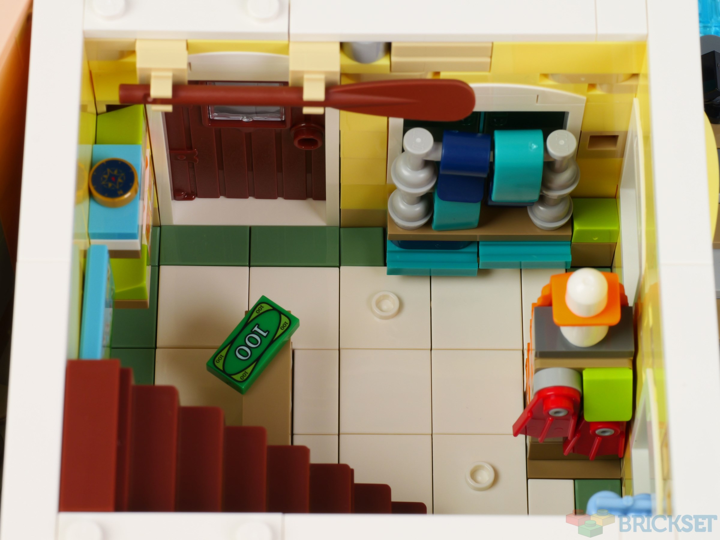
The occupant of the ground floor of the yellow building operates a diving school/equipment hire business. It's filled with scuba tanks, life preservers, flippers and so on. The light blue air tanks will be handy for those wanting to add them to the recently introduced classic space minifigure in that colour.
Stairs lead up to the first floor, which has the smallest interior of them all. There's barely room for a sofa and television up there. The resident does, however, have a spectacular view across the sea from the adjoining balcony.
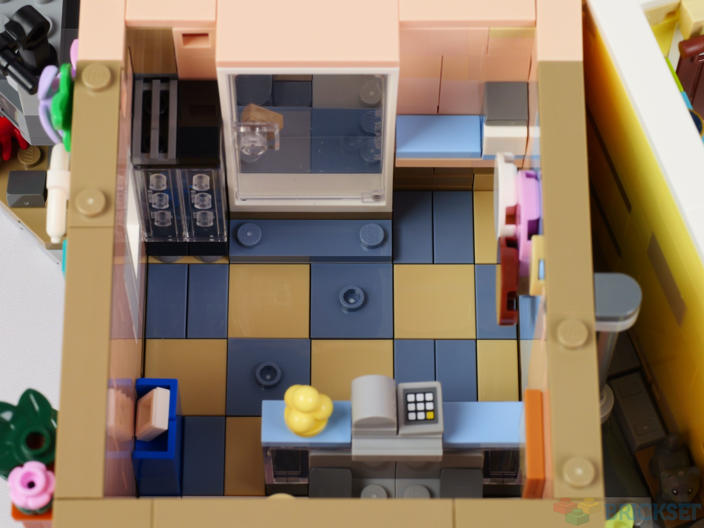
An ice-cream parlour, replete with a chilled cabinet stuffed with frozen delicacies, and an upright freezer, occupies the ground floor of the nougat building in the corner.
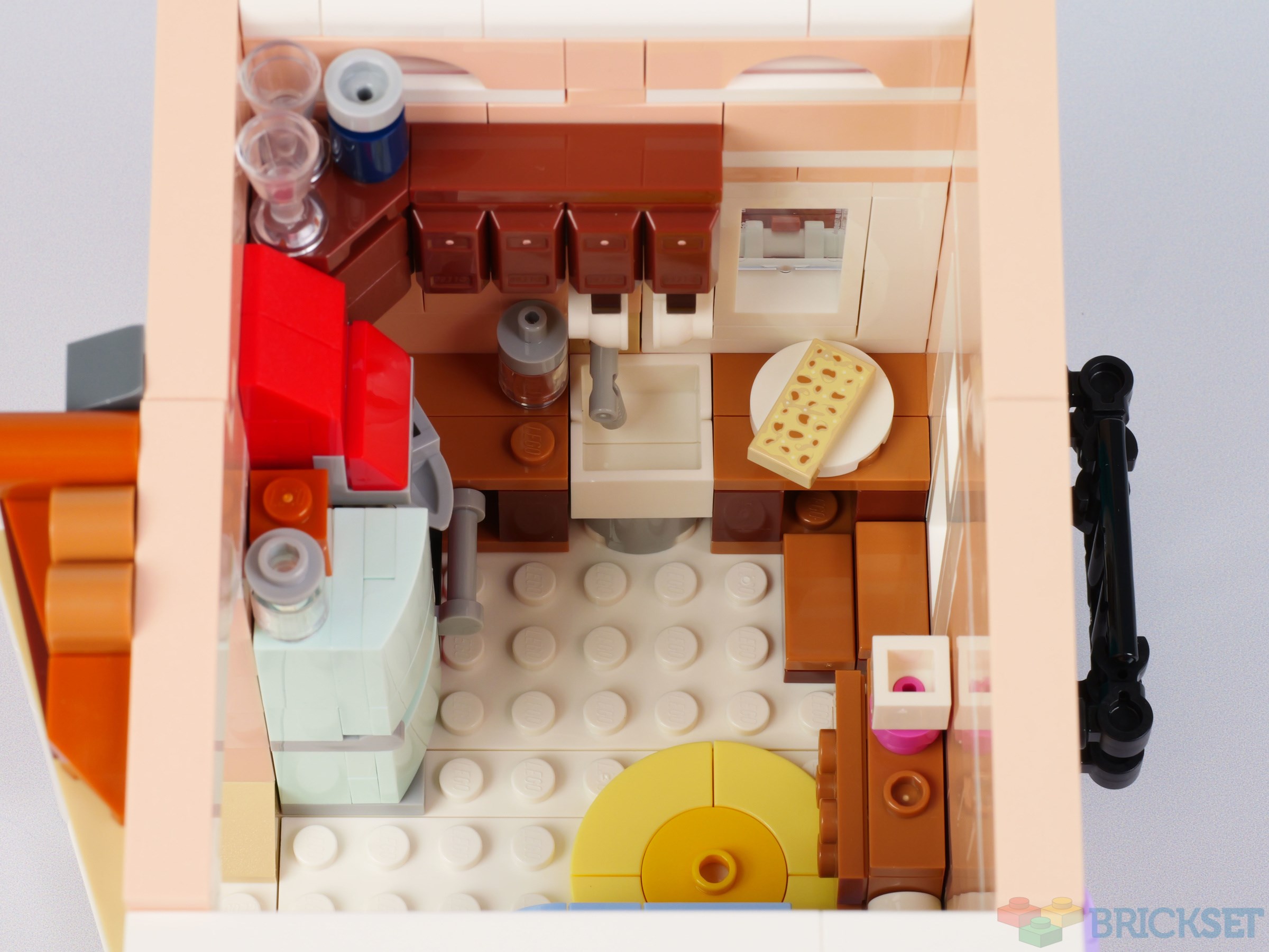
The kitchen upstairs in the bedsit is the best I have seen in a LEGO model: it's packed with everything a kitchen needs. There's an upright fridge/freezer, cooker with extractor above it, worktops, sink, coffee percolator on the stove, and cupboards on the wall.
A bed with drawers beside it fills the other corner of the room.
This top floor and that of the yellow house are joined internally, which doesn't seem particularly realistic given they are at an angle to each other, but it does mean that every room of every building has a means of access and egress.
Minifigures
A generous 10 minifigs are provided to populate the businesses, accomodation,and alleyways. The majority reuse existing pieces, but some are new, most notably the torso and legs with an apron pattern of the elderly female pasta chef, below.
She's accompanied by what might be her rolling-pin-wielding grandson in the kitchen of the reddish-orange building.
The fisherman wears a knitted jumper under his life jacket, and has dual-moulded legs to represent Wellington boots.
This is the occupant of the flat above the left-hand buildings. She's carrying focaccia, which is a new printed piece.
This female is the rider of the scooter propped up against the wall and I think she might suffer from 'helmet hair' when she removes her protective headgear.
In the Italian riviera, tourists outnumber the locals by a considerable margin, but that's not the case here: this camera-wielding gentleman is the only one.
This young lady works in the ice cream parlour...
...and these are her customers. The gent's torso is new and it's very colourful. He looks very dapper, and perhaps colourblind too, wearing an orange tie, lavender waistcoat, medium azure scarf, and red trousers!
Finally, we have this mystery woman, wielding a pen (a part I am not familiar with) and paper. Is she a detective? A journalist? An author or artist? Or does she just work in the fish shop? That's for us to decide, I guess...
Construction
There's not much to say about building the model because it's very straightforward. The only thing of note is the way the two halves of the base are connected together, initially with ball joints before being strengthened with hinges.
There are couple of new printed parts in the set (the pasta dish and focaccia) but the majority of decorations are stickers.
Verdict
There is a lot to like in this model: it certainly evokes the atmosphere of the Cinque Terre villages with their narrow cobbled streets and colourful buildings, and constructing it has made me want to visit them again.
If this was an Icons set released 'out of the blue' we could accept it for what it is and be very satisfied with it, but because it's based upon an Ideas project, we have to compare it with the original submission and, unfortunately, when doing so, it falls short.
Although the building's exteriors are well-detailed and more pleasingly coloured, they just don't look as good as those on the original model. It's hard to pinpoint exactly why, but they just don't!
It's a different matter inside them, though: these are some of the best and most detailed interiors you'll find in a LEGO set, surpassing those in the Modulars in some cases.
The 3,251 set will cost £249.99 / $299.99 / €279.99 when released on August 1st and that seems expensive, particularly in the USA. Furthermore, you'd have to really like the Italian riviera to consider spending that much on this set, particularly when there are so many other large desirable ones vying for your hard-earned cash this year.
159 likes














67 comments on this article
That pen piece has been around for a while; surprise you haven't encountered it before.
Unpopular opinion, I think the boat ramp is actually supposed to be a waterslide. It’s the only logical conclusion with the size that it is… :-)
Not too many stickers, in my opinion.
I think the bricks on the building with green shutters look a bit jarringly bright. I would have liked that building to be a bit more pastel-coloured, like the other two.
The rockwork and pavement tiling are really effective though- thanks for the review Huw!
I agree, the exteriors of the original fan design were much better.
The original looked like a real street. This just looks like a Friends version
@alLEGOry_HJB2810 said:
"I think the bricks on the building with green shutters look a bit jarringly bright. I would have liked that building to be a bit more pastel-coloured, like the other two."
Check out photos of the real Cinque Terre. There’s indeed buildings in this very bright colour.
Is it really especially expensive in the USA?
299 USD currently convers to 220 GBP or 254 EUR. So relatively least expensive in the states surely.
The negatives are a bit sad, but this is a great set nonetheless.
I was going to comment on why the roof of the orange building is inexplicably short on one side, but in later photos it's clear that that's for the balcony - the earlier photos have the roof on the wrong way.
Apparently Lego added the aerials in agreement with Alex the original designer, as when you go to Cinque Terre they're a striking feature of all the houses, and they felt that it made for a nice contrast - old buildings with janky modern aerials.
@ZeroGravitas said:
"I was going to comment on why the roof of the orange building is inexplicably short on one side, but in later photos it's clear that that's for the balcony - the earlier photos have the roof on the wrong way."
You are right! I didn't spot that. I'll correct them. Thanks.
Edit: done.
Do you have the roof reversed on the first couple of photos...the reddish orange house?
Edit: Ope, Zero beat me to it!
It's built like an island now. How did that moped get there? XD
Excellent review as always @Huw
I fully understand the roof redesign for stability issues and the departure from the square footprint so it doesn't interfere with the modular building segment of the market.
But would it really have hurt LEGO to at least put in some more masonry brinks? The walls looks very, very plain now from the outside and that is shameful imho.
Can't believe they didn't bring back the shutter pieces for this. The ingots don't look good and most importantly don't work!
I dunno, this seems lovely to me. A bit pricey (lots of parts, to be fair, but £250 is £250.)
The only thing missing for me is a pale, bald minifigure in a nice black suit, a barcode on the back of his neck, and a list of residents for the town that he has to surprise.
I’m not convinced. The overall silhouette just doesn’t feel quite right. Personally, I think the blocky, box-like look could’ve used more variation and contrast to make the shape stand out more. In the original design, the beach area adds a nice sense of calm at the base and contrasts well with the rocky parts. The horizontal lines in the facades emphasize the blockiness, whereas in the original, the facades feel more organic and picturesque. The colour choices for the houses also worked better in the original, it all felt more cohesive. I really think Lego could’ve taken that original design to the next level… but sadly, they didn’t. Great review Huw!
"I believe this is the first set to use reddish orange so extensively, and it's the perfect colour for an Italian riviera building."
For the usual System sets, I'd think it's a yes. But we got 42177 last year and its reddish orange inventory is the best if you tolerate Technic.
Curious to see how this sells. While I like the set, I agree with the sentiment at the end of the review that you'd have to REALLY be an Italophile to see strong value in picking this up. It'd be difficult to fit into a city setup, and there aren't really attendant sets that go along with it.
I COULD see Pirates fans picking this up and retrofitting it to be a portside town. That'd be a cool potential use for the set.
Nice review!
The shutter mold on the coral building in the original project have been retired for a long time indeed, but the shutter mold on the white building is still in production (they appear on the outhouse of the new Friends beach resort, for example). I suspect the use of ingots has more to do with wanting to commit to a particular window style on each floor instead of a mix of large and small windows. For my part, I also think the final set keeps enough subtle texture variation on the walls to maintain visual interest while keeping the construction sturdy and parts-efficient.
I really love how well-furnished the interiors of this set are, even compared to the original proposal. I would not be at all surprised if the designer of the original project was forced to keep its interiors more austere due to the parts-heavy design of the walls and roofs, since back when it was first proposed, LEGO Ideas still limited models to a maximum of 3000 pieces.
The walk-in shower feels particularly unique compared to anything we've seen in a previous 18+ set, and I love how the shower curtain is constructed, even if its brick-built design prevents it from actually closing. I'm kinda surprised some of these details didn't get highlighted more prominently in the official product photos!
The floors have also been varied up nicely compared to the original, with the lower floors fully tiled in varying patterns and the upper floors instead opting for rugs in various shapes, colors, and patterns instead of generic hardwood floors. And I appreciate the right-hand building having multiple stories and a balcony instead of just one level with a high ceiling. I do wonder how the occupant of the yellow apartment is meant to squeeze past the TV cabinet from the stairwell, though!
The flower shop from the original proposal did get replaced with the boating/diving supply shop, but I can't say I mind since this sort of shop feels more unique and particular to the coastal setting, rather than something you could potentially see as a side business in any modular building set. The rowboat also suits the "old world" setting better than the kayak in the original project, IMO — I associate these sorts of kayaks pretty strictly with recreation, whereas the rowboat can be used either for fishing, diving, guided tourism, etc.
That said, I find it a shame that by moving the harbor/boat dock to the front corner, the finished set loses much of the sandy shoreline from the original, which could have also tied in with this shop quite nicely. For instance, you could have a tourist with a beach towel from the shop spread flat for sunbathing.
I love the alley cat who has stolen a fish from the fish market (or perhaps been gifted one, if the fishmonger was in a generous mood)! The printed pasta and foccaccia tiles also makes me smile, having enjoyed plenty of homemade pasta and foccaccia since my wife and I first moved in together. The grandmother's new apron is also a very fashionable-looking printed outfit!
Overall, I think the final set designers did a very good job here! The overall build looks very warm, sunny, and picturesque, with a clever off-grid composition and lots of charming details. Hope that the project creator is very happy with it as well, and that it will be popular with a lot of buyers!
@WokePope said:
"Curious to see how this sells. While I like the set, I agree with the sentiment at the end of the review that you'd have to REALLY be an Italophile to see strong value in picking this up. It'd be difficult to fit into a city setup, and there aren't really attendant sets that go along with it.
I COULD see Pirates fans picking this up and retrofitting it to be a portside town. That'd be a cool potential use for the set."
We've had many specialized locales before - particularly US-focused in the modulars line - so I don't see being "too Italian" as a detriment here. I think one of this set's main issues is the unremarkable build experience. That's something most buyers only find out about *after* purchasing the set, though, so maybe that won't affect sales too strongly.
The original Idea looked stunning. The final result just looks a bit bland. Just as well... still got a couple of other £250 sets waiting on my wishlist!
More windows than the original has reduced the number of bricks on walls. Consequently the textured bricks that added character to the original have been lost by the looks of it
The aerials are easy to ditch, seeing how they attach to the roofs.
I like it, but it's not a set I desperately want, but it's a set I'll happily pick up when I can. This year is turning out quite expensive though, so it may not be for a while.
Interior detail is fun when we build, but mostly irrelevant and forgotten afterwards. For a display piece, the outward look is what really counts. The evolution from fan made to LEGO standard has really downgraded the outside appearance. Too bad.
@WokePope said:
"Curious to see how this sells. While I like the set, I agree with the sentiment at the end of the review that you'd have to REALLY be an Italophile to see strong value in picking this up. It'd be difficult to fit into a city setup, and there aren't really attendant sets that go along with it.
I COULD see Pirates fans picking this up and retrofitting it to be a portside town. That'd be a cool potential use for the set."
Yes. Day-one purchase for me, but I'm biased.
However, I do agree with others who like the original version, which by far catches the "feel" of Cinque Terre much more closely. And the shutters: the original ones are just perfect!
@Huw said:
"television aerials have been added to them, which is perhaps unfortunate because it dates the model to the late 20th or 21st century. In fact, there's also a satellite dish on the back of one of the buildings which dates it even more precisely. "
I don't get how is this a problem. Aerials are still pretty common in Cinque Terre. The set itself has a TV and the minifigs clothes also date the model to modern times. If someone wants to make it looks like another period, they can just take the aerials.
I often (but certainly not always) think the OG Ideas submissions look too drab or too 'greebly' for an official LEGO set, but here I actually prefer the original design so much more than the finished set. It's still nice, but too simplified, and perhaps even too bright, especially for an 18+ set.
The price in the USA is cheaper than Europe or the UK, by about 30 USD.
@GirlWoman said:
"Can't believe they didn't bring back the shutter pieces for this. The ingots don't look good and most importantly don't work!"
One of the shutter pieces used in the original design was retired because the tabs they hooked into were too prone to breakage, so they're not going to bring it back. The other is still in production, so there's nothing to bring back, they just decided to use a different design.
The IDEAS model definitely looks very eye-catching and something you are likely to give out large bucks for. However, the set itself is nothing to write home about - nice but not nearly unique, sophisticated, or memorable enough to warrant such a price, even with the interior details.
I think most of what's changed is simply a result of the Lego review process: increase stability, remove retired parts (evidently those green shutters, wonderful as they are, haven't been used in 18 years), and as others have mentioned, make the base more akin to the Lion Knight's castle construction and less like a modular set, as we all know Lego doesn't seem to want to do modulars in the Ideas line.
With that said, I do agree with those who say that the original submission simply looks better - and in particular more convincing. For those who are plugged into the Lego world deeply enough to really care about the original submission, I'd say those folks would have been better served if the original version went through the Bricklink Designer program instead. The shutter parts might still have gone away, and depending on how unstable the original roof design is, the roof might still have gotten the new construction method we see in this Ideas set. But the rest of the submission likely would have survived more or less as-is.
Finally, even within the constraints of the Lego process, I agree 100% with those who say that the number of masonry bricks has been reduced way too much. And I'd also add that I think the original corner water feature looks more interesting than the straight shoreline we see in the official set (not to mention, that boat launch is ridiculous).
Great price in the US, where I live the sum corresponds to $367.
As I navigate towards purchasing less Lego, this has become an easy pass for me...thanks for the detailed review. Nice set but my bucks are gonna go towards hunting down season 4 bricklink sets instead...
@strangeworld said:
"Great price in the US, where I live the sum corresponds to $367."
Yeah, the price in the U.S. is the cheapest by far!
The mystery woman is a food critic that can be found in a few City sets.
I quite like this one. It's a sidestep rather than a straight upgrade or downgrade in comparison to the original IMO. Both models have details that I prefer in the other if that makes sense. The price feels a bit steep, but it isn't outrageous, so I might pick this one up in the future.
The original submission looked much better. I was really looking forward to this but the changes to the windows, replacement of some colors, removal of masonry bricks in key places, every detail adds up and the end result didn't make it for me.
I feel the minifigures are slightly oversized compared to the buildings.
I feel the shutters are slightly awful compared to non-awful shutters. :o)
@Vertigo80 said:
"Is it really especially expensive in the USA?
299 USD currently convers to 220 GBP or 254 EUR. So relatively least expensive in the states surely."
A lot of people have complained about the recent price rises in the US being greater than in other territoies but haven't taken into account that the Dollar has lost around 15% of it's value this year.
It's a shame that Lego has changed so much from the original version, if it was voted it's because it was beautiful.
These interiors are definitely some of the best I've seen! They're just crammed full of detail. I think the reason the original submission's exterior looked better is that the walls were just more textured. The walls on the final set seem too flat and clean to me, the original submission looked well-worn in a cozy and inviting way. I also wish we got more new minifigure prints - they're a bit too City-focused IMO, but the new food prints are great.
Well I like it more the more I look at it. But I still won't get it due to funds. If money was no object, sure thing.
I like the ingots as shutters. I think they work. Can't expect all LEGO to be functional, otherwise we would have stairs more frequently inside!
I like the use of colors. I can see them pairing quite well. The water only looks good, removing the beach was an ok choice I guess.
I’m really torn on this one, similar to the 21353 Botanical Garden.
Pros
Right up my alley (no pun intended) for realistic sets that can add to my city
I like the new “Barracuda Bay” water
i appreciate the detailed rooms and the solid appearance from all sides
I’m glad they changed out the gelato sign that falls if you just look at it wrong.
The new rock shoreline is intriguing
Cons
This type set is more palatable at an A-Frame price
The buildings desperately miss the original greebling
Ingut shutters and Cabinet windows just don’t work
The street seems way too small
The minifigs are a bit bland
That alley arch not lining up is giving me nightmares
The new rock shoreline leaves awkward anti-stud gaps
With so many sets already stuck in my wish list, I’m having a difficult time seeing how this one makes it through. At a different price in a different year…
I know this is an odd thing to be annoyed about ...
... but does anyone else really despise those ingot pieces? I don't know what it is, but they just annoy the hell out of me, I don't like them. Whenever I'm building something and I see them (as opposed to 1x2 tiles), I grind my teeth.
@tmtomh said:"(evidently those green shutters, wonderful as they are, haven't been used in 18 years)"
That's because the tabs they hooked into were prone to breakage.
@GoldenNinja3000 said:
"These interiors are definitely some of the best I've seen! They're just crammed full of detail. I think the reason the original submission's exterior looked better is that the walls were just more textured. The walls on the final set seem too flat and clean to me, the original submission looked well-worn in a cozy and inviting way. I also wish we got more new minifigure prints - they're a bit too City-focused IMO, but the new food prints are great."
I agree, definitely the original walls had a lot more texture and removing it took away a lot of the charm from this set. There are certain elements that are key to a set in order to make it stand out, sometimes it's texture, sometimes the color theme used, or the building techniques, etc. Unfortunately sometimes Lego fails to realize it when they make changes to the original submission. They may have their reasons but the risk of changing things is that those key elements may be removed and as a result the end product loses its charm.
@Zordboy said:
"I know this is an odd thing to be annoyed about ...
... but does anyone else really despise those ingot pieces? I don't know what it is, but they just annoy the hell out of me, I don't like them. Whenever I'm building something and I see them (as opposed to 1x2 tiles), I grind my teeth. "
No, not like that. When used right they can be a nice detail piece and provide interesting texture. But my eyes are struggling to read them as window shutters here. I don't know, I think that they look too thick and embedded in the walls, rather than something quite thin and adjustable. Also since they had to use two ingots per side the "shutters" get that big grove in the middle, which my brain just can't register as anything I recognize.
If they couldn't use actual shutters, perhaps a 1x4 tile with a print could have been an OK compromise.
How can "Expensive, especially in the USA" is a Cons? This not Lego fault....American Citizen elected president "Mr. Tariff"
I initially thought the focaccia piece was a new milk chocolate printed tile. It doesn't look like a bread.
As others wrote, the USD price is actually cheaper compared to current EUR and GBP conversion rates, so I wouldn't mention this as a cons in the review every time. The era of 1:1 RRP rates between US and EU is finally over.
I was expecting this to go straight on the wish list, but seeing the changes, I'm not convinced. The interiors are great, but the exterior, which is after all what will be visible 99% of the time, is massively inferior to the original submission. Think it's going to be a pass from me sadly!
I waited a lot for this set, but now I'll skip and keep my money for something else. The Lego model to me seems too much modern, loosing the fashinating atmpsphere of a real ancient village. Overtourism also here, in Lego models! Personally I loved more the modular structure of the original submission, easy to be integrated in something bigger.
Lego always makes significant changes to the original submissions, so that shouldn't suprise anyone. I think they improved on it in every way, but clearly i'm in the minority with that. My only issue is the pricing.
@Zordboy said:
"I know this is an odd thing to be annoyed about ...
... but does anyone else really despise those ingot pieces? I don't know what it is, but they just annoy the hell out of me, I don't like them. Whenever I'm building something and I see them (as opposed to 1x2 tiles), I grind my teeth. "
I hear you. I do not have a hatred for them and they have their use - something quite useful in fact. But it seems Lego is using them with abandon lately - so I know what you mean. This is a part that you should sprinkle, not douse. And certainly (IMO) not suitable for shutters.
I really wanted to like this set but the final product just doesn't have the same Wow factor as the original submission. Those ingot pieces subbing for shutters just look awful. I agree with others that they are just overusing this part to death.
After seeing the original set again, I just can unseeing it... Worst Ideas adaptation ever, in my opinion. How to ruin a perfect set! This could only be worse if the lego designer decided to replace minifigures for minidolls. After seeing the original reddish building and the Lego poor rendition, there is no way I could spend money on this....
There is no doubt in my mind that it was designed by an AFOL. The brick-built rocky base tips the designer's hand.
The pastel colors and lavish kitchens make this set feel like a Lego Friends set that has died and gone to heaven.
Managed to get it locally at a preorder price of around US$210. For this price I think it's worth the shortcomings.
If need to, can use it as a base set to expand the riviera with bigger boat launch ramp, more buildings, wider town square area etc.
Also, digging the Light Blue air tank! :-P
I really like it, but it’s an island which is surely unrealistic. I would have happily mod’d this to link in to my town but I think it’s too much work. Shame, the reddish orange alone could have sold me.
Great set. Both versions are good but I honestly think the official one is better. It just looks better composed to me.
@regent8585 said:
"How can "Expensive, especially in the USA" is a Cons? This not Lego fault....American Citizen elected president "Mr. Tariff"
"
Tariffs don’t apply here because LEGO in the States comes from Mexico under USMCA (and starting next year will not be imported and come from Virginia). It is also cheaper in the States than anywhere else.
@M4444M44 said:
" @regent8585 said:
"How can "Expensive, especially in the USA" is a Cons? This not Lego fault....American Citizen elected president "Mr. Tariff"
"
Tariffs don’t apply here because LEGO in the States comes from Mexico under USMCA (and starting next year will not be imported and come from Virginia). It is also cheaper in the States than anywhere else. "
I thought they weren’t starting until 2027.
Are masonry bricks available in these colors? If not, that may be why they weren't used--which I agree makes the exteriors much less attractive. If they are available, that could make an easy fix for what I feel is the only major negative for this set. In other respects (yes, even the ingot-shutters) I'm quite happy with the revisions.
@GusG said:
"The original looked like a real street. This just looks like a Friends version"
The original looked like a real street, the other like LEGO.
That woman with the pen? Property development scout for AirBnB, stands out a mile.
I just got back from Italy and I craved for a some kind of souvenir bringing back memories of places I visited. I did order this set before reading the reviews, and I was afraid that I just spent a hefty 1200PLN for a bland mediocre experience. How wrong I was! I found the building process awesome, very relaxing and I loved every little detail designers put into this thing. Colours are great as well, and I think overall composition works very well. Definately much better than I aticipated based on the AFOLs opinions on the Internet.