Review: 43032 World Cup 2026 Official Emblem
Posted by Huw,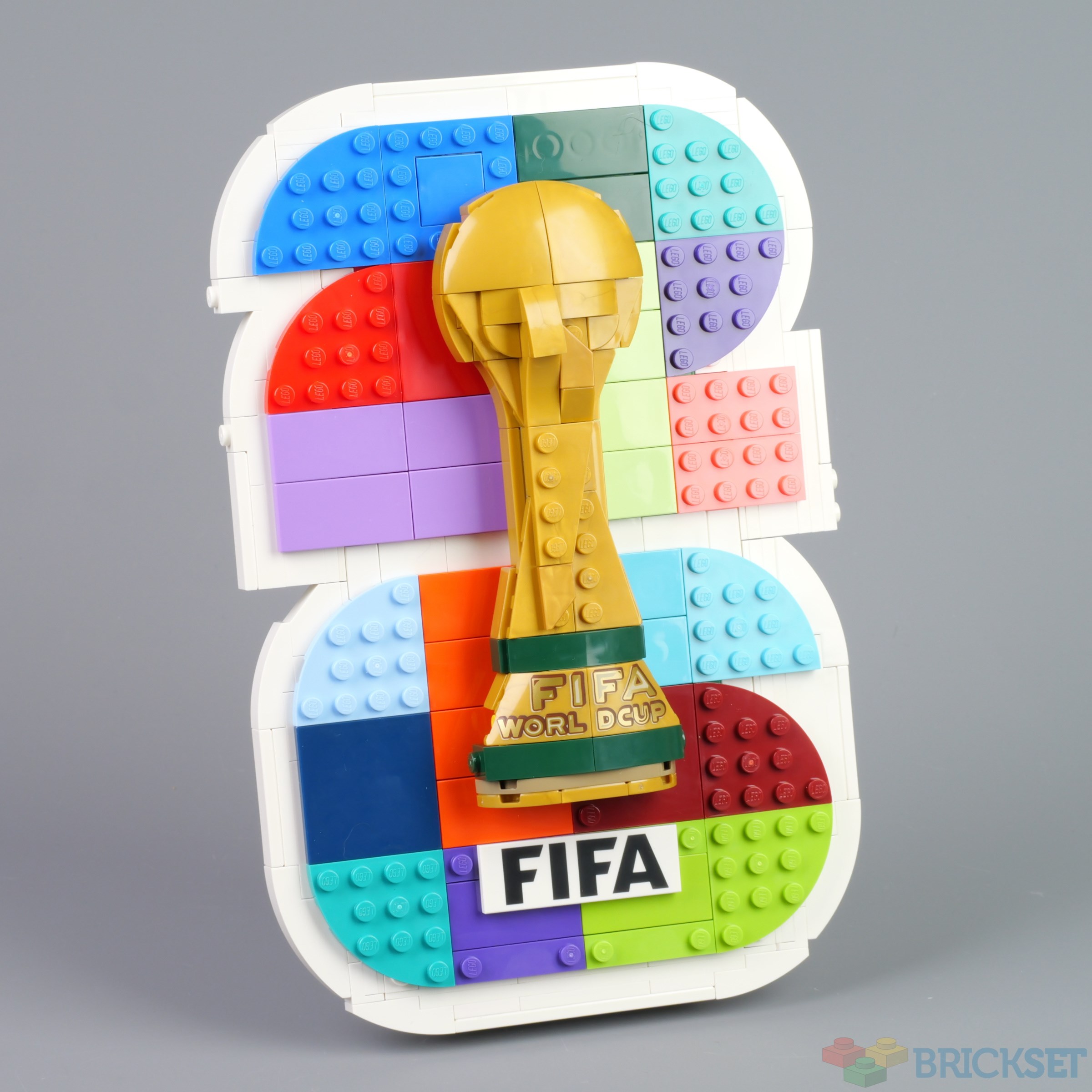
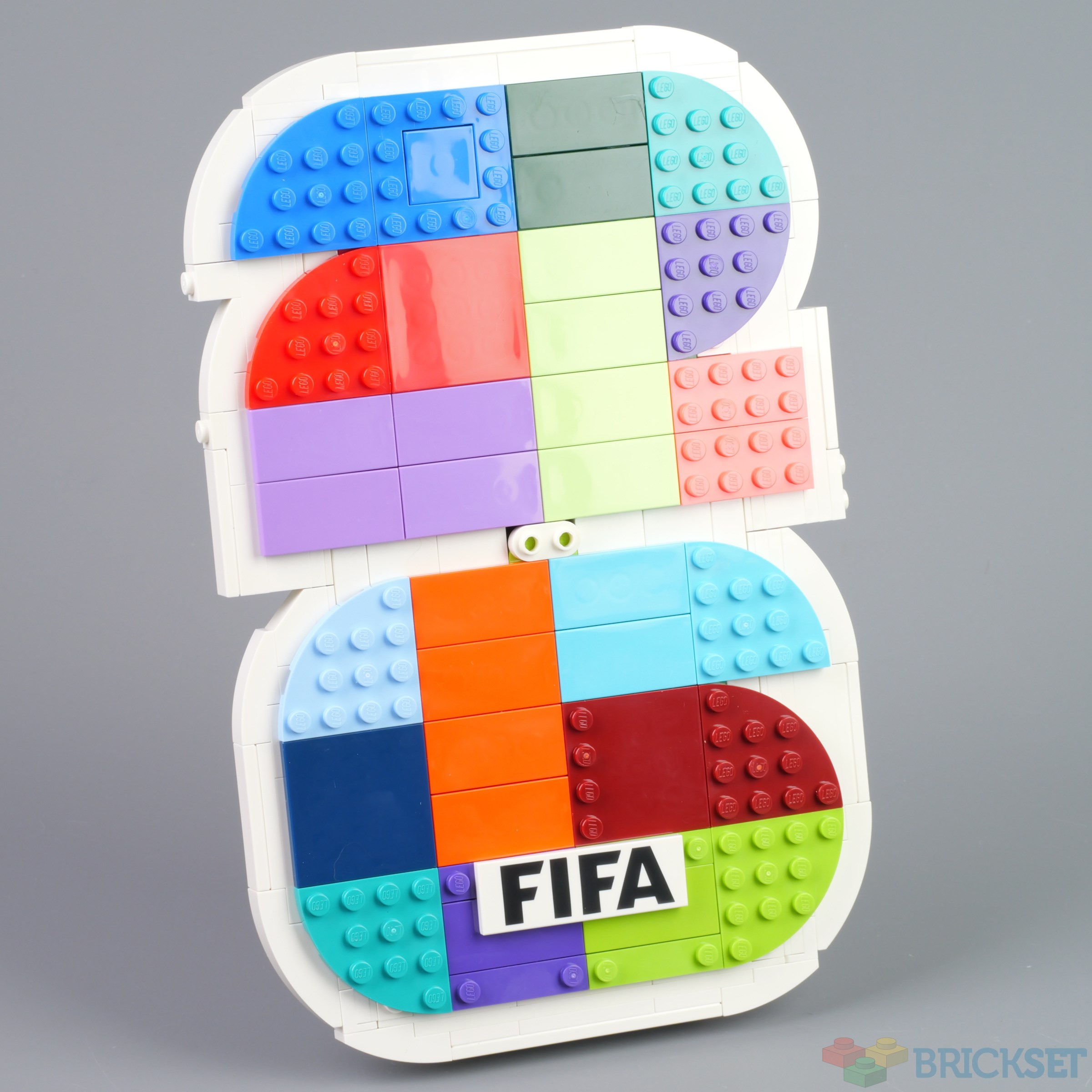
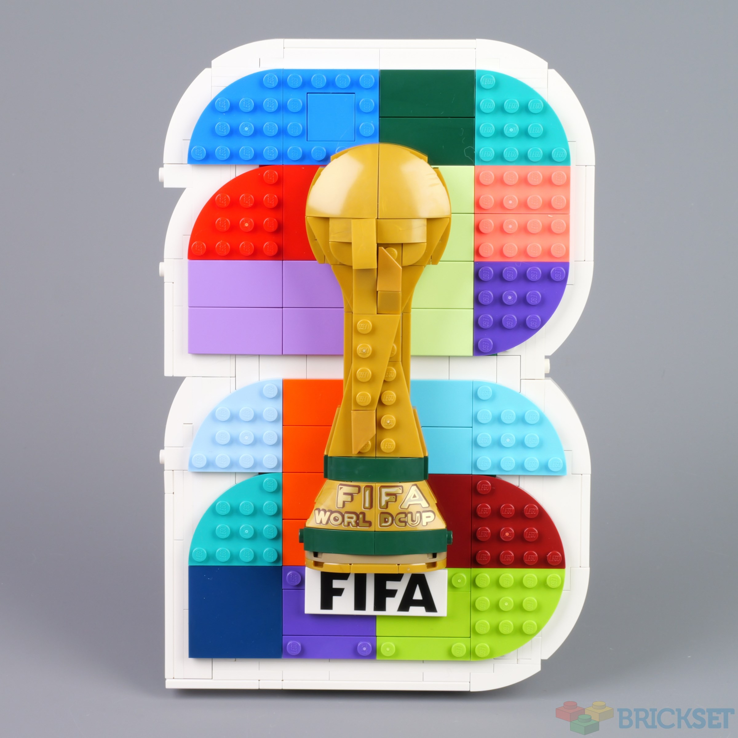
To me it looks like this year's FIFA World Cup logo has been designed for the tournament in 180 years' time, in 2206 rather than 2026, but nevertheless LEGO has faithfully reproduced it in 43032 FIFA World Cup 2026 Official Emblem which'll be launched next month.
Summary
43032 FIFA World Cup 2026 Official Emblem, 298 pieces.
£19.99 / $24.99 / €24.99 | 6.7p, 8.4c, 8.4c per piece.
Buy at LEGO.com »
A reasonable reproduction of a flawed logo
The set was provided for review by LEGO. All opinions expressed are those of the author.
I believe we are supposed to see a single 2 above a single 6 in the logo, but I read it as 2206. What about you?

The LEGO model, which suffers from that 'flaw' as well, draws colour inspiration from an expanded version of the logo that can be seen here.
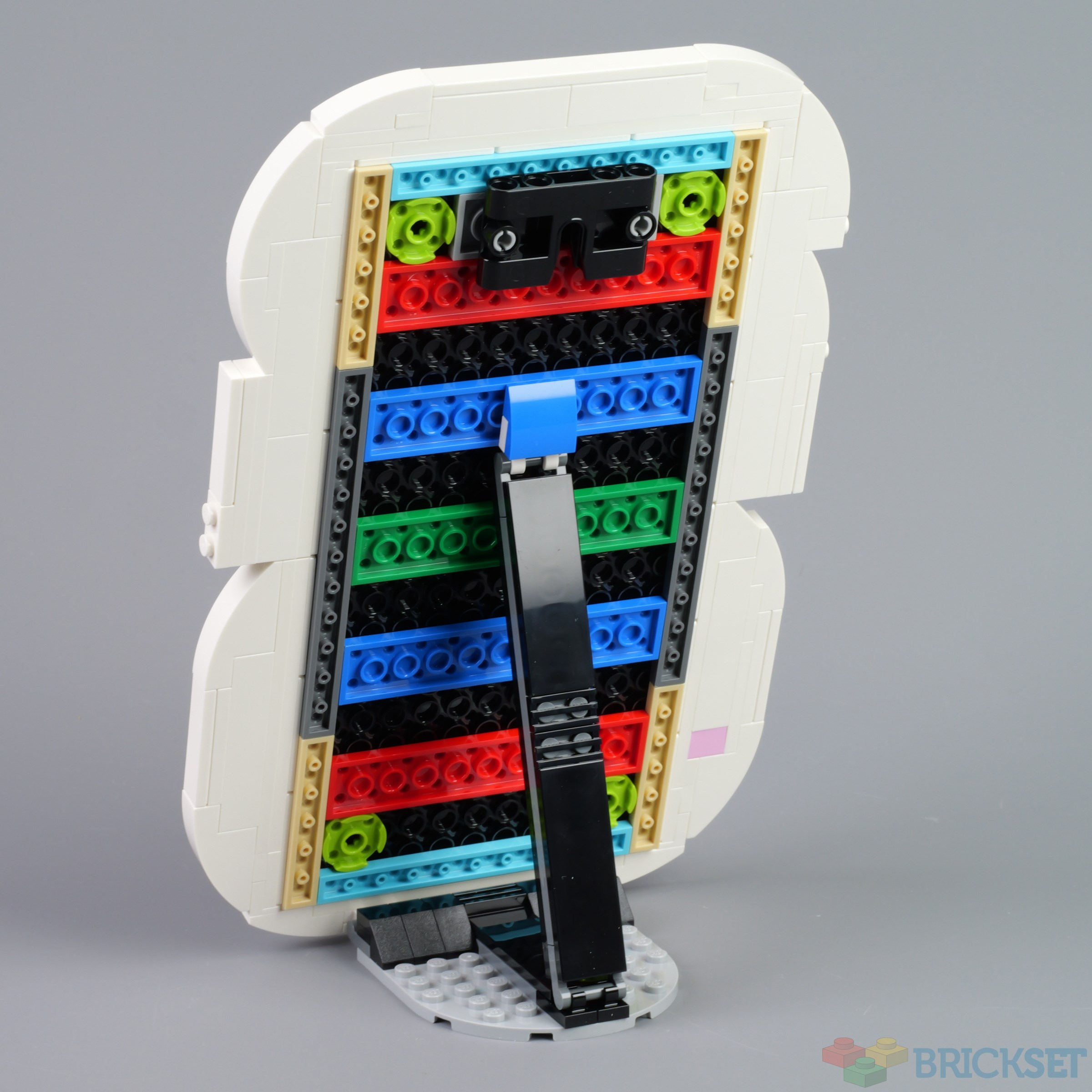
It comes with a stand for displaying on a shelf which can be removed should you wish to hang it on a wall using the supplied hook receptor piece.
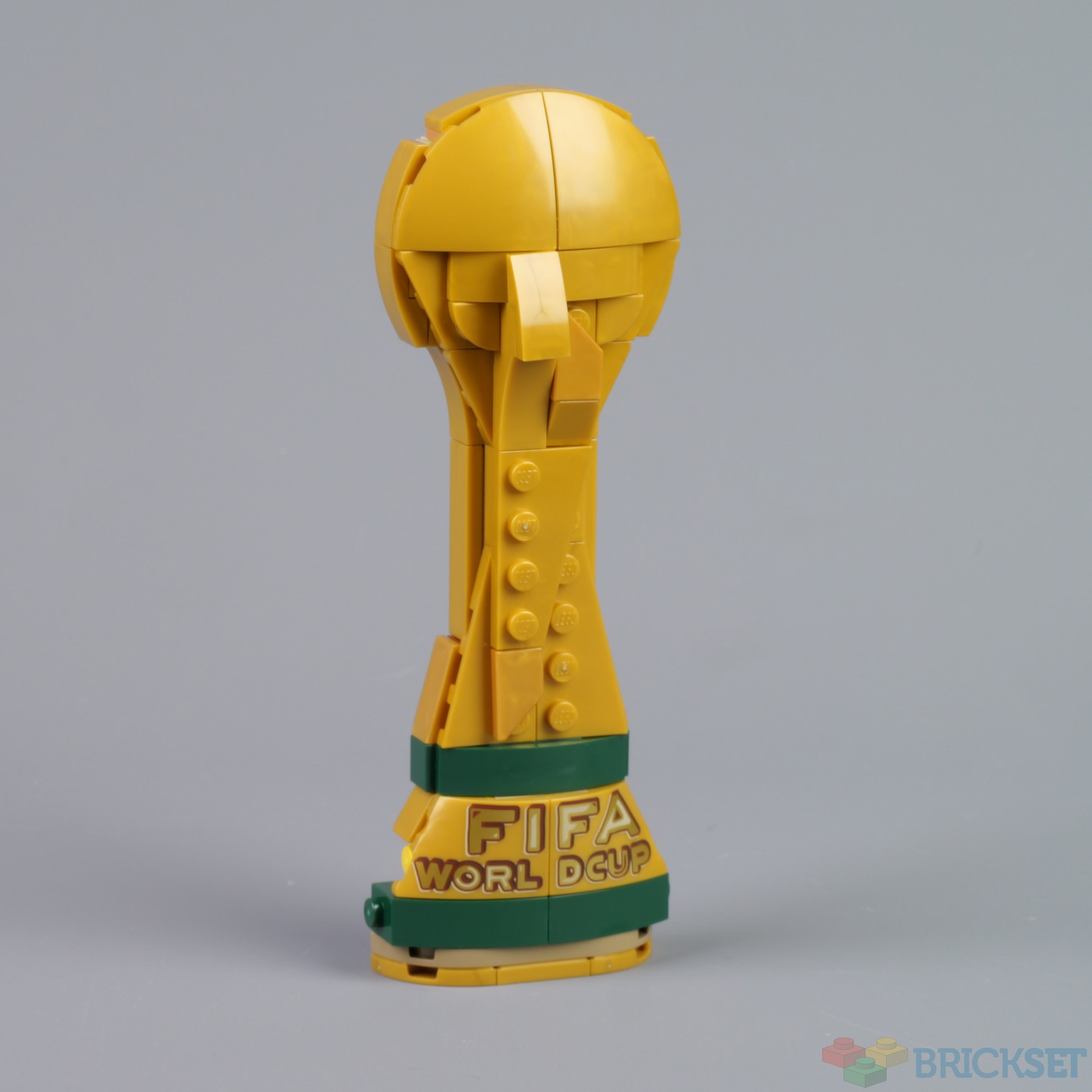
The decorations are printed, and it's unfortunate that the text on the trophy reads WORL DCUP. I know STAMPs (stickers across multiple parts) are frowned upon nowadays, but I think one might have been preferable in this case.
If you're seeing 2206 rather than 2026 or just 26 you can of course modify the model, as I have done here. I needed to add a handful of white plates and tiles to do so. The curve at the top left of the bottom 2 is not perfect: I could have done with another 1x4x1 curve, but I have none in stock.
It's reasonably priced, at £19.99, $24.99, €24.99 for just under 300 pieces, but I suspect its appeal is likely to be restricted to hardcore World Cup fans only.
57 likes
69 comments on this article
"I know STAMPs (stickers across multiple parts) are frowned upon nowadays, but I think one might have been preferable in this case."
....or just edge-to-edge prints? Can't be too hard, right?
But not a particularly interesting set anyway. In that regard probably the worst of this wave of football sets.
And that's a big "no" from just about everyone, I'd imagine!
Oh honey... no.
I wish there was a minifigure-scale trophy included...
So, I finally understand what you are saying the numbers look like.. but honestly, they just look like a wide 2 and a wide 6. Too many colors going on - makes it hard to look at period. Definite MEH.
I saw 2206 even before I read the article.
Nice collab with an incredibly corrupt and garbage org, and the set blows too. $6 parts pack.
Are the LEGO® Editions sets for me? Nope, not interested at all. But I can still appreciate the new themes, and most of them look great. It’s nice that Lego keeps introducing fresh ideas to see what works and what doesn’t. Not many toy companies have the luxury of releasing something new every season without repeating themselves.
Has to be one of the ugliest sets ever made. It's sad that Lego collabs with some ultra corrupt organization only to make the ugliest sets ever. Like they couldn't put any effort in or what?
I think it is supposed to be read from top to bottom: first a 2, then a 0, and after that a 2 and a 6, so that it reads '2026'
22
06
"The decorations are printed, and it's unfortunate that the text on the trophy reads WORL DCUP. I know STAMPs (stickers across multiple parts) are frowned upon nowadays, but I think one might have been preferable in this case."
Or just do proper prints like every other high quality manufacturer. How's that for a novel idea?
In any case I am not interested in this set. Not particularly interested in the sport to begin with, and going by where this tournament being held I am definitely going to boycott the entire event this time.
Sorry, I only see 2 and 6 in background. I don't see 2206. That's on the official logo and the LEGO set also.
@AustinPowers said:
""The decorations are printed, and it's unfortunate that the text on the trophy reads WORL DCUP. I know STAMPs (stickers across multiple parts) are frowned upon nowadays, but I think one might have been preferable in this case."
Or just do proper prints like every other high quality manufacturer. How's that for a novel idea?
In any case I am not interested in this set. Not particularly interested in the sport to begin with, and going by where this tournament being held I am definitely going to boycott the entire event this time. "
LMAO I'm imagining some kid going through a bin of bulk in the future and finding a piece with FI WORL on it and wondering wtf that ever meant. And now I'm wondering if bricklink will have it come up when you search "fi worl" hahahaha.
How are you reading anything other than 26?
This comment is only related to the set not about it: I am appalled by the Lego trend towards display/unplayable sets. Am I wrong in thinking the name Lego comes from the Danish for "play well"? There are too many products coming out that are not designed to be played with. A quick check of the new sets on the website currently gives a ratio of 79% display products and 21% playable toys. It's doesn't feel right... :(
I remember seeing a similar discussion at the time when the logo was revealed a few years ago. I still see 2206. The black version is fine (as are all the single colour versions), as it is just a vertical 2 6 but the mixed coloured version is a mess. It wouldn't be so bad if the text on the trophy was vertical rather than horizontal but I find the eye reads the numbers as if they were the same orientation as the letters. But no doubt some graphic designer was paid handsomely for this design.
The gap in WORLD is pretty bad. Surely they could have printed the L slightly closer to the edge and put a gap between the D and CUP. It will be interesting to see how they describe this part at bricklink as the phrase "D CUP" has other meanings if you google it.
@iknow_kung_fu said:
"This comment is only related to the set not about it: I am appalled by the Lego trend towards display/unplayable sets. Am I wrong in thinking the name Lego comes from the Danish for "play well"? There are too many products coming out that are not designed to be played with. A quick check of the new sets on the website currently gives a ratio of 79% display products and 21% playable toys. It's doesn't feel right... :("
You're absolutely correct, but that's simply not how Lego works these days. In the world of chasing as much profit as they can, this has meant throwing toys to the side and focusing on display pieces. The need to hit as many IP as possible, appeal to the upper middle class consumer, and find every niche to move beyond just toys or statues and into art pieces like this has been fascinating, if not disappointing.
You'll likely get more people telling you "but they still make playable toys" as if that's an excuse when most of those playable sets are even priced out of what kids can afford these days. The simple matter is Lego has lost the plot, and for the last 10 or so years has fallen further away from its core.
@Onatu said:
" @iknow_kung_fu said:
"This comment is only related to the set not about it: I am appalled by the Lego trend towards display/unplayable sets. Am I wrong in thinking the name Lego comes from the Danish for "play well"? There are too many products coming out that are not designed to be played with. A quick check of the new sets on the website currently gives a ratio of 79% display products and 21% playable toys. It's doesn't feel right... :("
You're absolutely correct, but that's simply not how Lego works these days. In the world of chasing as much profit as they can, this has meant throwing toys to the side and focusing on display pieces. The need to hit as many IP as possible, appeal to the upper middle class consumer, and find every niche to move beyond just toys or statues and into art pieces like this has been fascinating, if not disappointing.
You'll likely get more people telling you "but they still make playable toys" as if that's an excuse when most of those playable sets are even priced out of what kids can afford these days. The simple matter is Lego has lost the plot, and for the last 10 or so years has fallen further away from its core."
One person's "lost the plot" is another person's "biggest toy company in the world, with record profits now they are producing for the adult builder market". I reckon quite a few brickset users build a set and then just display it, whether it has play features or not.
A supermarket near me has small LEGO sets that cost about the same as two reasonable quality loaves of bread and two 2L bottles of milk.
When you look at a set like 6012, it has 2 minifigures and a small handful of parts and the price adjusted for inflation £8 / $10. It is not so different to 71851 containing 3 minifigures and a slightly more substantial collection of parts for £9 / $10.
@MZ_1 said:
"I wish there was a minifigure-scale trophy included..."
It would probably be pretty easy to design. Just a gold ball element (hoping that exists) on top of a 1x1 round brick on top of a round 2x2 jumper plate.
I have been one of the people disliking the onslaught of statue junk but looking at the larger World Cup trophy set and earlier releases from other themes this is a great development. Rebrickables Inventory calculation shows that the 43020 World Cup Trophys contents are worth about 700€ while the price can be as low as 135€. Many parts are definitely overvalued to a large degree but I did a calculation with the lowest possible prices and some unrealistic prices of what I would want to pay at maximum for a piece, and getting the set still comes out to a better deal than buying the parts separately. 31213 Mona Lisa is an even better deal. Getting just its gold pieces separately would cost about 70€, but the full set is sometimes discounted to less than that. Imagine that, 80% of the contents are free, or maybe a 50% discount on all the pieces which are very useful to build realistic landscapes and metallic gold structures.
You may not want to display these sets, but many of them do provide great bricks for MOCs for far cheaper than usual.
@LuccaTalksYT said:
"How are you reading anything other than 26?"
To read just 26,the typeface is twice as wide, relative to height, as any other I've ever seen. Hence it reads as 4 characters in a standard typeface. Thus 2206.
Even you telling me that you see just 26, I find it hard to do so.
You could buy THREE of these and it’s still cheaper than one MBTA Commuter Rail ticket to get to a World Cup match in Foxborough. (They jacked up the price exclusively for the World Cup.)
WORL DCUP
Or perhaps the back of car? I see a bizarre numberplate and a yellow tow-hitch.
@WokePope said:
"WORL DCUP"
GRINGOT TS
International FIFA Peace Prize
@AustinPowers said:
""The decorations are printed, and it's unfortunate that the text on the trophy reads WORL DCUP. I know STAMPs (stickers across multiple parts) are frowned upon nowadays, but I think one might have been preferable in this case."
Or just do proper prints like every other high quality manufacturer. How's that for a novel idea? "
They've managed to print to the edge of parts in 76911 just fine. Might be due to the fact that these pieces are flat.
Yeah, no.
@DoonsterBuildsLego said:
" @LuccaTalksYT said:
"How are you reading anything other than 26?"
To read just 26,the typeface is twice as wide, relative to height, as any other I've ever seen. Hence it reads as 4 characters in a standard typeface. Thus 2206.
Even you telling me that you see just 26, I find it hard to do so. "
Me too. The fact we are having difficulty seeing what we are supposed to suggests that it's flawed.
A flawed logo? Dare I say it's actually a brilliant logo? I mean, those morbidly obese numbers make it immediately obvious that (most of) the tournament is in the US! ;-)
LEGO's 2026 variant is better that FIFA's, but still not good.
Oh, sorry. That was Huw's mod of this set that is the better one!
@501stLegionClankerFighter said:
" @MZ_1 said:
"I wish there was a minifigure-scale trophy included..."
It would probably be pretty easy to design. Just a gold ball element (hoping that exists) on top of a 1x1 round brick on top of a round 2x2 jumper plate."
Well, I meant existing mould of FIFA trophy.
I see 2206 on the LEGO model and 26 on the official FIFA
Not a set I'll be getting
Today I feel AFOL.
That L and D spacing is so ridiculous lol
Wow, that is so bad on many levels! xD (I'm football fan)
Fun fact: someone got massive amount of money for creating that logo.
There should have been a poll for this article. I'd like to vote that I also thought it was 2206! Took me a while to see the wide "26", especially with the coloring.
Thanks for ruining the logo for me lol
all i can see now is 2206
@Huw said:
" @DoonsterBuildsLego said:
" @LuccaTalksYT said:
"How are you reading anything other than 26?"
To read just 26,the typeface is twice as wide, relative to height, as any other I've ever seen. Hence it reads as 4 characters in a standard typeface. Thus 2206.
Even you telling me that you see just 26, I find it hard to do so. "
Me too. The fact we are having difficulty seeing what we are supposed to suggests that it's flawed."
Apparently you’re supposed to read the first two, then bizarrely go down, read the 0, the in an upward diagonal to the next 2, then back down. Unnecessarily confusing.
I'm so confused. Does no one else see a gold dress?
@LuccaTalksYT said:
" Apparently you’re supposed to read the first two, then bizarrely go down, read the 0, the in an upward diagonal to the next 2, then back down. Unnecessarily confusing."
This feels like that blue dress / brown dress internet debate from a few years back.
The logo only has two digits. You're not supposed to read it down-diagonally up-down. The logo is just a single big fat 2 above a single big fat 6. That's it.
The problem is that the graphic design is terrible. The numerals are just too wide. Some people are reading the single big fat 2 as actually a pair of 2s side by side (22) in the first row. Then in the second row, they're reading the single bit fat 6 as a 0 and a 6 (06). Put it together, it makes 2206.
What they should have done is make a tall 2 on the left and a tall 6 on the right. Of course, with Lego bricks, that should be relatively easy.
@Huw said:
" @DoonsterBuildsLego said:
" @LuccaTalksYT said:
"How are you reading anything other than 26?"
To read just 26,the typeface is twice as wide, relative to height, as any other I've ever seen. Hence it reads as 4 characters in a standard typeface. Thus 2206.
Even you telling me that you see just 26, I find it hard to do so. "
Me too. The fact we are having difficulty seeing what we are supposed to suggests that it's flawed."
It is easier to see if you look at the all black version of the logo. I guess that is the idea. The designer was trying to be clever making it look like 2026 or just 26. And ended up making it look like 2206.
D cup? Call me interested.
@JDawg5 said:
" @LuccaTalksYT said:
" Apparently you’re supposed to read the first two, then bizarrely go down, read the 0, the in an upward diagonal to the next 2, then back down. Unnecessarily confusing."
This feels like that blue dress / brown dress internet debate from a few years back.
The logo only has two digits. You're not supposed to read it down-diagonally up-down. The logo is just a single big fat 2 above a single big fat 6. That's it.
The problem is that the graphic design is terrible. The numerals are just too wide. Some people are reading the single big fat 2 as actually a pair of 2s side by side (22) in the first row. Then in the second row, they're reading the single bit fat 6 as a 0 and a 6 (06). Put it together, it makes 2206.
"
OMG, thank you. I can finally understand what other folks were seeing.
I can sort of see how you get to the two twos in the top row but with no indentation in the bottom line I can’t see how you separate a zero and six unless I guess you have seen 22 already and are looking for it - but with context you know it’s meant to be 26. If the trophy properly cut the numbers in half then it would be more obvious.
But I agree then it’s like the dress - you see what you see and it’s hard to see what someone else obviously sees!
Its the vertical/horizontal reading meme in lego form!
But really, any support of the Infantino/Trump world cup is supporting all the worst of capitalism. Skip it, and make Lego reassess their tie in deals.
Lego needs to just admit they don’t have any values anymore. At least honesty counts for something.
1
When I first saw the 43020 set I thought it was a melting ice cream cone set.
2
I like the design of some sets in this theme, but I have not much interest in this sport and im disgusted at the peace thing fifa gave to Trump (a set could be made of this?).
I'm still staring at that WORL DCUP thing and can't believe it is for real, it's like living in bizarro land, how does a human mind manage to produce something like this, it's a bigger mystery than Atlantis.
I cant see 2206!! Its a 2 and a 6!! How do you see 2 x 2 and a 0????
The World Cups are most commonly branded 82, 86, 90, 94, 98, 26 etc, i.e. Espana 82, Mexico86, Italia’90, WorldCupUSA94, France 98 and FIFA World Cup 26. There have been exceptions, e.g. Qatar 2022.
The official logo conforms to this year’s brand and easily reads as 26 to me. Lego breaking it up into gaudy colour patches does create the perception problem IMHO (though I still see just ‘26’)!
It looks like TLG is trying to recreate AI slop.
And then charging us for it, in order to cash in on an event so thoroughly rife with corruption that every time you watch a FIFA-match, an angel loses its wings and gets gonorrhea.
As far as insults go, this set does manage to hit pretty effectively from different angles and on many levels, but couldn't you have just called my mother fat instead?
Oh, are we allowed to criticise the subjects of kits again?
@MZ_1 said:
" @501stLegionClankerFighter said:
" @MZ_1 said:
"I wish there was a minifigure-scale trophy included..."
It would probably be pretty easy to design. Just a gold ball element (hoping that exists) on top of a 1x1 round brick on top of a round 2x2 jumper plate."
Well, I meant existing mould of FIFA trophy."
Yeah, @501stLegionClankerFighter, there's a minifig-scale one in 43020
@Brickodillo said:"D cup? Call me interested. "
I'm fine with any size cup, as long as she has nice legs. And since this has no legs at all, pass.
@smurfybloke said:"The official logo conforms to this year’s brand and easily reads as 26 to me. Lego breaking it up into gaudy colour patches does create the perception problem IMHO (though I still see just ‘26’)!"
The trophy going straight up the middle doesn't help, because it sort of divides what's supposed to be one 2 into two, and one 6 into a 0 and a 6.
I'll wait for the FIFA Peace Prize trophy so I can gift it to myself. Haven't started a single war this year, my momma's so proud.
I see 26 as in 2026. Like I was born in 56 as in 1956 or like when you says its the 70's as in 1970's.
I don't really see the 2206 problem. but still.... PASS
@smurfybloke said:
"The World Cups are most commonly branded 82, 86, 90, 94, 98, 26 etc, i.e. Espana 82, Mexico86, Italia’90, WorldCupUSA94, France 98 and FIFA World Cup 26. There have been exceptions, e.g. Qatar 2022.
The official logo conforms to this year’s brand and easily reads as 26 to me. Lego breaking it up into gaudy colour patches does create the perception problem IMHO (though I still see just ‘26’)!"
There were also exceptions to using just two digits in the logo in 2002, 2006, 2010, 2014, 2018 as well as 2022. I see a pattern there. If they did two digits with lowish numbers it is likely to lead to confusion with the edition number. So is if it was World Cup 18 does that mean the year or the edition. 2022 was the 22nd edition, so they aligned for once. It was obvious that 98 was the year. But 18 not so much, it could be the edition number.
@WizardOfOss said:
"A flawed logo? Dare I say it's actually a brilliant logo? I mean, those morbidly obese numbers make it immediately obvious that (most of) the tournament is in the US! ;-)"
That level of obesity creates moobs, specifically D-cups. See, it all makes sense.
Never thought I'd see a Lego piece with the word "Dcup" printed on it.
@Zander said:
" @WizardOfOss said:
"A flawed logo? Dare I say it's actually a brilliant logo? I mean, those morbidly obese numbers make it immediately obvious that (most of) the tournament is in the US! ;-)"
That level of obesity creates moobs, specifically D-cups. See, it all makes sense.
"
@DylanMoran said:
"I'm not tolerating the word 'moobs'! They're not 'moobs'! They're 'MREASTS'! And they are badges of wisdom."
@WizardOfOss said:
[[[[I know STAMPs (stickers across multiple parts) are frowned upon nowadays, but I think one might have been preferable in this case.]]
....or just edge-to-edge prints? Can't be too hard, right?
But not a particularly interesting set anyway. In that regard probably the worst of this wave of football sets.]]
Lumibricks does that. And it looks glorious
@lordofdragonss said:
[[ @WizardOfOss said:
[[[[I know STAMPs (stickers across multiple parts) are frowned upon nowadays, but I think one might have been preferable in this case.]]
....or just edge-to-edge prints? Can't be too hard, right?
But not a particularly interesting set anyway. In that regard probably the worst of this wave of football sets.]]
Lumibricks does that. And it looks glorious]]
You don't even need to look that far......a certain Polish brand also does it!
Which is the worse international sports cartel: FiFA or the IOC? Both are pretty evil based on their history. But of course Lego doesn't care as long as money it makes.
@Dash_Justice said:
"Which is the worse international sports cartel: FiFA or the IOC? Both are pretty evil based on their history. But of course Lego doesn't care as long as money it makes."
I'd say the IOC has been quite a bit less controversial during the Rogge and Bach era. How things will continue under Kirsty Coventry remains to be seen. She did have some not so great moments during the recent Winter Olympics though....
FIFA on the other hand....somehow Infantino manages to make me long back to the Blatter and Havelange eras....guess that's saying a lot.
Not depicting the FIFA Peace Prize; so I'm not gonna buy this set.
@WizardOfOss said:
"I'd say the IOC has been quite a bit less controversial during the Rogge and Bach era. How things will continue under Kirsty Coventry remains to be seen. She did have some not so great moments during the recent Winter Olympics though...."
She'll probably demand that the U.S. take in white Rhodesians as "refugees".
@CCC said:
"Supermarket near me has small LEGO sets that cost about the same as two reasonable quality loaves of bread and two 2L bottles of milk.
When you look at a set like 6012, it has 2 minifigures and a small handful of parts and the price adjusted for inflation £8 / $10. It is not so different to 71851 containing 3 minifigures and a slightly more substantial collection of parts for £9 / $10.
"
I think that says more about the price of food in the UK than the price of Lego. Only Lego that you can buy in the U.S. for the same amount as 2 loaves of bread/2 gallons of milk are recruitment bags or CMFs. At least where I live.
Aww .... bless you for trying!