Quick look: 43023 Lando Norris Helmet
Posted by Huw,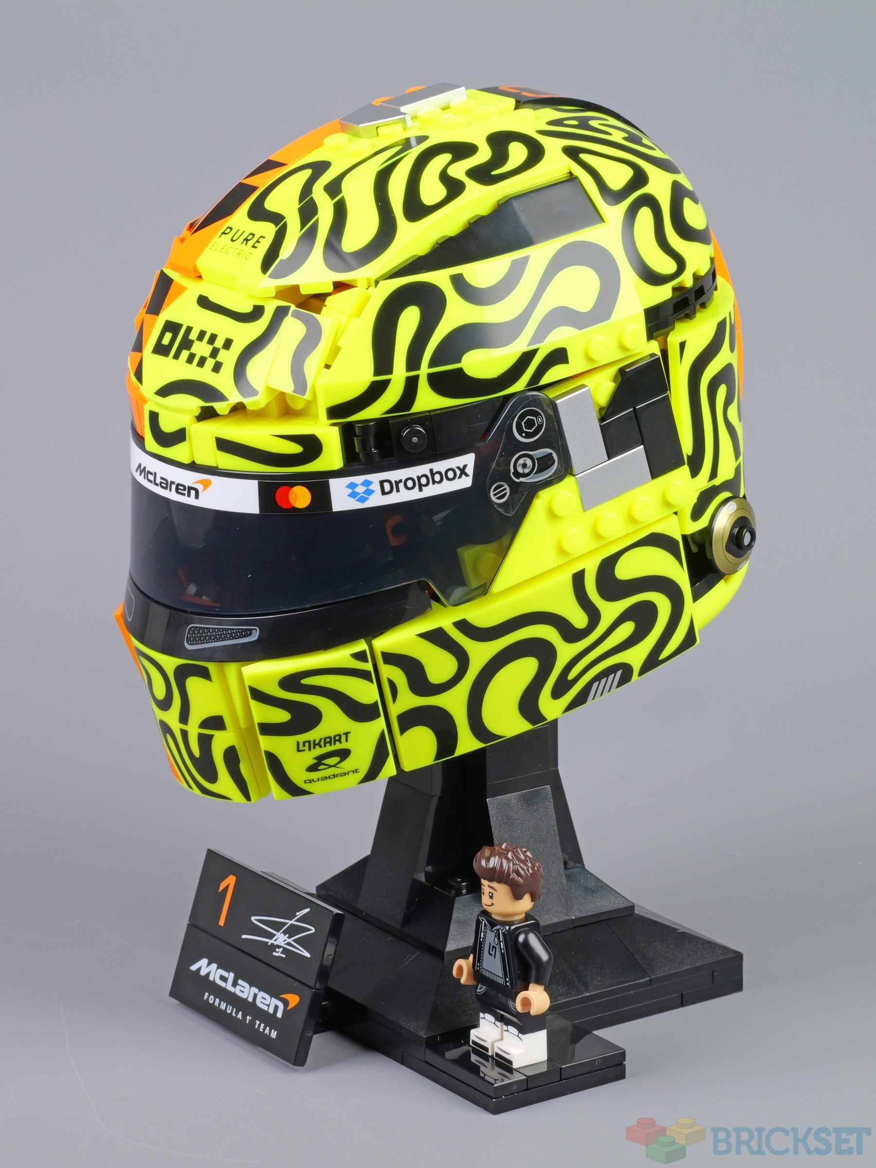
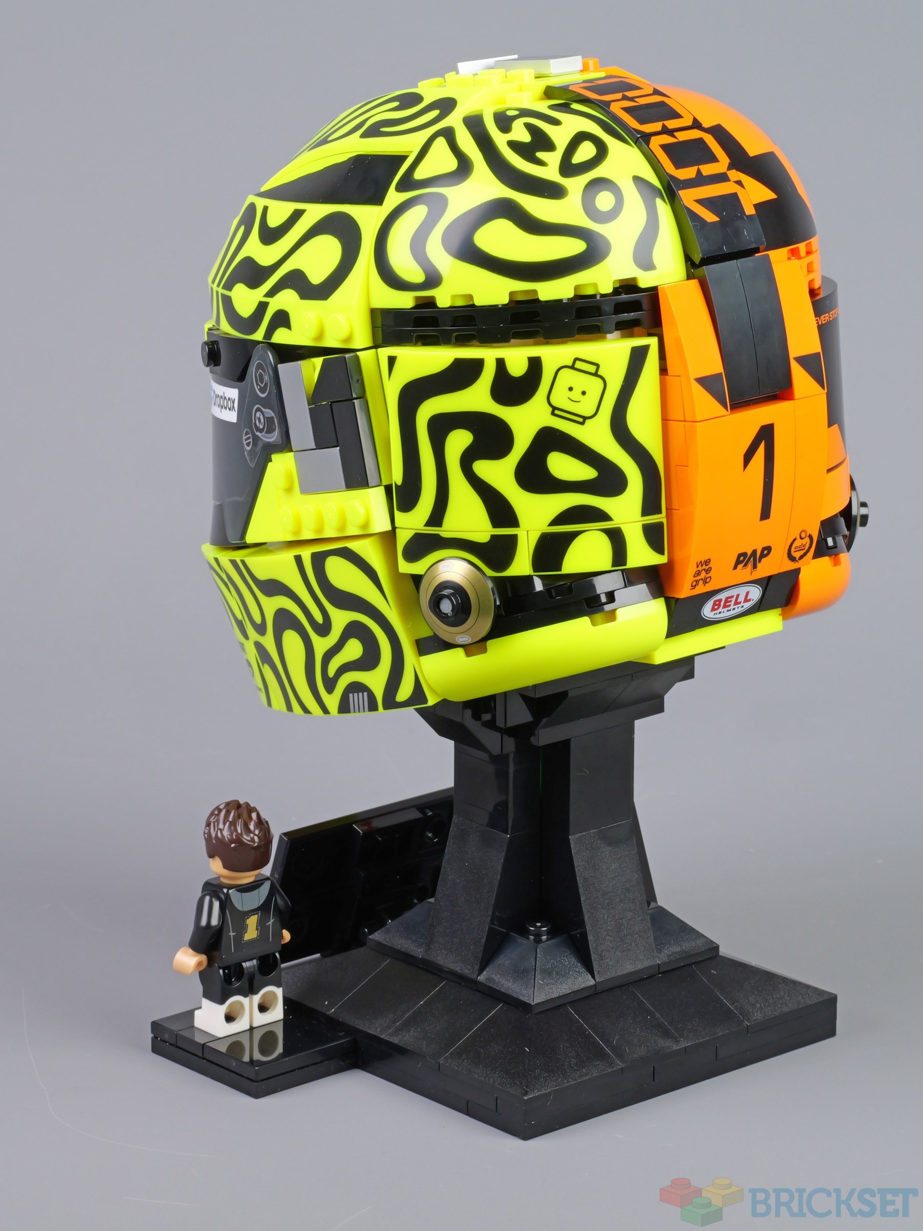
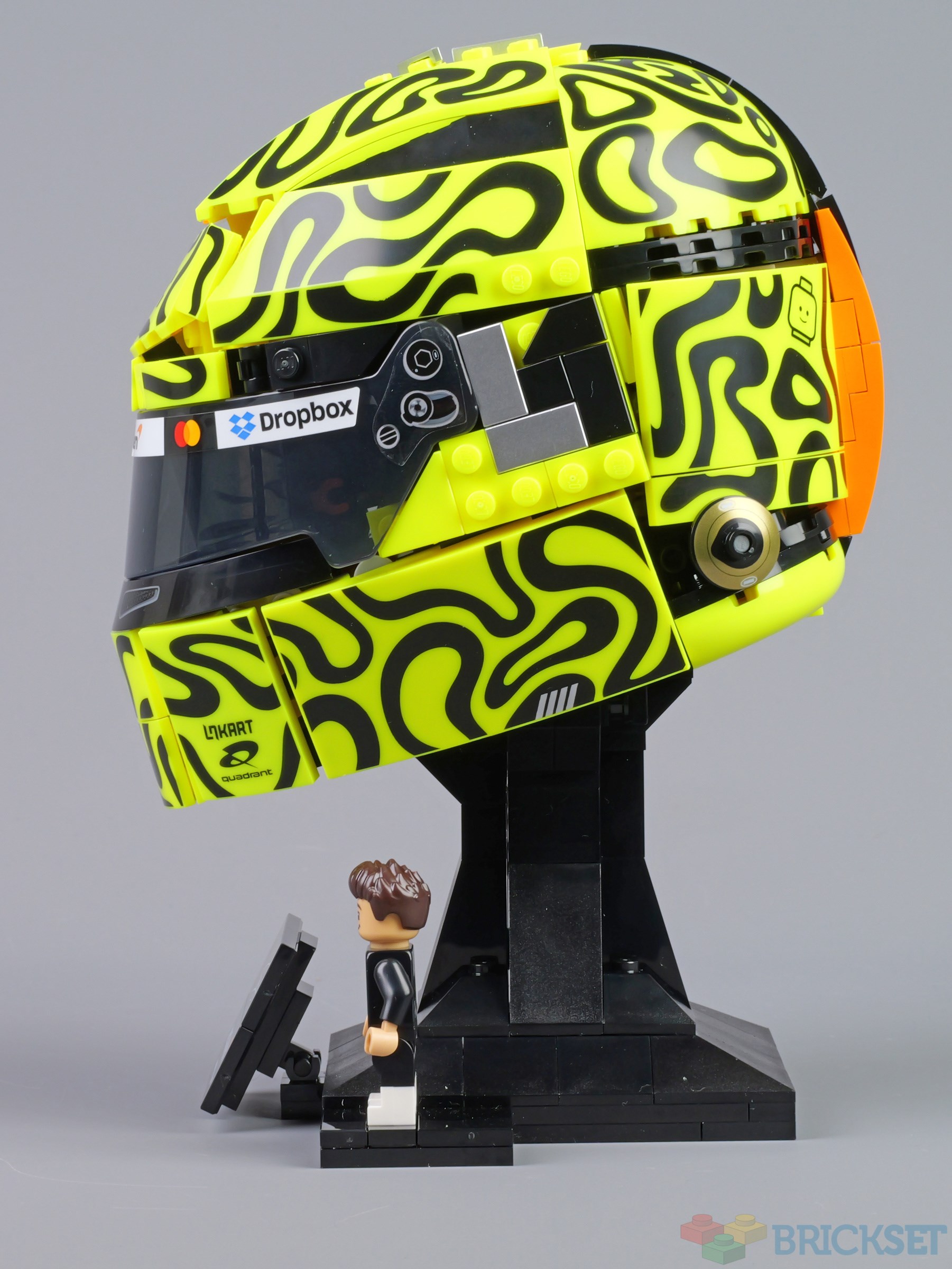
43023 Lando Norris Helmet is one of four Formula 1 Drivers' helmets that have been released this year and what's interesting about this one is that it's a model of the helmet that was worn only once by the British driver, at Monaco this year, to celebrate McLaren's 1000th race.
I'm not going to do a full review because, construction-wise, it's 90% the same as 43014 Charles Leclerc Helmet, which we reviewed fully earlier this year.
Summary
43023 McLaren Mastercard F1 Team Lando Norris Helmet, 793 pieces.
£79.99 / $89.99 / €89.99 | 10.1p, 11.3c, 11.3c per piece.
Buy at LEGO.com »
An eye-catching and attractive display model
- Nearly every decorated part is printed
- Minifigure is not wearing a race suit
The set was provided for review by LEGO. All opinions expressed are those of the author.
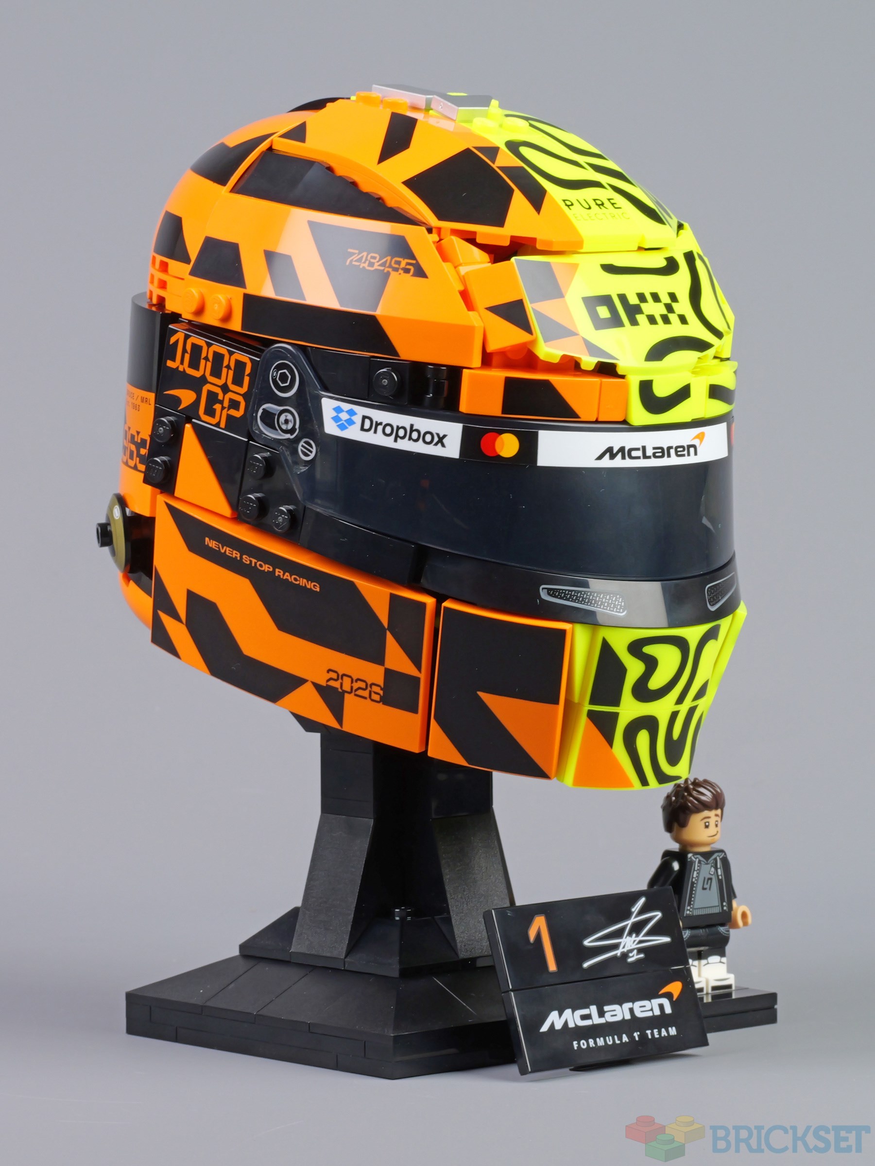
As with the other helmets, all the decorated parts are printed with the exception of the visor, which requires three stickers including a long thin one along the top edge. Recognising that it's tricky to apply, three versions are provided, two full-length, and one split into three for use if all else fails.
Additionally, the sheet provides two 'LN' logo stickers and a driving licence. These can be applied wherever you fancy: on your laptop, tablet, table, walls...

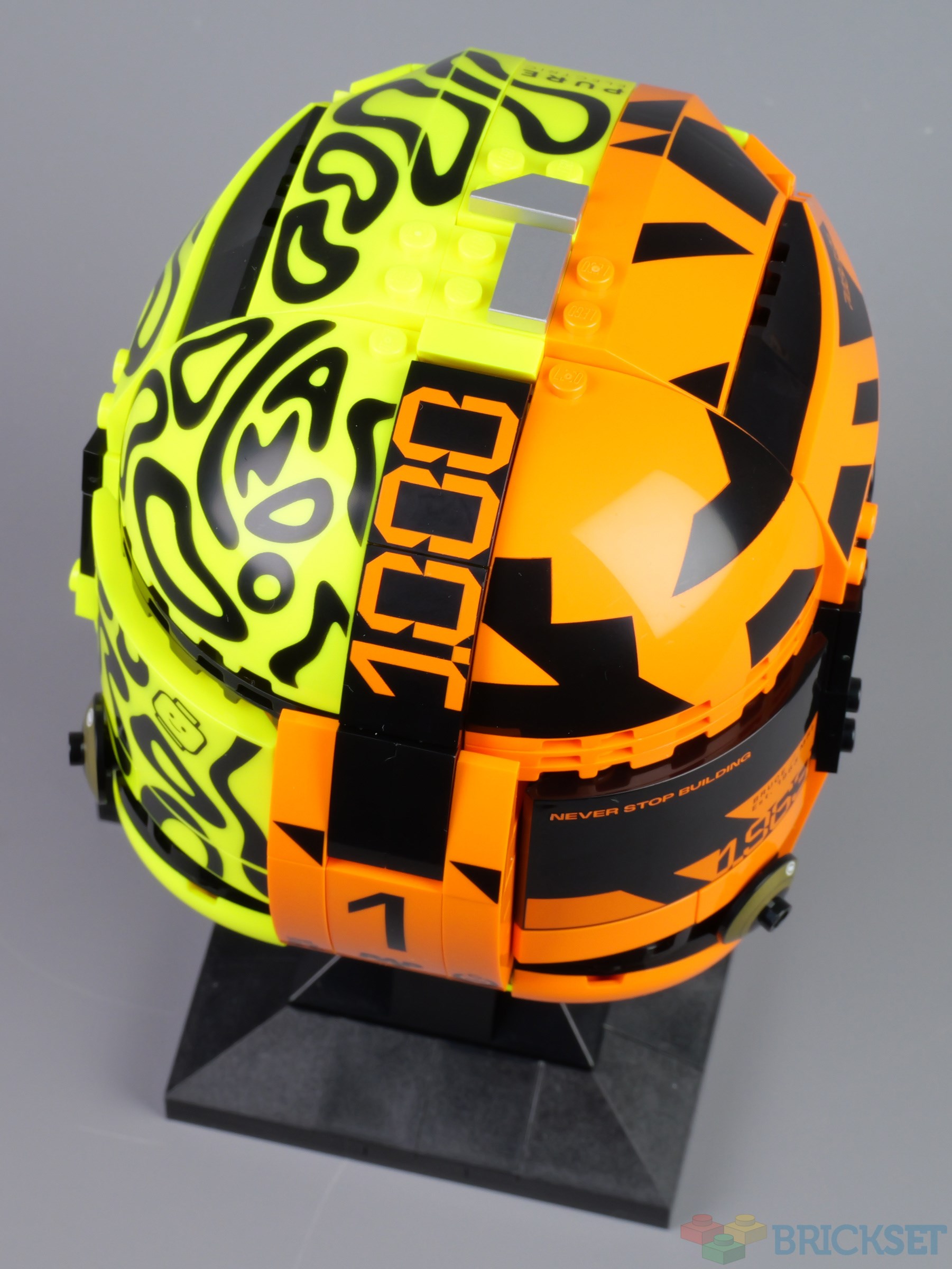
The helmet is structurally very similar to the others, although I think there are some differences to the shape at the back. It also incorporates a silver L on the left side, and a number 1 on the top, indicating Norris is the current world champion.
The orange and, in particular the vibrant yellow, make this an eye-catching model.
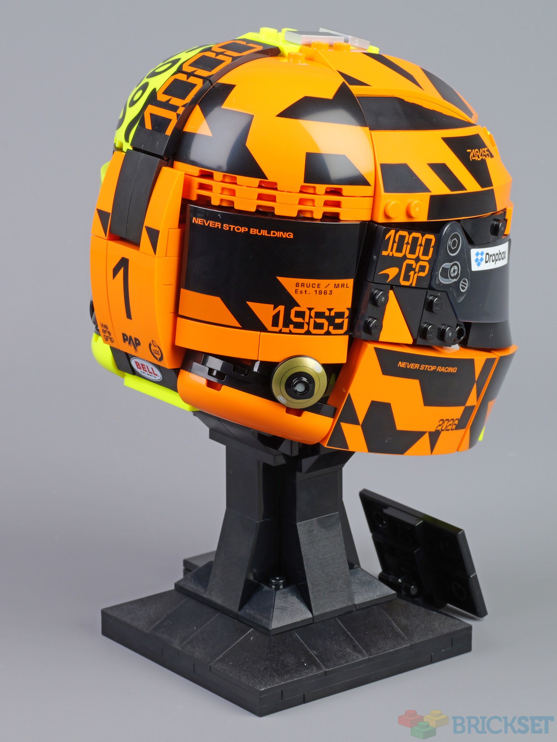
1963 indicated the year that the McLaren team was founded and I suspect the 'Never stop building' text on the back deviates from that on the actual helmet :-)

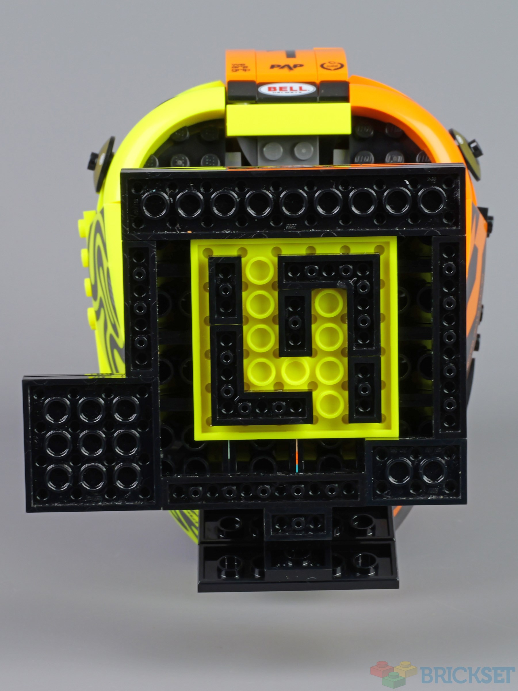
Lando's logo has been incorporated into the base.
What's puzzling about this set, and 43017 Oscar Piastri Helmet, is that the minifigs are dressed in casual clothing rather than race suits, which was the case for the figures in the other two.
Nevertheless, it's a nicely detailed minifigure, with dual-moulded legs.


Despite being pretty much identical in design to the first two helmets, this set has around 90 pieces fewer, but costs the same, $89.99, £79.99, €89.99.
I am sure the four of them will look great on display together and I'll include a photo of them all when we conclude our reviews.
57 likes
53 comments on this article
Does anyone else really dislike this shade of neon yellow? For some reason it looks so cheap and nasty to me.
@Mister_Jonny said:
"Does anyone else really dislike this shade of neon yellow? For some reason it looks so cheap and nasty to me."
I like it. Great accent color. Not great as a main color of big builds. But for a sports theme? Perfect.
@Mister_Jonny said:
"Does anyone else really dislike this shade of neon yellow? For some reason it looks so cheap and nasty to me."
Highlighter Yellow and Eraser Coral are both eye burning and awful in my opinion. I'm also still miffed they replaced Trans-Brown with Trans-Black.
Why are the McLaren pilots not wearing race suits though? Is it because of some weird licensing issue with one of the sponsors? I mean there are plenty of sponsors on the helmets already so you'd think that wouldn't be a big deal.
Seeing the Dropbox logo in a LEGO set is kind of funny to me.
I don't care about these helmet-type sets of any kind, but this one does look good at a first glance. Applying those stickers does seem like a nightmare to me, though. Good thing it mostly has prints!
@ToysFromTheAttic said:
"Seeing the Dropbox logo in a LEGO set is kind of funny to me.
I don't care about these helmet-type sets of any kind, but this one does look good at a first glance. Applying those stickers does seem like a nightmare to me, though. Good thing it mostly has prints!"
"All those stickers"?
Did you read the article?
@Mister_Jonny said:
"Does anyone else really dislike this shade of neon yellow? For some reason it looks so cheap and nasty to me."
That color looks terrible in hand because it's slightly translucent. Hopefully Lego will increase the opacity in the future.
@560heliport said:
" @ToysFromTheAttic said:
"Seeing the Dropbox logo in a LEGO set is kind of funny to me.
I don't care about these helmet-type sets of any kind, but this one does look good at a first glance. Applying those stickers does seem like a nightmare to me, though. Good thing it mostly has prints!"
"All those stickers"?
Did you read the article?"
Yes, I did, and I was referring to those big stickers, which the article points out being a pain.
It's times like these I feel thankful that I don't collect everything...
@Murdoch17 said:
" @Mister_Jonny said:
"Does anyone else really dislike this shade of neon yellow? For some reason it looks so cheap and nasty to me."
Highlighter Yellow and Eraser Coral are both eye burning and awful in my opinion. I'm also still miffed they replaced Trans-Brown with Trans-Black."
@Bmute said:
" @Mister_Jonny said:
"Does anyone else really dislike this shade of neon yellow? For some reason it looks so cheap and nasty to me."
That color looks terrible in hand because it's slightly translucent. Hopefully Lego will increase the opacity in the future."
The three of you are weak and will not survive the winter. I'm sorry you had to find out this way.
Boring—not for me. So many printed parts are just as bad as lots of stickers. If a set relies on printed parts or stickers to be recognizable, that’s bad.
@Mister_Jonny said:
"Does anyone else really dislike this shade of neon yellow? For some reason it looks so cheap and nasty to me."
It's my least favorite LEGO color. I dislike it enough that I'll avoid purchasing sets I like the design of because I find the color so grating ( 60465 ). I love Vibrant Coral, though. So I don't know what it is about Neon Yellow that my eyes detest.
As someone who doesn't care at all about F1, these helmet sets are really cool. I'd love to build one if I ever find them at a steep discount!
@Mister_Jonny said:
"Does anyone else really dislike this shade of neon yellow? For some reason it looks so cheap and nasty to me."
My all-time favorite solid color. In fact, I'm considering buying this set just because of that.
I think that never stop building was on the actual helmet that I saw on the race. The helmet was the recreation of the Lego one with all of the studs and mini figure heads. The only difference is that the real helmet had energy drink logos
@Murdoch17 said:
" @Mister_Jonny said:
"Does anyone else really dislike this shade of neon yellow? For some reason it looks so cheap and nasty to me."
Highlighter Yellow and Eraser Coral are both eye burning and awful in my opinion. I'm also still miffed they replaced Trans-Brown with Trans-Black."
i love Trans-Black personally but i also feel like they definitely need a new Trans-Brown that is, like... actually brown
I would've opted to keep trans-brown alongside trans-black, but then, I would've also opted to keep the trans-neons alongside of or instead of their weak, pale counterparts. I would have gladly sacrificed highlighter yellow, orangish red, and any/all fans of those colours to keep those other colours around.
Vibrant coral, I kind of like. I don't think hardcore fans of vibrant colour need to be sacrificed as kindling. Not immediately, anyway.
This set is a ridiculous eyeblight, but if I'm honest, I wouldn't even have liked this if it came in Blacktron-colours.
@person_that_uses_brickset said:
"I think that never stop building was on the actual helmet that I saw on the race. The helmet was the recreation of the Lego one with all of the studs and mini figure heads. The only difference is that the real helmet had energy drink logos "
Another –inexplicable– difference is that the actual helmet has a LEGO-logo, that is absent on the model.
Can we see an image of this helmet under a blacklight? It might be blinding but worth it.
I'm prepared to bet real money that they couldn't put the minifig in the race suit because of some branding or licensing issue with logos that are on the suit but not on the helmet.
I do still like the concept of these, and actually think this might be the best of the bunch so far.....it's just that in the grand scheme of things, Lando is not really on top of my list. Have already seen them discounted below €70, and while that in itself doesn't seem unreasonable, that's not what I would pay just to collect them all.
So, next Verstappen and Alonso? And then some oldies? I'd buy those....
@Brickemans said:
" @person_that_uses_brickset said:
"I think that never stop building was on the actual helmet that I saw on the race. The helmet was the recreation of the Lego one with all of the studs and mini figure heads. The only difference is that the real helmet had energy drink logos "
Another –inexplicable– difference is that the actual helmet has a LEGO-logo, that is absent on the model."
Where was it located? Is there any chance you can put the lego print that is inside the set in the correct spot?
I think the biggest surprise to me with this set is learning that "Lando" is an actual real-world name, I had always assumed it was entirely made up for Star Wars...
@ThatBionicleGuy said:
"I think the biggest surprise to me with this set is learning that "Lando" is an actual real-world name, I had always assumed it was entirely made up for Star Wars..."
Me, too.
Ah, Lando Norris, the secret crossover child of the martial arts scene and a certain space opera.
@ThatBionicleGuy said:
"I think the biggest surprise to me with this set is learning that "Lando" is an actual real-world name, I had always assumed it was entirely made up for Star Wars..."
There has even been a Pope Lando......over a millennium ago and only for about half a year, but still...
@Murdoch17 said:
" @Mister_Jonny said:
"Does anyone else really dislike this shade of neon yellow? For some reason it looks so cheap and nasty to me."
Highlighter Yellow and Eraser Coral are both eye burning and awful in my opinion. I'm also still miffed they replaced Trans-Brown with Trans-Black."
I don't mind the new opaque colours even though I agree that the material of the neon yellow looks particularly cheap and crappy, but I don't mind the colour per se.
What I do absolutely hate with a vengeance is every Trans colour these days. Ever since LEGO changed the material I think all Trans colours look kind of matte and milky, with Trans-clear being the worst of the bunch. I think it actually looks disgusting, with its non-clear, milky-purple, almost like it was made out of the material that usually comes out of the male reproductive organ.
Yuck.
Have you ever put Vibrant Yellow parts under a UV blacklight? It's sooo bright - like, 'brighter than the sun' bright!
@Paperballpark said:
"Have you ever put Vibrant Yellow parts under a UV blacklight? It's sooo bright - like, 'brighter than the sun' bright!"
Do I want to purposely discolour my LEGO pieces? Generally speaking, no, I do not.
Highlighter Yellow though... yeah, sure, absolutely.
You can’t fail to be impressed by the ambition of tackling the geometry in this way. Indeed it’s hard to imagine even ten years ago that LEGO would put into production a system model this far away from the studs on top model. Kudos to the designers!
Captain Snot of Clone Troop Booger Division reporting for duty, sir.
@jsutton said:
"You can’t fail to be impressed by the ambition of tackling the geometry in this way. Indeed it’s hard to imagine even ten years ago that LEGO would put into production a system model this far away from the studs on top model. Kudos to the designers!"
They are LEGO engineering masterpieces.
@FARLANDER said:
"Boring—not for me. So many printed parts are just as bad as lots of stickers. If a set relies on printed parts or stickers to be recognizable, that’s bad."
Are you saying you wouldn't know this was a helmet if it didn't have the prints?
@ThatBionicleGuy said:
"I think the biggest surprise to me with this set is learning that "Lando" is an actual real-world name, I had always assumed it was entirely made up for Star Wars..."
Lando’s not a system. He’s a man.
@monty_bricks said:
" @FARLANDER said:
"Boring—not for me. So many printed parts are just as bad as lots of stickers. If a set relies on printed parts or stickers to be recognizable, that’s bad."
Are you saying you wouldn't know this was a helmet if it didn't have the prints?"
Hahaha ;-p
Lando! Lando system? Lando's not a system he's a man. Lando Calrissian....card player, gambler, scoundrel......you'd like him.
@AustinPowers said:
" @Murdoch17 said:
" @Mister_Jonny said:
"Does anyone else really dislike this shade of neon yellow? For some reason it looks so cheap and nasty to me."
Highlighter Yellow and Eraser Coral are both eye burning and awful in my opinion. I'm also still miffed they replaced Trans-Brown with Trans-Black."
I don't mind the new opaque colours even though I agree that the material of the neon yellow looks particularly cheap and crappy, but I don't mind the colour per se.
What I do absolutely hate with a vengeance is every Trans colour these days. Ever since LEGO changed the material I think all Trans colours look kind of matte and milky, with Trans-clear being the worst of the bunch. I think it actually looks disgusting, with its non-clear, milky-purple, almost like it was made out of the material that usually comes out of the male reproductive organ.
Yuck. "
the fact that you even write this and get so worked up about LEGO changing some colours shows that you might think about having your head imagined.
@MrBedhead said:
" @AustinPowers said:
" @Murdoch17 said:
" @Mister_Jonny said:
"Does anyone else really dislike this shade of neon yellow? For some reason it looks so cheap and nasty to me."
Highlighter Yellow and Eraser Coral are both eye burning and awful in my opinion. I'm also still miffed they replaced Trans-Brown with Trans-Black."
I don't mind the new opaque colours even though I agree that the material of the neon yellow looks particularly cheap and crappy, but I don't mind the colour per se.
What I do absolutely hate with a vengeance is every Trans colour these days. Ever since LEGO changed the material I think all Trans colours look kind of matte and milky, with Trans-clear being the worst of the bunch. I think it actually looks disgusting, with its non-clear, milky-purple, almost like it was made out of the material that usually comes out of the male reproductive organ.
Yuck. "
the fact that you even write this and get so worked up about LEGO changing some colours shows that you might think about having your head imagined."
So you can't see that the new "Trans-mik" looks nothing like the old, crystal-clear transparent. Likewise the other new Trans colours, where the old ones looked almost as shiny as gemstones?
Maybe you should have your eyes examined then.
We are supposed to pay premium prices for premium quality with LEGO.
The new trans material looks like what cheap knockoffs like Lepin used to use. Cheap and nasty.
@MrBedhead said:
" @AustinPowers said:
" @Murdoch17 said:
" @Mister_Jonny said:
"Does anyone else really dislike this shade of neon yellow? For some reason it looks so cheap and nasty to me."
Highlighter Yellow and Eraser Coral are both eye burning and awful in my opinion. I'm also still miffed they replaced Trans-Brown with Trans-Black."
I don't mind the new opaque colours even though I agree that the material of the neon yellow looks particularly cheap and crappy, but I don't mind the colour per se.
What I do absolutely hate with a vengeance is every Trans colour these days. Ever since LEGO changed the material I think all Trans colours look kind of matte and milky, with Trans-clear being the worst of the bunch. I think it actually looks disgusting, with its non-clear, milky-purple, almost like it was made out of the material that usually comes out of the male reproductive organ.
Yuck. "
the fact that you even write this and get so worked up about LEGO changing some colours shows that you might think about having your head imagined."
I'm trying to imagine his head but I can only picture Mike Myers.
The helmet looks like how nausea feels.
Kudos to the designers because it's a masterpiece in how it's engineered probably. And there's so many printed parts!
I'm just... going to look away from it now
I love vibrant coral and like vibrant yellow just fine. Bright colours make me happy.
@AustinPowers said:
" @Murdoch17 said:
" @Mister_Jonny said:
"Does anyone else really dislike this shade of neon yellow? For some reason it looks so cheap and nasty to me."
Highlighter Yellow and Eraser Coral are both eye burning and awful in my opinion. I'm also still miffed they replaced Trans-Brown with Trans-Black."
I don't mind the new opaque colours even though I agree that the material of the neon yellow looks particularly cheap and crappy, but I don't mind the colour per se.
What I do absolutely hate with a vengeance is every Trans colour these days. Ever since LEGO changed the material I think all Trans colours look kind of matte and milky, with Trans-clear being the worst of the bunch. I think it actually looks disgusting, with its non-clear, milky-purple, almost like it was made out of the material that usually comes out of the male reproductive organ.
Yuck. "
i just miss trans neon orange and green
@Elrond said:
"Why are the McLaren pilots not wearing race suits though? Is it because of some weird licensing issue with one of the sponsors? I mean there are plenty of sponsors on the helmets already so you'd think that wouldn't be a big deal."
According to Oscar Piastri, they were asked what they wanted their minifigs to wear instead of the race suit. Both drivers went with outfits they would wear any day of the week
The 'Never Stop Building' line is a riff on McLaren slogan this year, which is 'Never Stop Racing', which is ironic considering how the season's been going in terms of reliability.
Still mourning the missed opportunity of a full blobs helmet and the minifig in a racesuit. (at least his outfit is Monaco 2025-inspired.) (And they apparently chose the hair piece themselves, but I still disagree with Lando's.)
(and fluro-yellow being that divisive a colour is actually hilarious, you either love it or hate it)
I'd be interested to see what some MOCer could do with those printed pieces.
@560heliport said:
" @ToysFromTheAttic said:
"Seeing the Dropbox logo in a LEGO set is kind of funny to me.
I don't care about these helmet-type sets of any kind, but this one does look good at a first glance. Applying those stickers does seem like a nightmare to me, though. Good thing it mostly has prints!"
"All those stickers"?
Did you read the article?"
Did you read the comment you're replying too? The phrase "all those stickers" does not appear in it, just "those stickers."
@JustinPepsiman said:
"According to Oscar Piastri, they were asked what they wanted their minifigs to wear instead of the race suit. Both drivers went with outfits they would wear any day of the week"
Interesting, though from a business standpoint it makes the sets a little less attractive imo. I think a lot of people would have liked to combine the pilots with the F1 cars from last year.
@TheOtherMike said:
"I'd be interested to see what some MOCer could do with those printed pieces.
@560heliport said:
" @ToysFromTheAttic said:
"Seeing the Dropbox logo in a LEGO set is kind of funny to me.
I don't care about these helmet-type sets of any kind, but this one does look good at a first glance. Applying those stickers does seem like a nightmare to me, though. Good thing it mostly has prints!"
"All those stickers"?
Did you read the article?"
Did you read the comment you're replying too? The phrase "all those stickers" does not appear in it, just "those stickers.""
It was edited after I commented.
@560heliport said:
" @TheOtherMike said:
"I'd be interested to see what some MOCer could do with those printed pieces.
@560heliport said:
" @ToysFromTheAttic said:
"Seeing the Dropbox logo in a LEGO set is kind of funny to me.
I don't care about these helmet-type sets of any kind, but this one does look good at a first glance. Applying those stickers does seem like a nightmare to me, though. Good thing it mostly has prints!"
"All those stickers"?
Did you read the article?"
Did you read the comment you're replying too? The phrase "all those stickers" does not appear in it, just "those stickers.""
It was edited after I commented."
But the quote in your comment still doesn't have the word "all" in it.
@TheOtherMike said:
" @560heliport said:
" @TheOtherMike said:
"I'd be interested to see what some MOCer could do with those printed pieces.
@560heliport said:
" @ToysFromTheAttic said:
"Seeing the Dropbox logo in a LEGO set is kind of funny to me.
I don't care about these helmet-type sets of any kind, but this one does look good at a first glance. Applying those stickers does seem like a nightmare to me, though. Good thing it mostly has prints!"
"All those stickers"?
Did you read the article?"
Did you read the comment you're replying too? The phrase "all those stickers" does not appear in it, just "those stickers.""
It was edited after I commented."
But the quote in your comment still doesn't have the word "all" in it."
Note that the original comment has been deleted, as well.
Oops, no, I can't see it because I've blocked comments from that individual.
@560heliport said:
" @TheOtherMike said:
" @560heliport said:
" @TheOtherMike said:
"I'd be interested to see what some MOCer could do with those printed pieces.
@560heliport said:
" @ToysFromTheAttic said:
"Seeing the Dropbox logo in a LEGO set is kind of funny to me.
I don't care about these helmet-type sets of any kind, but this one does look good at a first glance. Applying those stickers does seem like a nightmare to me, though. Good thing it mostly has prints!"
"All those stickers"?
Did you read the article?"
Did you read the comment you're replying too? The phrase "all those stickers" does not appear in it, just "those stickers.""
It was edited after I commented."
But the quote in your comment still doesn't have the word "all" in it."
Note that the original comment has been deleted, as well."
Two incorrect claims in a row. :'-) Also, not worth the fuss.
This comment section is a disaster from start to finish. And yes, that includes my comments.
@Andrusi said:
"This comment section is a disaster from start to finish. And yes, that includes my comments."
but your winter comment was the best!! :D
Lando Norris was born in 1999.
So, we can assume, his parents were born somewhere in the 60s or 70s.
And we might assume they grew up with certain movies, which might have inspired their choice for a childs name - although, they might of course also be some catholic nostalgics! :D