LEGO Ideas: Original Projects vs. Final Sets
Posted by CapnRex101,
LEGO Ideas models routinely feature changes when compared with the projects which inspire official products. However, the significance and magnitude of these alterations definitely varies.
The sudden emergence of 21325 Medieval Blacksmith has elicited discussion concerning its divergence from the original Ideas submission. However, examining past models reveals some sets which deviated further from their source material while others remain consistent. We have therefore scored each product according to the adjustments which were necessary.
21100 Shinkai Submarine 6500
Shinkai Expedition by at_guy
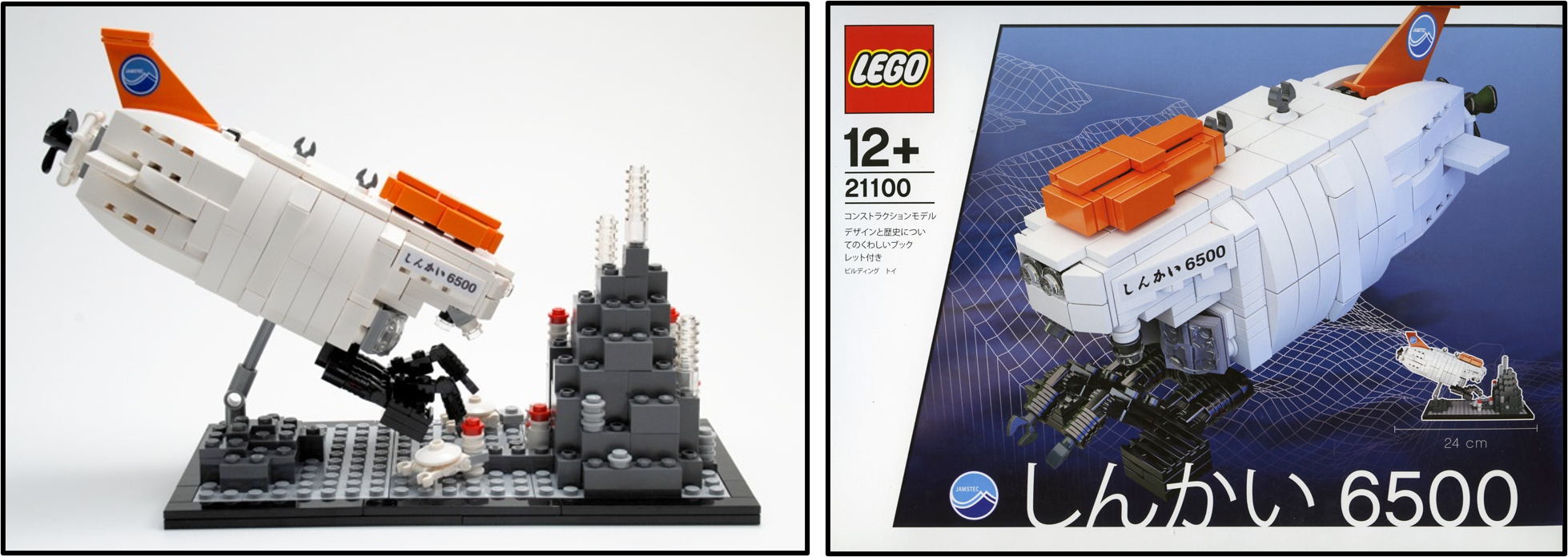
Similarity Score - 10/10 - The first LEGO Cuusoo product was launched during December, 2010. Remarkably, 21100 Shinkai Submarine 6500 exhibits no outward alterations from the original project, featuring an identical submarine and environment for exploration. This is the only product without any apparent changes.
21101 Hayabusa
Asteroid Exploration Spacecraft Hayabusa by daisuke
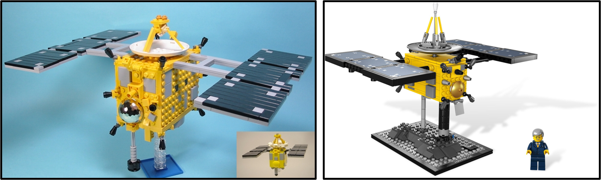
Similarity Score - 3/10 - Immediately following an instance of particular fidelity to the original design, LEGO demonstrated their willingness to develop something very different with 21101 Hayabusa. The final spacecraft is constructed between the two scales that were proposed by daisuke and its building techniques are entirely different, although some details were retained.
21102 Minecraft Micro World: The Forest
LEGO Minecraft by mojang
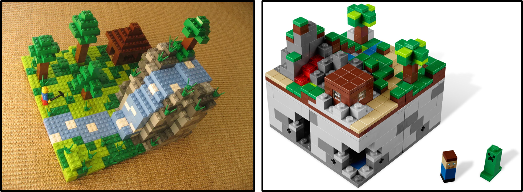
Similarity Score - 1/10 - Fundamentally, the unusual 21102 Minecraft Micro World: The Forest shares almost nothing with the project that inspired its release, except for the Minecraft theme. The scale was altered dramatically and the biome was expanded to incorporate further variety, including underground caves.
21103 The DeLorean Time Machine
Back to the Future (BTTF) - DeLorean Time Machine by m.togami
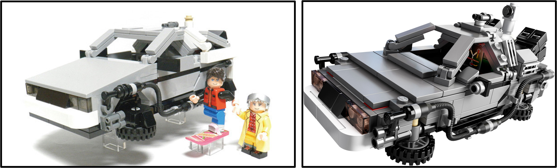
Similarity Score - 4/10 - Scale was established by m.togami's creation and particular details remained consistent until the completed design. However, the broader structure was altered considerably, most notably across the bonnet where the smooth 6x8 slope was swapped for several tiles. Many people were disappointed with the updated design.
21104 NASA Mars Science Laboratory Curiosity Rover
Mars Science Laboratory Curiosity Rover by Perijove
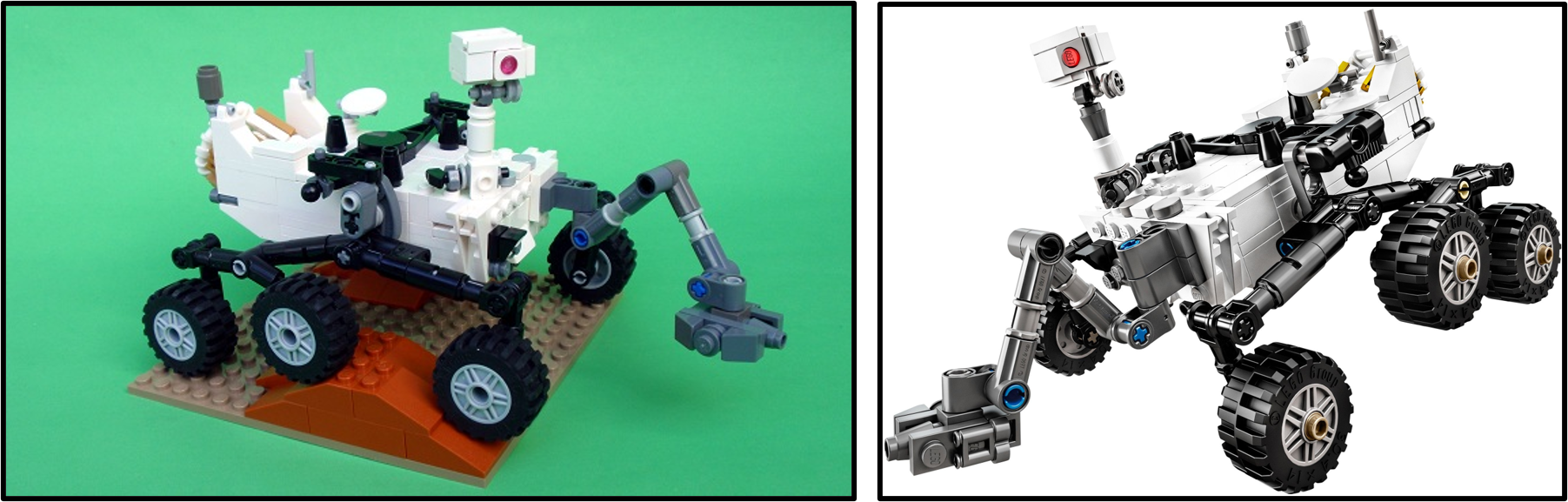
Similarity Score - 9/10 - Adjustments to Perijove's submission are almost completely cosmetic, replacing certain Technic elements with direct equivalents. In fact, the only obvious difference relates to the surface beneath the rover, where Martian dark orange elements were replaced with dark bluish grey components.
21108 Ghostbusters - Ecto-1
Ghostbusters 30th Anniversary by BrentWaller
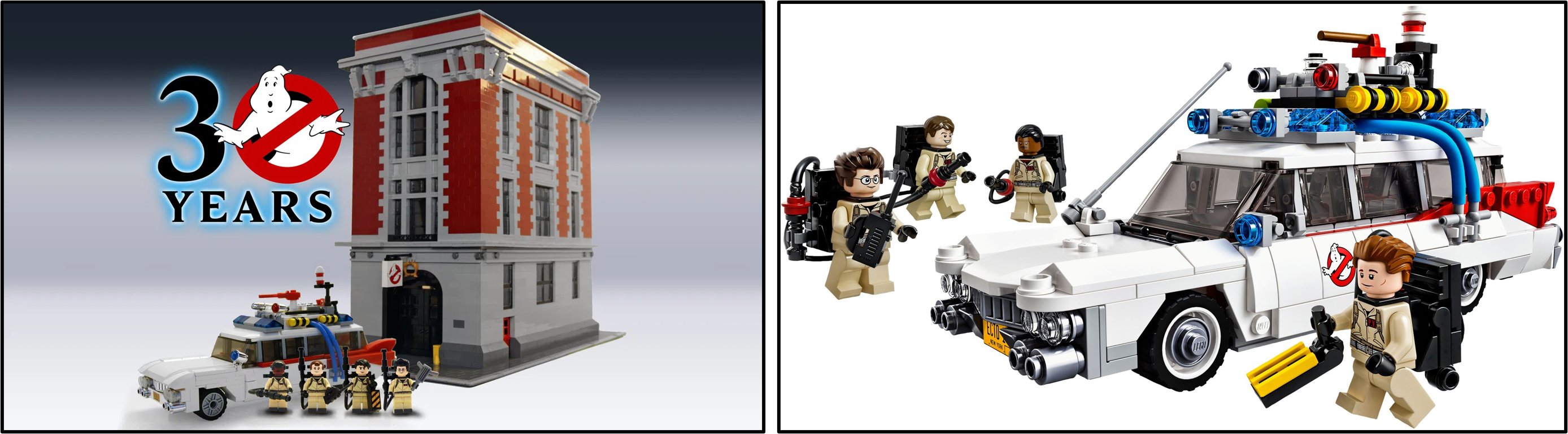
Similarity Score - 3/10 - BrentWaller's submission focused rather broadly upon Ghostbusters, including the renowned firehouse along with the ECTO-1. While the firehouse was completely omitted, the official ECTO-1 exhibits some intriguing similarities to the original model, including the window assembly and external bodywork.
21109 Exo Suit
Exo Suit by PeterReid
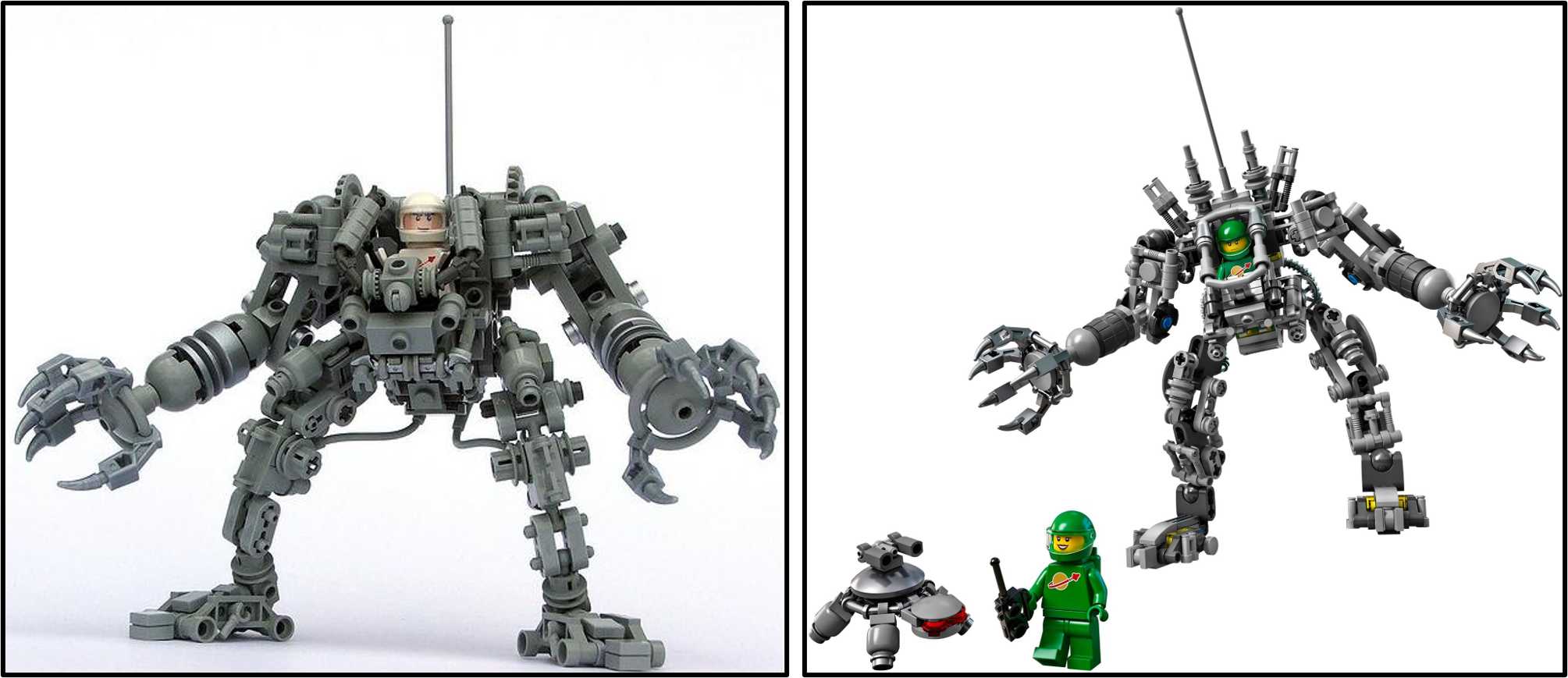
Similarity Score - 6/10 - Numerous details from PeterReid's original Exo Suit were retained when 21109 Exo Suit was created, as one might envisage as Peter Reid and Mark Stafford worked closely to develop the revised design. However, the structure required considerable strengthening and certain features were evidently lost in the transition.
21110 Research Institute
Female Minifigure Set by Alatariel
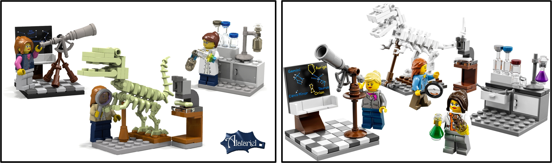
Similarity Score - 8/10 - Other than switching the dinosaur skeleton from tan to white, the most prominent change here relates to the product name. Presumably it was decided that the name 'Female Minifigure Set' may lessen its appeal to boys interested in the sciences. However, the essential concept and design remained the same.
21301 Birds
LEGO Bird Project by DeTomaso
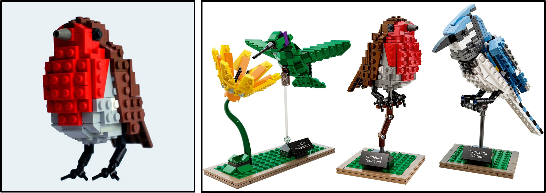
Similarity Score - 9/10 - 21301 Birds remained incredibly close to DeTomaso's original avian creations, changing only minor details and the presentation of the three models. However, the building techniques remained outwardly identical and the birds which LEGO selected were also those presented most prominently in the LEGO Ideas project.
21302 The Big Bang Theory
The Big Bang Theory by Alatariel
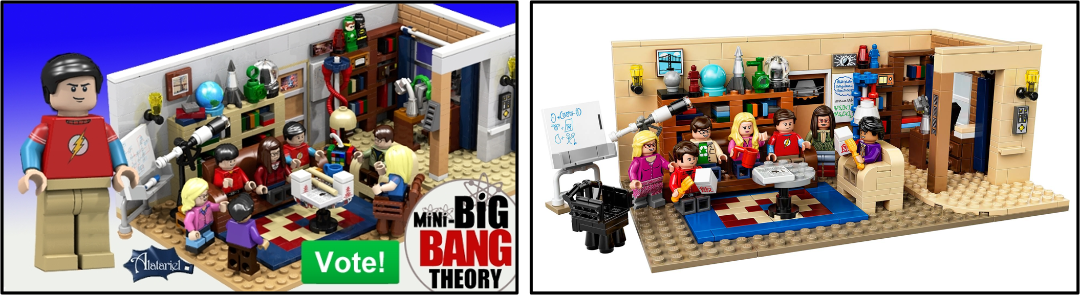
Similarity Score - 8/10 - LEGO updated the wall colour when designing 21302 The Big Bang Theory and the furnishings were adjusted as well. However, the size and shape of the model remained unaltered between Alatariel's design and the final product, focusing upon exactly the same section of Leonard and Sheldon's onscreen apartment.
21303 WALL•E
WALL•E by MacLane
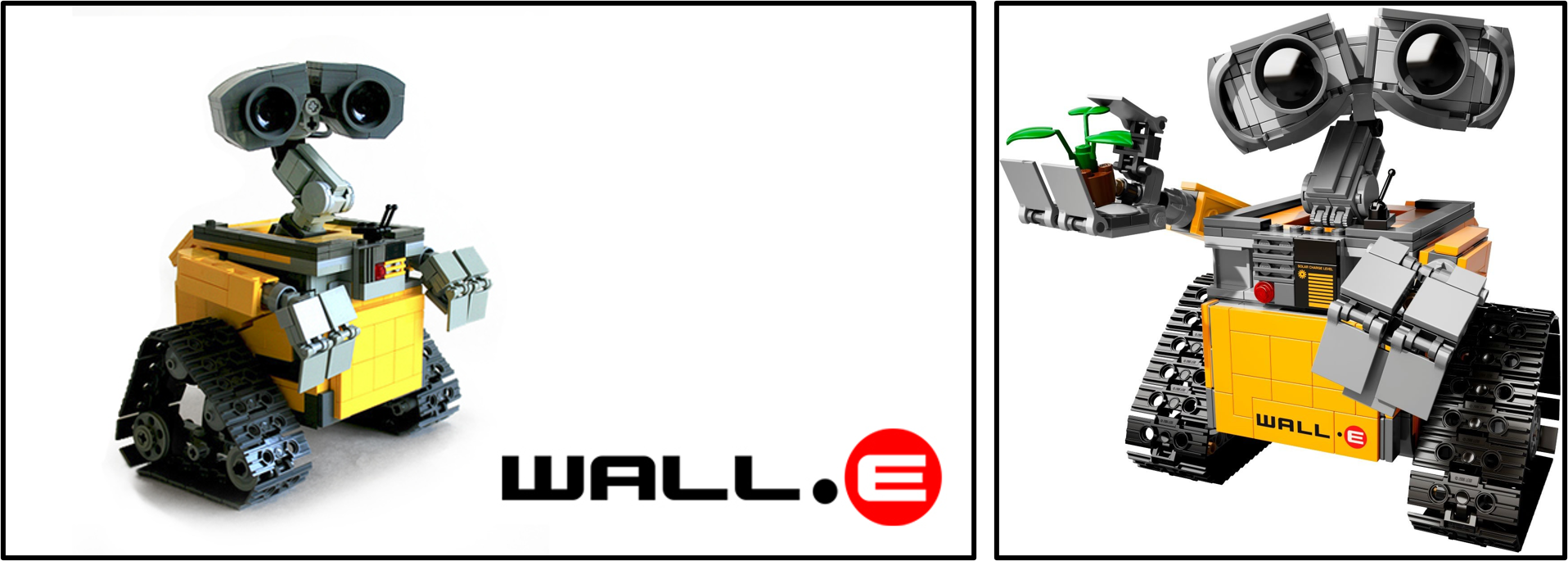
Similarity Score - 7/10 - The fundamental shape and scale of 21303 WALL•E was established by MacLane too. The finalised design featured several printed pieces which were omitted from the original model but the most substantive difference surrounds the eyes, which included much greater detail and more accurate shaping after revision from LEGO designers.
21304 Doctor Who
Doctor Who and Companions by AndrewClark2
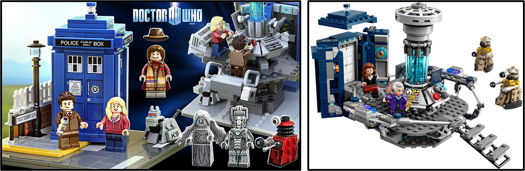
Similarity Score - 7/10 - 21304 Doctor Who faithfully replicated the concept proposed by AndrewClark2, featuring an opening TARDIS which could connect to the internal console. Moreover, certain subtle details remained consistent between the two models but the Dalek design was updated dramatically and the Totters Lane base was omitted.
21305 Maze
Labyrinth Marble Maze by JKBrickworks
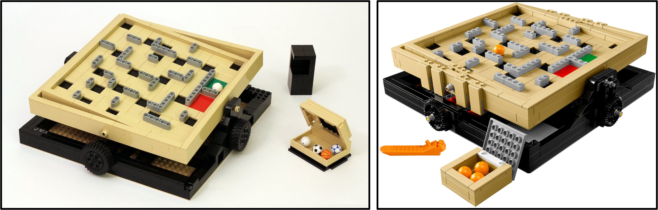
Similarity Score - 9/10 - JKBrickworks outstanding marble maze required few adjustments to become 21305 Maze. Technic barriers which divided the maze were replaced with bricks and the framing structure was strengthened slightly. Otherwise, the scale, mechanism and colours remained completely intact throughout the development process.
21306 The Beatles Yellow Submarine
Beatles Yellow Submarine by kevinszeto
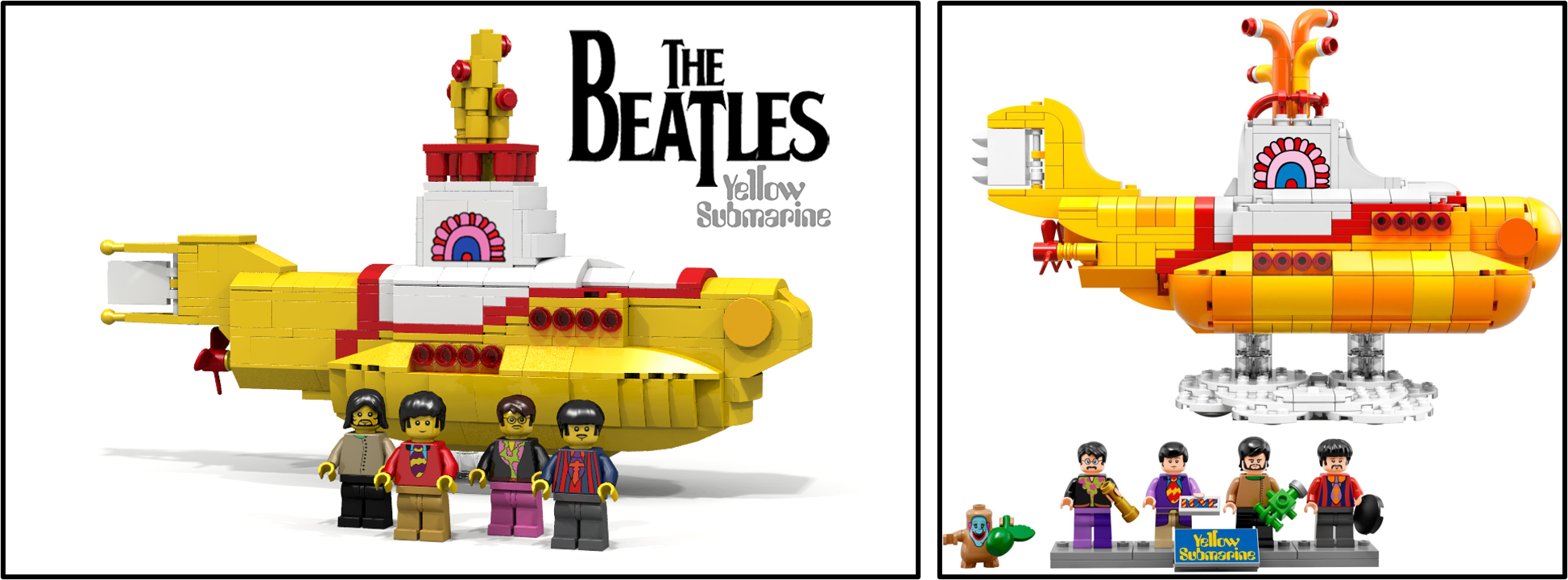
Similarity Score - 6/10 - Despite remaining at the same scale and including similar colours, 21306 The Beatles Yellow Submarine demonstrates remarkable deviation from the original project which inspired the model. The proportions were altered and the curved shaping was greatly improved. However, the transition between yellow and white sections and the rows of windows each remained unaltered.
21307 Caterham Seven 620R
Caterham Super Seven by bricktrix_Carl
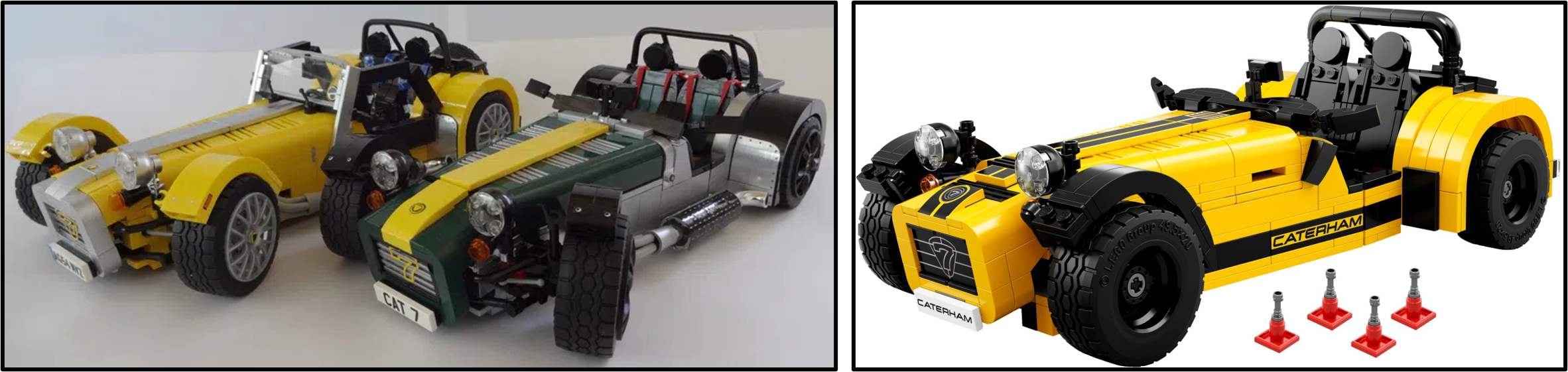
Similarity Score - 7/10 - The building techniques employed for 21307 Caterham Seven 620R were borrowed directly from bricktrix_Carl's racing creation, hence their proportions remained absolutely identical. However, fewer decorations appeared on the final model and some details were simplified to ensure reasonable sturdiness and ease of construction.
21308 Adventure Time
Brick-built Adventure Time Figures by aBetterMonkey
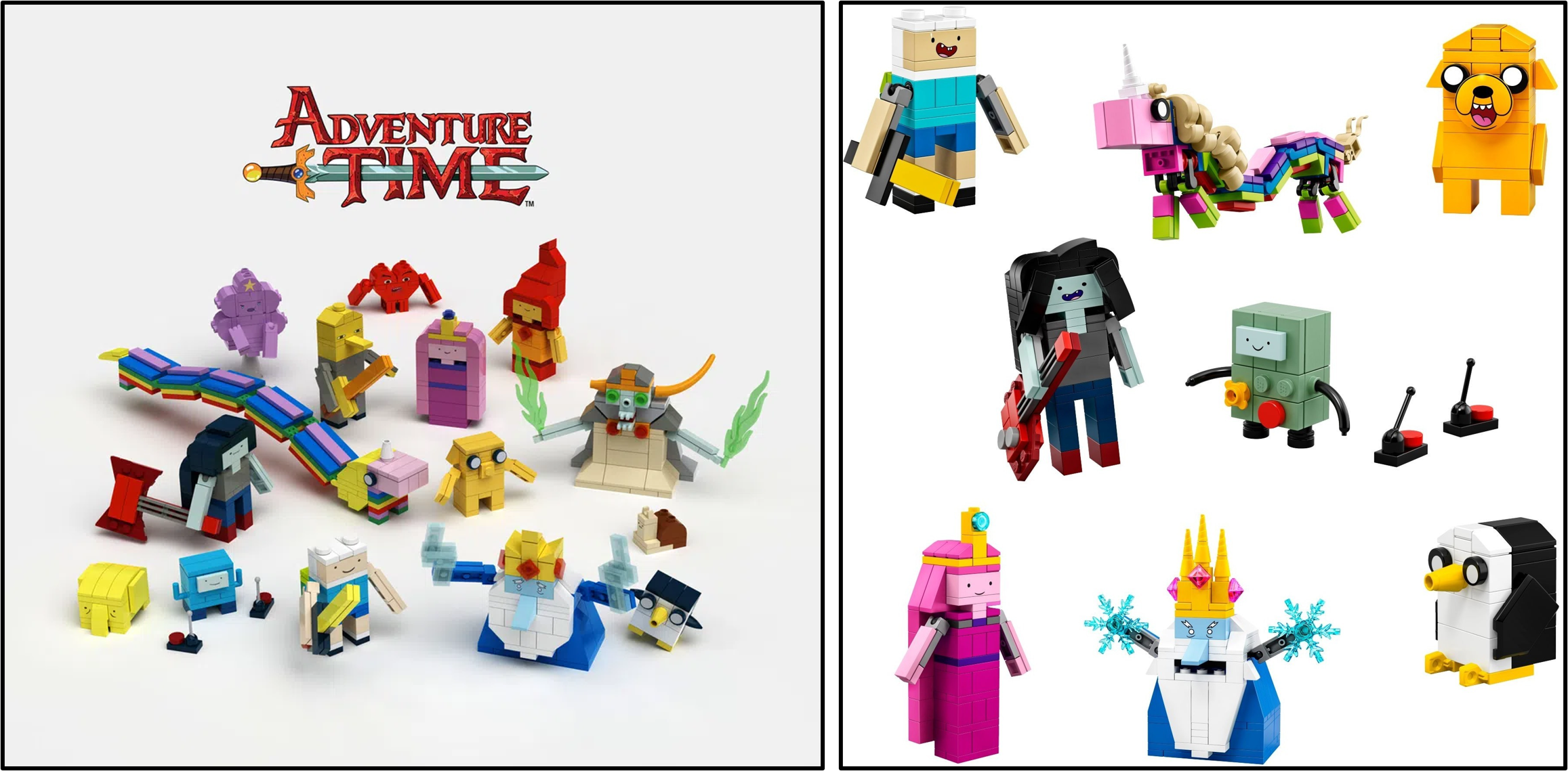
Similarity Score - 7/10 - The project created by aBetterMonkey established a consistent scale and design style which was retained for 21308 Adventure Time. Many construction techniques were shared between the original submission and the revised model, although some characters were excluded and the more complicated figures exhibited notable alterations.
21309 NASA Apollo Saturn V
Apollo 11 Saturn-V by saabfan

Similarity Score - 7/10 - 21309 NASA Apollo Saturn V is certainly among the most successful Ideas sets, hence its return as 92176 NASA Apollo Saturn V during 2020. The original model from LEGO Ideas established the scale and separation functionality which would be retained with the revised model, although the building techniques were predominantly changed.
21310 Old Fishing Store
Old Fishing Store by RobenAnne
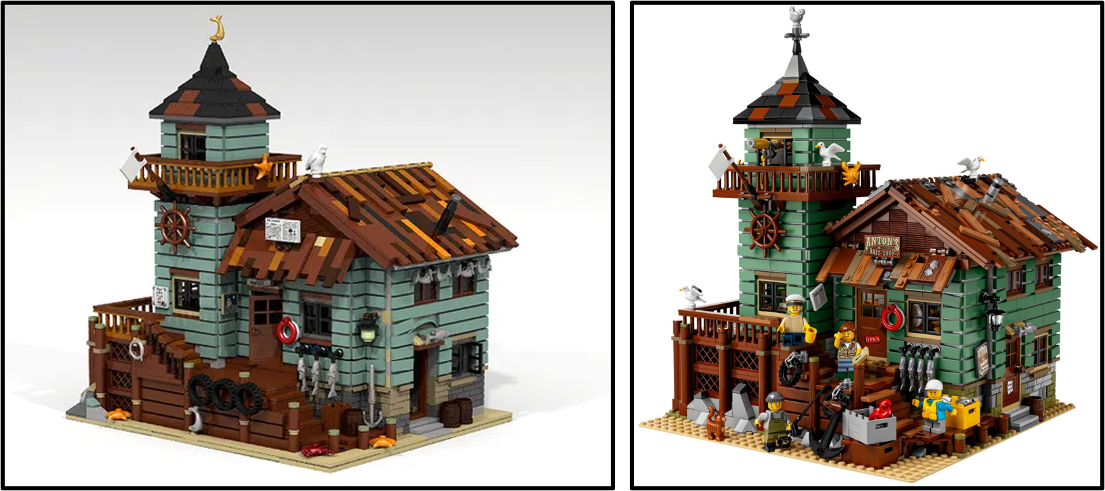
Similarity Score - 9/10 - Once again, RobenAnne's detailed creation presented an appropriate size and layout for 21310 Old Fishing Store and both designs capture ramshackle detail. Their shape does differ slightly but the colours and multitudinous external features appeared on both the proposed model and the final product.
21311 Voltron
Voltron - Defender of the Universe by len_d69
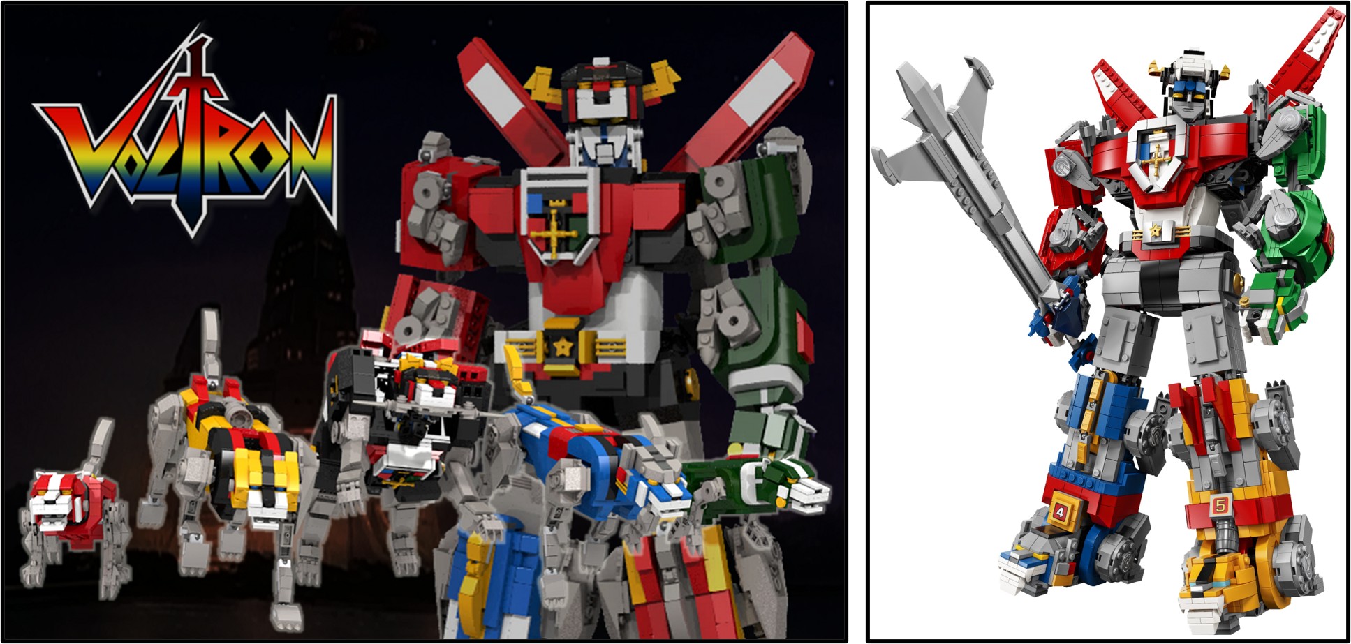
Similarity Score - 5/10 - Mechs have always presented numerous design challenges, the most renowned of which is maintaining stability while including some articulation. 21311 Voltron was especially vulnerable to these issues based upon its size, hence the final model featured many changes from len_d69's project. However, the scale remained the same and certain tiny details are visible on both designs.
21312 Women of NASA
Women of NASA by 20tauri
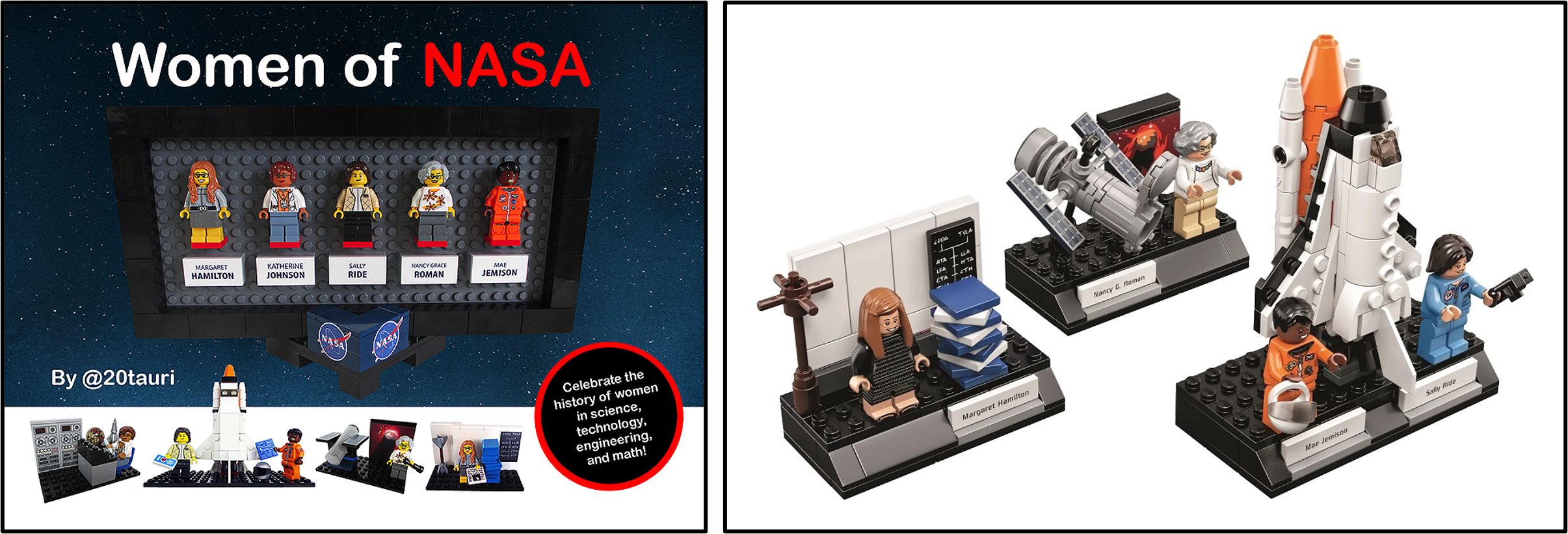
Similarity Score - 6/10 - The segments of 21312 Women of NASA which were retained from 20tauri's proposal remained fundamentally identical, comprising three small vignettes for the minifigures. However, the display frame was excluded along with Katherine Johnson and her associated vignette, leaving three remaining models in the finalised set.
21313 Ship in a Bottle
Ship in a Bottle, the Flagship Leviathan by JakeSadovich77
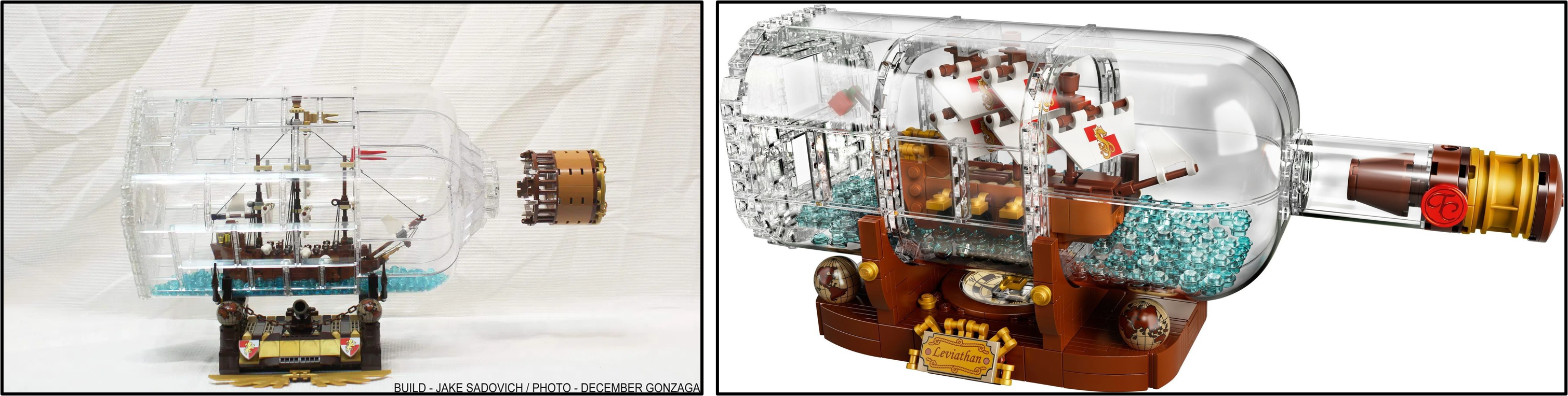
Similarity Score - 3/10 - The announcement of 21313 Ship in a Bottle provoked considerable criticism because the revised model was completely different to the Ideas submission. On this occasion, I think such dramatic adjustments were necessary because the original bottle would have been exceptionally fragile and therefore impractical for an official product. Despite these enforced changes, the concept and certain building techniques remained intact.
21314 TRON: Legacy
Tron Legacy Light Cycle by BrickBros UK
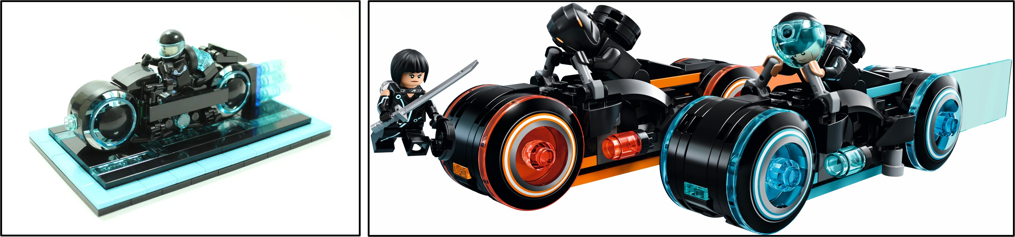
Similarity Score - 4/10 - The aerodynamic Light Cycle designed by BrickBros UK was altered rather substantially for 21314 TRON: Legacy. One bike became two and their updated design achieved far superior accuracy to the onscreen vehicles. The decorative base, resembling the Light Cycle Grid, was retained though and the scale remained the same too.
21315 Pop-Up Book
Pop-Up Book by JKBrickworks
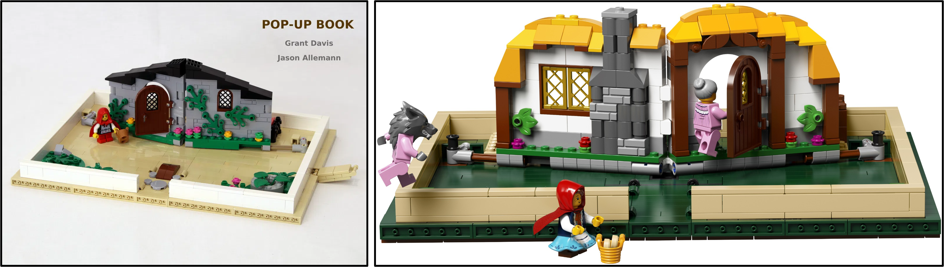
Similarity Score - 8/10 - Much like JKBrickworks' earlier model, the mechanism for 21315 Pop-Up Book was taken directly from the original design and the size of the book was unaltered as well. The colour scheme was brightened significantly though, both across the cover of the pop-up book and inside where white wattle and daub replaced light bluish grey stone.
21316 The Flintstones
The Flintstones by AndrewClark2
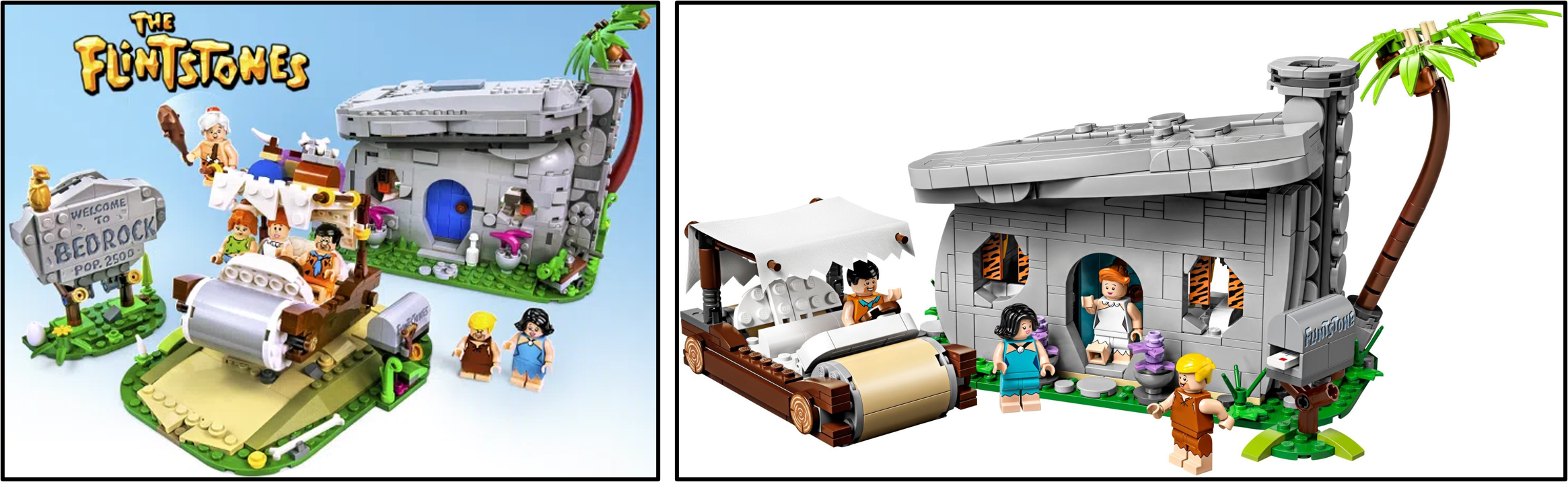
Similarity Score - 6/10 - AndrewClark2's second successful project also shares similarities with his first. The scale of 21316 The Flintstones matches the original version and certain building techniques were retained. However, several characters, the road and the Bedrock sign were omitted while the design of the Flintstones' house was simplified, lacking such intricate texture.
21317 Steamboat Willie
Steamboat Willie by szabomate90
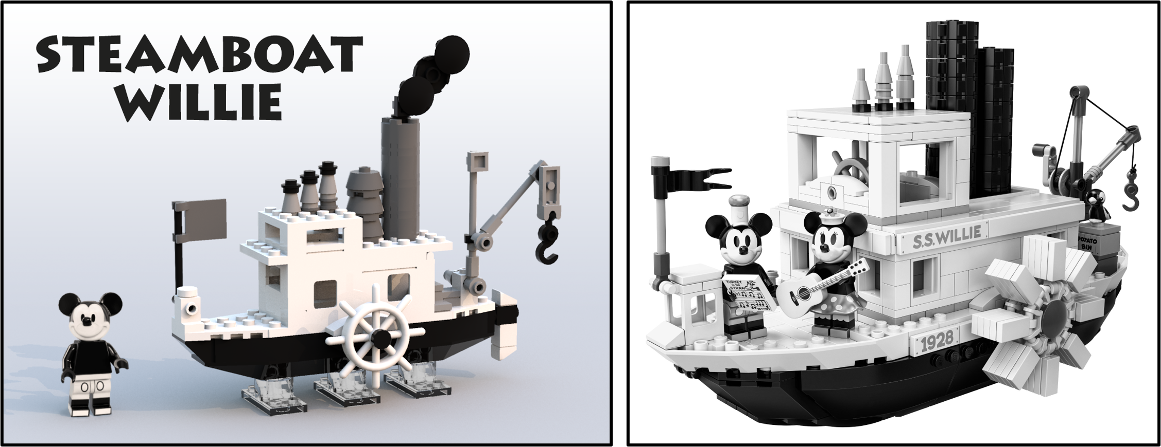
Similarity Score - 2/10 - 21317 Steamboat Willie represented the greatest deviation from the original project of any Ideas product since 21102 Minecraft Micro World: The Forest became available. The updated ship was constructed at a completely different scale and the detailing was vastly improved. The subject matter did remain essentially similar though, unlike with the earlier Minecraft product.
21318 Tree House
Treehouse by KevinTimeHouse
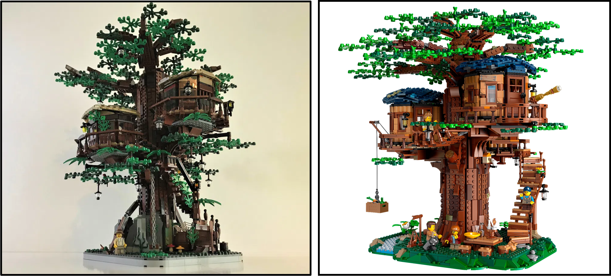
Similarity Score - 7/10 - While the visual differences between KevinTimeHouse's model and 21318 Tree House are extremely obvious, these changes are primarily cosmetic. Once again, brighter colours were introduced and the lowest layer of branches was moved upwards into the canopy. More essential features, such as the shape, size and construction, remained relatively similar though, even including the same number of cabins.
21319 Central Perk
The Central Perk Coffee of Friends by Mric76
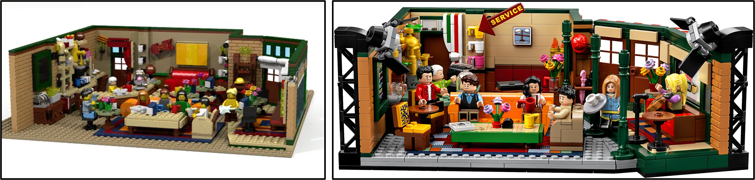
Similarity Score - 5/10 - By contrast, 21319 Central Perk appears outwardly fairly similar to Mric76's proposal but the differences are perhaps more fundamental. The colours remained predominantly unchanged but the model was scaled down dramatically, necessitating various alterations to the building techniques and details as well. The updated model also introduced studio lights, reflecting Friends' sitcom status.
21320 Dinosaur Fossils
Dinosaurs Fossils Skeletons - Natural History Collection by Mukkinn
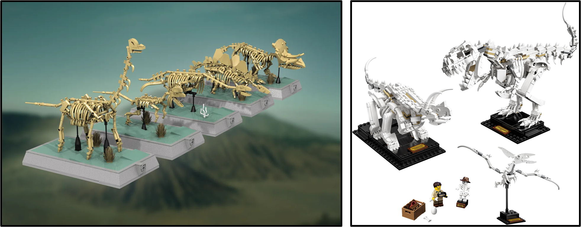
Similarity Score - 3/10 - Mukkinn presented several skeletons from which LEGO could select their favourites in his project. 21320 Dinosaur Fossils therefore contained three fossils which appear reminiscent of those originally proposed, featuring similar proportions. However, their colours and construction methods were overhauled entirely, incorporating many more Technic elements for greater stability.
21321 International Space Station
International Space Station by XCLD
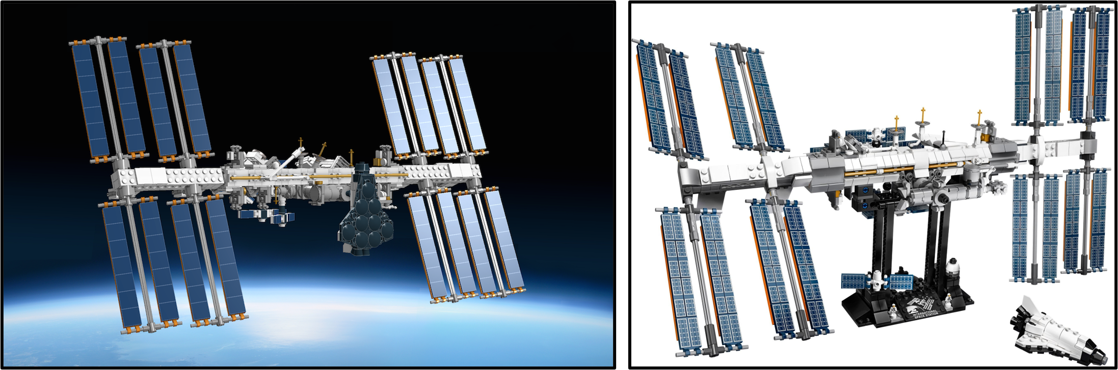
Similarity Score - 9/10 - 21321 International Space Station has undoubtedly remained the closest to its source material of any recent Ideas product. Other than the addition of printed solar panels, the only notable differences between the completed model and its predecessor were subtle external details and the truncation of the central truss assembly.
21322 Pirates of Barracuda Bay
The Pirate Bay by Bricky_Brick
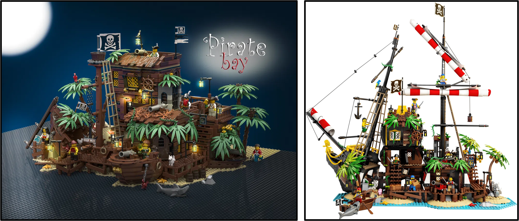
Similarity Score - 4/10 - The fundamental arrangement of structures remains rather similar between Bricky_Brick's creation and 21322 Pirates of Barracuda Bay. However, the colours were brightened considerably and closer connection to the original Pirates theme introduced, even resulting in the island transforming back into the infamous Black Seas Barracuda!
21323 Grand Piano
Playable Lego Piano by SleepyCow
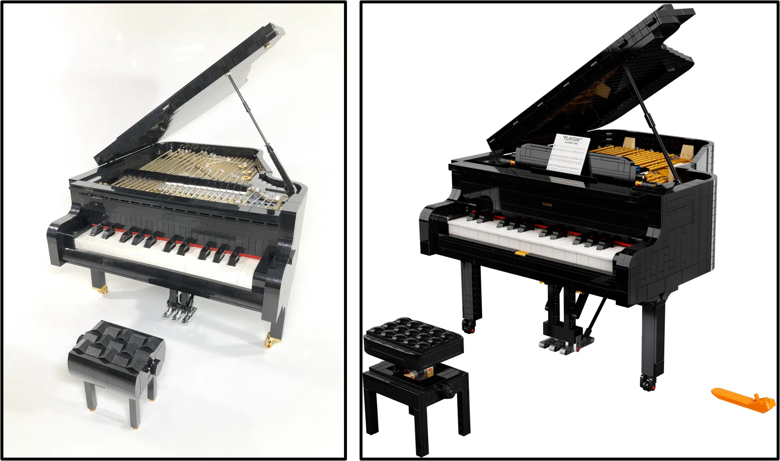
Similarity Score - 6/10 - Certain models are changed to improve perceived marketability while others require alterations to reflect LEGO design standards. 21323 Grand Piano occupies the latter category, lacking the intricate strings that appeared on the original design. The internal mechanism was therefore very different, although the dimensions and shape of the piano remained similar.
21324 123 Sesame Street
123 Sesame Street by bulldoozer
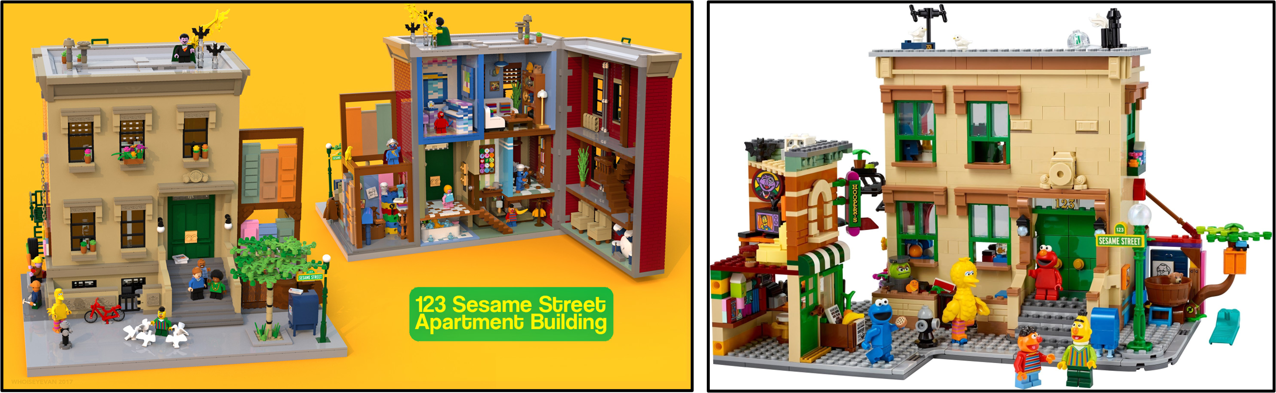
Similarity Score - 3/10 - 21324 123 Sesame Street, by contrast, was evidently scaled down to ensure greater marketability. The final model comprises 1368 which is fewer than half of even the smallest design presented by bulldoozer, hence the considerable differences between the original project and the official product. However, certain smaller details remained intact, such as internal furnishings.
21325 Medieval Blacksmith
Medieval Blacksmith by Namirob
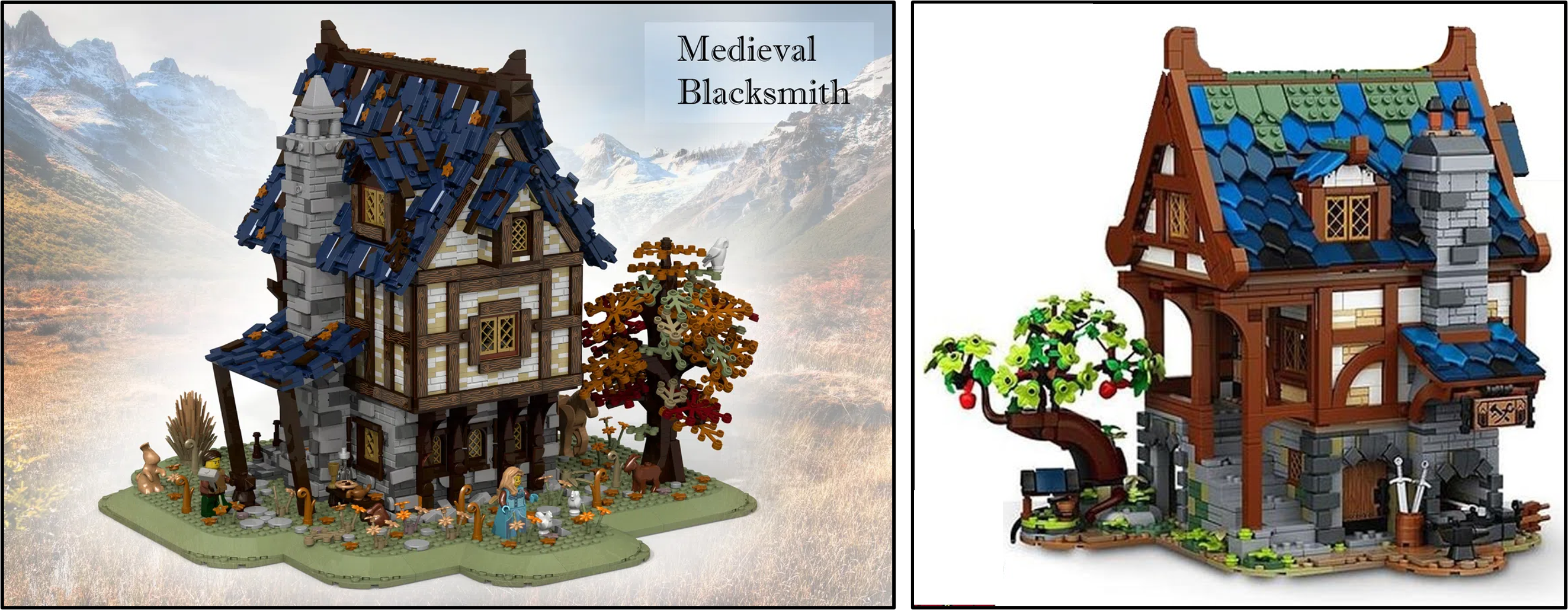
Similarity Score - 6/10 - The differences between 21325 Medieval Blacksmith and the building designed by Namirob exemplify the separation between fan creations and official sets. Similar architectural details appear on both models and their shapes have remained unaltered. However, the ramshackle tiles seem more secure on the updated structure and the colour scheme looks brighter too, following the examples of 21318 Tree House and 21322 Pirates of Barracuda Bay, among other sets.
Studying the entire LEGO Ideas theme reveals the considerable variation between products and how similar they remain to their original counterparts. However, the reasons for these changes seem quite consistent. Brighter colours are almost invariably preferable for LEGO, presumably because those models are more marketable, while details occasionally require simplification to meet LEGO's construction quality standards.
Certain changes have obviously been more successful than others. Few would likely support 21103 The DeLorean Time Machine over the creation which inspired it, whereas the opposite may be true for 21319 Central Perk. There are only two occasions where I believe LEGO took essentially nothing from the original submission, those being 21102 Minecraft Micro World: The Forest and 21317 Steamboat Willie.
Which alterations do you think have been the most successful and where should LEGO have remained more faithful to the original creation? Let us know in the comments.
483 likes
123 comments on this article
Good article! Despite the hyperventilating over changes to the Blacksmith Shop, those changes are more the norm than the exception.
One thing is for sure: I'm super happy that we got Black Seas Barracuda, which was not the first intent of the original IDEAS submission.
Brilliant article! I was surprised people were upset over the Blacksmith shop being different, and this is a great illustration on how almost all Ideas sets are modified from submission to release. Kudos to the Lego designers for knowing how to improve stability and accessibility for official sets.
The Tree House, Barracuda Bay and Blacksmith sets all have the same problem: Brighter colors. The Old Fishing Store proves that it's not impossible to retain a more desaturated and realistic color scheme, which makes it one of the best sets ever for me.
While I loved the original Barracuda Bay submission, the adaptation by the designers to incorporate the transformation function and the tribute to the legacy of the Pirates theme were absolutely brilliant and, in my mind, the greatest improvement made in any of the Ideas set’s evolutions.
@Graupensuppe said:
"The Tree House, Barracuda Bay and Blacksmith sets all have the same problem: Brighter colors. The Old Fishing Store proves that it's not impossible to retain a more desaturated and realistic color scheme, which makes it one of the best sets ever for me."
Different strokes for different folks. I absolutely dislike the slumlike fishing store, and I love the splashes of colour in the tree house and the Black Seas Barracuda.
I also think the new blacksmith is pretty faithful to the colourscheme, it's just that the shiny render makes it seem brighter. I'd have to see an actual photo to really know what it looks like.
Spot on coverage as usual, thank you Cap'n for your keen insight.
I guess I'm a diehard fan of Ideas, since what I've been seeing throughout your analysis is that each single modification from Lego has undoubtedly improved the original submission by strengthening its structure and/or improving its aesthetics. The incredible success of Barracuda Bay is a perfect example of this, imo.
As far as the Blacksmith set goes, even though I really enjoy the Lego "overhaul", a stronger effort to keep the original set's Medieval identity would have been appreciated; that's the only aspect I think has been somewhat lost in the transition.
Nonetheless, I very much enjoyed the outcome, as for just about all Ideas sets.
Great article. People really need to learn to reign in their expectations. Also this conflation of dull and drab colors with realism is quite bothersome considering the medieval world was full of colors. If you don't like colorful things that's fine, but don't justify your opinion with the false notion that brown = more realistic.
There’s always going to be necessary modifications to make something viable as a mass-produced product.
This list is also a great reminder of how many awesome creations have come from Lego Ideas!
The DeLorean still bugs me, but that’s the set that made it ok in my mind to alter display pieces from the original build.
Still sad I missed the birds.
@Bion said:
"Also this conflation of dull and drab colors with realism is quite bothersome considering the medieval world was full of colors. If you don't like colorful things that's fine, but don't justify your opinion with the false notion that brown = more realistic. "
And in medieval times they were able to put their shingles on straight and even, and stonemasons knew how to build things smooth and square, so it's good to see that in the final product.
@Koentinius said:
"Different strokes for different folks. I absolutely dislike the slumlike fishing store, and I love the splashes of colour in the tree house and the Black Seas Barracuda."
I like brighter colors as well. But it’s still all graded on a curve for me. Looking at my Old Fishing Store, I still find it to be really fun colors.
@Bion said:
"Also this conflation of dull and drab colors with realism is quite bothersome considering the medieval world was full of colors."
I don't think trees and grass in the autumn were any more colorful in the middle ages than they are now. Roofs rarely have vibrant colors. And timber frame houses often use very dark, almost black wood. The original model doesn't seem unrealistic at all to me.
This is an article I have want for along time. Thank you.
My personal biggest disappointment with Lego Ideas was the ship in the bottle. It went from, I love this idea, I would buy two; to what is this garbage?
As to the sets where the color scheme was brightened (21318, 21322, 21325), the perceived color changes are further heightened by the slightly muted color rending in the digital photos, which are also often against a darker background. The official LEGO sets, by contrast, are always against a plain white background and likely shot in lighting that emphasizes the colors to make an eye-catching image. A few sets (most notably 21325) are also viewed from different angles than the original submission image, which further emphasizes perceived differences.
Not to go on another rant here, but brighter color scheme does NOT equal "less realistic" historically! Throughout history, people have generally painted things in bright, bold primary colors (just look at the colorful buildings of certain restored medieval town centers throughout Europe or reconstructions of paint flecks found on Greek and Roman statues) and did not necessarily have access to the vast nuanced shades of color we use today. These colors did fade with time/exposure, and a more muted color scheme is thus appropriate in evoking an aged/worn appearance (which is what most people are used to seeing when viewing historical buildings today and thus base their expectations on); however, I believe LEGO prefers to sell us more "newly constructed" sets rather than "old" ones (with the notably exception of 21310), which has the added benefit of making a more eye-catching set image.
I think the take-home from this is that AFOLs like really drab colour palettes.
I don't mind the overall design change except for the tree. It looks so out of place in a medieval setting. The only other minor issue I'd have would be the color palette. I wish the brown wood coloring of the beams were slightly darker.
While it's true that most Ideas sets have gotten brighter colors from the original submission, the Exosuit technically went more drab/darker than the original (because of the addition of the dark grey).
My most anticipated set in the past year has become a joke. I was one of the original voter on the design, and with the significantly simplified model to be released, I will not buy this set.
Lego needs to know we didn’t vote for this. If we don’t let them know we did not ask for this, they will continue making these significant changes to other Ideas designs down the road.
I honestly think LEGO did a great job adapting the Blacksmith's shop. The scale is less excessive, and the use of the shield pieces for the roof looks gorgeous, as does the shaping of the wooden framework.
I think many MOCs go overboard in using jagged, mismatched details to convey aging/texture. LEGO's version gets the same idea across without becoming an eyesore.
My only hope is that LEGO didn't get rid of the animals from the original submission, particularly the goat.
@DavidBrick said:
"Your scoring system is insane. I really don't understand it at all. The second one looks exactly the same to me an got a 3.
Most everything looks fine besides The Flinstones and BttF which was always a mess."
21101 Hayabusa is constructed at an entirely different scale to the original submission and uses completely different construction techniques. The solar array stanchions, for example, consist of Technic pieces on the revised model whereas the fan creation integrated layered plates and tiles.
I would advise everybody to look carefully when comparing designs. Colour changes often suggest more significant alterations than are actually present.
I really hope we get more Doctor Who at some point. I really want a Tennant figure
@morvit said:
"My most anticipated set in the past year has become a joke. I was one of the original voter on the design, and with the significantly simplified model to be released, I will not buy this set.
Lego needs to know we didn’t vote for this. If we don’t let them know we did not ask for this, they will continue making these significant changes to other Ideas designs down the road."
Not to be cynical but I think the market of buyers that will purchase a less expensive, more simplified set (that would otherwise have not purchased the unaltered set) greatly outweighs that of disappointed voters of the original submission who refuse to purchase the official set out of protest. I can understand some of the disappointment but LEGO is after all a company that wants to maximize its profits according to their analyses (even if some fans don't always agree with their decisions).
It must be exhausting to be so angry all the time about so little
Personally I really dislike the darker colours on the original tree house and pirate bay. It’s not because I’m against darker muddier colours but because they lack good contrast. The original pirates bay is probably the worst example imo. Dark brown woodwork, dark green leaves and dark blue water, the most contrasting colour is the sand. I’m not always fan of the colour scheme that Lego uses but it almost always an improvement.
When the Pirate Bay got the go ahead, I was like, "Cool, A pirate Ideas set." When images of barracuda bay got released, I was like "OMG MUST HAVE!!!" Lego did a wonderful thing with updating that Ideas submission.
4/10 for Barracuda Bay? Agree to really, really disagree.
Don't get me wrong, I absolutely love the set (Greatest of the year in my opinion), but it is NOTHING like the original project. Adapting the project to pay tribute to the Pirates theme was probably a genius idea, but it meant thoroughly digressing from the original concept, in shape, in design, in color. Basically, the only things left are Old Redbeard and a stranded ship turned into an island.
In that sense, I think 4 is a stretch, especially when considering lower scores have been given to products that are more similar to their original counterpart.
What a useful article! Thanks for taking the time to compose it, Cap'n.
@morvit said:
"(...) I was one of the original voter on the design, and with the significantly simplified model to be released, I will not buy this set. (...)"
Now, that's interesting because I didn't vote for, and wouldn't have bought, the messy, morbid (though impressive!) original, but will likely buy the official release at some point. I'm sure LEGO have done the sales potential maths.
Either way, it's all LEGO, so we can always build whatever the heck we want, whenever we want.
Very timely article!. Did you write it after reading the heated discussion when the first image of Medieval Blacksmith emerged? People are often upset not because the final versions are different but because they don't like the changes/differences made to the original projects. Ultimately, the important question to answer is whether the changes have changed your mind towards purchasing/not purchasing the final product.
Unpopular opinion here - I love the changes that were made to Steamboat Willie. The original MOC was too simple to pay full tribute to the cartoon. The final product looks like a full ship, adds the rotating wheels and bouncing smokestacks, and provides room for other really nice details. I know a lot of people didn’t want to pay $90 for a tribute to a 1920s (?) cartoon, but it’s one of the most underrated sets imo.
@Graupensuppe said:
I don't think trees and grass in the autumn were any more colorful in the middle ages than they are now. Roofs rarely have vibrant colors. And timber frame houses often use very dark, almost black wood. The original model doesn't seem unrealistic at all to me."
Well considering the Little Ice Age and cutting down of most ancient forests (often replaced by evergreen monocultures), autumn may have actually been more colorful in some areas in the middle ages than today! While I can't comment too strongly on roofing colors in European medieval buildings (my impressions are mostly red-orange, brown, or grey, with blue also being found in some areas), I will point out that roofs in some Eastern Asian buildings (see the CTF sets) often are vibrantly colored (I realize this is a different culture and possibly time period). As to the color of the timbers of timber-framed buildings (which I understand Germany has one of the largest concentrations of in the world), are these timbers mostly dark because the wood color is inherently dark (and thus would have looked dark when newly built), the wood has aged to a darker color over time (which one sees today), or were the timbers painted a dark color (I have sometimes also seen these timbers painted bright colors on other buildings)?
I don't really think any IDEAS submission has been better than the finished product. I love seeing how the LEGO designers scale way too big models down to sensible sizes, and slick them up and improve them. The biggest improvement to me is the «Friends» set, which went from kind of ugly to desirable even for a non «Friends» fan. I look forwards to seeing the «Seinfeld» model, which I'm sure will be (real and) spectacular!
How about adding an "Improvement" score to the article. Scoring on well Lego improved upon (or made worse) the original idea.
Some sets, Lego did the right thing, and made excellent improvements to the original idea.
This is why you should vote on the "idea" of the submitted models and not on how good or bad the actual model is.
I think once again this helps to remind all of us that LEGO Ideas is about the idea and proof of concept of a model. The proof of concept is something we shouldn't be so attached to because we know changes have to happen to make the model better in other aspects we don't usually think of.
If you want LEGO to make as few changed to your original design as possible, then you need to build your model to the LEGO design standards, as well as think about the models in all aspects and angles such as build-ability by younger builders, marketability, and appeal beyond the 10,000 supporters. Everyone on LEGO Ideas is a fantastic builder, but everyone is also learning product design at the same time.
For me, as long as the original fan designers are satisfied with the final product, then I will be as well.
I’d be interested in a follow up article examining why some of the lower scoring ones were changed the way they were and whether it was for the better
@morvit said:
"My most anticipated set in the past year has become a joke. I was one of the original voter on the design, and with the significantly simplified model to be released, I will not buy this set.
Lego needs to know we didn’t vote for this. If we don’t let them know we did not ask for this, they will continue making these significant changes to other Ideas designs down the road."
Sorry but this sounds extremely entitled. Voting on an Ideas set doesn’t give you the right to get exactly what you voted for.
Theres no Point in boycotting to Make “Lego know we didn’t vote for this”, as many people will like the changes (and even more wont even have seen the original model), and shouldn’t not buy a set because you don’t like it.
If you don’t like what came of it, save your money and make a MOC. It’s clear now that many Ideas sets undergo significant changes, even the amazing Barracuda Bay and Treehouse which had similarly drab colours in the original. Perhaps you just don’t like the theme?
@Graupensuppe said:
" [...]Roofs rarely have vibrant colors. [...] "
Well, there are amazing examples of polychrome roofs dating from the late Middle Ages in eastern France. For example, the town hall in Meursault, the castle of Corton André, or most bell towers in Franche-Comté ("clocher comtois").
Granted, they are still quite uncommon, more elaborate than the Ideas Blacksmith's roof, and often found on buildings of significant importance, but they are the first thing I thought of when I saw the set!
I don't think a brightly coloured roof would be any less realistic than a ramshackled, decaying roof like the one the original concept...
My favorite article of the year so far ;-)
Ideas has brought a few gems, but always delivers a different type of set than their usual line up.
I don't like all of them, but appreciate the concept and what LEGO develops.
What I vote for is actually quite irrelevant in regards to the final product, for me :)
Fantastic article, Its clear lego have to meet certain demands, whether that's marketability, sturdiness, piece count, price point, etc. I think for the most part Lego do a great job in bringing these fan made models to everyone. It's in the name "Ideas" fans create an idea that lego then work with to bring to the wider audience, also people need to remember it's a kids toy first and foremost
@morvit said:
"My most anticipated set in the past year has become a joke. I was one of the original voter on the design, and with the significantly simplified model to be released, I will not buy this set.
Lego needs to know we didn’t vote for this. If we don’t let them know we did not ask for this, they will continue making these significant changes to other Ideas designs down the road."
I voted for the original as well but will be happily letting LEGO know that I love the altered final model. Will look fantastic with my Medieval Market and Kingdoms sets.
@LordDunsany said:
" @Graupensuppe said:
I don't think trees and grass in the autumn were any more colorful in the middle ages than they are now. Roofs rarely have vibrant colors. And timber frame houses often use very dark, almost black wood. The original model doesn't seem unrealistic at all to me."
Well considering the Little Ice Age and cutting down of most ancient forests (often replaced by evergreen monocultures), autumn may have actually been more colorful in some areas in the middle ages than today! While I can't comment too strongly on roofing colors in European medieval buildings (my impressions are mostly red-orange, brown, or grey, with blue also being found in some areas), I will point out that roofs in some Eastern Asian buildings (see the CTF sets) often are vibrantly colored (I realize this is a different culture and possibly time period). As to the color of the timbers of timber-framed buildings (which I understand Germany has one of the largest concentrations of in the world), are these timbers mostly dark because the wood color is inherently dark (and thus would have looked dark when newly built), the wood has aged to a darker color over time (which one sees today), or were the timbers painted a dark color (I have sometimes also seen these timbers painted bright colors on other buildings)?"
Wood gets darker with age. The medieval wood that is black today has been oxidising away for hundreds of years. When originally hewn it would be straw yellow or red dependent upon tree type. Oak the wood of choice for European dwellings starts out a lovely honey colour, mellows through brown and after a few hundred years goes black. Western Red Cedar starts out pinkish red and goes grey with exposure to oxygen. Inherently dark woods such as Ebony and Walnut tended not to be used for construction.
Another factor that nobody seems to have mentioned is that whilst designers do have some budget (frames I believe their called) for colour changes they're going to have to work with the bricks that are currently in production. There is always a greater palette of Reddish-Brown in production than there is Dark Brown and it may not have been economically feasible to produce all the needed parts in the Dark Brown colour.
@J0rgen said:
"I don't really think any IDEAS submission has been better than the finished product. I love seeing how the LEGO designers scale way too big models down to sensible sizes, and slick them up and improve them. The biggest improvement to me is the «Friends» set, which went from kind of ugly to desirable even for a non «Friends» fan. I look forwards to seeing the «Seinfeld» model, which I'm sure will be (real and) spectacular!"
I'm afraid it will be a 100% plastic fantastic this time around. But maybe Elaine wants to investigate again. ;-)
I can take all the changes Lego did on Ideas sets, except on the Ship in the Bottle. That was to much!
Thank you for all the research on the long article, I learnt a bit about the early ideas models that passed me by at the time. At the end of the day I think we would all rather TLG simplify the ideas than reject them.
@MartyMcFly said:
"How about adding an "Improvement" score to the article. Scoring on well Lego improved upon (or made worse) the original idea.
Some sets, Lego did the right thing, and made excellent improvements to the original idea."
I think adding an improvement score is a great idea! Changes can be bad or good
Pirate Bay is the most changed Ideas set in my eyes since it doesn’t resemble the original submission at all. However, I don’t think that’s a bad thing at all when the designers created something so incredible with Pirates of Barracuda Bay. I liked the original design enough to know I would buy it, but the fact that the final set can transform into an actual ship sealed the deal for me.
This article really highlighted why I struggle with CapnRex's articles: we really aren't looking at the same things... I strongly disagree with so many of those scores! It's like he's comparing piece per piece or detail per detail, instead of seeing the overall inspiration!
For Ideas, and especially for Ideas, I think people should focus on the fact that it's the idea that got submitted that made it, not the details themselves. The very fact that we got Saturn V, Barracuda Bay, Tree House, and so many other great sets is because the idea was enticing, not just the specific build, and Lego never would have gone in those directions by themselves. And most of those are better in their official release format than in their original submission, if you ask me. And then if you look carefully, some key features of each build are kept in all cases, where a number of other techniques could have been used but instead they kept the original. Look at the Ecto-1 for example. Same for the Delorean; you simply don't see car chassis built like that in any other official Lego product. And to me that warrants really high similarity scores, even if they changed some other parts to solidify or make the build more legit.
@aztecwarrior said:
"Okay, maybe no one has realized this (but maybe you have), but in the third 2020 review phase there are 2 sets that will not be made. Why? Because lego has stolen the ideas! There is a downtown style police station in the third review. What does lego do? Steal the idea and make the Creator Expert Police Station modular for 2021 without giving any credit to the ideas designer. There is a Bonsai tree in a black tray in the third review. What does lego do? Steal the idea and make the Creator Expert Botanical Collection Bonsai Tree fir 2021 without giving any credit to the ideas designer. So those two ideas we can know for sure will not be approved."
You are aware many of these sets, modulars especially, are in the design process for years before they are released? It's not Lego's fault someone else had the same idea that they were already planning to release.
@Phoenixio said:
"This article really highlighted why I struggle with CapnRex's articles: we really aren't looking at the same things... I strongly disagree with so many of those scores! It's like he's comparing piece per piece or detail per detail, instead of seeing the overall inspiration!
For Ideas, and especially for Ideas, I think people should focus on the fact that it's the idea that got submitted that made it, not the details themselves. The very fact that we got Saturn V, Barracuda Bay, Tree House, and so many other great sets is because the idea was enticing, not just the specific build, and Lego never would have gone in those directions by themselves. And most of those are better in their official release format than in their original submission, if you ask me. And then if you look carefully, some key features of each build are kept in all cases, where a number of other techniques could have been used but instead they kept the original. Look at the Ecto-1 for example. Same for the Delorean; you simply don't see car chassis built like that in any other official Lego product. And to me that warrants really high similarity scores, even if they changed some other parts to solidify or make the build more legit."
I'm not sure @CapnRex101 would disagree with you, this seems to be very close to the entire point of the article.
I thought there might be some discussion concerning 21322 Pirates of Barracuda Bay. The revised model is evidently quite different to the proposed design, although its scale, layout and construction techniques have remained fairly consistent.
For instance, the angled bow is located towards the left, with a taller structure in the centre and the deeper building on the right. That arrangement exists on both designs.
I don’t want to rehash any old arguments but Lego sets have lead times of years. The police station and bonsai tree were probably already in full production ready to ship out to stores in December so they could be on shelves on Jan 1 by the time these projects hit the Q3 3020 review. People have asked for a police station modular for years and it was obvious not a “new” IDEA when it passed review. If sets were developed that fast Lego would not have released a police station (George Floyd etc) but developed something else.
Maybe for the theme's 15th anniversary we could have a poll to rank all the ideas set?
@xboxtravis7992 said:
"Brilliant article! I was surprised people were upset over the Blacksmith shop being different, and this is a great illustration on how almost all Ideas sets are modified from submission to release. Kudos to the Lego designers for knowing how to improve stability and accessibility for official sets. "
Wrong, this is a great illustration on how some Ideas sets respect very well the spirit of the initial design (such as the Old Fishing Store for example), and some don't. Lego could have done much better on the Medieval Blacksmith, they just chose not to, sadly...
@Phoenixio said:
"This article really highlighted why I struggle with CapnRex's articles: we really aren't looking at the same things... I strongly disagree with so many of those scores! It's like he's comparing piece per piece or detail per detail, instead of seeing the overall inspiration!
For Ideas, and especially for Ideas, I think people should focus on the fact that it's the idea that got submitted that made it, not the details themselves. The very fact that we got Saturn V, Barracuda Bay, Tree House, and so many other great sets is because the idea was enticing, not just the specific build, and Lego never would have gone in those directions by themselves. And most of those are better in their official release format than in their original submission, if you ask me. And then if you look carefully, some key features of each build are kept in all cases, where a number of other techniques could have been used but instead they kept the original. Look at the Ecto-1 for example. Same for the Delorean; you simply don't see car chassis built like that in any other official Lego product. And to me that warrants really high similarity scores, even if they changed some other parts to solidify or make the build more legit."
It sounds to me as though you are suggesting that the minimum score should have been perhaps 5/10, simply for depicting the same vague subject as the proposed design.
That being the case, I wonder what would qualify for scores below 5/10? Maybe had LEGO taken the Blacksmith Shop concept and transformed it into an X-wing or similar?
Personally, I think the scores are fair, taking anything where the subject remained the same but everything else was changed as 1/10 on the scale, such as 21102 Minecraft Micro World: The Forest, while 10/10 represents a set without any apparent alterations like 21100 Shinkai Submarine 6500.
In my personal opinion, it’s not that the blacksmith has been changed that’s the problem. It’s the fact that it’s been arguably changed too much. The changes don’t necessarily make the product bad, but it doesn’t capture the same spirit as what was submitted.
Take a look at the original pitch. The colors are more muted. The place looks old, run-down, but still lived in. It’s probably what would happen if a building was sitting in the middle of the dark ages for a long period of time. The released product in comparison is far too... clean. Not bad, but it looks overly polished compared to the second design.
It’s not that changes in pitches to release are necessarily a bad thing, but there are times where we liked something because it wasn’t like what LEGO usually puts out. I mean... that’s the point of Ideas, right? To get sets we otherwise wouldn’t have under LEGO’s normal way of doing things?
Very interesting article, I was looking yesterday for something like this but there wasn't anything I could find.
Somehow I had vaguely thought there were more Ideas sets featuring buildings than there actually have been. I suppose that shows what a high bar a submission has to reach to pass review.
I think there is now a fair precedent for colours to be made brighter (especially extensive use of dark brown being swapped out) and some degree of simplification to heavily detailed exteriors (Old Fishing Store being an exception to that last I think) in the transition from submission to final product.
All I want is some minifigure-scale buildings with muted colors. Lego rarely makes something like that, so I vote for them on Ideas whenever I see them. But even if they pass the review, more often than not these colors get changed. It's just frustrating, because there are more than enough colorful sets.
I think the key is pretty simple--if the changes are an improvement, they're fine. Hence you don't really get complaints about the DeLorean, or ExoSuit. Even Barracuda Bay was a big change and arguably not an improvement, but the giant nostalgia boost I think most would agree made up for it.
It's when the changes are marketing-driven that the complaints rightfully roll in. When a large, beautiful set is reduced to a small, just fine set, that's when people are unhappy.
Had absolutely no interest in the original versions of the Treehouse, Barracuda Bay or Blacksmith and the mass of drab colours they were, but when they had an official touch up courtesy of Lego, they were instantly in my collection or on my wish list.
Steamboat Willie had such a glow up, it’s remarkable to compare the two.
The only product I’ve been disappointed in with the finished product is the Flintsrones, with the lack of the sign and Dino.
@ra226 said:
"I think the key is pretty simple--if the changes are an improvement, they're fine. Hence you don't really get complaints about the DeLorean, or ExoSuit. Even Barracuda Bay was a big change and arguably not an improvement, but the giant nostalgia boost I think most would agree made up for it.
It's when the changes are marketing-driven that the complaints rightfully roll in. When a large, beautiful set is reduced to a small, just fine set, that's when people are unhappy."
Both the Exo-Suit and DeLorean got TONS of complaints. You need to have been there to really grasp the extent of the complaining that has accompanied almost every one of these sets for not matching the original submissions.
What you seem to actually be observing is the tendency for complaints about a lot of these to go away once the sets have been actually released and people who were initially shocked by the changes largely come around to them, or at least get overwhelmed by the much larger number of people who do like the final sets and didn't care one way or the other whether they match the "first drafts" they were based on.
This is a really insightful post! Something I think people are overlooking is how it's literally called LEGO "IDEAS".
Obviously, beautiful creations are submitted for consideration, but I don't think that LEGO gets enough credit for the work they do to translate the concepts and IDEAS into viable products that suit their strategy (particularly when IP stakeholders are involved) and meet their quality standards for set design.
It's simply not feasible to make most Ideas sets into $400 intricate display pieces with flimsy (if not impossible when CAD is involved) building techniques.
I certainly wish other choices were made in some sets, but I love the IDEAS line for bringing us fresh and exciting sets we likely wouldn't get outside of it.
Really nice article, it's fascinating to see the original and released models side by side.
I think I've said this before, but the main problem with Lego Ideas is people's perception of what the platform is about. Everyone seems to think that they are voting for the fan's design, and that the model submitted will be the set released. This is incorrect! Lego Ideas is about the *concept*, the three or four basic words that describe the model. You are voting for the concept, not the fan model, and the fan model is only really there to help drum up votes to show that the concept has enough interest to make a set that would sell.
Basically, I think Lego designers are free to make whatever model they like, so long as they stay true to the original concept, and keep a vague resemblance of the fan model so people can see that they are kind of getting what they voted for.
A lot of people think the original blacksmith design was better because it looked more weathered, but I feel like the amount of greebling combined with the muted color scheme was a detriment; the roof looks like an amorphous scattered blob of one tone if you don't look closely. Lego's version maintains some amount of wear and tear with the sand green at the top, but with there still being a degree of order to the tiles, and some contrast to bring it to life.
The change in scale also makes sense. One thing I always keep in mind when Lego changes the scale of an Ideas submission is that, when you support a set, they ask you what you are willing to pay for it. Chances are, the price people were willing to pay for the blacksmith's shop nowhere near matched its massive scale, and Lego stopped making sets where they lose money selling about two decades ago.
One thing I will grant is that the tree feels like a bit of a downgrade; its tiny, bowed form is the place where the change in scale sticks out most, obviously clinging for dear life on what remains of the base.
@elisewong18 said:
"Maybe for the theme's 15th anniversary we could have a poll to rank all the ideas set?"
I second this! Or do a competition like the Best Set of the Millennium tournament from last year. Would be interesting to see how people value to original product idea vs the final set.
@Graupensuppe said:
"All I want is some minifigure-scale buildings with muted colors. (...)"
It's tricky to say this without sounding condescending, but are you aware of what the concept of LEGO allows you to do...?
Terrific read! Although, interestingly enough, I do think the final products are considerably better, mostly.
Great article, it's really interesting to see the original/released differences. I'd wrongly assumed it was only recent Ideas sets that were radically changed.
I think that the original Blacksmith, Barracuda Bay and Tree House submissions all suffered from dreary colours, so much so, that I didn't vote for any of them, but I do own both Barracuda and Treehouse because they were great models made vibrant by better use of colour schemes.
The originals might be more realistic sure, but I find no joy in looking at a set full of miserable colours twinned more beiges and lifeless tones.
I also found the original Blacksmith a bit repetitive which the new one certainly is not.
mi dispiace ma non sono d'accordo con te Cap il set realizzato da lego fa schifo rispetto all'originale e il fatto che questo sia già successo non modifica questa cosa
saluti
brickadvisor
i'm sorry but i disagree with you Cap the set made by lego sucks compared to the original and the fact that this has already happened doesn't change this thing
Everyone expects Lego to make changes for various reasons. Some end up being well received (Pirates of Barracuda Bay) and others not so much (DeLorean).
People saw the weathered blacksmith shop and expected something like Old Fishing Shop...but a DeLorean in a Bottle kind of change.
Is there an instruction or a detailed gallery of the original Ship in a Bottle?
Great article, very insightfull, however if I were you, I have left off the blacksmith as we've only got one image of it, whereas the others are all released sets that are fully known. That said. I personally really like what we can see of the blacksmith, and can't wait to see more of it.
@CCC said:
" @Phoenixio said:
"This article really highlighted why I struggle with CapnRex's articles: we really aren't looking at the same things... I strongly disagree with so many of those scores! It's like he's comparing piece per piece or detail per detail, instead of seeing the overall inspiration!
For Ideas, and especially for Ideas, I think people should focus on the fact that it's the idea that got submitted that made it, not the details themselves. The very fact that we got Saturn V, Barracuda Bay, Tree House, and so many other great sets is because the idea was enticing, not just the specific build, and Lego never would have gone in those directions by themselves. And most of those are better in their official release format than in their original submission, if you ask me. And then if you look carefully, some key features of each build are kept in all cases, where a number of other techniques could have been used but instead they kept the original. Look at the Ecto-1 for example. Same for the Delorean; you simply don't see car chassis built like that in any other official Lego product. And to me that warrants really high similarity scores, even if they changed some other parts to solidify or make the build more legit."
I agree, the scoring is completely arbitrary. When I see the pop up book, the insides are completely different even if the mechanism and shell are the same and same scale. That one scores very highly as the changes are deemed to be cosmetic. Whereas keep the same size and similar frame for the delorean and it gets a low score."
This was a great article. I just want to point out that the designers of the pop up book are incredibly happy with the changes, and the mechanism and scale are probably considered more important than the possible scenes.
@bananaworld :
Whether you can fix it yourself depends on the availability of the pieces. If I could, for example, replace the green and lime green leaves on the tree with olive green, dark red, and dark orange pieces, the model would already look a lot better to me - but they haven't been made in any of the more muted colors yet.
Good job and good perspective on the original vs LEGO version for ideas set. It puts the current huff and puff about the Blacksmith Shop into better perspective.
Obviously Old Fishing Store was by far the best of the Ideas sets, and LEGO was wise to leave it as is. In some cases they clearly improved the model (Steamboat), but mostly TLC had to compromise the original in order to make something practical. I understand and respect those limitations. If I don't like it, I won't buy it.
The change of the bonnet on the 21103 The DeLorean Time Machine should get the designer fired imo.
I prefer Lego’s redesign to the original submission nearly every time. And if given the choice to purchase Lego’s $120 Sesame Street or the original version for $200 or $250, I’ll take Lego’s version.
Back to the Future is one of my favorite films, and I own models of the Delorean, but honestly neither of those minifig-scale Deloreans appeal to me at all. It really needs the UCS treatment (like Ecto-1) to do it Justice.
Mostly I’d just like to thank Lego & the fan designers for so many great sets, and CapnRex101 for a great article!
What an awesome and informative article. Thanks @CapnRex101 for all your efforts.
I feel like most of them are good improvements from the original. BUT... I think they really messed up Dinosaur Fossils and the Medieval Blacksmith.
LordDunsany - While it may be true that people in old times had less nuances to choose from and often used bright colors, many of the pigments used back then were also less stable. They tended to fade rather quickly (long before the paint itself became worn), so many buildings probably had such somewhat-faded colors most of the time. Timber buildings were often painted with tar to prevent rot, which gave a dark brown/black color even when the wood itself was much lighter.
I've heard it's also an issue of scale, if you make a miniature of for instance a building the model will tend to look brighter than the original, even if they actually are the exact same color.
When it comes to Lego I believe it's an issue with a "hole" in the palette - on one side you have the dark/earth/"sand" colors with very low saturation, on the other you have the bright/primary/"girly" colors with near-100% saturation, but there's very little in-between these extremes. Given the choice between "too bright" and "too drab" many will prefer the latter to get a more realistic look.
Regarding excessively reworked Ideas projects I think the designers would benefit from paying more attention to what makes a good set and not just a good MOC, and especially Lego being more open about the design process (they've improved on this over time, but it's been a painfully slow process and they still are a bit too secretive). Too many contributors uses Ideas as a MOC gallery to show off their creations without regard to if it will work as a set, and other concepts are just too vague (like the Minecraft one), needing lots of reworking to make a sellable product.
Lego models can often be placed on a "play-to-display" scale - on one end you have extremely play-focused models like "4+" and basic City sets, with simple building so young kids can get along to play quickly. Somewhere in the middle you have stuff like the Expert sets with larger size and more advanced building, but still intended to be somewhat play-friendly. Then you have the "look, but don't touch" exhibit-quality MOCs, with like 10k+ parts and lots of fiddly details which'll fall off or became misaligned if you just look too hard at them. At the extreme end you have the photo-focused models that are intended to look good on pictures but not necessarily in real life, these usually features partial builds (just enough to fill the frame) and using tricks like forced perspective.
When building a MOC this factor boils down to your personal preferences, but for an official set it's usually expected that it's at least somewhat play-friendly (at least for a minfig-scale model) and can easily be handled without requiring special instructions or constant realignments - anything else will easily lead to a flood of complaints.
@Lyichir said:
"Both the Exo-Suit and DeLorean got TONS of complaints. You need to have been there to really grasp the extent of the complaining that has accompanied almost every one of these sets for not matching the original submissions..."
I was there. There are always complaints, this is the Internet after all. But the pros and cons tend to balance out when there are changes that can be perceived as improvements and not just a way to make it smaller and cheaper which seems to be the case here. It's a cute set, but not in the spirit of what people voted for.
I'll give you points on the DeLorean, though--the hood is pretty bad. But there were many improvements made, too. But ExoSuit was wonderful, and the green CS man was an awesome addition.
I wonder if Lego didn’t produce the Ghostbusters building in the ideas range because they didn’t want to share the profits with the creator for a large set.
Anyways thanks for the article.
@ra226 said:
"It's when the changes are marketing-driven that the complaints rightfully roll in. When a large, beautiful set is reduced to a small, just fine set, that's when people are unhappy."
But the submission itself is not a set, it's a gauge of interest that the LEGO group will use to determine which IDEAS will move forwards and become a set. If a "Large Beautiful Set" is what you want you may have to resort to some MOC-ing.
Excellent article, CapnRex101--I particularly enjoyed taking a fresh look at some of the earliest projects to be approved!
The only change Lego has ever made to an Ideas project that I still can't accept is the alteration of the hood/bonnet of the Delorean in the BttF set. On the other hand, I feel the Yellow Submarine was greatly improved by its redesign and the Steamboat Willie set's well-thought-out expansion justified its extra cost. Most of the other complaints I've seen (and, yes, made myself on some occasions) are capable of being solved in the classic Lego way--buy some different bricks and alter the set to suit your tastes! Or, of course, don't buy it at all--that works too. But I've had a lot of fun with the various Ideas sets and I think TLG is doing a good job of choosing excellent ideas and turning them into solid and enjoyable sets.
People complaining about alterations to the proposed ideas need to realize that fan designers have to go thru the same round of reviews and approvals process as any regular set designer at LEGO once their project has garnered 10k votes and gotten the go ahead after surviving TLG's initial review phase. It's rare that the initial design will make it to production without several modifications along the way, this is evident from what CapnRex101 has outlined in this article with the majority of final set designs having significant changes over the original submissions.
I think if you were to ask any LEGO designer about iterating their normal set proposals they would all say it took more than one review to make final approval for production.
And it's probably premature to have included 21325 Medieval Blacksmith in this rating since we really don't have enough images and description about the final product yet to make an accurately weighted assessment.
@CapnRex101 said:
" @Phoenixio said:
"This article really highlighted why I struggle with CapnRex's articles: we really aren't looking at the same things... I strongly disagree with so many of those scores! "
Personally, I think the scores are fair, taking anything where the subject remained the same but everything else was changed as 1/10 on the scale, such as 21102 Minecraft Micro World: The Forest, while 10/10 represents a set without any apparent alterations like 21100 Shinkai Submarine 6500."
I actually agree with your statement there. 21102 is arguably the most different of them all: completely different scale, different subject, the only thing left is the IP... And then 21100 could only deserve a 10 with how little it changed from its original submission, since that was the purpose of your grading system. But for me, it's all the others in between that don't match with my evaluations, and yes, I would certainly have put most of them above 5.
But I say that knowing from your other articles that you are very detail-oriented. It fits quite well with the ranges you usually cover, which is most of the licensed stuff, or minifigures. In those cases, reproducing something close to the "original" makes sense. But for Ideas, the original projects are far from perfect in my eye, and I'm usually very happy with the modifications brought up by seasoned Lego designers. Comparing detail to detail with the original doesn't make as much sense in those cases. I think you did convey that in a few of the comments, that the modifications were for the best, but then the ratings can be a tad misleading as well.
Like some people have mentioned, the scoring system is certainly not perfect and not everyone would agree. After all, it's based on a single person's opinion. There's no way the scores are 100% fair and accurate because saying so would mean the scores are facts but not opinion.
Excellent article
I wonder if they didn't make any modifications to Shinkai because they never planned to redesign these projects, but then with Hayabusa realized they simply couldn't avoid it. People can submit _ANYTHING_. If it uses parts they no longer make, or techniques that are no longer legal (if they ever were), or the design just isn't stable enough to release, there's no way around it. They either have to decline it because of how it's designed, or they have to change that design.
@axeleng:
In many cultures, it was common to repaint buildings annually, so the idea that they would get old and faded over time just doesn't fly. If the paint is that susceptible to age, the protection it affords the structure underneath is as well. If you don't repaint because you're too cheap, or too broke, maybe your exterior starts to rot, and the elements can get in to eat away at your structural timbers.
Minecraft was a special case because it was submitted by the guy who owned the game. He used it as a way to backdoor a licensing deal, rather than a way to get _his_ model released as an official set. We don't know what happened behind closed doors, but we know this is the only instance where a project submitter continued to get payments for any spin-off sets beyond the one that was released under Cuusoo/Ideas (up until the point when he sold the company to Microsoft). It's also worth noting that, while they scaled it down for the initial release and three followup sets, they later shifted to minifig scale for the bulk of the theme's run.
@ra226:
You have to forgive the hood on the simple fact that it would have been impossible to include an alt build with the circuitboard if it had to be strapped to that giant slope. AFOLs can do it because they aren't restricted on how they make it happen, but string or rubber bands simply aren't going to cut it in a retail set. They also stated that the slope is too steep, which is true.
@nick3c:
The size of the Firehouse was beyond the scope of what Ideas was intended for. Even without the car, the Firehouse set clocks in well above the 3000pc limit that has since been imposed on Ideas submissions. They also have to consider how many new elements they'd have to order to make each set work, and the car alone features 11 new prints (4x torso, 4x head, license plate, backpack, and GB symbol), three new drum-lacquered parts, and a few more parts that were molded in new colors. If you threw the Firehouse in on top of that, I don't think the Ideas team could have budgeted for that design at all, even if they scrapped a lot of recolors and prints in later sets (or even just stopped confirming new sets for the next year).
@Phoenixio:
The point of this article is not to see if something has been improved over the original submission, but to see if it's faithful to it. Steamboat Willie was considered to be a vast improvement over the original by many, but it got one of the lowest scores because it deviated so much from the original submission. If anything, I think he scored some of these too high. The Fishing Store has significant changes to the external stairway, and a ton of accessories were added. Even the forward corner in this image shows a major structural change, as there's quite a bit less of a bite taken out of it. The roof is darker, more rocks are around the base, the foundation is a different color, and I don't see it earning more than an 8/10, tops.
@ALEGOMan:
10k isn't anything to them. You're talking about Forma and the Bricklink sets when you get down to numbers that low, which don't really pay for the development of larger sets, or sets that have to be distributed through the normal supply chain. If they're not doing direct sales at that point, they'd need to release them through a single geographic location, like they do with convention exclusives.
Of the examples listed, at least one of these appears to have been a flop. I don't recall any excitement over the Adventure Time set (though the Dimensions packs that came about as a result were popular), nor was it ever hard to find until they retired it and cleared out the leftover stock. The danger in overestimating the market demand for one of these projects is that it could turn out like AT did. The worst situation that they want to avoid is if they tank the sales on a set by doing so, when tightening up the design could have resulted in something much more marketable that would have sold like hotcakes. Since the designers get paid a percentage, it may hurt to think about your project being mini-sized when you're thinking about how much you'll earn per copy, but smaller sets can move more product just by being affordable enough that people will grab a copy instead of passing on it because they can't afford it.
Extremely interesting article thank you.
I really like Ideas sets, there are some exceptions to that, however, they tend to be subject matter based, rather than the changes Lego makes. I think in general, reading through your article, for me personally, the changes made by Lego tend to be improvements.
Great read.
It also confirms what I suspected all along. My favorite Ideas sets are those where the final product either stayed very close to the original submission (like Old Fishing Store, Saturn V, Birds, Maze, Wall-E) or improved upon the submission while still retaining most of the original look and feel (like Ecto 1, Caterham or Yellow Submarine).
With the Tree House and Pirates of Barracuda Bay, I think both the submission as well as the final product are great and I would have bought either version.
But something like the Blacksmith or Steamboat Willie or Dinosaur Fossils to me are examples where I could never see myself buying the final product because to me the changes are so significant that the look and feel of the submission is lost to me, especially as imho the changes didn't make the set better.
@rvnlord said:
"Is there an instruction or a detailed gallery of the original Ship in a Bottle?"
I commented on the other thread, the original design is available from the Chinese fake Lego companies. Ditto with the original Pirate Bay design. I would normally avoid anything suggesting purchase of fake brands but in this case it is extremely relevant to the discussion.
(Not just to the poster above, to everyone generally:)
If anyone doubts the rework, I suggest they chase down the original design, build both, and compare. Throw away all the fake Lego pieces and use authentic ones, if you like. I was one of the people disappointed by the Ship in a Bottle changes, so I did this. The original design looks nice, but is oversized, difficult and not much fun to build, and incredibly fragile. Putting the two side by side made me really appreciate how much effort went into to re-working the Idea whilst retaining the core elements.
The original designers create amazing concepts, much better than I could ever do. But they are not Lego designers, there is much more to a successful set than just the original concept. That's why Ideas is my favourite line, even when I have no interest in the subject matter I love seeing how the set evolved over the design process.
The original blacksmith design looks wonderful and I'd love to see it on display. There may even be some details (chimney) better than the official design. But taken as a set, I guarantee you the official set will be a better building experience and a better all round product.
@Brick_Master: I have the official Ship in a bottle whereas a friend of mine bought the fake version of the original submission. When comparing the two I agree the final product is overall much better, but the ship itself looks so much cooler on the set based on the original submission.
I guess that the set 21317 is better made by LEGO than by the author of the idea.
@CCC said:
" @BlueWitch said:
"I guess that the set 21317 is better made by LEGO than by the author of the idea."
But at probably 2.5 or 3 times the cost. This set is the reverse of many IDEAS sets. LEGO knows that Disney fans are used to paying high prices for collectibles, so could be sold a more expensive set than proposed."
I guess you're right. It's too expensive.
a lot of ideas set improved a by lot from the original design imo
@AustinPowers:
You might be the only person who feels that Steamboat Willie doesn't look vastly superior to the original submission. The only major complaint I recall when it was revealed is that the $70 price tag pushed it out of most peoples' budgets.
What's interesting is that with most of the sets I believe the original creator was involved/consulted on changes made to their submission. So any changes people were unhappy about were actually ok'ed by the original artist.
Excellent and very revealing read!
As fo me, I too think the LEGO make the Blacksmith only better, more vivid, more in style of their old Medieval sets. So, haters gonna hate.
Alas. whining and grudging will be all the way... Which is very childish.
@PurpleDave said:
" @AustinPowers:
You might be the only person who feels that Steamboat Willie doesn't look vastly superior to the original submission. The only major complaint I recall when it was revealed is that the $70 price tag pushed it out of most peoples' budgets."
I don't know. Last time I saw Steamboat Willie it looked very much like the original submission and far less like the final product. The proportions for a start are far better on the original submission as are some of the details. Tell me what in your opinion is better about the final product, other than that it is bigger.
This is a FANTASTIC Article! Really appreciate the attention of going through every set and comparisons on each. Well done!
@Koentinius said:
" @Graupensuppe said:
"The Tree House, Barracuda Bay and Blacksmith sets all have the same problem: Brighter colors. The Old Fishing Store proves that it's not impossible to retain a more desaturated and realistic color scheme, which makes it one of the best sets ever for me."
Different strokes for different folks. I absolutely dislike the slumlike fishing store, and I love the splashes of colour in the tree house and the Black Seas Barracuda.
I also think the new blacksmith is pretty faithful to the colourscheme, it's just that the shiny render makes it seem brighter. I'd have to see an actual photo to really know what it looks like."
Agreed! Old fishing store never interested me, while the others look absolutely gorgeous with the brighter color scheme
@Ladondorf said:
"I honestly think LEGO did a great job adapting the Blacksmith's shop. The scale is less excessive, and the use of the shield pieces for the roof looks gorgeous, as does the shaping of the wooden framework.
I think many MOCs go overboard in using jagged, mismatched details to convey aging/texture. LEGO's version gets the same idea across without becoming an eyesore.
My only hope is that LEGO didn't get rid of the animals from the original submission, particularly the goat."
I completely agree with everything you said there :) Concerning the goat though, the original mold of that piece is no longer intact if I'm right. So the set coming with a goat will most likely not happen. And I know LEGO nowadays is willing to make new parts for Ideas sets , but I don't think a new goat piece will be vital enough (lets hope though).
@CCC :
Yeah, I misremembered. I had been interested in buying it, but originally expected it to fall into the $30-50 range.
@AustinPowers :
The submission was not even close to minifig scale, and it had a very barebones design. A member of my LUG puts the set on our layouts all the time, but nobody would ever do that with the original submission.
The minifigs wasn't something they had control of. When they picked this to produce as a set, the CMF team was already planning to do their minifigs for Steamboat Willie's 90th anniversary (by the 100th, it will be in public domain in the US). That's how they got the two new hats in an Ideas set at that time. But they weren't allowed to use the deco without getting permission from the CMF team (who apparently rarely give it these days), so they added the silver details to keep them different.
If you saw something different, I have no idea where you found it. SW had the shortest turnaround of any Ideas set so far, as I recall. They revealed the set very soon after announcing that it had been selected, and it was in stores not long after that. Basically, by the time they presented the results of its review, they must have already had the sets in production for them to hit shelves as quickly as they did. So, again, I'm not sure when in that process there would have been time for an alternate design to get posted.
@Mr_Phosphorus:
If that's true, that's highly unfortunate. Brickforge was on the verge of ordering a mold to make goats when they got tipped off that a LEGO goat was going to be produced. If they had a few years lead time, they would have been able to sell enough to pay off the cost of the mold, and then anything after that would have been pure profit. The goats would continue to sell well enough to be worth producing. But if the mold was still being paid for, competition from official LEGO goats would kill sales enough that it would take years to finish paying it off. So they scrapped their plans to make a goat, and sure enough an official goat came along soon after...but only appeared in one set. If they'd produced their own goat, the sky-high prices for official ones would have driven business back their way, and they wouldn't have had any trouble paying off the mold by now. Brickforge goats also would have helped keep the cost of LEGO goats down, by offering a more affordable alternative.
Blacksmith shop definitely looked way better in Ideas form. The whole aesthetic was more interesting.
@Darth_Dee said:
"What's interesting is that with most of the sets I believe the original creator was involved/consulted on changes made to their submission. So any changes people were unhappy about were actually ok'ed by the original artist."
Even if the creator didn’t like the change or the end product, I’m sure most if not all would OK the changes so their design/product can be sold worldwide and to get that commission.
@BrickHelix said:
"I really hope we get more Doctor Who at some point. I really want a Tennant figure"
I made my own using official parts. Business man striped suit. Barty Crouch Jr., Tennant face from Mad Eye Moody (with tounge out no less) and sticky-uppy hair.
@p3co said:
"The DeLorean still bugs me, but that’s the set that made it ok in my mind to alter display pieces from the original build. "
That was indeed one of the most ugly Lego sets ever released. They should do it justice with a new set like they did with the UCS Ecto-1, Batmobile etc.
Great article, thanks!
This is a great article Captain Rex. Thank you very much for it!
@ALEGOMan said:
"It's basically like "I made an apple", ok cool the final design will be a pear, I mean the idea is there, they're both fruits, and green. I get it with sets that may be too big, but like com on, 10,000 supporters, that's 10,000 purchases at least. They will still buy it lol."
I don’t have any data, but I think it’s terribly inaccurate to say that 10,000 supporters means 10,000 will buy. I would argue most people that vote don’t necessarily have any intention of buying, they just like how it looks.
Also, it’s amusing how upset people get when the design changes, and act as if their vote was wasted. Voting costs nothing, and takes up hardly anytime.
@MatrixQuest:
I don't watch the show, but I made an exception for the John Hurt episodes. Aragorn torso and brown legs from Weathertop, original Olivander head, and Capaldi's hair from the Ideas set. And I whacked that TARDIS down to size, reducing the footprint to 6x6, and making the whole thing one inch shorter. It looks less like a two-story building now. For a few more days it's out at the Henry Ford Museum facing off a pair of Christmas Daleks.
@monkyby87:
Indeed, anyone with internet access can sign up for Ideas (some might have to lie about their age) and vote up any and every submission they see. Not all of these people can afford to buy even a small set without asking someone else to give them money.
@coenstegeman:
You probably vote for tons of submissions that never clear 10k, and several that do but get declined in review. Is your vote wasted on those as well? You don't even have the option of buying any of those.
The only design change to an Ideas model that really upset me was 21308 Adventure Time. When the set first won the review I planned on getting it, only for LEGO to cut out half the characters and keep the price the same.
@Brick_Master said:
" @rvnlord said:
"Is there an instruction or a detailed gallery of the original Ship in a Bottle?"
I commented on the other thread, the original design is available from the Chinese fake Lego companies. Ditto with the original Pirate Bay design. I would normally avoid anything suggesting purchase of fake brands but in this case it is extremely relevant to the discussion.
(Not just to the poster above, to everyone generally:)
If anyone doubts the rework, I suggest they chase down the original design, build both, and compare. Throw away all the fake Lego pieces and use authentic ones, if you like. I was one of the people disappointed by the Ship in a Bottle changes, so I did this. The original design looks nice, but is oversized, difficult and not much fun to build, and incredibly fragile. Putting the two side by side made me really appreciate how much effort went into to re-working the Idea whilst retaining the core elements.
The original designers create amazing concepts, much better than I could ever do. But they are not Lego designers, there is much more to a successful set than just the original concept. That's why Ideas is my favourite line, even when I have no interest in the subject matter I love seeing how the set evolved over the design process.
The original blacksmith design looks wonderful and I'd love to see it on display. There may even be some details (chimney) better than the official design. But taken as a set, I guarantee you the official set will be a better building experience and a better all round product. "
I think I've waited 2 years to hear someone say this!
Made my day. Thank you :)
"3BrentWaller's submission focused rather broadly upon Ghostbusters, including the renowned firehouse along with the ECTO-1. While the firehouse was completely omitted"... for a time... 75827
In a fast forward, most sets were improved by Lego, I conclude ..
Anyway, for Medieval Blacksmith, I would prefer dark over reddish brown and dark over light blue. But I assume, lightblue shingles are a reminiscence to Blacksmith Shop 3739.
0/10 on 21325 if no goat included!
(Because? Remember Flintstones ideas forgot to add the house dino to its draft - which I miss so much in the final set).
@Nanex:
Ghostbusters was produced before they put a 3000pc limit on submissions, but the Firehouse beat that by over 50% without the car. Between just the sheer size involved, and the number of Q elements they would have needed to make that happen, it wasn't remotely viable to produce the _entire_ proposed design in one go. Once they got the license under their belt, other design teams had more freedom to make it happen, but only outside of the Ideas theme. But the car did get accepted, and the submitter got to participate in the profit sharing of a wildly popular set. And they even gave him a free copy of the Firehouse set when it was released.
@Leg0liver:
Dino is still included in the final Flintstones release (he's shown on the TV). The problem with producing a physical build is that the color scheme meant doing so would have required a ton of Q elements, or it would have looked like garbage (possibly both). But the person who submitted that project even stated that he includes way more than they're ever likely to produce in a final set so they can pick and choose which elements to include. He could have just built the car for his project, and eventually that might have been all you got in the final set. Instead, you still got the house to go with it, while the Bedrock sign, Pebbles, and Bamm-Bamm were omitted, and Dino was reduced to a "missing pet" news report on the TV.
"123 Sesame Street, by contrast, was evidently scaled down to ensure greater marketability."
More than any of the others, that annoys me. One of the reasons I voted for Sesame Street was because of the dimensions of the building.
I want something that has a regular form factor, ideally fitting into the modular structures. Whilst I appreciate some of the details, I hate the fact that the released set has this weird, dangling, corner section. As a result, I do want the mini figures, but the building leaves me cold.
And then at the same time, they increased the part count of the Grand Piano. If it had stuck to it's original design, it ought to have been a more affordable £200-ish. Instead, we're left with a model that goes over £300, and when you pop the lid, it looks less like a piano than the original.
If Sesame Street was scaled down to make it more marketable, why did they make the Grand Piano less marketable?
@hackenbacker:
The piano had smartphone functionality, and may have been scaled up to not be dwarfed by one when you try to run the app with it.
@PurpleDave said:
" @hackenbacker:
The piano had smartphone functionality, and may have been scaled up to not be dwarfed by one when you try to run the app with it."
Maybe, but when they announced that the Piano had been selected, I thought that was going to be a definite purchase for me. As soon as I saw what they released, I lost all interest.
Given that the IDEAS Blacksmith is introducing a tan horse and two Black Falcon knights, lots of Classic Castle fans will be super chuffed!
I will always be disappointed with the changes they made with the Dr.Who Lego set!
I think initially with the Blacksmith shop having the brighter colors threw me off at first. But after I've looked at it more I really do like what they did with the set. Thank you for this great comparison, as it's so cool to see not just the different IDEAs sets but how fan building is different than mass production. So thank you for this great article!