First picture of Ideas Medieval Blacksmith
Posted by Huw,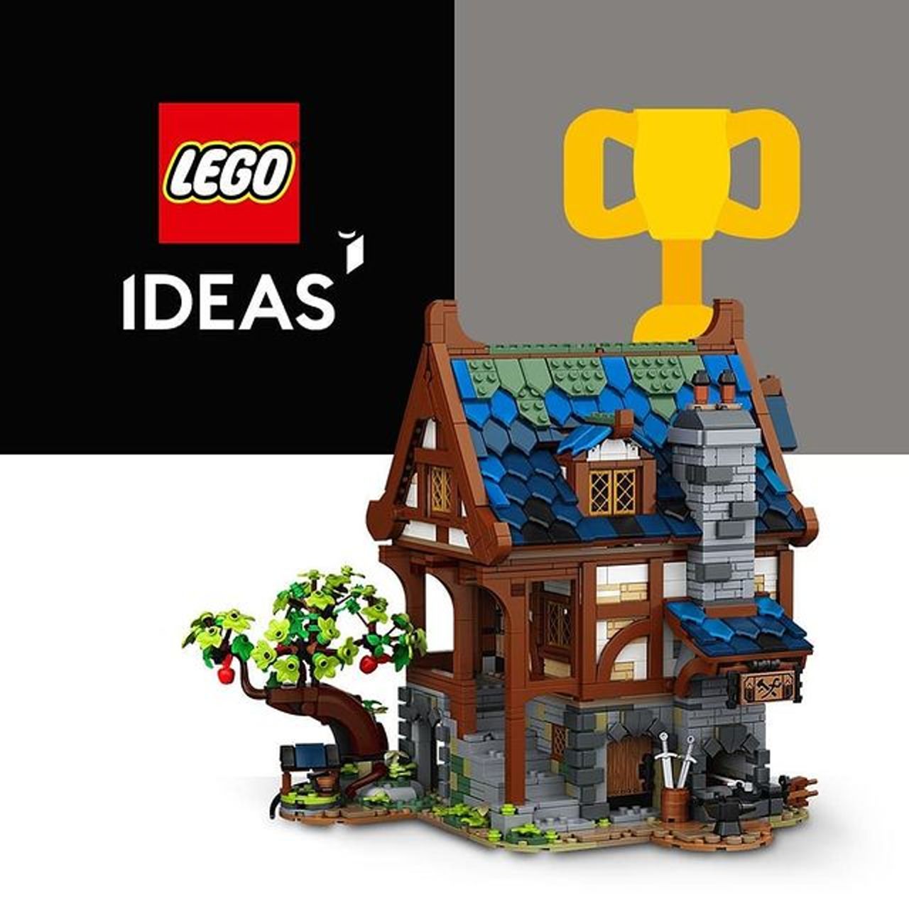
Amazon.co.uk has revealed the forthcoming Ideas Medieval Blacksmith on its Shop By Theme page.
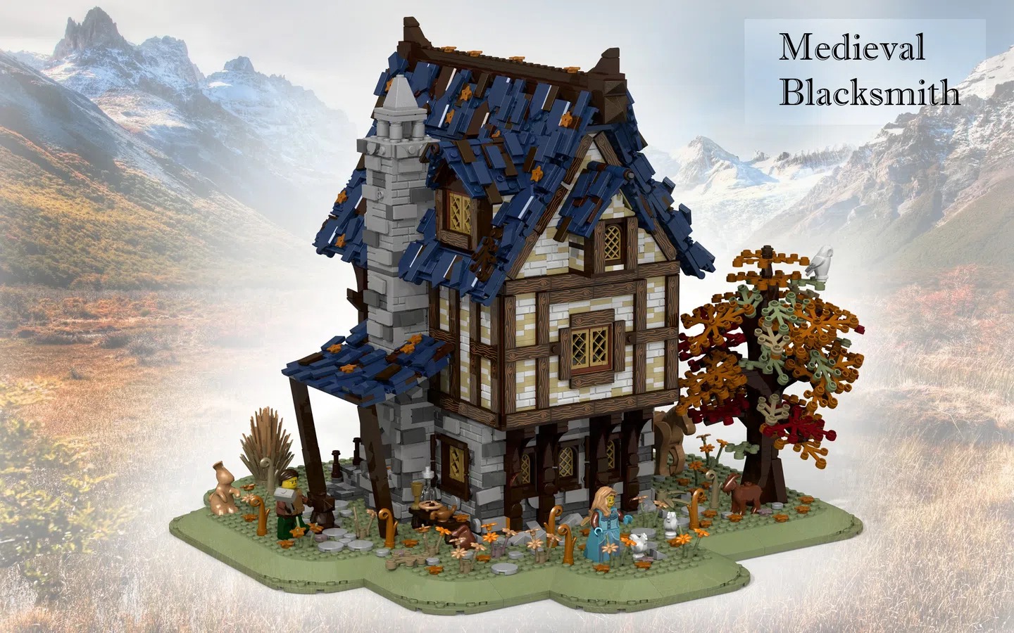
It's only a thumbnail but it's sufficient to see that it looks excellent, although a significant departure from Namirob's original submission, a picture of which you can see after the break.
If I had to guess I'd say it will be released on 1st February.
221 likes
182 comments on this article
Looks great.
Definitely picking that up, been too long since a good medieval theme.
What's the point of submitting a design if it is going to be significantly altered? (aside from the obvious benefits and bragging rights) The whole point of the Ideas is to have the submitted design be put on market. Of course it must meet the rigorous design and play standards of TLG. Understandably there would be modifications, but one would think it would at least have some semblance of the original design submission. They look NOTHING alike other than being blacksmith houses. When the first Ideas were done they weren't too far off from the original submissions (barring the above quality requirements). I was looking forward to getting the blacksmith house, but now that I see it, I'll pass. I'll just check the bricks and pieces for any cool parts in new colors. What a shame.
Not sure if I like the roof... But always nice to see medieval sets back again!
It would be nice if Cesar Soares had the chance to work with a project like this, specially due to his past with the medieval theme! Want to see pictures of this one and the Ninjago Gardens asap, they both look packed with awesome building techniques!
I feel like at this point, rather than just modifying an approve build to their standards, Lego are simply taking the idea and making their own set. The only two things I see in common between these sets is the colour scheme and the medieval house style
One thing I always liked about official Lego sets (say, the Modulars, none of which I own) compared to large-scale MOCs I've seen is how they boil down ideas and nice-part-usages to the minimal workable level instead of spreading it out repetitively. I think Lego has done that here, too - the raised ground in the original submission and the sheer size of the roof really seem excessive - but I could totally understand if someone felt that Lego's version looks dumbed down compared to the original. I wonder whether the excessive detail on the roof, for example, wasn't a driving factor for the support the ideas submission received.
Very nice! It looks to be a very parts-intensive build. Looking forward to seeing the insides.
@Wraeththu said:
"What's the point of submitting a design if it is going to be significantly altered? (aside from the obvious benefits and bragging rights)"
Well, it's called Lego IDEAS. And the overall idea/concept is accomplished imo.
@Wraeththu said:
"What's the point of submitting a design if it is going to be significantly altered? (aside from the obvious benefits and bragging rights) The whole point of the Ideas is to have the submitted design be put on market. Of course it must meet the rigorous design and play standards of TLG. Understandably there would be modifications, but one would think it would at least have some semblance of the original design submission. They look NOTHING alike other than being blacksmith houses. When the first Ideas were done they weren't too far off from the original submissions (barring the above quality requirements). I was looking forward to getting the blacksmith house, but now that I see it, I'll pass. I'll just check the bricks and pieces for any cool parts in new colors. What a shame."
Rather this than not having it at all
But what's up with that brown quarter circle tile on that wall? The point of diagonal beams in timber framing is to provide stability against "racking" -- what sort of stability would a crooked wooden beam (which is only connected to _one_ corner of a beam rectangle) provide?
I think that the angle of the photo is misleading. If you look at the features like the extended window at the back and the little roof section on the side it is there. I believe that with more pictures the similarities are greater. The biggest difference is the base.
Underwhelming. Nothing like the source idea. Yet another downgrade of an amazing submission to fit the colorful LEGO play-style.
Seems nice, but I wonder, would this gather 10k votes? I have some doubts...
@DonnaxNL said:
" @Wraeththu said:
"What's the point of submitting a design if it is going to be significantly altered? (aside from the obvious benefits and bragging rights)"
Well, it's called Lego IDEAS. And the overall idea/concept is accomplished imo.
"
I suppose, but again, it seems a stretch imo.
Yes, I'm glad that it does exist as well, and have purchases a number of Ideas sets. It is a proven market and seems that they could have maintained more of the original design (again understanding they must make modifications to meet TLG standards). But it looks more like the set being released was the LEGO version and Ceaser's design upgrading it to a 'fancy MOC' as has been done with other sets.
I prefer the original, but overall I like the set. It looks like they've made it to appeal to younger people as well as adults. The original had a more adult look about it.
@Indy1984 said:
"I think that the angle of the photo is misleading. If you look at the features like the extended window at the back and the little roof section on the side it is there. I believe that with more pictures the similarities are greater. The biggest difference is the base. "
Exactly. If you take a look at the other photos of the original design, you'll notice that the two buildings are very similar in overall structure, it's just that this first picture of the final model is shown at a rotated angle compared to the original. The biggest difference at this point is the more vibrant color scheme and the landscaping, particularly the tree.
While I do prefer the original for it's darker tones and additional "greebling" on the roof, this one still looks pretty good. I think y'all should hold off on the pitchforks until we get better pictures.
Small & cute!
I probably wouldn't have had room in the budget for the massive (and impressive) original submission, but this looks pleasantly affordable.
Superfans could maybe even afford two and extend it nicely.
I'm sorry. I love LEGO. I love the Ideas program. But this deviation from the original design really lost me. I was pumped for this set, but the meddling by LEGO has ruined it for me. Kind of sad.....
I'm confused why are people complaining about the fact that it looks so different (I don't think it does but that's beside the point). It's Lego after all, if you don't like it, just rebuild it in a way that works for you...
Personally I rather like it and I look forward to better images to see how it might fit with our medieval market which we've not built for a while now...
Similar to the Treehouse, the colours look better on this version than the original submission. I wonder how much it will cost.
It looks to be a good set and probably a reasonable downscaling that's feasible from a sales and marketing standpoint. There are a few oddities but hey - we haven't had a medieval set in a long while. Let's not be too whiny.
I know I'm unusual in this respect, but I always prefer clean, elegant sets to overworked and repetitive MOCs. This looks like a vast improvement to me.
And it looks like it might actually be affordable, unlike the original.
@R0Sch said:
"Underwhelming. Nothing like the source idea. Yet another downgrade of an amazing submission to fit the colorful LEGO play-style."
How dare they? It’s almost like the original LEGO Castle was bright yellow, and...a toy!
Is it the same as the original submission - no. But that was parts heavy. The finalised version has been simplified, and part count reduced. Same happened with the 21322 Barracuda Bay. The original was epic. Lego will have worked with the Designer, so it should have their “seal of approval”... I like it, can’t wait to see interior details and the rest of the outside...
And the Amazon link doesn’t direct to Ideas sets, but Jurassic World ones instead... perchance Amazon have published the image a tad too early and someone is getting a New Year knuckle rapping?!
Happy New Year AFOLs, and keep up the excellent work Huw, Brickset is a brilliant resource and well delivered!
As with almost every Ideas set; the original was better. I was interested in the original but have no interest in this one.
Downscaled but I am sure the alternative roof tiles design will grow on me. I prefer the original submission but it doesnt mean I dont think the Lego version is not good. Only real shame is there is no goat ;)
There was no way the original submission would become a set. Too big, too parts intensive, it would have been a £300-400 set. You can definitely see the thematic and design links between the two, much like the Pirates of Barracuda Lego IDEAS set. Hope this has as many hidden classic castle references as that did to classic pirates... As while it's nice, it's notcurrently shouting 'must buy' to me.
Everything having already been said for and against, I find myself agreeing with both sides. Was the original set worthy of becoming an Ideas set? Absolutely. Will the Lego rendition be worth the money? By all means.
Undoubtedly, there have been compromises in building the final model, so well pointed out in previous posts by fellow Bricksetters. The original model is a true work of art, but in order to dish out a perfect replica, a rough estimate would bring the price tag close to the most expensive Lego sets ever. Its commercial interpretation resembles it enough to be another great affordable Ideas theme set.
All in all, long live the Ideas theme. And happy building in 2021 to everyone.
I'll be very interested to see more/better photos. The original design looked like an excellent 18+ set, but this looks more like a 7+ City set. Hopefully the picture just hasn't caught it's best angle.
Wow, the finished product looks nothing like the Ideas model. There is no need for me to buy another standart Lego medieval set.
As with previous final versions TLG realize that to reach a larger audience they need to reduce the piece count and detail. So a compromise will always be there and they will lose some of the original AFOL voters, but according to the marketing people they should gain more from the mainstream family shoppers who never voted. But before making up your mind it would be good to see other angles and the inside to see how much they have changed the upstairs living quarters and the ground floor blacksmiths shop. On the plus side if it is available on Amazon then the price will be discounted at some time. Overall, I hope by making a more city like set TLG have plans for other medieval buildings which can be joined together as looks a bit lonely at the moment, and as no figures are shown yet I hope the goat is still included.
I personally like what I see. It is downscaled, but downscaled well. At least this way I can see the price not being ridiculously high.
It's always upsetting when people completely disregard these highly detailed Ideas sets as "a 7+ city set" just because they're smaller and less detailed than the original submissions
Also if you look at the original submission from different angles, you'll see this is extremely accurate in terms of shape, they just look completely different because the 2 images in this article are taken from different angles
I like it, not the huge beast as the originally submitted idea, will be more affordable!
@MisterBrickster said:
"I know I'm unusual in this respect, but I always prefer clean, elegant sets to overworked and repetitive MOCs. This looks like a vast improvement to me.
And it looks like it might actually be affordable, unlike the original."
I totally agree. I had the same thing with the pirate bay. Didn't like the original submission at all, loved the final product.
Finding it amusing that people actually thought the original 10,000-piece, wholly-unrealistic, would-never-get-made, wouldn't-pass-design-review, never-in-a-million-years submission was going to be what was released.
At least look at the silver lining, it's not another Ideas set based on an existing product.
Looks like yet another fantastic Ideas set!
I mainly voted for the model because of its beautiful, desaturated color scheme, but once again they've changed it :(
@Andhe said:
"Hope this has as many hidden classic castle references as that did to classic pirates... As while it's nice, it's notcurrently shouting 'must buy' to me."
It doesn’t seem very Castle-y to me. Apart from the forge at the base of the chimney and the swords in the barrel, this could be a house from the City range. Seen from a different angle, it could be someone’s house in 2021. I wish LEGO had the nerve to go for a proper Castle set, either through Ideas or developed in house.
the ideas design is nice though I would prefer the more muted colours of the OG idea
It looks good on first glance, in my mind the original was way to big and out of scale with anything we have gotten in castle before.
However there better be some cool animal moulds and minifigs with the set :P
I think they did a good job on rescaling the project. It would look weird together with older medieval sets. However i would have wanted to see a little darker color skeme, so you could also use it for dark lord empires instead of the jolly knights
Love the ghibli vibes from this, absolutely beautiful
@Graysmith said:
"Finding it amusing that people actually thought the original 10,000-piece, wholly-unrealistic, would-never-get-made, wouldn't-pass-design-review, never-in-a-million-years submission was going to be what was released."
Lego fans and unrealistic expectations for new products, name a more iconic combination.
(compare also: the run up to the Death Star rerelease)
They took an IDEAS submission that looked like a MOC and turned it into something that looks like an official LEGO set. I am not sure why anyone would be surprised by that?
Anyone who submits to IDEAS and expects a near-replica to be produced as a set is likely to be disappointed. It's the idea that is up for review not the final product.
I like the look of it from what we can see from this one photo. However I'm not completely convinced by the choice of colours at the top of the roof, not sure what they're trying to represent there with the sand green?
I have a small street of modulars which I see as older buildings set in roughly contemporary times. Half timbered buildings are part of the mix of different ages of building in the UK so this might be a good complement. (The city I live close to has an small 16th century half timbered building used as a restaurant in a row of shops and restaurants which are more modern, I like the juxtaposition of new and old like that.)
It’s too far from the original design for me. I’ll pass. They’ve done it to make it more affordable.
I prefer the new roof. I don't like excessive greebling on buildings, it makes them look poorly constructed and in case of the roof, ready to fall apart. They could do better than that in the middle ages really.
@Graysmith said:
"Finding it amusing that people actually thought the original 10,000-piece, wholly-unrealistic, would-never-get-made, wouldn't-pass-design-review, never-in-a-million-years submission was going to be what was released.
At least look at the silver lining, it's not another Ideas set based on an existing product."
Spot on!
They ruined the model with the roof!
Quite a difference to the Blacksmith Shop designed by Daniel Siskind back in 2002:
https://brickset.com/sets/3739-1/Blacksmith-Shop
If I remember correctly this was the first fan designed set. It even featured Daniel's name on the front of the box.
I like it. The tree looks lovely and the curves look great. Not too sure about the colouring of the roof tiles. However, as A Star Wars fan, I have enough grey pieces already.
I do like it.
But yeah, it really does look nothing at all like the original submission, does it?
Would the designer who submitted the idea still have involvement in how it ended up? And would they have a release party where they can sign boxes but for it to be nothing like what they designed? Pre covid of course...
If you want a better photo for comparison look at image 5 of the Ideas submission. The overall shape is the same; the only thing that has changed is the roof, colour scheme, details and size. Of course these are significant things but the overall design is the same, while being more affordable and generally more appealing.
I think they've captured the sense of the original pretty well, and at the same time reduced the part count so that it's more affordable for more people. For those wanting something bigger to boast about buy 2 or 3 and MOC it up
I like it - are those green brick bricks I see?
Hopefully comes with some nice minis and gift with purchase.
I like it. Much more affordable for those of us who want more medieval architecture but aren't operating on a lavish budget! :)
I actually think this version loks better than the original. They got rid of that weird vegitation at least.
But some points:
The roof is still quite ugly. Especially the fronts don't look "medieval" in my eyes, those large beams framing it have "viking" or "celtic" vibes in my eyes.
Why exactly is the roof blue? And why is there a bit of bronze at the top?
The Chimney's top is weird. In my eyes those two small outlets belong to TWO small ovens below, not a single large forge.
I prefer the original. The new variant is childish.
The more I look at it, actually, the more I prefer the official version. There are two types of “detail” here - the original has lots more “random” detail, like that roof. However it doesn’t paint a very interesting picture on an individual level, such as round door frames and window frames, and nothing is particularly contrasting. From a distance, the original looks sort of bland, and close up, it doesn’t have anything in particular to admire apart from an overall effect. The official on the other hand, has more “individual detail”, such as around door frames like I was saying, and is contrasting to the rest of the walls rather than BEING the rest of the walls. From a distance, it will look far more interesting, and close up, it’ll have far more to look at.
Basically, we are looking at a MOC vs a Lego set. And Lego are never going to make a MOC.
I like the design better then the original , but also reminder different angle of view.
Not sure why people are upset about this, maybe just a vocal minority. Barracuda Bay was completely redesigned and is one of the top sets of 2020. The original submission was never going to be a viable set with zero changes
Personally, I like the roof on the Lego version better, and I’m glad they kept it to a smaller size.
@Henry_D said:
" @monty_bricks said:
"Not sure why people are upset about this, maybe just a vocal minority. Barracuda Bay was completely redesigned and is one of the top sets of 2020. The original submission was never going to be a viable set with zero changes"
Yes , it was redesigned , yet it kept it classic retro lego pirate theme style, while this one lean towards Duplo
"
Not even close with your Duplo comment. As @Paperdaisy said, many of these submissions are excellent MOC’s, but that doesn’t mean they make good Leto sets. The piece count and price along would never be viable, let alone some of the building techniques. What Lego does is take a MOC, and in many cases has to revise them to be a decent Lego set. We see this with almost every single set.
Honestly, I like that they downsized it. Ideas sets were becoming too big and too expensive for many people. It's nice to have a mixture of the larger sets and more accessible sets.
This is a purchase for me, I love it.
@dingbat591 said:
"Everything having already been said for and against, I find myself agreeing with both sides. Was the original set worthy of becoming an Ideas set? Absolutely. Will the Lego rendition be worth the money? By all means.
Undoubtedly, there have been compromises in building the final model, so well pointed out in previous posts by fellow Bricksetters. The original model is a true work of art, but in order to dish out a perfect replica, a rough estimate would bring the price tag close to the most expensive Lego sets ever. Its commercial interpretation resembles it enough to be another great affordable Ideas theme set.
All in all, long live the Ideas theme. And happy building in 2021 to everyone."
Absolutely agreed, and honestly, as cool as the original would have looked on display, I would not have enjoyed building those walls, or that roof. That just looked like hours of sitting and trying to get 1x1 plates to line up smoothly - not how I want a building session to go. The smaller, commercial version is exactly that - smaller - and likely far easier to assemble. Personally I think both models look wonderful, and appreciate the lessened impact this will have on my wallet.
I've voted for nearly every single one of the Ideas sets they decided to produce in the last couple of years, and I haven't bought any of them because they keep dumbing them down in the redesign. Or, in the case of the piano, added extra expense with pointless mechanical function.
This was not always the case, and I have bought several other Ideas sets before. I fully support them altering the design, it's to be expected, but I wasn't voting for "Medieval Blacksmith", I was voting for "Attractive Complex Medieval Blacksmith that will look good on my shelf". This looks really childish, and I'm sure it will sell because it's a pretty good model and this is Lego after all ... but were the people voting for it on Ideas children, or were they adult collectors like me?
I haven't bought a Lego set since 71043 was released, which I bought on release day nearly 18 months ago because I'm that sort of Lego buyer. Since ending my Dark Ages I haven't gone this long without ordering a set!
I do wonder if this is in part to do with them changing the voting system. It used to be they'd ask your age and how much you'd be willing to pay for a set. I was always honest about that and willing to pay a large amount for the complicated sets, but now it's just vote-and-move-on, perhaps they no longer know the demographics?
It is rare, but this time I prefer the LEGO version to the original submission. Both look good.
While I understand that producing a near-replica of the original submission as an official LEGO set would have been impossible, I still don't think they did a particularly good job with the redesign. I personally find the choice of colors on the roof quite questionable, and I far prefer the original more muted colors that look a lot more medieval-ish.
Although significant changes being made to the original submission was inevitable, this LEGO Ideas set still stands as a big downgrade from the original submission, especially with the color scheme choice.
I don’t like this design at all, it looks a lot smaller, too bright and colorful and it looks like a complete different model compared with the original design. Don’t no if i am going to buy this one.
Still looks a lovely set from what I can see so far, but still a shame it’s been changed/downscaled so much from the original.
Will wait and see for more when we see the official press release.
This looks beautiful - I think they did a great job distilling the original idea and streamlining and improving the design. I love the original too, but it would probably have cost 3x as much. Love the medieval theme, and hope there are more to come!
@chocolategoddess said:
"This looks really childish, and I'm sure it will sell because it's a pretty good model and this is Lego after all ... but were the people voting for it on Ideas children, or were they adult collectors like me?"
I'm a grumpy old man and I think this is a fantastic set.
Life's a lot more fun when you don't worry about what is considered 'childish'
While it changed a lot I can say I like it and may get it to place at my Lego World.
I understand the dumbing down of the design, as too many MOC's are needlessly cluttered with excessive pseudo-detailing and the original submission was a good example of that specially in the roof.
HOWEVER, I don't understand why they had to change the colour scheme and make it look so bright. They should have gone with Dark Brown and the roof didn't need that plethora of blues and green.
I'll still get it, but it's a massive disappointment for sure.
Count the studs. At this angle, the roof line[24st] + the grounds and well (There's a well!) [8st] + the window roof at the other end [3st], overhang of the tree... It may be smaller, but it's still near modular building size.
And it'd be hilariously awesome if in the scaling down process the blacksmith became a dwarf (with med legs)!
I voted for this on lego ideas because I liked the idea, but I would never have bought the original submission (too bland colors and too ”unfocused” design imo). Turns out voting on it was a good choice as the redesigned set is far better than I could’ve imagined! Definite buy for me
Disappointed really! Nothing like the original. I mean its a nice set unto itself but I wish LEGO would keep more to the original script. What's the point of LEGO Ideas and these folks putting in all the effort only to start with a fresh slate. I realize there are reasons for some modification but why accept a set if it needs to be totally redesigned. Perhaps in the end its only about the idea.
It looks really nice, just wondering how looks interior and is it closed from back or not? hmmmm
I didn't look through all the comments, but for all of those complaining that it looks different: have you considered that the picture is just another angle? Because the whole model is damn similar once you rotate it, as can be seen in other pictures from the original submission... Sure they modified some parts and simplified some textures, but it looks really close to the original to me...
I like the simplified lego design.
better matching my castle collection.
Original design is cool, but too complex.
Ehh... for starters, the Ideas version looked a LOT better. Second, it's not like the Barracuda Bay set that went for a theme that meshes well with the original Pirates line. This doesn't thematically match with the classic Castles theme from the '80s, so it's not going to attract as much AFOL nostalgia purchasing. I am actually relieved to not see another "must buy" set, though it would be cool to see a return to the best Castle theme, which was in the '80s with Crusader/Lion knights and Black Falcon's knights.
I have been waiting on a Blacksmith shop from Lego ideas for SO LONG. Even tried to make it happen myself.
I seem to remember that the fand designer works with lego as it's turned into a set. We can probably assume that they helped with this redesign.
41-yo AFOL here. I like it a lot - much more than the original submission, which I agree is a very well-built MOC, but not something that I would buy from the LEGO store. While some folks might cry,"childish!", to me this fits the "LEGO aesthetic," which I am attracted to . . . as a fan of LEGO. It boggles my mind when people complain about something looking too much like a LEGO toy - that's what it is!
Really, I love the idea of having a new Medieval set, but I am not going to reward TLG for ruining the original design. This is so different from what I voted for, so simplified and changed in so many ways that buying the final product is out of the question for me.
I'll rather stick with the Medieval sets by that other company I am not allowed to name.
"My children's toys are too childish!"
Looks good! I'm glad it isn't another massive set as Ninjago City Gardens is already gonna tank my 2021 Lego budget lol.
Its fantastic! Both the original and the LEGO redesign, such craftsmanship. 100% getting this!
Thoughts on an interview series with past Ideas winners to get some behind the scenes on how much input they have during the final product design phase?
Reading through the comments it seems folks are split between loving the new look or hating it because it deviates so much from the original. It would be interesting to hear from some people whose idea was pretty much replicated vs. very different.
I’m going to reserve judgment until I see it in full, but so far I’m very, very skeptical. The gut reaction isn’t there for me yet. Hopefully it will be.
Wow, that's... simplified.
Looks like a dumbed down version of the original. All to straight and neat looking. I won’t be getting this one but lego have a lot of releases this year I do want so it’s more about the spending budget.
For those complaining that the set's bright color scheme looks "less medieval" and more "childish" than the original submission, I think people in the past generally painted things in bright primary colors that would eventually lose their vibrancy and fade with age/exposure/wear. Perhaps people are more used to seeing these muted colors in older buildings and thus attribute more realism to a less vibrant color palette. When these buildings were new/had new paint jobs, however, they were likely more brightly colored. While I understand the aesthetic preference for the muted/darker color scheme (which does give buildings a more "aged" look to them that some people undoubtedly prefer), I do think that claims that brighter color schemes = more childish and less realistic are a bit unfounded when viewed through actual historical standards instead of our more modern color aesthetics (with our increased access to/usage of a much vaster color palette). There were similar comments about the color scheme changes in 21322 that were slightly more justified as the ship was suppose to have been wrecked for many years (however, I prefer displaying an intact ship at its colorful prime rather than as a faded wreck).
At least it's not another sitcom set
There better be a goat in there!!
Wow! What a disappointment. I understand modifications to make it stable and reducing the number of parts. Why change the color? I prefer the dark brown trim. I thought the original tree was great. I wonder if the final design was on ideas, if it would reach 10,000 votes?
@MrBob said:
" @Indy1984 said:
"I think that the angle of the photo is misleading. If you look at the features like the extended window at the back and the little roof section on the side it is there. I believe that with more pictures the similarities are greater. The biggest difference is the base. "
Exactly. If you take a look at the other photos of the original design, you'll notice that the two buildings are very similar in overall structure, it's just that this first picture of the final model is shown at a rotated angle compared to the original. The biggest difference at this point is the more vibrant color scheme and the landscaping, particularly the tree.
While I do prefer the original for it's darker tones and additional "greebling" on the roof, this one still looks pretty good. I think y'all should hold off on the pitchforks until we get better pictures."
The tree and color choices are not selling tickets on my couch. The happy-go-lucky colors should be firmly kept away in other Lego lines. Duplo for example.
Nice comment with the pitchforks - you might have a point so the "pointy" weapon will be kept away for now. This doesnt mean that the torch and rope are removed from my backpack though.
I have no problem with redesigning the IDEAS projects to transform them into marketable official sets. Just can’t figure out why the Grand Piano survived with a huge piece count and very clunky internal mechanism when so many other great projects get scaled down like this one has.
I think the charm of the original has been lost in translation, I love Ideas and this is the first time i’ve gone.... hmmm not sure.
I think the intent of the roof on the original could have been much better carried across into the retail set, still removing some of the complexity, but the run down ramshackle look has just been completely disregarded
I like both. Give it to me now!
I don't mind the changes. I probably wouldn't have the budget for the original, but might be able to get the official set. It looks really cute!
I think the updated design looks excellent. The changes are relatively substantial but appear focused primarily upon strengthening the structure which is certainly worthwhile. The colour changes do not bother me for the reason that @LordDunsany mentioned above. Medieval artworks routinely feature colourful buildings and that probably reflected reality at the time. We only imagine them with muted colours because that is what remains today.
The only alteration that I really dislike is the chimney. Medieval buildings can sometimes be distinguished by their chimney designs and the original example was quite realistic, with an elevated stone chimney cap that would dissipate smoke quickly. The finalised model instead features two chimney pots which would be unsuitable for a blacksmith and seem completely unhistorical to me.
@northgeorgiamasonry said:
"I have no problem with redesigning the IDEAS projects to transform them into marketable official sets. Just can’t figure out why the Grand Piano survived with a huge piece count and very clunky internal mechanism when so many other great projects get scaled down like this one has. "
My guess? I’m not sure if this is even still a part of the supporting process, but the prices a supporter is willing to pay. Maybe for the grand piano, the price supporters were willing to pay was close to the actual cost and for this set the price supporters were willing to pay was drastically less than what the original IDEA would have cost. From comments on other articles I could totally see AFOLS wanting to pay classic castle prices for a modern day imagining.
I appreciated the original fan design but not interested to buy it. After seeing the simplified design, I didn't change my mind. I am not a Medieval theme person. I remember a similar discussion on the tree house. I was tempted to get that even after the design changed. Can't really tell from one pic, but the new design of the Smith seems to accommodate more to the non-Afol community.
After the initial maybe disappointment at the changes, I now really like the official version. I'd felt very conflicted that the Idea simply would not fit in with the rest of classic Castle, not least in scale. Lego have made this set a proper Castle set.
I like the blue roof, as it recalls the earlier fan-designed blacksmith's. It now looks like a minifigure-scale Lego set. Just have to decide how to rationalize having three blacksmith shops in one village.
I really like the commercial set but agree it looks nothing like the original Ideas submission. Unless you think ‘it being a medeival house’ as sufficiënt for there being a big similarity.
I also think the one we’re getting will fit much better with the original Medeival Market Village from a decade ago. Looking forward to finally adding to that part of my LEGO Town!
Yes, the original looks great, but the official version actually looks like an official set, with an affordable piece count. The size of the building looks roughly in line with modulars, so it could be moc'd to fit a street, maybe as an old English pub.
I used to feel like some of the commentators above "they've ruined the original submission", until I bought a fake Lego version of the original ship in a bottle design. Yes, it looked nice, but it was massively oversized, difficult to build, and incredibly fragile. That's when I appreciated the work the Lego designers do in adapting an Idea into a full-fledged set. The original submitters come up with amazing designs, but that's only the first part of the job!
This set also shows just how special Old Fishing Store is. They made an official set that met LEGO requirements but preserved the rundown, ramshackle character of the original design. I think everyone understands that the design will go through changes, but so many of them lose their character in that process.
I think it's great, and will be a day one buy for me depending on the price. I also hope it sells well so LEGO will think about producing more medieval sets. I think the original MOC was great too, but it would've been cost prohibitive to produce a set with that piece count.
I'm excited to see what the interior looks like, and if it comes with any cool minifigures.
The model looks good, but where are the minifigures?
Also, you could make a decent "How it started/How it's going" meme with this
@northgeorgiamasonry said:
"This set also shows just how special Old Fishing Store is. They made an official set that met LEGO requirements but preserved the rundown, ramshackle character of the original design."
Reading through all the comments of 'this can't be done' or 'that wouldn't be practical', I was surprised that the Old Fishing Store hadn't been mentioned. Truly an example of an Ideas set done right.
The Old Fishing Store is an incredibly boring build, just like the Ghostbusters HQ. I'd build almost any modular thrice over before rebuilding either one, and Ninjago City/Docs is even better.
I'll wait for more pics of the interior, and back, before passing judgment. I'll probably buy it, as I am something of a completionist for Castle series sets.
I'm willing to excuse the changes to the color scheme if there is a goat in there. Come on LEGO, this is the perfect opportunity to bring the goat back, do not disappoint us!
wow, what a definite departure from the original work. This is very different from what I voted for. It looks good, but why all the drastic changes LEGO? It had a very nice muted color scheme, now very bright. The same color change happened with Pirates of Barracuda Bay with the white and gold additions. It helps the design with muted colors to keep it looking old. For now a PASS.
Sadly it looks nothing like the original and much smaller.
Agreed! This looks more than 50% different from the Ideas' submitted design. At what point is there no point if set will be changed so radically from the submission?
@Wraeththu said:
"What's the point of submitting a design if it is going to be significantly altered? (aside from the obvious benefits and bragging rights) The whole point of the Ideas is to have the submitted design be put on market. Of course it must meet the rigorous design and play standards of TLG. Understandably there would be modifications, but one would think it would at least have some semblance of the original design submission. They look NOTHING alike other than being blacksmith houses. When the first Ideas were done they weren't too far off from the original submissions (barring the above quality requirements). I was looking forward to getting the blacksmith house, but now that I see it, I'll pass. I'll just check the bricks and pieces for any cool parts in new colors. What a shame."
I voted for the Idea. I will be buying the official Lego set. I just wish the Lego designers would stop with this obsession for using Sand Green in every big set. It does nothing to enhance the look of this set the way they used it on the roof. I also agree with CapnRex that they should have used the original Chimney design rather than altering it. I'm glad this looks like it will be a much more affordable set than the original design.
It's a great looking set. However, Lego as usual swings for both audiences and misses.
I would've bought a more serious and epic looking blacksmith for myself or just a blacksmith playset that's a part of a castle theme for the kids. I'm not sure what to do with this. It's nice, but not a stunning display piece and playing with an isolated blacksmith is not the same as playing with castle and knights. Instead of assuring I buy the set for one reason OR the other Lego keep making these in-between sets that are mostly a pass - not because they're bad, but because other sets fit the bill better.
I do not like to say negative things, because Lego has their own reasons for doing things, but this is a travesty. Lego's version is like a 10-year-old kid tried to remake a master builder's set with a limited number of parts. Lego comes out with sets that are 18+ that have no business being called 18+ like Elf Clubhouse but cannot make this set at all like the designer's original vision. We voted for the set and expected it to look something like the picture. I was really looking forward to buying this set as probably the best set of the year. They made the other Lego Ideas sets as big as the designer wanted.
I understand that Lego wanted to change the colors, was not going to print 20 wooden tiles, and has their design rules on stability, but this is just the worst oversimplification I have seen in a long time. The Lego designer and the suits that dumbed down this set should be embarrassed.
Why does the tree in the Blacksmith shop look like a better tree than the one portrayed in the Bonsai set?
Damn,some market research told them bonsai are great,and they are force feeding us... And was really looking forward to all the animals that should come with the set ..but guess this is cheaper. Well,still a great set,but far from what was rated on the ideas site
I’m amazed at the number of people that just don’t get it. If the Ideas platform were to stick 100% with the original designs, and not change or alter anything, no sets would get made. At least not for the price anyone here would be fine with paying. Plus, structurally many of the original submissions aren’t viable sets.
To all of those that say they understand Lego has to change stuff, but it still sucks...well, I don’t think you actually do understand.
But AFOL’s are a crazy bunch.
I haven't seen a set that has changed so much since the original design since Steamboat Willie. At least that one was built up and made better. The opposite seems to have happened here. (Yes, I have looked at photos of the original from other angles. They STILL seem like two different but similar sets.)
I will probably get it and overall it's a pretty good set...but not at all as impressive as the original set that we all voted for on Lego Ideas looked like!
In my opinion, Lego's interpretation looks like it came straight out of a Disney fairytale. This is nothing bad per se, but I have to agree that it has little to do with the original submission which aimed at realism.
@Wraeththu said:
"What's the point of submitting a design if it is going to be significantly altered? (aside from the obvious benefits and bragging rights) The whole point of the Ideas is to have the submitted design be put on market. Of course it must meet the rigorous design and play standards of TLG. Understandably there would be modifications, but one would think it would at least have some semblance of the original design submission. They look NOTHING alike other than being blacksmith houses. When the first Ideas were done they weren't too far off from the original submissions (barring the above quality requirements). I was looking forward to getting the blacksmith house, but now that I see it, I'll pass. I'll just check the bricks and pieces for any cool parts in new colors. What a shame."
"They look NOTHING alike"? They're both three stories tall, with a peaked roof, blue shingles, and a dormer window. Both designs use heavily textured and mottled gray stonework for the ground floor and chimney, and a half-timbered construction with brown timbers and white infill for the upper floor and attic.
The overall structure of the two designs is nearly identiical: on the left side, there is an exterior stone staircase which the attic overhangs, supported by vertical wooden timbers. On the right, the upper floor jetties outward, overhanging the wall of the ground floor. On the front are the chimney, dormer wiindow, and the window of the blacksmith shop, with an slate-shingled awning overhanging it. The only obvious structural changes to the building itself are that the positions of the chimney and dormer window have been switched left to right, and an additional doorway has been added to the ground floor beneath the dormer window.
I recognize that a lot of more nitty-gritty details differ between the two designs even if the overall structure has been largely kept the same. The timbers in the original model's walls were all vertical or horizontal, while the final set adds curved timbers as well. The original model's lower level used prefab half-arch pieces over the doors and windows, while the final set uses SNOTted tiles and curved slopes to give the arches a more heavily textured look like the rest of the stonework.The original model had conspicuous gaps between its roof timbers, while the final set uses an elaborate hinged design which makes those timbers more solid, but also makes them noticeably thicker than the SNOTted tiles used for the half-timbered walls. And of course, the original project's roof shingles were less varied in color than the final model's, but much less varied in color, giiving the roof more of a a run-down or dilapidated look.
But all in all, the similarities between he two buiildings are profound enough to make it obvious that the final set is based on the original build. If they'd simply designed a blacksmith shop set from scratch without this specific fan-created model as a basis/prototype/sketch model, the end result would most likely have looked vastly different in terms of its color, structure, and even a lot of the specific architectural features like the jetties and awnings that help this model stand out so much from other sets and MOCs.
I must say I do not understand your enthusiasm Huw: the original set was amazing but the final one is very dissapointing, both in shape and in colors... If I buy it, it will be probably to use the pieces to make a Prancing Poney MOC
@elisewong18 said:
"I appreciated the original fan design but not interested to buy it. After seeing the simplified design, I didn't change my mind. I am not a Medieval theme person. I remember a similar discussion on the tree house. I was tempted to get that even after the design changed. Can't really tell from one pic, but the new design of the Smith seems to accommodate more to the non-Afol community."
I don't think it's really accurate to describe the changes of this model as it being "simplified", let alone "appealing more to the non-AFOL community". A lot of the changes like the updated timber framing, stone arches, and landscaping add considerably MORE complexity and detail than their counterparts in the original model.
There are also some changes in this design that don't impact the complexity one way or another, like using Reddish Brown instead of Dark Brown for the timber framing, or adding some variagation to the color of the roof shingles to represent moss or weathering. But frankly, I'd like to believe that most AFOLs have more nuanced and mature perspectives on color palettes than the sort of "darker/duller is better" approach that has resulted in tiresome, unimaginative, low-contrast lighting and color grading in so many "gritty" or "serious" video games and movies.
The only part of the model that IS "simplified" compared in the final version than the original project is the construction of the roof, and I suspect those changes were driven by fundamental structural concerns. After all, since this project is a digital model, it's impossible to know how sturdy this roof construction would be for long-term display, let alone whether it would be prone to breaking or sagging when physically interacting with the set (like removing the attic to see inside the other floors, or opening the roof up by its hinges to see inside the attic).
So many people are mentioning the Old Fishing Store as proof that LEGO can stay true to the sort of ramshackle design that often appears in MOCs, but the Old Fishing Store's roof had a much more sturdy and solid design than the Blacksmith Shop to begin with. That project's roof was made up of large tiles representing wooden boards, which were then attached to a very solid underlying surface (with only a few attached by single studs). The Blacksmith Shop project's roof has loads and loads of tiny 1x2 tiles attached irregularly to a surface that's hinged in at least four places on each side, and presumably built from much smaller plates to accommodate those hinge pieces.
Keep in mind that large tiles like those on the roof of the Old Fishing Store can be much more securely attached to a single stud than 1x2 tiles — larger tiles have tubes on the underside to ensure that each anti-stud functions as a fixed pivot point, while 1x2 tiles can slide more freely on a single stud, resulting in weaker clutch and a greater likelihood of popping off when the roof is hinged open. That's fine for a model nobody ever intends to touch once it's on display, but a potential nightmare for a model which builders are intended to be able to open up to view or access the interior.
And honestly, a lot of AFOLs anticipated changes to the roof design well in advance — many conversations I saw about this project even before it reached 10,000 supporters or got approved for development into a set tended to acknowledge that the roof construction was unlikely to remain as-is.
So it'd be strange to treat changes to that one aspect of the model as a "deal-breaker" when so many of the proposed model's more defining characteristics have been retained. It'd be like deciding the Exo-Suit set ruined the original model by not using the same specific parts like minifig hands or micro-motor pulleys as greebles, or that the Yellow Submarine set was ruined by using Light Nougat for the Beatles' skin tone rather than Bright Yellow.
The roof might let it down, but I really like this overall. I’m a bit of a history buff and the lack of minifig scale historical sets has really annoyed me!
Not a day one purchase, but I’ll put it on my Wishlist!
Agree with many others here, they took a masterpiece and reduced it to something that's only perfectly fine. The departures on Barracude Bay were done with an artistic purpose, but these changes seem pretty clearly marketing driven: make it smaller, make it cuter, make it cheaper.
The original was definitely a great MOC, but would not have made a good set. I don't think people realize that Lego has a larger customer base that the few whiny AFOLs who for some reason think they want a dark-mode set that costs a kidney and a half, but still whine when the piano comes out just for them.
Ideas sets have gotten a bit bloated of late. Sometimes it's just submissions that were designed really huge, and other times the Ideas team has scaled it up on their own (massively, in the case of the piano). It's actually nice to see not only an instance where the submission was reigned in while still producing an appealing result, and also an Ideas set that's being released at a more "modest" scale. I say that somewhat sarcastically, since it still won't be less than $100, and it's been a long time since they've released anything below $50 (excluding the new GWP).
@ab21:
Tudor construction includes the use of diagonal timbers, but there's not really a good diagonal element to represent those. I suspect the curved tile was a compromise in that direction. Whether it works better than just mounting a 1x tile at an angle is up to the builder to decide. I suspect many will be built as show, but others will be tweaked to include a true diagonal timber.
@chrisaw:
Funny thing about the yellow castle is that the idea that all castles are grey is a fallacy that's probably Hollywood's fault. In reality, one of two things is going to happen. Either you're trying to build a defensible fortress, in which case you're going to quarry the strongest material that can be found locally, regardless of color. Or, you're going more for an impressive palace and you'll spare no expense to get the fanciest stone you can (which grey is not).
So, "castles are always grey", except nobody's going to make Neuschwanstein Castle in grey because it's clearly white. And nobody makes Middle Eastern castles in grey because we're all used to the idea that they would be either undecorated tan sandstone, or white to reflect the sun.
Looking up pictures of actual castles, yes, there's certainly a lot of grey (granite is strong, and grey is a common color, so it's inevitable that some castles will be grey). But Bolsover Castle looks dark-tan. Warwick Castle, Croft Castle, Hever Castle, and Coca Castle look tan. Penrith Castle and nearby Brougham Castle (what's left of them) look closest to sand-red (yeah, imagine that). Craigiever Castle is pink! Carlisle Castle is a deep orange-red. Clonyn Castle looks almost black. There's a Black Castle (now a pub) in Bristol that actually is black. I know I've mentioned it before, but there's an actual yellow castle out there somewhere in western Europe (somewhere in the UK, I believe). Unfortunately, I can't find any photos of it this time. And then there's Palacio da Pena (Pena Palace), which has to be seen to be believed. It looks like someone built a castle based on a LEGO model. It has a section that's grey, but also sections that are vibrant yellow, deep red, and tan. There's even a section of wall that looks dark-orange. A couple people have even apparently tried to recreate it in micro and nano scale, but given how optimal the design is for this medium, I'm surprised I didn't find any evidence of a minifig-scale attempt. Maybe people aren't aware of it, or think nobody would take it seriously.
@Graysmith:
It wasn't actually 10k pieces, was it? I can't remember when it was implemented, but I know there's now a 3k limit on submissions. I also remember that the Treehouse would have stayed under that limit if they hadn't included the second set of foliage.
@Henry_D:
Nah, if you want to see what Tudor construction would look like in the Friends theme, look no further than 43188 from the Disney Princess theme. The Tudor-style framing is limited to a single use of a brown stanchion on a two-story hut.
@Paperdaisy:
The sand-green on the roof might be moss?
@doe:
Possibly? That was 2002. LEGO Factory (which resulted in at least eight sets) didn't happen until 2008, which is around the same time that I believe a couple of AFOL Space builders were invited out to help design some of the Mars Mission sets. There was the NXT development, where five Mindstorms users were invited to help design the new replacement for the RCX-generation basic set (Steve Hassenplug even came up with the idea for the L-shaped connector block, possibly the first fan-designed element, which has been referred to as the "Hassenplug" ever since), but that was released in 2006, and it was a collaboration more than a straight fan design.
@monty_bricks:
People still haven't figured out, or simply refuse to accept, that an Ideas submission will not be faithfully recreated exactly as shown. And they get mad when it isn't.
@chocolategoddess:
No, they know the demographics. They've got better knowledge of us than we do these days. And they know that if they roll out a bloated monstrosity that's not tied to an IP, they may get most of the 10k voters to actually buy it, but the general public won't. At least with the piano, it's a symbol of elegance to be able to put a grand piano (or even a baby grand) in your home, so there's that angle to play up. There really isn't one for this original submission. So, do you stay faithful for a set that will possibly lose money and maybe even make higher-ups reconsider if Ideas is even worth keeping around, or do you boil the submission down to a workable design that can move pallets of product because you don't have to give up a rent payment to buy it? Especially now, you're probably seeing just the first hints of COVID-reactive design reduction. SW sets got a lot smaller this year as well. The stuff that was in the pipeline when everything blew up nearly a year ago has mostly been released at this point, and going forward you're probably going to see more affordable sets as they try to maintain sales with one group of people who are barely scraping by, and another who will be (or have already) been returning to work and getting back to what passes for their normal lives these days.
So, with the demographics, they can probably tie your Ideas voting history back to your VIP purchasing history, and see who is lying when they say they would pay hundreds of dollars for a monstrous LEGO set. If that happens too much, it's garbage data that can, and should, be disregarded. How many kids saying they would pay a million dollars for a particular set will ever be able to afford to do so, much less have any hint of a desire to follow up on that promise when that time comes around?
One thing worth noting is that the current scale of 21325 is appropriate to incorporate into 10193, so you can have a larger market village. It is also comparable to 3739, which is likely an intentional homage. It may even look good next to 21318. The original Ideas submission was none of these things: it's an enormous building that doesn't fit in with any other sets.
I actually like the size quite a bit here: integration into displays is important. What's the point in having a big, one-of building that fits with none of your other Lego stuff, especially the other Castle sets? In the 2010s, Lego did not fully understand the importance of contiguity and they missed out. Now, they understand the principle, at least.
It does seem that many AFOLs seem to prefer a darker/more muted color palette as well as a more ramshackle appearance to their structures. That is fine as an aesthetic but it does bother me when people try to claim more muted colors are more realistic as that was often simply not the case historically (I mean, who painted stuff in dull colors? Why would you want your building/ship to look old and faded?). The color change is somewhat exaggerated by the fact that digital model images often tend to wash out, darken, and/or mute colors even further. While the set is not without faults (I prefer the original chimney and tree designs), essential elements of the original Ideas submission do remain in the official set as has been pointed out by others, and I do think that much of the disappointment in changes is more to due to with the change in atmosphere/mood evoked by the brighter colors and cleaned-up design of the official set.
@PurpleDave the sand green could be moss on the roof - I did think about that, or some kind of age patina (if it was supposed to be aged copper then sand green would be about the right shade) but I'm not visually convinced by it if that is the case. Not a deal breaker though for me, it's only a few parts.
That roof is gonna need a makeover. Maybe that's why they made it that way? To make people buy more Lego to fix it? ;)
Why do people like to moan so much?
In reality, the final building is pretty close in structure to the original. Windows, roof, chimney, stairs etc all in the same places.
Colours actually look better and the building actually looks a bit more stable than the original model.
I love it and hope the prices is reasonable so I can buy it.
@StarNinja :
It varies. We know for a fact that the Exo-Suit was a collaboration between the set designer and the project submitter because they needed the combination of experience in building such fragile-looking designs, and the knowledge of what would and would not clear the Design Department's approval process. We also know that Steamboat Willie was pretty much ready to go when it was announced, so there was no opportunity to rope in the project submitter on that one.
@LordDunsany :
Indeed, the "classical" Greco-Roman look that we're all familiar with today looked _VERY_ different in ancient times. No stark-white marble statues were to be seen, but only traces of the once garishly vibrant paint jobs can be found deep in cracks and crevices today. It just didn't adhere well enough to smooth marble to stand the test of time, and if you restored those statues to their original look you'd get raised eyebrows at best, and petitions (and maybe lawsuits) to stop desecrating historical artifacts at worst.
@CapnRex101 :
I'm not sure how historical it would be to do all of your blacksmithing outside to begin with, but that would certainly take care of some of the smoke problem (depending on the direction of wind). Outside you'd have to deal with rain and winter making it impossible to continue working because the metal would cool off too quickly (and in the case of rain or snow, unevenly at that).
@Aanchir :
How dare you bring logic and evidence to a public rant! Now regarding the original roof, digital or not, all those 1x2 tiles would be very easy to knock loose when they're only attached to a single stud. That's a key to the whole ramshackle design trend that's become so popular in recent years, but it makes for a patently lousy LEGO set. Kids are going to build this set. Adults who haven't spent their entire lives building ever-more-complex structures will too. That original roof design isn't even a great example of the ramshackle look, let alone something that could ever be approved for production. MOC builders may be willing to endlessly fiddle with delicate construction to display something that's _EXACTLY_ they way they want it to look, but that's unacceptable for an official set. They've recalled sets or issued patch kits for lesser issues than what this roof would involve.
@Paperdaisy :
If it was a copper roof, the patina should be more uniform (i.e. all sand-green). Also, the use of plates in sand-green vs blue tiles introduces a varied texture for those parts alone, which further suggests that something is growing on the roof. If it's an issue for some people, the roof parts probably won't be too hard to buy in small quantities, at which point the roof can be "restored" to original condition.
Am I losing my mind? I'm seeing people praise the changes made to Barracuda Bay while simultaneously bashing this. They did the exact same thing for both sets, made it smaller, cleaner, brighter, and more in line with other related products (And it's actually still way more detailed than the Medieval Market Village but i never saw anyone describe that set as looking like Duplo).
And also with both sets some things were moved around a but but all the major features are still there as Aanchir pointed out.
Not a huge fan of the roof colours myself but i think it would look great if you mix around the different shades of blue more instead of having them grouped together (and maybe do away with the green entirely)
@kongutahu said:
"Am I losing my mind? I'm seeing people praise the changes made to Barracuda Bay while simultaneously bashing this. They did the exact same thing for both sets, made it smaller, cleaner, brighter, and more in line with other related products (And it's actually still way more detailed than the Medieval Market Village but i never saw anyone describe that set as looking like Duplo).
... "
Actually if you look back, that set prompted almost as many complaints when it was first announced. And yet, somehow, it was sold out almost immediately, was hard to obtain for the first month or two, and is now generally considered to be one of the best sets of the year. Funny, almost like TLG know something random internet commentators don't!
@biffuz said:
"Seems nice, but I wonder, would this gather 10k votes? I have some doubts..."
The Old Fishing Store did, so anything can happen.
The redesigned model has a similar vibe to the ”mountain windmill” project currently in review on lego ideas. They’d probably go very well together
@kongutahu:
Oh, people whinged like there was no tomorrow, but they were probably a little more forgiving of Barracuda Bay once they found out you could actually reconfigure it into a full ship. I expect no such mercy for this one, unless the interior wows the pants off of everyone.
It's a lot smaller, certainly. That's likely to be more historically accurate. I regret the lost detail but, as has already been pointed out, this version will harmonize much better with other Lego sets depicting the same period. As for looking like a childish toy, I think being photographed in front of something that looks like a bright yellow wind-up key may have a lot to do with that perception. I'd also prefer a more upright tree, like the original version, but the twisty, gnarled shape is much more realistic for an apple tree, and an apple tree is much likelier to be left so close to the house/forge, so I'm not going to quarrel.
I was not at all likely to buy the original model, for reasons of space and budget. I'm quite likely to buy this. Yes, I think TLG made the right call. They usually do, IMO.
I hope the swords in the barrel (which are using the new mold from the CMF crow tournament knight) are cool silver drum laq. and not pearl silver made shinier through the render.
Doubtful about it. The original was great, a nice add for my Middle Age village, but now...it is not so spectacular!!
What a horrendous disappointment. After how amazingly wonderful Pirates Of Barracuda Bay was, I expected much much more from this set. This could've been a love letter to Classic Castle, much in the same way that Barracuda Bay was the ultimate homage to Pirates. I really would've liked to see references to every castle faction in the form of shields and maybe a minifig or two. Also, the original submission was so much more detailed and realistic looking; largely due to the color palette used. I think the final design could've worked better overall had they stuck closer to the original color palette, as well as added many many references to classic castle. As it stands, this looks like a Creator 3-in-1 rather than a proper IDEAS set. Safe to say this is an easy pass for me, and I can only hope that another castle project will be approved for production sometime in the future, hopefully with a less disappointing final design. They really missed the mark here.
This looks great! Im glad they scaled it down. The building looks like it will (hopefully) be reasonably inexpensive.
Very happy to see Castle return again. Personally I prefer the Lego version to the original, although I can see why people are disappointed.
Just on castle and classic themes, why cant Lego do an 18+ Classics line or specific Pirates, Castle (maybe space) theme just for adults, with one or two sets a year similar to the Modular Buildings and Fairground series?
Maybe a whole theme of castle or pirates one year may not sell as well with kids but I dont see why we cant get a similar set to this and/or POBB every year (maybe cycle the classic themes around) just for adults.
Lego always uses the excuse that kids arent interested, Id disagree with that but if it is the case well kids arent that interested in the modular buildings either but we get those every year.
Ideally Id like to see, if we use castle as an example, say a big castle for $200 aimed directly at adults, and maybe a smaller set under the same 'theme' similar in complexity to the Winter Village series that could be an option for both adults and kids. Maybe the castle and then a cheaper 'bad guy' castle or couple of open back village buildings (like the early WV sets eg toy shop, bakery etc.)
Similarly with pirates maybe a set along the lines of Imperial Trading Post as the 'big set' and then a small 4 cannon ship like the old ones.
As well as making classic themes return (albeit with just a couple of bigger 18+ sets a year), this would also free up Ideas from all the people trying to bring back castle, pirates, space, wild west instead encouraging more ideas like Ship in a Bottle, Pop up Book, Globe, Old Fishing Store which are completely original and unique ideas that we wouldnt normally see. I believe it is sets like those that are the true spirit of Lego Ideas.
Im all for classic theme/set proposals on Lego Ideas but Im sure people will agree if Lego 'answered our pleas' and gave a 'classic themed' set each year then AFOLs (and others) would be satisfied and both sides would win. (we get what we want and Lego gets a lot of money of course).
Furthermore, theoretically, if kids saw these POBB/Blacksmith Shop-like sets coming out each year, interest in these old themes could take off again. This last comment of mine is a minor hope but I dont see why lego cant invest purely in its AFOL community, the exact same way it does with the previously mentioned modulars, fairground, WV, also the Ninjago City buildings, perhaps one could argue the CNY sets as well.
@Wraeththu said:
"What's the point of submitting a design if it is going to be significantly altered? (aside from the obvious benefits and bragging rights) The whole point of the Ideas is to have the submitted design be put on market. Of course it must meet the rigorous design and play standards of TLG. Understandably there would be modifications, but one would think it would at least have some semblance of the original design submission. They look NOTHING alike other than being blacksmith houses. When the first Ideas were done they weren't too far off from the original submissions (barring the above quality requirements). I was looking forward to getting the blacksmith house, but now that I see it, I'll pass. I'll just check the bricks and pieces for any cool parts in new colors. What a shame."
There's actually more in common than first meets the eye! The two pictures above depict the building from different angles and sides - the official LEGO image depicts the Medieval Blacksmith from a side closer to image 3/6 on Namirob's submission page. I agree that the original model is superior, especially with regard to the roof, which I don't really care for on the LEGO Ideas version. But I think this is a really nice set and an outstanding parts pack. It looks like the changes made were mostly intended to reduce the piece count and keep the set under $200, something I really appreciate, especially during these fraught times. Remember we should also expect a fully furnished interior and likely a minifigure or two. While the size and wall textures have been dramatically cut down to size, it looks like most of the architectural design details and original build techniques from Namirob's model are still there if you look closely (the dormers/gables spring to mind, for instance), just on a smaller scale. Though I'm predisposed to be kind to a set like this, since we haven't got a big exclusive set in the Castle theme since Kingdoms Joust! And I'm still holding out hope for a Castle-themed exclusive in the Creator line (the Castle equivalent of 2020's "Barracuda Bay" or "Space Rover"), maybe a big modular-style castle someday!
This will be perfect as a base to modify to my liking. Why else would any self-respecting AFOL buy LEGO but to be able to rebuild to their own discerning standards opposed to some form of model that is static and unmodifiable?
@monkyby87 said:
"I’m amazed at the number of people that just don’t get it. If the Ideas platform were to stick 100% with the original designs, and not change or alter anything, no sets would get made. At least not for the price anyone here would be fine with paying. Plus, structurally many of the original submissions aren’t viable sets.
To all of those that say they understand Lego has to change stuff, but it still sucks...well, I don’t think you actually do understand.
But AFOL’s are a crazy bunch. "
What's even more amazing is your understanding on what people actually said. No one said there should be zero change. People are saying this is too much of a change. It's okay to make small changes to improve the set, but in this case they made drastic changes that looks worse for many people. While it's an opinion whether it is a big change or not, at least there's a good amount of people agree it is a big change, just like you said it yourself too. Wonder if you would still say change is okay if the original idea was a house but the final product is a car. It's not a bad thing to voice our opinion so that lego could make improvements in the future. It's actually bad to blindly applaud and thumbs up to everything Lego releases.
I absolutely love this and will be getting it. Whilst I appreciate the beauty of the original design, I would not have purchased it because it wouldn’t fit in with the other buildings I have and would be too expensive. I love the size and neatness of this model.
The official one looks a little bright-colored for the dark ages, and shrunk down compared to the original.
@vader11 said:
" @monkyby87 said:
"I’m amazed at the number of people that just don’t get it. If the Ideas platform were to stick 100% with the original designs, and not change or alter anything, no sets would get made. At least not for the price anyone here would be fine with paying. Plus, structurally many of the original submissions aren’t viable sets.
To all of those that say they understand Lego has to change stuff, but it still sucks...well, I don’t think you actually do understand.
But AFOL’s are a crazy bunch. "
What's even more amazing is your understanding on what people actually said. No one said there should be zero change. People are saying this is too much of a change. It's okay to make small changes to improve the set, but in this case they made drastic changes that looks worse for many people. While it's an opinion whether it is a big change or not, at least there's a good amount of people agree it is a big change, just like you said it yourself too. Wonder if you would still say change is okay if the original idea was a house but the final product is a car. It's not a bad thing to voice our opinion so that lego could make improvements in the future. It's actually bad to blindly applaud and thumbs up to everything Lego releases."
No one is blindly applauding Lego here...but a lot of people are blindly hating it. In fact I haven’t once here said I love this set or that it’s great. Just that people don’t seem to understand why the design changes. And frankly, if anyone here calls themself an AFOL and didn’t expect a drastic departure from the submitted model, then they need to rethink calling themself that. The roof alone screams redesign for an actual Lego set.
@Norikins:
Have they ever drum-lacquered a sword before? Would it hold up on a flexible blade? The only weapon identified on Bricklink is the lightsaber hilt, which is short and stocky, and not likely to be flexed much.
@Nokturn:
Oh, if they'd included shields from all the different Castle factions, people would be tearing their hair out at how many stickers they had to apply in an Ideas set. The heraldry for the four "factions" in the original Yellow Castle was never even printed on anything.
@Brickchap:
The only problem with that idea is...it's not like AFOLs have a hard time finding stuff they want to buy, and indeed many have to sort out the ones they actually will buy from the ones that they just wish they could afford to buy. Adding more sets to the pile isn't really going to help matters unless it's something that will also have more general appeal. That's where the Legends sets fell flat. People bought them because they were nostalgic, but sales volume was probably sharply lower than the original sets had achieved. Not only has most of the original market base moved on, but they weren't as appealing to new customers as modern sets that were sitting beside them.
@vader11:
People tend to be more vocal about the things they dislike, and there are still people commenting here that are saying they prefer the official version over the original submission. So, it's very likely a net zero situation. Some people hate it, some people love it, and it all balances out in the end. Except more people will probably buy it if it's $100 over $300.
It’s a beauty. I wish they added more landscaping context, but it is certainly a beauty and a worthwhile upgrade on the Medieval Market Village theme.
Now I want that goat bonsai.
If this came out as a medieval set without an IDEAS connection, AFOLs would lose their mind and love it, but because it's a scaled down IDEAS set it garners many complaints.
I think LEGO did a great job scaling it down and making it semi-affordable. Congrats to the LEGO designer for the good work, and Namirob for his original idea.
@Graysmith said:
"Finding it amusing that people actually thought the original 10,000-piece, wholly-unrealistic, would-never-get-made, wouldn't-pass-design-review, never-in-a-million-years submission was going to be what was released.
At least look at the silver lining, it's not another Ideas set based on an existing product."
Yes, it's every time the same with these kind of submissions. People don't get the Idea of Ideas. They think when they vote for an Idea they have the gained the right to get exact this set
@Nokturn and @vader11 : I could not agree more. You took the words right out of my mouth.
+1000
@monkyby87 : the roof of the original submission looks perfectly fine from a technical standpoint. Other companies manage to produce sets with a very similar look and still retain stability. Sure it might not be for every kid, but remember these kinds of sets are usually display models that don't get played with (or don't get bought/built by kids in the first place). Sure, some Ideas sets might appeal to kids as well, like Sesame Street, or even the Old Fishing Store. But show me a kid that plays with a Women of NASA set, a Hayabusa, or an Exo Suit.
Let's face it, the majority of Ideas sets are fan service to AFOLs, they should be treated as such and not dumbed down as much as this. I think most people understand full well that an original submission will never be realized 100% in the final design, but this one in particular looks more like a Creator 3in1 set, as others have mentioned.
The official one looks like a decent set with nice detail (though I am not sold on the bonsai-esque tree and sand green on the roof). I'll wait for more pics before making the final judgement.
But seeing how far it is from the original submission (and knowing that Lego designers aren't the first day in business) makes me wonder why they approved this set at all - could they have taken something else instead, that required less complete redesign?
This looks like a candidate for BrickLink's AFOL Designer program, but likely would end up costing too much, unless Lego lends some production aid, now that they own it.
Somedy has for sure already said this, but this looks like a fairytale house, the medieval aesthetics are mostly lost I think, woodwork and roof looks somewhat off. Nice build but not so interesting design imo.
@AustinPowers , ah yes, there’s the ole “other companies make good sets” schtick.
@tallblocktoo said:
"Disappointed really! Nothing like the original. I mean its a nice set unto itself but I wish LEGO would keep more to the original script. What's the point of LEGO Ideas and these folks putting in all the effort only to start with a fresh slate. I realize there are reasons for some modification but why accept a set if it needs to be totally redesigned. Perhaps in the end its only about the idea. "
Well, that is the name of the program...
@ALEGOMan said:
"Lego is pathetic and should just end the whole ideas thing if they aren't even going to put 25% of the original idea in there what's even the bloody point? this isn't even 1%"
Lego is, on the contrary, very clever and will boost your idea (if you were to submit a good one) in becoming a Lego set and all this will make you as designer proud of your idea, the Lego company itself richer from purchase revenues, and interested customers happy they have a wider array of choices for their hobby, to the point of spending quite some time on the internet discussing the topic (wow, almost 200 comments on this article alone). I don't see a pathetic side anywhere, frankly.
Even though it's a huge departure from the original, (which looks amazing), I still think this is a great homage to the Medieval theme. At the end of the day, Lego is a business, and if they made the original exactly, it would probably cost $600+
At least with the scaled-down version, it's marketable and hopefully will be under $200. Day One purchase for me, because a medieval building with this much detail might not come around again.
Also, it's Lego. If you don't like it, MOC it!
My most anticipated set in the past year has become a joke. I was one of the original voter on the design, and with the significantly simplified model to be released, I will not buy this set.
Lego needs to know we didn’t vote for this. If we don’t let them know we did not ask for this, they will continue making these significant changes to other Ideas designs down the road.
I just don't see why LEGO doesn't do everything perfectly--in a way that pleases everyone.
@OhioBricker said:
"I just don't see why LEGO doesn't do everything perfectly--in a way that pleases everyone. "
I'm assuming this is sarcasm. The way you phrase this exemplifies exactly WHY such an ask would be impossible (since everyone's tastes are different).
@monkyby87 said:
" @vader11 said:
" @monkyby87 said:
"I’m amazed at the number of people that just don’t get it. If the Ideas platform were to stick 100% with the original designs, and not change or alter anything, no sets would get made. At least not for the price anyone here would be fine with paying. Plus, structurally many of the original submissions aren’t viable sets.
To all of those that say they understand Lego has to change stuff, but it still sucks...well, I don’t think you actually do understand.
But AFOL’s are a crazy bunch. "
What's even more amazing is your understanding on what people actually said. No one said there should be zero change. People are saying this is too much of a change. It's okay to make small changes to improve the set, but in this case they made drastic changes that looks worse for many people. While it's an opinion whether it is a big change or not, at least there's a good amount of people agree it is a big change, just like you said it yourself too. Wonder if you would still say change is okay if the original idea was a house but the final product is a car. It's not a bad thing to voice our opinion so that lego could make improvements in the future. It's actually bad to blindly applaud and thumbs up to everything Lego releases."
No one is blindly applauding Lego here...but a lot of people are blindly hating it. In fact I haven’t once here said I love this set or that it’s great. Just that people don’t seem to understand why the design changes. And frankly, if anyone here calls themself an AFOL and didn’t expect a drastic departure from the submitted model, then they need to rethink calling themself that. The roof alone screams redesign for an actual Lego set. "
Except that apparently some people do blindly support Lego and almost everything they release. Saying the set is a great is one thing, but telling others not to complaint is another thing. To me that's a very clear sign of blindly defending lego. This is a controversial issue that even Huw seems to agree. All we did is just voicing our opinion, but not telling others to not to do so. Fact is, even Huw himself, quote "a significant departure from Namirob's original submission", and look at the other comments, pretty clear a majority of them are not a fan of this big change. So quoting your original post of saying, "If the Ideas platform were to stick 100% with the original designs, and not change or alter anything, no sets would get made". Again, No one say there should be zero change at all. You just falsely assume it, yet people blindly supporting Lego seems pretty clear at least to many people. I have even seen comments like "if you don't like it, just don't comment or buy it". If that's not blindly supporting, what is? If people against something without any reason, then it's blindly against, but we clearly provide tons of great reasons. And if people support something no matter what, such as saying something like "if you don't support lego then you don't have lego anymore", that's blindly supporting (and I have seen similar comments like that). Furthermore, you again falsely assume many people only blindly against lego. If they blindly against lego in everything, why would they even buy lego and comment on here and being an AOFL? I give credit when they deserve it and I do it from time to time. Just not this time. Pretty sure everyone here likes lego to some degree and no one here is completely against lego. On the other hand, I don't have much issue with the original design and definitely prefer the original one (maybe with minor changes), just like many people have mentioned. I don't see any serious structural problem of it. As of your quote, "if anyone here calls themself an AFOL and didn’t expect a drastic departure from the submitted model, then they need to rethink calling themself that.", not even sure how is that relevant. Why an
With regard to concerns about the brighter colours, I wonder to what extent replacing the bright blue 2x3 pentagonal tiles with dark blue elements would solve this issue. The bright colours do not particularly bother me but I am curious to see the model without blue parts.
@morvit said:
"My most anticipated set in the past year has become a joke. I was one of the original voter on the design, and with the significantly simplified model to be released, I will not buy this set.
Lego needs to know we didn’t vote for this. If we don’t let them know we did not ask for this, they will continue making these significant changes to other Ideas designs down the road."
You're a bit like a broken record with your copy-pasta comments.
LEGO makes sets to appeal to the widest possible audience, not just you. As has been pointed out, ad infinitum, you can just build whatever you like from LEGO.
@melkor23 said:
" @Graysmith said:
"Finding it amusing that people actually thought the original 10,000-piece, wholly-unrealistic, would-never-get-made, wouldn't-pass-design-review, never-in-a-million-years submission was going to be what was released.
At least look at the silver lining, it's not another Ideas set based on an existing product."
Yes, it's every time the same with these kind of submissions. People don't get the Idea of Ideas. They think when they vote for an Idea they have the gained the right to get exact this set"
I doubt it was 10,000 pieces, since LEGO Ideas has a piece limit of 3,000.
Clearly changes need to be made. Has anyone disputed that? The kind of reductionist argument being made here is quite disappointing. Look at the Old Fishing Store for an example of how this could be done better.
@yuffie said:
" @Paperdaisy said:
"They took an IDEAS submission that looked like a MOC and turned it into something that looks like an official LEGO set. I am not sure why anyone would be surprised by that?
"
I think this sums up the situation perfectly but is unfortunately too tricky a concept for quite a few members on here.
"
No need to be so rude. 2020 has revealed LEGO to have a broader appeal to adults than previously. That's why The LEGO Group has been actively marketing its products to adults in recent months (e.g. "adults welcome"). It's reflected in set designs, too: the colosseum is a good example of LEGO sets moving in a new direction. You can see why they might want to do that, since adults have more disposable income than children. The fact that some set designs (and, yes, piece counts) seem focused on adults, not children, is good reason to think this set might have been kept more faithful to the original design.
@CrunchyLeaf said:
" @melkor23 said:
" @Graysmith said:
"Finding it amusing that people actually thought the original 10,000-piece, wholly-unrealistic, would-never-get-made, wouldn't-pass-design-review, never-in-a-million-years submission was going to be what was released.
At least look at the silver lining, it's not another Ideas set based on an existing product."
Yes, it's every time the same with these kind of submissions. People don't get the Idea of Ideas. They think when they vote for an Idea they have the gained the right to get exact this set"
I doubt it was 10,000 pieces, since LEGO Ideas has a piece limit of 3,000.
Clearly changes need to be made. Has anyone disputed that? The kind of reductionist argument being made here is quite disappointing. Look at the Old Fishing Store for an example of how this could be done better."
The Old Fishing Store's roof was already a simple, sturdy design that likely wouldn't have had any trouble meeting LEGO's quality standards. This project's roof was much flimsier and more chaotic due to using many more hinges and much smaller tiles (including many more that are attached by just a single stud).
Frankly, even this "official" version of the roof is much more complex and intricate than EITHER version of the Old Fishing Store's roof. Those roofs were constructed from just a couple thin layers of tiles attached to solid,, flat, rectangular surfaces which were only hinged at the roof's peak. In this set, the top and bottom halves of the roof are hinged at different angles, the roof structure itself involves much more extensive layering, and there are more individual hinged sections due to details like the dormer window and chimney which break up the plane of the roof.
@CrunchyLeaf said:
"The fact that some set designs (and, yes, piece counts) seem focused on adults, not children, is good reason to think this set might have been kept more faithful to the original design."
The only way this argument makes any sense is under the baseless assumption that the changes here were made to appeal to younger buyers. But I've never met an adult who enjoys when an official set is so flimsy that parts pop off at the slightest touch, even if they're the sort of builder who'd willingly tolerate that sort of fragility in their own MOCs. And most of the updated building techniques in this set add considerably MORE complexity compared to the techniques used for those parts of the original MOC, even if they look less "messy".
This set does look great on its own, but compared to the original it does not compare. Oh, well. I will love to get this when it comes out.
I cant decide personally, I like the more "Gritty" colors of the original Build, but the Official Lego version is closer in line with the coloring from the Castle theme which also is nice.
And while the original model is great, it has way too many little details to be viable as an official Lego Set. We propably saw the last of builds like these once LOTR got cancelled as a Theme.
Given that the IDEAS Blacksmith is introducing a tan horse and two Black Falcon knights, lots of Classic Castle fans will be super chuffed!
Just disappointing, there is no comparison...
This is really disappointing. You wait years for a Medieval set, and they release an ordinary looking house with an apple tree attached. If there weren't a few swords in a bucket, it wouldn't even look Medieval. Couldn't they have released a Castle instead?
Yes, the original blacksmith house looked way better, but still not a castle.
@KnightOfRen:
Well, they also (from the start) get a bunch of copies of the set, and profit sharing on the entire run of the set.