Review: 21057 Singapore
Posted by Huw,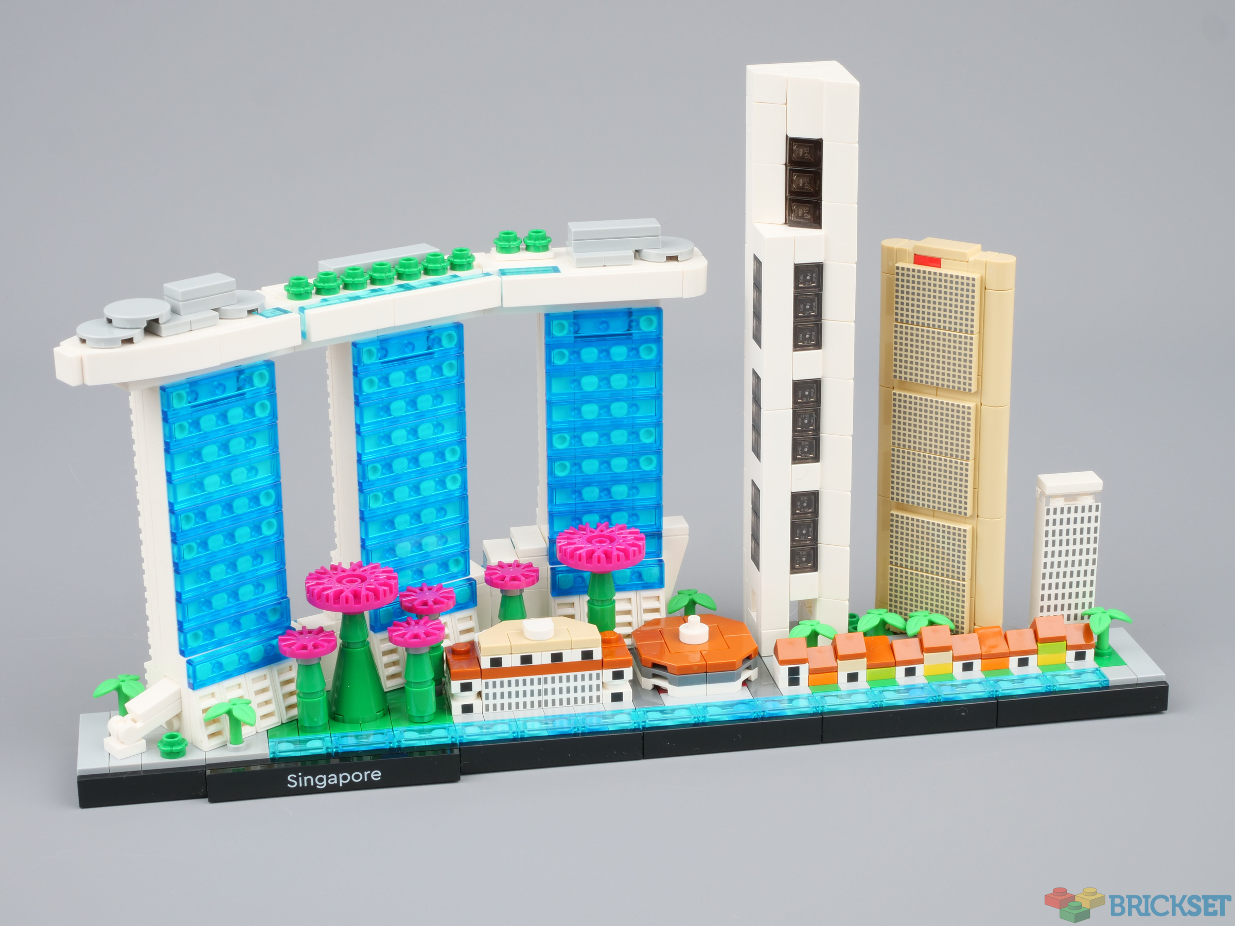
The Architecture theme seems to have taken a bit of back seat recently, with just one set produced during 2021, so let's hope that the release of this new skyline in January marks the return to the theme's former glory.
21057 Singapore is the 14th skyline and, like some of the others, includes a building that's appeared in an Architecture set before, in this case Marina Bay Sands. The hotel is one of the most iconic and distinctive buildings in the world, and one that I had the pleasure of staying at during March 2020, just before the world went to pot.
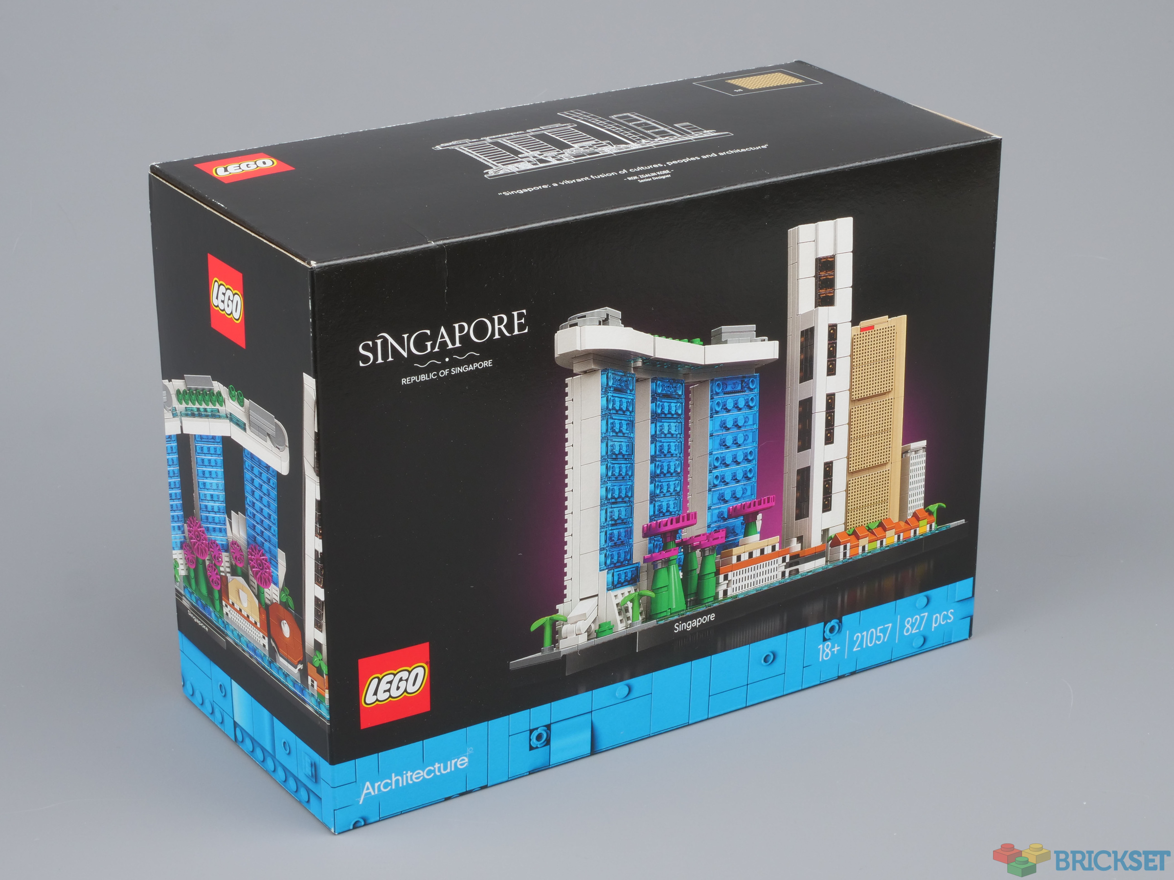
Box and contents
The first thing noticeable about the set is also the most disappointing: it comes in a regular box, and not a premium flip-top one that until now have characterised Architecture sets. A cost-cutting exercise, no doubt.
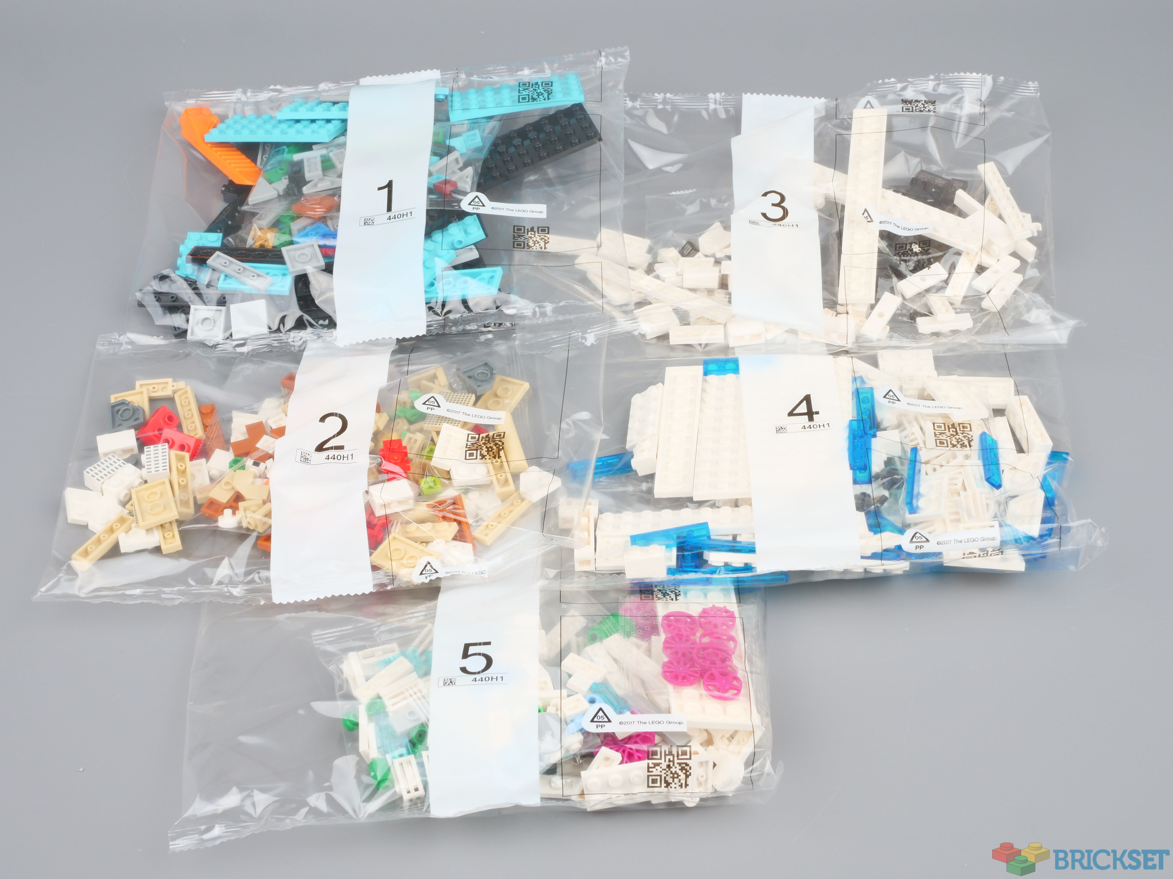
The box is deeper than most of its size, and inside are five numbered bags and the instruction manual.
The instructions of Architecture sets were one of the worst culprits for having pages with black backgrounds which made dark colours hard to see and differentiate, but LEGO has listened to complaints and this one has mid-grey pages instead.
New parts
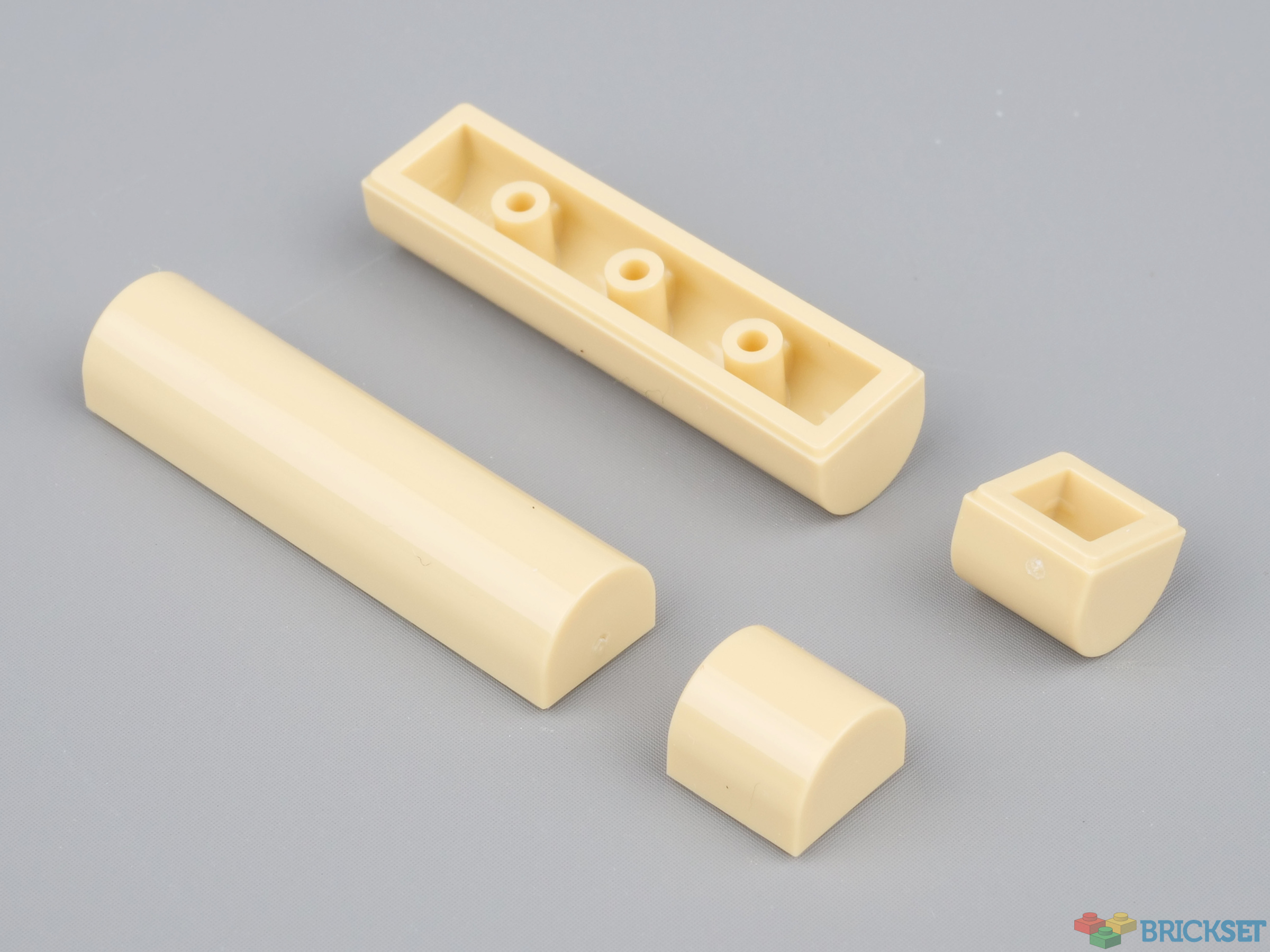
The 1x1 curved piece, 49307 PLATE 1X1X2/3, OUTSIDE BOW, introduced a couple of years ago is a useful decorative piece, but it's difficult to line a row of them up neatly so a 1x4 version has been introduced to solve that problem.
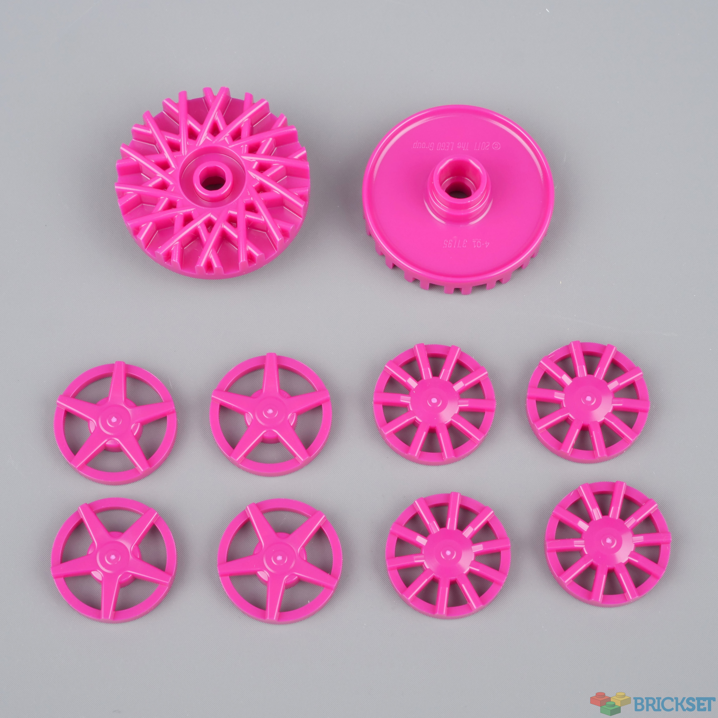
Although not new elements, these wheel hubs have been recoloured in bright purple and provide a vibrant pop of colour to the set, as you'll see below.
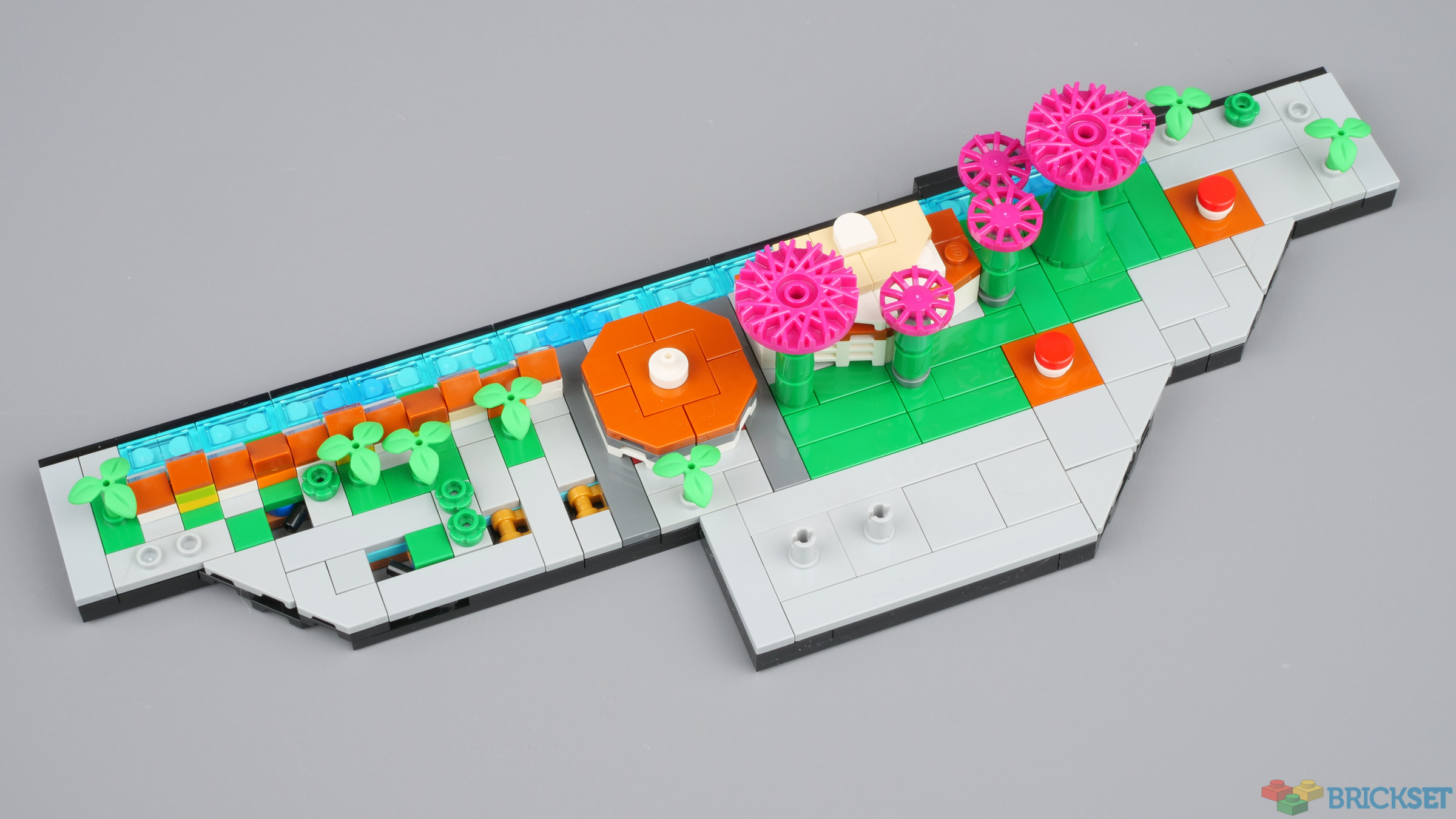
The completed model
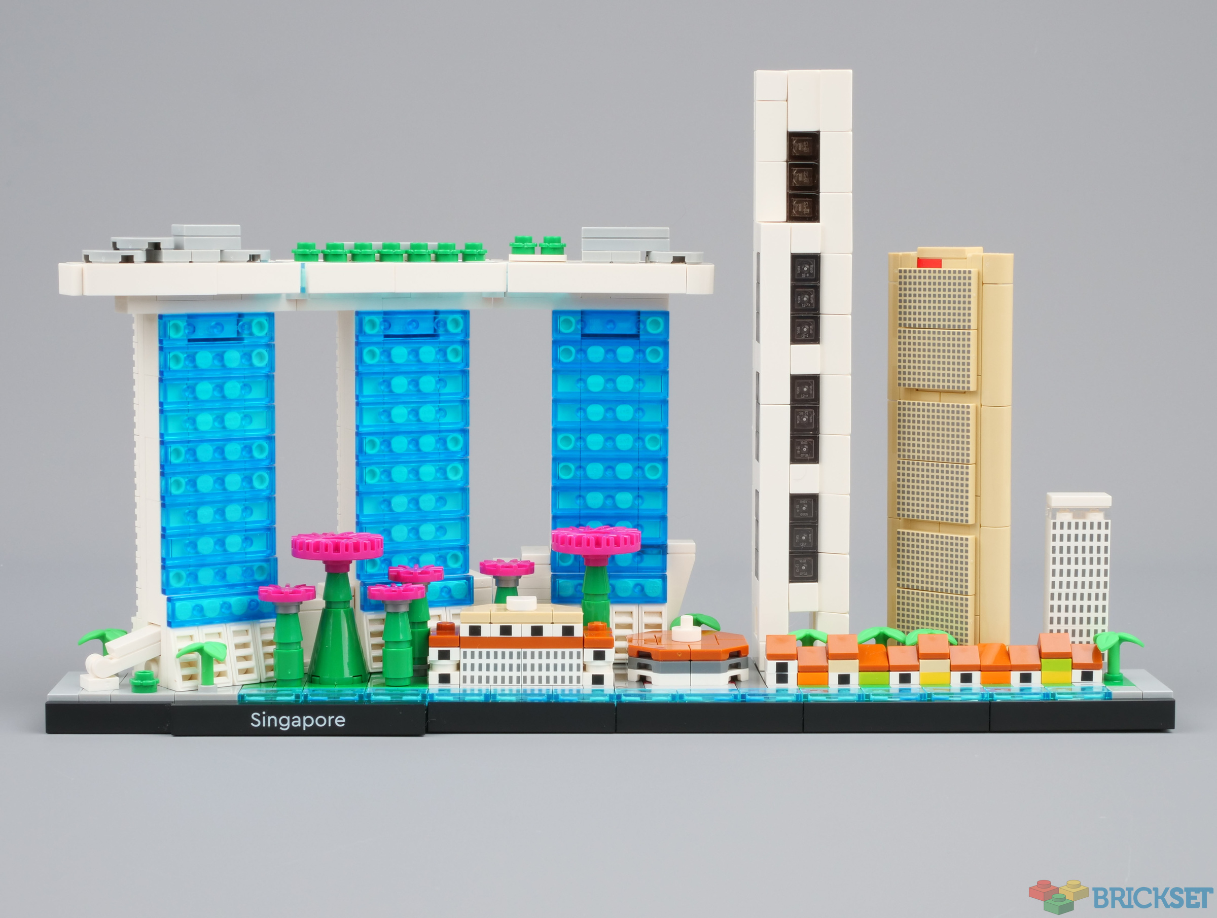
A lot of landmarks are crammed into the 36-stud wide model. From let to right:
- Marina Bay Sands, and in front of it:
- One Raffles Place
- OCBC Centre
- Boat Quay, along the waterfront
- On the far right, an un-labelled building which a Singaporean in the LEGO Ambassador Network suspects is inspired by Riverwalk Apartments.
Their relative position is inaccurate, instead they've been placed in an aesthetically pleasing arrangement.
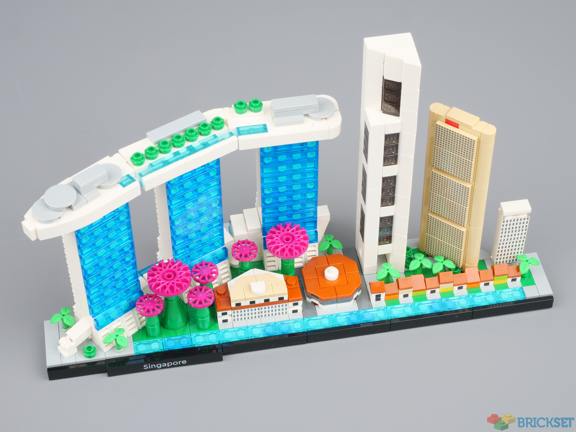
The high-rise buildings contrast well with the low-level colonial-era buildings in the foreground, and the magenta wheel hubs really make the scene pop.
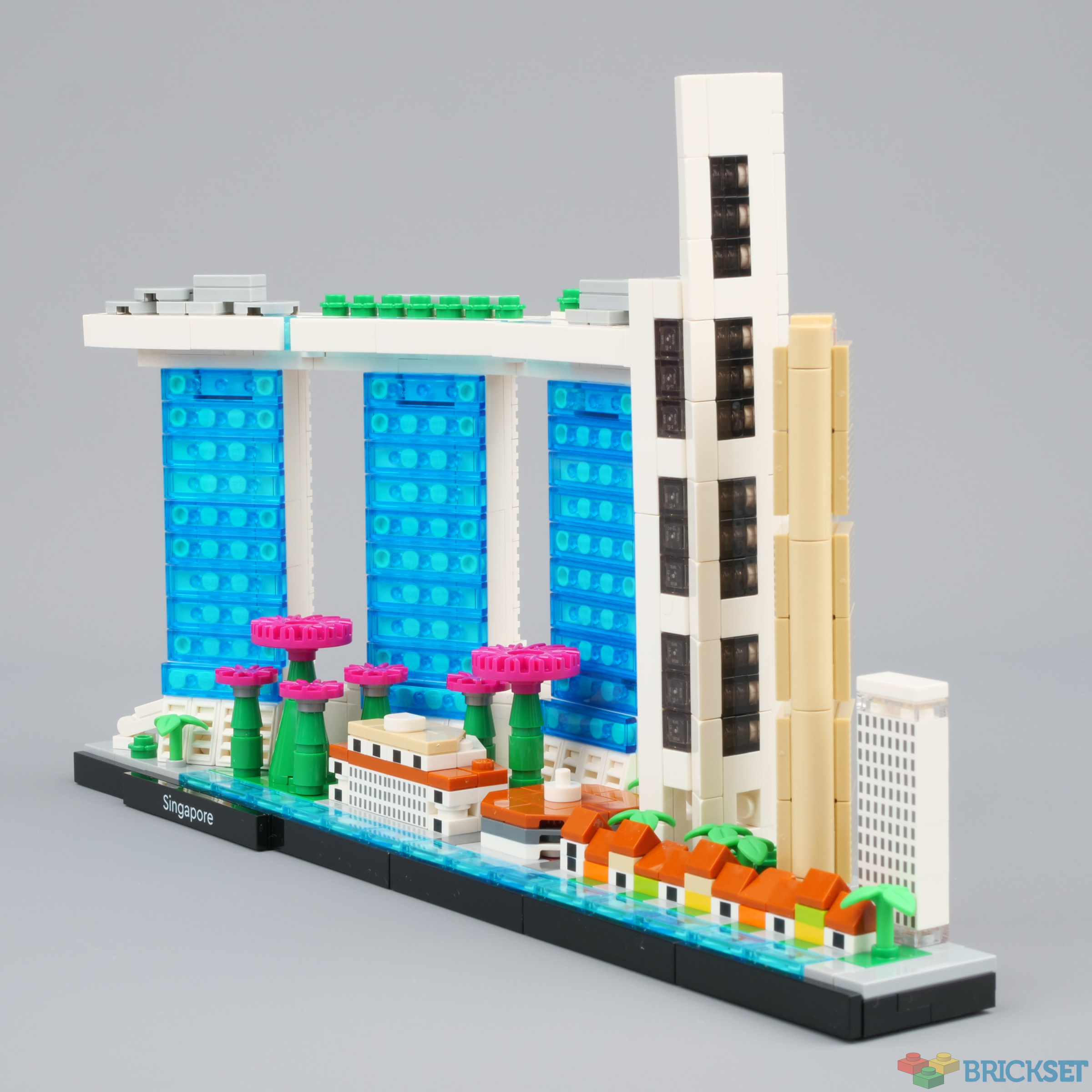
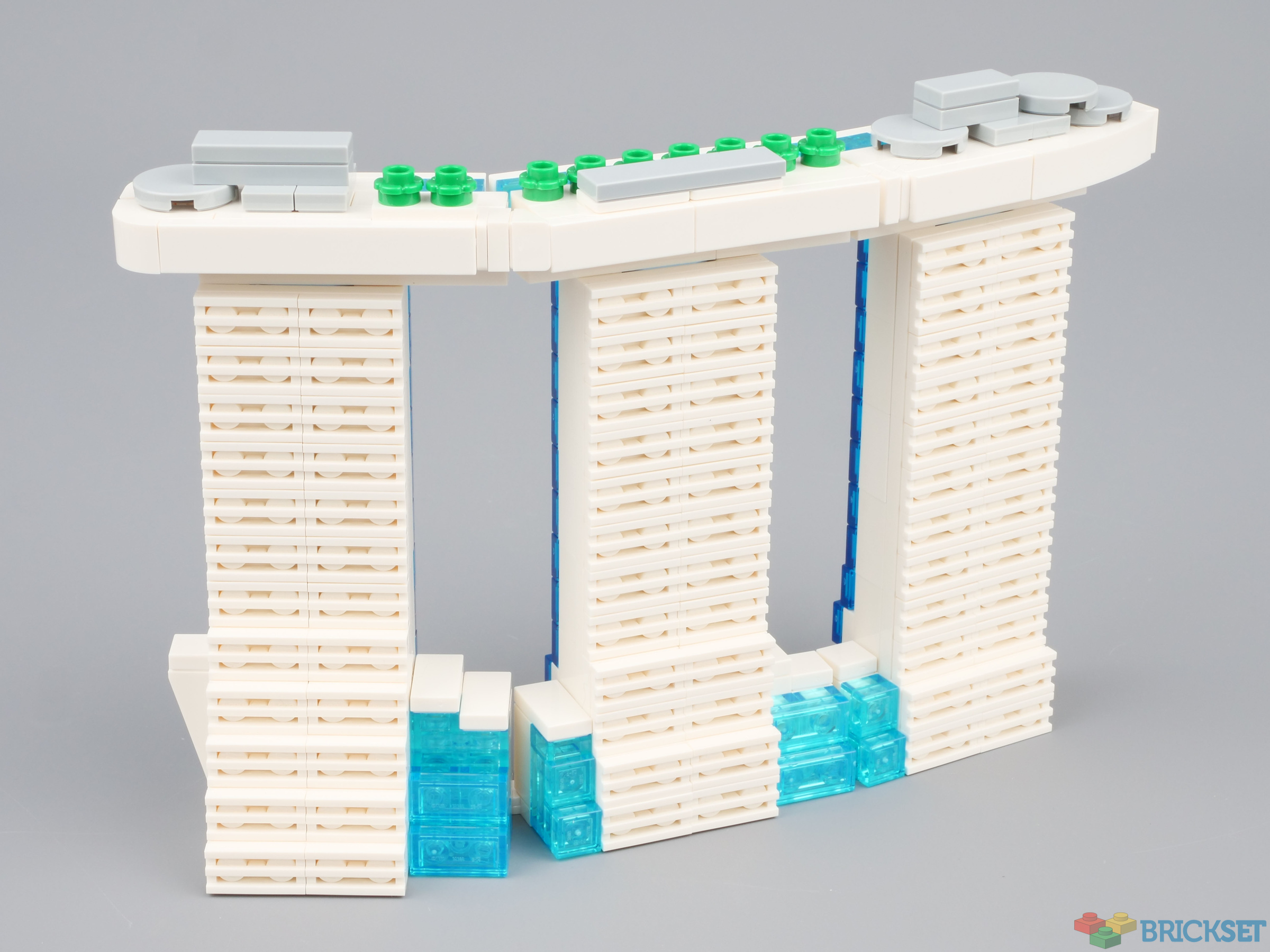
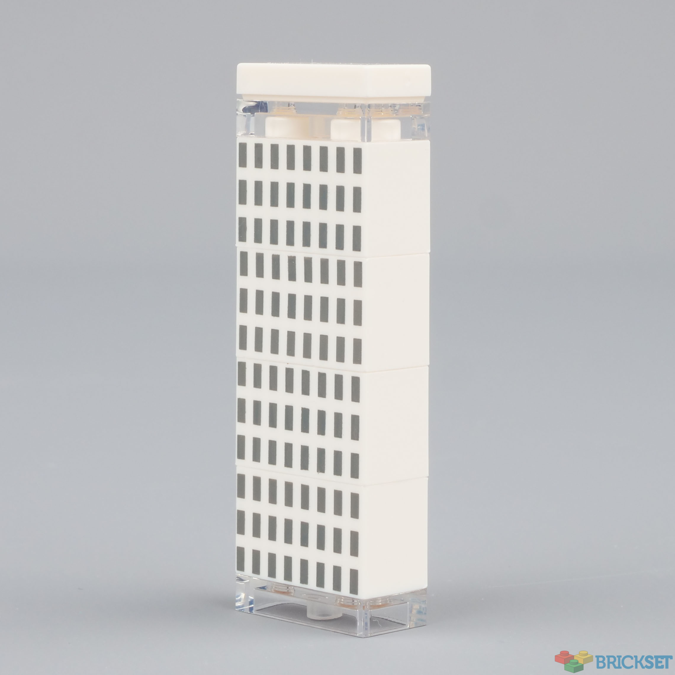
It does not look as impressive from the back, but it's still quite detailed. It's a shame about the holes in the inverted 1x3 tiles used on the skyscraper, though.
Gardens by the Bay, Fullerton Hotel, Lau Pa Sat, Boat Quay
With the skyscrapers removed, the lower level can be appreciated in more fully, and the method used to attach them to the base -- using clips and bars -- can be observed.
Gardens by the Bay is home to a number of artificial supertrees with elaborate canopies that are illuminated at night for a spectacular display. The wheel hubs were an inspired choice to represent them and, as I said above, their vivid colour makes the model pop.
The historical buildings along Boat Quay were bustling with fishing, imports and exports in the 19th century. They've recently been renovated and now house bars, restaurants and shops.
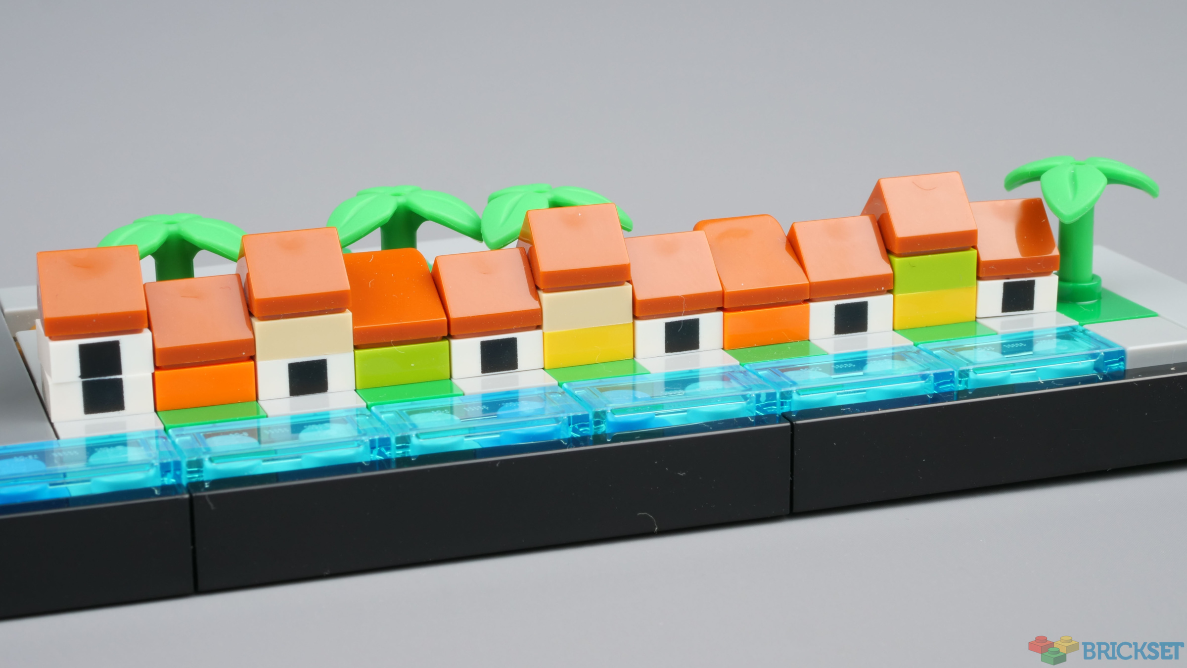
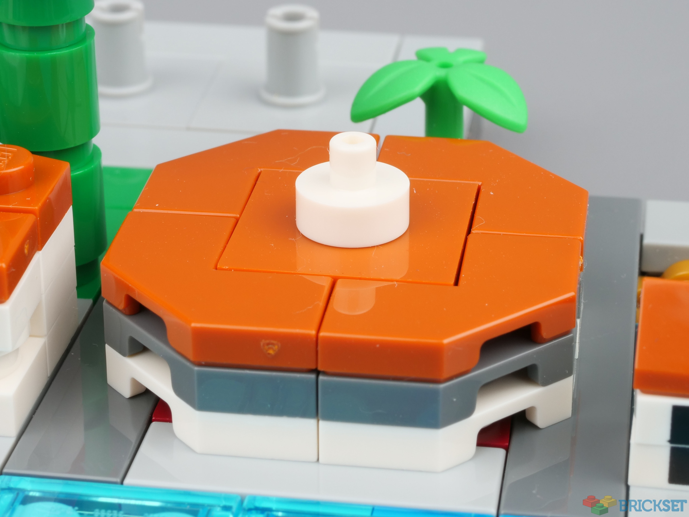
Lau Pa Sat is cast-iron octagonal building built in the 19th century that was once a fish market. It's now a general food market. 2x2 plates and tiles with a cut-corner have been used to approximate the shape.
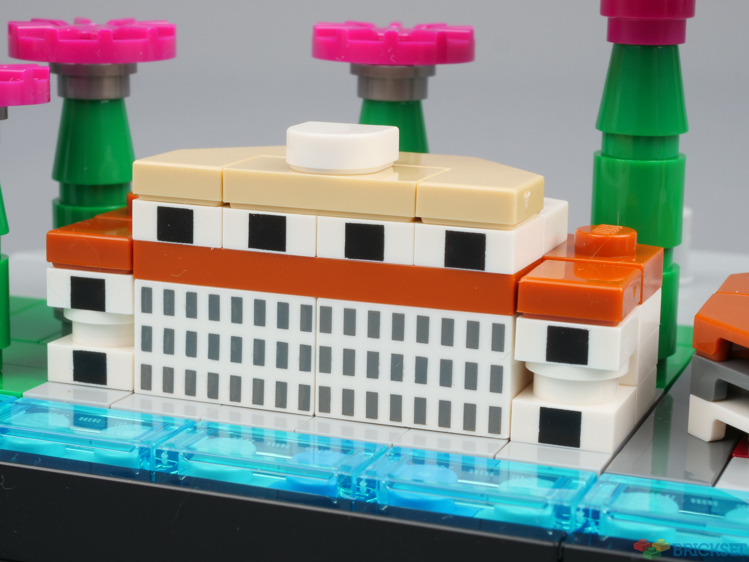
The Fullerton Hotel was once a post office and government building. The model makes use of printed 1x2 bricks and 1x1 plates and is a recognisable approximation of the real thing.
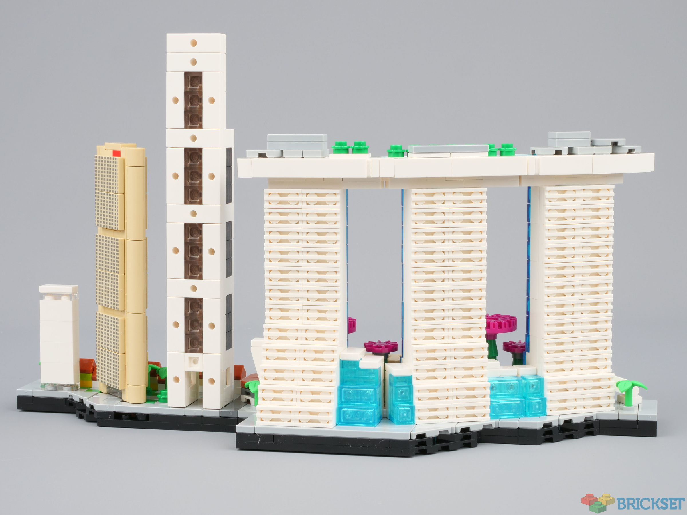
Marina Bay Sands
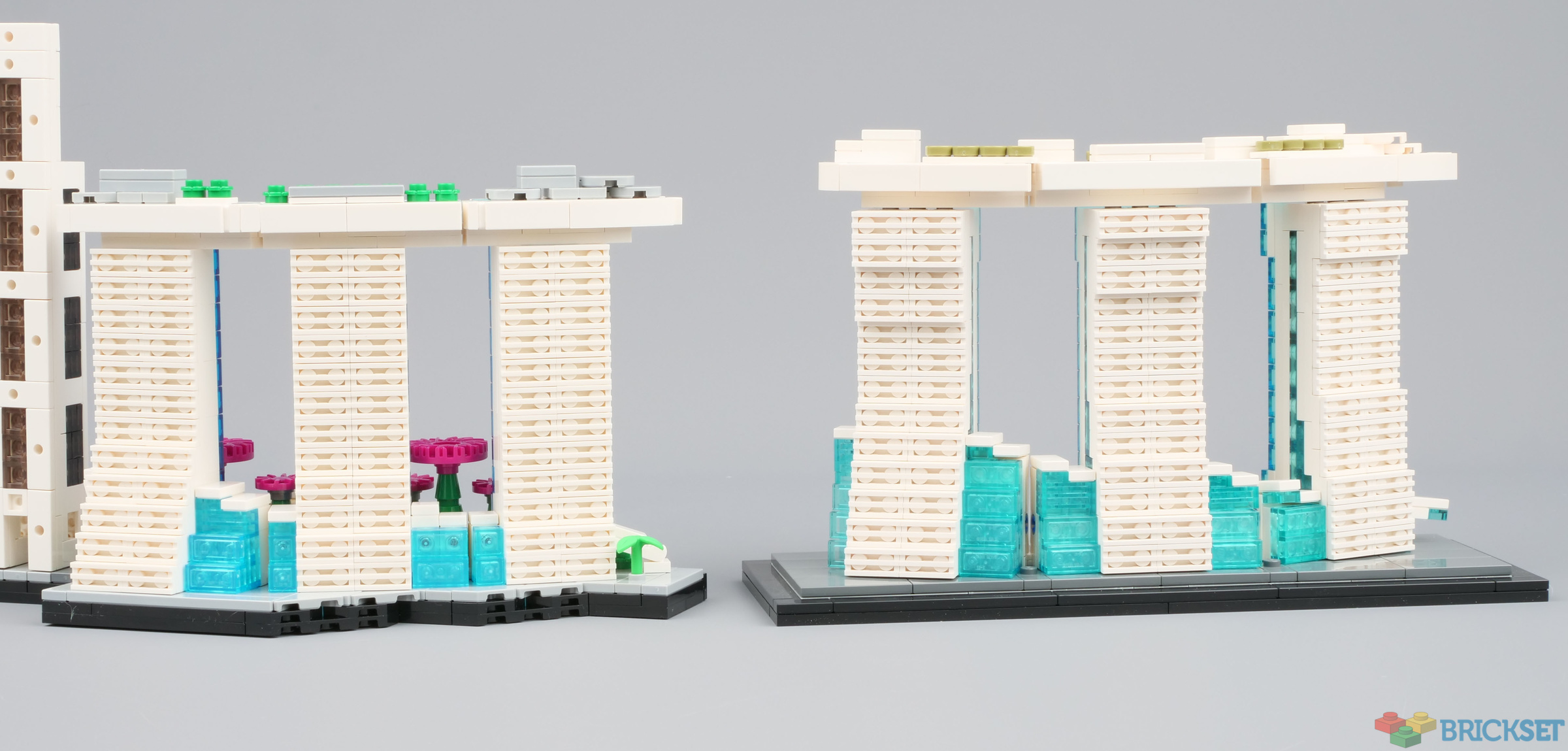
The building, which houses a hotel and casino, was opened in 2011. The 3-acre sky park at the top which bridges the three towers includes gardens, restaurants, bars and a spectacular infinity pool overlooking the city. Swimming in it and admiring the view is an experience I will never forget.
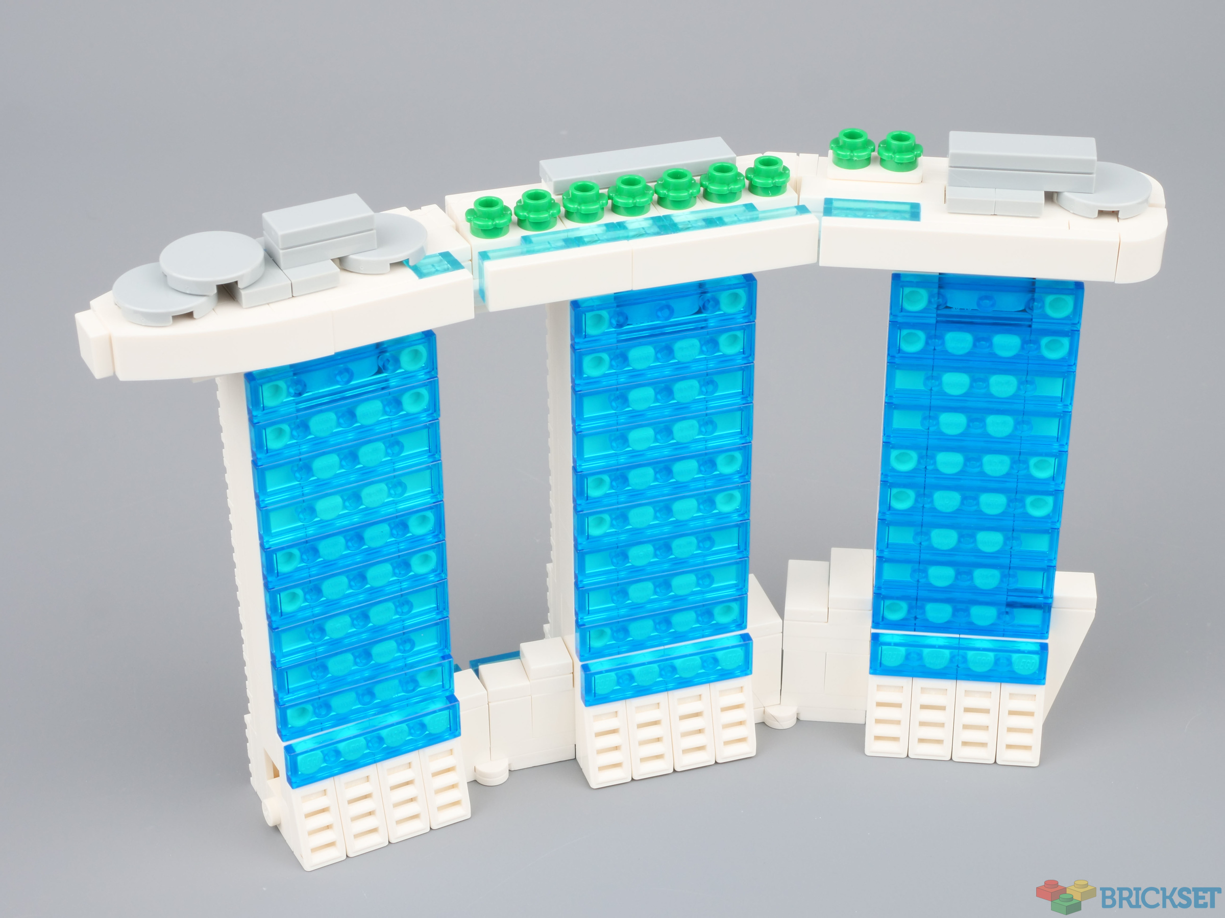
The towers are a difficult shape to replicate in LEGO at this scale, but they look reasonable. Both sides are glass, of course, so it might have been preferable for the back to have been clad in transparent blue tiles too.
One Raffles Place
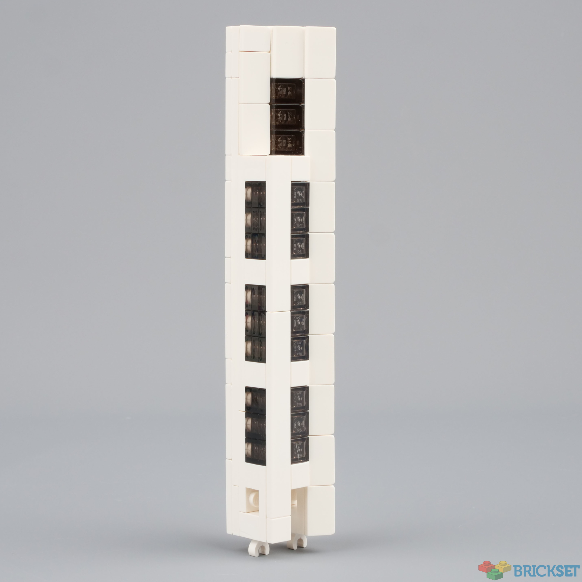
The 280m tower in the financial district is one of the tallest buildings in the city. It's built on its side and uses cheese wedges to capture its distinctive triangular shape.
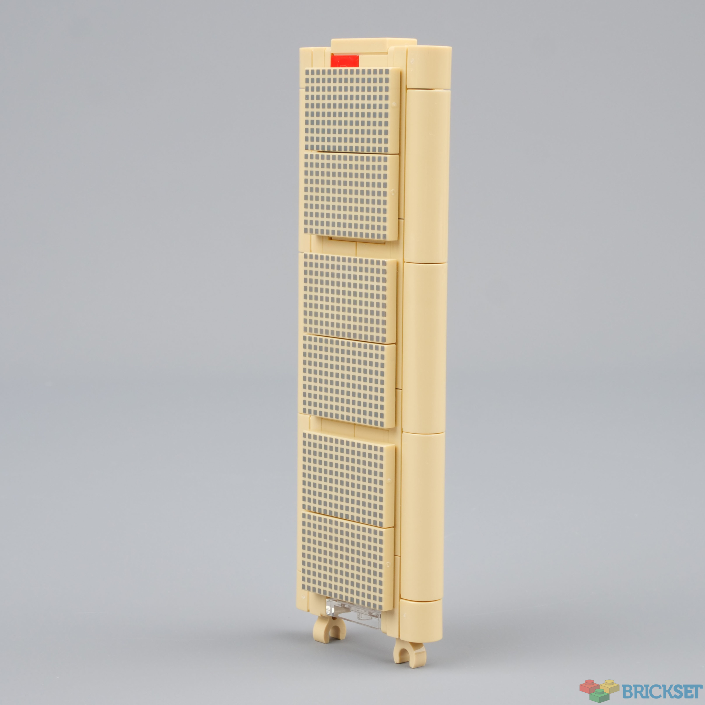
OCBC Centre
This is the 52-storey headquarters of the OCBC bank. It's nicknamed 'the calculator' on account of it being flat with window clusters that look like buttons.
The new 1x4 curved pieces are used on the sides.
Riverwalk Apartments
The nondescript small building on the far right of the model has presumably been added to give balance to the design, and it works well doing so.
Compared to 21021 Marina Bay Sands
21021 Marina Bay Sands was released during 2013 and was available only in Singapore. Consequently, it has become one of the most coveted Architecture sets among collectors and can command prices of over $500 at BrickLink. I suspect that the bottom will drop out of the market now because the version in this skyline set is comparable in size and superior in design and detail. In particular the darker transparent blue tiles look much better.
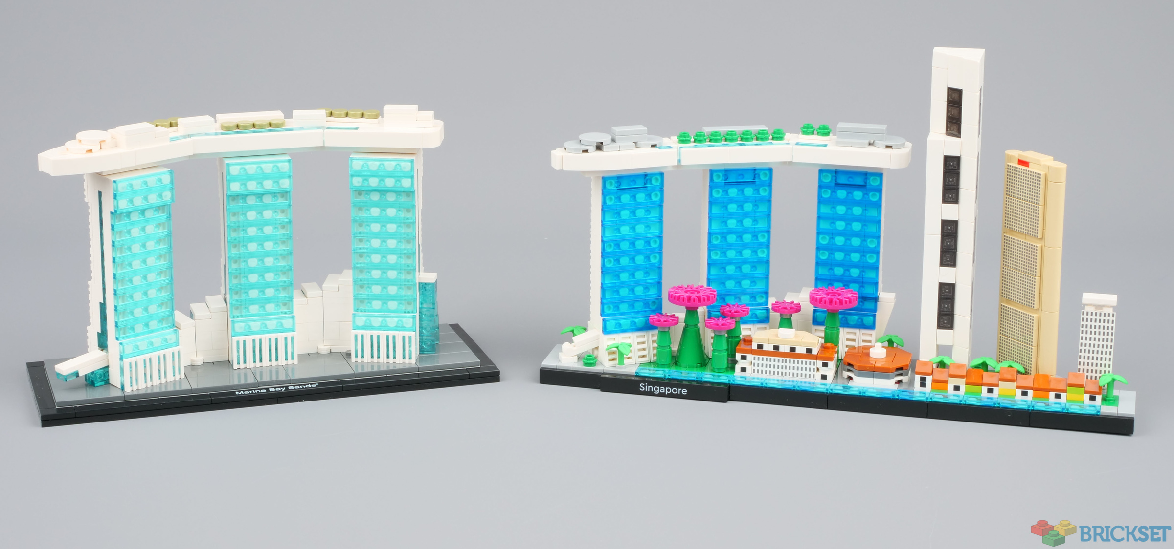
Both were designed by Rok Zgalin Kobe, so there are similarities but with 8 years' of new parts available to work with, he's been able to make improvements
Verdict
This has immediately surpassed 21043 San Francisco as my favourite skyline. It's the vibrant colours, the contrast between the old and new buildings and, last but certainly not least, that while building it and writing this review I was reminded of my visit to the island city state and seeing most of the landmarks on the model, at a simpler time when international travel was a pleasure and something that could be done on a whim without bureaucracy, masks and invasive medical procedures...
Thanks to LEGO for providing the set for review. All opinions expressed are may own.
98 likes
25 comments on this article
I think I understand why the skyline doesn't look so convincing. It's that there is practically no sense of distance between the Marina Bay Sands and the other buildings. They're literally on opposite sides of the water. The Fullerton Hotel is much closer to the other buildings than to MBS. The Gardens would also have been behind the MBS seen from this angle, but that's not the fault of this set's designers. I also understand now why the Flyer is not shown: because it's simply not in frame.
Great review of the real Singapore
Damn "invasive medical procedures"
I really wanted to see a comparison to 21021 , so it's great to see you included that here! Seems like a good alternative to a €500 set, but I do like the lighter transparant tiles better.
EDIT: I really dislike how the box isn't flip top though. Really cheapens the set, and breaks with the rest of the theme.
Doesn't look like it has over 800 pieces. At least surprised they didn't increase the price compare to other older skylines. Lego always seems to prefer releasing sets (or similar ones) that has been done before (Star wars especially) rather than releasing new models. This, Burj Khalifa, NYC, Chicago, etc. They are so many skylines/buildings that haven't been done before. Especially when they are releasing one skyline per two years now, instead of two per year in the past.
This is a great set la
@Freddy_Hodson said:
"Great review of the real Singapore
Damn "invasive medical procedures""
I think someone still had the Majestic Tiger on their mind!
I still hope for a return to decent sized models of interesting buildings, like we had when the line launched.
This set is definitely growing on me. I did think it was a bit too colourful at first, but it looks much better against a black background, as per the box art.
I'm not really bothered about the lower quality box, as I always split along the glue joins and store flat anyway.
"... LEGO has listened to complains and this one has mid-grey pages instead."
@Huw Can you add a photo to go along with this so we can see the difference?
If the world went pot than why is it still illegal in some countries? Okay, I’ll stop.
Cool set, I’m not familiar with Singapore outside of Pirates of the Caribbean and a few of the government’s stances but neither relates to the set so I don’t really have much to say. My mom is an architect and her firm designed one of the buildings in (I think) the Shanghai set, the magenta one iirc. Definitely an amazing deal imo, the magenta hubs and caps don’t seem useful outside of this context but dang if they don’t look fabulous.
“Invasive medical procedures” are no issue to me, than again I don’t really enjoy travel. Sorry, I prefer to learn about worldwide customs through Wikipedia— but you do you, I’ll do me.
@Huw I’m not sure where you had your rectal exam, but it isn’t part of the normal covid testing as far as I’m aware, it’s probably best to stick to nose and throat swabs instead.
This is an awesome set, but it's missing some important Singapore icons IMO. I really with the Singapore Flyer had been included and I think it's really weird that there's no representation of a Merlion statue at all, even if it was just a 1x1 white cone without a print. Singapore is incredible and definitely the best place I've lived by far, so I can't wait to get this set and put it on display!
Not so sure about the set. First of all, the box looks much cheaper and toyish. And why is the new Marina Bay Sands superior in design and detail? The older one looks a bit more detailed to me when viewing the side by side pictures.
I have all the skylines (and too much Lego already). This may be the first one I'll let pass.
Nice (and much more detailed) set to put next to 2000446.
What if Merlion replaces Lau Pa Sat, Fullerton Hotel sits at the back of the Merlion, and the flower-shaped ArtScience museum is placed where Fullerton Hotel is placed in the model?
To make space for them, the One Raffles Place and OCBC Centre can shift rightward, with Riverwalk Apartments being removed from the model. Half of the Boat Quay can be reduced too.
Maybe can even place Esplanade at the far right bayfront, instead of Boat Quay.
Such an irony their new 18+ design defeats the purpose of making it adult-focused. Meaningless & distracting light blue ribbon banner, plus lower-cost toy box.
While I have my issues with this set, there is enough that I like. And I will get this set....once the price drops below €40 that is.
It feels a lot like the Tokyo set to me: the big buildings are a mixed bag (Marina Bay Sands in particular looks rather crude), I like the small ones a lot more and I especially like that it looks like apart of a city instead of just some buildings next to each other. And while I do feel some iconic buildings are missing, I doubt if those could have been captured with Lego pieces at this scale.
@Vic0v0 said:
"What if Merlion replaces Lau Pa Sat, Fullerton Hotel sits at the back of the Merlion, and the flower-shaped ArtScience museum is placed where Fullerton Hotel is placed in the model?
To make space for them, the One Raffles Place and OCBC Centre can shift rightward, with Riverwalk Apartments being removed from the model. Half of the Boat Quay can be reduced too.
Maybe can even place Esplanade at the far right bayfront, instead of Boat Quay."
Agreed.
"Such an irony their new 18+ design defeats the purpose of making it adult-focused. Meaningless & distracting light blue ribbon banner, plus lower-cost toy box."
I assume the light blue banner was representing Marina Bay itself and thought it fitting for that reason (sure, they could've gone with red instead to represent the Singapore flag, but IMHO blue actually looks better here, and I digress). People have been complaining loudly for more than a year about the 18+ box art being too drab and lifeless, so they start adding accent colors and now they're "meaningless & distracting"? Do adults in general really hate color so much? I'd hate to grow old if that was the case.
@kaosconman said:
""... LEGO has listened to complains and this one has mid-grey pages instead.""
I included a photo of the gray pages in my review at:
https://brickarchitect.com/2021/review-21057-lego-singapore-skyline/
I do not prefer the gray color. It appears pixelated due to the halftoning process, and makes the text harder to read. I would honestly have preferred a much lighter gray color, or even a white background. That said, I know it isn't a popular opinion, but I preferred black pages.
Sincerely,
—Tom
P.S. You will find that my review was a bit more critical than Huw's review. I also included some stuff that he didn't cover in as much detail, such as a calculation of the scale of each feature in the building, more depth in the comparison with the older Marina Bay Sands set, and a map showing the position of the landmarks in the real city.
Has a LEGO Architecture skyline set ever shown the structures in true geographic
relationship to each other? I always thought they just picked some recognizable landmarks
(and sometimes a couple of more obscure ones to fill in the gaps)
and arranged them in an aesthetically pleasing way...
@tomalphin said:
" P.S. You will find that my review was a bit more critical than Huw's review. "
I noticed! This review was very much influenced by my recent visit there. The model may have its faults but it effectively evokes a sense of the place and I see that as being the primary goal of skyline sets.
I know it would've been tremendously difficult to do justice to it, at that scale ...
... but Singapore without the Merlion just isn't Singapore.
I thought all 2022 sets were switching to paper bags. Has that changed?
@Kynareth said:
"I thought all 2022 sets were switching to paper bags. Has that changed?"
I hope not... Plastic bricks look so much better :-)
"at a simpler time when international travel was a pleasure and something that could be done on a whim without bureaucracy, masks and invasive medical procedures..."
I want those times back...
@LegoSonicBoy said:
" @Vic0v0 said:
"What if Merlion replaces Lau Pa Sat, Fullerton Hotel sits at the back of the Merlion, and the flower-shaped ArtScience museum is placed where Fullerton Hotel is placed in the model?
To make space for them, the One Raffles Place and OCBC Centre can shift rightward, with Riverwalk Apartments being removed from the model. Half of the Boat Quay can be reduced too.
Maybe can even place Esplanade at the far right bayfront, instead of Boat Quay."
Agreed.
"Such an irony their new 18+ design defeats the purpose of making it adult-focused. Meaningless & distracting light blue ribbon banner, plus lower-cost toy box."
I assume the light blue banner was representing Marina Bay itself and thought it fitting for that reason (sure, they could've gone with red instead to represent the Singapore flag, but IMHO blue actually looks better here, and I digress). People have been complaining loudly for more than a year about the 18+ box art being too drab and lifeless, so they start adding accent colors and now they're "meaningless & distracting"? Do adults in general really hate color so much? I'd hate to grow old if that was the case."
Actually, I am one of those who "have been complaining loudly for more than a year about the 18+ box art being too drab and lifeless". You can read how delighted I was for the mere reason of Lego introducing a white 18+ box with a little bit of theme design in the comment section under the Brickset article of revealing the Fab 5 Loft set. Thus, I think I need to elaborate more on my wordings.
I want to stress that before the 18+ package was introduced, every element on the box arts match with the Lego theme or set. Even the frames of images, the transition among different elements on the box arts, and the composition and the overall ratio of elements on the box arts were carefully designed and specifically used within the theme or a set.
Meaningless:
The so-called 18+ banner was originally only used in Star Wars box arts to mimic and represent the surface of Star Wars Lego models. Although Lego lately added some fun elements in the banner for a handful of sets, such as Technic parts in Technic sets and that little guitar in the Fender Stratocaster Ideas set, the banner still remains mismatched to most of the 18+ sets themselves, because basically you don't see Star Wars-like patterns on the surface of most of the 18+ sets built for display. That is what I mean by "meaningless", as the LEGO surface/pattern shown on the banner is formed by Lego elements that aren't necessarily used or found in that particular set.
Distracting:
If you go simplistic, the original black box is simplistic. Don't stick in between simplistic and immersive design by adding a banner that catches my eyes away from the actual model placed in front of the void. All the elements that convey the theme or the background arts that add the atmosphere/vibe for the model are taken away on 18+ boxes. However, a dazzling and busy banner totally unrelated to the theme is added but not helping to showcase the beauty of the model! In the early 18+ boxes, the font is placed on top of a very busy-looking Lego structure without bolding the fonts or adding plain color behind the font. It is such a pain to read the important information. I couldn't believe such a basic design principle was violated. The recent 18+ boxes use the plain color around the white font for better reading for the set number and piece count. Also, the font size and ratio of the font versus banner are not consistent among all 18+ sets.
I don't know if it is a coincidence or not. The designers of the 18+ boxes are not careful and the 18+ box arts are more prone to silly and low-level mistakes or misprints. Examples are 75309 Star Wars Republic Gunship and 42131 Technic D11 CAT Bulldozer. The first version of the box arts has its name written as the more complicated D11T model, which the Lego set is not based on. However, on the box arts and manual, real-life images of both D11 and D11T are carelessly used. The graphic designer cer