Review: 21340 Tales of the Space Age
Posted by CapnRex101,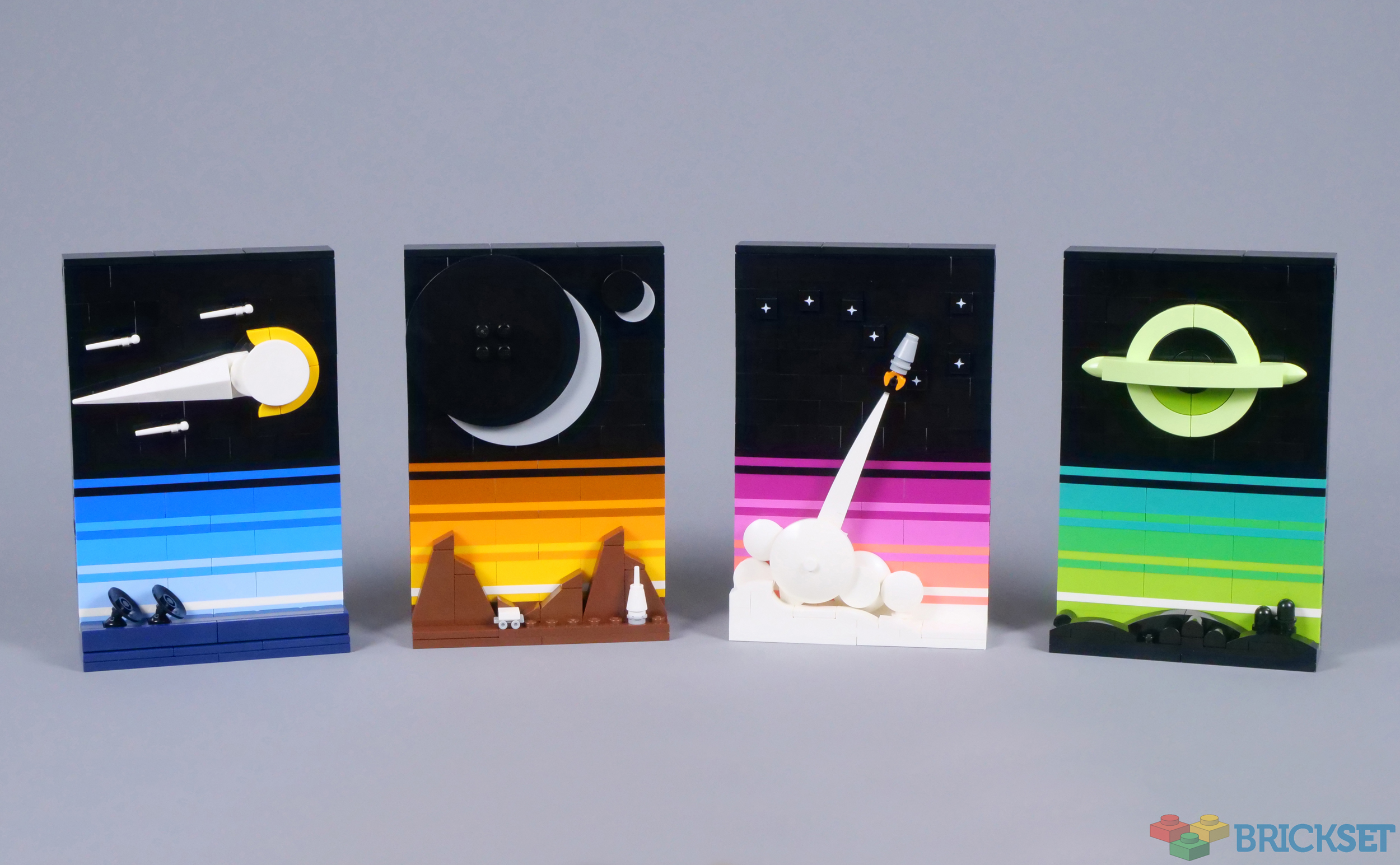
The increasing size and ambition of LEGO Ideas sets provides an opportunity for some stunning designs, although smaller creations can achieve superb results as well. 21340 Tales of the Space Age shows this potential and looks incredible in official images!
Few changes have been introduced, relative to the original project, other than the addition of another picture. The unique style presented by Jan's creation therefore remains intact and the price of £44.99, $49.99 or €49.99 is also quite affordable, so this should prove impressive.
Summary
21340 Tales of the Space Age, 688 pieces.
£44.99 / $49.99 / €49.99 | 6.5p, 7.3c, 7.3c per piece.
Buy at LEGO.com »
Stylish and stunning, 21340 Tales of the Space Age represents the best of LEGO Ideas!
- Outstanding display value
- Appealing use of colour
- Varied options for display
- Repetitive construction
The set was provided for review by LEGO. All opinions expressed are those of the author.
Box and Contents
There seems to be little consistency regarding which Ideas sets are packaged in boxes with flaps, as 21340 Tales of the Space Age includes a standard box. Nevertheless, the four images look splendid and I like the teal border. Inside are eight numbered bags and five instruction manuals, so as many as four people can build simultaneously. The fifth booklet contains information about the celestial phenomena depicted, as well as the fan designer, Jan Woznica.

The Completed Model
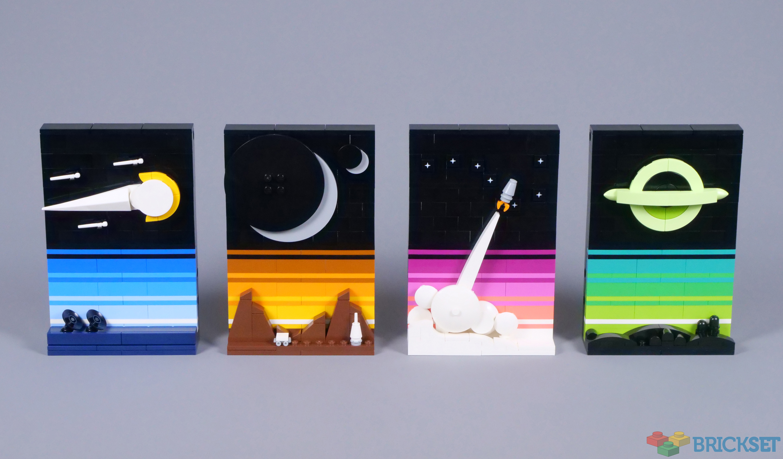
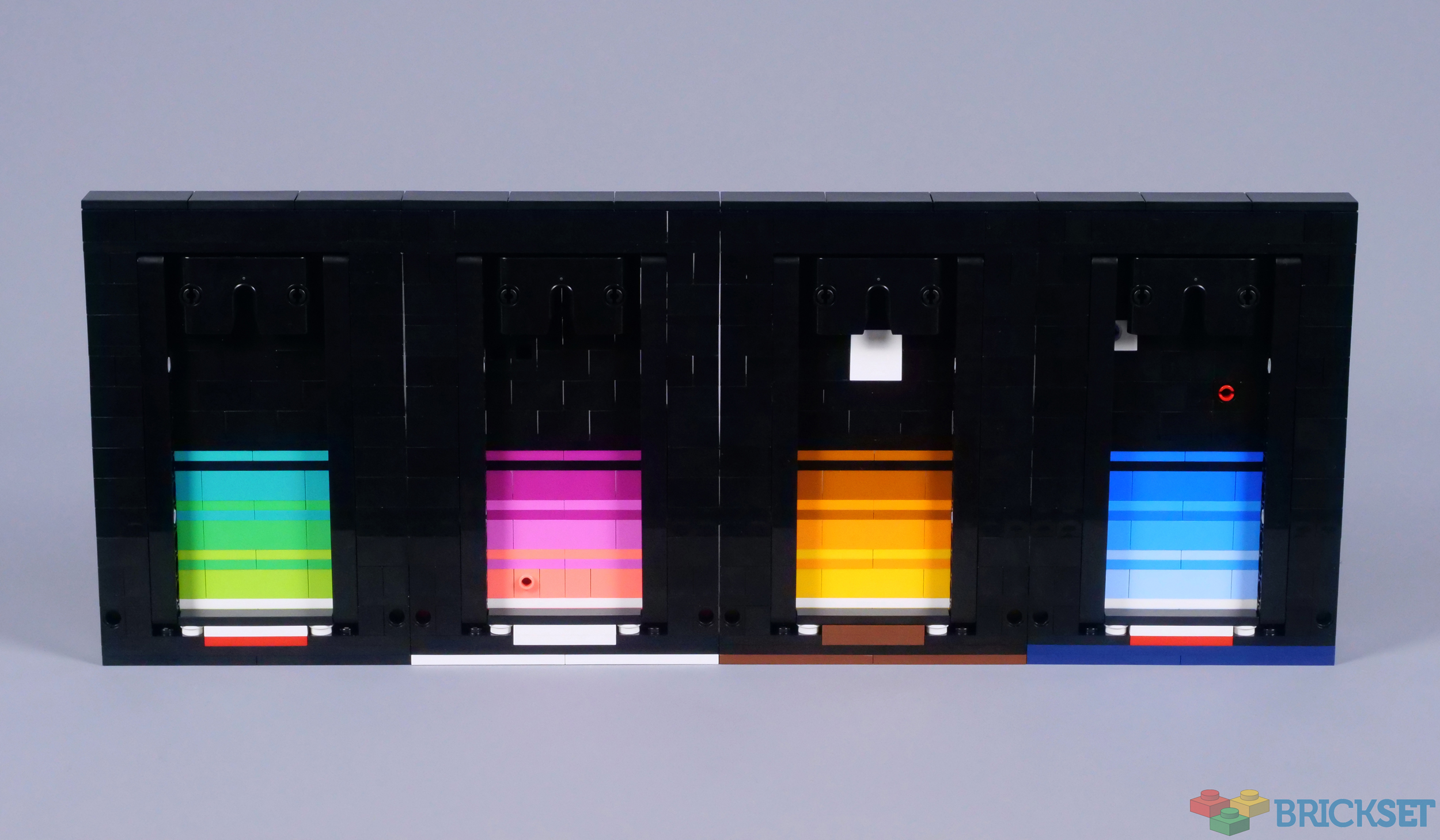
Each image measures nearly 15cm in height and 9cm across, so they are relatively small and easy to display. Additionally, these little models have surprising presence, benefiting from their bold colours and distinctive style, which is inspired by retro posters. Their shared features also ensure the images look nice when presented together.
Technic pin holes are available on the sides of each image, providing connection points between them. Three pins are perhaps excessive, but certainly provide a secure connection. These joints are perfectly hidden too, behind the front layer of bricks, which leaves enough space for Technic supports and hanger elements across the back.
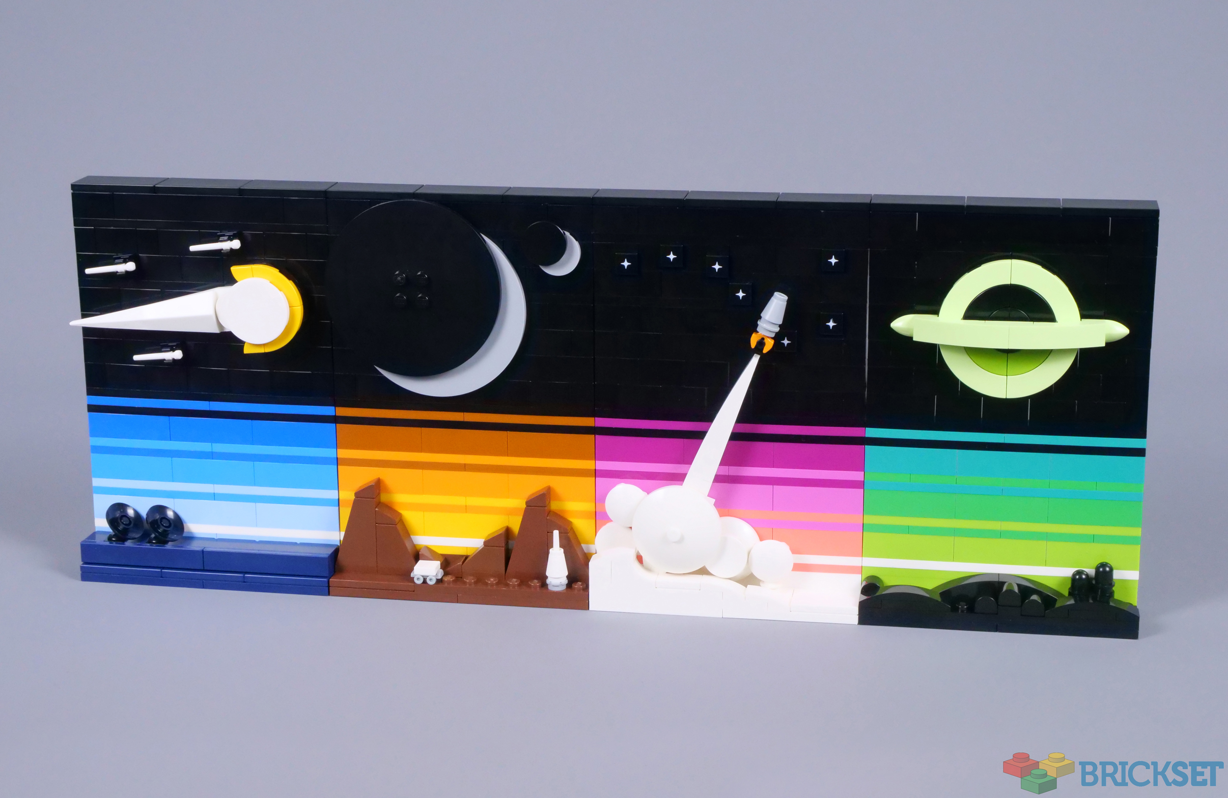
The four models look fantastic when combined, as their layers of colour line up neatly, but cover a spectrum of shades. The addition of green tones beneath the black hole is effective and I like how the colours of the foregrounds differ too, which is a minor change from Jan's design. Even though this configuration is attractive, I actually prefer to display them separated, as above.
Technic beams reinforce the images, which are only one or two bricks deep. Their bright colours remain visible though and the structures are finished quite nicely, even from behind. Also, the designer has also included a couple of unexpected red and white plates on the first and last models, representing the Polish flag and Jan's home country.
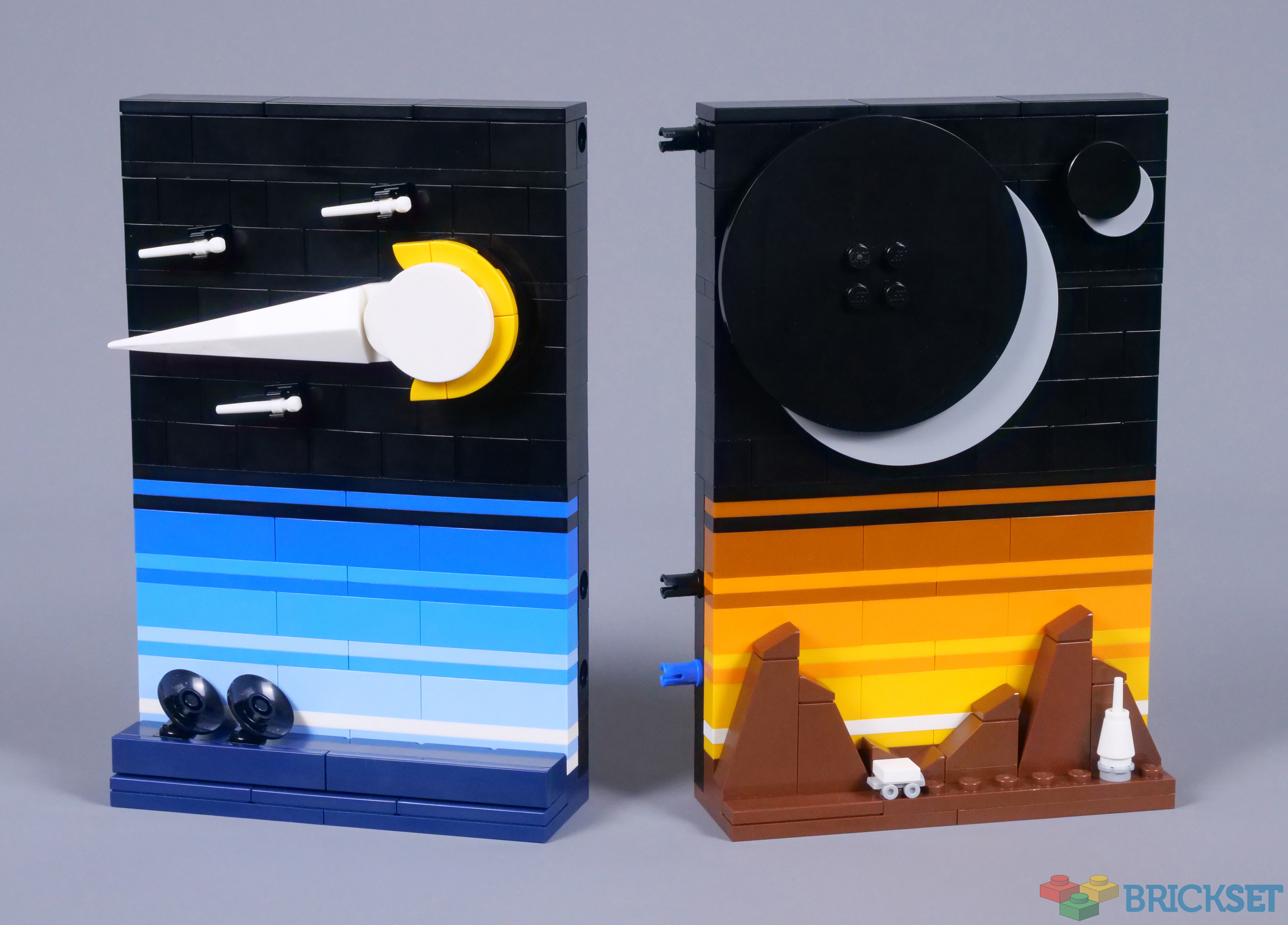
Beyond the inclusion of an entirely new picture, the most noticeable alterations from the original project have been applied to this image, which the instructions describe as depicting comets. Comet groups are believed to exist, but I think this more closely resembles a meteor shower. Regardless, rather than descending from the top of the image, these objects are now travelling sideways, while the white base has been replaced with dark blue.
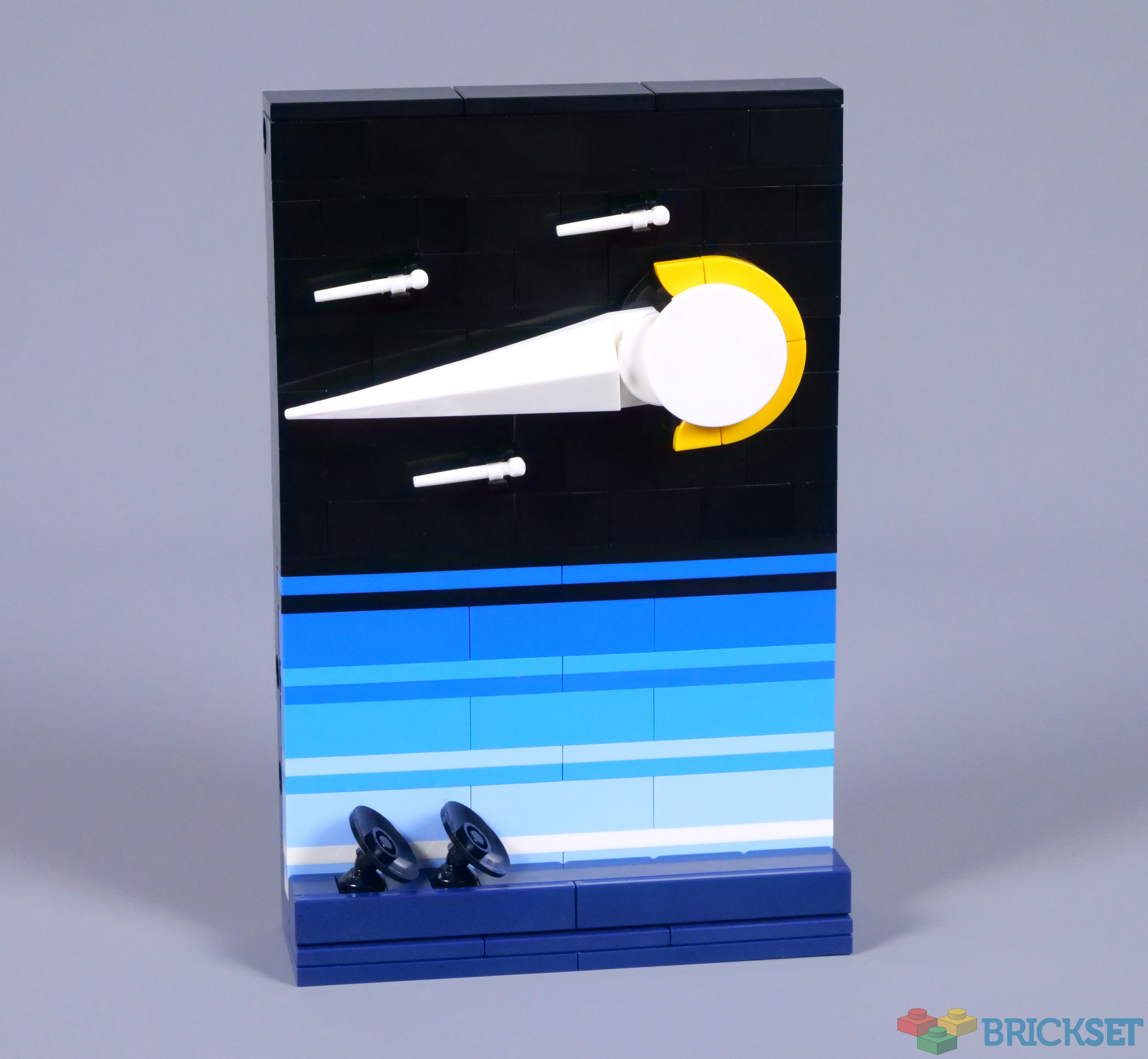
I appreciate the latter change, which complements the shadowy radio telescope receivers on the ground, while the orientation of the meteors could easily be changed if you wish. Whatever their direction, I like the flame yellowish orange glow around the closest object, while those more distant are represented by white wands, attached using 1x1 clips.
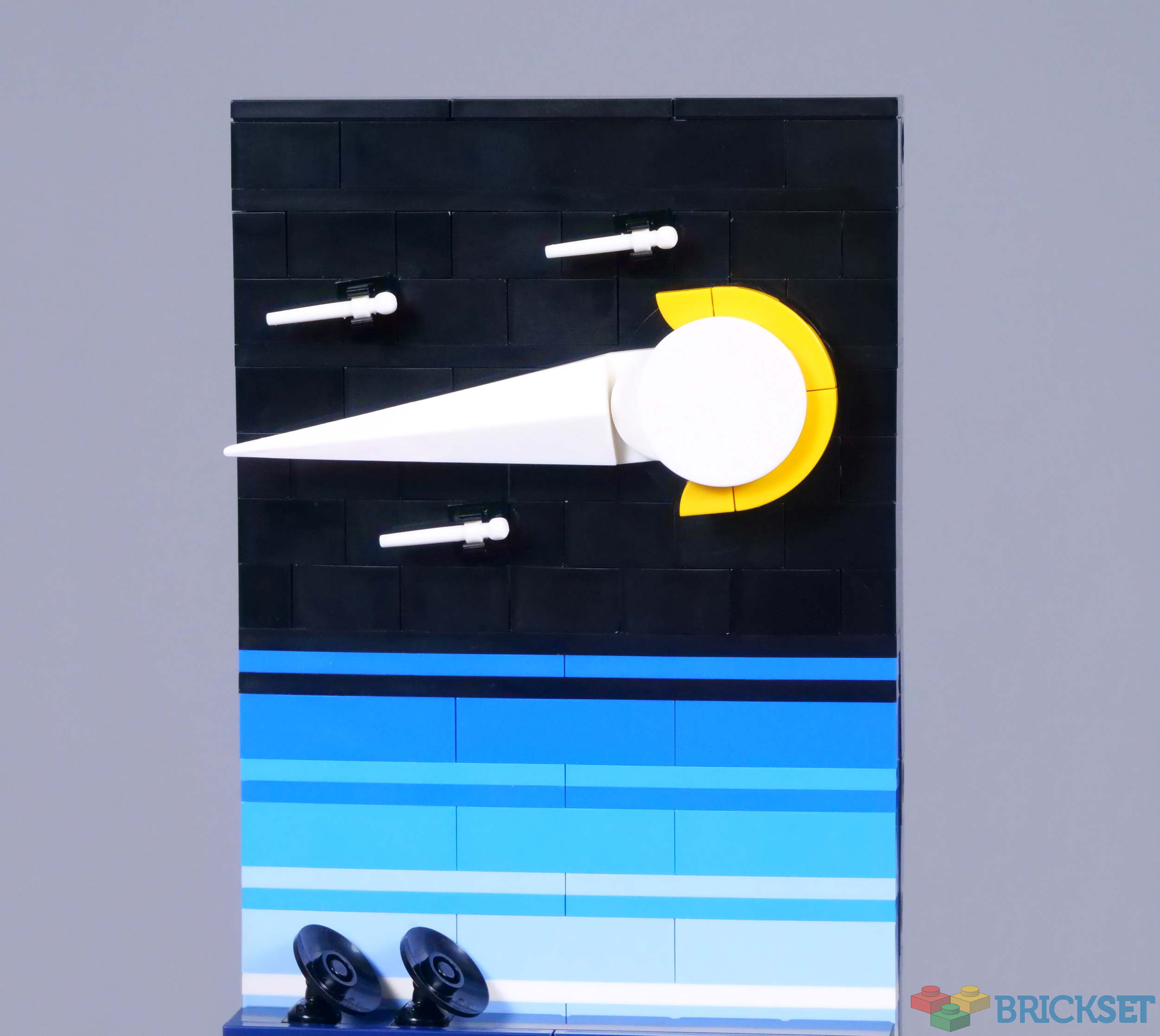
Whereas the first image is presumably based on Earth, the second seems more alien. The dark orange and reddish brown colours are immediately reminiscent of Mars, but the gigantic moons in the sky are nothing like Deimos and Phobos. The barren landscape is attractive and I love the tiny rover, overwhelmed by its environment, although leaving an imprint by smoothing the terrain as it travels.
However, the most appealing features are undoubtedly the moons, partly illuminated or even eclipsed by the planet. Stacking 8x8 round tiles with four studs and 2x2 round tiles is very successful, especially since the light bluish grey pieces clearly stand out against the dark backdrop. In addition, depending on the light source, the uppermost elements cast a shadow, which only makes the moons seem more realistic!
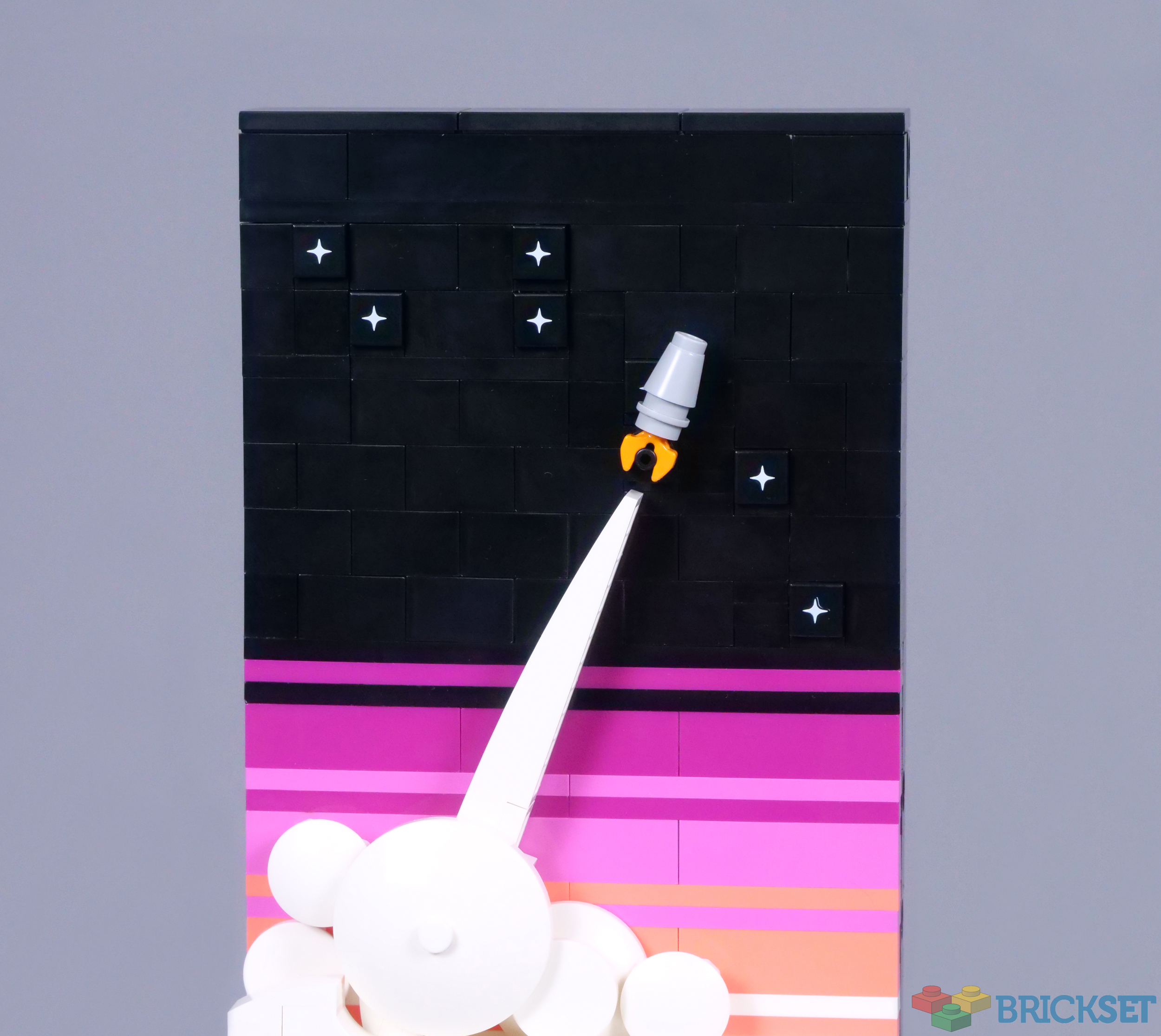
The most dynamic of these four images is definitely the rocket launch. The billowing clouds are absolutely brilliant, either representing smoke around the launchpad, or disrupted clouds where the rocket has burst through. The combination of round tiles, dishes and 2x2 sliders is wonderful and I like the gentle curvature of the 1x10 bow extending beneath the spacecraft.
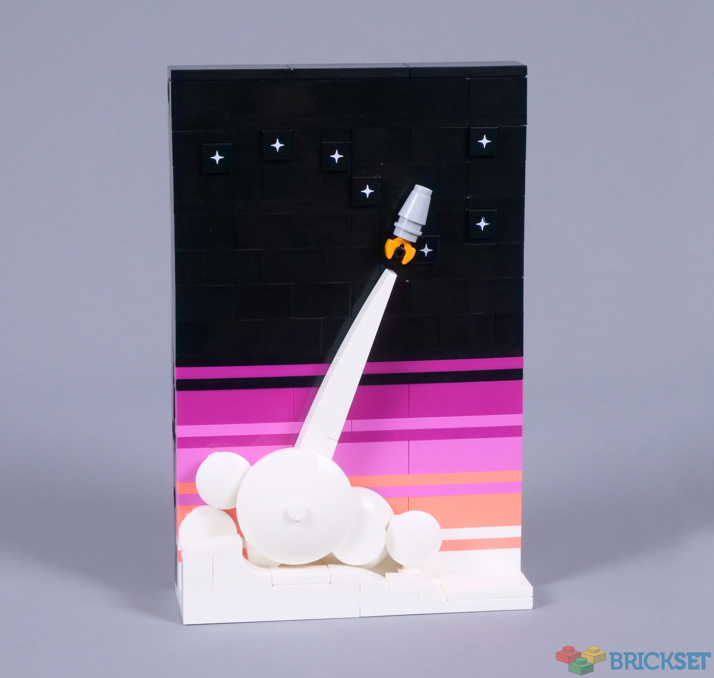
Unfortunately, the direction of the rocket plume can be disrupted slightly, as it is only supported by a single clip. Even so, the model looks lovely and includes several printed stars to recreate constellations. Ursa Major, commonly known as the Plough or the Big Dipper, is presented on the box and above, while Ursa Minor appears below. Instructions for Cassiopeia and Cepheus are also provided, but the lack of Southern Hemisphere constellations is disappointing. Of course, you can easily build your own.
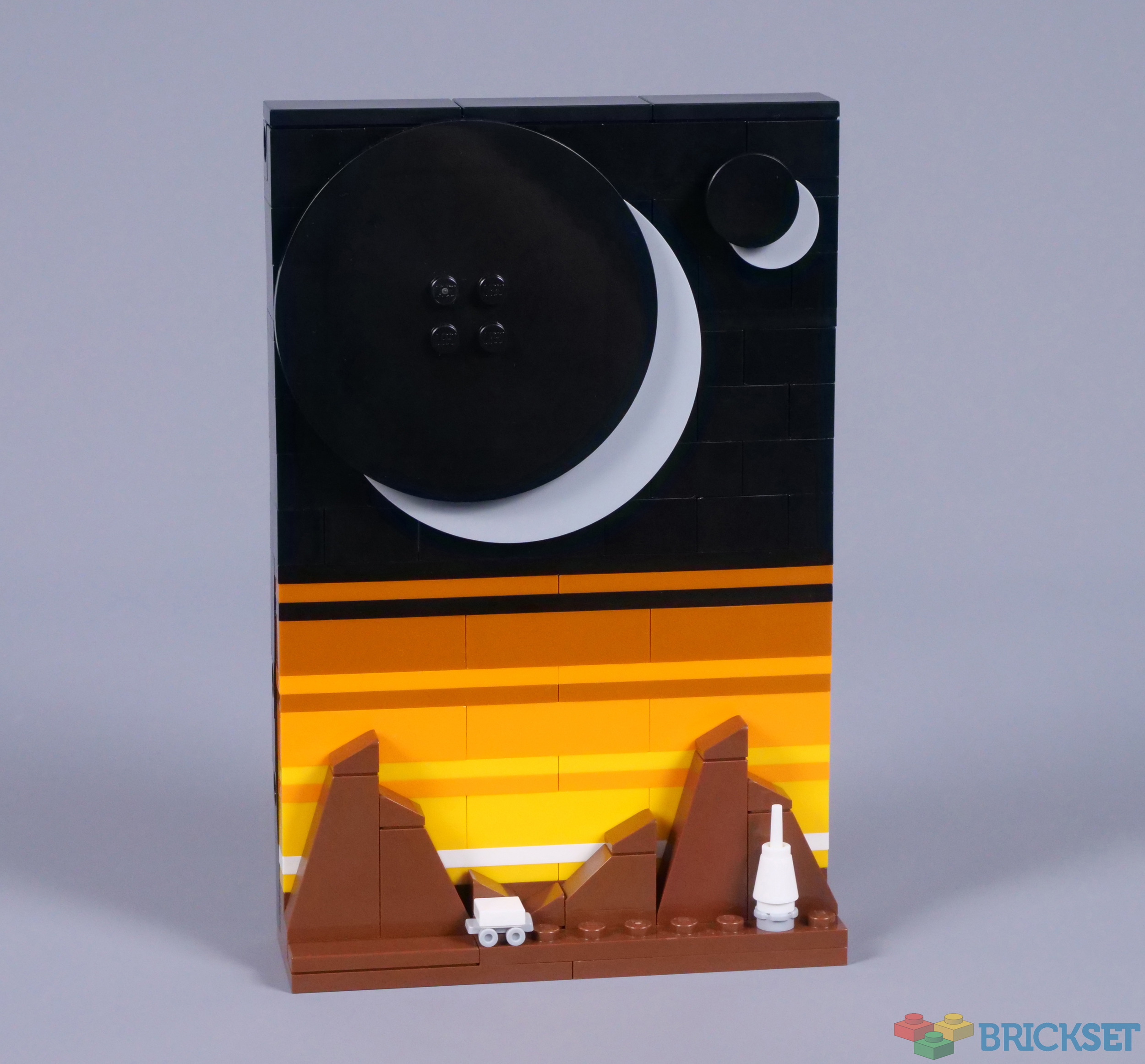
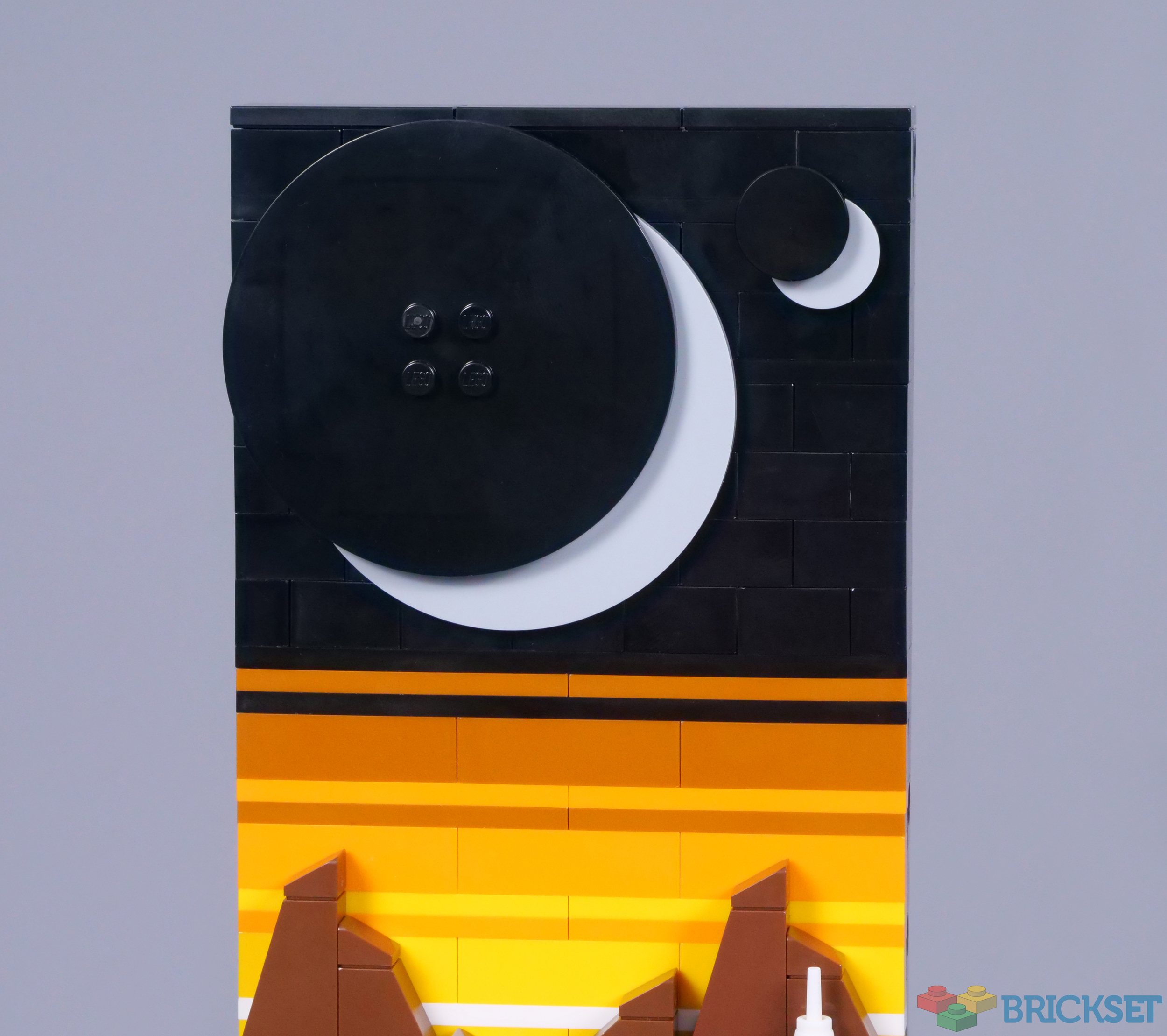
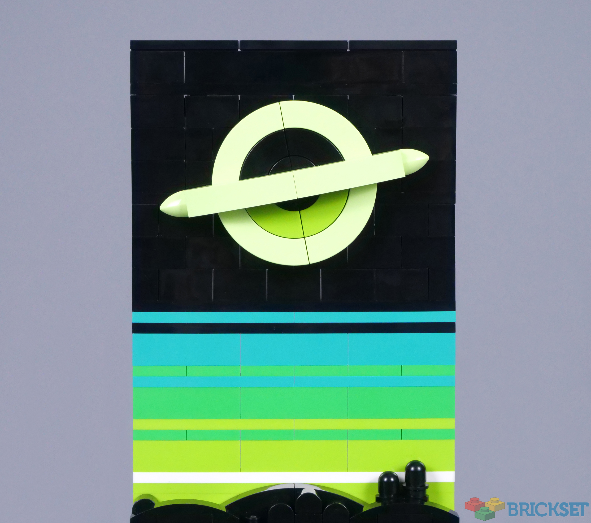
The fourth image was suggested by LEGO, although developed with direction from Jan, so the style remains identical. This green atmosphere looks completely alien and provides a beautiful backdrop for the silhouetted landscape, featuring a couple of odd buildings atop a hill. Perhaps these denote a long-abandoned civilisation, whose people fled in anticipation of the approaching black hole.
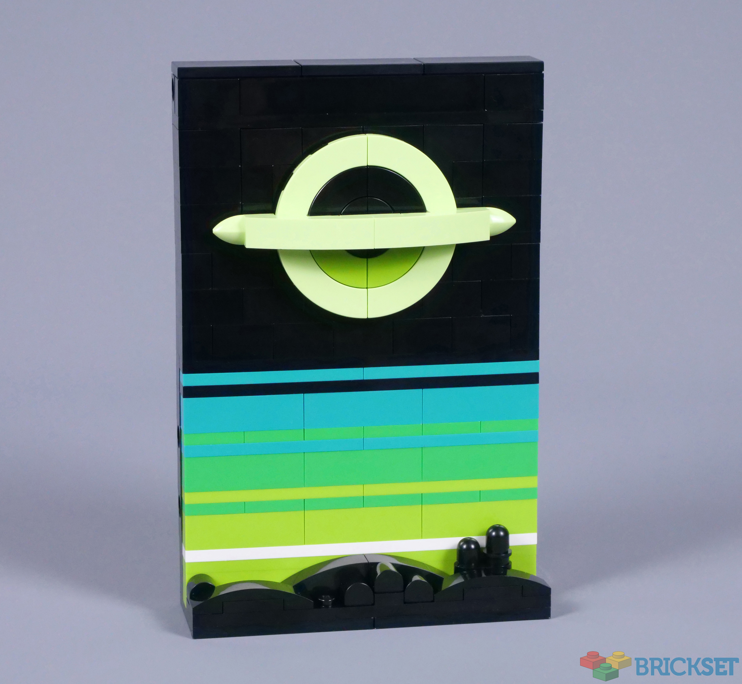
Depictions of black holes differ between sources. This example looks marvellous and recalls the collapsed star from Christopher Nolan's Interstellar, featuring a spring yellowish green accretion disk, visually distorted through gravitational lensing. A pair of lime green 2x2 curved corner tiles nicely represent bands of matter gathered around the black hole.
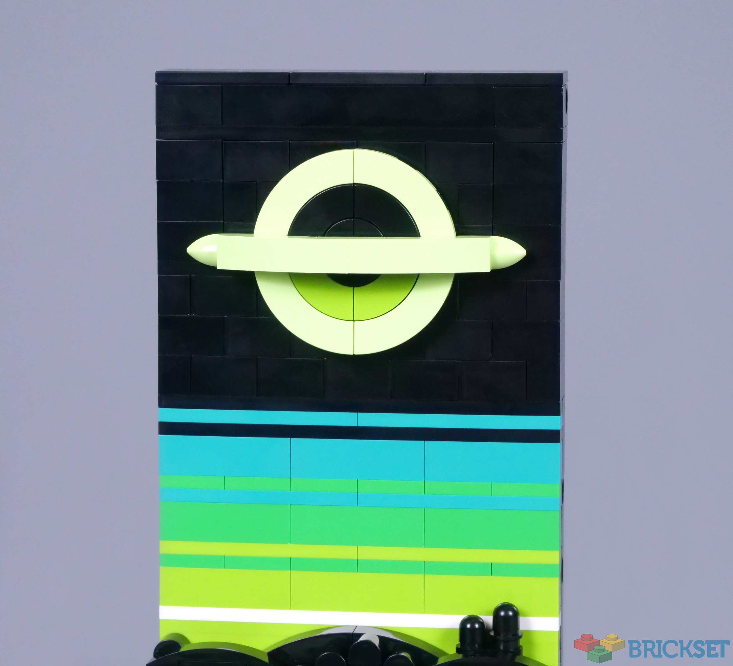
However, I think angling the accretion disk appears more natural and is possible with only minor modification, by adding a 2x2 jumper plate behind the black hole. The below design looks much better to me, so I am surprised the designer instead decided to position this stellar phenomenon horizontally.
Overall
Enjoyable though sets like 21336 The Office or 21338 A-Frame Cabin can be, 21340 Tales of the Space Age represents the essence of LEGO Ideas, in my opinion. The concept is unusual and possesses a visual character which would typically be limited to fan creations. Fortunately, this set is available to everyone and looks incredible!

While their construction is inevitably repetitive, these four images feature spectacular colour and are ideal for display. Their presence is remarkable, considering their modest size. In addition, I think the price of £44.99, $49.99 or €49.99 represents reasonable value, so I would recommend this creative addition to the LEGO Ideas range with no hesitation.
215 likes
50 comments on this article
Happy to see another well made non-licensed Ideas set!
While it’s not a set I was initially into, I’ve come around. Now…I think you summed up my thoughts quite well about it. Good review. Hopefully I’ll be able to pick this one up down the line.
I like these . . . but where you say 'black hole', I say 'London Underground'. I cannot not see the roundel.
I saw this in person today at my local lego store and they look awesome. They'd make an absolutely lovely display to hang on a wall.
The best one is the orbital laser vaporising the unruly population of a rebellious planet which refused to cede to my demands.
@someguy827 said:
"Happy to see another well made non-licensed Ideas set!"
Gotta wonder how much more attractive these kinds of sets are to Lego that potential licenses.
Polish flags you mean ? I guess that makes sense... but those black plates above them sure reminded me of the German Empire lol.
Otherwise, I much preferred the comets going down towards the planet and the white radiotelescopes from the original submission, but it's a pretty set nonetheless.
Nicely comprehensive review!
This has been mentioned in a few places, and troubles me: the one with the "eclipsed" planets/moons; I don't think it's supposed to represent eclipses at all because if it were the bodies doing the eclipsing would be lit as the eclipsed bodies are. If they're supposed to be eclipsed by the planet in the foreground, the angles seem wrong for it to be casting shadows on both.
I think they're supposed to be, simply, waxing or waning crescent moons.
Have I totally misunderstood something...?
I really like this, may pick it up subject to space (sorry) availability on my shelves.
I agree completely with adding an angle to the 4th image which will stop comparisons with a washed out London Underground logo and will make the image look more dynamic and less rigid.
Its a lovely set, so simple I magpied it and saved myself £45... and between you and me, it was more fun reverse engineering it with a few tweeks anyway.
I assumed these were human endeavors over time from satellite, rover, exploration and alien mothership, making us wonder if we should have kept the noise down.
@Terry_Wright said:
"I like these . . . but where you say 'black hole', I say 'London Underground'. I cannot not see the roundel."
@danieltheo
Not Underground; tram. Once you see the logo for the Croydon Tramlink, you can't unsee it here!
How much effort would it take to change the blue image so that the objects are coming downward again? In the original concept, I liked how they could have told the story of an exploration mission that took off in a rocket, explored a distant world, and then returned to earth, with the white disc resembling a heat shield.
Stylish and classy. And doesn't much room to display which is a bonus!
Gorgeous set, super easy to mod back closer to the original submission. Looking forward to having mine.
"...the essence of LEGO Ideas, in my opinion. The concept is unusual and possesses a visual character which would typically be limited to fan creations. Fortunately, this set is available to everyone and looks incredible!"
Exactly! Ideas is at its best when it's giving us things we've never seen before from Lego.
Surely the rover is leaving a trail of disturbed soil behind it (to the right) as it travels away from the lander, rather than smoothing it out (to the left)?
I thought the London Underground one was meant to be Saturn.
I love this set so much. It's a striking display piece and it's definitely one of my favorite Ideas sets. Can't wait to get it!
It is wonderful, which is why I ordered it immediately! Some sets are just no-brainers :-)
@bananaworld said:
"
@Terry_Wright said:
"I like these . . . but where you say 'black hole', I say 'London Underground'. I cannot not see the roundel."
@danieltheo
Not Underground; tram. Once you see the logo for the Croydon Tramlink, you can't unsee it here!
"
Doh! You're right, @bananaworld. I should've noticed that, too, seeing as I don't live too far from one of the Tramlink stops.
@Terry_Wright said:
"I like these . . . but where you say 'black hole', I say 'London Underground'. I cannot not see the roundel."
Black Hole? London Underground? Is there a difference? lol
Definitely picking these up when I can.
Thanks for the review.
A great affordable set!
It works on my imagination too.
Like how do we get from story 1 to 4?
This is a super minor complaint, but I prefer the original version of the brown one without the white cone piece. It makes the tiny rover seem smaller and more lonely. It better conveys a sense of desolation and scale by being the only human-made object in the frame.
I'm unconvinced the green one was necessary or even all that successful. I see "ringed planet" when I look at it, and not "black hole accretion disk."
I'll be picking this one up. Nice to see Ideas going back to smaller and less expensive sets. I'll probably piece together The Black Sun on Rebrickable to go with these.
Nice to see a set not based on an IP.
@Huw, you made a typo. I’m guessing there are 4 instruction booklets, not 5.
As much as I love Lego Space, I also love it when Lego does space-related sets that don't fall under that umbrella. I also love Ideas sets like this, that (as others have said) don't resemble anything Lego normally does.
@JDawg5: I'm pretty sure the white cone is supposed to be the lander that deployed the rover, or something like that, which would mean that @adamdw is correct about the studded and smooth surfaces.
@TechnicBoi: "The fifth booklet contains information about the celestial phenomena depicted, as well as the fan designer, Jan Woznica."
visually stunning set. hope to see more in this style!
I didn't notice the wands before! 10/10 for NPU!
Absolutely great set!
However, it also feels like a MOC'ing opportunity to add some LEGO Classic Spacemen (Spacemen not included in this set), and perhaps a Brick Built Classic Space Logo.
@adamdw said:
"Surely the rover is leaving a trail of disturbed soil behind it (to the right) as it travels away from the lander, rather than smoothing it out (to the left)?"
Fair point. I suppose I was thinking of the rover travelling back towards the lander and flattening the ground, which seems equally possible. Either way works.
Surely it wouldn't of been that difficult to add another star configuration for Southern Hemisphere as mentioned in the review in the instructions.
Then again adding the southern cross does have other political connation's.
Great review. But this was always on my must-have list. I am pleased that the reviewer was knowledgeable about the subjects. Very happy to know that the black hole is easily angled. It doesn't visually work well parallel to the horizon. Great set!
It's the evening of 5/5 in the US, and it still says coming soon on 5/5 at Lego.com...
Really interesting review and useful mod for the black hole
@kingalbino said:
"Its a lovely set, so simple I magpied it and saved myself £45... and between you and me, it was more fun reverse engineering it with a few tweeks anyway.
"
I know what you are saying, but I’ve never heard the expression “magpied it”.
Is that a website like Bricklink?
@CapnRex101 said:
"...the orientation of the meteors could easily be changed if you wish."
Can they easily be oriented almost downwards as in the original fan submission?
Lovely builds but I am really annoyed Legho decided to show meteors as comets, it just looks awkward not pointing down for some reason xD
I just ordered this! I love the colors and the style. It looks reminiscent of old sci-fi book covers, like Issac Asimov's robot and Foundation series. Can't wait to put it together!
@lemish34 said:
"i know what you are saying, but I’ve never heard the expression “magpied it”.
Is that a website like Bricklink?"
I’m since they say they saved £45 it means they didn’t buy any pieces but used ones from their collection.
@LordDunsany said:
" @CapnRex101 said:
"...the orientation of the meteors could easily be changed if you wish."
Can they easily be oriented almost downwards as in the original fan submission?"
Yes; they are attached using either 1x1 bricks with studs on the side or a Technic pin, so they can be rotated. Those bricks will need to be rearranged though, should you wish to recreate the original submission exactly.
The more I look at the fourth picture, the more I see the London Transport roundel. It also seems visually unbalanced compared to the other pictures' skies which are still mostly black.
So when the inevitable Ideas copycat projects come along, who's doing London Transport roundel pictures? I'm sure there's a big worldwide market for Croydon tramlink fans, haha.
"adding a 2x2 jumper plate behind the black hole" to angle the accretion disk would also raise the black hole away from the background - would it not?
I propose another solution - replace the two black half round plates (1745) in the middle and the two black 1x2 plates (3023) with a single 2x2 round open stud (18764) and a 1x4 plate (3710). With this you should be able to pivot just the accretion disk around the black hole, reaching at least 15 degrees tilt before you reveal the lime lower semi-circular tiles underneath.
@gbergevin said:
"It's the evening of 5/5 in the US, and it still says coming soon on 5/5 at Lego.com... "
It was available to vip on 5/5.
This was a day one purchase for me.
@kolaxanthe said:
" @Terry_Wright said:
"I like these . . . but where you say 'black hole', I say 'London Underground'. I cannot not see the roundel."
Black Hole? London Underground? Is there a difference? lol
Definitely picking these up when I can."
Well one is where a lightless place where matter is constantly crushed, pressed and squeezed until it at the densest it can be…
…and the other is a black hole XD
Really a lovely set that I will pick up sometime—although not immediately. I love classic sic-fi—especially Ray Bradbury—so there's a ton of appeal in this set for me.
I absolutely love this set. It's an affordable Ideas set that will surely look beautiful next to my Star Wars collection, and the set looks great in both individual and combined configurations.
Can't wait to pick it up, so I can finally dip my toes further into the 18+ line.
Lovely set, but I really don't understand how the meteors image could be described as representing comets!
Comets don't have any kind on extra glowey bit at the head (unlike the plasma that starts in front of a meteor). What comets *do* have, and this image doesn't, is two tails, pointing in different directions: one is always trailing behind, like, um, a tail, whilst the second is always pointing away from the Sun.
So, that's no comet!
I really appreciate that this Lego Ideas set remained almost identical to the original Ideas submission. Lately within the last few Ideas submissions that have been accepted, the actual product changed drastically from the original submission, like with the Sonic set. But I'm glad that they actually remained faithful to the original, which paid respect to the person who designed the Ideas submission.
@tm76 said:
"Surely it wouldn't of been that difficult to add another star configuration for Southern Hemisphere as mentioned in the review in the instructions.
Then again adding the southern cross does have other political connation's."
Why, Crux is just another southern hemisphere constellation. The smallest constellation in fact. Why does it have to represent political connotations?