Review: 60363 Ice-Cream Shop
Posted by CapnRex101,
LEGO Friends features a variety of characterful buildings and 60363 Ice-Cream Shop presents evident similarities with those sets, which is an appealing prospect. The irregular shape of this structure and its colour scheme definitely recall buildings in Heartlake City.
I welcome this influence from Friends and think the ice cream shop looks good on the whole, particularly because of the bright colours. Also, three interesting minifigures are provided, including the shop's delightful polar bear mascot.
Summary
60363 Ice-Cream Shop, 296 pieces.
£29.99 / $39.99 / €34.99 | 10.1p, 13.5c, 11.8c per piece.
Buy at LEGO.com »
60363 Ice-Cream Shop is good, but could be outstanding with improved detail
- Creative building design
- Attractive colour scheme
- New costumed minifigure
- Interior lacks detail
- Awkward window shapes
The set was provided for review by LEGO. All opinions expressed are those of the author.
Minifigures
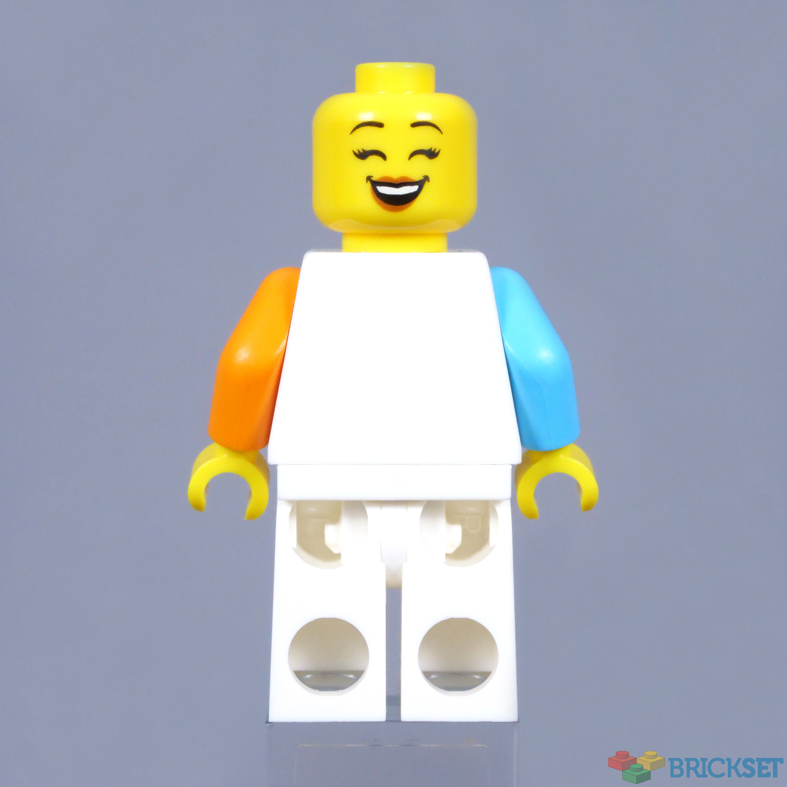
Costumed characters have become a feature of the Collectable Minifigures in recent years and this polar bear mascot is similarly dressed. The headgear is fairly simple, but includes a printed nose and eyes with moulded ears, which is everything needed. The double-sided head beneath this element is very cheerful.
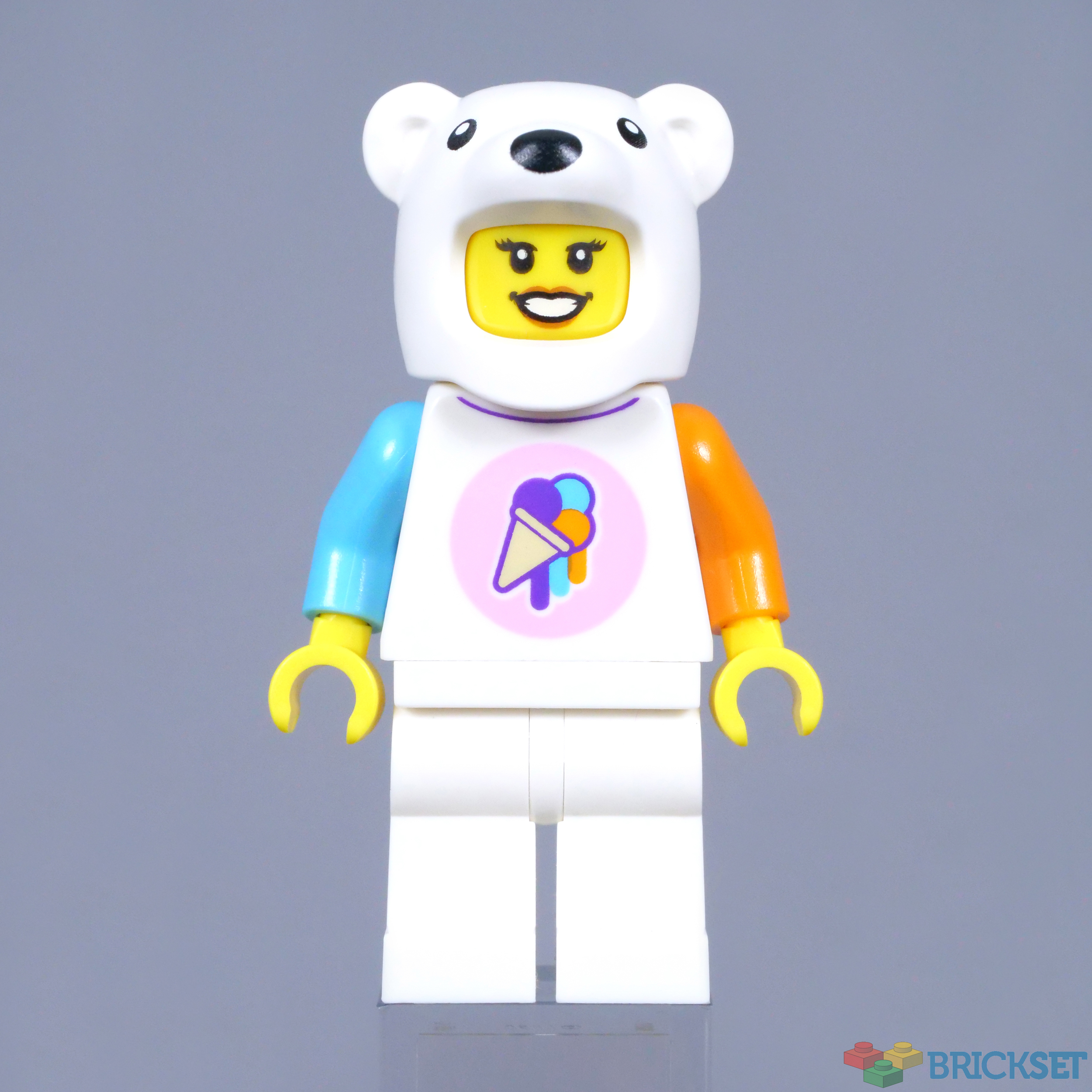
The torso is simply decorated as well, displaying the ice cream shop's colourful logo. I like the medium azure and orange arms, which correspond with colours on the logo and the actual shop. There is no printing on the back of the torso though and that is disappointing, since modern torsos are nearly always decorated on both sides.
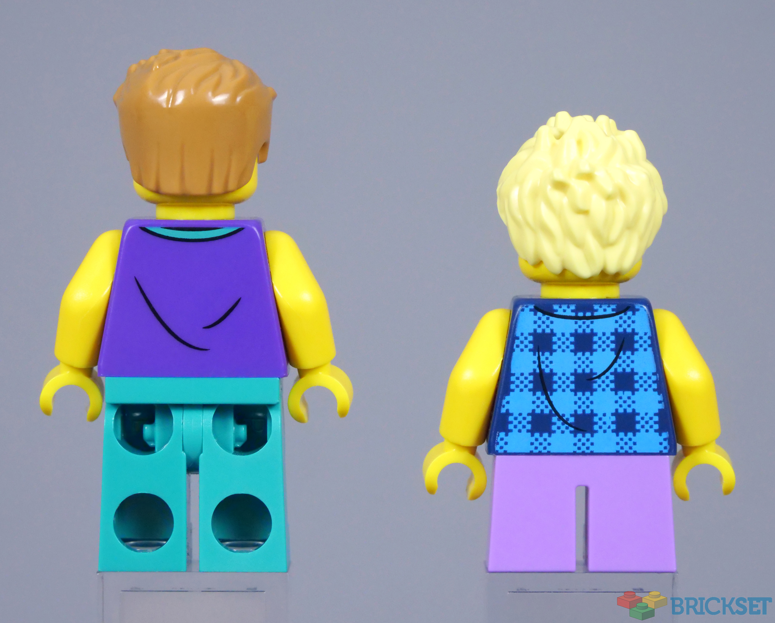
Two customers are included, also comprising some new elements. The adult's head is unique and appears suitably summery for visiting the ice cream shop, while the purple torso is new as well. Frustratingly though, there is a notable colour difference between the minifigure's teal legs, one of which is darker than the other.

Although the child's component parts include new printing, this torso has featured sleeves in the past, so is exclusive with yellow arms. Additionally, the blonde hair element has only appeared three times before. Regardless of their new or uncommon pieces, these two minifigures look excellent.
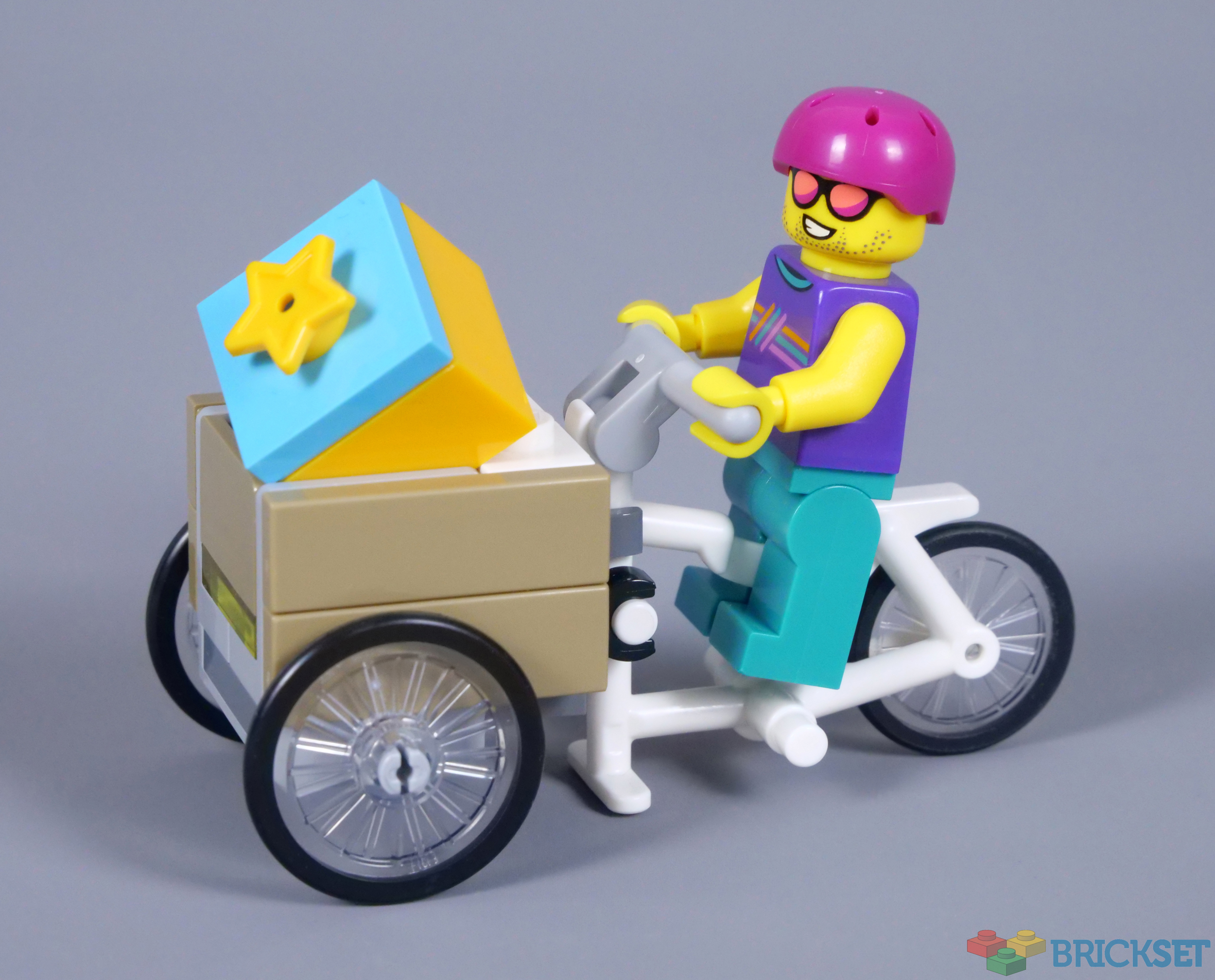
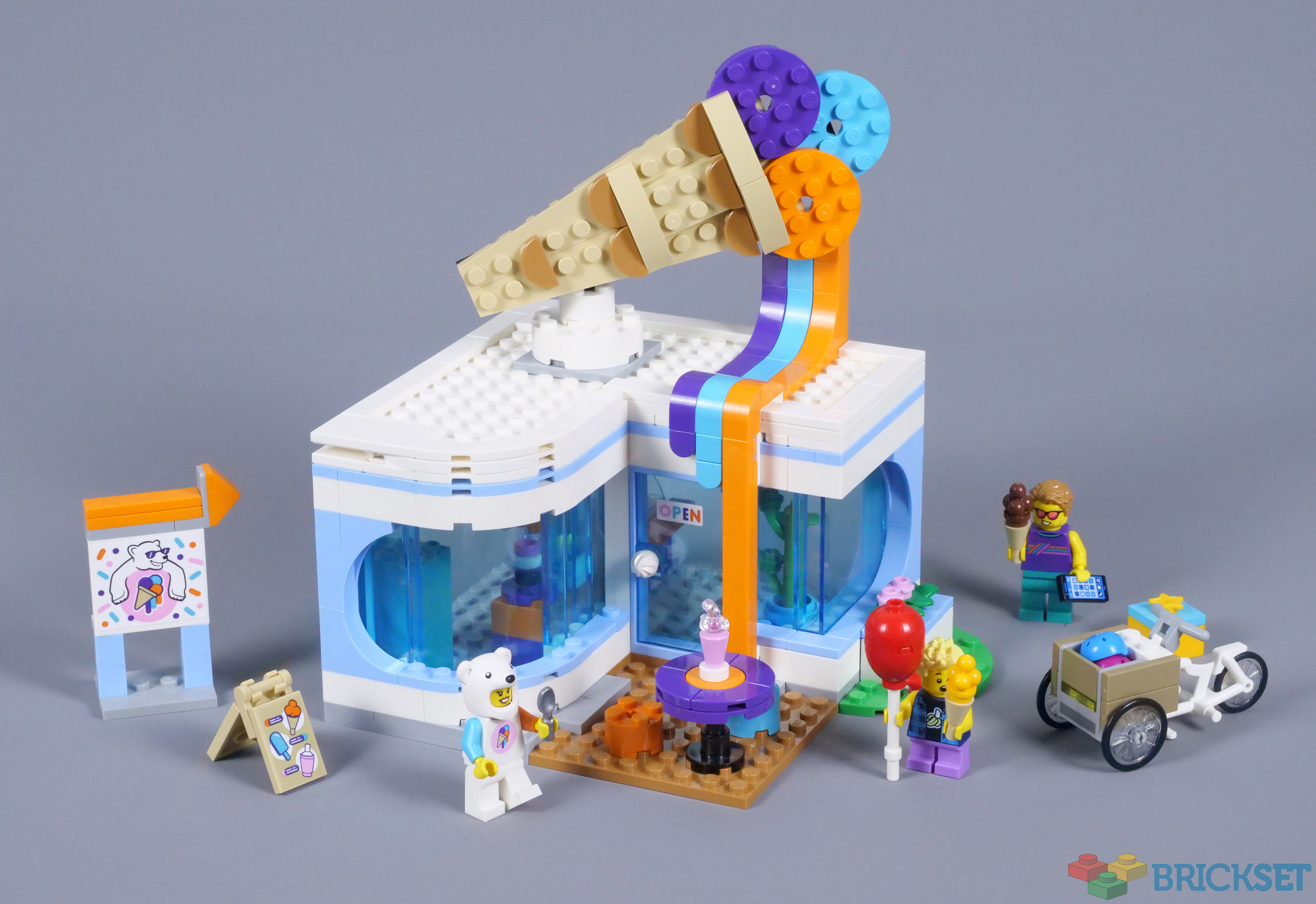
A generous selection of accessories is provided. Naturally, these include ice creams, which are available in four colours throughout the set. A printed mobile phone, a balloon, a spoon and an empty gift box also accompany the minifigures, alongside helmets for both characters.

The Completed Model
Those helmets are required when riding the included bicycle, with a large container on the front. The frame element was designed for vending carts in 2019 and I am surprised that this vehicle was not adapted for selling ice cream, as similar carts have appeared a couple of times before. Instead, this is a generic vehicle, with a wooden basket for carrying ice cream home.
A sign points in the direction of the ice cream shop, featuring a brick-built arrow on top. The light bluish grey bracket interrupting the arrow is not ideal, although I prefer this design to a sticker. Nevertheless, the sticker underneath does look nice and two more are applied on the folding sign, which advertises the available refreshments.
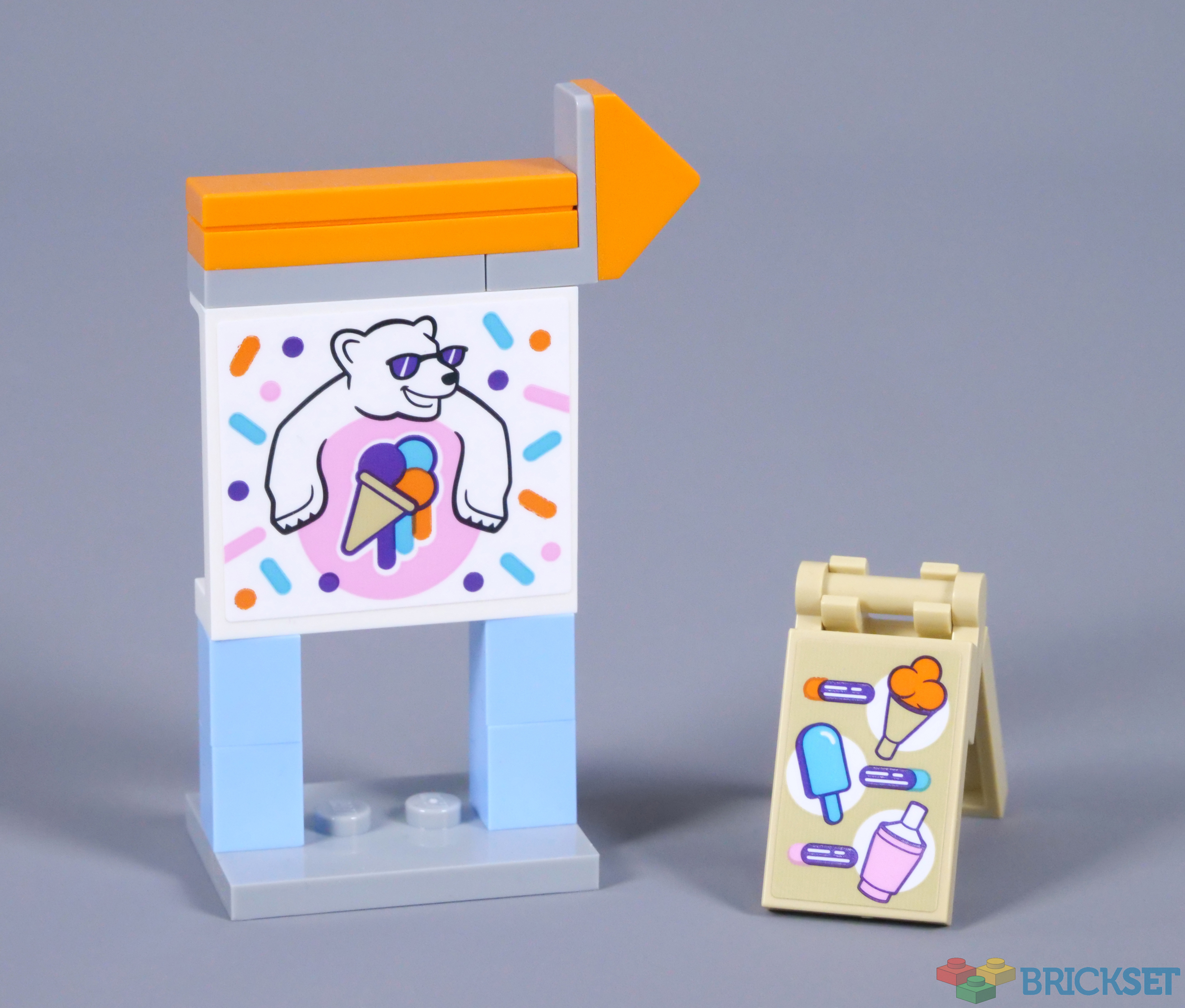
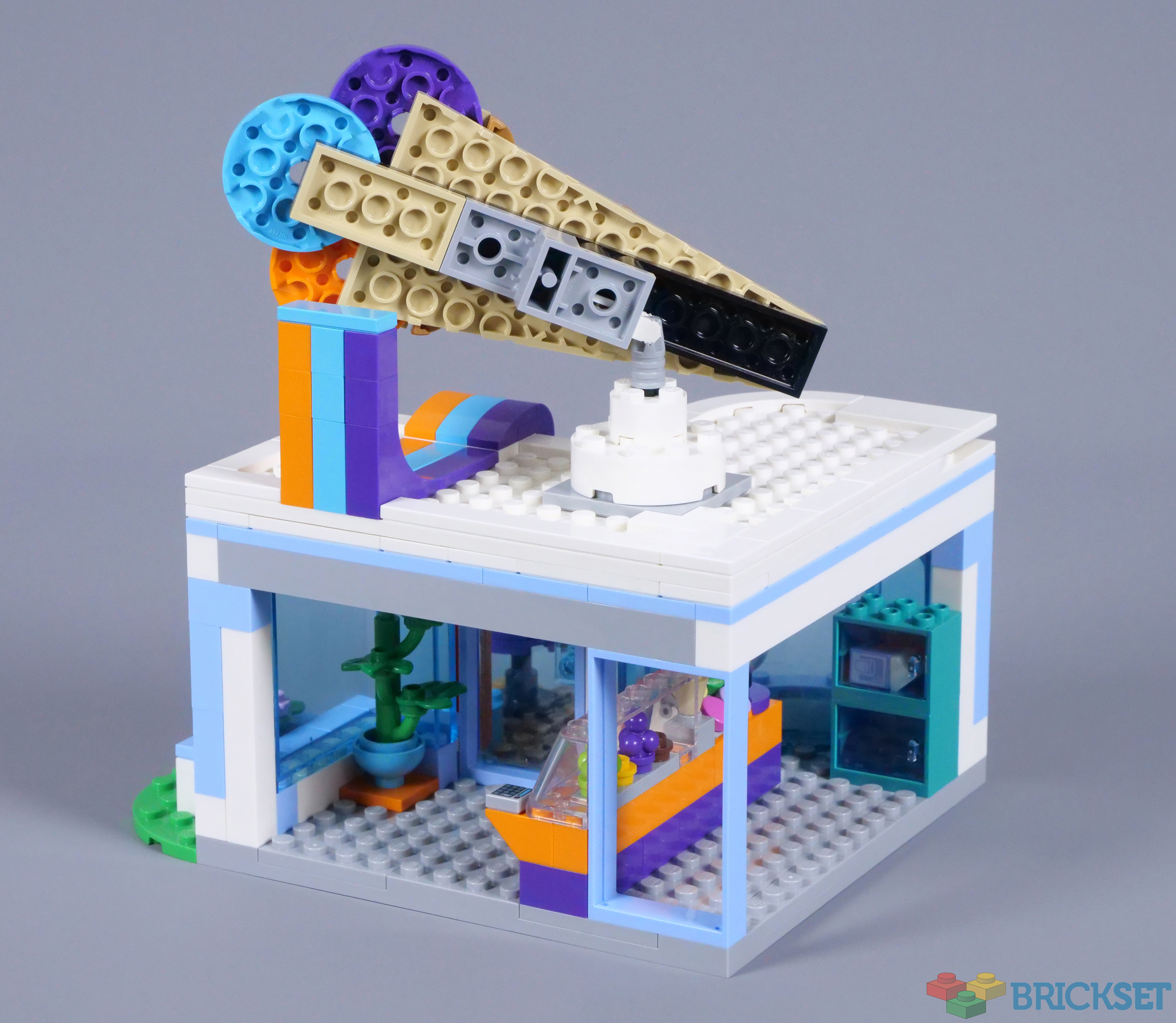
The colours on the directional sign are the same as those on the shop, which is predominantly white and bright light blue. This combination matches the minifigure's polar theming and I like the complementary bands of orange, medium azure and purple. In addition, the architectural style of the building is appealing and the footprint works well, designed around a new L-shaped 16x16 panel.
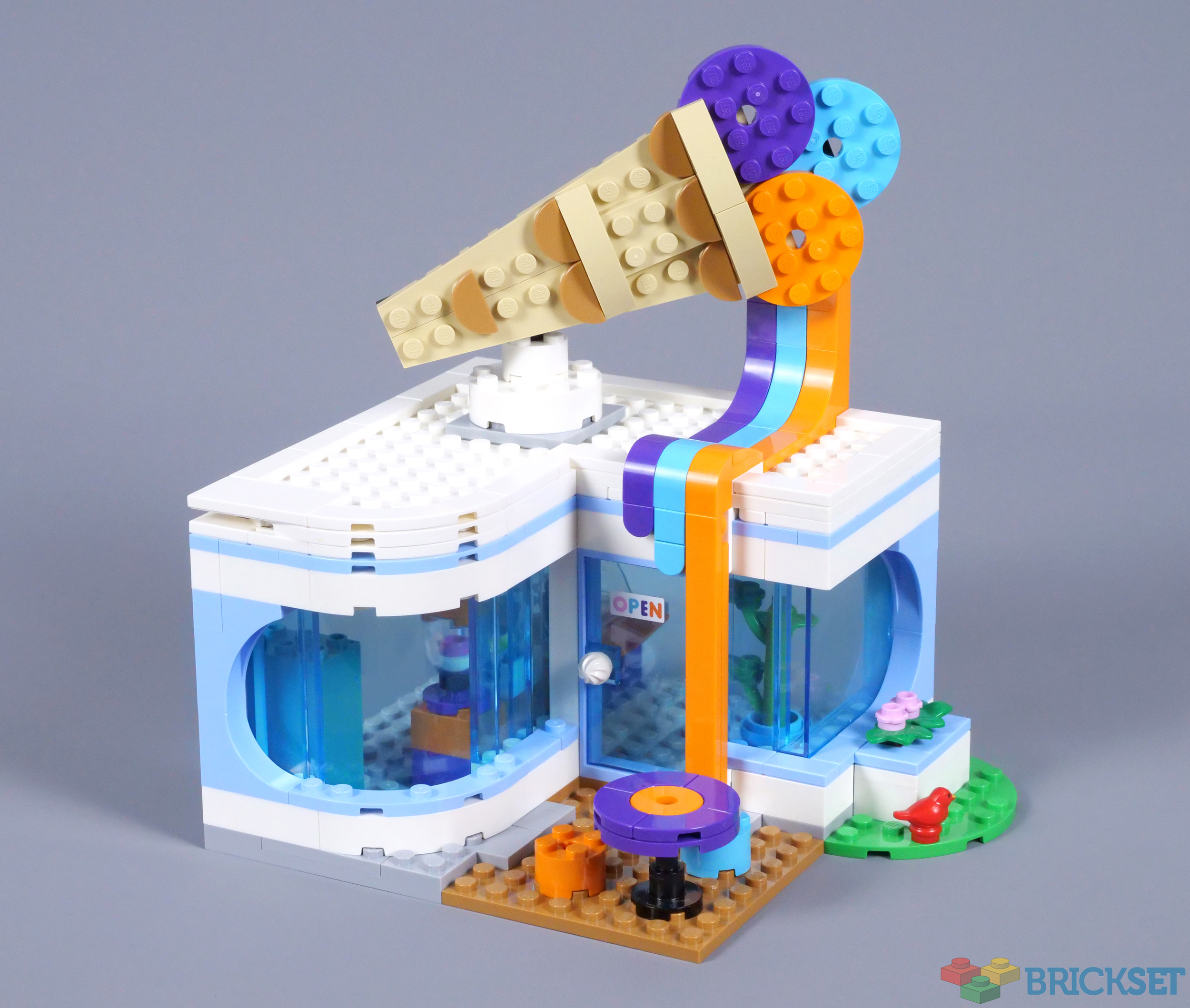
Strangely, one section of the building features a curved roof and window, while the other comes to a sharp angle. The shapes would be consistent, ideally, although this would entail extending the building to accommodate the door, so I understand the compromise. However, I dislike the use of green and medium nougat plates, which look awkward when placed together.
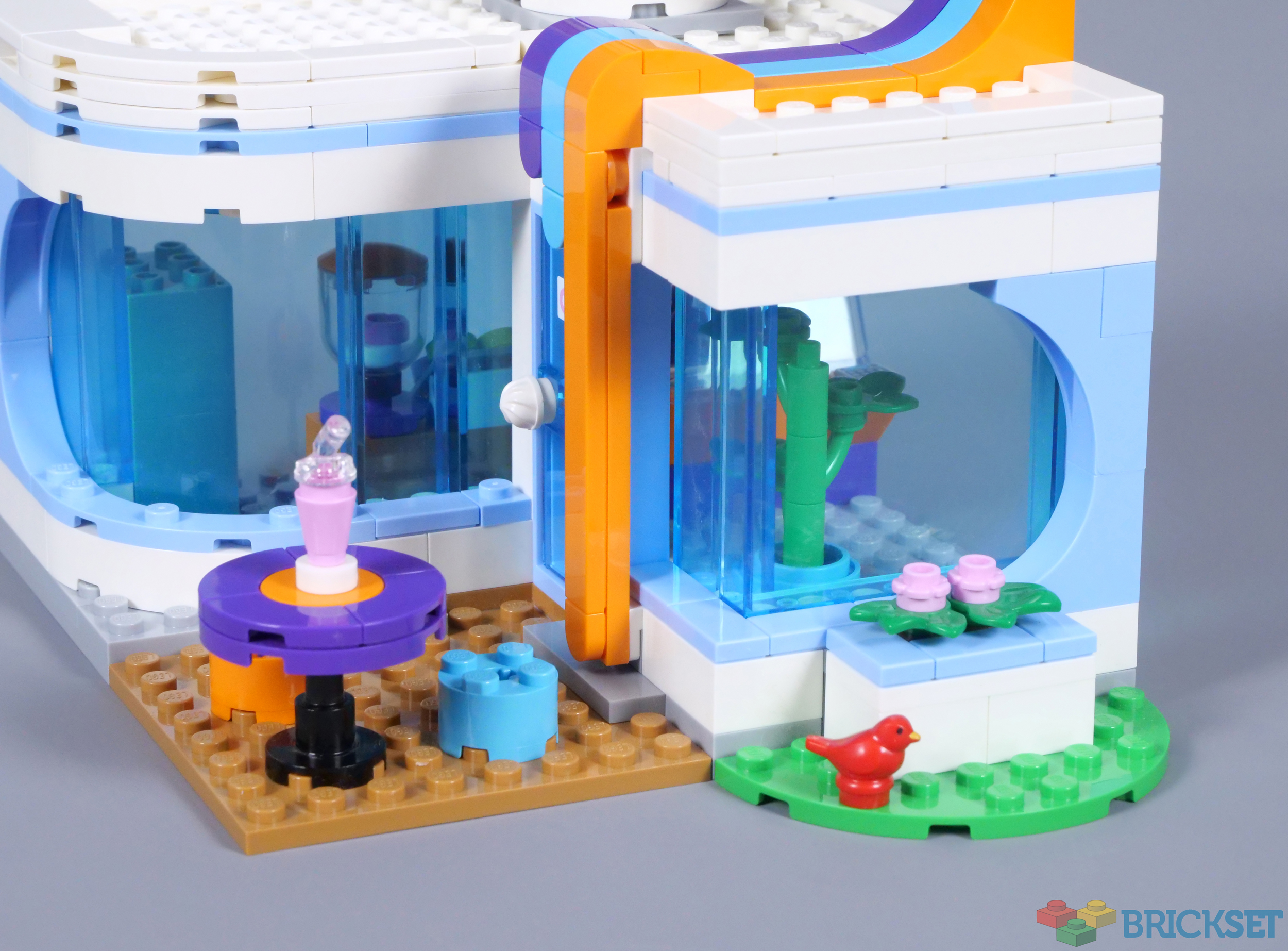
The medium nougat 8x8 plate is intended to represent a patio and looks reasonable, although a lighter shade would better contrast with the table and chairs. Their purple, orange and medium azure colours match the bands of colour decorating the front of the shop, which continue onto the roof.
Food-shaped signs are a common sight in LEGO City and Heartlake City, so an enormous ice cream is mounted on the roof. The melting effect and those bands of colour are effective and I like the 1x2 half circle tiles, that provide texture on the cone. Unfortunately, this sign is only two-dimensional, which feels like a missed opportunity for something truly spectacular.
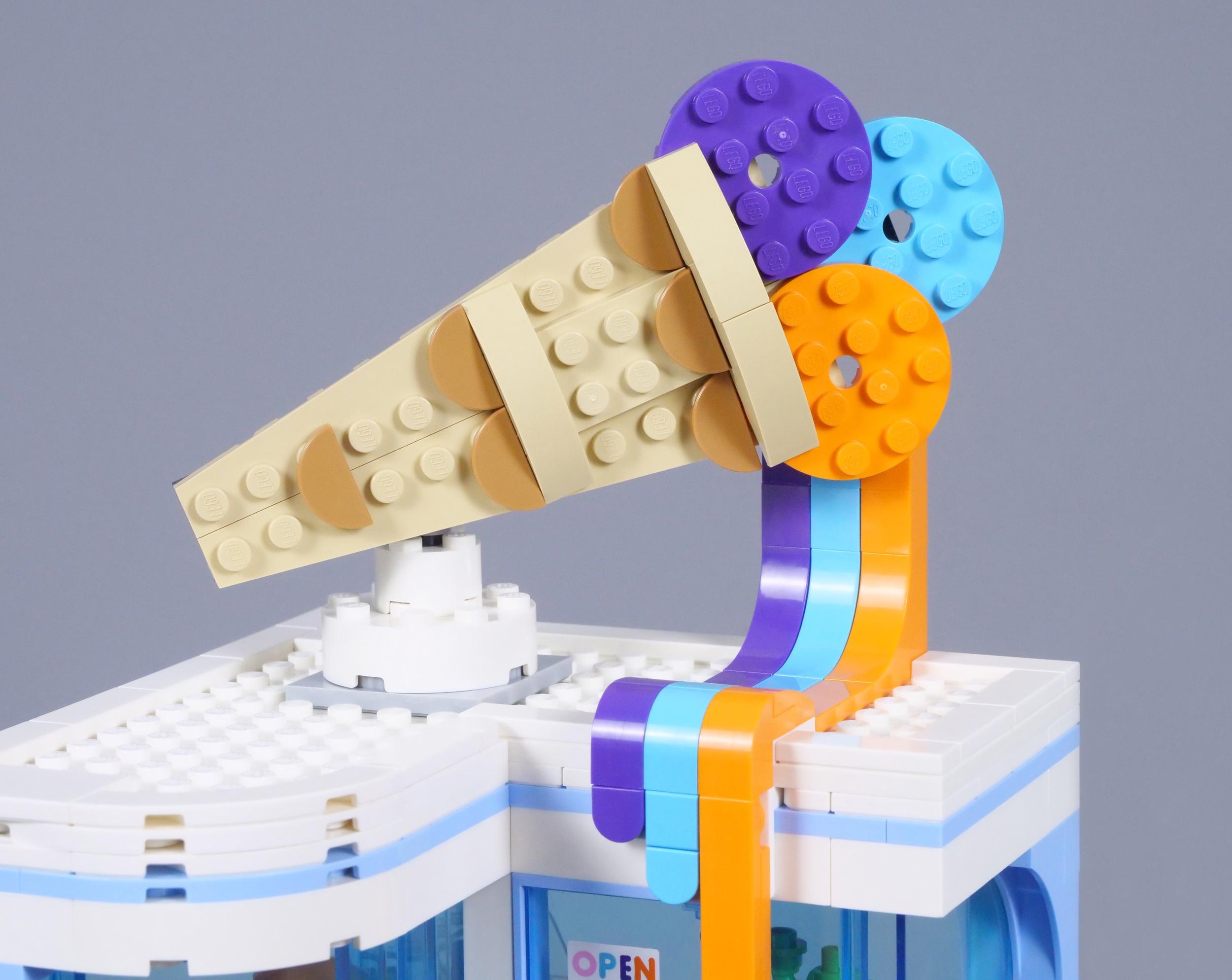
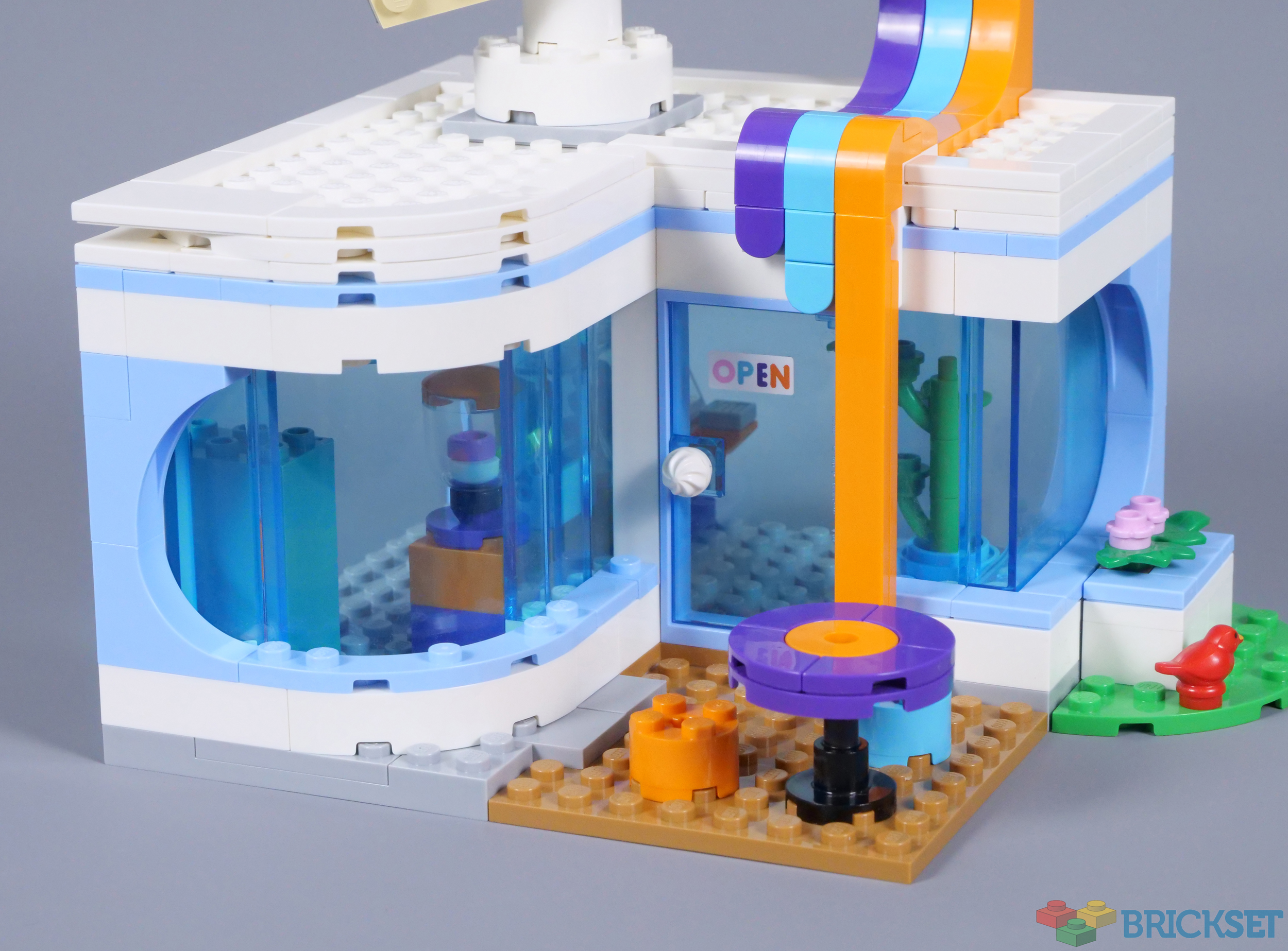
As expected, the view from behind is unappealing, although realistic. The sign is attached to a turntable and can rotate on a ratchet, but is designed to adjoin the melting ice cream. The back of the building is open for access to the interior and the roof can be detached too, so minifigures are easy to position inside.
Minifigures enter through the trans-light blue door, which features an ice cream-shaped handle, appropriately. The interior is sparse and I think a menu would have been a fitting addition, but this space provides ample room for customers to wait. The location of the indoor plant differs between official images and the instruction manual.
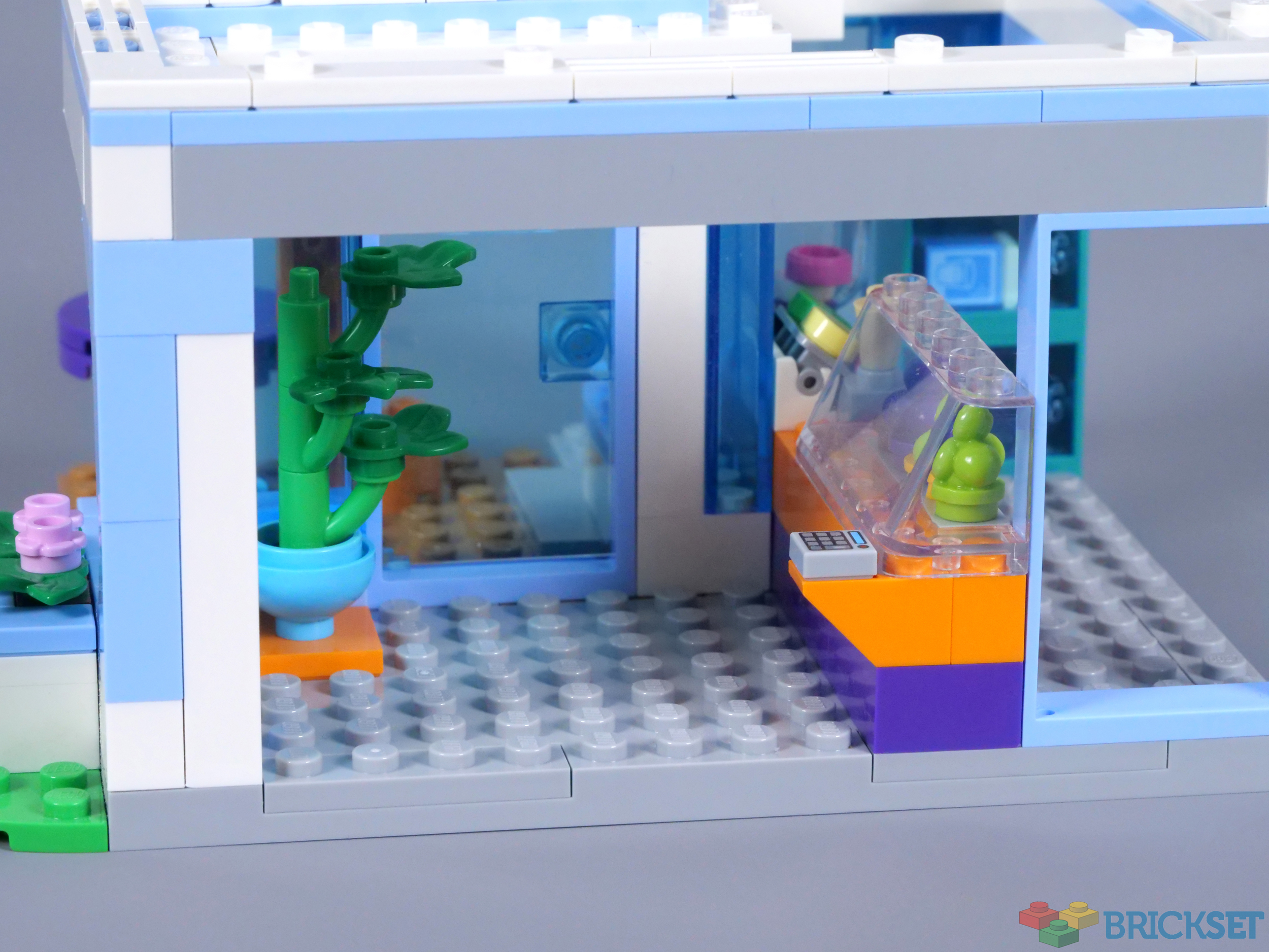
The counter is simply constructed, but remains attractive, thanks to the spectrum of ice cream flavours on display. Several are presented behind a trans-clear window, while ice lollies and a carton of milk are kept in the nearby fridge freezer. The continued vibrant colours look superb, but I find the whole interior fundamentally lacking in detail. Moreover, there is no need for such a large space behind the counter.

Overall
60363 Ice-Cream Shop definitely takes some lessons from Friends and benefits as a result, in my opinion. The colour scheme is excellent and I like the sign on the roof, even though a more complex ice cream would have been better. The detail is underwhelming though, particularly on the roof and inside. In general, Friends sets provide a higher level of detail.
Also, I think the finishing could be improved, most notably in relation to the windows. Despite these flaws and some missed opportunities, I am fairly satisfied with the ice cream shop. The minifigures are an unexpected highlight and the price of £29.99, $39.99 or €34.99 provides fair value, relative to the broader City theme.
116 likes
41 comments on this article
Looks a lot like the BTS set (but much cheaper).
I think it looks great. Will make a nice addition to my summer display and decent play value.
The bike element got turned into an ice cream cart in 60328 Beach Lifeguard Station, which is also part of my summer theme.
US price is steep, as almost always for CITY. If it goes on discount it might be the first CITY set I buy in years.
Love the polar bear costume!
We Bare Bears theme when?
How ironic, I just uploaded a modular version of this set today to Flickr.
cool set (pun intended:) )
Not a fan of the chosen colors for the ice cream. But still a good set. The signage could’ve been improved though since exposed studs are almost always unsightly.
The ice cream cone looks a little bit like a Star Destroyer. The melting is great though, that's a very fun detail.
N-Ice! :-)
Really good looking set. Tempted to get 2, or maybe even 4, to make a fully enclosed building.
Glad to see the Cresta bear still getting gainful employment... It's frothy man!
It might just be me and my terrible eyesight but it looks as though a piece is missing from the roof. I didn't see anything in the review about that notch. Weird if it's designed that way.
Good review! This set is less exciting to me than some of the larger buildings from this wave, but its Streamline Moderne–influenced architecture, frosty color palette, and bold sculptural signage all help it stand out quite nicely from previous LEGO City eateries.
The 16x16x2/3 L-shaped plate used for the foundation is an interesting new element, although for MOCs an 8x8x2/3 and and 8x16x2/3 plate could usually serve the same purpose at only a small cost to stability. So far this is the only City set that uses it, as well as the only set that uses the inside corner of the L to define the shape of the building, but I'm eager to see what other ways it will be used in the future. It definitely helps the building feel more impressive than it would with a more generic square or rectangular footprint!
The model adheres to the same modular design standards as other buildings from this wave (rooms 8 1/3 bricks tall, a 1x4 Technic brick to attach the planter box, etc), although in this case they don't lend it much obvious customization potential, unless you wanted to swap the planter box for some other type of street furniture like a bike rack. After all, I don't feel it'd be appropriate to the type of building to add an additional floor, and attaching another building in place of the planter would awkwardly block one of the windows.
In general, I'm with you in not quite being "wowed" by the set, but I do think it's pretty impressive for what it is. And I suspect I would appreciate it more for its uniqueness and aesthetic charm if not for all the other outstanding City sets it shares a wave with!
"Although none of the child includes no new printing,"
Not quite sure what's being said here
A neat if small set that should be enclosed.
Imagine it's so hot that the roof decoration is melting, but the boss insists you have to wear the bear suit!
@Toc13 i believe it's about their system-ID tattoos
@bricks_and_boxes said:
"The signage could’ve been improved though since exposed studs are almost always unsightly. "
But it's... it's LEGO.
If I were to buy this set I think I'm going to have to change out the Ice Cream colors on the big sign. That color combo is totally inedible for me. I'd rather make it a little more realistic.
@Toc13 said:
""Although none of the child includes no new printing,"
Not quite sure what's being said here"
Thank you, that has been corrected. The wording was originally 'although none of the child's printed parts are new' before I changed it to 'although the child includes no new printing'. I must have missed deleting 'none of'.
@Ridgeheart said:
"Hot dang, that is one of the eightiest-looking sets that ever eightied. It eighties for days, from the outfits to the sunglasses to the shaping to the eightiest colour-blocking this side of a Friends-set. I like it!"
Definitely mid-80s to early '90s - that kid is clearly into the new grunge movement everyone's been hearing about.
I like this set. Finally a decent building again in City! And the price doesn't seem too terrible for what you get for once.
And personally I like how roomy the interior is.
That said... what ice cream combination is purple, orange and azure? Grape, oranges and smurf icecream?
If I'd see such a sign I'd turn the other way. Was the classic chocolate strawberry and vanilla not 'hip' enough?
Seriously... smurf icecream
@Binnekamp said:
"I like this set. Finally a decent building again in City! And the price doesn't seem too terrible for what you get for once.
And personally I like how roomy the interior is.
That said... what ice cream combination is purple, orange and azure? Grape, oranges and smurf icecream?
If I'd see such a sign I'd turn the other way. Was the classic chocolate strawberry and vanilla not 'hip' enough?
Seriously... smurf icecream"
Exactly why I posted my comment about the color combo earlier. Either the orange or the purple I could work with but the blue is just a no go for me. Can't stomach blue food other than Blueberries. I could even go as far as the colors Disneyland used for their Fantasia Ice Cream which was Pistachio, Cherry & Banana if I remember correctly. So the colors would be light green, pale yellow & pink. Or maybe a Rainbow Sherbet combo. I've gotta agree with CapnRex that the interior does need a little more something. Like maybe a Slushie dispenser.
I love that the L-shaped baseplate here is compatible with the new Road system, even though the set itself isn't marketted as being compatible. Also the nougat footpath matches the nougat in other new City sets.
I'm glad they're committed to the new Road system because I've started collecting a City based around it and it would irk me if they suddenly abandoned the system as toy manufacturers are so prone to do.
@ForestMenOfEndor said:
" @Ridgeheart said:
"Hot dang, that is one of the eightiest-looking sets that ever eightied. It eighties for days, from the outfits to the sunglasses to the shaping to the eightiest colour-blocking this side of a Friends-set. I like it!"
Definitely mid-80s to early '90s - that kid is clearly into the new grunge movement everyone's been hearing about."
Smells like teen spirit.
Yes, the sign is two-dimensional, but the "melting" effect is inspired. Although I do agree with other commenters that the blue is a weird choice.
Explain to me the problem with the teal legs. I don't see anything wrong with them at all.
@ozbrickcreator said:
"Explain to me the problem with the teal legs. I don't see anything wrong with them at all."
Same here.
@ozbrickcreator said:
"Explain to me the problem with the teal legs. I don't see anything wrong with them at all."
I didn't see it before but now I do. The right leg is a teeny bit darker than the left leg from what I can tell. So in reality it could be much more obvious in person.
I think this is FIRST time where everything on Menu is actually obtainable in the set. I'm serious.
Love the 80’s vibe going on with this. If I had to complain, it would be too many studs showing.
@DoonsterBuildsLego said:
"The bike element got turned into an ice cream cart in 60328 Beach Lifeguard Station, which is also part of my summer theme."
It also appeared as Ice Cream cart in 31131 : Downtown Noodle Shop (2022), and 60234: People Pack - Fun Fair (2019)
Simply the best Lego City "buildings" in this 5 years.
The main point is: This is a "complete" set. So sad there so many City sets are "incomplete" in this 5 years. Their designers haven't thought deeply about all individual set.
Plus, cool design and this set can be amended/upgraded so easily.
This is a really great set imho.
The only thing that is really putting me off is the chosen colours for the ice cream flavours.
Like others have mentioned, what are those supposed to be?
I've just been on holiday, with lots of eating at ice-cream stands, and though certainly a lot of flavours were available, those usually tended to be in various shades of brown, cream, red/pink or light green.
When I get this set I will swap out the colour scheme for something more realistic.
It's a neat little set, but yes, I agree that in particular the interior feels a bit lackluster. It wouldn't have taken much like adding a chair, a fridge or a washing sink, but somehow they opted not to include those details.
I like it, but it also feels like a missed opportunity to continued with the Ice Planet Ice Cream brand as introduced in 71741 NINJAGO City Gardens (perhaps with a more Western font, of course).
@sjr60 said:
"Really good looking set. Tempted to get 2, or maybe even 4, to make a fully enclosed building.
Glad to see the Cresta bear still getting gainful employment... It's frothy man!"
Guess he has to get the work where he can these days.
Looks good. Will fit nicely with the Dynamite set.
I disagree with most of the reviewer's critiques aside from the sparse interior. Aside from that, this is a fantastic looking set!
@lotographia said:
"I'm glad they're committed to the new Road system because I've started collecting a City based around it and it would irk me if they suddenly abandoned the system as toy manufacturers are so prone to do."
I wouldn't get too comfortable with the new road system. Even in ye olden days when Lego still used baseplates for roads, they constantly tinkered with the design, changing the width of the road, to later changing the color (from old gray to green), changing the width again, then later changing to new dark gray. Maybe this new system will stick around longer than a few years, but I wouldn't bet on it.
@Ridgeheart said:
" @raven_za said:
"I like it, but it also feels like a missed opportunity to continued with the Ice Planet Ice Cream brand as introduced in 71741 NINJAGO City Gardens (perhaps with a more Western font, of course)."
You're not wrong, that would have been lovely - but since trans-neon orange was discontinued in 2012, we'd have to settle for regular trans-orange. Hardly seems worth it at that point, you know?"
Trans neon orange has been in numerous sets in the last decade so much so that it was a main color in Nexo Knights. It also was featured in other themes such as Ultra Agents. Or did you mean to say 2022?
Round off the square-angled window, move the table and chairs inside so they don't block the front door, and maybe add a gumball machine--the balloon can help with that--and everything becomes perfect, IMO. And the sign isn't meant to be seen from behind--only the employees park at the back of a strip mall. I've seen plenty of real-life signage that is just as unattractive from the back as this sign is!
I'm particularly thrilled with this set because in my town there's an old-fashioned carwash (it may once have been a gas station) that has a very similar color scheme and layout to this store. Shouldn't take much effort to turn the building into a MOC of that carwash, something I've long dreamed of making. Perhaps all I'd need to do is buy the carwash set as well as this one and start tinkering!
Pity about the US City surcharge, but it's been worse, I think. That's why I save up VIP points (that and the special sets that sometimes need them, such as the upcoming Bricktober coin-op rides)!
@Ridgeheart said:
" @raven_za said:
"I like it, but it also feels like a missed opportunity to continued with the Ice Planet Ice Cream brand as introduced in 71741 NINJAGO City Gardens (perhaps with a more Western font, of course)."
You're not wrong, that would have been lovely - but since trans-neon orange was discontinued in 2012, we'd have to settle for regular trans-orange. Hardly seems worth it at that point, you know?"
The Ice Planet Ice Cream didn't use any trans-neon orange, though... refer https://live.staticflickr.com/65535/50871107532_647f26186c_b.jpg https://live.staticflickr.com/65535/50871107242_1208ed08b5_b.jpg and https://live.staticflickr.com/65535/50871008821_2f02284a89_b.jpg