DREAMZzz Instruction Manuals
Posted by CapnRex101,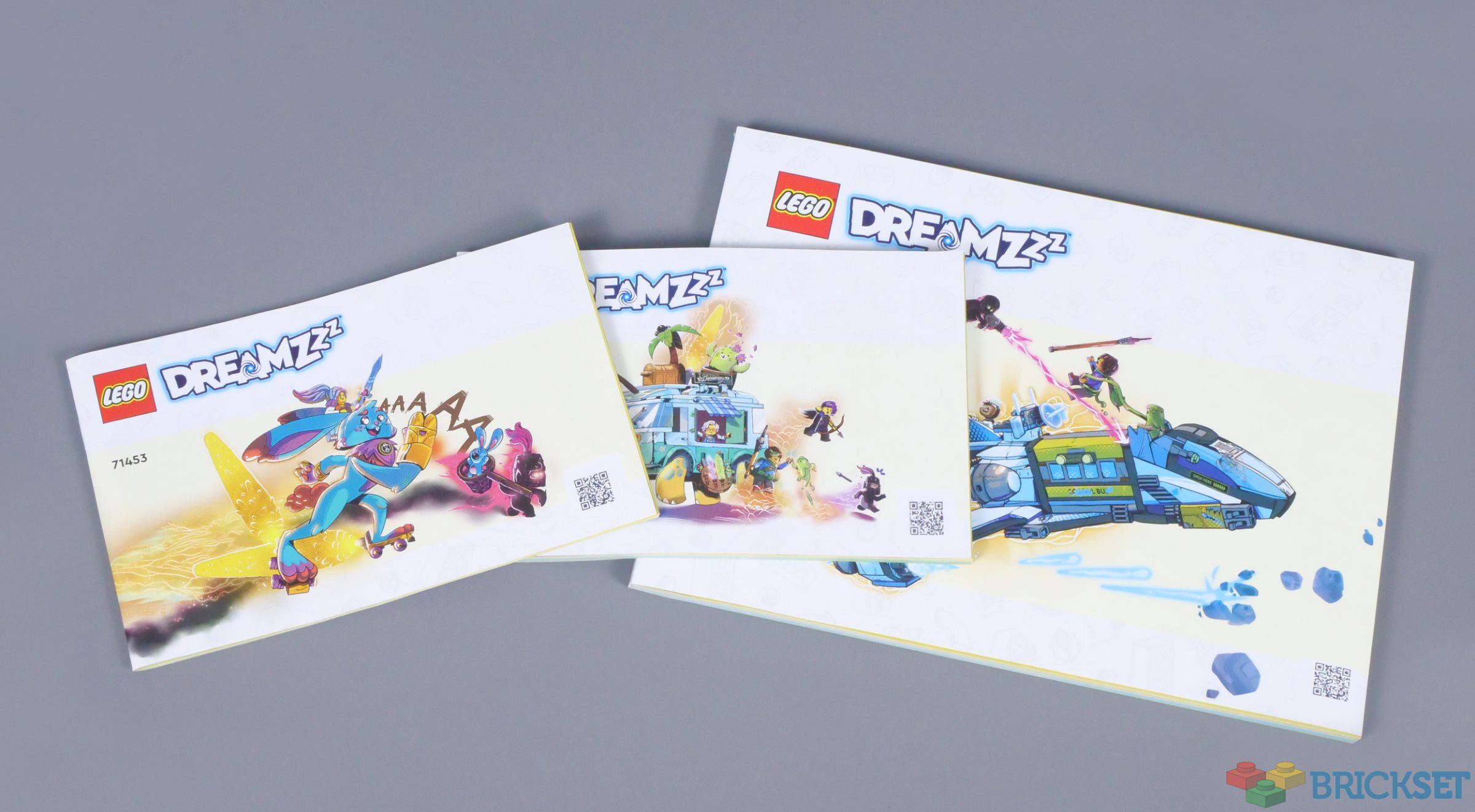
LEGO greatly simplified the design of instruction manuals last summer, so most display a render of the set, sometimes of dubious quality.
However, the DREAMZzz theme includes more interesting instruction manuals. In addition to images in the style of sketches on their covers, the booklets contain comic panels and a clever way of separating phases of construction, as each model is adaptable with different accessories.
While not as important as the quality of the sets themselves, I think the instruction manuals are worth examining...
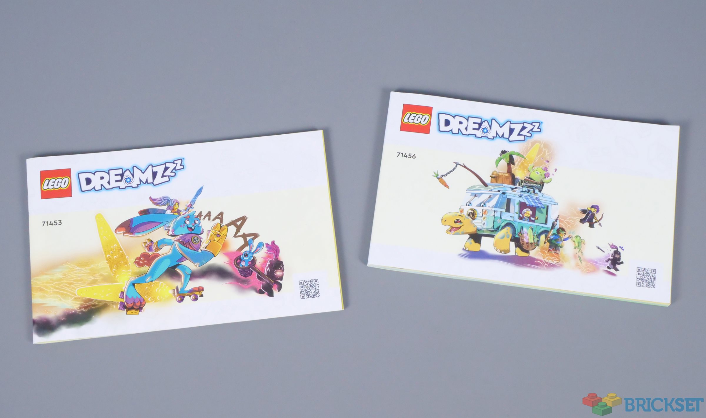
As mentioned, the covers are decorated with sketches of the set, rather than the usual render. These are much more attractive and give the sets an extra sense of thought. I can understand LEGO wanting their instruction manuals to be predominantly white, thus matching paper bags when they are introduced, but the renders have no character whatsoever, whereas these images do.
The artwork continues inside, introducing the minifigures as they are assembled and showing how they might interact with the models. Here Mateo and Z-Blob ride a rover in 71460 Mr. Oz's Spacebus. Again, while not revolutionary, these are a nice addition to the building experience.

Similar images appear at the beginning of each bag, showing which section of the model will be assembled next. These remind me of the comic panels found in early LEGO Star Wars sets, which presented the minifigures building their vehicles and potential alternative models.

Speaking of which, an interesting feature of DREAMZzz are the options for adapting models for various situations. The first seven bags and 124 pages of the manual create a basic spaceship, which can then be upgraded with huge engines to maximise speed or heavy weaponry and additional vehicles.

The options are colour coded where the manual divides and these colours are reflected on the pages, which is visible from the side! Of course, this makes the booklet quicker to navigate for children, but also looks good, in my opinion.
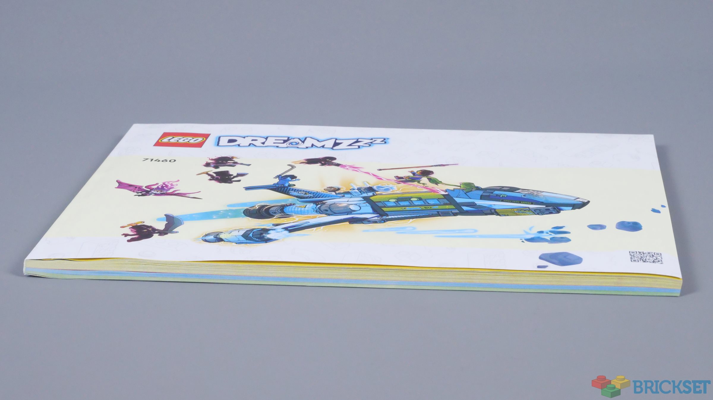
As you can see here, the basic spacecraft is assembled on yellow pages, but those turn blue when building the enhanced engines and green for the heavier weapons. Once again, sketch-like images signal the beginning of those sections of construction.

None of these features are particularly complex, but I think they improve the experience when building DREAMZzz sets. Colour-coded pages would not be necessary for every theme, but I would like to see more stylish imagery for covers across the LEGO portfolio, instead of bland renders.
Would you like any of these changes to be applied to the instruction manuals for other themes? Let us know in the comments.
179 likes
49 comments on this article
It would be cool if they could find a way to jazz up other instruction manuals. The current incarnation of manuals seems very bland and uninteresting. As someone who keeps the manuals regardless of whether or not I keep the set, I would definitely like to see more creativity. This is a good start.
I'm surprised and this is good, because it seemed like last year Lego were deliberately trying to phase manuals out and move everyone onto digital manuals.
They show the set number too!
I haven't bought any Ninjago for a while, so have they included any stylized art for the new Ninjago sets at all, given both are from new shows launching about the same time?
The instructions can "split"?...So sorta' "Chose your own Endeavors":)
Kinda' also a little Story-bookish; which isn't a bad thing, and I do like the color-splashes around the page edges.
Also: The rabbit's going to be mine (place 'Fudd laugh' here), but also the Z-Blob mech (which make me think of "Iron Giant" and 50s/60s Sci-Fi in general).
The trend for larger instruction manuals is usually bad IMHO, but this case it's not. The variants seem to need a dedicated set of instructions. Still, it seems quite bloated. Maybe put a few more pieces into each step and save a few trees?
@MrClassic said:
"They show the set number too!"
Definitely good. They seem to be trying to hide set numbers lately. Even taking them off order confirmations. Very irritating!
Okay, I’ll be the first to point it out. What percentage of LEGO customers are colorblind? Did anyone focus group this format with people who have varying forms of colorblindness (I know there are at least three) to see if this works for them, or if they’ll have to have someone looking over their shoulder to tell them which steps go together?
I wish all manuals had drawings instead of renders or photos. The box has photos, and I can take pictures of the set once it's done. But seeing some action scenes as imagined by an artist would be wonderful. Things like ElDorado could show the soldiers marching for the governor, or shooting a cannon, or unloading the ship.The modulars could show pieces of a story, with characters doing their own creative thing. I feel like it's an under-utilized area of what we buy and given that manuals are kept more than boxes, the best place to do creative things.
I'm really impressed with the artistry and creativity in the graphic design. This new line is setting the standard that hopefully will be followed.
@MrClassic said:
"They show the set number too!"
It only seems to be the 18+ sets they are missing from at the moment. I do wonder why: it will make identifying them in 10+ years far more difficult.
@PurpleDave said:
"Okay, I’ll be the first to point it out. What percentage of LEGO customers are colorblind? Did anyone focus group this format with people who have varying forms of colorblindness (I know there are at least three) to see if this works for them, or if they’ll have to have someone looking over their shoulder to tell them which steps go together?"
These look like mostly clear examples that also call out page numbers to help.
I'd like to see more help with brick colors. The recent 21340 Tales of the Space Age has some helpful color sorting and differentiating in the instructions for dealing with different hues of the same color. As a colorblind builder, it really helped a lot. I just wish the printed colors were closer to the actual brick colors - colors in the instructions always seem way darker. (or maybe that's my colorblindness effecting that).
Multiple options are neat, and I'm sure folks love it but my OCD kills me on deciding which is the 'one true official' build to follow and display when there are multiple options. :-) Probably a trick to get me to buy two copies.
@MrClassic said:
"They show the set number too!"
That's one thing I absolutely hate and have zero idea why LEGO did it - getting rid of the set numbers on instruction manuals.
It makes no sense at all, is annoying to the max, and a bloody nuisance.
Thank God they reintroduced them here.
And how great is this type of design. I would appreciate it if they did similar designs for Ideas, 18+, Technic, Art and Architecture too.
I really like the creative decisions they make with the new theme. Definitely shows more effort than on many other themes nowadays (Star Wars in particular).
More of it please.
That's quite cool actually. Certainly an improvement. I mean I do have those niggling thoughts about is it worth the extra paper, ink or costs but yeah it's quite cool.
This reminds me a LOT of the Speed Slammers subtheme of technic that ran from 2000-2001.
Seriously, just the check the instructions of 8236 Bike Burner and tell me that doesn't remind you of the sketched images of the model and the color coded sections of the instruction booklet. Skip to page 16 for the best example.
I'm loving this!
This is so much better an addition than those awful renders and the patronizing progress bar and especially the celebratory 'yay, you completed it!' lines around the model when you assemble ONE minifigure or sometimes when you just get to a random section of the model. Even taking into account that the majority of sets are for children, those are like saying that the build is a slog you have to be coached through.
Sorry for the rant. I came accross this stuff in 40580 and it hit a nerve.
@oukexergon said:
"I haven't bought any Ninjago for a while, so have they included any stylized art for the new Ninjago sets at all, given both are from new shows launching about the same time?"
The Core waves had some pieces of art for each major section of a build.
@briandrewz86 said:
"It would be cool if they could find a way to jazz up other instruction manuals. The current incarnation of manuals seems very bland and uninteresting. As someone who keeps the manuals regardless of whether or not I keep the set, I would definitely like to see more creativity. This is a good start."
Yea, like they did with 21334 ;-)
swOOOOSH, PEW PEW!
This is the way.
I have noticed in some of the newest Friends sets that you see the odd little animation on the page such as heat radiating if you’re finished building a fire related thing like a fireplace for example. I do find it a tad distracting. The first time I saw it, I was actually looking in the pieces as I thought it was a new part :)
Do the manuals provide any credits to the artists?
I have been searching long and hard to find at least few people that have worked for LEGO on concept art and stuff like that, to be able to follow their work for inspiration.
At least it's one booklet per set, including the alternative options.
Some themes, in particular City have been quite different in how they handled instructions over the years, up to 2019 it seems to split booklets by bags mostly (a set like 60231 : Fire Chief Response Truck stops halfway a build to continue in booklet/bag 2)
Then sets like 60295 : Stunt Show Arena in 2021 had 6 booklets , but no bag numbers/build orders on the cover at all (probably meant to "build together", but the lack of booklet numbers can be annoying for storage.
Recent 2022 sets did get bag numbers on them again.
Then 2023 switched to numbered booklets not directly related to bag numbers, but build orders, but the modular nature of a set like 60372 : Police Training Academy does still allow it to build in different order from the 1-2-3-4.
Then also 2023, a really big set like 60380 : Downtown at least doesn't split everything by tiny booklets, but 5 medium sized booklets across 18 bags, which is still an improvement over the past, and it allows building together, as the way the set is designed.
@MudTail said:
" @oukexergon said:
"I haven't bought any Ninjago for a while, so have they included any stylized art for the new Ninjago sets at all, given both are from new shows launching about the same time?"
The Core waves had some pieces of art for each major section of a build."
Oh cool, I hope it's a trend that persists and increases.
the ART oh my word I could cry tears of joy this is beautiful. Dreamzzz is the theme that keeps on giving and I can't WAIT to get my hands on a set
Really nicely designed for the user experience. The illustrations draw you in and 8 year old me's imagination would've been ignited by the characters, world and possibilities. Great job, Lego
Very cool, and glad they didn't push it towards app.
Oh I love these illustrated covers! To me that's an improvement over not just the standard 2023 instruction booklets but also older ones. There's no reason the instructions have to have the same basic product photo as the set itself—if you have the set you probably already had the box and know what you're in for!
This is what those alternative models needed way back in the 90's.
I would really like just one instruction book per set. If there's more than one, then they should be the same size, and they should be numbered to indicate how many books there are: i.e. "1 of 3" or "1/3" so I know at a glance how many books I need- I don't want to have to page through, trying to figure out if I have all the books at hand.
I really miss the old mini catalogs that were included. These days, we sometimes don't even get any images in the back of the instructions of all the sets in the theme or subtheme.
@amosnp:
I’m not actually colorblind myself (as I discovered doing theatrical lighting in college, I have very good color sense…but I still can’t mix paint colors to save my life). I did however once diagnose someone with colorblindness, over the internet. A woman, even, and since the genes are recessive on the X chromosome, any form of colorblindness in a woman is supposedly as rare as a man having the most extreme version, which is just B/W vision and no colors at all. In this case, dark-blue pieces looked purple to her, but not to her kids.
Anyways, one of the things you’re going to be fighting is how the colors are achieved. A laser is just one color, but paint is mixed using red/blue/yellow subtractive mixing. Print shops use cyan/magenta/yellow subtractive mixing. Theatrical lighting uses red/blue/green additive mixing. And then there’s the part you have firsthand experience with, which is that the color that’s there is not always the color you perceive. These are all just different ways to get our brains to conclude that you’re looking at the same color, like adding “1+9”, or “2+8”, or “5+5” as a way to communicate the number ten. To most of us, this is a solution that works, more or less. To someone who is colorblind, it’s like only seeing “1”, “2”, or “5”, and wondering why they don’t all look like the same number.
The unfortunate answer is, I don’t think they can ever get print instructions to work the same for colorblind individuals unless they actually tailor them to your specific form of colorblindness (in which case they may not work for anyone else). And the only way to achieve that is if the people designing the instructions either understand what you’re going through, or if they have people with different forms of colorblindness offering input through the whole process.
@PurpleDave said:
"Okay, I’ll be the first to point it out. What percentage of LEGO customers are colorblind? Did anyone focus group this format with people who have varying forms of colorblindness (I know there are at least three) to see if this works for them, or if they’ll have to have someone looking over their shoulder to tell them which steps go together?"
The newer light pinks and all the variations of green and red have been a nightmare for me. I have a hard time with dark red and brown as it is.
As for instructions, thankfully I can tell by shape most of the time if it looks confusing, or I look at the colors I can differentiate and use process of elimination. Trans red and trans green are the worst offenders here.
These look ok, from what I can see here. I’ll have to wait until I can buy one to know for sure.
But honestly, I think LEGO has been pretty good about colorblindness. I can’t articulate it specifically, but it always seems like parts that could be confused are kept in separate numbered bags and separated in the build.
Very rarely do I have to ask a family member for help when building an official set.
It’s more like when I’m sorting that I need more assistance.
Fascinating how this kind of colorful comic printing is ok but color on the front (to match the box art) is “too wasteful”.
- fun for kids though
This is easily my favorite theme Lego has put out in the last decade. I haven't been this excited for a Lego theme since Exo-Force. These instruction manuals are so amazing to look at, they remind me of the old lego inspiration books with all the moc's from the 90's, but I alos get big Time Cruiser vibes from them (in a good way)
MK sets had some fun elements to their manuals as we’ll. MK would hold up a sheet when a sticker was needed & shooting stars would appear when a sub assembly was finished. And not exclusive to MK but I love the minifig progression bar at the bottom.
This is once again amazing, but I wish there was more smaller sets from this line.
This is why IMO this line will fail. How kids can play with the setting if they can afford 2 sets max?
@RatchetingClank said:
"Do the manuals provide any credits to the artists?
I have been searching long and hard to find at least few people that have worked for LEGO on concept art and stuff like that, to be able to follow their work for inspiration.
"
No clue I’m afraid for credits, but Matt betteker on art station is a concept artist for dreamzzz, bionical and Ninjago, and has a ton of interesting things there. I recommend checking him out.
I'd at least like to see more steps per page. I don't think TLM would apply more pieces per step again, but more steps per page should be doable and save weight, paper, space and time.
For me instruction manuals are very much a part of the experience. Not just in the building (I really don't like digital instructions), but also in the lead up to it. Getting ready to build, unpack the box, sort the bags and then laying the instruction manual(s) out in front of you. Having a bland render on the cover doesn't do much in triggering your imagination, it just shows you what you'll have once you finished building, not what it should be doing (shooting down baddies or something).
With these Dreamzzz covers I can imagine just pausing for a bit, looking at the cover and then really wanting to build stuff...
As for colours: I'm not colour blind, but do struggle with darker colours sometimes. In my experience that seemed to be a bigger problem in older sets though, where I would be left with parts in the wrong colour later in the build. Still happens when I (re)build older (SW) sets, not so much with the new ones. I really think Lego has improved in that aspect.
Reminds of the cool manuals from 1999-2001, although of cause they were much thinner^^
@amosnp said:
"Multiple options are neat, and I'm sure folks love it but my OCD kills me on deciding which is the 'one true official' build to follow and display when there are multiple options. :-) Probably a trick to get me to buy two copies. "
I'm with you.... I buy a Creator 3 in one and often think, ill make the small or medium model first and then take apart to make the Large (You can't take apart Lego :-) ) So I buy another. The one advantage of course is once you have secured a copy you cant loose and you may then get 33% off the 2nd copy and have spare parts......
Got lost with the City Missions...... too many options.......
I have not read all of the responses but has anyone asked about price? The manual looks great, Art and sections in colour codes all seem a great idea, for any set that has Variants. I just wonder if having the Art at least adds extra cost for the buyer?
@PurpleDave said:
" @amosnp:
I’m not actually colorblind myself (as I discovered doing theatrical lighting in college, I have very good color sense…but I still can’t mix paint colors to save my life). I did however once diagnose someone with colorblindness, over the internet. A woman, even, and since the genes are recessive on the X chromosome, any form of colorblindness in a woman is supposedly as rare as a man having the most extreme version, which is just B/W vision and no colors at all. In this case, dark-blue pieces looked purple to her, but not to her kids.
Anyways, one of the things you’re going to be fighting is how the colors are achieved. A laser is just one color, but paint is mixed using red/blue/yellow subtractive mixing. Print shops use cyan/magenta/yellow subtractive mixing. Theatrical lighting uses red/blue/green additive mixing. And then there’s the part you have firsthand experience with, which is that the color that’s there is not always the color you perceive. These are all just different ways to get our brains to conclude that you’re looking at the same color, like adding “1+9”, or “2+8”, or “5+5” as a way to communicate the number ten. To most of us, this is a solution that works, more or less. To someone who is colorblind, it’s like only seeing “1”, “2”, or “5”, and wondering why they don’t all look like the same number.
The unfortunate answer is, I don’t think they can ever get print instructions to work the same for colorblind individuals unless they actually tailor them to your specific form of colorblindness (in which case they may not work for anyone else). And the only way to achieve that is if the people designing the instructions either understand what you’re going through, or if they have people with different forms of colorblindness offering input through the whole process."
Thanks for additional info. Definitely a challenge on paper. Labels, numbers, or names would help (but then you get into language or reading issues). I'd love to see some features in the instructions app to help - digital gets some more options. There's also a 3rd party site that does some color blind Lego stuff that's helpful. https://color.brick.design/
@Huw said:
" @MrClassic said:
"They show the set number too!"
It only seems to be the 18+ sets they are missing from at the moment. I do wonder why: it will make identifying them in 10+ years far more difficult."
Yes indeed. Missing set numbers on manual covers is extremely annoying. I have my manuals all organized by set number. Hard to get it in the right spot and find it later when their is no number on it. Worst filing it cause I have to look it up first. But even worse is then if there are other books without numbers already files, I might have to look those up, again, to to figure out where the new one slots in. I don't mind if it's small in an unobscure place as long as it's there. The madness needs to stop ASAP.
I can't overstate the importance of a good instruction manual. It's a joy to look at and (sometimes read). Without a paper manual, building is far less pleasant. I HATE digital manuals, so much so that affter building a couple, I have stopped buying the Bricklink Designer sets, because they only have digital manuals.
When you buy cheap China LEGO knockoffs (OK, I confess, I bought a few) their crappy instruction sheets make you realize that LEGO really is better than the Chinese brands, because truth be told the brick quality of the Chinese brands is actually not that bad any more, the way it used to be.
LEGO manuals seemed to have declined in quality in recent years, in that the colours and shades are hard to tell apart. Or maybe my eyes are getting worse...
So LEGO paying more attention to the manuals is something I welcome, and hope they realize that this is a very important part of what makes LEGO special.
@Klontjes:
For me, these new images do very little. They don’t trigger immediate association with the sets they represent, which is what the cover image is for. I don’t mind them, but I would prefer if the set was still pictured on the cover in some way.
For color representation, they have played around quite a bit. Sometimes they’ve taken a step backwards, but in general there has been improvement.
@amosnp:
There was a time when I toyed with the idea of pursuing theatrical lighting design as a career. One of the more interesting things I learned at that time is that our eyes will naturally “white balance” themselves. Experiencing that in a five-minute demonstration really hammers home how much of what we think we see is just in our minds. You also have to unlearn much of the color theory you’ve carried with you since kindergarten.
Anyways, one option to help tell things apart would be to use letters or glyphs. You don’t have to know what the character represents, as long as you can tell them apart from each other.
This is awesome, especially since it seemed like they were making a push towards digital for a while. I really hope this expands to other themes as well. While these drawings may not be much, it really makes it seem like a much more premium product. Adding art is always a good thing.
@alfred_the_buttler:
They used digital for Dimensions, because building the models is incorporated into the game itself. They did it again for Mario, because digital allows them to include animations that explain how to play the game. And they did it for Bricklink because the runs are so tiny that it's not worth the setup cost to print them. Offhand, I'm not aware of any other themes that have had strictly-digital instructions. Mostly it was baseless conjecture that (in spite of an official explanation that clearly doesn't work for any other themes), because a single theme got them, then the plan must be for _every_ theme to get them. Plus there's the (small) crowd that has actually been asking for this to happen, which muddies the water.
WHERE ARE THE NUMBERS?!
Can't wait to buy some Dreamzzz sets! The theme definitely looks quite strong so far