Metro Map of LEGO colours available now
Posted by Huw,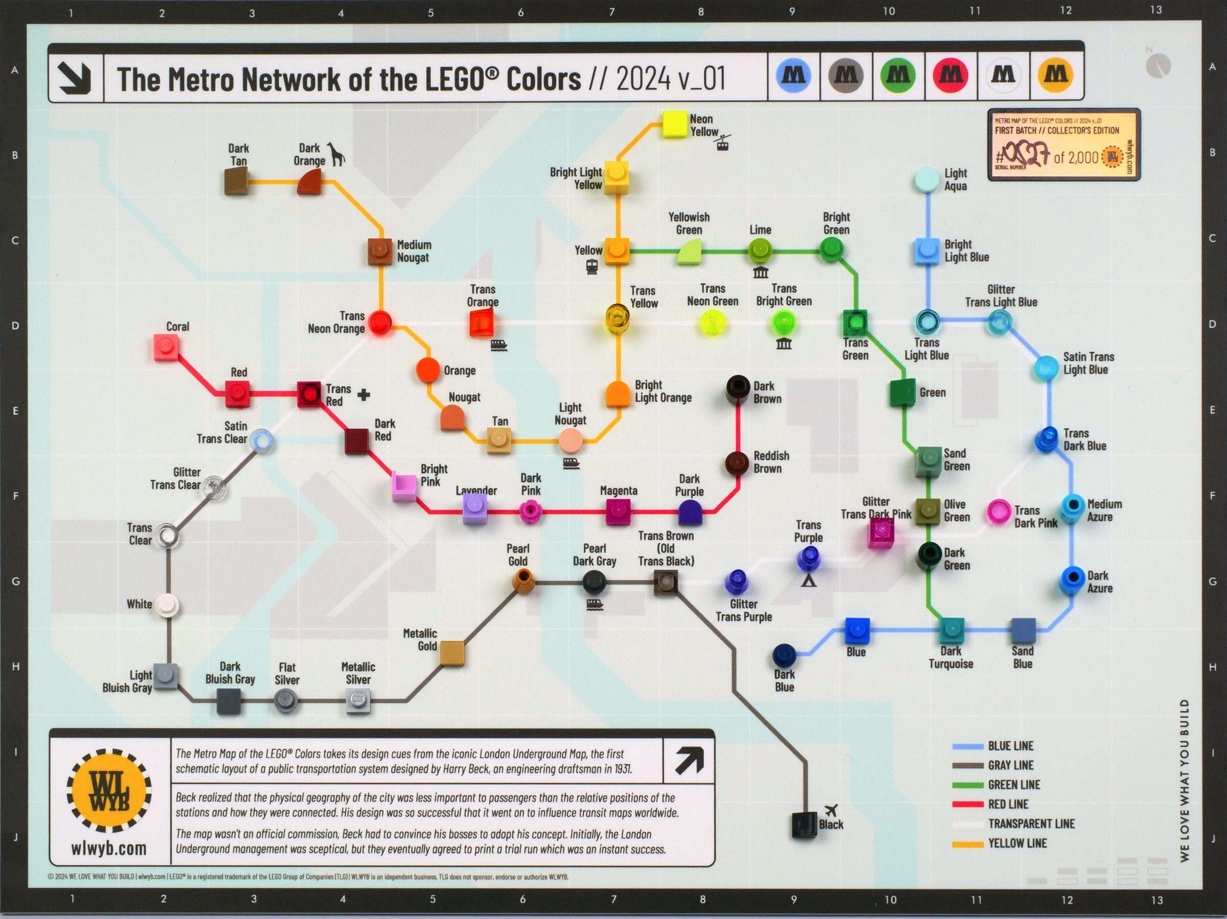
Our friends over at wlwyb.com have introduced a new product to their shop: the Metro Map of LEGO colours.
Like the hugely popular Periodic Table of LEGO Colours it uses 1x1 LEGO pieces in a creative way to produce an attractive wall poster. As the name of this one suggests, they are arranged like stations along railway lines.
It's printed on a thick plastic sheet which is about 300x400mm in size. There's a plastic hook on the back to enable it to be hung on the wall.
The 1x1 pieces are glued in place extremely neatly and squarely with no sign of glue around them.
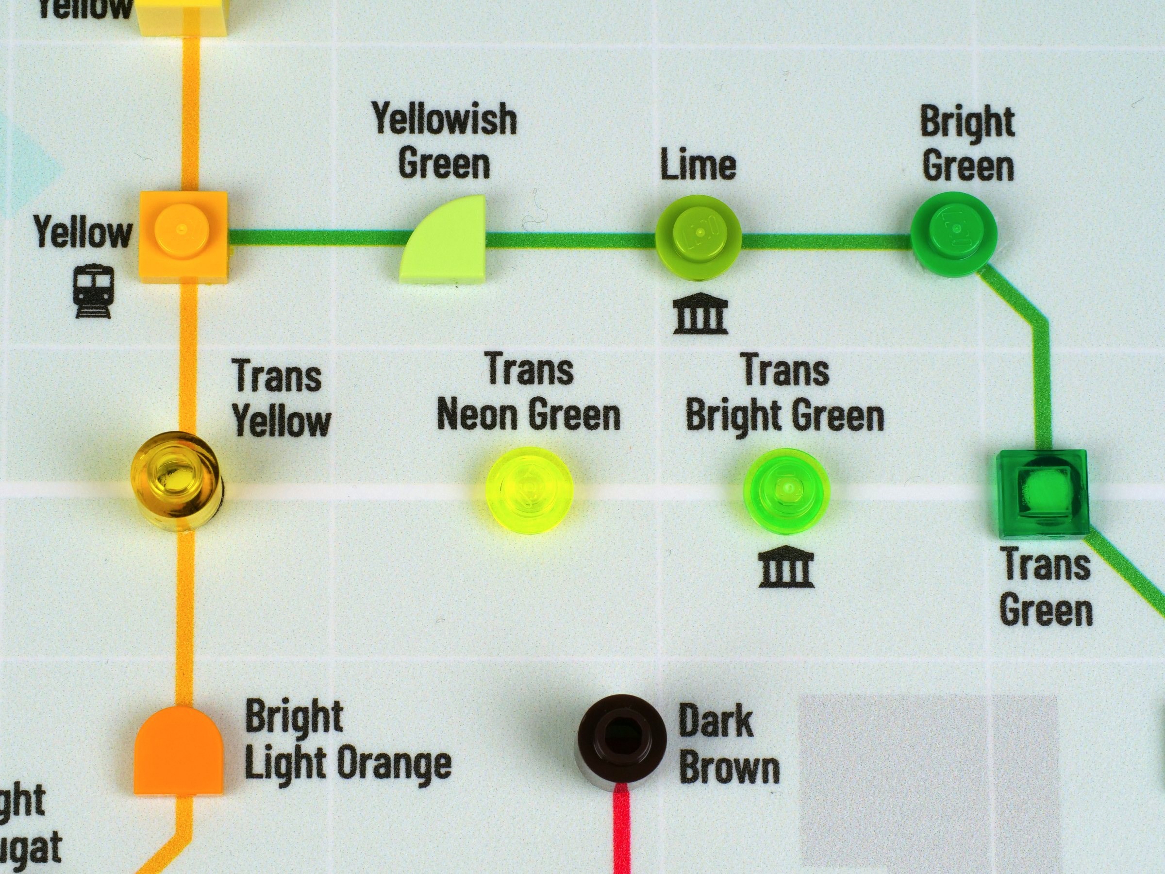
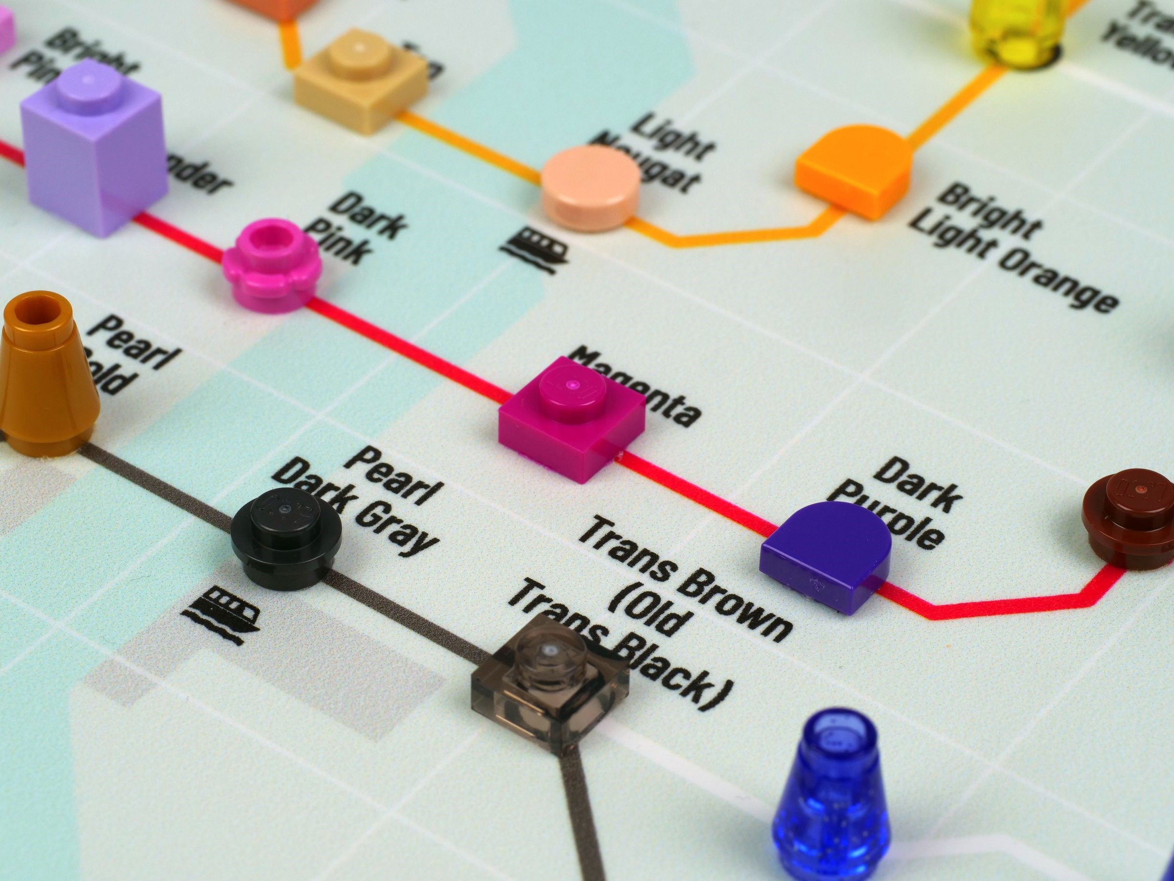
They are arranged along coloured lines, with green pieces on the green line, red ones along, yes, you've guessed it, the red line, and so on.
Some of the lines intersect at logical places: green and yellow as shown below, and green and blue at the dark turquoise (teal) station. More connections would have been nice, though, like red and blue at the purple station.
A white 'transparent line' connects them all together and my only complaint about the design is that it's hard to see that line against the light-coloured background.
It's inspired by Harry Beck's 1930s map of the London Underground that showed stations relatively arranged geometrically rather than accurately geographically, and information about that original map, and how it influenced the maps of other systems, is provided at the bottom left of the poster.
I was initially a little surprised that valuable space was taken up with this given that something more LEGO-relevant could have filled it instead, but I guess it helps cement the fact that this has not been designed as a colour reference but as an attractive, interesting and novel way of displaying and showing the variety of LEGO colours in use today, something that will have appeal beyond hardcore AFOLs.
It's available at wlwyb.com and normally priced at €49.99, but Brickset readers can enjoy a 10% discount by using the code Brickset at checkout.
Thanks to wlwyb for providing a sample for this article. All opinions are those of the author.
101 likes
39 comments on this article
Impressive.
I found it better as the periodic table of LEGO colors.
Intriguing!
...but it's not my cup of tea.
Looks interesting, too bad the new 'reddish orange' colour is missing though.
Just wanted to say thank you for adding the sponsored tag to the site - it does a great job of addressing the concerns I raised previously about clear disclosure of sponsored content, I really appreciate it.
As for the map - I do actually rather like it! My personal complaint about the LEGO periodic table has always been that it sort of awkwardly straddles the line between being an art piece and being some sort of genuine attempt to be systematic and categorise the colours, with the end result being that it falls short of doing especially well at either in my opinion. This, however, is much more clearly just for aesthetic value; I suppose I could raise some small quibbles about the placement of particular colours on particular lines, but they bother me much less in a product that doesn't make any pretence of trying to be especially informational in any sense.
I do wonder whether the geography is based on anywhere in particular - it would have been a cute touch for it to be set in Billund, perhaps, but alas there are too many rivers on the map for that to be the case.
I know every color may not be available in this piece, but a board with each color in a 1x1 plate arranged in a color gradient would be really cool
Not sure where they are getting their colour names from but Lego don’t do pink ??
Really creative idea - nice!
@Echo_bricks said:
"Not sure where they are getting their colour names from but Lego don’t do pink ??
"
Those are Bricklink's color names.
I like how the dark orange piece with the giraffe symbol both reference 31150
I didn’t realize this until just now, but the non-polycarbonate trans colors (like trans clear canopies or even trans color canopies of newer vintage) fluoresce slightly under ultraviolet light. It’s not as strong as trans-neon colors, which very strongly fluoresce, but it is noticeable.
It changes the way these colors look under uv light, even though in normal light they look the same as their polycarbonate siblings.
There’s even some solid colors with this issue, though the only one I’ve seen so far is a right-wing piece on my daughter’s Milano spaceship (the second, slightly smaller one). That wing piece lit up like a Christmas tree in the dark under UV, but in normal light it looks the same as everything else.
Why are the gold colors on the Gray Line and not the Yellow Line
The LEGO logos on the pieces are not aligned horizontally. An absolute No-Go!
Will the ‘second batch // NON-collectors edition’ version have a lower price?
The old one is neat, this one is cool. This is one I might have to get :)
Wicked! Great idea and it helps show the relationships in a fun way.
@Echo_bricks said:
"Not sure where they are getting their colour names from but Lego don’t do pink ??
"
Don't quote me on this, but I believe that in Danish, there's no word that means just "pink." So it never translates to any color being called simply just "pink."
On Pick a Brick, their official name for what we would call pink (or bright pink) is "light purple."
@WolfpackBricksOfficial said:
"Why are the gold colors on the Gray Line and not the Yellow Line"
Because metals are not considered 'true' colours, just like black and/or white.
But ... gray is a colour, so there goes that theory...
It's a nice gimmick, but I would much prefer the periodic table.
Sand green is included. My favourite Lego colour!
@WizardOfOss said:
"It's a nice gimmick, but I would much prefer the periodic table."
No need to choose one over the other, it's still available!
Are all the colours included?
@HeriSanmi said:
"Are all the colours included?"
No
Riding on the metro....
Very very nice!
It's a novel idea but like with the periodic table one and all the minifig encyclopedia books it is incomplete. I personally won't spend that kind of money on something that is incomplete and/or out of date upon release. I have gotten the occasional encyclopedia book only at a reduced price mostly for the exclusive figures. But this item & the Periodic table are just to costly for me to justify.
I like it! I like subway maps and i like lego. Hoorah!
Nice to read that the tiles are all placed neatly and squarely and no excess glue but it's all spoiled by the woeful calligraphy of the LE numbering. Very poor for what is supposedly a collector's edition.
Well its fun for a small collection of colours but some of the line orders look wrong to me.
dark brown - reddish brown - purple !!!! should link to dark tan or dark red but not purple!!
also silver - gold - black ???? silver and gold for a metalic line otherwise gold should be with the yellows
I know having colour lines can be awkward to get the colour change right for instance blues turn into purples at one end and greens the other way, so this would have been a great way of splitting the "blue" line to show how it can merge into new colour lines - so a missed oppertunity.
I think they missed an opportunity to call this a Tubeside map.
@peterlmorris said:
"I didn’t realize this until just now, but the non-polycarbonate trans colors (like trans clear canopies or even trans color canopies of newer vintage) fluoresce slightly under ultraviolet light. It’s not as strong as trans-neon colors, which very strongly fluoresce, but it is noticeable.
It changes the way these colors look under uv light, even though in normal light they look the same as their polycarbonate siblings.
There’s even some solid colors with this issue, though the only one I’ve seen so far is a right-wing piece on my daughter’s Milano spaceship (the second, slightly smaller one). That wing piece lit up like a Christmas tree in the dark under UV, but in normal light it looks the same as everything else."
Similarly, shining a UV light on a Transformer toy that uses unpaintable plastic (https://tfwiki.net/wiki/Unpaintable_plastic) can be interesting, as it fluoresces very differently than the plastic that looks, in normal light, to be the same color.
I've noticed that they are missing "Lamborghini Sián FKP 37 lime special edition(s)". ;)
*sigh* ... besides the absurdity to map colors to something completely different once more (like a sorting sytem for chemical elements influenced by quantum physics, not visible light wavelengths):
What metro system in the world would ever have such a layout, with non-connected lines where connections would be most advised, and no central city region where many lines meet in one or few central stations?
If assinging lego colors to lines makes little sense (again), one would at least expect that at map is something cool, not completely random.
@Ridgeheart said:
"The Trans Neon colours have been orphaned. That is a brutal cut."
It looks like all trans colours are on the White line, that probably being the closest to Transparent you could get on a print. Although I would've done a dashed outline on that.
Not planning to get this one. I already have the Periodic Table, which has all the colours (as of 2023), and more information.
One tip for people who get this one or the periodic table one - I found a cheap 30x40cm picture frame that came with a plastic panel rather than glass. I took the panel out, and the frame fit this one perfectly. It's a great way to hang it up on the wall and make it look a little more neat.
@Rubrica said:
[I do wonder whether the geography is based on anywhere in particular - it would have been a cute touch for it to be set in Billund, perhaps, but alas there are too many rivers on the map for that to be the case.]]
Not enough streets in Billund to make a map this big:)
Unpopular Opinion:
LEGO makes pieces in TOO MANY different shades. This is coming from someone who grew up before they even made orange bricks. The variation of colors over the years can make it difficult to make MOCs in one color/shade without ordering individual pieces.
I have more colours than this and I’m inspired to do my own version with all of them now! Hopefully it wouldn’t be too messy…gonna study the Tokyo metro for reference.
@Clutch_P said:
" @Echo_bricks said:
"Not sure where they are getting their colour names from but Lego don’t do pink ??
"
Don't quote me on this, but I believe that in Danish, there's no word that means just "pink." So it never translates to any color being called simply just "pink."
On Pick a Brick, their official name for what we would call pink (or bright pink) is "light purple.""
Hi, I am Danish. "Pink" in Danish is called "lyserød" (or "lyseroed"/"lyserod" if our special letter "ø" (o with a / through it) does not show in your text).
However... most Danes seem to have adopted "pink" into their regular Danish vocabulary with "pink" referring to a color that is usually bright pink.
Also, "lyserød" translates literally to "light red" and is, I believe, mostly imagined as a more delicate pink... not completely pastel, but more towards a pastel pink than a bright pink.
I wish this used Lego's official names. Bricklink's color names were essentially fan-invented. Honestly, I’m surprised they didn’t change the names to the official names once they were known. That’s like if the name of a set wasn’t known at release and fans called it one thing and refused to use the right name after it was revealed.