Review: 76165 Iron Man
Posted by CapnRex101,
LEGO launched the Helmet Collection during April, including three exceptional helmets from Star Wars. 76165 Iron Man broadens the range and incorporates excellent detail, although this model combines design features from multiple depictions of the character.
The pronounced cheeks have therefore elicited criticism, deviating from Iron Man within the Marvel Cinematic Universe. Nevertheless, this attractive helmet remains immediately recognisable and features some wonderful metallic gold elements. Iron Man's famous helmet should therefore appear outstanding on display.
The Completed Model
Iron Man was introduced during 1963 and his appearance has changed frequently, reflecting Tony's alterations to his armour. This model takes inspiration from numerous sources but incorporates the important aesthetic features which are associated with Iron Man, including a golden faceplate that complements dark red elements. The helmet measures almost 20cm in height when placed on its stand, narrowly surpassing the previous helmets.

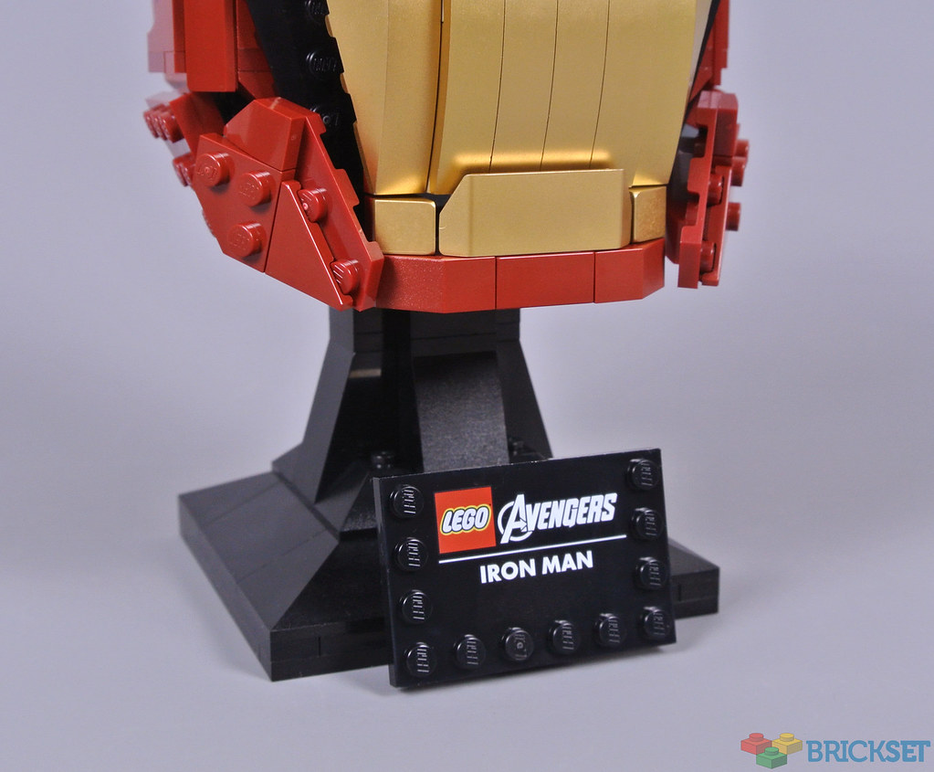
Each model from the Helmet Collection is connected to an elegant display stand. These are identical in structure, comprising some angular slopes. I appreciate the contrast between the helmet and its plinth and the printed plaque looks marvellous, featuring appropriate Avengers branding. The helmet can be detached from the stand but they are designed to remain united.
Drum-lacquered metallic gold elements have become increasingly prevalent during recent years, appearing especially prominently in 10266 NASA Apollo 11 Lunar Lander and 80012 Monkey King Warrior Mech. This model introduces some new pieces in this appealing shade, including 2x2 angled tiles and 2x6 wedge slopes. Despite the limited selection of pieces which are available in metallic gold, I think the faceplate looks superb.

Stickers depict the eyes, appearing fittingly bright when compared with the original character. Printed components would have been welcome, although Mark Stafford has correctly pointed out that stickers generally display more vivid colours than printing on black parts. However, printed pieces are situated among the metallic gold elements, including 1x2 plates which are visible in the image below. Their colour varies from the surrounding parts under photographic lighting but appears consistent in normal conditions.

The chin is probably my least favourite aspect of this helmet, especially when viewed from the front as the dark red band appears rather narrow. I think the shapes around either side look reasonable though, making perfect use of small ball joints and shading that create sunken cheeks. This structure differs from Iron Man's onscreen designs but his comic book helmet sometimes looks relatively angular. Auditory sensors are invariably present and printed 3x3 round tiles form those important details here.

Dark red 2x8x2 bows are employed across the reverse of the helmet, producing an attractive curve. Unfortunately, the transition between these curving elements and the flanking slopes is abrupt and I think further curved slopes would have been useful here. The metallic gold stripes underneath are interesting because they rarely appear on depictions of Iron Man, although I am pleased with the visible separation of the armour plates that protect Tony Stark's neck.

Overall
The popular Marvel Cinematic Universe has established certain expectations for Iron Man's helmet, despite some variation between movies. 76165 Iron Man departs from that standard quite dramatically, featuring an unusually broad jaw and flattened chin which resemble some comic book designs. I think remaining faithful to the films would have been more appropriate though, given their recent prominence. The visible differentiation between dark red colours is also disappointing.
Nevertheless, the metallic gold faceplate looks magnificent and I am certain these pieces will prove useful for alternative creations. The eyes appear excellent too. This set costs £54.99 or $59.99 which is consistent with the past Helmet Collection models, although this example only contains 480 pieces so feels expensive beside the other helmets in that regard.
73 likes
27 comments on this article
I love the gold, and it's definitely recognizable in an instant. But his helmet has such a distinct shape and I don't think they captured it at all. The face is all off, it's like there's a Snapchat filter on him. And when you look at it head-on, it looks like a tube. And there are SO many mocs of it ( https://rebrickable.com/mocs/MOC-49601/ZetoVince/iron-man-helmet/ off the top of my head) that I can't really buy the idea that they weren't able to capture it well. The ppp just adds to the issues.
Also, not a negative but I'm also fascinated by the idea of gold-printing one side of a plate. I feel like every chromed/metallic'ed piece we've gotten so far has been on all outward-facing surfaces, and it's interesting to see a new approach to that
I have this, enjoyable build but as mentioned it seems to be a mishmash from comics and film. I think in the end, it looks good and is more like the comics, The question is, what are the chances of other Marvel helmets, or will this be a one-off?
Poor Iron Man, he looks really sad. Even got a couple of tears
Ridiculous. Not a toy, poor display piece. Fails on all usual Lego fronts.
As the majority of my cash is going towards saving up for college, even a $40 set is a big spend for me. However, when I first heard the rumor that there was going to be an Iron Man bust this year for $60, I decided that it would be my big purchase of the year. I waited several months for the reveal, only to be completely crushed when I saw how bad it looked. All that anticipation for nothing. Thanks Lego.
p.s. I got the Stormtrooper helmet instead, so it all ended well :)
Something about the helmet though just looks... off. Like it’s supposed to be the movie helmet but doesn’t quite capture that look.
For the price, “close enough” really isn’t good enough.
All I see in this is a blown-up version of the minifig version of the Iron Man helmet. It's blocky, especially around the base which would fit a minifig head. In other words it's lego inspiring lego rather than Marvel inspiring lego. That's what I see anyway.
This is simply not a good model. The brand-which-must-not-be-named has a Halo helmet roughly this scale which puts this to shame as a display piece.
I do like the ingenuity of side-printing those plates, but the color variation seems pretty noticeable in all the reviews I've seen.
As a big Iron Man-Fan with a lot of figures in a shelf: I do not like it!.
It looks like he has the mumps.
As an average MCU fan, I would say this looks okay given that it's built of Lego pieces. Not perfect, but it's clearly recognizable as Iron Man. However, I also agree with the other criticisms of the helmet that have been made. I'm basically in the middle. But I would never buy this at $60 and probably not even $30 given the above mentioned criticisms. I love the *idea* of Lego doing the Helmet Collection but they're all massively overpriced, even as a huge Star Wars fan.
Good review, definitely hits everything.
I’m not big on any helmets mainly because of the stud factor. I like a wee bit less studs. This falls into that category, but as you and many have said, there are some issues.
Not enough to keep me from trying to get it. I’ll try to when it’s a little more affordable.
It’s an above average set but why the long face?
It's alright I guess, not bad by any means
It feels like they were half way through designing it and were gonna come back and neaten it up and shape it a bit better but then just forgot.
A black panther helmet with purple highlights has huge potential!
Hugely disappointed with this rendition. Looks nothing like the helmet depicted in the recent movies. Yes it’s recognisable but not in a good way.
It looks like he’s got the mumps.
Have to pass on this.
That lower part looks like someone with their bottom lip over their top lip.
Too silly and somewhat simian looking.
Sadly I’d have to agree on them missing the mark.
With that said, it’s loads better than I could design so kudos to them for that.
But it is certainly missing something. She shape, especially near chin and cheeks feels off.
I’ll likely not buy it unless I find a massive discount (same goes for the SW helmets)
I like how the helmets and the busts look. I'm even intrigued with the new artsy sets. But I do not see myself buying sets to hang on the wall, or just for display purposes. I have one set that sits on a shelf that does nothing (but wows everyone enters the room), but as a SW fan I had to get the destroyer.
With my very limited knowledge of the source material, I found it immediately recognizable.
That being said, there have been so many different versions of the character in comics and movies that I think it would be hard to choose which one to portray correctly. So I think they chose to design a mixture of several different versions to make it recognizable yet not too specific.
That's the beauty of the Star Wars helmets. Those designs have changed very little if at all over the course of the movies and TV shows.
Anyway, love all those gold pieces.
Well I like it. I enjoyed the build too. Probably won't be collecting other helmets (this is my first), have to see what they come out with next - Darth Vader?
Dark red has always had problems with dye lots. I recently got some 12 x 3 wedge plates, left and right, from Bricklink, and the difference in shade between the two is very noticeable and disappointing. I think it’s a glaring quality issue, but the color has been around for over a decade and no one at the company has found a solution yet.
No other color in my collection has nearly the same color issues.
Still, I love the color and love using it in MOCs. But I do wish they could fix the problem.
Regarding colour issues, I agree that (new) dark red has always been the worst offender.
My main gripe with LEGO concerning this issue is that not only did they not find a solution to it for this colour, but nowadays you have many more colours with issues. Even colours there were perfectly consistent for decades.
For a company that charges premium prices, corresponding quality should be a given.
But when even copycats like Lepin et al offer better colour consistency (and for a fraction of the cost) it becomes almost shameful that the self-proclaimed "quality leader" isn't able to deliver on its promise.
@paulrothwell said:
"Poor Iron Man, he looks really sad. Even got a couple of tears"
Thanks, now that's all I can see.
I own one. Ace set LEGO
I agree that the chin is not appealing. It looks like a Mitch McConnell Golden Helmet.