LEGO to ditch the black backgrounds in instruction manuals
Posted by Huw,
Many of the instructions for 18+ sets are printed on a black background, presumably to make them more look more 'grown up'.
However, this has been at the expense of not only ink, but also legibility. If you've ever tried following them under artificial light you have probably found that they are very effective at reflecting incident light which makes it difficult to do so, and in dim conditions it's hard to differentiate between dark colours like brown, dark brown and dark red.
One of the most egregious examples I encountered was 10277 Crocodile Locomotive, which is almost all black and brown pieces so very difficult to follow.
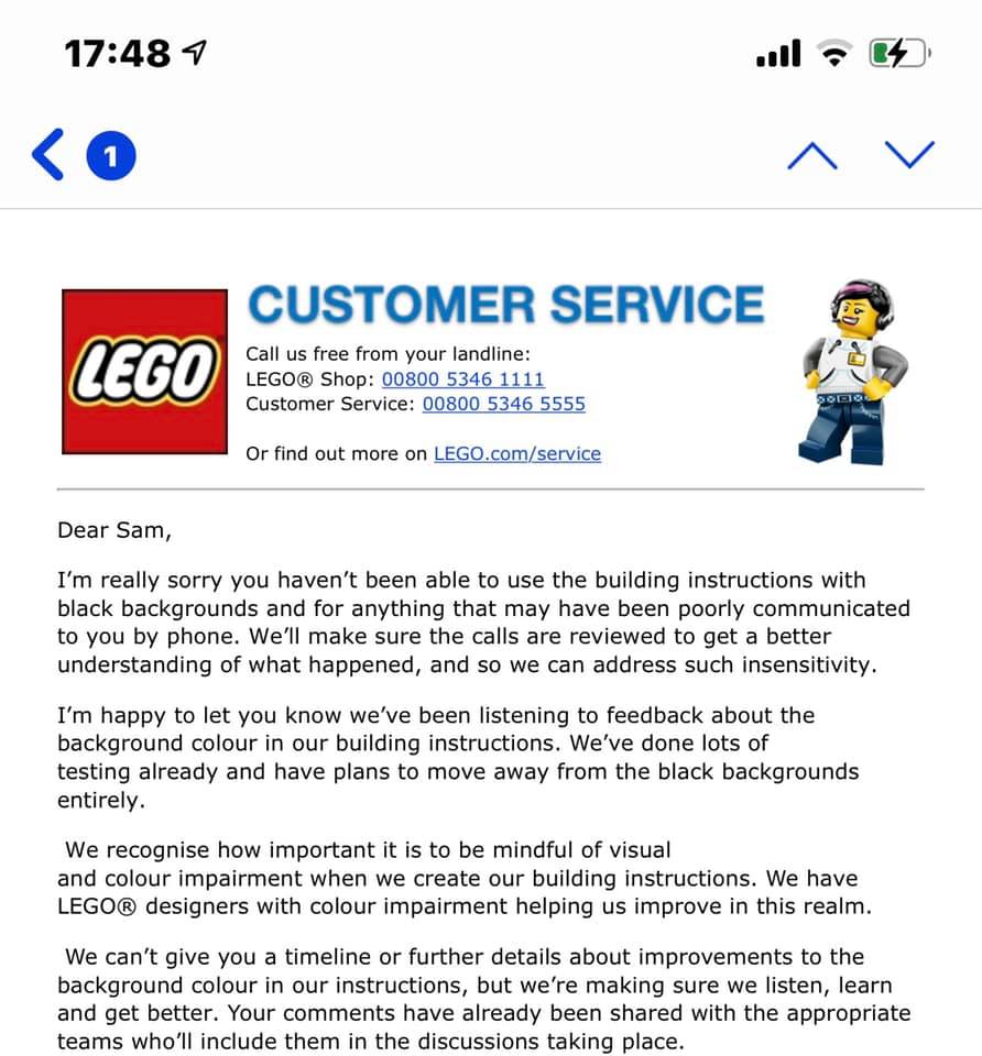
It seems that many people have complained to Customer Services about it and as a result changes are being made. Sam Walker posted the response he received to his complaint on Facebook earlier: "We've been listening to feedback... and [we] have plans to move away from the black backgrounds entirely." Personally, I can't wait to see the back of them.
Have you encountered any particularly bad ones? Or will you miss the black backgrounds?
258 likes
122 comments on this article
The only issue I’ve had is with the very dark brown almost blending in to the blackground. It’s fine when building fresh from an open bag as there’s a limited number of pieces to choose from, but I couldn’t imagine trying to rebuild from a set I’ve already previously built and taken apart.
This may be splitting hairs, but do the black instructions actually use more ink? I don't have any manuals nearby at the moment, but seem to recall that they always have fully printed pages.
That being said, this is certainly a welcome change!
They could stay in smaller sets like the architecture line, but return to a lighter background in larger sets. So basically returning to how it was 5 years ago
I'd love it if we as consumers got some sort of discount for going "digital only" with instructions. I'm sure people with the technology would rather use their phones/tablets and save a couple bucks. Unlikely, I know, but I can dream...
I haven't gotten any sets with the black booklets, but some relatives have.
Glad they're phasing them out. Bad idea.
At least it wasn't as bad as the grey to black gradient of the 2005 Star Wars sets.
The black instructions certainly use more ink. If the page were printed to be light gray for the background, that would use some black ink. A darker gray would use more black ink. Completely black would use a lot of black ink. It wouldn't be much ink for one book- the ink gets spread very, very thin- but it would add up!
Now ditch boxes that can't be folded down, and white stickers, please.
Good!
Now if only it was easier to tell the difference between black, dark gray, and light gray when there's not other bricks in the instructions to compare it to. I don't know how many times I've put down a black piece and realized later it was supposed to be dark gray. At least if I've already placed all three I can compare the new piece in the instructions to the color for the one I've already placed. (...and yes, I'm aware black has a white outline, but I sometimes forget that.)
I also have trouble telling the difference between other similar colors, but the gray issue seems to be far more common.
Yes this is really hard with glare under any artificial light I found, worse so on black pages, but also still most have sheen so reflect to so hard to see. Typically do my lego in the evening with artificial light to!
@tyresoflaherty said:
"I'd love it if we as consumers got some sort of discount for going "digital only" with instructions. I'm sure people with the technology would rather use their phones/tablets and save a couple bucks. Unlikely, I know, but I can dream..."
Please no. That will only encourage Lego to completely move away from printed instructions. They started doing it with the Mario sets (I know their reasoning, but still that’s their first step). Bluebrixx also doesn’t have printed instructions and that’s why I’m still staying away.
Has this news been backed up by anyone from the LAN at all or nah?
@560heliport said:
Thanks for clarifying! If only they could transfer the budget for ink saved from this move to ink for printing on dark minifigure parts...
@dawid said:
" @tyresoflaherty said:
"I'd love it if we as consumers got some sort of discount for going "digital only" with instructions. I'm sure people with the technology would rather use their phones/tablets and save a couple bucks. Unlikely, I know, but I can dream..."
Please no. That will only encourage Lego to completely move away from printed instructions. They started doing it with the Mario sets (I know their reasoning, but still that’s their first step). Bluebrixx also doesn’t have printed instructions and that’s why I’m still staying away.
"
Mario wasn't the first, they also did that with "Lego Dimensions". While not the same, they do offer full PDF files to download if that digital in-app instructions. But yeah, part of the charm is that Lego is still "offline" experience. I don't want Tablet/Phone/Computer near me when I'm building.
@PDelahanty said:
"Good!
Now if only it was easier to tell the difference between black, dark gray, and light gray when there's not other bricks in the instructions to compare it to. I don't know how many times I've put down a black piece and realized later it was supposed to be dark gray. At least if I've already placed all three I can compare the new piece in the instructions to the color for the one I've already placed. (...and yes, I'm aware black has a white outline, but I sometimes forget that.)
"
I have the same issue. I have taken to having a flashlight sitting next to me when building so that I can increase the contrast when looking at the instructions. That is really my biggest request, is that there be proper contrast between colors so that they can be differentiated. There are probably cases where a black background just works because it provides the required contrast necessary to see what is going on.
Frankly I don't care what the background color is, just so long as the contrast is right!
Amazing. I thought it was just me. They did it for cool factor, not usability factor, I am so pleased. Keep covers and boxes as they are, no issue there! :)
@BovineBrick said:
"This may be splitting hairs, but do the black instructions actually use more ink? I don't have any manuals nearby at the moment, but seem to recall that they always have fully printed pages.
That being said, this is certainly a welcome change!"
a solid black background will use much more ink that the lightish blue/grey common in other instructions
( I work in digital printing and ink cost calculations for print jobs is something I encounter!)
Great news. Now please bring back the set number on the cover.
Real builders don't need instructions, they guess and hope! :)
I was one of those who complained to Customer services, in a feedback form after buying the latest modular. It's not so much the general background, as the black background in the small 'parts to use' window. Dark brown and dark blue were almost impossible to see.
@Wells: I’m with you. The flashlight function on my phone gets a lot of use when I’m building from a manual with black pages.
The worst has been the new modular building I couldn’t see the dark brown in most things.
I agree the colour contrast issue between dark grey/light grey etc. pieces has always been a PITA for me as well. I always wondered why they didn't do something in the same light as how they show a Technic bar "real life" size next to the step image. If they did a standard "colour key" for steps where dark elements are used showing the print colours for black, dark grey, etc. it would go a long way. I find myself leafing through instructions trying to find a step that I know has a black piece and then colour-matching that step to the one in question.
I didn't mind the black backgrounds, but I had assumed that dark colored pieces to be added in each step would be outlined or highlighted to contrast from the black background. I'm actually surprised this wasn't the case and I'm glad steps are being taken to make the visibility much better.
A bigger problem I have is digital instructions for older sets. Even when downloading them from Lego's official site, the quality is horrible. It's hard on the eyes and difficult to differentiate greys and blacks. The only solution I have found is raising the brightness/gamma on my screen, which makes it somewhat tolerable. This happens across all my devices and mostly with older Star Wars sets.
I don't recall having any issue with the Crocodile Locomotive personally. The biggest problem I have is with older sets such as 7662 MTT especially with digital instructions. I'm not sure why they can't have better quality digital instructions especially for the older sets. I had a horrible time telling the difference between the browns, black, and dark greys on that set among other older sets.
@Soundwavves I agree, the image quality needs to be bumped up. It may have been acceptable 15 years ago, but not anymore.
At last a company that has listened to the consumers, as someone with less than perfect eyesight the black pages were a pain. Well done Lego.
Oh, this is good news :-)
I don’t like the Black background. For me it is hard to see.
I use mostly the online instructions - with app (if available) or pdf.
So I can also zoom into :-)
But of course, the Laptop needs also some space on the building table ;-)
The UCS Batmobile from 2006 was the absolute worst (when anyone asks about the hardest set I’ve ever built, it’s that because of this issue). All of the pieces are black (or sometimes very dark grey ;))...
Oof. I made everyone get out their pitchforks. Yeah, I'd have to agree that Dimensions sets not coming with instructions WAS pretty annoying. Fair enough.
The Dark Brown parts in the Police Station instructions were practically invisible. I'm very surprised something like that got past all their internal checks.
When I was building the new police station modular, it was almost impossible to see the dark brown parts on the black background.
I’m of mixed thoughts on this. For premium sets, they do look classier, but then they also show your fingerprints in a way that white pages never do. I also remember going to bed with a splitting headache when I was about 3/4 done building 10179 because of the smell of the freshly-printed construction tome.
@BovineBrick:
The pages start off as wood-colored wood pulp. Then it’s bleached. Then they either stick with the post-bleach white background, or they print black over all the “white space” on the page. So only where you see a color other than white is it printed. The more saturated the color (primaries vs pastels, black vs grey), the more ink they used to achieve that color. You used to be able to see how that trick worked really easily in the Sunday comic strips, as the printing technology used was still archaic enough that you could easily make out the dots of ink used to achieve shading. Tiny dots gave you a pastel color. Larger dots and increased the saturation. Then the color dots blended together and filled in the space around unprinted white dots, which got progressively smaller until you had a solid patch of color.
@tyresoflaherty:
Bad AFOL! No cookie for you! Digital/print hybrid would cost more to manage than print-only.
@dawid:
Dimensions did it because building and rebuilding the accessory models was an integral part of the game experience. It was still unpopular, especially with people who didn’t want to play the game. Mario did it because it was the only way they could incorporate animations to convey how to play the game in a non-textual format (which would have required translating into many languages). Now the new robotics kit has gone digital only, but again it is an “e-set”, basically. So, based on their own explanation for digital-only Mario instructions, it sounds like they intend to stick to printed instructions for regular sets, but they may shift to digital instructions for any sets that require connectivity to function. Note that the PU system includes a dedicated remote, so you aren’t strictly required to drag a smart device and into play, so they are probably conscious of the fact that someone with no internet access may try to operate a PU set with that remote.
I don't mind the black background. If the black is bleeding through the other colors when it prints, that could cause an issue determining which color brick to use, but that is a printing issue, kind of like their light ink colors printed poorly on dark torsos. If printed correctly that shouldn't be an issue. I can see the gloss could cause an issue though, like lights reflecting on a computer screen. If they matted it a bit there wouldn't be a glare.
It has taken computers like 30+yrs to bring back a black background instead of all the white/light gray on the screen. I love the dark mode here on Brickset, and now the latest computer update has it too. My eyes don't burn like they used to.
I think this is a good thing.
While the black background does look good, but from a usability perspective, it was bad.
*Tears of joy flow* GOOD RIDANNCE!
A very wise decision indeed, and if you’ve seen my reviews recently I have been very vocal in my opposition to these instructions booklets, purely because of how hard they are to follow.
Thank god and about time too. I havent built an architecture set in a long time although I do believe it could be a bit of a struggle sometimes.
Personally I sometimes find different shades of colours such as tan and nougat or even black and brown hard to distinguish even in a 'regular' coloured instruction book often due to glare and relatively poor lighting. I do wear glasses but normally I dont have any trouble distinguishing between colours or real bricks.
One of the best things Lego does in an instruction book is when metallic parts have a 'shine mark' or 'sparkle' detail so as to distinguish between say light blue ish grey and silver.
But the black instructions are definitely the worst. I havent built the Police Station yet so I dont know what that would be like.
Personally I hope this makes Lego scrap this ridiculous 18+ idea too. For some sets the black box looks alright depending on the subject matter and context but most it looks terrible and highly detracts from the set.
A black box was OK for the Haunted House since its spooky and dark. Star Wars a black box sort of makes sense since the ships are in space and Star Wars is a 'serious' theme not that Lego themes arent serious but take Elf Clubhouse. Christmas is supposed to be fun, joyful, lots of lights. And those elves are rather funny. Yet a black, dark, drab background???
For example, the black box (and colour choice of the locomotive) completely ruined the Crocodile. Lego sets need to pop out at you, compare POBB to the crocodile. Why would any buyer be interested in a drab, boring locomotive that has no carriages and is in fact just a mirror build anyway? It is my personal belief that the crocodile would have sold a lot better if it had a normal bright box with say a railyard in the background and perhaps a red or green colour scheme.
The Police Station didnt look THAT bad but modulars are supposed to be bright and fun with lots of little stories and details. Myself and other fans have expressed how while Police Station is a great build and certainly not the worst modular ever, it lacks the WOW factor or 'that little something' that previous modulars had, certainly from Parisian Restaurant onwards. Combine this with a black, very boring box and the effect is even more so.
Again, compare any new black box 18+ set be it Elf Clubhouse, Crocodile, etc to the box for POBB. POBB looks like a Lego set, fun, detailed, (in that case nostalgic for some). The box is inticing, what is what box art is meant to do. Hey, cool set. Look closer and heres lots of details or fun play features, some NPU etc.
To sum up, keep the normal instruction manuals which have worked for years (although I do very much appreciate the relatively new inclusion of red lines around the bricks being placed, that helps A LOT) and BRING BACK CREATOR EXPERT.
I never understood where this supposed problem came from of customers cant distinguish between adult and child sets or something???
Creator Expert also made it more attainable for younger builds to look forward to and TFOLs particularly. I built my first ever modular building, by myself at age 7. Clearly I didnt need to be 18 to achieve that goal.
Creator Expert was something one can 'build towards' (pun not intended). Think of it like starting off at 4+/Juniors, onto City, maybe Creator some harder sets and eventually your an 'expert' This 18+ thing as many pointed out makes it sound like a bar or errr adult entertainment. And if adults were having 'problems' with the fact they were building what ultimately remains a kids toy then clearly they arent a true AFOL.
This is good news!
Good riddance! Just built the Porsche 911 with the black background - what a pain!
Comforting to know l wasn't the only one having a hard time telling the colors apart.
I think the issue here is the reflective nature of the paper (even for light background manuals), and the fact that some colours dont match exactly with the actual colours (colour inaccuracy).
e.g I had trouble distinguishing some shades of pink, blue, light blue as well as obviously dark red, black, dark blue, dark grey etc. This is irrespective of background color (I had this issue with both dark and light background manuals).
Unless the paper quality is changed and colour accuracy is improved, the issue will remain, at least for me.
@BovineBrick said:
"This may be splitting hairs, but do the black instructions actually use more ink? I don't have any manuals nearby at the moment, but seem to recall that they always have fully printed pages.
That being said, this is certainly a welcome change!"
Yes, it does. If Lego are printing in-house this would represent a saving for them in materials. If not, it may be a point of negotiation with their print suppliers, given the likely volumes involved.
A standard(ish) light blue background would likely be a 20-30% tint of cyan or thereabouts. A solid black background isn’t just black; that looks washed out and grey on its own, so you print a “rich” black that might use something like a total percentage of 50-100% of cyan, magenta and yellow in some combination, plus 100% black. So black backgrounds could require up to around ten times as much ink as pale tinted backgrounds.
I do like the look of the black manuals quite a bit, and haven't experienced any building issues, but it's easy to see how it's difficult to differentiate in sets like the Crocodile Locomotive. I hope they find a way to keep the 18+ manuals different from other sets, though.
Not on topic, I realise, but 80107 Spring Lantern Festival is back in stock on the Lego Store in the UK! (as at 1am on 2 March)
Something similar happened to me, but with a set with a standard background in the instructions. It was very hard to differentiate between the dark blue and black pieces in 75209.
I'll miss the black background, never experienced a problem before with them. LEGO do put boarders around darker pieces so they can be seen. Sad to see them move away but hey oh.
You know, I'm not sure I've actually gotten any sets under the 18+ branding yet. I've been meaning to get the Haunted House and Botanical Collection for a while now but still haven't got round to it. Maybe I missed out on an unfortunate situation!
I always love manuals that put a red outline over pieces you add in a certain step. Makes spotting the littler ones much easier!
I recently built the Elfs Clubhouse and using the black background instructions (with all the issues mentioned above) really had me thinking whether or not I would purchase any more of the creator expert/modular/18+ sets. So for me (but maybe not for my wallet) this is a good move from LEGO :)
Unless they use raw paper as the background color, the amount of ink will remain the same. Black is just generally cheaper in large quantities than the pastel blue (or other color - hence why color copies are almost always more expensive than black & white). Given the wide array of colors Lego pieces come in, I don't think there is a perfect background color that will provide suitable contrast for all sets. Regardless, I will be happy to see black go.
@adamdw:
That is vaguely disturbing.
I also really hate dark brown as I find it very difficult to make out the orientation regardless of background.
My worst (LEGO colour) memory is 75530 Chewbacca as I recall a few steps were insert this dark brown blob into this black blob.
The other main colour confusion I can remember was the very first step in 10220 VW Camper Van where I spent ages trying to find a 6x4 dark grey plate among all the bags before realising that they actually meant a black plate (also a few pages later there is a step where two black pieces are joined together and one is shown as black and the other as dark grey).
Next, get rid of the ugly "18+" boxes. They ruined the annual Xmas set, and there's no need for them at all.
That's a good move for user-friendliness. I would also like to see boxes for expert sets have actual art on the front side on them again, but considering the point is to have the set on display rather than the box, I suppose that's not strictly necessary.
Anish Kapoor has entered the chat
Like others have mentioned, I often encounter problems with darker elements regardless of the background. When consulting the instruction books online I've noticed that they seem brighter and more legible.
I actually prefer the black backgrounds.
So this is definitely an UNWELCOME change to me.
The problem isn't with the black backgrounds, it's with LEGO's terrible ability to reproduce their colours in the instructions to begin with. Even in instructions that do not have black backgrounds there are colours that are very hard to distinguish (example: the roof in Florean Fortescue on the Diagon Alley MBS set, is pretty hard to distinguish what's black or dark brown.
And that set doesn't have a black background set of instructions
What would be rather handy is if they issued light background versions of all the currently black background PDF instructions. There seem to be so many revisions of each set of instructions, I don't think one more would be too much hassle.
@sjr60 said:
"What would be rather handy is if they issued light background versions of all the currently black background PDF instructions. There seem to be so many revisions of each set of instructions, I don't think one more would be too much hassle."
Are the PDF versions also black background? Surely they could re-generate these with a different background.
With the app that downloads the instructions, would be good if there was a user preference to choose the background colour/style but I assume its still a PDF so may not be workable.
I don't have a big problem with the black background, but it also always struck me as dumb. I guess I don't care if they make this change or not.
My biggest problem is that outline most dark colors with black lines rather than white lines. It is fine to use black with light colored brick, they are terribly difficult to see at times with dark colors. Black elements are the pieces that seem to be outline with white. Maybe to help differentiate between dark brown and dark blue they could use light tan with dark brown and a light blue for dark blue.
Oh thank goodness. Honestly I think background color should be determined by the colors in the set. The only time a dark background should be used is if the set is mostly very light pieces, like whites and pastels.
It’s the contrast that makes it hard to see. For crying out loud, is no one literate in basic color theory anymore?
Hopefully they change the outline colour for brown and dark brown bricks on instructions. The black background is a bit harder but it does depend on the set - Crocodile Locomotive was horrible but the Micky and Minnie build is okay. But then the Ideas Tree House was a nightmare as all the brown pieces where outlined by black instead of yellow or white. Spent most of the build with my phones flashlight on or holding the manual close to my face and moving it around to try and catch the light in a way that showed what was what! Will be glad to see the back of it and glad I wasn't the only one having the issue. Thanks for reporting on this, will happily await the change! :)
Yeah, i actually wrote a complaint about this to LEGO while building the Police Station. Dark-brown pieces were almost invisible against the black backdrop, and lots of other dark colour were also badly visible.
Having built a whole bunch of the 18+ sets over the past year, i'm glad they will change it.
The black backgrounds are a basic design fail. I will not miss them.
I download the pdf instructions to my iPad. Can zoom in as much as I want and lighten up, besides saving space on my desk. This way the original instructions remain as brand new, plus I have no contrast issues.
@Wells said:
" @PDelahanty said:
"Good!
Now if only it was easier to tell the difference between black, dark gray, and light gray when there's not other bricks in the instructions to compare it to. I don't know how many times I've put down a black piece and realized later it was supposed to be dark gray. At least if I've already placed all three I can compare the new piece in the instructions to the color for the one I've already placed. (...and yes, I'm aware black has a white outline, but I sometimes forget that.)
"
I have the same issue. I have taken to having a flashlight sitting next to me when building so that I can increase the contrast when looking at the instructions. That is really my biggest request, is that there be proper contrast between colors so that they can be differentiated. There are probably cases where a black background just works because it provides the required contrast necessary to see what is going on.
Frankly I don't care what the background color is, just so long as the contrast is right!"
I also have problems with dark blue where I sometimes can't tell if it's a studded plate or a studless tile.
@DaBigE said:
"Unless they use raw paper as the background color, the amount of ink will remain the same"
This really isn't true! Colour is achieved in printing by varying not just the mix of colours (commonly CMYK for this sort of thing). On white paper, the lighter backgrounds will require far less ink than the deep solid black. Just picked up (as it was close to hand?) instructions for 30365, which have a typical city light blue. I can't be sure, but I reckon the ink coverage in background areas is probably down about 20-30%.
And the cheapness of mono colour printing isn't just down to ink cost (anyway, those cost relationships change if you move away from home printer technology)
The only 18+ set i own is the Porsche 911, which has many white parts, so it isn't really a problem that the background is black, but blueish colors are definitely better
it shouldn't have been until now
The black background wastes ink you can be sure of!
In my opinion, a plain white or other light background in the instruction would be cool. Possibly, a slight watermark of the entire model in the background. But I don’t want LEGO to forget about construction drawings completely. BI are part of the sets, as are the bricks.
@Lightbrick said:
"Not on topic, I realise, but 80107 Spring Lantern Festival is back in stock on the Lego Store in the UK! (as at 1am on 2 March)"
And temporarily out of stock again by 7am.
Lego doesn’t make it easy to buy one of its best-ever sets.
@mrspecial14 said:
"The UCS Batmobile from 2006 was the absolute worst (when anyone asks about the hardest set I’ve ever built, it’s that because of this issue). All of the pieces are black (or sometimes very dark grey ;))..."
I absolutely agree! Its almost impossible to build from these on line.
A few weeks ago I built an Architecture set (I don’t remember its number) and building with this black background was horrible. I’m so happy that they will change that
@tyresoflaherty said:
"I'd love it if we as consumers got some sort of discount for going "digital only" with instructions. I'm sure people with the technology would rather use their phones/tablets and save a couple bucks. Unlikely, I know, but I can dream..."
I wonder if the extra cost of the logistics around an additional digital-only version of a set might possibly negate any potential saving. I guess it's feasible for sets from the LEGO website, if not from third-parties.
A huge part of the attraction of LEGO for me and my son is that it gets us away from screens and technology for a while, spending time together in a 'traditional' way. So, we never use digital instructions, and I hope they'll stay.
I suppose if LEGO went completely paperless, we could print the instructions ourselves, but the quality and size would be compromised, and customers would have to absorb the extra cost, which for a big set would be significant.
In terms of sustainability, I think they could use fewer pages by having more bricks per step, and the boxes are sometimes a lot bigger than they need to be (no doubt to attract attention on the shelf). Also, the experiments into alternative materials are to be welcomed and encouraged of course.
Constructive feedback gets results. I wasn't a fan of the black paged instructions and sent feedback to Lego about it.
I miss the instructions that actually highlighted the next pieces.
Will be good to see what lego does to incorporate colour blind and other visual impairments as well as aging eyes to help see things easier for colour in particular. Black, Dark Blue Grey, Dark Green...
Nice to see the word "egregious" make an appearance
@Rare_White_Ape said:
"Anish Kapoor has entered the chat"
He just stole that Vantablack idea from Spinal Tap. "How much more black could it be? None. None more black."
I must admit personally, my biggest issue with the black instruction manual is that it gathers very visible fingerprints.
I had no particular issue building 10277 Crocodile Locomotive, in fact, I had a much bigger issue distinguishing black from dark brown parts in sets like 21318 Tree House.
I haven't found the black instructions that bad, but the brighter colors are absolutely better
1. I know I should go digital, but I spend all day working on the Bloody Computer (apart from when I'm distracted by this site) and don't want to go anywhere near a screen in the evenings, thank you.
I'm annoyed enough by the alternate builds in 3-in-1 Creator being online only.
2. Do shiny instructions "enhance the play experience" or increase the durability of the instructions? Printing costs and eyestrain would be decreased and sustainability and ease-of-recycling increased if they were printed with low-density ink on white(ish), matt, raw paper.
I used to build in the evening once the children are in bed and noticed that the black instrucktions are very tiring for my eyes.
I never liked the black background, but I don't care that much, I just use the digital version anyway, it's much easier to keep open... speaking of which, sometimes the colors in the PDFs are terrible and you can't distinguish two similar colors of bricks.
But the real issue I have with instructions is their thickness, size and weight! I have a few ring binders with hundreds of old instructions, and a lot of binders with few modern instructions each! And I'm willing to bet Lego received far more complaints about this than about the background color.
I really don't understand why they insist on putting so few pieces per step, and so few steps per page. I often skip several pages, because you can clearly see which pieces were added anyway. I know there's people who go into panic mode if you add more than 1 piece, but I wonder if they are the target demographic. I once saw a guy on Twitch trying to assemble a set for the first time in his life and he didn't know how to read the instructions, but even he figured it out pretty quickly.
I guess everyone will be happier if they make smaller manuals but add a QR code to a website or an app with fully animated instructions.
Ah yes I thought it was just me / my eyes. As you say when on your own on a well lit Dining room table for the most part its ok, but for whatever reason if you decide to build elsewhere in different light the black ones can be tricky, especially with dark brown pieces. Makes me think my first Lego was Classic Space which was always sand ish in the background, I suppose Moon dust...… It may make sense to use White backgrounds to save on printing..... I personally find it more difficult using a Laptop rather than the paper instructions.... although I was dead against but got used to the Super Mario digital instructions... but you can zoom and spin those...….
They were difficult to follow. I'll be glad to see the back of them.
This is fantastic news.
As someone with visual impairment I find Lego instructions hard enough, especially differentiating between certain colours, but the black background for the Police Station nearly made me give up and quit building Lego. So pleased Lego have listened to its customers.
@biffuz:
People have complained that the older instruction steps were too complicated, and that they often missed parts being added because it was sometimes hard to tell how many were placed in each step. Obviously, the “new parts” box should really help with that, but they also really simplified the individual step for the benefit of younger and inexperienced builders. It can get frustrating for experienced builders, for sure, but when this change is coupled with unprecedented market growth, it’s difficult to argue that it’s unnecessary, because you first have to prove that it isn’t directly responsible for that growth.
My biggest issue is to avoid fingerprints with such a dark background… Distinguishing different shades of brown and gray is occasionally difficult.
@BovineBrick said:
"This may be splitting hairs, but do the black instructions actually use more ink? I don't have any manuals nearby at the moment, but seem to recall that they always have fully printed pages.
That being said, this is certainly a welcome change!"
Kinda, it's true that more inked is used for the black background. But the difference (per page) it's very small.
So much ink.
I would prefer to get rid of the black boxes too and welcome a return of classic Lego box art for our AFOL sets.
For me it was a useless and unnecessary change with a waste of a lot of ink and making the building less enjoyable. That may have looked cool, but building instructions should be functional and clear, not cool. I’m glad they get rid of them. Everyone makes mistakes I guess, though I wonder if they had tested this beforehand?
I didn't really notice the black being an issue, but I agree it's probably for the best.
What I did notice is that the instructions for some large sets (like the Spring Lantern Festival) don't have the red lines highlighting new pieces in each step. I found that made them noticeably harder to follow.
Thank god for that. The black pages were a nightmare.
@mar10jonzz said:
"I used to build in the evening once the children are in bed and noticed that the black instrucktions are very tiring for my eyes. "
I don't tend to use night mode for my internet browsing for the same reason. Black text on white backgrounds are so much easier on the eye than white text on black backgrounds.
I had the same problem with the Elves Clubhouse set. I had to squint to see what color piece I needed.
It was a terrible design choice from the start, marketing/branding should never be prioritised over usability/legibility
@monty_bricks said:
"It was a terrible design choice from the start, marketing/branding should never be prioritised over usability/legibility"
And it was rubbish marketing and branding anyway!
Actually what I would really like is a return to stapled thinner booklets, because they fold flat on the table. The challenge with perfect bound booklets is that the heavily curved spine area invariably catches the light one way or another, regardless of the background colour....
Honestly, they didn't bother me.
They do like a little slicker than the white, but if it is easier for people to follow, then go with that. Which Lego seem to have, problem solved.
Thank goodness! They can ditch the empty looking, black and dull boxes too. Adults can read the age rating on the box and don't need special looking boxes, where every finger print and scratch is visible, to differentiate.
@huw Not sure what "Incident "light is - perhaps you meant to write "Incandescent" light?
^
adjective
(especially of light or other radiation) falling on or striking something.
Man that is good news for the sets.
Having just helped my Grandfather build the Crocodile Locomotive I can say I am glad to hear the black backgrounds are going away. Both of us had to use a flashlight to see what was needed on some steps.
This will be a helpful change for me, as most of my building is done w/dim light - by necessity. It's the only time I get some peace and quiet after the kids have gone to bed, and I don't want to turn on too many lights.
Now if only we could get them to reduce the size of boxes.
Sure, kids love getting big boxes for Christmas, but I'm sure most kids would prefer having a planet to having big boxes. When half of your shipments are just air inside half-empty boxes, that's just so environmentally unfriendly. Reduce package size by 50% and instead of needing 10 truck loads to ship something, it'd only require 5 truck loads. That'd be a huge saving for the environment, and on shipping costs.
@Graysmith:
Well, many parents would prefer to believe so. Some would even teach their young kids to regurgitate those words. Put a young kid in a room alone with a large box that says the world will grow 0.00000001° warmer, and a small box that says the world will grow 0.00000001° colder, and see which box gets opened. More likely, they open the big box. Even more likely, they open both.
Brown pieces are difficult to follow in the instructions anyway - because you can't easily see the black outlines that they have.
If Lego accepts that some colours do not stand out against a black background, then they also need to accept the black outlines for those pieces are equally problematic.
Besides legibility, I think the biggest issue to me is the waste of so much ink lol
@Huw said:
"^
adjective
(especially of light or other radiation) falling on or striking something.
"
Oh thank you for the explanation. Never heard of that before. Cheers!
Only came across this after purchasing 10295 a couple of weeks ago. Brown axles is all I have to say!
I guess I’ve only had one set with black pages, the new 911. I didn’t think about why that was so, just built it and had no problems. I don’t know if the technic 488 has black pages, I’ve not opened it yet. I will say that black pages didn’t have as much glare from my work lights. That’s my main issue with instructions, the paper needs to be less flossy.
As someone with eye floaters, the black background was amazing. They made the build process much easier and more enjoyable for myself.
@kkoster79 said:
" @Huw said:
"^
adjective
(especially of light or other radiation) falling on or striking something.
"
Oh thank you for the explanation. Never heard of that before. Cheers!"
I thought I was the only person who uses a flashlight to help read these instructions. I feel much better now...
While the black pages look elegant, I hate them. Especially for any parts that are clear or dark. It also seems like they would use more ink. But I'm not sure of that. I didn't like the black backgrounds.
What about translucent pieces. I had a hard time telling if they were supposed to be translucent or not.
@BovineBrick said:
"This may be splitting hairs, but do the black instructions actually use more ink? I don't have any manuals nearby at the moment, but seem to recall that they always have fully printed pages.
That being said, this is certainly a welcome change!"
I have to admit, I have quite a few of the "adult" sets, and I've never encountered black backgrounds in the instruction books, but I am pretty sure every set I've bought has the blue-gray background.
@iabstract:
I've been able to confirm that they used black backgrounds on the instructions for 21103, 21108, and 21109. I probably have more sets with them, but I either haven't opened them yet, or can't locate the instructions at the moment.
I’m so glad they are getting rid of the black background. Whilst it looks classy, it’s really hard to see which pieces to use.
How could this awesome piece of news have escaped me until now?
I was one of the people who complained intensely to customer service about the subject matter. I went so far as to say that I would not buy another single set that contained an instruction manual with black background, and I absolutely mean that. I HATE these manuals, they are such a pain on the eyes.
Finally one piece of good news related to TLG. There haven't been many of those in Germany lately!
Next thing on the list would be to "un-dumb" the manuals and save more than 50% of the pages. Better for the environment and more rewarding building experience, especially for 18+ sets. I can at least kind of understand their policy of dumbing down everything for instructions of 4+ sets, but for those clearly aimed and marketed at adults, mostly experienced AFOLs no less? Come on TLG, remember how manuals used to be in the Seventies, Eighties and Nineties. No phone book sized behemoths with pages upon pages that only added one or two pieces each.
I very much diskike the black background, so this is good news!
happy to hear this. i agree that the black background made the crocodile build much harder than it needed to be.