Review: 76187 Venom
Posted by CapnRex101,
76187 Venom and 76199 Carnage feature many similarities, integrating almost identical building techniques and details. Of course, those obvious consistencies are unavoidable since both villains are symbiotes. Greater design variation typically proves beneficial though.
Nevertheless, these models certainly convey the menace associated with each symbiote, offering extensive detail. The teeth appear outstanding here, particularly because Venom's tan teeth contrast against the surrounding head, while his tongue also matches the original character.
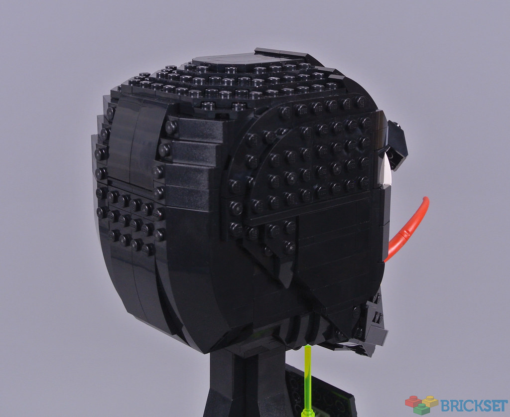
The Completed Model
Venom inevitably varies substantially from the majority of these sculptures, given the organic source material. Nevertheless, I think the character looks splendid, closely resembling 76199 Carnage and therefore measuring 19cm in height. Despite lacking the vivid colour of Carnage, this model integrates marvellous detail and the mouth section appears particularly impressive.

As expected, the construction of 76187 Venom is almost identical to its symbiote counterpart, integrating various colourful bricks with studs on the side and differing clips. Such bright parts sometimes remain visible following completion but they are totally concealed here, fortunately. Beyond the colour, the only distinctions between this model and 76199 Carnage are the trans-neon green elements and the sides of the head, which feature more studs.

Previous models from the Helmet Collection have included black display plinths and this model continues that tradition. The angular shape corresponds with other models and I like the printed plaque on the front. Additionally, the presence of trans-neon green slime distinguishes this base from previous examples, without affecting their consistent appearance when displayed together.

The enormous mouth and eyes look absolutely fantastic here, accurately recreating Venom's comic proportions. Tan was definitely the most appropriate colour selection for the character's needle-like teeth, standing out against the surrounding flesh. Carnage's teeth blended with the neighbouring elements and this design accordingly appears more attractive to me. Additionally, the orientation of the front teeth is slightly different between Venom and Carnage, for unknown reasons.

Moreover, I love the magenta accents around the teeth, portraying Venom's gruesome gums. The red elements inside the mouth look superb too, although I dislike the combination of both colours on the lower jaw. However, the prominent tongue is spectacular and trans-neon green pieces are attached inside the mouth. These represent Venom's repulsive saliva and continue beneath the head, connecting to the base!

Venom's eyes are identical to those on Carnage, featuring slightly different wedge plates and therefore different shapes. This asymmetry is quite effective, although Venom's eyes typically curve inwards towards the corners. That important feature is not replicated here which seems disappointing, particularly since the eyes provided another opportunity for distinction between 76187 Venom and 76199 Carnage.

However, one obvious difference between this model and Carnage is the omission of stickers here. That is definitely beneficial and additional studs accordingly appear on either side of the head. The pronounced lower jaw is shared by both symbiotes though. This arrangement does appear slightly odd but conveys Venom's inhumanity and was presumably necessary to avoid problems when arranging the teeth.

Slivers of red remain visible around the joints where Venom's jaw is connected, although they appear relatively subtle. Otherwise, the colour scheme remains completely consistent and the organic shaping looks splendid, making good use of various curved slopes with layered plates. The dramatic diagonal lines behind the jaw are unusual but similarly dramatic angles routinely appear in comic artwork, hence such decidedly inorganic features do not bother me.
Overall
76187 Venom and 76199 Carnage are obviously remarkably similar, sharing almost identical qualities and drawbacks. Both models capture the intimidating appearance of their respective characters, especially given their jagged teeth which look magnificent. Personally, I favour the tan components inside Venom's mouth, due in part to their exclusivity in this colour.

However, the eye shapes seem somewhat inaccurate and that issue appears more prevalent with Venom, whose eyes should curve inwards. The articulated tongue looks excellent though and I like the trans-neon green saliva too, further distinguishing this organic model from others. The price of £54.99 or $59.99 remains consistent with past Helmet Collection items and I think fans of both characters will enjoy these interesting sets.
Our review of 76199 Carnage is available here.
This set was provided for review by The LEGO Group but the review represents an expression of my own opinions.
73 likes
36 comments on this article
Oof, in the side by side view you can really see the duplication in design and construction. Pretty lazy and ill-considered, since I imagine anyone buying one of these would be interested in both. They should be MORE appealing together, not less!
Still not a fan of the asymmetrical eyes. That stud is appalling.
It’s not something I’d spend 60 bucks on, but I think it looks pretty awesome!
The eyes don't trail up the scalp high enough for me, and it doesn't look quite right... but I'm not sure if it's a deal-breaker.
Can someone explain the idea behind the ugly colorful (although hidden) bricks inside? It just looks plain ugly when building it.
@IgelCampus said:
"Can someone explain the idea behind the ugly colorful (although hidden) bricks inside? It just looks plain ugly when building it."
It's much easier to make a billion of part 22885 in Bright Purple and use those whenever you need a hidden one, vs making every part in a set the same color. If the entire inside of Venom was black, it would be a terrible build experience. The color at least helps you keep track of what's where
@IgelCampus said:
"Can someone explain the idea behind the ugly colorful (although hidden) bricks inside? It just looks plain ugly when building it."
It’s to make seeing what you’re doing easier while building the set. They’re not meant to be seen, just to help put it together.
@IgelCampus said:
"Can someone explain the idea behind the ugly colorful (although hidden) bricks inside? It just looks plain ugly when building it."
To make it easier to orientate when building (seriously, go and read the one star reviews for the 1989 bat mobile and then tell me people don’t need it). I find covering it up one of the most satisfying bits.
I still can't get over how silly the lower jaw looks, and honestly that one shot from the side ruins the entire thing for me. "Slightly odd" is an impressive understatement. Couldn't they have moved it lower?
I think this one works better than Carnage due to the induvudual teeth being more contrasted, and the lack of stickers. But it does seem a bit lazy that they are essentially recolours of each other, especially around the eyes as noted.
I think they look horrible and I wouldn't want them on display in my house...
The design is close enough to the character for me. Don't know much about these chaps except for that Spiderman movie I saw the black one in. But I can't fathom why anyone would want that decorating their home. Enjoy if that's your thing.
@sirventricle said:
"I still can't get over how silly the lower jaw looks, and honestly that one shot from the side ruins the entire thing for me. "Slightly odd" is an impressive understatement. Couldn't they have moved it lower?"
In fairness to the LEGO designer, Venom’s lower jaw is sometimes depicted as unnaturally protruding in the comic books, so the portrayal here is not canonically wrong and does convey his unsettling appearance.
@Rumble_Strike said:
"I think this one works better than Carnage due to the induvudual teeth being more contrasted, and the lack of stickers. But it does seem a bit lazy that they are essentially recolours of each other, especially around the eyes as noted. "
I agree with you and @CapnRex101 that the eyes aren’t well done. As noted by the Capn, they should extend up and back. I suspect it would be a major undertaking to mod this bust so the eyes are true to the source material.
Thanks for the review.
The side view ruins the whole thing for me. Granted it wouldn't be displayed facing its side.
I think Venom reigns supreme between the two. I don't know if I'll get it, but I'd be more likely to pick that up vs Carnage.
I agree about the eyes, but I don't think that would be the deal breaker.
Request for Rex: Can you post a picture of Carnage with Venom's teeth? Many thanks. :)
I think I would've preferred white teeth, would've potentially been more striking, bu the tan teeth are probably more accurate to whatever version this is representing
@jarack said:
"Request for Rex: Can you post a picture of Carnage with Venom's teeth? Many thanks. :)"
I already have in the Carnage review: https://brickset.com/article/58630
It mostly looks great, definitely better than Carnage, but the eyes kind of ruin it. They just don't look like what I think of Venon looking like
@CapnRex101 said:
" @jarack said:
"Request for Rex: Can you post a picture of Carnage with Venom's teeth? Many thanks. :)"
I already have in the Carnage review: https://brickset.com/article/58630"
I wonder what the Carnage bust would look like without any stickers.
I'm surprised people like Venom better than Carnage. While the stickers annoy me, I like the red and black design much more than Venom's plain black pieces which blend into the base too well. I don't like the eyes on either of them, though. The stud looks terribly out of place and I don't see the need to make them asymmetrical when they're 95% similar. I've purchased Carnage but I think I'll be waiting on a sale for Venom. Still shocked that LEGO made these two before a Spider-Man bust...
@Kynareth said:
" @IgelCampus said:
"Can someone explain the idea behind the ugly colorful (although hidden) bricks inside? It just looks plain ugly when building it."
To make it easier to orientate when building (seriously, go and read the one star reviews for the 1989 bat mobile and then tell me people don’t need it). I find covering it up one of the most satisfying bits."
I’ve had sets with those types of interior bricks with pieces exclusive in a certain color. Weird how LEGO does this with non-visible bricks yet refuses to recolor other pieces on the exterior of models...
I wonder what the Carnage bust would look like with the Venom stickers.
It's far from the biggest aesthetic problem with this set but I really don't like the way the forehead slopes stick out over the layer of plates on top of the head... I guess this is partially up to different design teams, but otherwise I don't understand why the Superheroes busts are so much more expensive and have worse designs than the Star Wars ones.
I want the teeth.
With Venom, as a comic fan, I want it a little more accurate to the art.
Have the eyes bigger, wider in the middle then trailing upwards into the sides of the forehead.
Like you see in the classic illustration.
That would've set it apart from Carnage.
With Carnage, to set that one apart, they should've had those tendrils, that come off his body here around the neck and head asymmetrically.
Doesn't look like Venom / not captures it's character.
A lot of folks slating these, I’d buy them
I'm hoping for a Ghost Rider bust next.
@Huw said:
"I think they look horrible and I wouldn't want them on display in my house..."
To be fair, "looking horrible" is accurate to the characters.
@Zander said:
" @sirventricle said:
"I still can't get over how silly the lower jaw looks, and honestly that one shot from the side ruins the entire thing for me. "Slightly odd" is an impressive understatement. Couldn't they have moved it lower?"
In fairness to the LEGO designer, Venom’s lower jaw is sometimes depicted as unnaturally protruding in the comic books, so the portrayal here is not canonically wrong and does convey his unsettling appearance.
@Rumble_Strike said:
"I think this one works better than Carnage due to the induvudual teeth being more contrasted, and the lack of stickers. But it does seem a bit lazy that they are essentially recolours of each other, especially around the eyes as noted. "
I agree with you and @CapnRex101 that the eyes aren’t well done. As noted by the Capn, they should extend up and back. I suspect it would be a major undertaking to mod this bust so the eyes are true to the source material.
"
I like how it's apparently fine that the jaw looks like it looks, but the eyes are wrong, although there are as many different iterations of these eyes, as there are artists that drew that thing.
Dreadful. I don’t care how well made they are. They’re just not visually appealing. I’m very surprised Lego have released these.
@Gamlebilrokker said:
" @Zander said:
" @sirventricle said:
"I still can't get over how silly the lower jaw looks, and honestly that one shot from the side ruins the entire thing for me. "Slightly odd" is an impressive understatement. Couldn't they have moved it lower?"
In fairness to the LEGO designer, Venom’s lower jaw is sometimes depicted as unnaturally protruding in the comic books, so the portrayal here is not canonically wrong and does convey his unsettling appearance.
@Rumble_Strike said:
"I think this one works better than Carnage due to the induvudual teeth being more contrasted, and the lack of stickers. But it does seem a bit lazy that they are essentially recolours of each other, especially around the eyes as noted. "
I agree with you and @CapnRex101 that the eyes aren’t well done. As noted by the Capn, they should extend up and back. I suspect it would be a major undertaking to mod this bust so the eyes are true to the source material.
"
I like how it's apparently fine that the jaw looks like it looks, but the eyes are wrong, although there are as many different iterations of these eyes, as there are artists that drew that thing.
"
In art produced by Marvel, that generally isn't true, so no double standard. The eyes are very rarely like those shown in the LEGO bust. They are almost always top-to-bottom wider with the outside corner extending back in the direction of the top or crown of the head (though not actually reaching that far). The white of the eyes sometimes has peaks along the top edge of each eye. The lower mandible, on the other hand, is often shown over-extended in Marvel's art: sometimes jutting out and other times just extremely wide. That isn't always the case, but often enough that it's in keeping with the character's common portrayal. Here is Marvel's own entry for Eddie Brock, the original Venom: https://www.marvel.com/characters/venom-eddie-brock
I like the trans-green slime. But can't we all agree that we've had enough Lego Venom? :O)
I'm not sure why there would be slime on the underside of his lower jaw.
That said, I like this colour scheme more than that of Carnage, simply because of the contrast with the teeth and rest of the head.
But yeah, as is said with the Carnage review:
Couldn't they have just released them at different times? That way it would be less jarring that they present the same bust twice!
@Binnekamp:
Maybe he ate someone who had some sharp, pokey bits? Anyways, the reason they're probably doing both of these at the same time is that they're both going to be in Venom 2. It would be extremely weird to do Carnage but not Venom, and if Carnage is killed off or defeated soundly enough, there might not be another opportune time to release one for that character.
Venom is an incredibly striking looking model, and having built it myself I enjoyed the whole process more than I thought. I'm also really pleased with how it looks on display. It is truly terrifying, but in a good way!
I'm going to pass on Carnage though. I know they share similar designs but to me Carnage just feels messy in comparison.