Friends Advent Calendar - Day 4
Posted by MeganL,
The day after we met Olivia, we had a build that demonstrated one of her interests. Since we met Emma yesterday, it might be safe to assume that we'll have a build that reminds us of Emma behind door number 4.
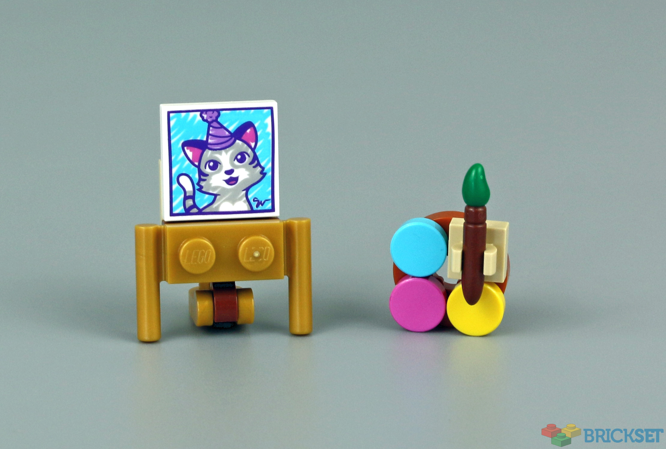
Today's build is indeed something that reminds us of Emma! We have an easel with a painting of a very cute kitty - I originally thought it was new, but it turns out it's been seen a few times before, including in 21045 Trafalgar Square. Along with the easel there's a palette complete with paintbrush.
It's not festive, but it is very suited to Emma, so I think this is a great build to follow the microdoll.
46 likes
13 comments on this article
The painting doesn't have nor green, nor yellow in it.
Another good day from the Friends calendar. I'd be happy with this little build for City as well.
Am I being stupid but how on earth does that kitten fit in Trafalgar Square
Oh wow it genuinely does
So, there is a kitty poster on Trafalgar Square?
@Feddy_Hodson & @Yooha :
The kitten picture is in the National Gallery that overlooks Trafalgar Square.
@mafon2 said:
"The painting doesn't have nor green, nor yellow in it."
It's not done yet. ;)
@kdu2814 said:
" @mafon2 said:
"The painting doesn't have nor green, nor yellow in it."
It's not done yet. ;)"
Artists usually only sign the piece of art when it is complete. :)
@mafon2 said:
"The painting doesn't have nor green, nor yellow in it."
The colours on the palette are the three primary colours: yellow, cyan and magenta.
Using them, you can make all other colours
@mafon2:
The palette doesn’t have any green on it either, which is even more impressive, since you’d have to mix it out of the colors that are there.
@YanVanLan:
For light, the three primary colors are red, blue, and green. For print media, the three primary colors are cyan, magenta, and yellow. If you notice, these two color wheels are the inverse of each other. If you combine RGB light, you get what appears to be white light. This is additive color mixing. If you combine CMY pigment, you get what (in theory) appears to be sorta black. This is subtractive color mixing. But this is paint we're talking about. For paint pigments, the three primary colors are red, blue, and yellow (the three “original” colors from the time when they actually reduced brown and green out of the LEGO System). CMY is used for print because they are the secondary colors for light, and they are each fairly transparent when printed on a page, allowing the white of the paper to read through better. For paint, you prefer to not have the color of the base material read through at all, in most cases, so highly saturated pigments are preferred. Nobody would try to paint with just CMY paints unless those were the colors they wanted you to see in the painting (i.e. no mixing of colors). Producing paint in that saturated of a green is a lot harder than a web tutorial makes it sound, if all you have to start with is CMY paints. It’s also far cheaper to just buy a tube of green.
@PurpleDave :
I was only trying to give a possible explanation for the choice of colours on the palette and didn't intend to go into detail about colour theory, but since there are some inaccuracies in your explanation, here we go anyway…
The explanation about light colour and print colour is absolutely correct and yes, the old painters did indeed use a system in which blue, red and yellow were the main colours, but they themselves realized that their system was not flawless. They worked with the pigments at their disposal (CMY pigments having only recently become available, as I'm sure you know), relying largely on their experience to estimate which pigments would yield which colours when mixed. For example, they certainly did not choose the same red as the basis for a mixture every time; if one wanted to obtain purple, one would rather opt for a carmine red (which already tends to magenta), while for orange one would rather have gone for vermilion red. Early painters also often had to work with fairly strong opaque paint because of the substrate, which often consisted of relatively dark wood. Later painters, however, painted more and more on canvas, so they started to use more transparent paints, so that colour mixing could also be obtained by applying several layers of different colours on top of each other (which gives a painting a lot more depth). By the way, it is not true that CMY paint is always transparent, there are also cover paints based on CMY pigments.
My point is, the old colour theory only worked to a limited extent then, but it was useful at the time and is still useful today, but rather for the cheaper paints, such as the poster paint used in kindergarten and hobby projects. Many modern art painters do prefer to use CMY paints as a base colours, especially to obtain complementary grays.
I'm not saying that those are the only colours in their palette and that they mix all the other colours out of it; for their most commonly used colours they often have specific pigments, but most deliberately keep this selection quite limited and prefer to mix the rest.
Finally, that saturated green is in fact easier to get by using CMY and almost impossible to get with traditional 'blue' and 'yellow', believe me!
@YanVanLan:
CMY isn’t perfect either. The “black” it produces in print is part of the reason they do CMYK printers (the other reasons are expense of using 3x as much ink, and over-saturating the page with so much ink). Different printers use slightly different colors for their CMY ink, too, and Adobe keeps tweaking their definitions to favor human skin pigmentation over backgrounds, because people tend to be more important to us when judging how good a photo looks.
As for CMY paints, the last time I took an art class was in the mid-90’s, so I don’t think they existed then. Then again, a lot of art paint at the time still used heavy metal pigments (I believe Chromium Red and Chromium Yellow we’re favored colors of my last art teacher), so changes in laws may have forced a change in the way artists paint. I don’t recall having any trouble mixing saturated greens with the colors I was using. In fact, as I recall, there was a bit too much green in some of them, so it was hard to get rid of it. But again, in many cases, depending on the exact cost of each tube of paint, and how much you needed to use, it might have been cheaper to just buy some. It was certainly a lot easier for us amateur artists who weren’t very skilled at mixing colors with paints (I had a much easier time doing so with light in a theatrical setting).
@PurpleDave said:
Yes, a lot has changed since they tried to make paint less toxic, getting rid of the heavy metals amongst other things, but CMY’ish pigments have been around for a while now and artists in search for truer colours have been using them for over a century. Granted, for a long time they were very expensive!
Nevertheless, it is true that CMY paints even today are not perfect, the current pigments used for them are still not really true CMY’s, but they come very close and offer a very clean way to mix other colors, especially for beginning students who haven't developed their palet yet.
You need to add at least black (iron oxide) and white (titanium oxide) to get a broader scope and many also add (burned) omber and (burned) sienna. Next step is usually exchanging the blue for something that is more to their liking (cyan is the least true pigment in most premixed paints, often already including some white pigment to artificially make it lighter, and sometimes gives trouble in mixing with more traditional paints).
So in truth many painters eventually end up with a personal palet that is neither the old way or the new, but their own… as it should be ;-)