Adding the Boutique Hotel to your modular street
Posted by Huw,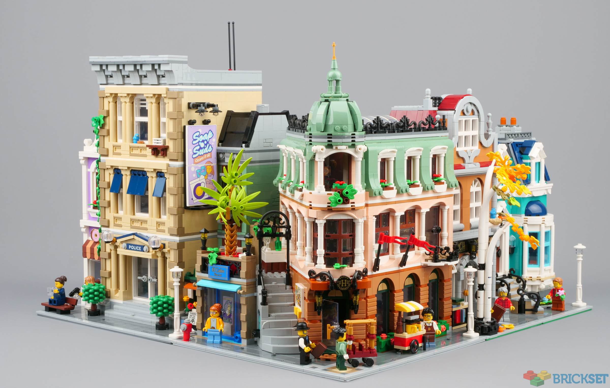
10297 Boutique Hotel is, of course, designed to connect to previous modular buildings, and I am sure you are wondering what it looks like next to recent ones.
Find out after the break!
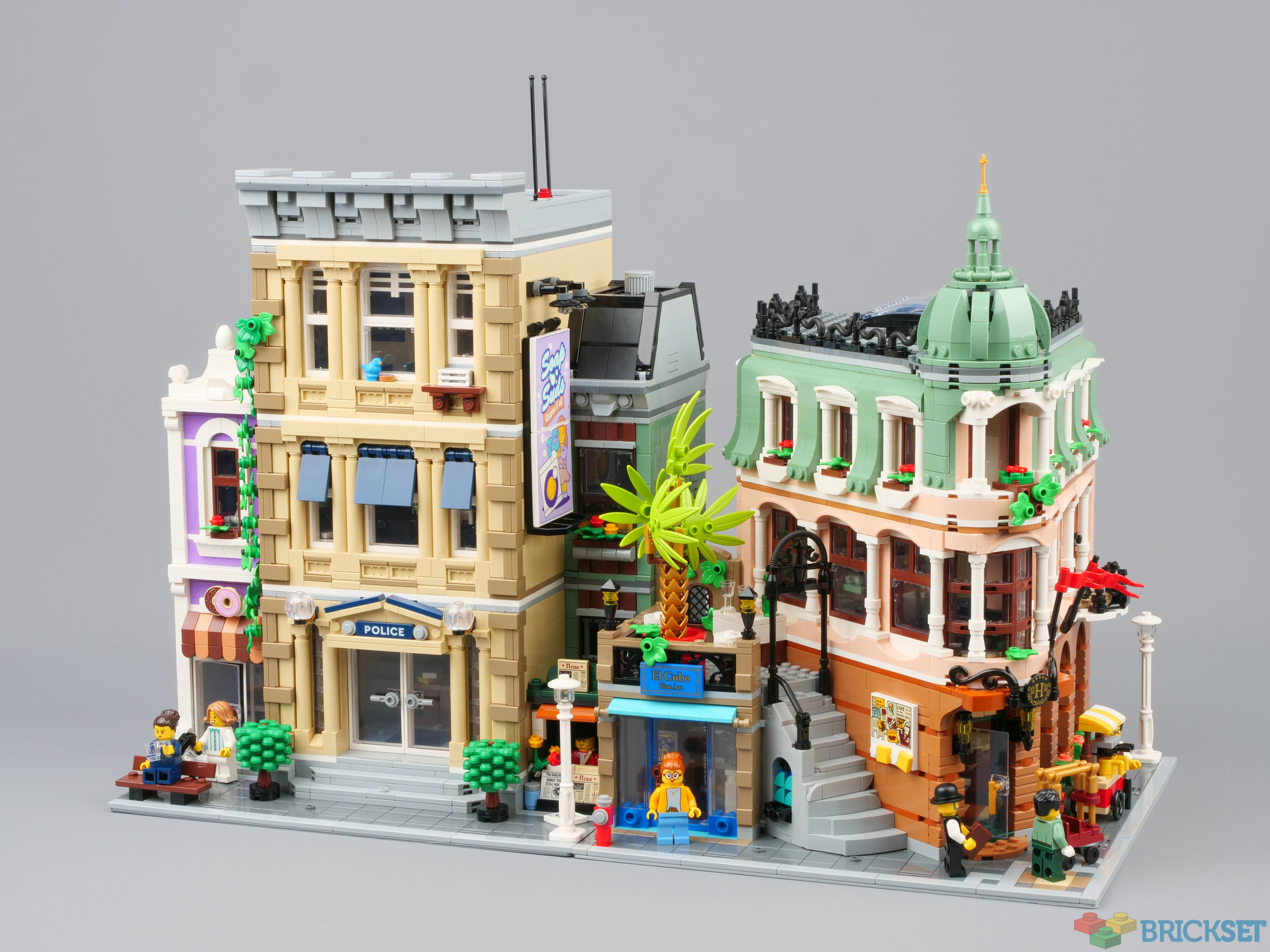
With 10278 Police Station on the left:
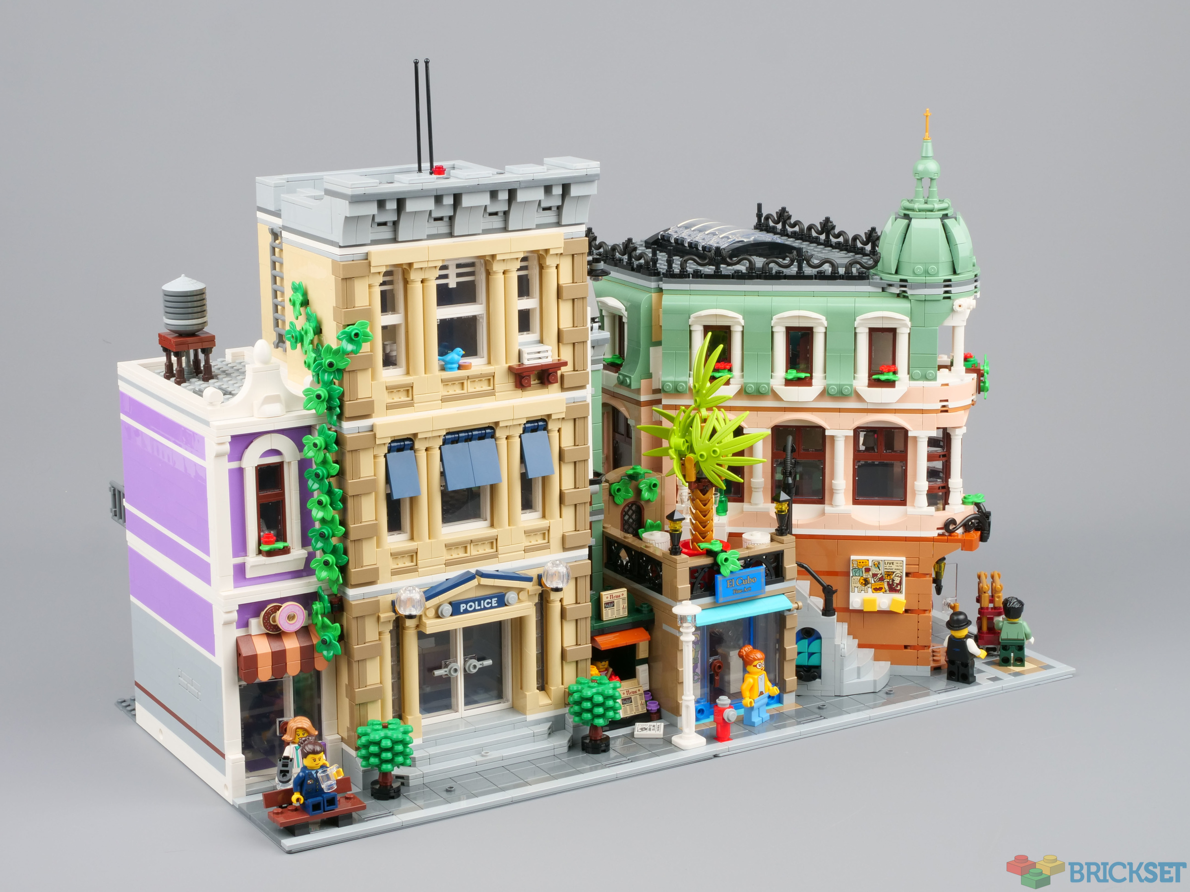
With 10278 Police Station on the right:
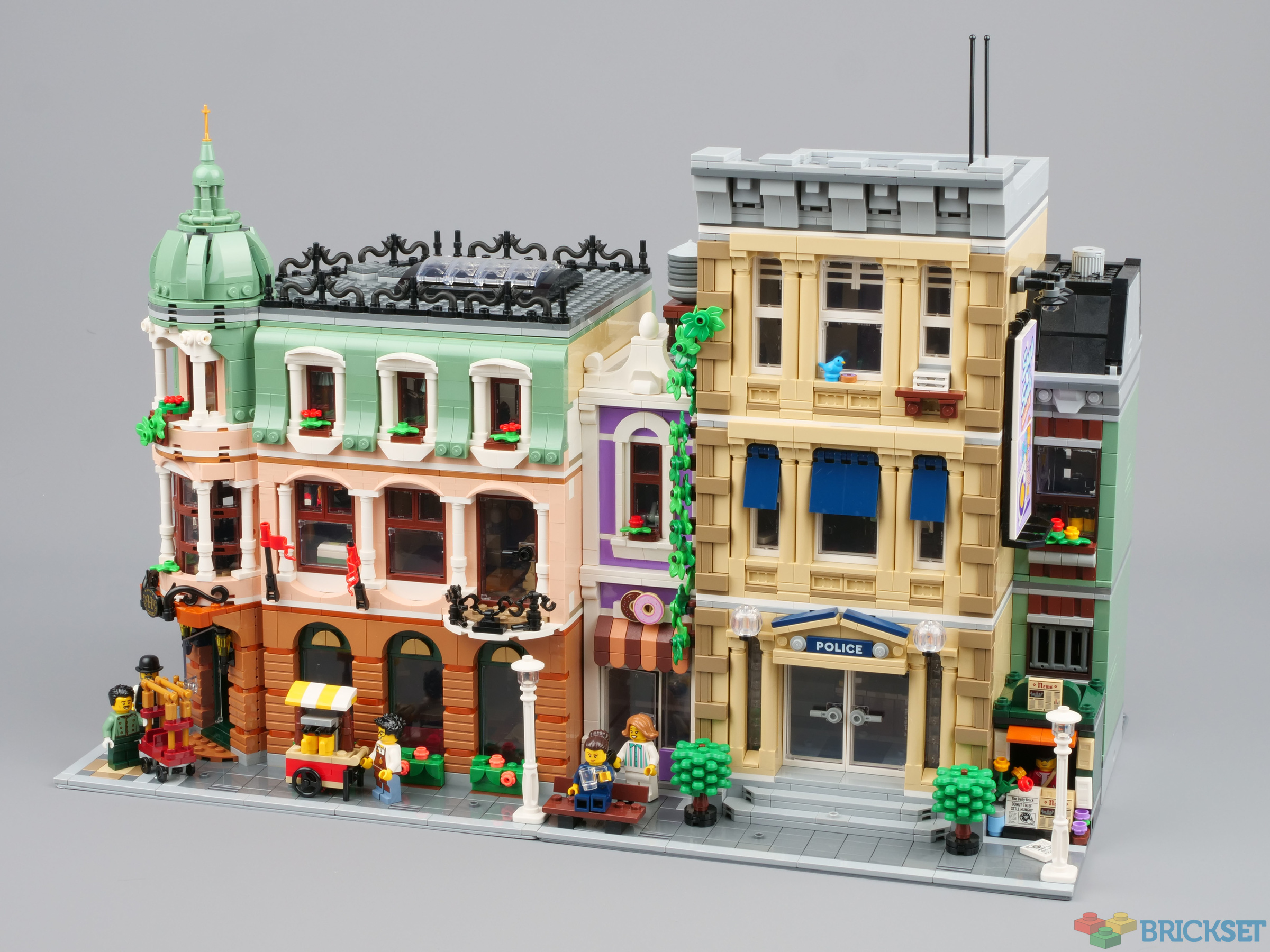
Sandwiched between the two halves of 10270 Bookshop:
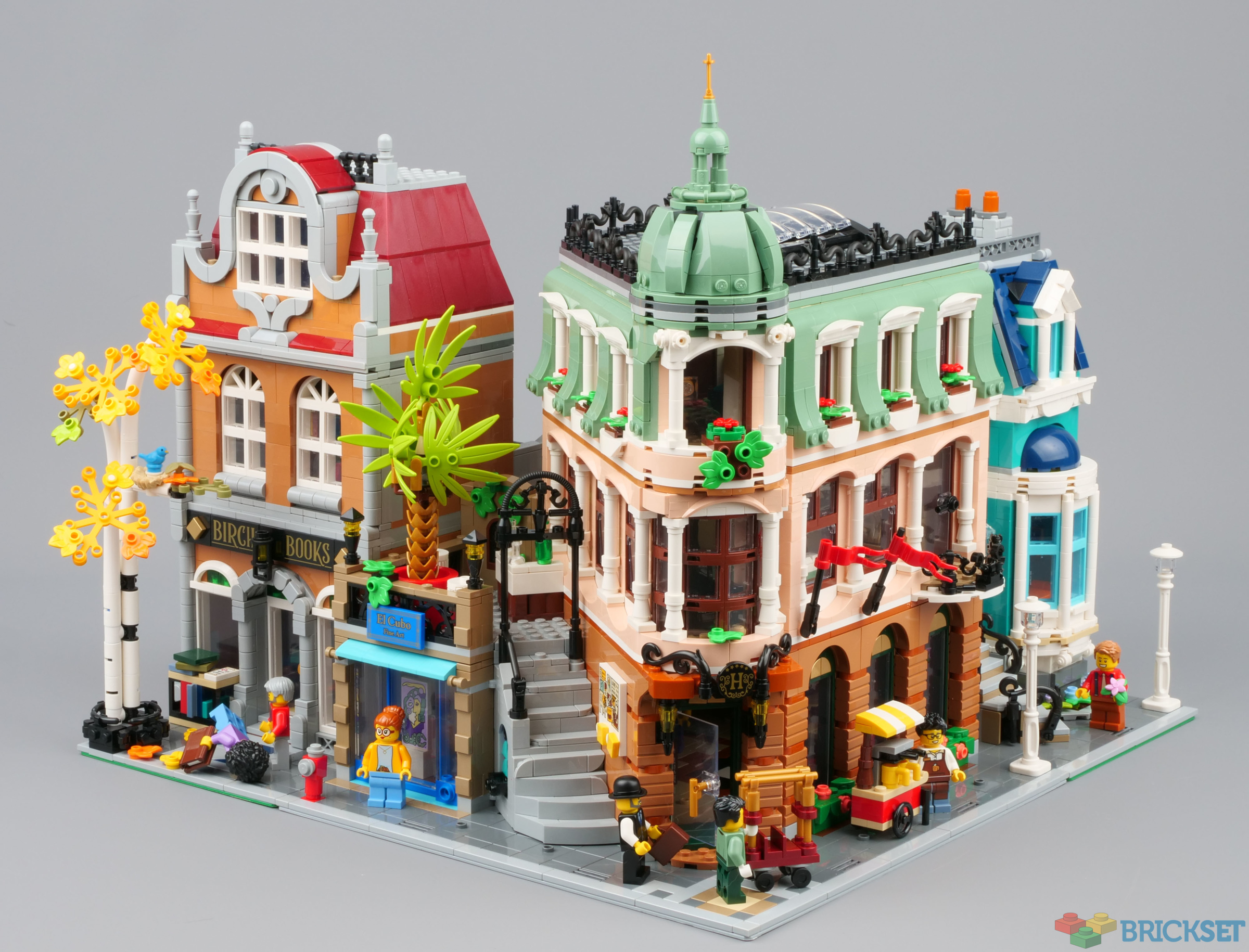
With 10278 Police Station on the left and 10270 Bookshop on the right:
To be honest, it looks pretty good wherever you put it, and I am sure you'll have fun reconfiguring your street to accommodate it.
Thanks to LEGO for providing the set for review. All opinions expressed are my own.
198 likes
72 comments on this article
I do like the little nook created on the second floor by the bar
How does it look next to the Parisian Restaurant? IMO that's the most logical placement!
While it is a little short, if I ever find it on sale it would be a MUST buy. Thanks for the comparison!
Cheers Huw.. I wasn't going to bother with the bookshop, but seeing the Hotel sandwiched between the two halves looks amazing
Man I wish I had enough space to get some modulers.
@Alakazam03 said:
"Man I wish I had enough space to get some modulers."
They don't take up that much space. Especially a single modular can fit almost anywhere
@dawid said:
" @Alakazam03 said:
"Man I wish I had enough space to get some modulers."
... a single modular ..."
Hahaha, good one
IT looks kinda messy to me(
@dawid said:
"How does it look next to the Parisian Restaurant? IMO that's the most logical placement!"
That's what I was thinking too! I think they'll look fantastic together.
I like how, when put next to the Police Station, it looks like there's an alleyway behind it
BTW, I off topic, but there's still a few 2022 sets that haven't been updated
I'll dig out the PR and maybe some others later...
@dawid said:
"How does it look next to the Parisian Restaurant? IMO that's the most logical placement!"
That's what I think. I mean the hotel guests need to eat somewhere, right? ;-)
Just not sure about the combination olive green and sand green.
Another idea: 80107 Spring Lantern Festival.
I absolutely love this one! But I'm still a complete newbie to modulars (I have built the Corner Garage and am patiently waiting for Xmas when I can finally start working on Assembly Square!)
I like the set on its own, but I feel like it doesn’t fit in well with the Police Station and Bookshop at all. The angles and colors clash too much IMO. When I get this I’m definitely going to try it next to the Parisian Restaurant first.
Looks really nice with the Bookstore! The trees compliment each other well.
Excellent article. My favorite part of modulars is seeing all the different combos of them together.
Next to the bookstore, all I can think is "Global warming--the palm tree is thriving but the birch is dying".
@Huw said:
"I'll dig out the PR and maybe some others later..."
These layout comparisons are my favorite articles each year when the new modular releases. Thank you! I am most interested to see how this looks next to or near the Downtown Diner, as they both evoke Miami/Riviera/Southern California vibes.
And this is where I would put the Boutique Hotel with my other modulars!
IF I HAD ONE
In my opinion, it looks a bit short, compared to the police station and the Book store, so I would ad or duplicate the middle section, in same or in a different tone, to heighten the Hotel.
It really showcases how small the Bookshop townhome is. Yikes!
The tricky part is colors, not always architectural type.
I think being near PR makes sense, but color will be the judge. Maybe if roofing was different color?
Good article.
That bookshop townhouse on either side I really like, the others, not so much. I would indeed try Parisian on the left, and I think it would also look great with many of the Brickative Modulars.
I have Parisian Restaurant next to Downtown Diner due to the complimentary heights on adjoining sides of those models. I like how this looks next to the Police Station because it exposes that Soap n' Suds ad well.
The left skewed side does not look good with neighbouring buildings. I would expect another building aligned with it.
Maybe a small open place, like a park, is more suited?
No one:
Librarian: *Faceplants*
@Huw
Throw in the Daily Bugle while you’re at it.
Parisian Restaurant on the left. The terraces might look well together, and not a wall of bricks of another higher modular.
And it needs a repeated first floor. It’s not a very tall hotel. Need to buy at least 2 sets or part buy just the first floor.
I only have the PR, but this might be my second.
Is everyone else thinking the obvious place for the hotel is on the left of the PR? I am having difficulty seeing it on the right of the PR.
But the gap created might be interesting.
I like it as a stand-alone... but the style doesn't seem to really fit with the other modulars, or at least not with the ones I already have, and it looks.. small? Specially next to the police station.
I imagine a hotel being a bit bigger then the surrounding buildings
I.m.o. at least the dome should reach above the neighboring constructions.
Just based on the pictures, I feel it might fit best next to Assembly square...
Thanks Huw, looking forward to seeing the lineup with other modulars.
I do think BH may suffer in having a fairy narrow range of camera-friendly angles. From front on to the “flat” side of the hotel, it looks a little samey, while the awkward angle with the big roof gap is actually quite prominent on the gallery side.
Also may be tricky to match up with other modulars. The hotel edge is quite far forward up its whole height, with some ugly tan appearing behind the front of the roof. Would need to be up against something like AS or CG to hide it.
On the other side, the gap above the gallery exposes any ugly sides on whatever is next to it. I think only PR (or a mirror build of DD?) would avoid that problem. Looks okay next to the bookshop, but the styles clash quite a bit.
I think it looks great in situ like this. Good job @Huw!
No one mentioned, and most importantly, how does it look next to the original cafe corner.
Other than the bookshop and police station, I only have Parisian Restaurant, Detective's Office, Corner Garage and Grand Emporium assembled at the moment: other recent ones are still in their unopened boxes and older ones are disassembled.
Nevertheless I'll dig what I can out tomorrow.
@Huw said:
"...older ones are disassembled."
Say what!?? :) How could you!! :)
It's weird that it's neither a full corner building nor a side one. Would have preferred it without the sidebuild and instead with an additional hotel floor. For a 15 years anniversary set it's disappointing to have a smaller, cramped together and yet more expensive set than this years modular. Just look at the grand Assembly Square and how many building styles that incorporated...
@R0Sch said:
"It's weird that it's neither a full corner building nor a side one. Would have preferred it without the sidebuild and instead with an additional hotel floor. For a 15 years anniversary set it's disappointing to have a smaller, cramped together and yet more expensive set than this years modular. Just look at the grand Assembly Square and how many building styles that incorporated..."
I have to reluctantly agree. As much as I love the modular itself, it looks kind of awkward when seen straight from either side, which is a common viewing angle when set up in a street setup on a shelf. It looks fantastic at a 45-degree angle, though! I could have done without the gallery as well and with a bigger main structure. I think my biggest gripe, more than the gallery itself, is the lack of a ground floor window on that side of the hotel, making it look a little bare... I'll see about modifying that little bit. Looking forward to pictures of it next to the PR.
Crazy how they fit 3000+ pieces into such. Tiny building. Cafe corner was only 2056 and was so much bigger. I know they’re using smaller pieces but it’s still weird to think there’s 3000 pieces in a volume smaller than what 2000 used to look like.
I'd love to see it next to Parisian Restaurant, both sides.
I'm very happy that Lego has brought back Parisian style architecture and the balcony on the left could go well with the sometimes annoying second floor of PR (which I usually had to put next to a park in order for it to look right).
That poor artist has been waiting a looong time for somewhere to sell their art!
This post is a great service! I would honestly love to see a version of this for every existing modular building but I realize that's a tall order. The style and (as someone else mentioned) scale of the series has changed a fair amount so I've found it a unique challenge to arrange my collection (started with Fire Brigade and skipped a few) in a 100% pleasing way.
Im guessing a more in depth review of this set will open my eyes, but right now a bit underwhelmed
They should really standardise the colour of baseplates for Modular Buildings - it’s making my OCD go haywire.
@iamkevinwill said:
"Cheers Huw.. I wasn't going to bother with the bookshop, but seeing the Hotel sandwiched between the two halves looks amazing"
My wallet was hoping I would skip bookshop, but unfortunately I agree - this configuration looks great!
@TheRightP_art said:
"They should really standardise the colour of baseplates for Modular Buildings - it’s making my OCD go haywire."
At least for the Palace Cinema the baseplate color was coded to the floor color, but it really can't be that hard to just use green or dark grey every time. Nearly all releases up to this point and presumably all releases in the future will have tiled ground floors anyway, so baseplate color really doesn't have much of an effect other than creating frustrating inconsistency from the back or the very front.
I love how the angled shape is so clearly coping with the awkward billboard placement on the police station, I still like both sets I just find it funny
I'm glad they have held off trying to incorporate the new City street system.
How does it look next to the Medieval Blacksmith? That is the ultimate test
@morvit said:
"How does it look next to the Medieval Blacksmith? That is the ultimate test"
While we are on the subject: how about a side-by-side shot with the McDonalds Galidor set 4040 with the printed tile of it from the Art Gallery? I must know if the set's as ugly as I remember from 2002, and as creepy as depicted in this set! ;-)
(The above is a joke, of course!)
@Murdoch17 said:
" @morvit said:
"How does it look next to the Medieval Blacksmith? That is the ultimate test"
While we are on the subject: how about a side-by-side shot with the McDonalds Galidor set 4040 with the printed tile of it from the Art Gallery? I must know if the set's as ugly as I remember from 2002, and as creepy as depicted in this set! ;-)
(The above is a joke, of course!)"
I think the brick brothers review shows it
Brothers Brick, sorry
https://www.brothers-brick.com/2021/12/06/lego-modular-buildings-collection-10297-boutique-hotel-building-on-15-years-of-nostalgia-review/lego-modular-buildings-collection-10297-boutique-hotel-tbb-review-9k30q-27/
@DavidBrick said:
" @Mr__Thrawn said:
" @TheRightP_art said:
"They should really standardise the colour of baseplates for Modular Buildings - it’s making my OCD go haywire."
At least for the Palace Cinema the baseplate color was coded to the floor color, but it really can't be that hard to just use green or dark grey every time. Nearly all releases up to this point and presumably all releases in the future will have tiled ground floors anyway, so baseplate color really doesn't have much of an effect other than creating frustrating inconsistency from the back or the very front."
The Bookshop isn't tiled. I like the fact they are making them in different colors."
The Bookshop IS tiled.
@Milo_Hilo_26 said:
"No one:
Librarian: *Faceplants*"
was wondering if anyone else saw that haha, had to cont+f to find it
I have all of my Modulars in IKEA Detolf showcases, so each one is on its own level and not attached to any other. I think this looks great because they are all near to each other yet not directly connected. I sometimes take them out just to place some of them next to one another on a table, but only temporarily or to experiment with which looks best next to which. In the end I always prefer how they look displayed in the Detolf showcases. Makes them stand out more for their individual details that way imho.
I feel like this set was designed to be placed after the Parisian Restaurant, would love to see them next to each other.
It's so strange that this set has the second largest amount of pieces of the Modular Building range, but seems so tiny! Even the single Bookshop building seems to tower of it, and that's only half of a full modular. I can kind of see why they call it the 'Boutique Hotel', something like 'Grand Hotel' wouldn't be appropriate at all.
I think if I could choose any set other than the Parisian Restaurant to place it next to, I might choose the Grand Emprium. They both have the feeling of representing much larger buildings that have been shrunk down in scale, and have matching flags as well.
A building with palm on the left and a building with a birch on the right side, very logical placement ??
IMO this building doesn't fit nowhere.
Is anyone else perplexed about the trash bin being completely inaccessible?
MORE, I need to see more! :D No, srsly it is a beauty and fits nicely between any other MB.
Fun set but parisian restaurant still isnt topped.
Huw, is it hard knowing that you have the set well in advance of the release, and we were all clamoring for information? I bet you have to sign strict confidentiality agreements in advance.
I like the idea of splitting up the bookshop, but as triangular you will always see the side of the other modular, which is where as others have mentioned the Parisian restaurant works well as the two 1st floor outdoor terraces will be next to each other.
However, as this is not currently available, I would instead move the red brick building on Assembly Square and place on the otherside of the blue building, i.e shifting the Square to the right of the base plate to be next to the triangular side of the Boutique Hotel.
I'm also curious about how it looks with both halves of the bookshop on the left. I'm also curious about they look *straight on* (ie. not at an angle like the photo in the article).
A 1x1 plate seems to be missing from one of the columns in the middle floor.
I think I would mod this to remove the gallery on the side and just focus on the hotel. Also, I just can't handle the second floor color for some reason.
I wish the light nougat pieces were more readily available a few months earlier. The amazing Venetian Houses (BrickLink Designer Program) in light nougat would have looked much better than it already is.
Also, the Cuban vibe this set has would go nicely with the style of the Venetian Houses.
@Stiel said:
"A 1x1 plate seems to be missing from one of the columns in the middle floor."
It is. Well spotted.
@labronco2 said:
"I think I would mod this to remove the gallery on the side and just focus on the hotel. Also, I just can't handle the second floor color for some reason."
I have the same ideas. I think light flesh was a horrible color choice, so I’m going to swap all of that out. I’m also going to delete the art gallery and properly square up the hotel. The odd angles will make it very difficult to tile the upper floors.
I created a digital model of the exterior of the Hotel and placed near the Parisian Restaurant.
Here are a couple of renderings: https://imgur.com/a/HMpxHJ1
@1992pb said:
"I created a digital model of the exterior of the Hotel and placed near the Parisian Restaurant.
Here are a couple of renderings: https://imgur.com/a/HMpxHJ1"
Just as I thought, looks pretty much perfect to me.
Hello Huw, maybe you already got this request & I'm just not paying attention, but please place it next to the Parisian Restaurant (Hotel showing on the right) & post a photo. Nevermind, I see it....
Putting 10278 to the left of Boutique Hotel is a bizarre, discordant juxtaposition, with a cheery palm tree obscuring the windows of the pretrial detention cell in the police station. It does look better between the two halves of 10270.
@DavidBrick said:
" @Mr__Thrawn said:
" @TheRightP_art said:
"They should really standardise the colour of baseplates for Modular Buildings - it’s making my OCD go haywire."
At least for the Palace Cinema the baseplate color was coded to the floor color, but it really can't be that hard to just use green or dark grey every time. Nearly all releases up to this point and presumably all releases in the future will have tiled ground floors anyway, so baseplate color really doesn't have much of an effect other than creating frustrating inconsistency from the back or the very front."
The Bookshop isn't tiled. I like the fact they are making them in different colors."
I definitely like the different colors of 32x32s introduced in this series, but they do look a little odd from the front.
@Boettner_Builds said:
" @labronco2 said:
"I think I would mod this to remove the gallery on the side and just focus on the hotel. Also, I just can't handle the second floor color for some reason."
I have the same ideas. I think light flesh was a horrible color choice, so I’m going to swap all of that out. I’m also going to delete the art gallery and properly square up the hotel. The odd angles will make it very difficult to tile the upper floors.
"
Tan or LBG would probably be more neutral color choices, and I think the only part that you'd have to swap out is the wheel arch, which it looks like could easily be replaced with a 1x6 arch. I'll have to wait to see until the instructions are released.