Review: 41951 Message Board
Posted by Huw,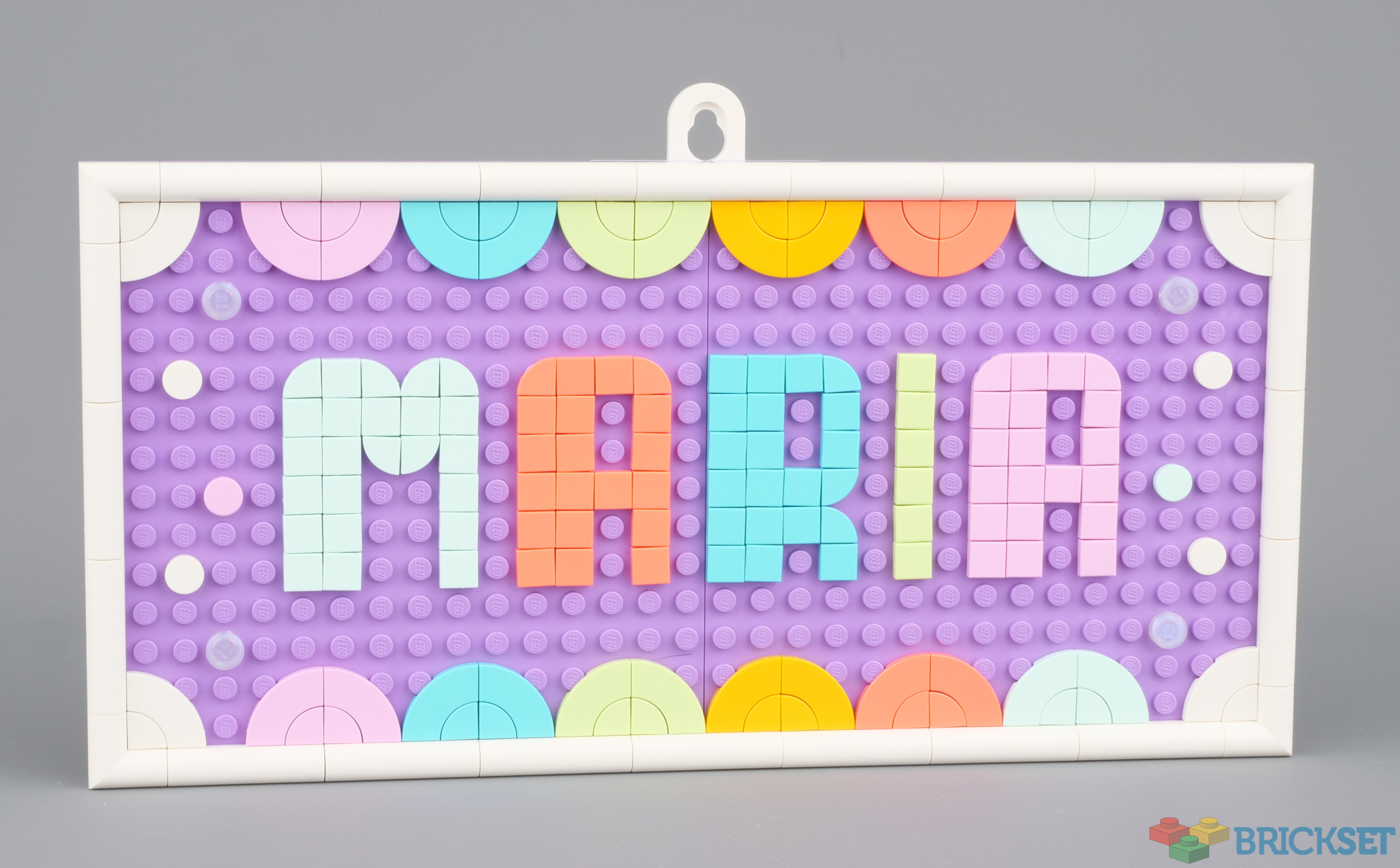
Three of the new DOTS sets that have just been released provide pieces and inspiration for creating lettering and patterns on large plates that can be used for message boards, signs, or art.
Two of them, 41951 Message Board and 41952 Big Message Board, contain tiles, plates and border pieces for a complete solution, while 41950 Lots of DOTS - Lettering contains just tiles that can be used in conjunction with the other two or on your own models.
In this article, I'll take a brief look at all three.
Summary
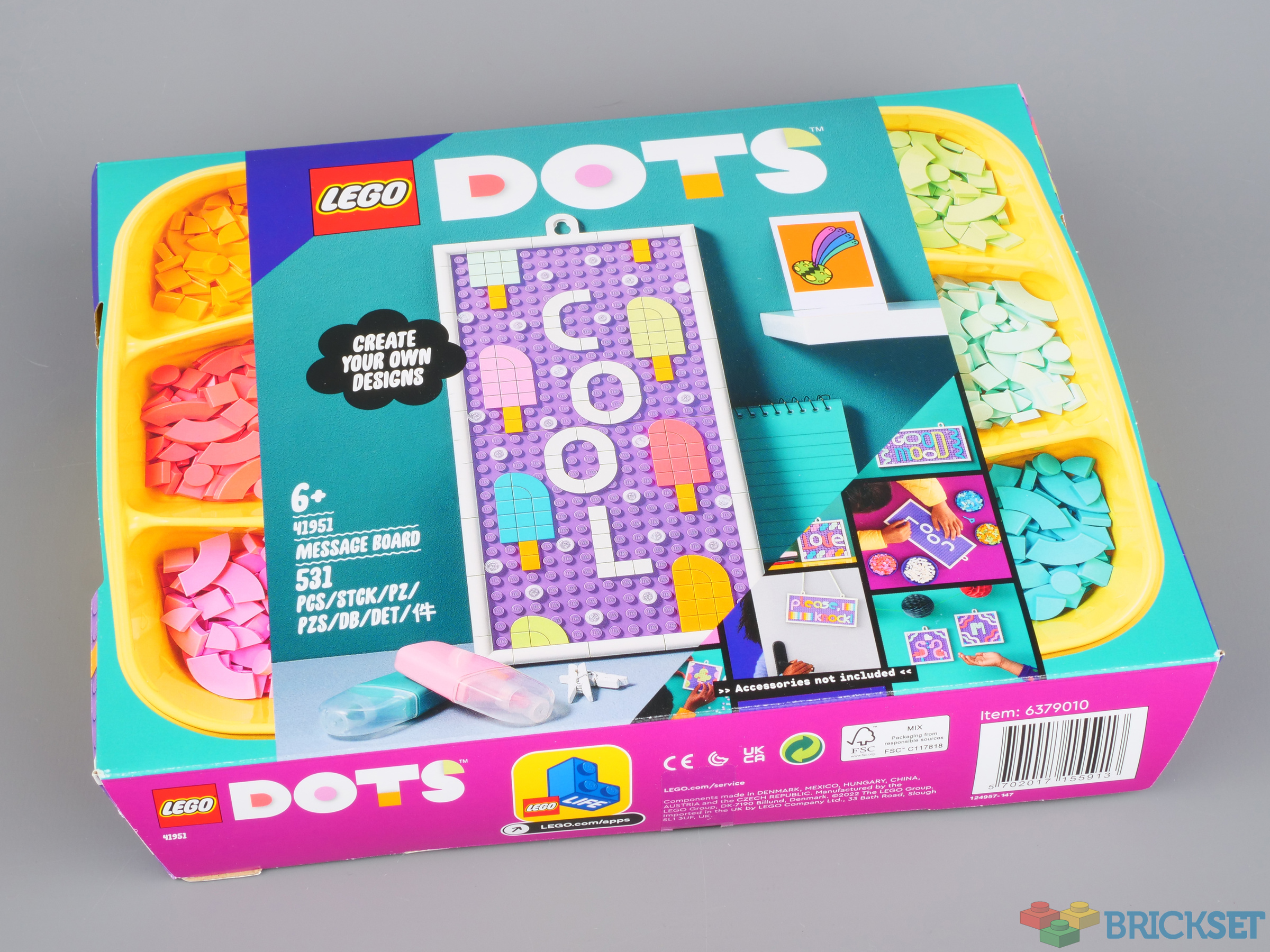
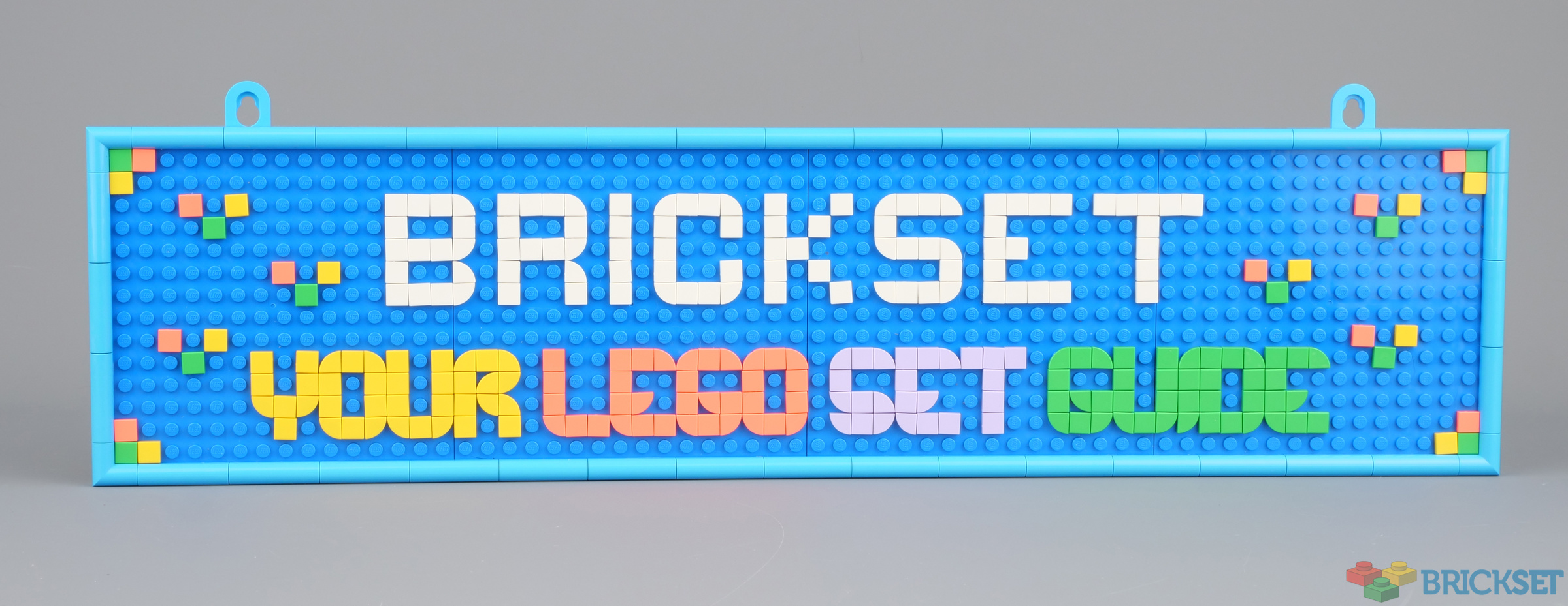
41951 Message Board, 531 pieces.
£17.99 / $19.99 / €19.99 | 3.4p, 3.8c, 3.8c per piece.
Buy at LEGO.com »
One of three sets that provide a new creative angle to the DOTS theme
- Good selection of tiles including 2x2 1/4 circles
- Inspiration for a variety of fonts
- None
The set was provided for review by LEGO. All opinions expressed are those of the author.
41951 Message Board is the only one that comes in a plastic sorting tray but rather than just having a cardboard band around it like those released when the theme launched in 2020, it's fully enclosed in a box. Perhaps this is because they were getting broken: they are not particularly sturdy.
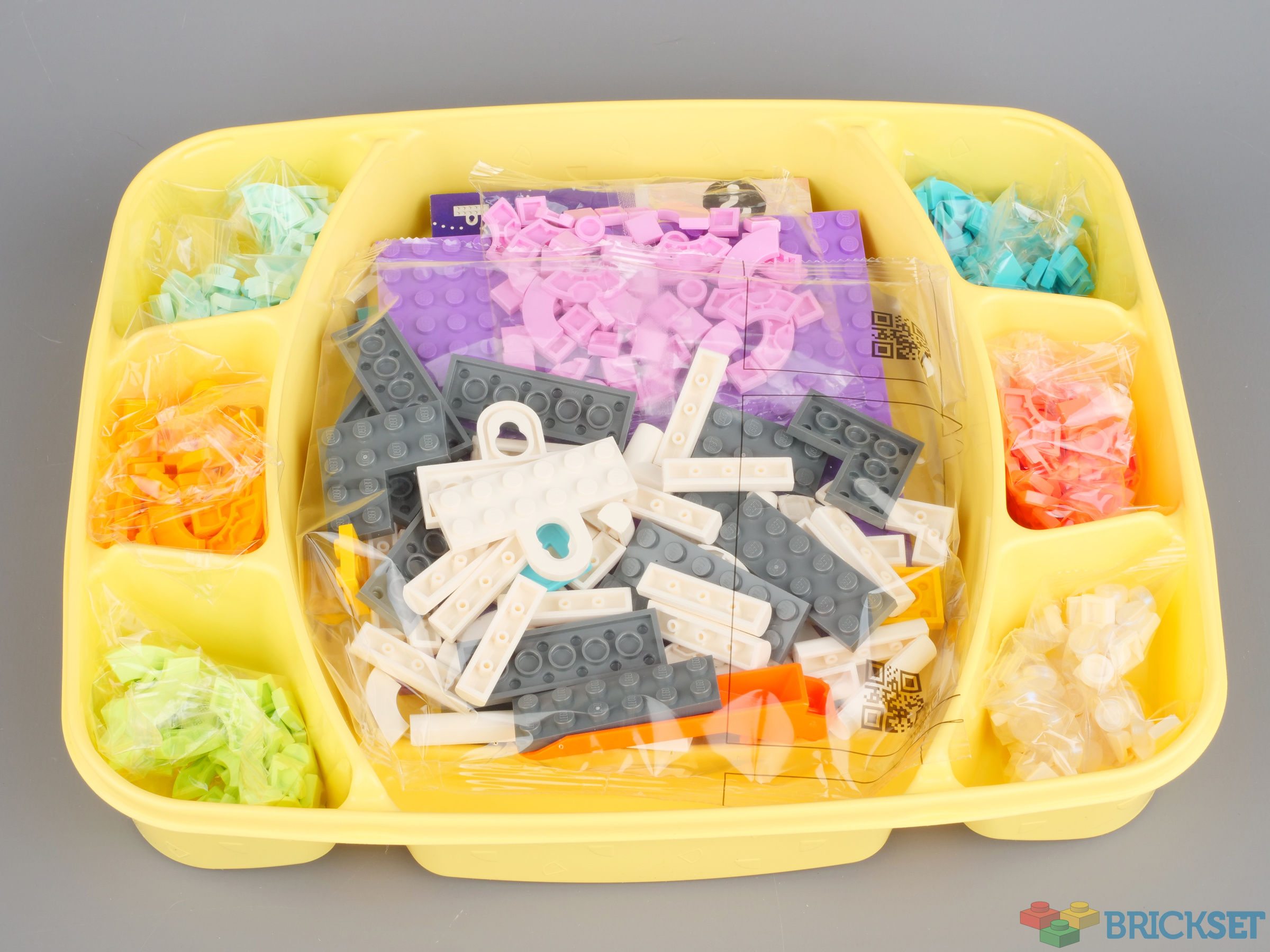
Each colour is packed in its own bag, so no tedious sorting is required.
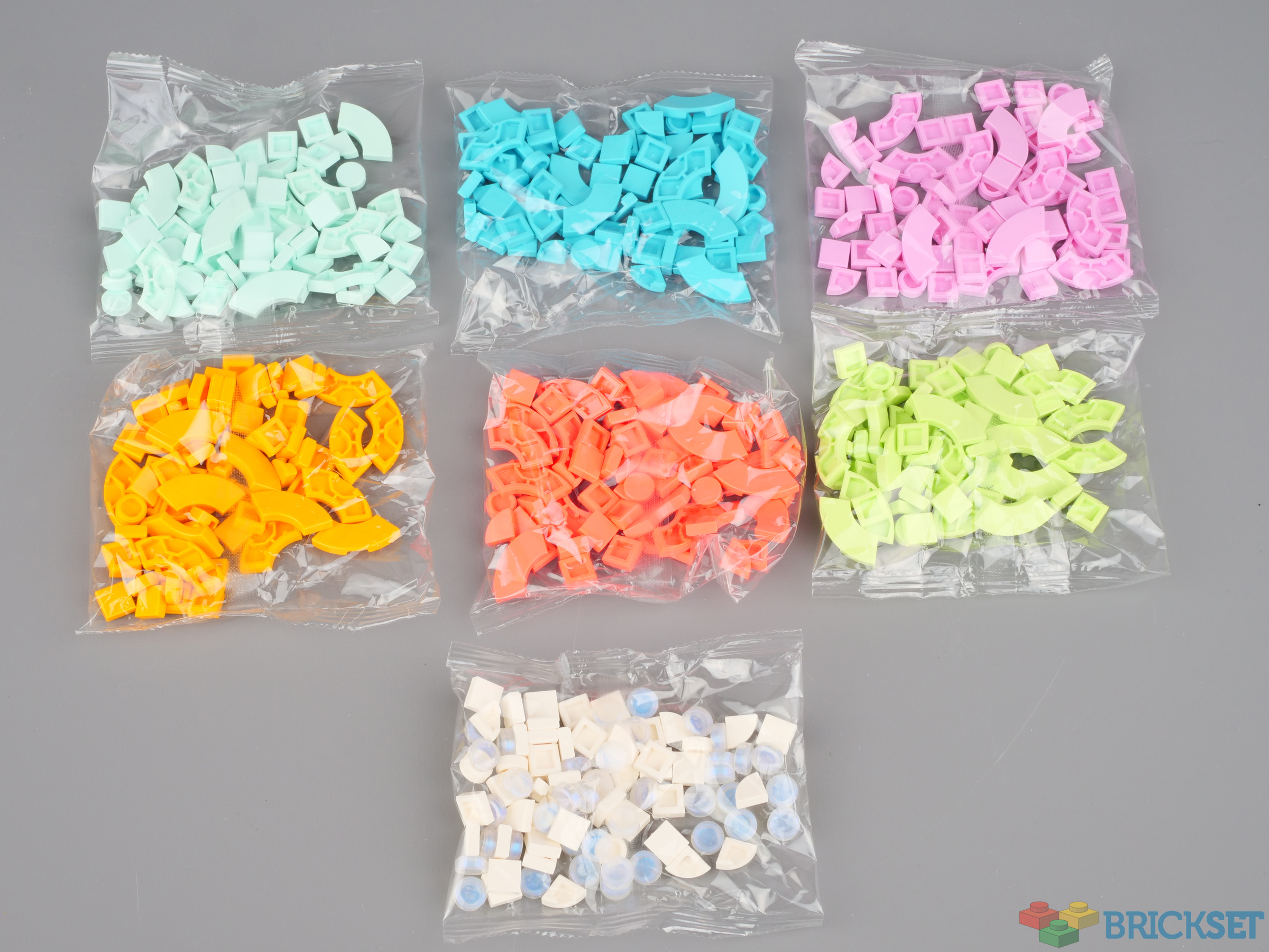
The colours in the set are aqua, flame yellowish orange, light purple, medium azure, spring yellowish green, vibrant coral, white and transparent opal.
With the exception of transparent opal, of which there are 40 1x1 round tiles, the set contains the following pieces in each of the other colours:
- 4 1x1 round tiles
- 12 1x1 1/4 circle tiles
- 16 2x2 1/4 circle tiles
- 30 1x1 square tiles
2x2 1/4 circle tiles have not been widely used in DOTS sets before. It's a shame that there are seven colours but only six small compartments in the sorting tray!
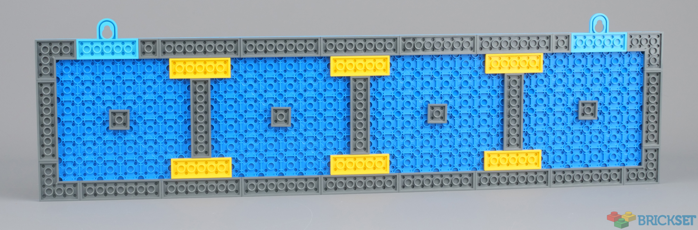
In addition, two 16x16 medium lavender plates are provided, along with pieces to hold them together, to create a border around the edge, and hang them from the wall.
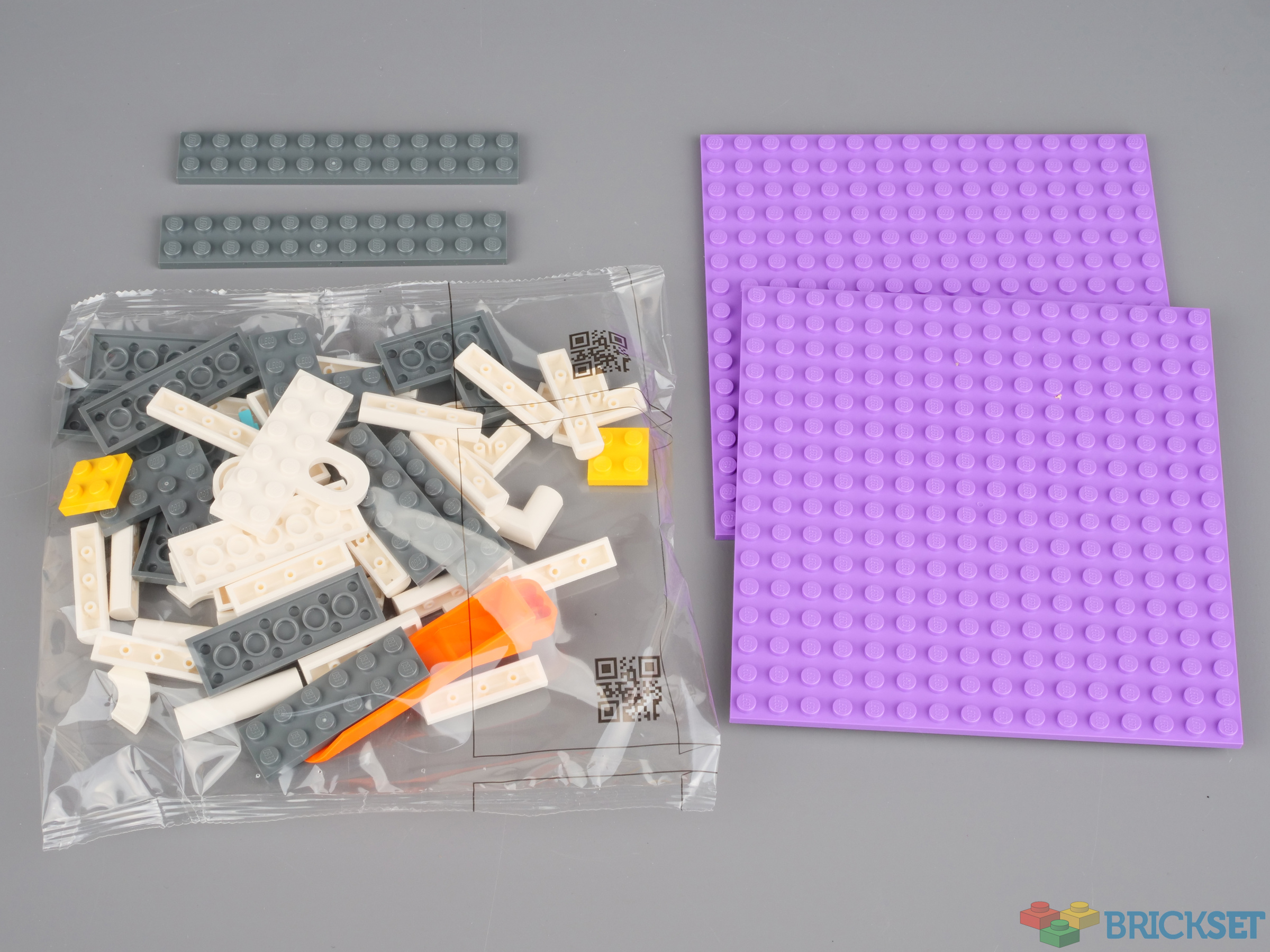
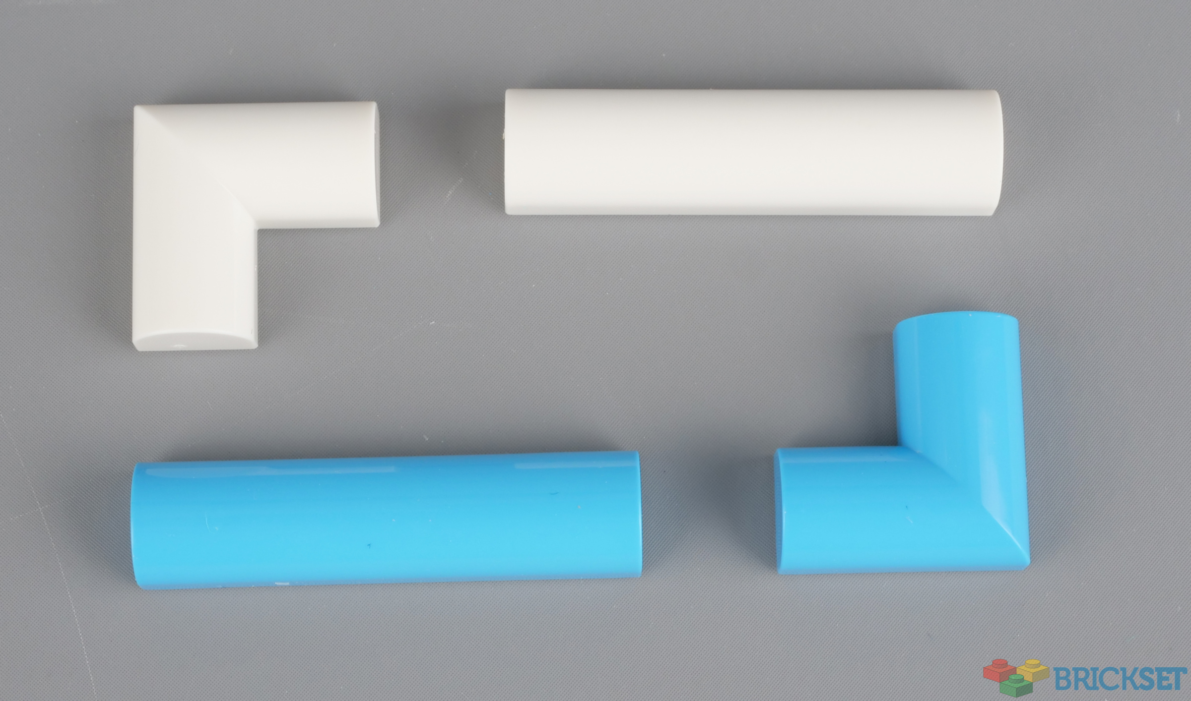
The border is made using 24 white 79756 PLATE 1X4X2/3, OUTSIDE BOW, which were first seen in 21057 Singapore, and four matching corner pieces, 79757 PLATE 2X2X2/3, OUTSIDE BOW, new in these sets. 41952 Big Message Board provides the same pieces in medium azure.
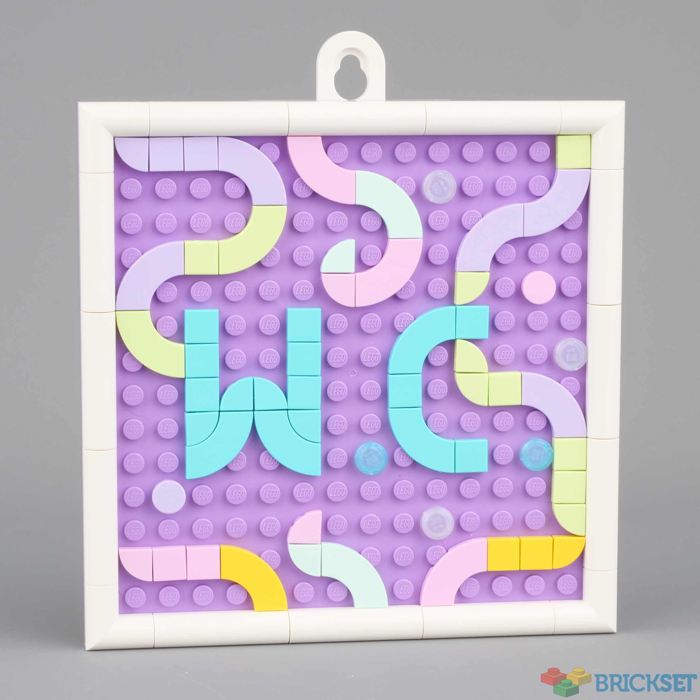
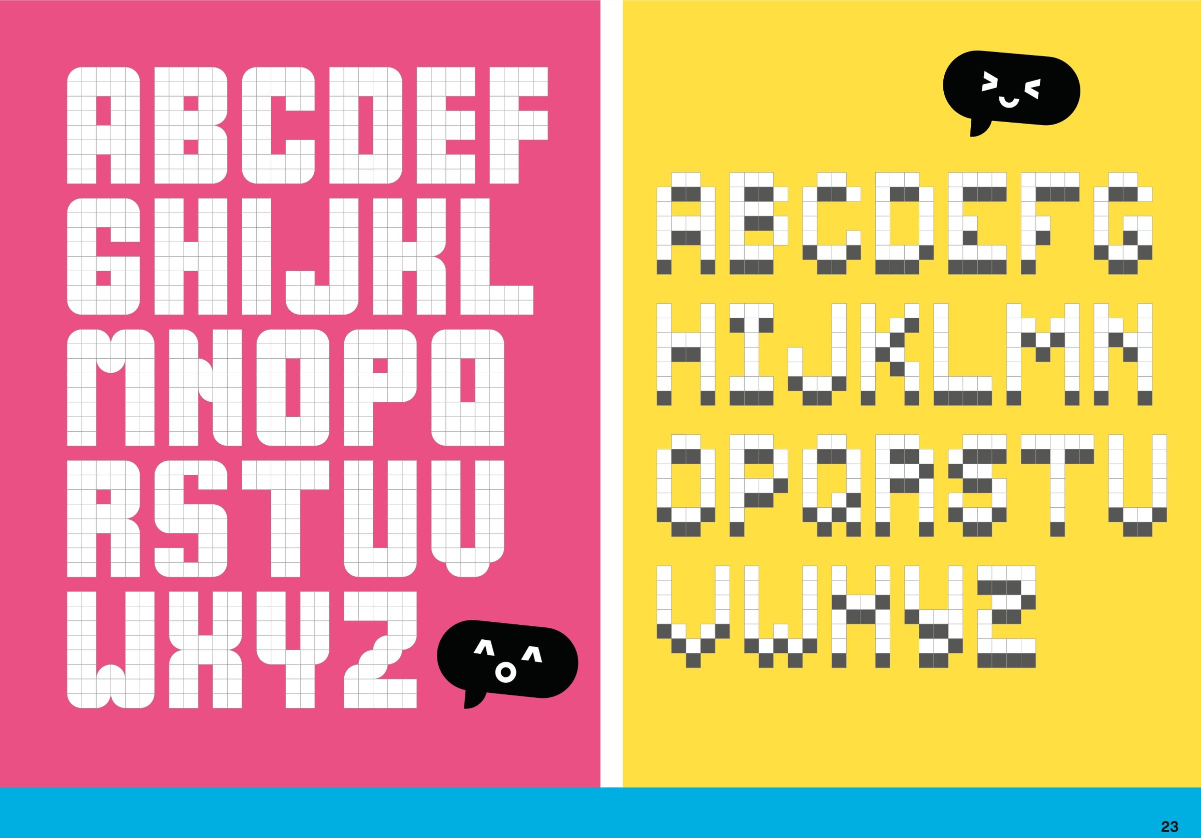
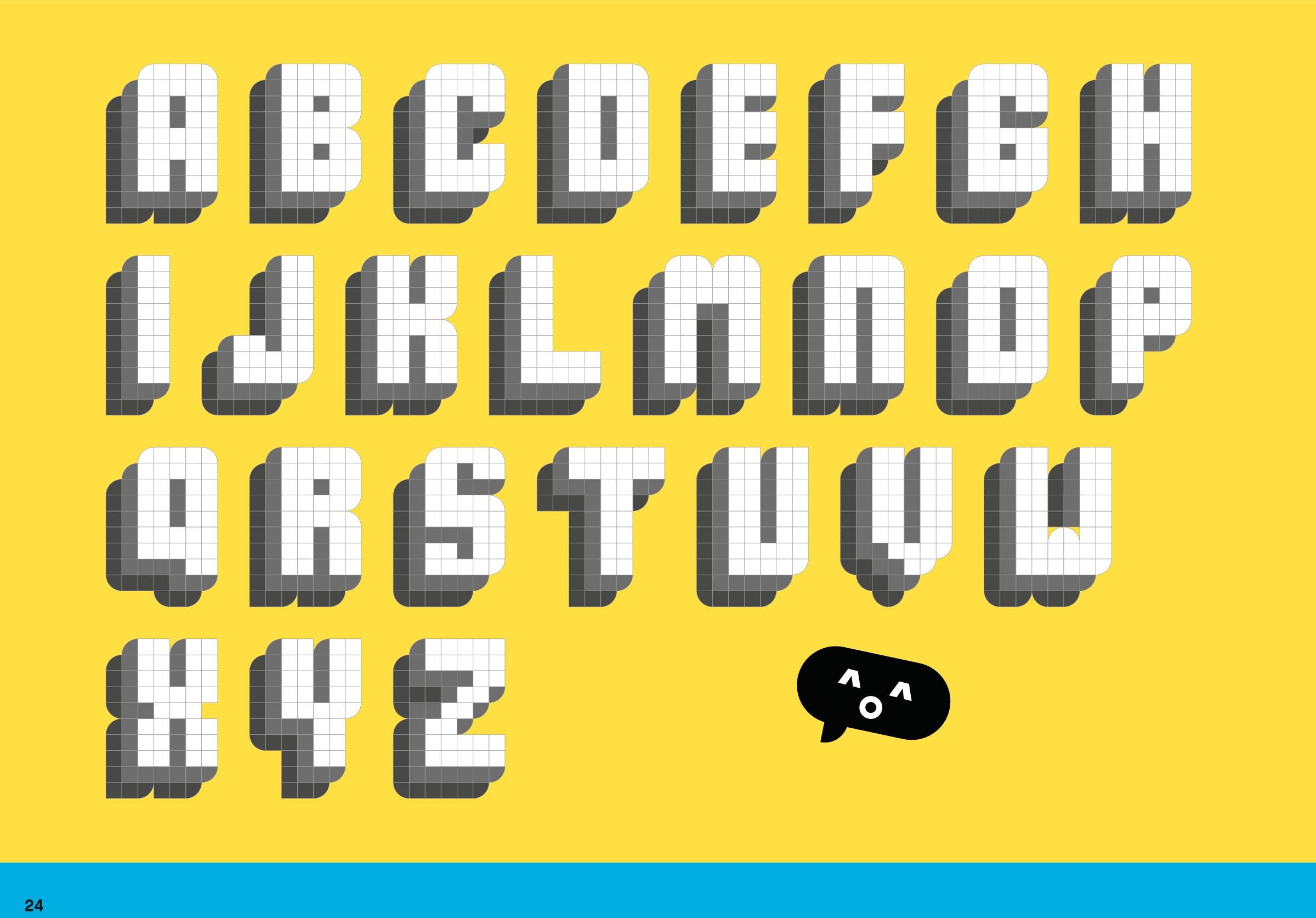
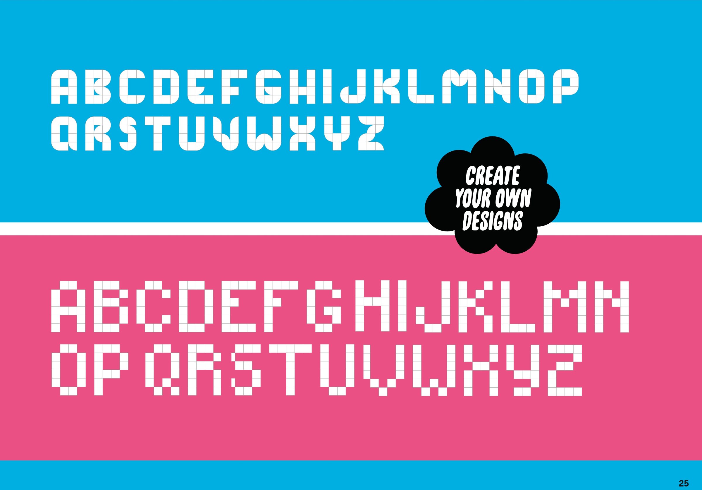
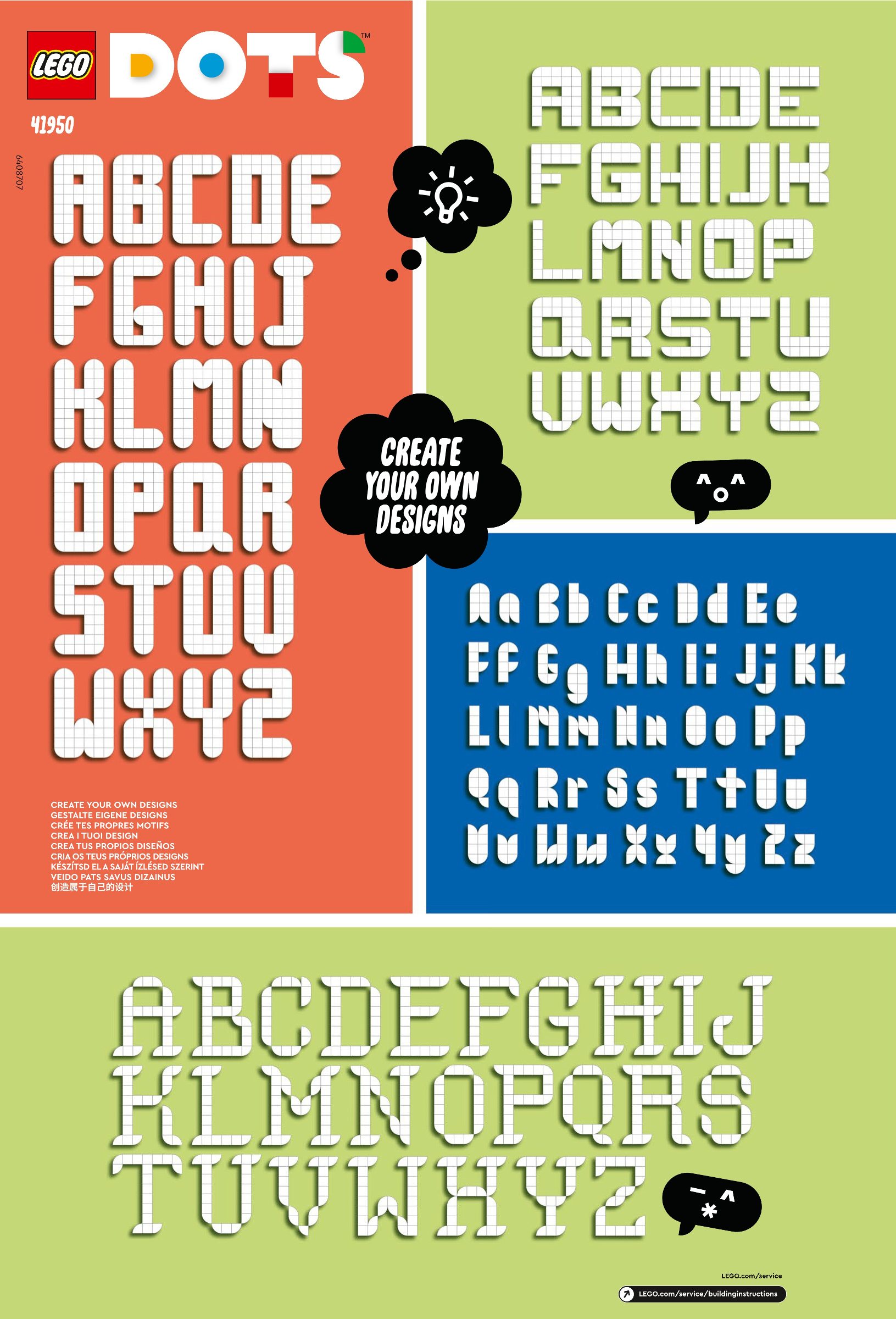
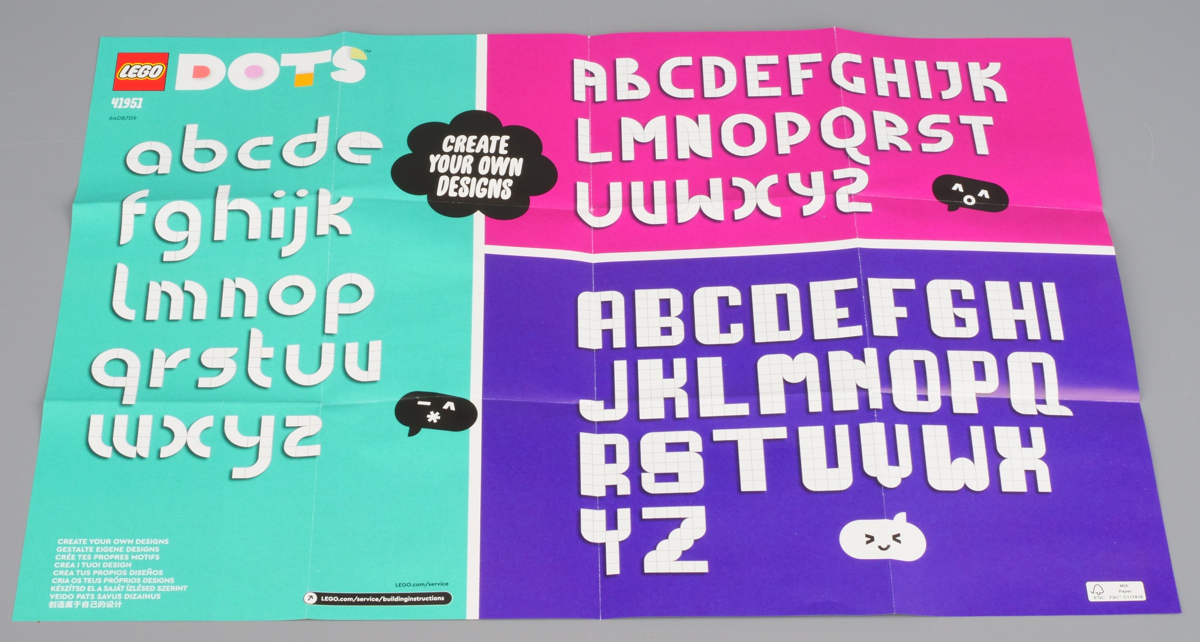
The instructions show designs for a variety of fonts as well as various patterns. I've added a few of the pages at the bottom of this article.
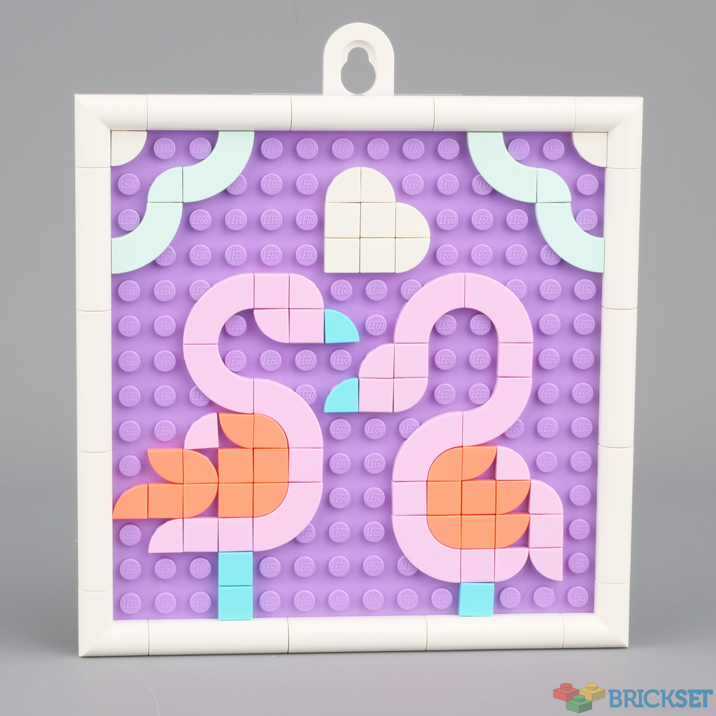
Here's are some my wife made using parts from this set:
A sign for the downstairs toilet door, which I think includes a few pierces from 41950 Lots of DOTS - Lettering:
Flamingoes, from instructions provided:
The largest set of the three, 41952 Big Message Board, is packed in a flop-top box which is great for keeping the parts in but not so good for keeping them sorted.
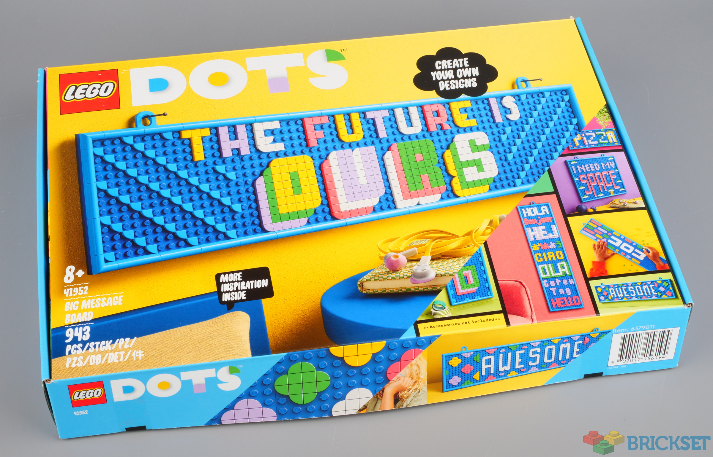
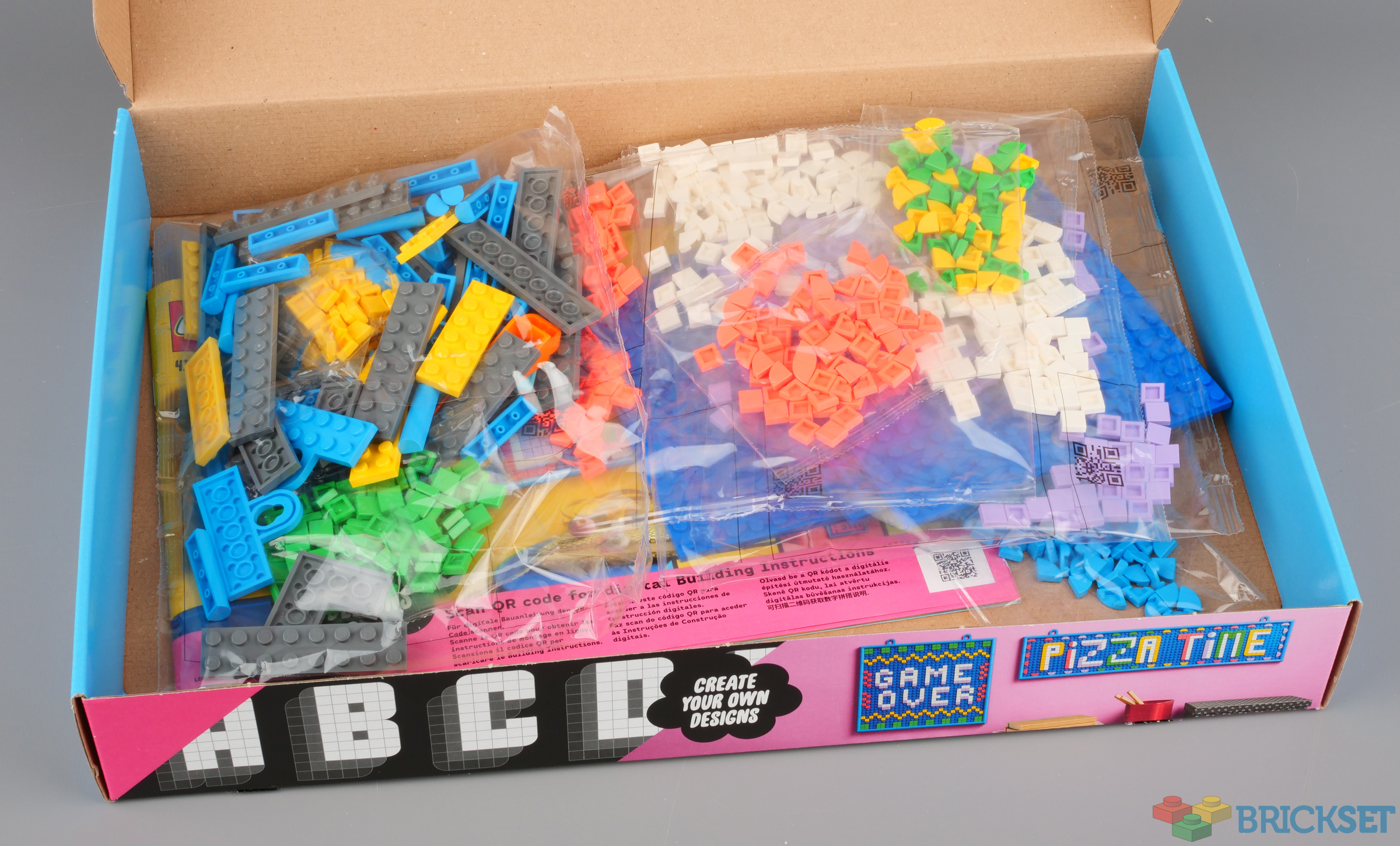
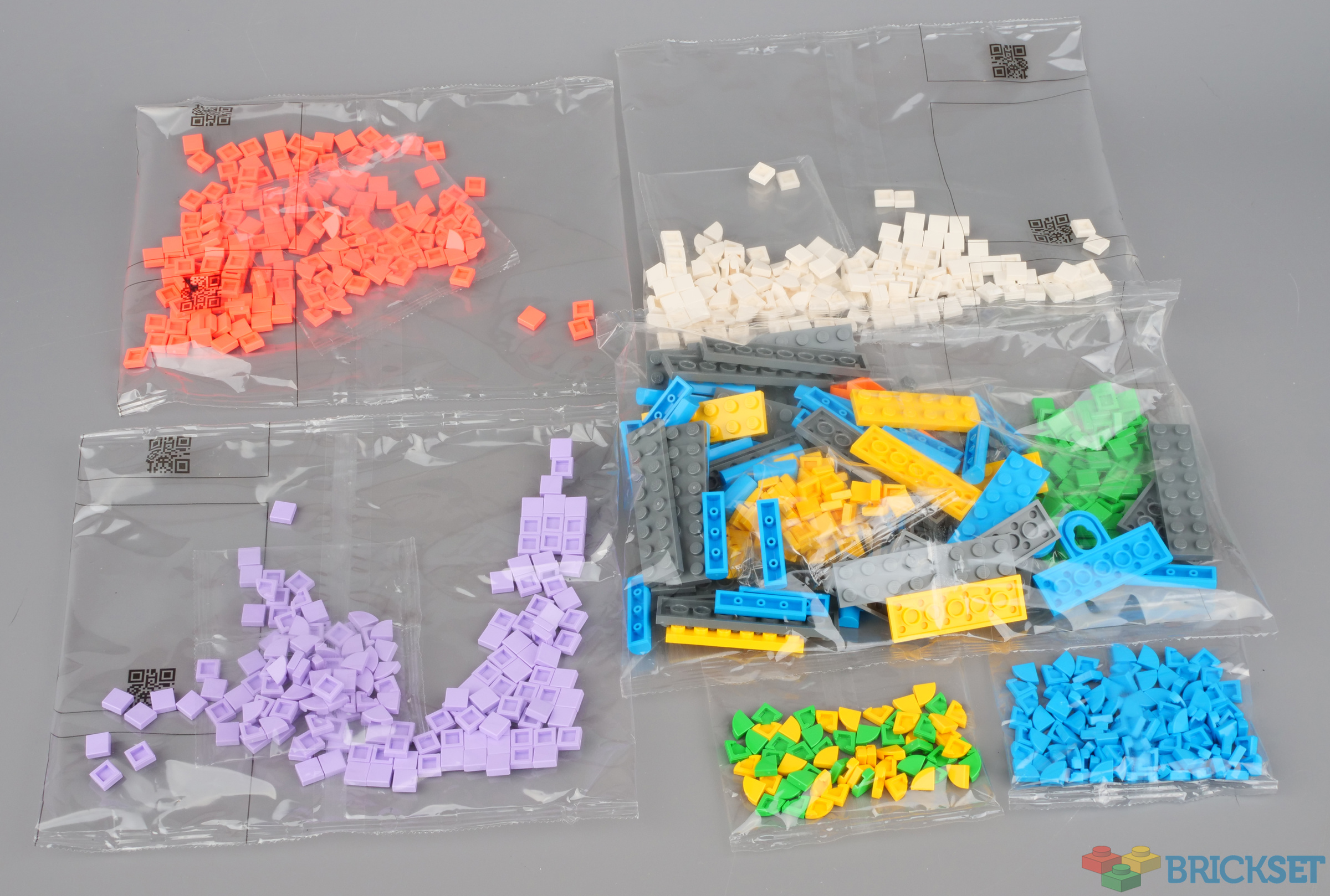
This one contains 943 pieces, including 1x1 square tiles and 1x1 1/4 circle tiles in bright green, yellow, lavender, vibrant coral and white and, additionally, 1x1 1/4 circle tiles in dark azure. You can view the quantities in the inventory
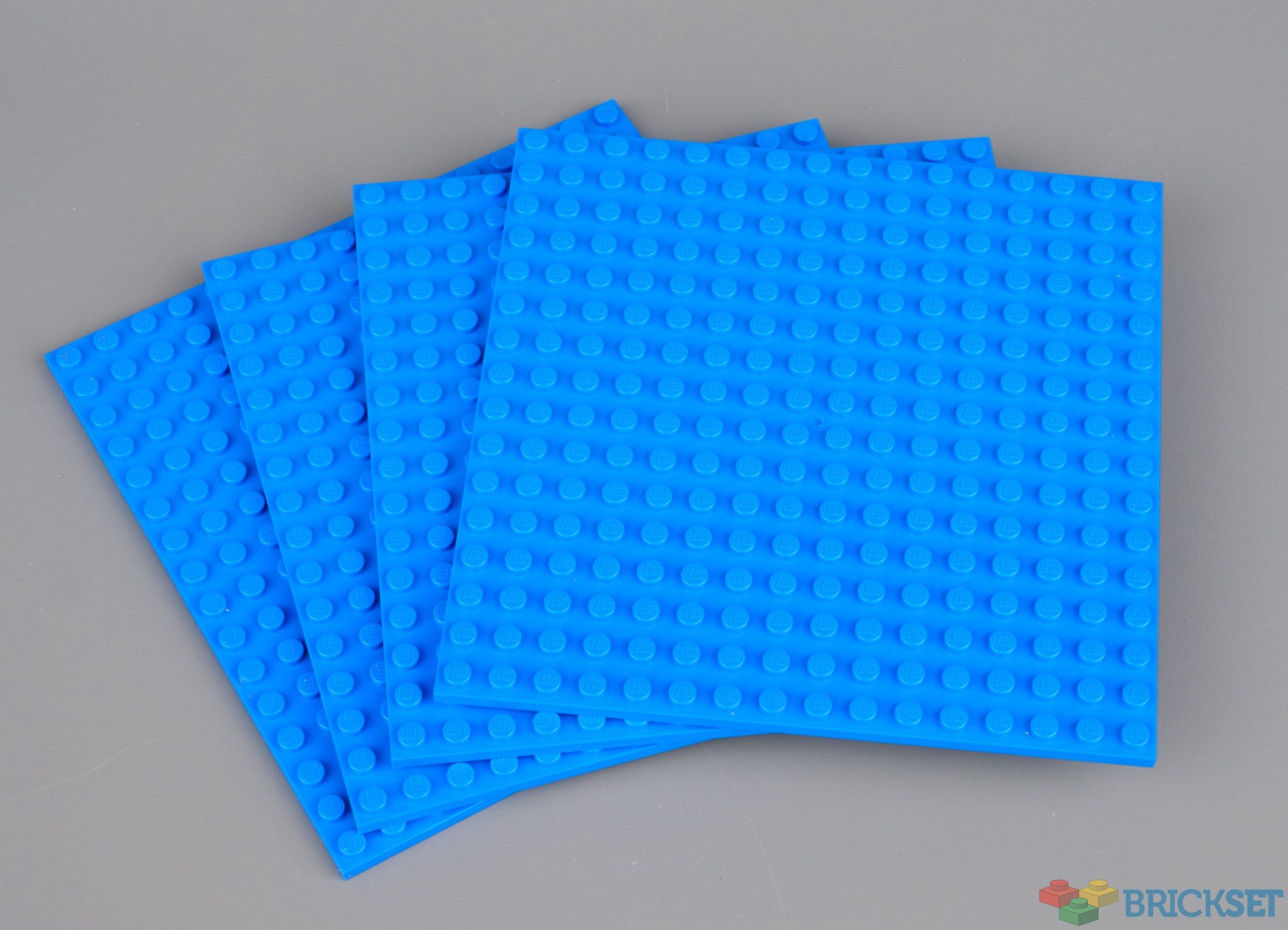
Four blue 16x16 plates are provided, along with 36 1x4 border pieces and four 2x2 corners in dark azure, as shown above.
Here's one Alice made, using the suggested fonts as a starting point, but with a few modifications.
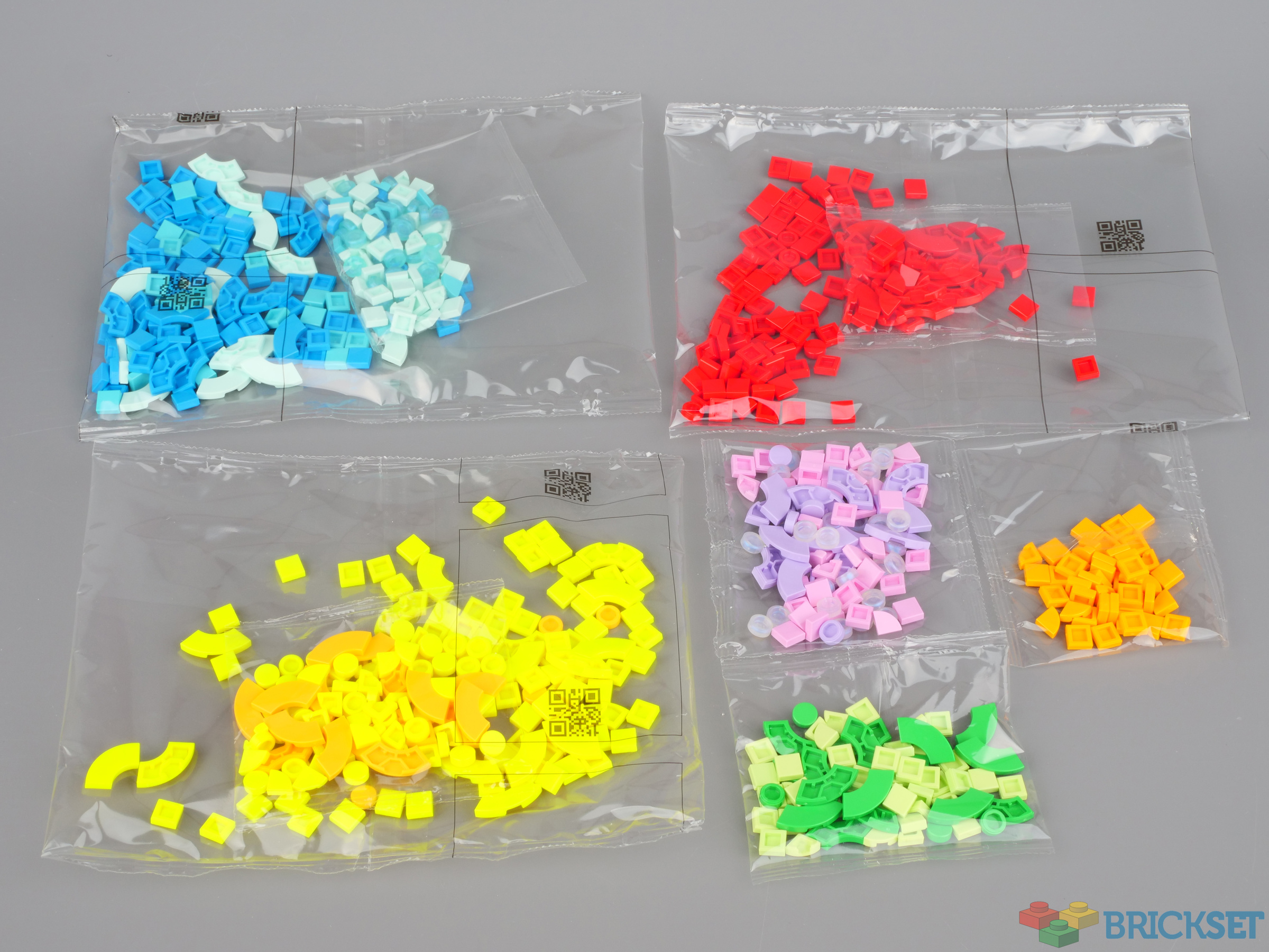
The third of the packs, 41950 Lots of DOTS - Lettering, contains 722 tiles in a variety of shapes and colours, including 156 tiles in vibrant yellow, a new colour introduced this year.
You could buy this set to supplement the parts in the two message board sets but if you've already got a stack of large plates and don't need any more, then of course you can buy just this set and use what you have already.
Here are some of the suggested fonts. The sheet showing those that use the 2x2 quarter circle tiles have not been uploaded to LEGO Customer services for some reason.
I think these are likely to be very popular, particularly 41950 Lots of DOTS - Lettering which is all you really need if you're looking to add letters to your existing models and/or want to acquire a lot of tiles as cheaply as possible, particularly if you have a use for the 2x2 1/4 circles which have not been easy to obtain in quantity until now.
Of the two message boards, I think the smaller 41951 is the better one, due to it coming with a sorting tray and plenty of the aforementioned 2x2 1/4 circle tiles which enable a wider variety of lettering to be created.
It's great to see continued innovation in the DOTS theme. It's one of the most creative themes, but for some reason appears to be under-rated among AFOLs, which is a shame. Perhaps these sets will change that.

All three are now available at LEGO.com, with prices ranging from $19.99 to $39.99 / £17.99 to $34.99.
113 likes
28 comments on this article
I like the typography guide.
Agree, the typography guide is great. It's lettering like this that makes DOTS useful for me. these look like good sets.
Those are some great designs right there! As nice as some of those mosaics are, thís is real LEGO Art to me.
Doesn't matter how many times I see it, all I see is:
The future is DURS
Those outside bow pieces are amazing!
@huw You listed no cons to these sets. How was the experience in changing the design again and again? When I've looked at these I've figured it would feel rather tedious. Have you found that to be the case?
I like that those sets have a big focus on square 1x1 tiles, so they can be used for a lot more then just mosaics, but also floor tiling etc.
Square tiles add a lot more to the usefulness of corner and half-circle 1x1 tiles.
One thing that would be neat is if the set included some small plates to put under some parts of a letter to give it a 3D effect, especially the fonts with shadow effects.
Very interesting...and low price! Trying to think of a good use for these hmmm...
@Agent00Z said:
"One thing that would be neat is if the set included some small plates to put under some parts of a letter to give it a 3D effect, especially the fonts with shadow effects. "
I definitely agree. I'd love if some of the future extra dots/lots of dots included 1*1 plates in addition or instead of the tiles.
I’d love to see these with a broader range of colors.
I don't care about the parts that are literally just 1x1s or smaller. But those baseplates are nice!
@MCLegoboy said:
"Doesn't matter how many times I see it, all I see is:
The future is DURS"
I did not want to make that joke again. For the 5th time :P
@MCLegoboy said:
"Doesn't matter how many times I see it, all I see is:
The future is DURS"
This is a mistake they did on the typography. It affects letter: {'C', 'G', 'J', 'O', 'Q', 'S', 'W', 'Y'} (see picture on page 24 - the yellow page where the lettering is in white with depth in gray and shade in black.)
This could easily be fixed by putting part 25269 (tile round 1x1 quarter) in white in the bottom left with part 27925 (tile round corner 2x2 macaroni) in gray for the depth and then again with part 79393 (tile, round corner 3x3 macaroni) in black for the shade. (I tested this before posting!)
Assuming they fix this, they would have to start producing 79393 in all sorts of colours (not a bad thing - only 6 colours at the moment). 27925 is already produced in 33 colours as of now.
For design purposes, it would be good to have 45 degree 1x1 plate but they would not hold very well on their own on the plate (very little left to 'clutch' on ).
The font recommendations are great but I wish the sets contained fewer pastel colors and more traditional LEGO colors. I'd love to see a pack with red, yellow, white, blue, black & green.
THE FUTURE IS DURS!!
I would find a version with the most common Lego 'basic' colours more useful for mocs, as would blend easier when using to smooth surfaces, whereas pastel shades always stand out.
Am I the only one who sees "The Future Is DVRS"?
I mean, maybe 15 years ago I'd think DVRs were the future, but it's all about streaming media these days.
DOTS is VERY underrated series among afols AND kids.
Good review! I've only kept a few Dots sets on hand since I moved up to Canada, but some of these are definitely on my wish list going forward.
Introducing 2x2 quarter circle tiles to the Dots palette is an interesting choice that opens up some neat possibilities for both lettering and more general pattern-making. That said, they aren't quite as intercompatible with all other Dots sets as 1x1s are, since they won't attach as securely to flexible parts like the bracelets or the new bag tags from 41949.
I suspect that's part of why LEGO waited until the theme was already well established to start expanding the parts palette in that particular direction. And it's nice that they took that step in such a big way by simultaneously inntroducing THREE different lettering/message board sets that offer the 2x2 quarter circle tiles in a wide variety of colors (including some brand-new recolors).
There aren't a lot of "earth tones" like shades of grey or brown, but 2x2 quarter circle tiles have appeared in those colors in other themes, and I suspect they could also be brought into the Dots theme at some point, perhaps for an animal-themed set similar to 41904.
@mr_Fikou said:
"Those are some great designs right there! As nice as some of those mosaics are, thís is real LEGO Art to me."
One of the big differences I've noticed between the Dots theme and other mosaic-based themes like LEGO Art is that Dots tends to be more geared towards graphic design (patterns, typography, etc) than portraiture or illustration. Of course, the lines do get blurred more in some places — for instance, "patterns" are one of the five categories of image provided in 21226.
@ytjedi said:
" @huw You listed no cons to these sets. How was the experience in changing the design again and again? When I've looked at these I've figured it would feel rather tedious. Have you found that to be the case?"
From my own experience, it's not nearly as much so as the sort of designs in themes like LEGO Art, since Dots designs have less of a tendency to cover up their entire "canvas" in individual tiles.
The only time it ever feels frustrating for me is if I've gotten pretty far into coming up with a build of my own and then end up realizing I ought to have started it a few studs over in one or more directions. Because that means having to individually remove and reposition each individual tile just to get the SAME pattern to look how I want it.
But removing the parts to make a DIFFERENT pattern with them is not nearly as frustrating to me (at least as long as I have a brick separator), since instead of feeling like "one step forward, two steps back", it offers a more satisfying feeling of pursuing a new path forward. I hope that makes sense!
@ambr said:
"I would find a version with the most common Lego 'basic' colours more useful for mocs, as would blend easier when using to smooth surfaces, whereas pastel shades always stand out.
"
Have you checked out 41395 Lots of Dots? It has plenty of parts in basic colors like Bright Red, Bright Orange, Bright Yellow, Bright Green, Bright Blue, Medium Lilac, Black, and White, in addition to a variety of tints, shades, and intermediate hues.
41950 also has a pretty good balance between lighter pastel tints and deeper, more saturated colors, although it has fewer colors overall, and lacks darker shades like Black, Earth Blue, and Earth Green to balance out the lighter colors.
@mroper295 said:
"The font recommendations are great but I wish the sets contained fewer pastel colors and more traditional LEGO colors. I'd love to see a pack with red, yellow, white, blue, black & green."
I got 41935 looking for those same colors. It provides lots of yellow and blue, but almost no green. It could use more black and white 1x1 tiles also.
A small note on the 2x2 macaroni tiles; I haven't had any trouble finding these on local PAB wall selections. Granted, not in such color variety, but pretty easy and cheap to grab 200 dark red tiles that way.
This review has only got me even more hyped up for 41951. The reason DOTS has been underrated among AFOLs should have been pretty clear since you started reviewing the sets: the male majority just doesn't care for anything they think is coded kid femme, such as the wearable accessories that the theme started out with. Even the colors bother them! These have much broader gender-agnostic appeal.
@Agent00Z said:
"One thing that would be neat is if the set included some small plates to put under some parts of a letter to give it a 3D effect, especially the fonts with shadow effects. "
Yeah, Vidiyo does this. It would've been nice to see in DOTS.
Why are they using plastic tray? They could just put the content into a regular cardboard box. Or using a tray, which is similar to the one, that's used in advent calendars.
That's so weird from the company who emphasize, how determined they are in environment-friendly operation and production.
@Sean_W said:
"I got 41935 looking for those same colors. It provides lots of yellow and blue, but almost no green. It could use more black and white 1x1 tiles also."
I was looking at that set at the LEGO store this afternoon and was impressed with the color selection. I didn't pull the trigger but it definitely got me thinking more about the DOTS line.
I have been fooled.. and have always been thinking that "The future is DURS", and the DURS is some new youngsters' abbreviation, which I'm not familiar about.. And now that you all have brought it up again here, it is indeed not supposed to be DURS.. How on earth could this simple lettering be so ambiguous in this Lego typography?
I.e. referring to the 2nd typography shown above, the D, O differ only by a small edge piece, with W looking more like a U.
DUUUUURS!!!
Shame the out-take wasn't included where Huw spelt 'Elvis'.