42139 ATV: What could have been
Posted by Huw,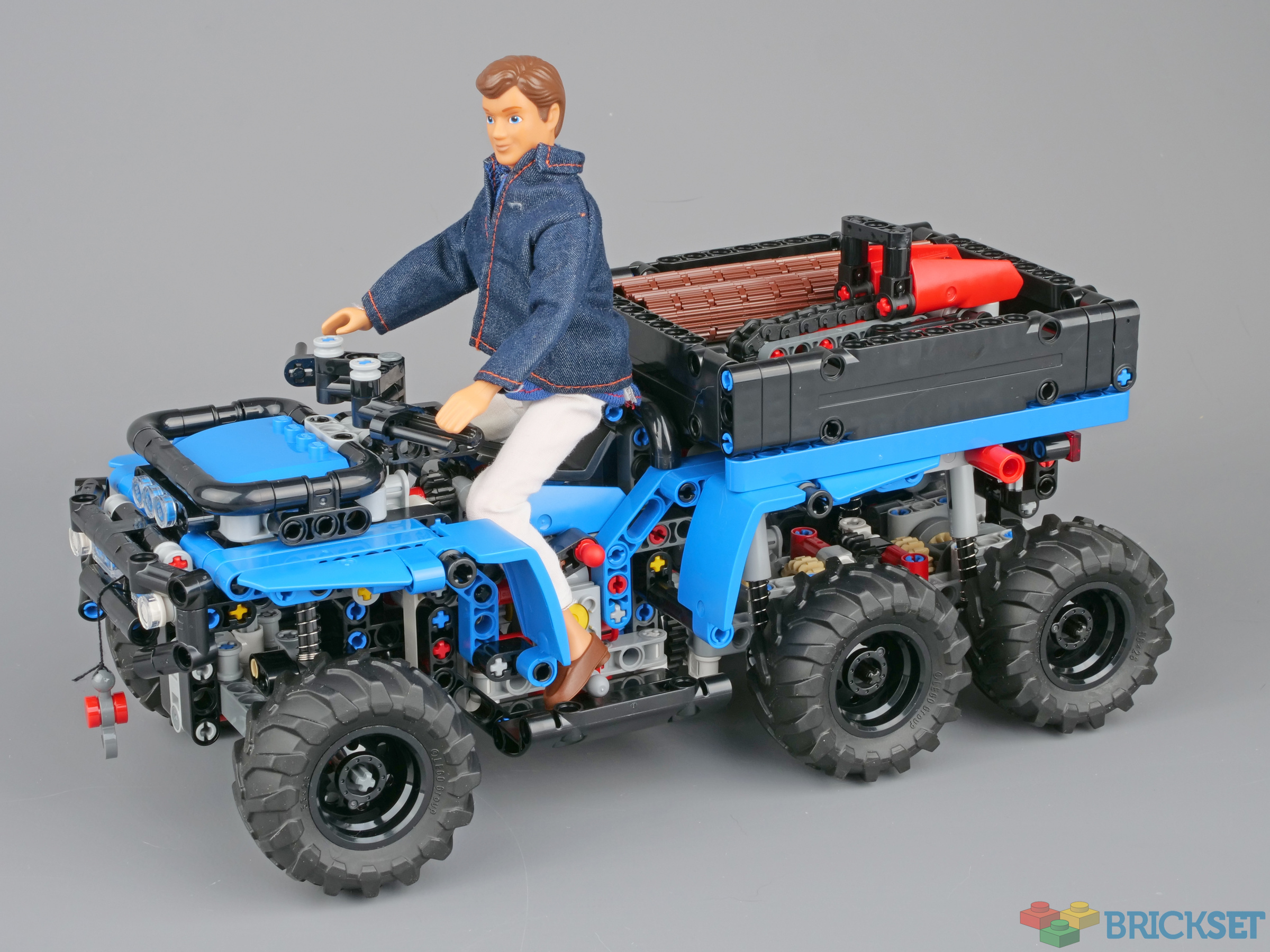
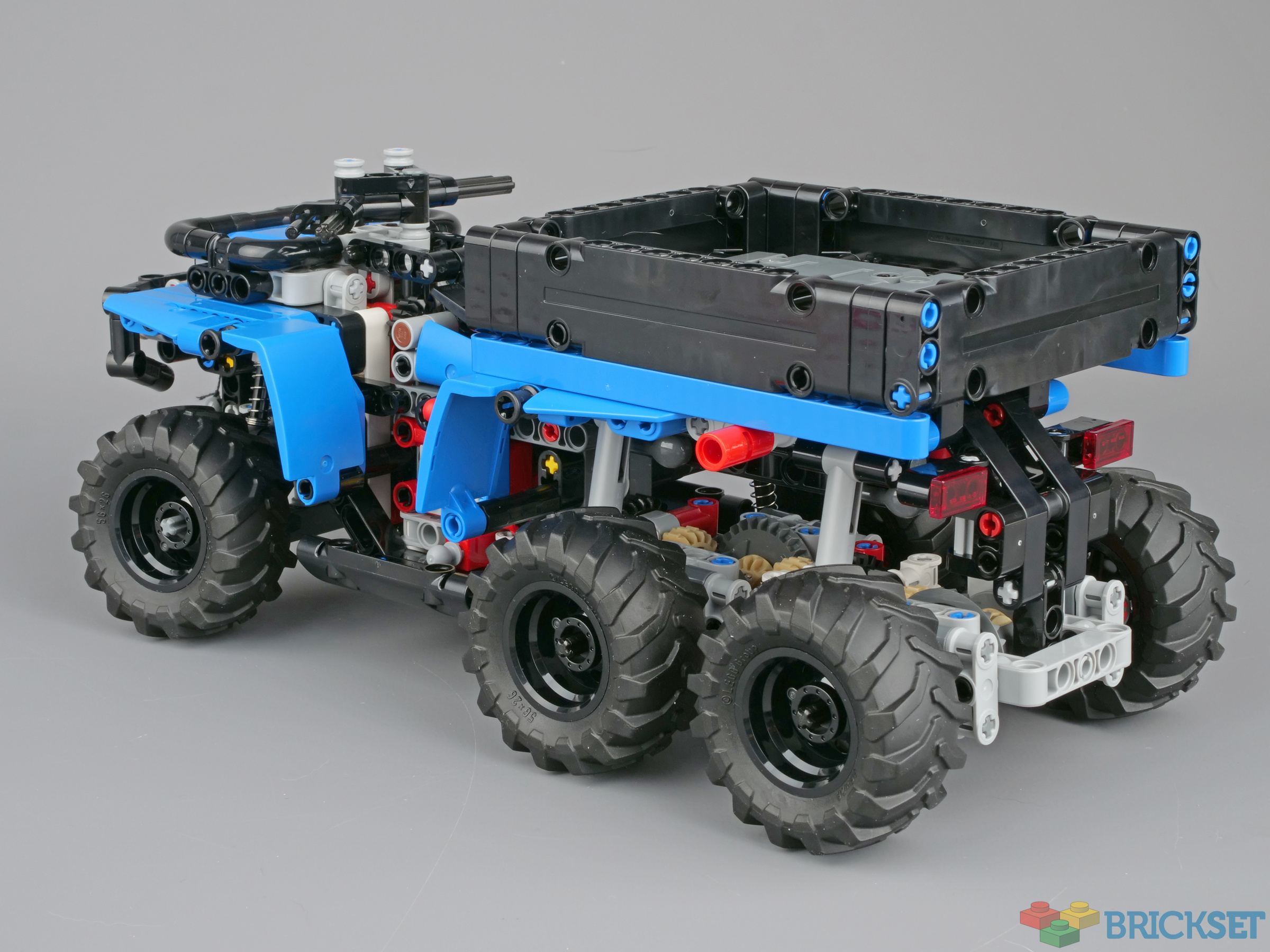
In my review of 42139 All-Terrain Vehicle yesterday I concluded that the unattractive colour scheme marred what is otherwise a very good and highly functional model.
So, I thought I'd do something about it and see how much better it could have been with a uniform livery.
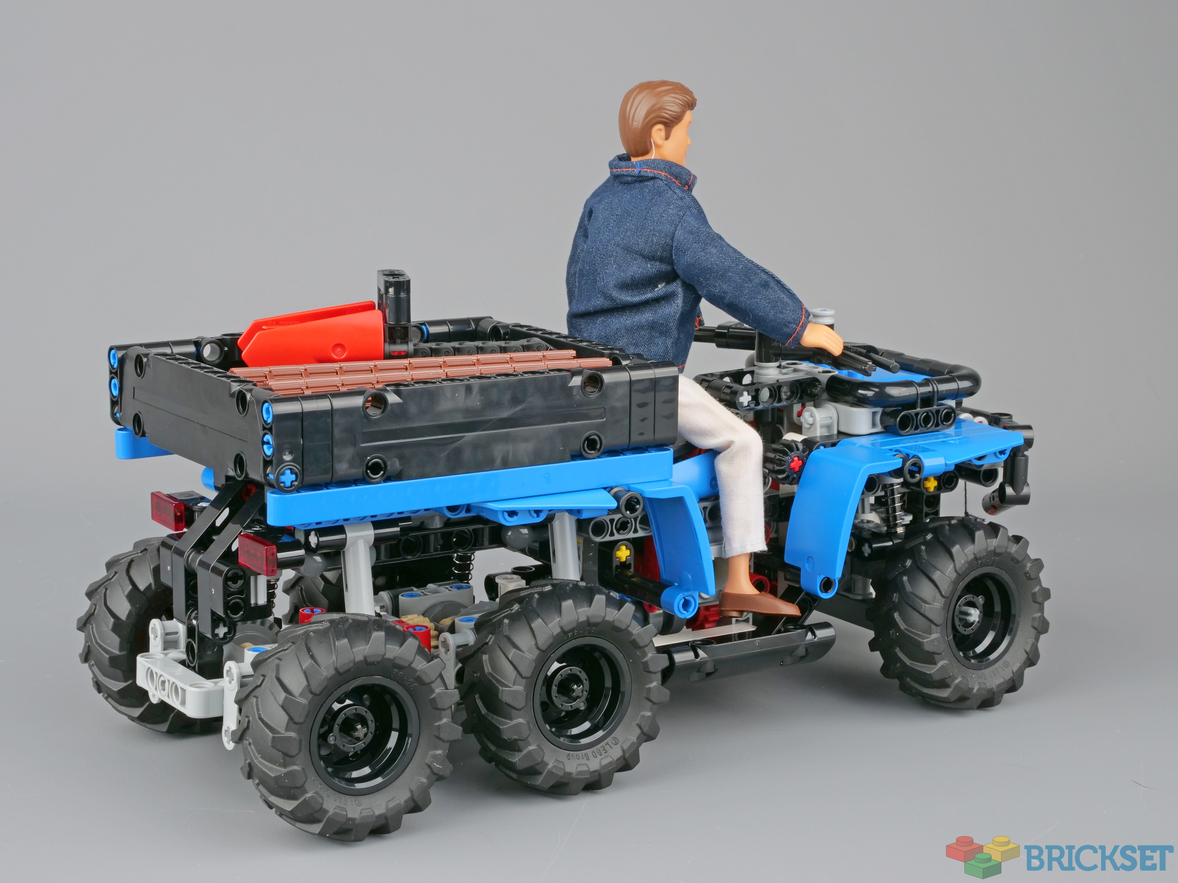
I even dug Christian out of storage to take it for a ride...
I wanted to replace all the white and orange pieces with a single colour which meant finding one that both 43500 LEFT PANEL 2X5 (NR 22) and 35396 ANGULAR PANEL 3X5X3 W/ 4.85 HOLE are available in, and that I had in stock. That meant either dark grey or blue, so I opted for the latter.
Fortunately, all the offending orange and white pieces can be removed easily without the need for much dismantling, so it was a fairly quick and painless job.
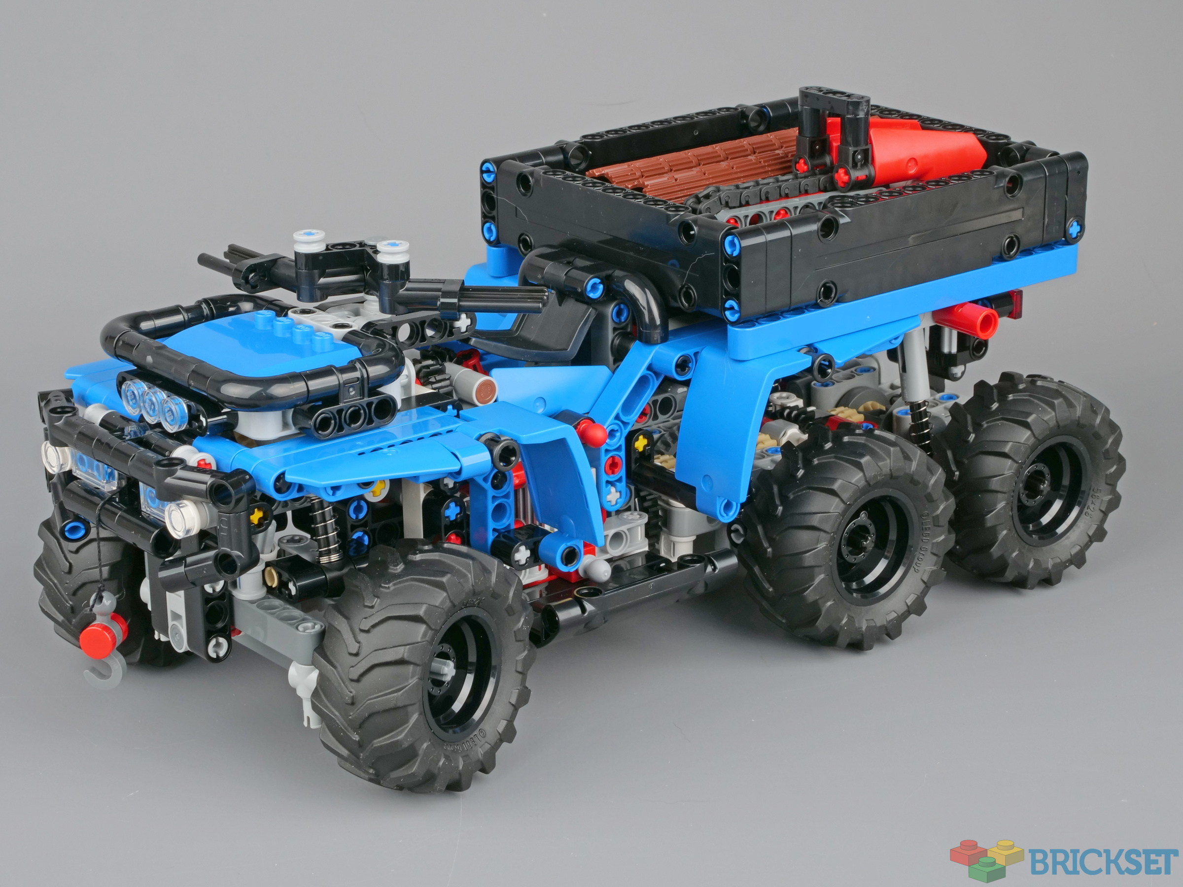
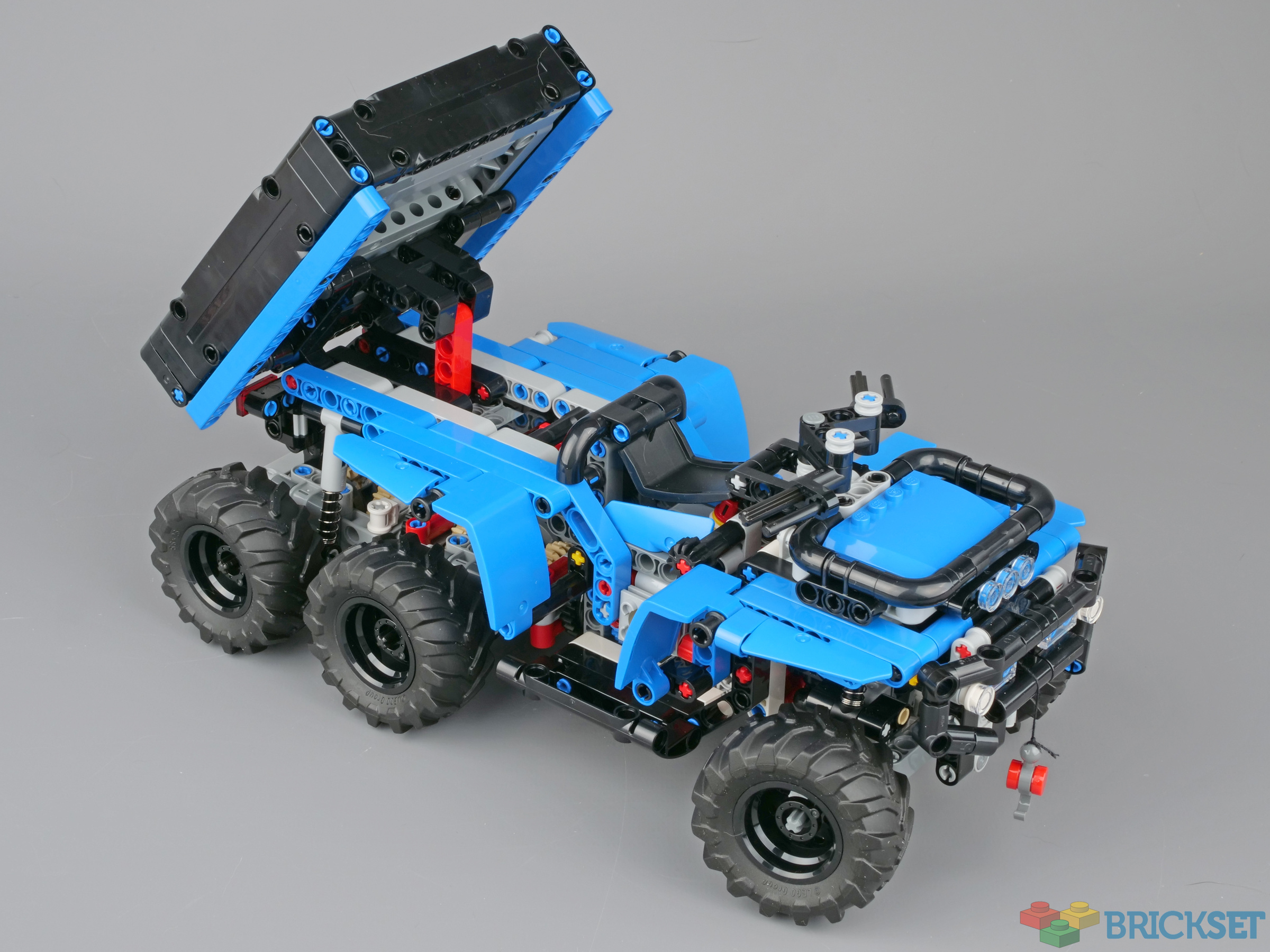
It's now much easier to see the shape of the vehicle and what it actually is.
I also replaced some of the more egregious red pieces while I was at it. There are still a couple of white beams buried within the chassis, but they are not that visible. If I were rebuilding the vehicle from scratch I would have replaced them.
Someone suggested seating a Scala figure on it, so here's Christian taking it for a ride. As predicted, the scale is pretty much spot on.
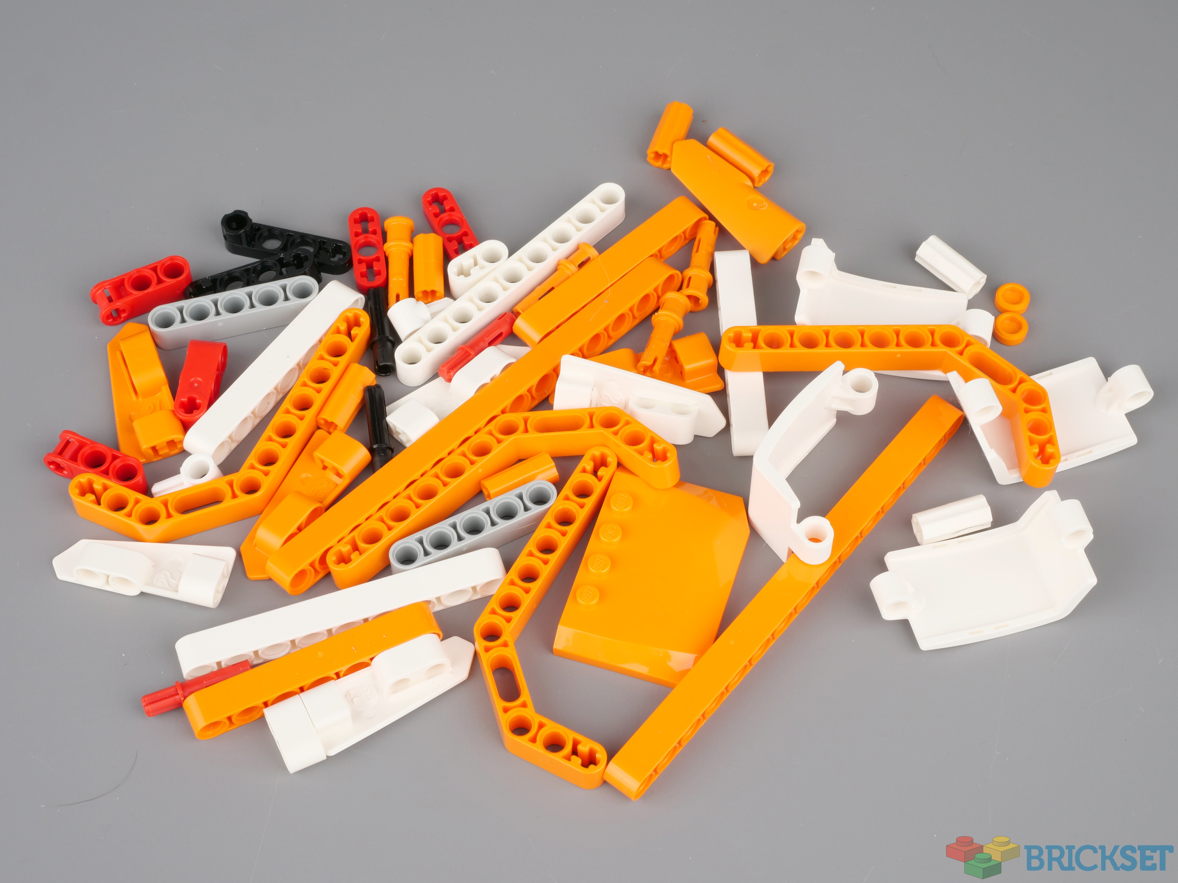
Here's what I replaced with blue pieces, or black in the case of the red parts.
181 likes
79 comments on this article
That is *so* much better looking
This looks great. It really puts the official colour scheme to shame.
way better look, love the Scala fig as well. I kinda want to see it in red and black tbh.....
Sometimes, I wonder if Lego are using multi-colours and stickers in a set like this explicitly to deter parts-packers.
Thank you, that looks so much better! And The way the original looks is a shame, shame, shame!
One starts to wonder why Lego is doing this. Their designers must be aware of these obvious misdesigns and colour mish-mashs.
Congrats to @Huw to make it so much more attractive.
@Goujon said:
"way better look, love the Scala fig as well. I kinda want to see it in red and black tbh....."
Red would look great, I'm sure, but the ANGULAR PANEL 3X5X3's are rare in red and I don't have any to hand.
@AndyB1 said:
"That is *so* much better looking"
I agree, unless you meant that scary doll ;)
Oh no, My Dad has a chainsaw!
Run!!!!!!
It looks better btw. I'm not opposed to brighter colours being used, but it's more consistent now!
Sold!
(The original looked like it was some huge earth moving monster that should have had steps to climb up into.)
Wait....someone actually preferred the original? Why?!
This is so much better indeed. And not only does it look better, especially for Technic I'll always prefer to have a lot of parts in a few colors over a few parts in a lot of colors. Just like this would make the set as a whole much more attractive to me. And why did it even need stickers?
That's a huge improvement! The blue makes the pins look less disturbing and the ATV actually visible. Very well done.
Edit: I think yellow would have worked as well, although, blue pins...
Maybe there is a market for add-ons sets..... Sell those parts in Blue (or other) as a polybag...…. or Xtra. I'm also interested in an extra parts packs for some similar 2 in 1's for example the Porsche 911. I built the Targa and will build the turbo but it would be nice to keep all the parts made up so its a 2 mins job to switch. Obviously there is Bricklink.
@Huw said:
" @Goujon said:
"way better look, love the Scala fig as well. I kinda want to see it in red and black tbh....."
Red would look great, I'm sure, but the ANGULAR PANEL 3X5X3's are rare in red and I don't have any to hand."
I think it would also look good in red, but with those angular panels in black or dark grey.
Nice work, Huw. Re-releasing sets with new colour schemes seems to be in fashion at the moment. Perhaps brickset should market a parts pack on Bricklink before LEGO decide to produce the blue version as an exclusive for a particular retailer?
Way easier to see what's going on but also very bland. I would use stickers to add finer details and some accent color.
I would have kept the red parts in the chassis too, they provide contrast.
The original version was too busy, this has the opposite problem.
Great idea, Huw, and the time you took to do the colour swap paid off because it looks great. Christian even looks kind of like a regular guy in this scenario:)
That's awesome :-)
@huw 100% agree that it looks better but I like the fact you did this article in the first place. You had a point and showed it. I hope Lego takes note.
Oh yes, this one is absolutely much better. The original one was so weird looking and very much looked like it required that stickerbalooza to make it look at least decent. But not this one, IMHO. Great job, Huw!
@bricksaber said:
" @huw 100% agree that it looks better but I like the fact you did this article in the first place. You had a point and showed it. I hope Lego takes note."
I suspect that they would have built prototypes in many colours to see which worked best, which is why the chosen livery is so puzzling.
This reminds me of when I used to build 5510 in different colors or put a Technic fig in the driver's seat.
I didn't mind the original (minus the stickers, those are everywhere and entirely overwhelming), but I do prefer this. It's probably too plain for lego's standards, but there has to be a middle ground between this and covering every available surface with insanely busy looking stickers.
With this color scheme, this set would have gone on my Want list. The set as released is to messy for my taste, so I won't be getting it.
I only came for the My Dad comments, and there is only one. I am disappointed. :(
I hope you haven’t put yourselves in danger in exposing secret LEGO’s master plan to reintroduce Scala as the new, true minifig scale. This is demonstrated in the increasing vehicle scales from 4-wide to 6 and now 8 over the years. Now that LEGO has taken the tentative step in producing this, the dazzling colours being an attempt to confuse the world and disguise the advancement, it seems their hopes of a quiet revolution are now dashed.
No, it is not an improvement...it is a vast improvement!
Wow it looks so much better and I love the fact you added Christian on there
Really want to see it in green with a bit of yellow ;)
Surprisingly, Christian is the piece de resistance that really completes the model. That is a sentence I never expected to write.
I would buy this one, but not the original. More than five stickers are too much stickers for a set. Sitckers just to improve details, please.
Ugh. There's too much attention to vanity with Technic these days. Just my opinion.
@Huw said:
" @Goujon said:
"way better look, love the Scala fig as well. I kinda want to see it in red and black tbh....."
Red would look great, I'm sure, but the ANGULAR PANEL 3X5X3's are rare in red and I don't have any to hand."
(35396) is readily available at pick-a-brick (for now) in the UK for 0.61. (11947/43500) is 0.34 and the opposite (11946/43499) is 0.35. The double angle beam (32009/41486) is 0.36. The 15M beam (64871) is 0.38. The 9M beam (64289) is 0.26, the 7M beam (32524) is 0.23 and the 5M beam (32316) is 0.17. The plate 4x6x2/3 (52031) is 0.48. The Technic pins in black(also avail in red) (32054) are 0.13. The red Technic parts (42003/42796) are 0.11 . Cross-axle extensions (59443) are 0.05. Beam 1M with cross axle (22961) is 0.13 (not sure if Huw used black or red). The round tiles (35381) are 0.04 (Huw seems to have used red here).
So directly from Lego the colour change to red (I assume blue or yellow would be very similar - green might be possible) will cost you (roughly): 9.21 (more or less) and you may need to provide a few pins and/or 3M axles. You may also want to change a few yellow axles for gray ones. (keeping the chainsaw in orange will cost you 0.69 less!)
So there you are: all the parts numbers and an idea of the prices - roughly 10 lbs in the UK.
Back in the days, there was a guy who tried to build 854 in as many colours as he could.
Side note (historical dirt-bike colours): Honda:red, Suzuki: yellow, Kawasaki:green, Yamaha: White.
A significant improvement - I’m impressed huw was able to so drastically change the appearance of the vehicle with what looks like a small handful of parts.
I’m unsure what Lego’s thought process was here. In the original color scheme it looks like the Technic equivalent of the Ion Cannon rear end from Assault on Echo Base.
A huge improvement. One might even say... a HUWge improvement! ;)
I think if you change the chainsaw to use the resulting unused orange 2x5 panels that might make it really pop as a separate item.
I voted "I like both"... Huw's colour scheme looks great but I wasn't too bothered by the original one... I'm not troubled by the fact that Lego looks like Lego.
What really makes this look great now is the inclusion of Christian. He really makes the vehicle look like something that a kid would play with rather than just build and sit on a shelf. I miss the old Technic figures- it somehow never feels quite right swooshing a helicopter or whatever when it has an empty pilot's seat- and for these larger scale vehicles having a figure like this (in more suitable attire than Christian's fashionable outfit, naturally) would really bring it to life.
Maybe a set that just includes a variety of figures with different helmets etc would be a good accessory set... I think basically what I'm saying is I want a Christian battle pack
Clearly I'm in a significant minority, but I think the recolour looks a little... dull... next to the original. If this was a scale model of an actual vehicle, like an Airfix kit or somesuch, then accuracy would be paramount. However, Lego sets are - however old we as purchasers / builders might be - toys, and so Lego probably has one eye on the set being 'zingy', 'eyecatching' and 'fun'.
Horses for courses, and as Huw's rebuild shows - that's the joy of Lego. You don't like something, you can take it apart and tweak it!
An unpopular opinion, but I prefer the original color scheme. I find the combination of white, orange and black more appealing. The solid blue and black look too bland in my opinion. Adding stickers with complementary colors like white, silver and maybe red or yellow, would certainly improve it.
Looking at the official product images, I also think the stickers add to the set. Leaving them off doesn't show the designers' intended appearance for this set. Although, I wouldn't have applied the stickers either. I prefer to not apply stickers on Technic sets, since I'd like to use the parts for my own models.
Nevertheless, comparing the color scheme (without stickers) from the review to this one, I like the original color scheme better.
I'll gladly buy the recolour, but it needs to include Christian.
I like the original colors myself. Toa of Plasma color scheme.
Can My Dad (Christian) hold the chainsaw?
Massive improvement! The only one I've seen like this (a Polaris) was dark green. These were never that popular.
Only thing I wouldn't have changed out was the saw--and that's because I use a Stihl. Been trying to find an older Jonesred, however.
I really like seeing the Scala figure on there to help give a sense of scale. Forget goats, sloths, etc... I really want non-minifig scale reviews to include an appropriately sized figure (when available). With Scala, Belville, Technic figures, Galidor, and everything else Lego has made over the last 50 years, there's probably something appropriately scaled for most situations.
You did AMAZING job, seriously!
You proved that with available pieces ugly set can look actually very good. Also that stickers are not necessary to something to look "finished".
I understand that LEGO is using colour which they have "in hands" atm to make production cheaper, but seriously prices are growing up all the time and it doesn't feel that company put enough effort in final products.
This is much better than the hot mess of colors. You can actually see what it is and the little man seems to fit perfectly.
I love seeing my dad on the atv.
@CT8088 said:
"Looking at the official product images, I also think the stickers add to the set. Leaving them off doesn't show the designers' intended appearance for this set."
It is kind of interesting to see how Technic has evolved over the years. In the early days very skeletal builds, with only the suggestion of bodywork. Then came panels in all shapes and sizes, and at some point designers didn't seem to be content if any function was still visible from the outside. And now we've arrived at a point where every single one of those panels needs to be covered with a sticker....
The moment stickers become essential to make a set look somewhat presentable, I think it's fair to say the designer did a poor job.
It's very satisfying to look from the official one to this one, this one is a MAJOR improvement!
With this color scheme I actually might buy it.
Thank you for showing us your modification!
@WizardOfOss said:
"The moment stickers become essential to make a set look somewhat presentable, I think it's fair to say the designer did a poor job."
I totally agree with this. They are fine for adding decorative flourishes and details but when it becomes necessary to apply them for the model to look any good, the line has been crossed.
Dear LEGO,
Please offer Huw Millington a job as your new Head of Aesthetics.
Thank you.
Hadn't paid attention to this set before.
I don't think white or orange would look bad on their own, but the mix together doesn't work and the single blue color scheme does help in that regard.
The Scala doll is *chef's kiss* perfection.
For my part, I don't really see a problem with either color scheme. This monochrome look is interesting in its own right, but the original model's color blocking (with orange body panels and white fenders) seemed pretty well coordinated to me.
That said, there is something refreshing about this version's less aggressive appearance. As big a fuss as LEGO fans often make about "gendered" set and packaging design in themes like Friends and Dots, the Technic theme's sets and packaging are often about as aggressively masculine-coded as a can of Axe body spray.
And while I don't think that's an inherent fault of sets like this one INDIVIDUALLY, I do sometimes find myself wishing there were occasional Technic sets with more elegant, harmonious, and even "friendly" colors and motifs to provide a bit more balance. You know, more like the aesthetics of 4993, 10271, and 10298, or even a lot of the cars shared by the https://twitter.com/friendshapedcar Twitter account!
Good choice picking blue for the new color scheme, it really brings out the huw in Christian's eyes.
Now just watch as those blue pieces all start to sell fast on Bricklink, as people buy the set and then convert it!
Never mind Technic figures, My Dad is what they need to bring the sets to life.
I'd love to know why they chose the eye-searing colour combination of the original model. It's much better in a single colour though I agree that red would be even better.
I love that this article exists, even if I prefer the original colour scheme. (I may be a little biased because I love B/W + orange as a colour set for pretty much any vehicle)
This is the beauty of lego shown so well, that a set can be totally changed up like this just by swapping out the pieces so easily. Thinking about it, it'd be pretty cool to see what other sets can be totally recoloured like this, and which ones have too many unique bricks.
Light blue, black aaand red? No, thank you.
He looks ready to pick up a date! XD
... you gave Christian access to a chainsaw?!
Or, one could make it in orange or white and keep most of these parts :D
My Dad arrives on wheels x6
He wields a saw to shorten sticks
A color swap is all the rage,
But Christian rules this Brickset page
@Galaxy12_Import said:
"My Dad arrives on wheels x6
He wields a saw to shorten sticks
A color swap is all the rage,
But Christian rules this Brickset page "
My Dad is always on a roll
He’d rather drive than walk or stroll
On his Ute he’ll pass the hours
And have lots of room for … flowers.
Has anyone else watched Trilogy of Terror all the way trough the third segment?
My Dad would love this! He told me blue is his favorite color so I know hed want this parked outside his home.
It's not an improvement, it's how Lego should have made it in the first place. I don't find Technic designs with action-esque stickers amusing. Keep it Technic, keep it beautiful.
@HOBBES said:
"So there you are: all the parts numbers and an idea of the prices - roughly 10 lbs in the UK."
Great job pricing up all the parts - must have taken some time! That seems relatively inexpensive.
Small point - I can see what you were trying to do by abbreviating 'pounds' but in practice, lbs is restricted to use for weight (and that is now rare with g or kg a lot more common) with £ referring to currency, the two are not interchangeable.
@lippidp said:
"Ugh. There's too much attention to vanity with Technic these days. Just my opinion."
Yes! I agree! If people want a great looking vehicle buy creator expert or the like!
Wow. Just seen the original colours and set. Eugh
This is far far better
The blue and black version does look better than the original version.
The original would have been so much better in either full orange and black
or fully white and black parts for a unified colour scheme.
Using parts in multicolour red, orange, white and black is just laziness by TLG.
Blue and black? Are we sure it's not white and gold? ;-)
Thought I'd have a go at building it from parts I own but building instructions aren't on Lego.com yet.
Definitely look better in blue and black. I will probably remove all the panels, then figure out how to extend a cab on the front for a mini-fig sci-fi moon rover!
C'mon Christian, safety first... don a helmet when you're banging about on your (much improved) ATV!
I prefer the orange and black look from the original, but to each their own. Curious why no one tried a green look, though, like the prototype.
@iabstract said:
"I prefer the orange and black look from the original, but to each their own. Curious why no one tried a green look, though, like the prototype."
The parts don't exist in green.
better... but only because of christian !!!
@gunther_schnitzel said:
"This looks great. It really puts the official colour scheme to shame."
no it doesn't. 'cause coloring's always a matter of one's taste