Review: 40568 Paris Postcard
Posted by CapnRex101,
The spectacular Parisian skyline has provided inspiration for several appealing models, now including 40568 Paris Postcard. While notably small, the locations are certainly recognisable and I welcome their varied heights across the postcard.
Summary
40568 Paris Postcard, 213 pieces.
£13.49 / $14.99 / €14.99 | 6.3p, 7.0c, 7.0c per piece.
Buy at LEGO.com »
While inconsistently realistic, the Parisian postcard looks quite attractive
- Intricate architectural detail
- Surprising references
- Awkward Eiffel Tower
- Flat skyline arrangement
The set was provided for review by LEGO. All opinions expressed are those of the author.
The Completed Model
Despite their shared size and design, the postcards do convey distinctive character. Relatively few light bluish grey and dark tan tiles represent buildings across the backdrop and the ground is predominantly green, starkly contrasting with the built-up 40519 New York Postcard. However, this model lacks the dynamic and realistic angles presented in the other postcards.
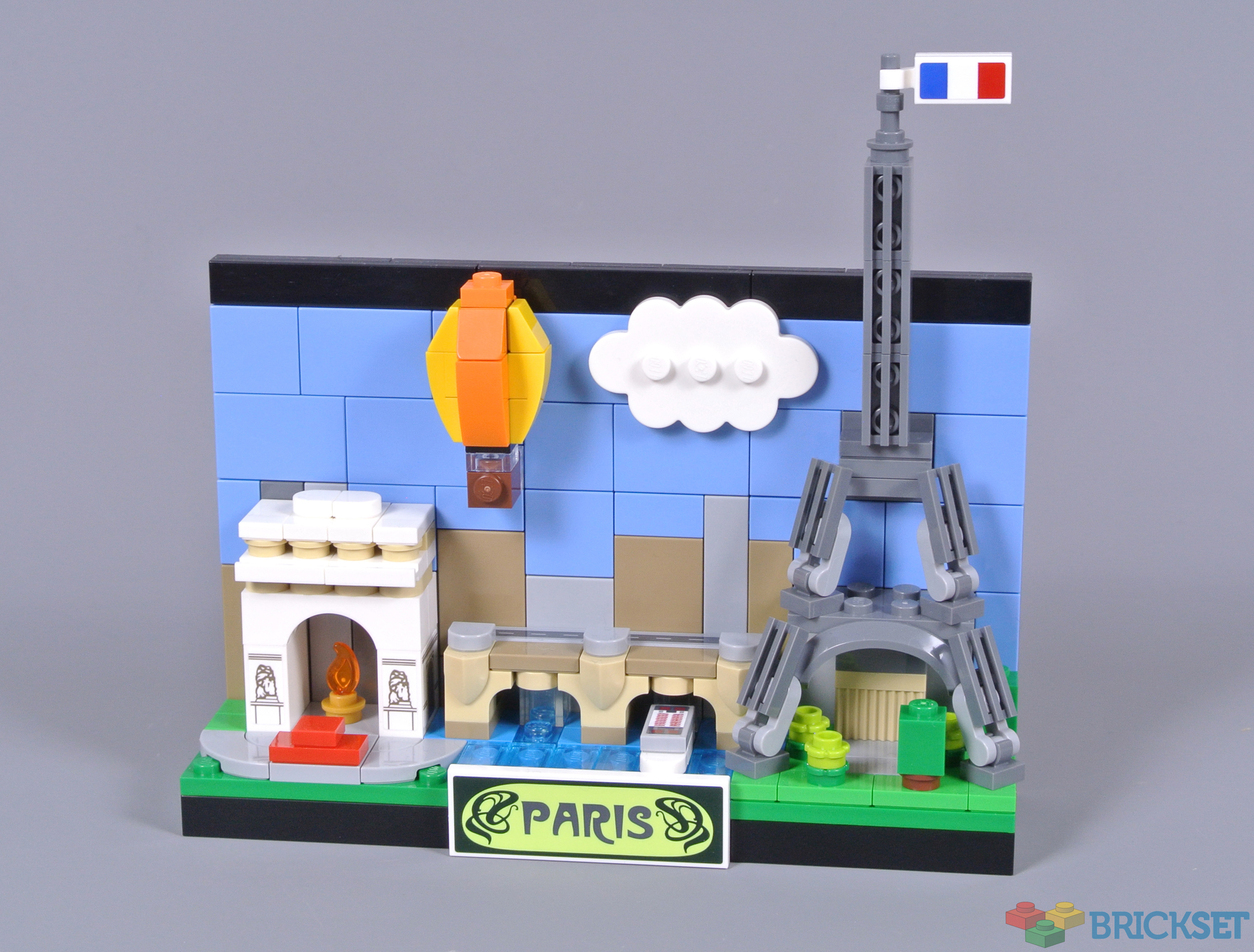
The reverse is undecorated, but neat. The completely flat surface allows easy display against the back of a shelf and I like the black bands along the top and bottom of the vignette, framing Paris' skyline.

Each postcard includes numerous stickers and the Parisian example is no exception, although only eight are needed. My favourite is certainly the identifying nameplate, which approximates the famous Guimard Metropolitain font associated with the Paris metro. The flanking ironwork designs look superb as well.
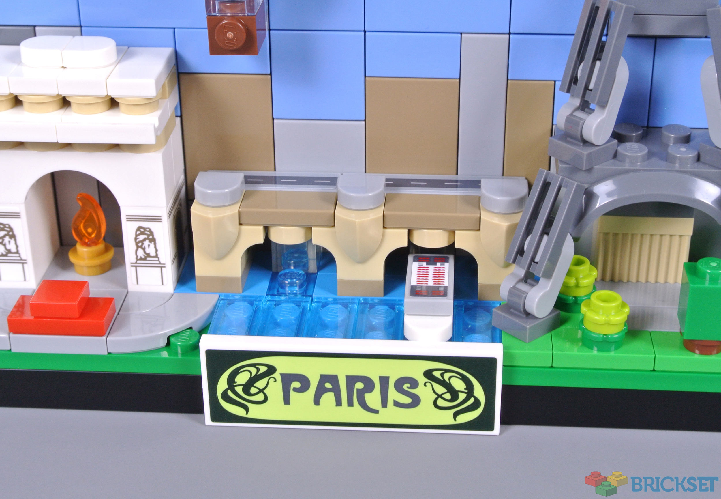
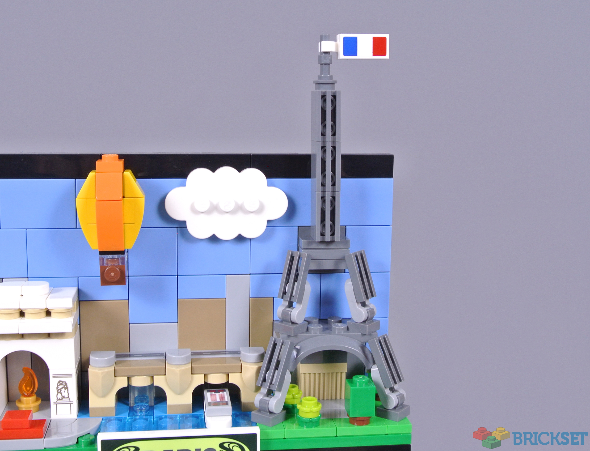
Of course, the Eiffel Tower is Paris' most recognisable landmark. I am reasonably satisfied with this design. Only including half of the structure is disappointing, although understandable given such restricted available space. Nevertheless, I like the lattice texture provided by the 1x2 grille tiles and the narrowing shape looks good, topped by the French Tricolour, which is a sticker.
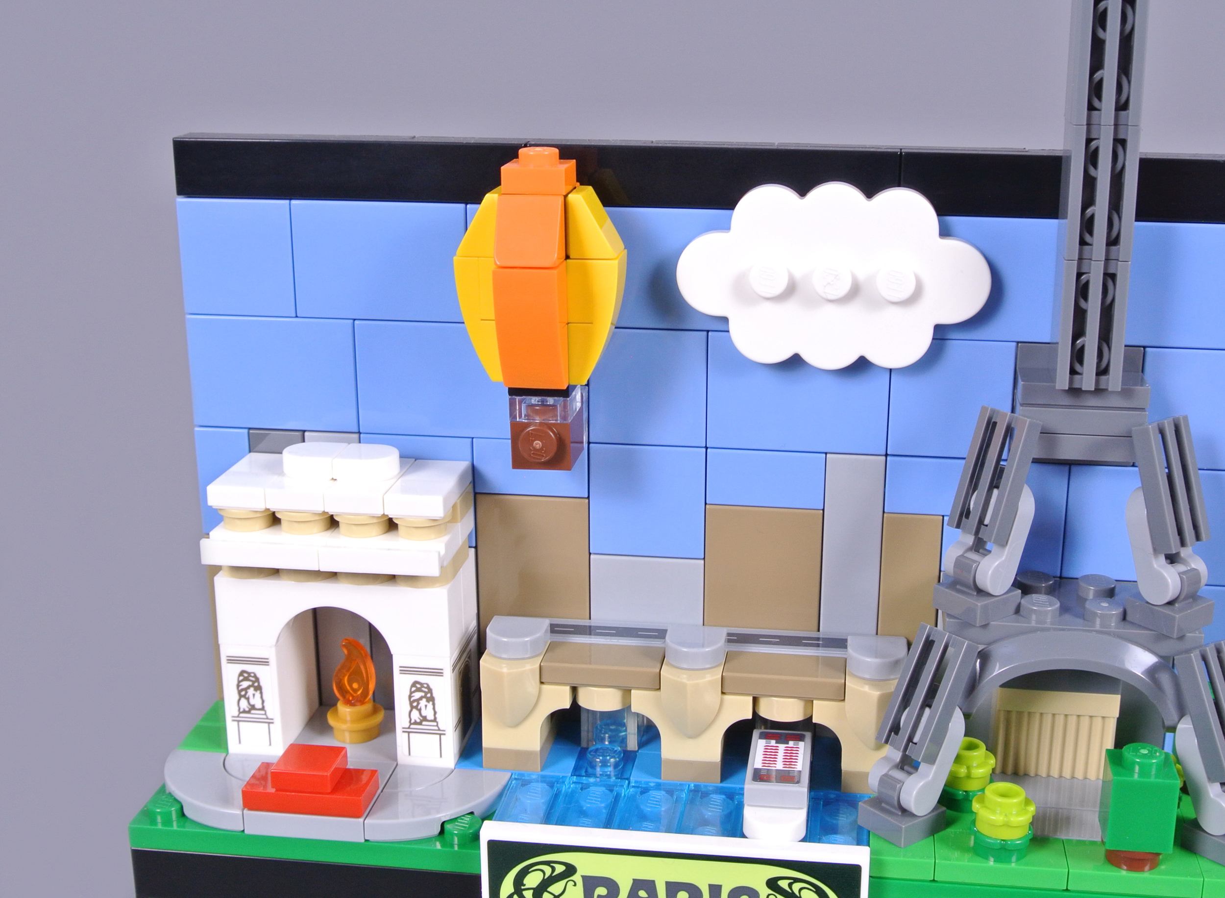
Several iconic bridges cross the River Seine, including Pont Neuf. This rendition of the bridge includes authentic pedestrian refuges and arches, with roadway stickers applied on top. The proportions of the Arc de Triomphe are awkward, although I am pleased the eternal flame is included. Moreover, the hot air balloon is a clever addition, paying homage to the Montgolfier brothers, whose pioneering balloon was launched in Paris during 1783.
Overall
The two previous postcards did not capture my attention, but I like 40568 Paris Postcard and 40569 London Postcard very much. Their vibrant colours are outstanding for display and I am pleasantly surprised by the presence of subtle details, particularly on the Parisian model. Using the Guimard Metropolitain font was ingenious, for instance.
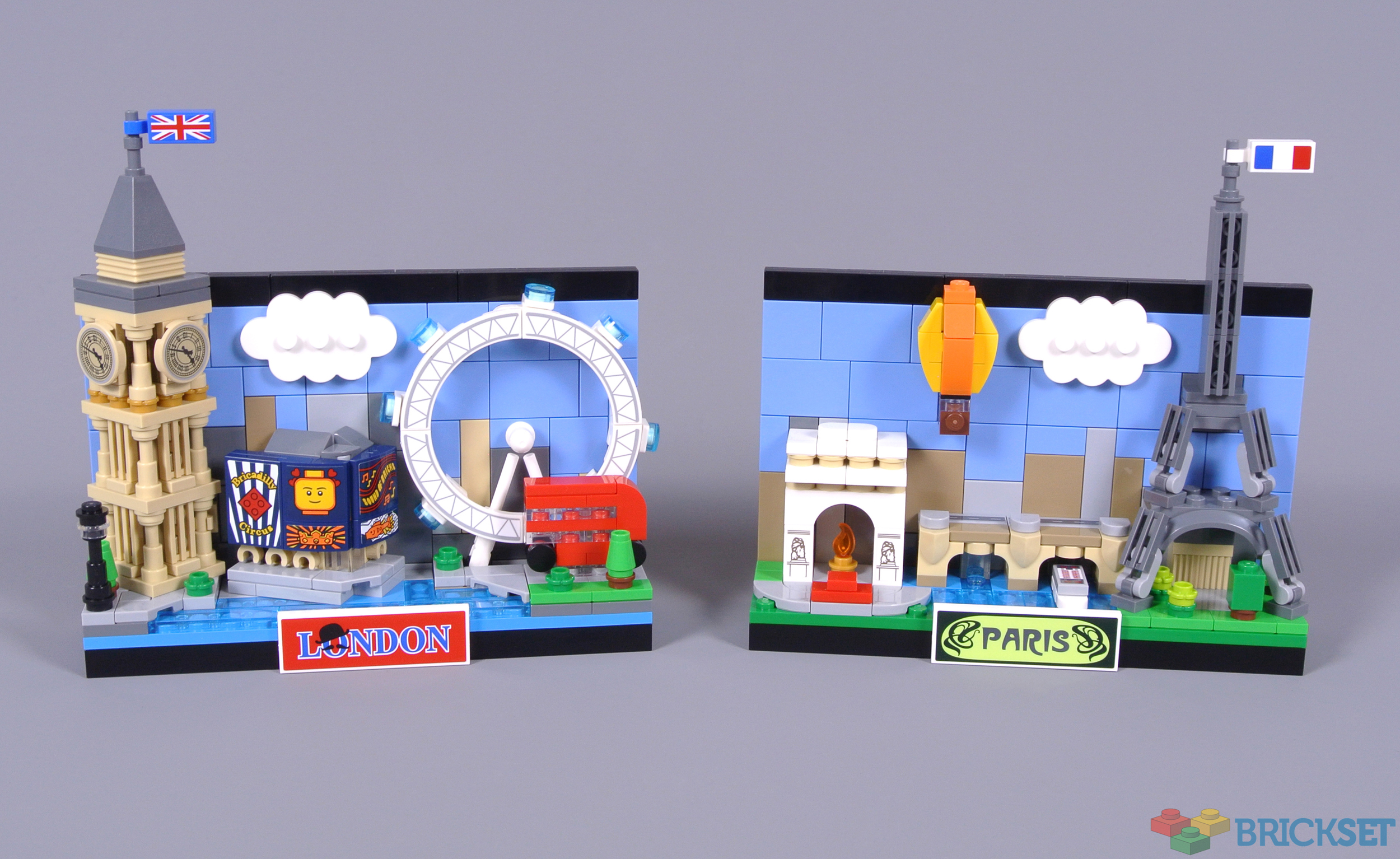
I think the Eiffel Tower seems lacklustre, although I am unsure how that could be substantially improved without expanding the whole postcard, which would spoil the consistency across the series. While not my favourite among them, I like this Parisian postcard and the price of £13.49, $14.99 or €14.99 represents fair value.
72 likes
11 comments on this article
Cool
2 things:
To me, the biggest problem with the Paris postcard is the hot-air balloon. It look like it is deflated and about to plummet to the ground. The new 3x3 round tile used extensively into the Super Mario Theme could be used as a third back layer (in orange) to show a completely inflated yellow and orange stripped hot air balloon.
Second, the region above the bridge is very sparse. That part of the background could have used some depth by adding a few plates behind the lower tiles. (this is less apparent on the London postcard because there is something in the front hiding these details.
Two and a half: not impressed with the square tree as this could be replaced by a minifig head in green - most likely available now since 'everybody is awesome 40516'.
When you see those two side by side, the Paris one looks like half the set. The Eiffel Tower is okayish, but everything else looks rather meh. The proportions of the Arc de Triomphe looks off, the bridge at this scale just looks like any other bridge, and the balloon indeed is a bit weird. Best part of it is the sticker for the name plate....
I would still rank it higher as the Beijing set, but only because it is recognizable as Paris.
I think the issue is the Tower is not front and center. Call it cliche, but that is THE structure most people think of when Paris comes to mind.
It being pushed off to the far side makes it kinda awkward to look at. I know there are more landmarks, but still. It’s not like New York where you picture tons of skyscrapers near a landmark, so you can shuffle things around a bit.
Too much of the “skyline” is visible IMO, it looks bland. Feels like maybe if they’d included Notre Dame that would have “filled things out” more.
They could have also included that black-monolith-of-death skyscraper ;)
These have been pretty cool but the stickers have turned me off from them. Not 100% against stickers but there are very similar products you can buy that aren't LEGO and don't have stickers for decoration.
Should’ve put the Eiffel Tower dead center and design around that. Also make it bigger too.
@PixelTheDragon said:
"I think the issue is the Tower is not front and center. Call it cliche, but that is THE structure most people think of when Paris comes to mind.
It being pushed off to the far side makes it kinda awkward to look at. I know there are more landmarks, but still. It’s not like New York where you picture tons of skyscrapers near a landmark, so you can shuffle things around a bit."
I wonder if it would be possible to place the Tour Eiffel in the centre of the postcard?
@HOBBES said:
"Two and a half: not impressed with the square tree as this could be replaced by a minifig head in green - most likely available now since 'everybody is awesome 40516'."
The square tree is actually correct, square cut trees line the park in front of the tower.
I see the name "Montgolfier", and all I can think of is Monty Python's "Golden Age of Ballooning" skits.
@mtpelepele said:
" @HOBBES said:
"Two and a half: not impressed with the square tree as this could be replaced by a minifig head in green - most likely available now since 'everybody is awesome 40516 '."
The square tree is actually correct, square cut trees line the park in front of the tower.
"
I stand corrected then.
I've been there several times, never noticed - but I accept that this is highly possible.
Edit: did a search, saw the square trees.