Designing a Modular Building from start to finish
Posted by Huw,
This article has been contributed by Pau Padrós:
I’m not very good at keeping promises, am I? About two years ago, I started a series of articles about Modular Buildings here on Brickset. And I say started because… I only did one. Anyway, hope you are well and that you will enjoy this second instalment in the series. This time I won’t make any promises on future articles for my own sake!
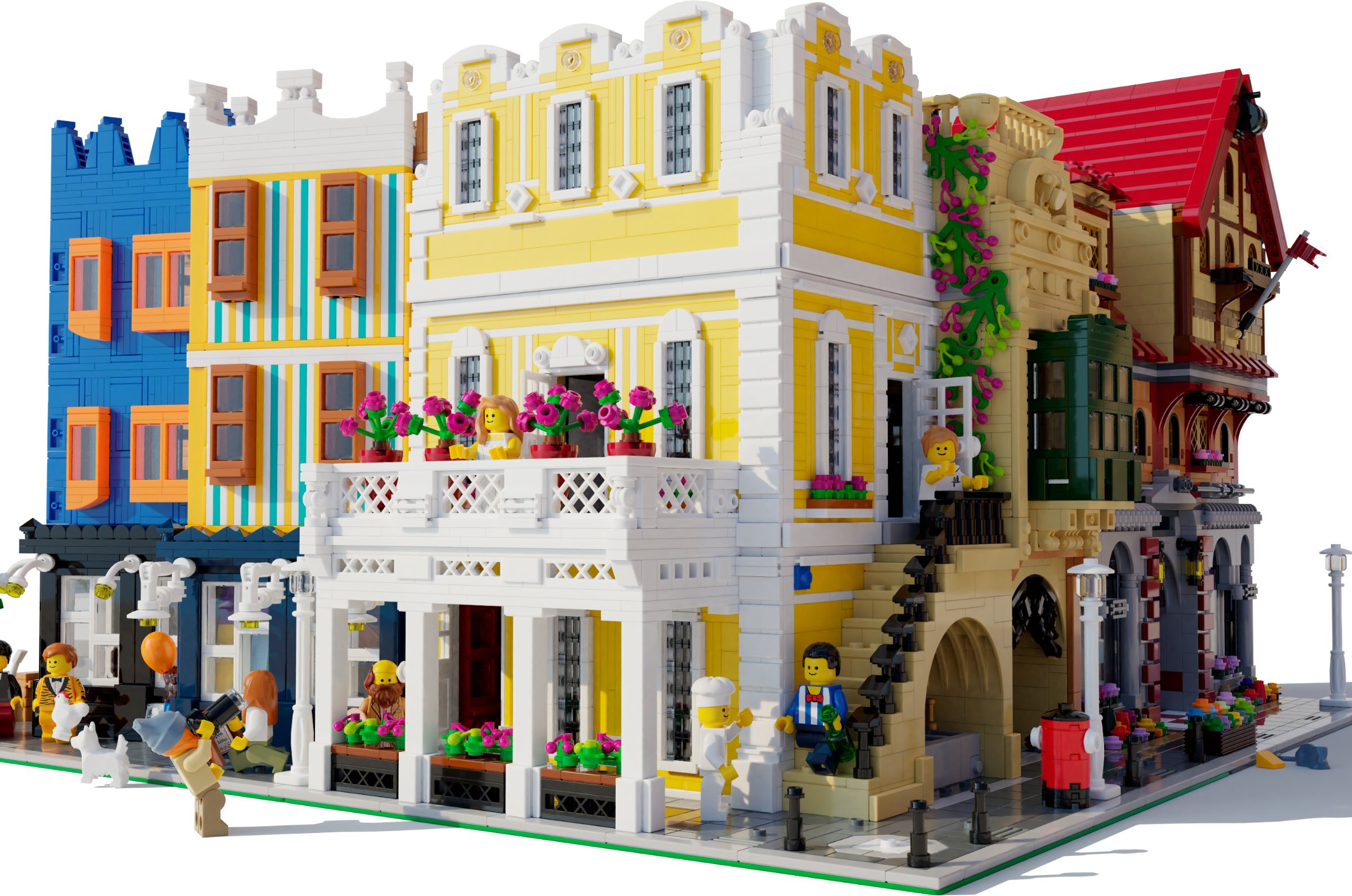
In the first article I discussed a few concepts that I often use to determine the composition of a building. Instead of doing an in-depth analysis of a specific topic again, I thought I’d do a full overview of the process of designing a modular from start to finish. The model that I will be talking you through about is the “Florentine Palazzo”, my twelfth custom modular building. You can download instructions for it for free at Rebrickable.
A Building with a Complicated Origin
This building is the result of joining two projects that I’d been working on. For years, many passionate fans have been asking for instructions to my builds, but sadly, most of my builds were merely digital and didn’t really account for availability of pieces in the required colours. I had been looking into retrofitting my older builds with current pieces for a while and decided to give my second model, the Italian Villa a try first. Awfully outdated techniques and questionable choices made me question if I really should be revisiting my older designs and ultimately chose to abandon the redesign.
Around the same time, I started work on a new modular which would only use pieces currently in production and opt for the more common pieces wherever possible to reduce building costs. I wanted to make a modular building for everyone to build, basically.
The building was to be similar to the Pet Shop (a pair of buildings on two 16x32 baseplates) and to have a distinctly English style. The project was coded “Worcester” because one of the references I was working with were this pair of townhouses in Worcester. At the time, I was also looking into Tudor style houses and typical English suburban homes for inspiration. It’s an interesting concept that might prove fruitful sometime in the future, but at that time I wasn’t quite feeling it and abandoned it as well.
So, that’s when I chose to merge the projects: a brand-new modular with a similar flavour to the Italian Villa. Since it was going to get instructions, I thought about what I would really like to have in my modular display. A companion to the Parisian Restaurant came to mind immediately. I don’t feel like any of the subsequent models match its elegance in shapes and its refined look.
Looking for the Big Picture
Getting the overall image of the building is absolutely key. After all, it’s the main thing that people see, and what will keep them interested to explore other interesting aspects that the building may have. This is why it is important for the building to feel well-thought-out and not a hodgepodge of inspirations without much cohesion. A clear, well-executed, simple idea can work wonders.
As of late, my preferred method of finding inspiration is via drawings. I had been collecting lots of drawings for a while but was reassured of them being a “legitimate” and worthwhile source of inspiration by my fellow modular designer Tong Xin Jun (aka ExeSandBox) with his Corner Bakery, which is pretty much inspired by a single drawing.
Personally, I don’t “translate” real buildings into modulars because I often feel like I’m shooting my creativity in the foot. My approach is most often a mix-and-match of various ideas which merge into a seamless model.
Part of the reason why drawings are now the go-to for inspiration is because they show the idea and often ignore most of the detail (which is mostly noise to me anyway). The main ideas of the building are there, and I can fill in detail with Lego bricks. On top of that, they often use an overexaggerated colour palette, which aligns perfectly with LEGO. They are simply so much easier to picture as finished models.
I often work with a digital board where I place all of the reference material I happen to be working with. This is the one I put together this time around:
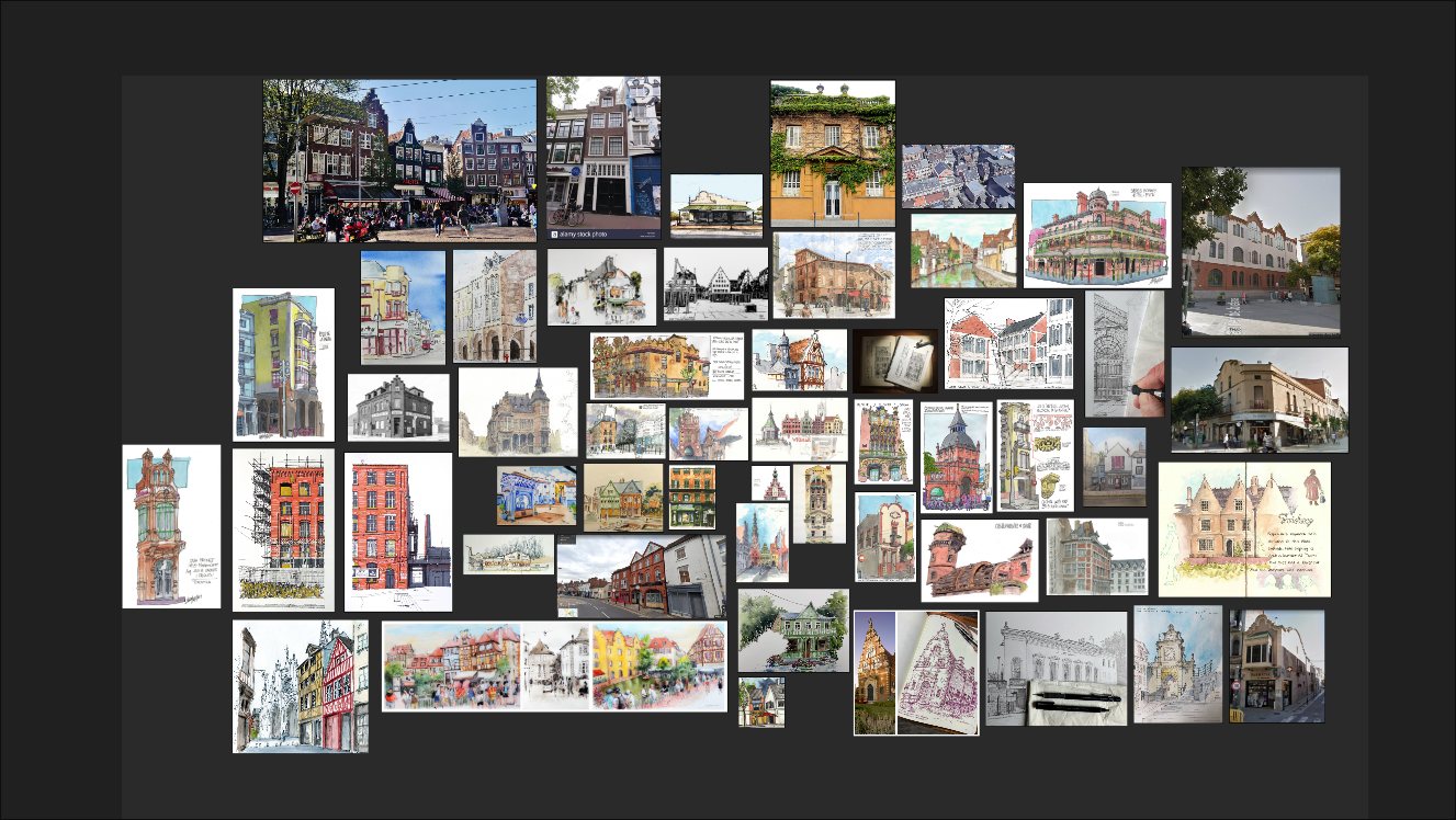
For this model, I used this drawing of a house in the Alsatian town of Colmar as the main source of inspiration. It’s one of those cases where the drawing is the sole reason that I chose this building as main inspiration. I do a lot of Google Maps trips in search for interesting buildings and ideas (or just for fun to be fair!). Colmar is not really a place I would have looked at for inspiration. On top of that, by looking at the original building, it’s unlikely I would have chosen it. It just doesn’t have that something that makes my mind go wild.
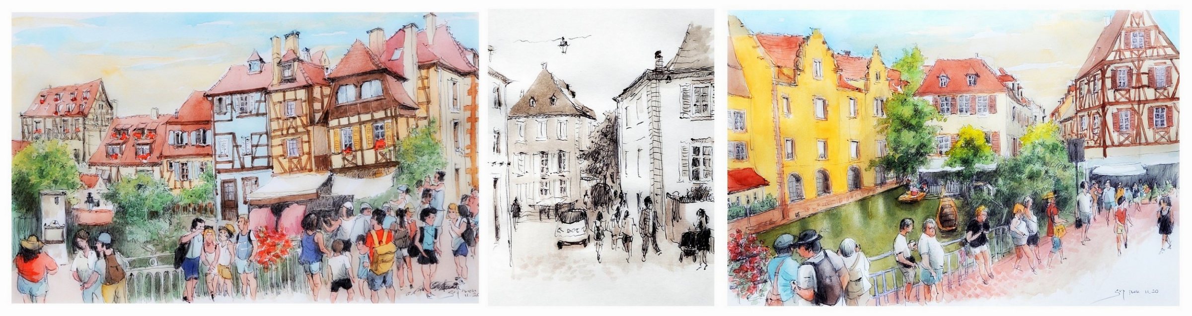
Drawing “Colmar - Alsace - France - rue Turenne” by Guy Moll
On top of referencing real buildings, I often have certain architectural features that I would like to incorporate into the design. From the start, I wanted to incorporate a tan exterior staircase with a small fountain under the steps and an arched alleyway as part of the ground floor. Both the yellow building and the extra architectural features I wanted to add lent themselves better to a corner modular than they would to one in a straight line, as I wouldn’t have had enough space to add all those things without the extra façade space of a corner modular. You might think that the thought process behind choosing a layout is more elaborate than that, but not really!
The origin of the exterior staircase is rather simple. A couple of years ago, we started a collaborative modular with fellow designer Giacinto Consiglio. The design didn’t go past a couple of bricks, but we discussed the idea of a protruding arched gallery accessible via an exterior staircase. The building was to be 48x32, so it would have been a majestic model. The staircase had a little fountain beneath. In fact, it’s a common element that he uses in many of his models and that I’ve always liked. For the longest time, I have wanted to incorporate a similar idea in a modular design of mine and now, I finally have!
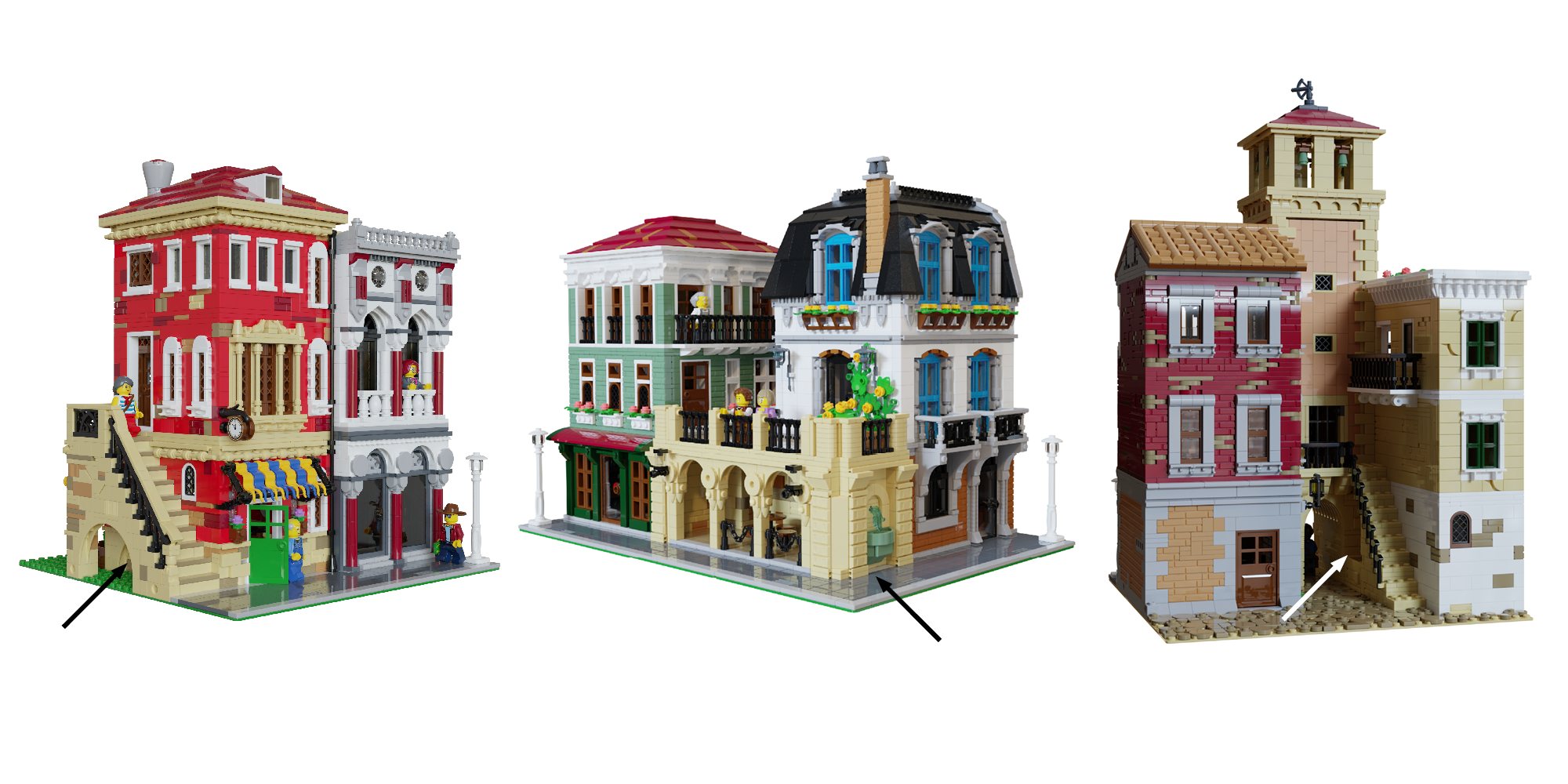
From left to right: Venetian Watchmaker’s and Glass Shop, Corner Terrace and Old Town Tower by Giacinto Consiglio
Behind the fountain, I placed a recreation of the mosaic in the Portaferrissa fountain in Barcelona. I’ve walked past it so many times and every time thought to myself: “That would be so cool to have in a modular!”. Portaferrissa basically means “iron gate” and was the name of one of the eight gates to the second wall of Barcelona. The gate was located where the fountain currently stands, right on the corner of La Rambla.
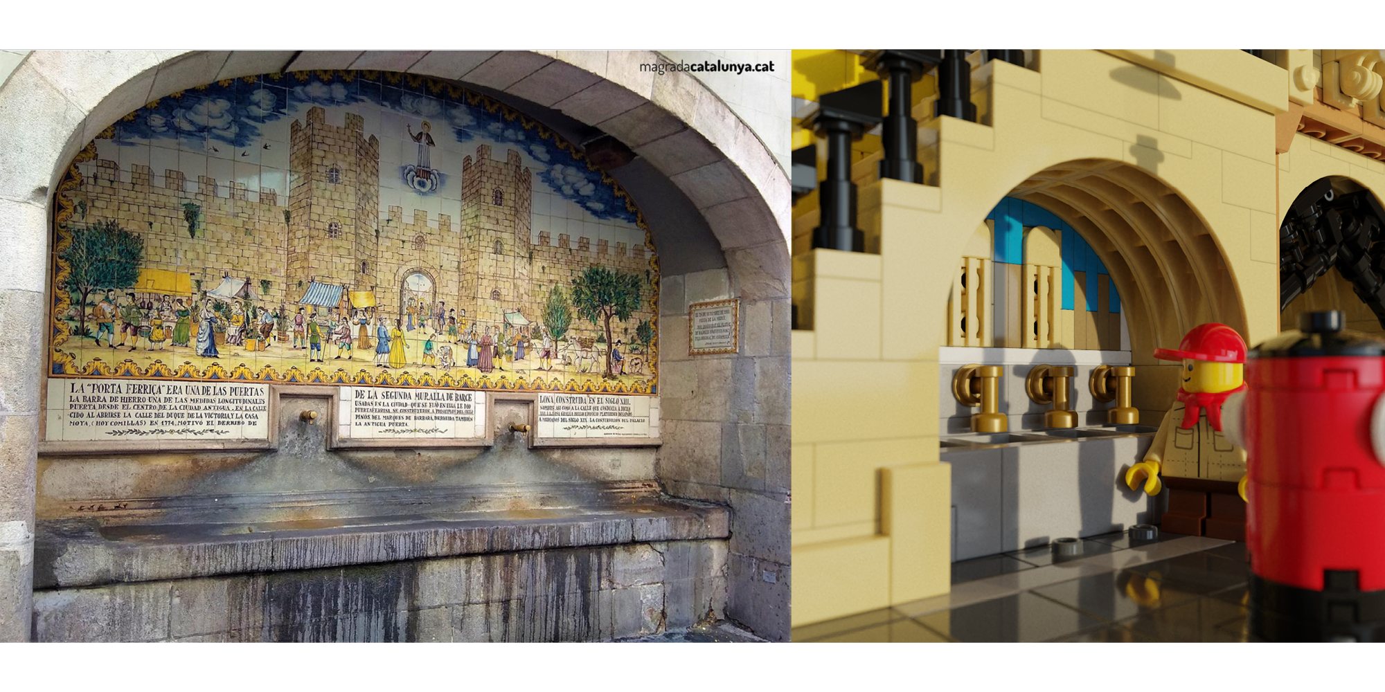
Portaferrissa Fountain (XVII century) and my adaptation for the model.
As for the arched alleyway, it’s an element that adds a lot of interest to the ground floor of a model, making it a lot more playable. It also has the plus that it removes space for interior detail, cutting the number of pieces spent on interior and the price of purchasing bricks (at least, I think of it as a plus). It also adds dimension to what could otherwise be a rather flat design and space for some nice wrought iron detailing.
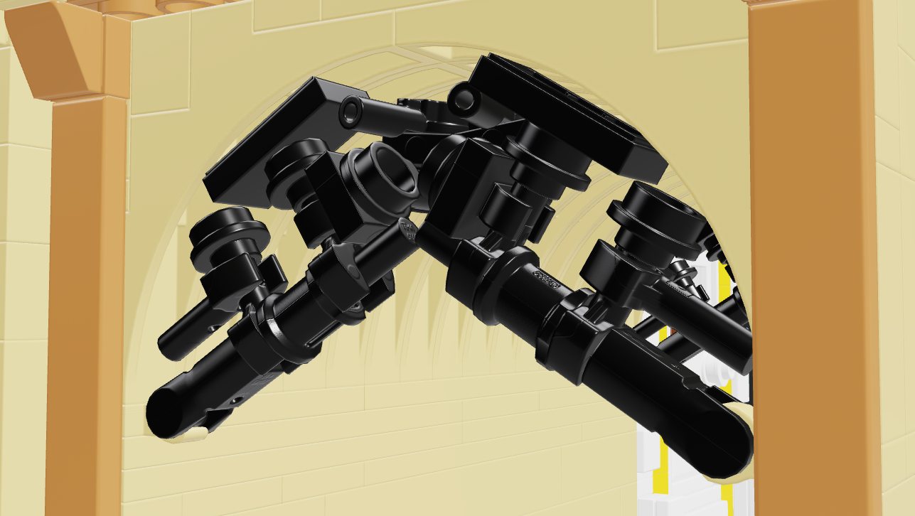
The exact way the ironwork would look (here pictured) is a consequence of experimentation but planning some space for it was done early on. (Mecabricks screenshot)
Figuring Out What Works Best
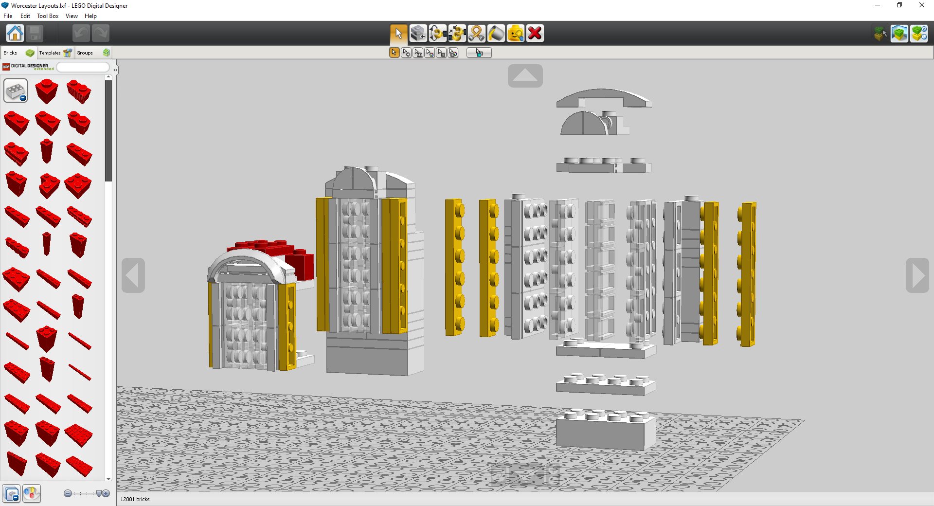
Once the main concept is penned, it’s just a matter of chipping away and finding out what works best for the model in question. In this case, the first thing that I tackled was seeing how I would stitch the various ideas together. Because I build mostly digitally (with checks here and there to make sure that what I’m designing is robust), I can play around with a few ideas before settling on a final one. Here is the LDD workspace for this model
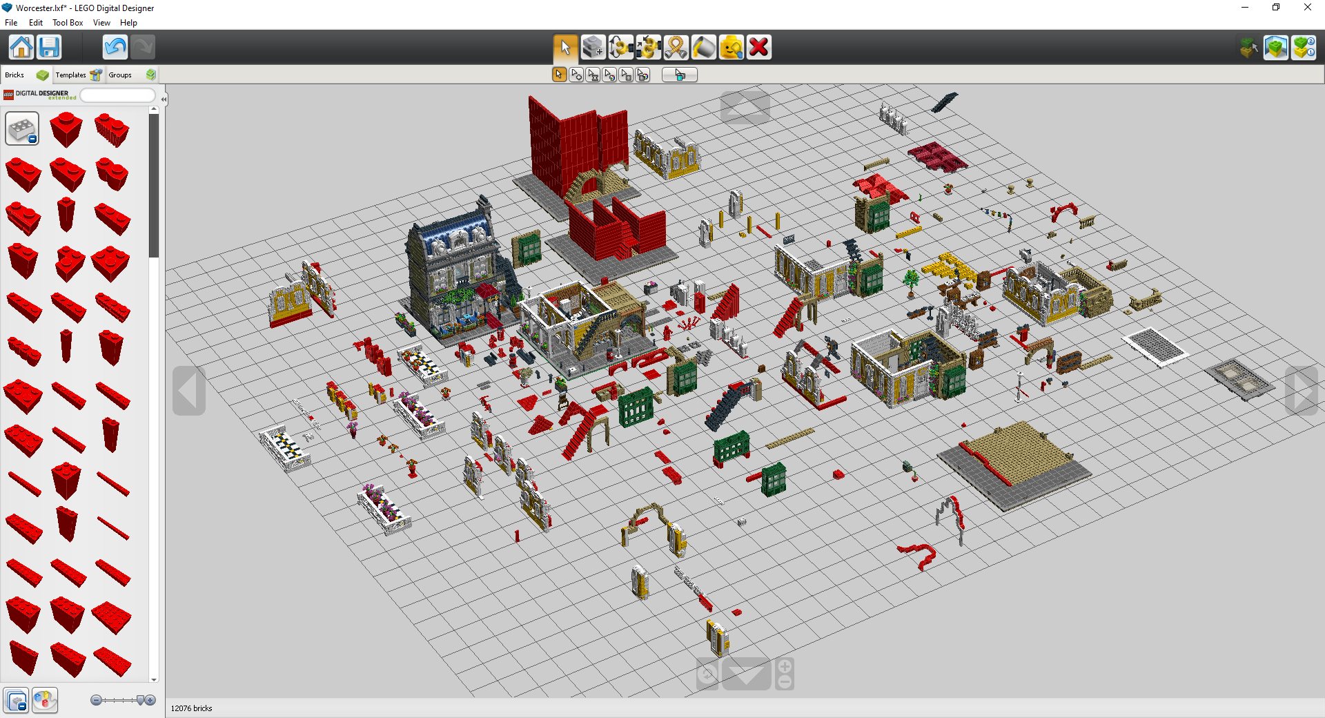
It’s extremely messy! I treat it as if it was a desk, and I was experimenting with the pieces. Thankfully, I don’t have to dismantle everything I’ve built (even if it’s rubbish) and can use it later on for reference. Because I was working with the Parisian Restaurant as reference, I placed it here to compare proportions from time to time too. A few highlights out of this complete mess:
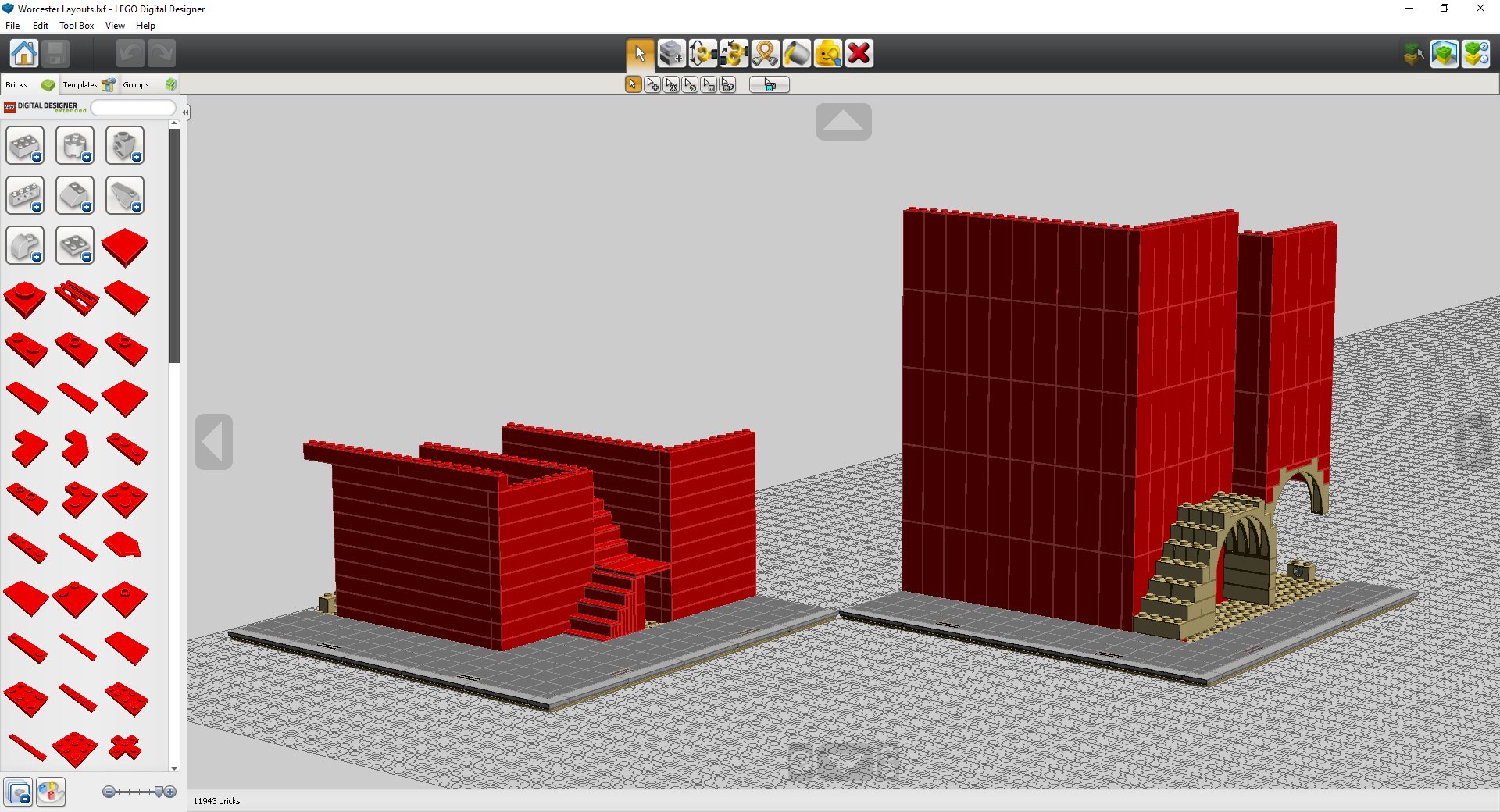
Left: a layout with a staircase with a middle landing. Right: a layout close to the final one. (LDD screenshot)

Drafts for the exterior staircase. As you can see, at first, I tried heavily-SNOTted solutions. I could make it work in this more complex way. But… Why? Simplifying goes a long way. The final design utilises a simple studs-up design. (LDD screenshot)
This is often how I work. The general concept is there, and I go through a bunch of iterations until I’m happy. For the gables of the yellow building, I started with a design far closer to the reference drawing. In my head, the ideal number of gables was three for the long bit and two for the short one.
While I liked how the separate gables looked, they just wouldn’t fit with the space I was working with. That’s why I tried placing them closer together. That changes the character of the building substantially (after all, you need to think that the eye naturally goes top down), but I wouldn’t say it’s a change for the worse.
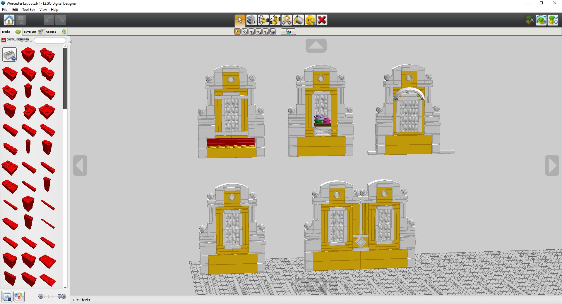
Evolution of the design of the gable roof (from top left to bottom right). The top left is the first design. I already liked it quite a bit, so I only experimented with adding elements, such as flowers and arches. I didn’t like any of them, so I simplified the design (bottom left). The conjoined version (bottom right – aka the final version) is an adaptation of this one. (LDD screenshot)
An important aspect of designing buildings is adding points of interest of varying degree. For example, the gable is a big point of interest, but, within the gable, there is a little round window and a larger window that heighten the effect of the gable. Overpopulating the model with detail might drown the novel concept that you are trying to get across, but not having enough detail makes the model downright boring. It’s one thing that I personally have been guilty of in the past: making the model way too “clinical” and missing that fun leash of colour that makes the models truly come to life. A mix of legibility and fun, interesting details is what I strived for. Because of how technically complex and SNOT-heavy the gables are, the window is entirely brick-built and uses plenty of SNOT.
Because I built this mostly from the top-down, the top floor sets the tone for what to expect elsewhere. On the second floor, there was no need to do SNOT brick-built windows, but since it was the way I’d gone with the top floor (where it was actually the most feasible option), and because visual cohesion is very important, I built a similar design for the windows on the middle floor.
Left: first concept for the window. Middle: Final design of the window. Right: Exploded view of the final design (LDD screenshot)
Not Everything Can Be Planned Out in Advance
In my experience, there often comes a point where most of the concepts and the concrete ideas one had in mind have been built, but the building is not yet complete. In this case, the original drive for the model only went as far as the yellow building and the staircase. Once that was completed, I thought: “well what now?”. The most glaring issue was… well… I was missing an entire side building. Originally, the plan was for this building from the French city of La Rochelle to fill that spot. It was narrow enough to fit that spot and had a fun asymmetrical window arrangement that might add some interest.
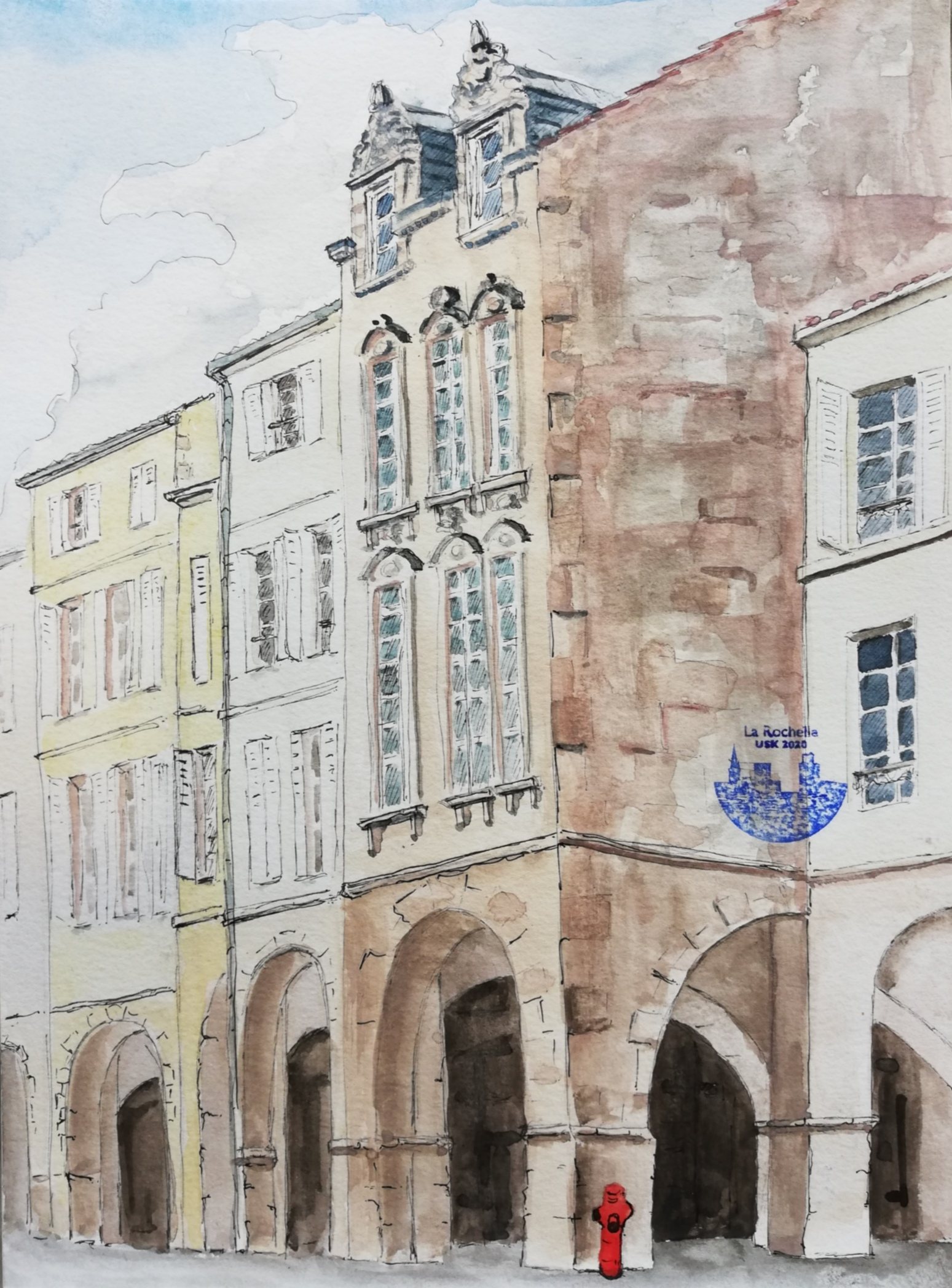
Drawing “La Rochelle Rue des Merciers” by Jean Lumine
Because (you guessed it!) I couldn’t get the design quite to work, I had to look elsewhere for inspiration. Trying the building from La Rochelle did make me quite keen on doing a building in tan (as in emulating limestone). It’s not something I do too often (if you know me, you’ll know I usually go for wacky colours before a more muted palette), so I thought it was a refreshing challenge to do a building in a muted colour and get most of the personality of the building from the detailing and not from the colour. An exercise in restraint if you will. Plus, it gives me that free reign to add plenty of weird pieces such as frogs or droid bodies as carvings.
The architecture of the island of Sicily came to mind as a source of inspiration. Especially that of the towns in the south of the island. And that made me think of a similar architectural style that I had been wanting to build for a while. Maltese architecture offered roughly the same ornate tan façades of Sicily, but with the added interest of colourful timber balconies. It was an obvious choice! The main inspiration for the side building ended up being the Palazzo Ferreria in Valletta, Malta.
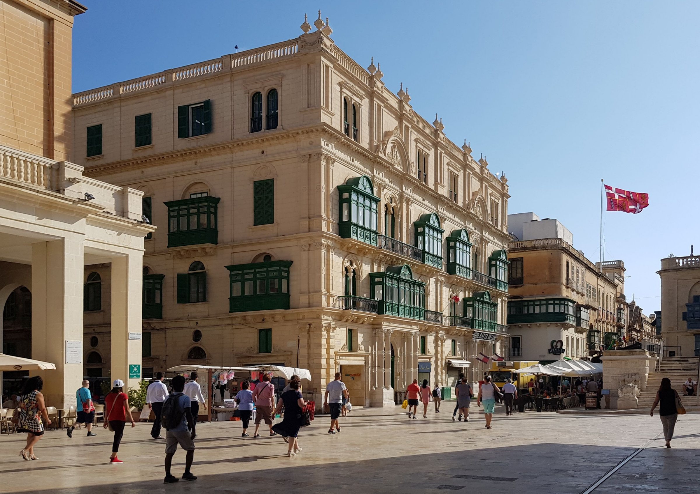
Palazzo Ferreria, 1876, Giuseppe Bonavia
It’s not something I usually do, but to complete this building, I basically sliced up the original building, cherry-picked my favourite bits and put them back together. I think that despite the variety of inspirations, the different concepts are quite well woven together. My favourite part of the building is how the façade keeps stepping back the further up it goes.
Another part of the building that was added later on was the large white balcony on the yellow building. For the longest time, the main yellow palace had a large flat yellow façade. It looked a bit barren. Of course, adding more detail on the façade or something along the lines of an awning or some overhanging flags is a solution, but I felt like something a bit more substantial was needed.
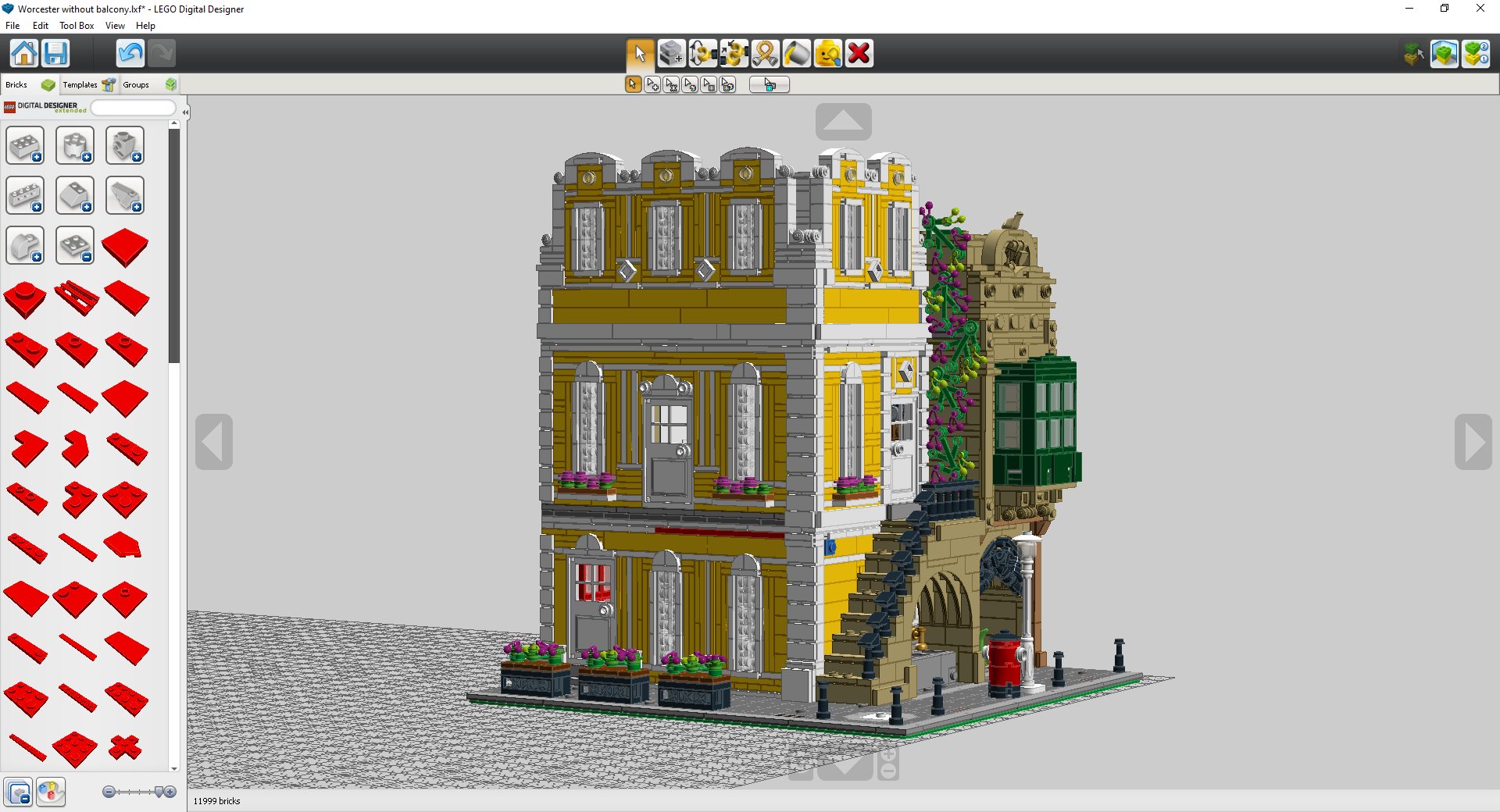
Sadly, it seems like I didn’t keep a copy of the building without the porch, so I’ve had to recreate what it looked like (the flowerpots wouldn’t have been there yet, but it looked way too dull without them!) (LDD screenshot)
A porch is something that was on my bucket list for the longest time. I finally ticked it off with my eleventh modular, the Octan Avenue. Still, having a terrace over the porch is not something I had ever done. I think it adds a needed third dimension to an area of the build that would otherwise appear a bit boring. As a reference to the Italian Villa, this area is fully tiled, just like the rooftop garden of the villa.
Tying All the Elements Together
As I said previously, many times my models have been deemed by some as “cold” and a bit too centred on the concept or the wacky colours to bother about creating an actual atmosphere to the scene. This time I consciously tried to add that life. No area of the model is left unloved.
There are the aforementioned flowerpots between the columns of the porch, potted plants on the porch itself and vines in the corner of the two buildings all in the same shade of purple to add an extra secondary colour. I could have easily used a variety of colours for flowers but the striking effect of having plenty of a single colour is lost.
On top of that, it adds that desired cohesion to the model. Lining the rest of the street, there are bollards, the classic white light posts, bins and post boxes, which only help enhance the cityscape.
Making Sense of the Exterior You Have Built
I do realise I’m rather particular in this matter, but for me interiors always come last. I build the entire building and then decide what to furnish it with. Many builders don’t go about interiors like this at all. For instance, one might decide to build a school and build the exterior so that it matches the mental image one has of a school. Or think about 2015’s Detective’s Office, the ground floor layout (with that space for sliding the barrel) is clearly a consequence of the whole detective/cookie smuggling business at hand.
Originally, I was going to place a Post Office in the building. Lego hasn’t built one yet in modular form, they usually come in grand buildings such as this one… It made sense. Out of curiosity, I asked a friend of mine what he thought about that, and he told me I would be mad if I didn’t put a fancy restaurant on the inside. Seeing how he was so convinced, and how it made sense as a companion piece to the Parisian Restaurant and how the side alley could be seen as a loading bay, I went for it. Admittedly, interiors have never been my best strength, but they turned out quite nicely, I’d say.
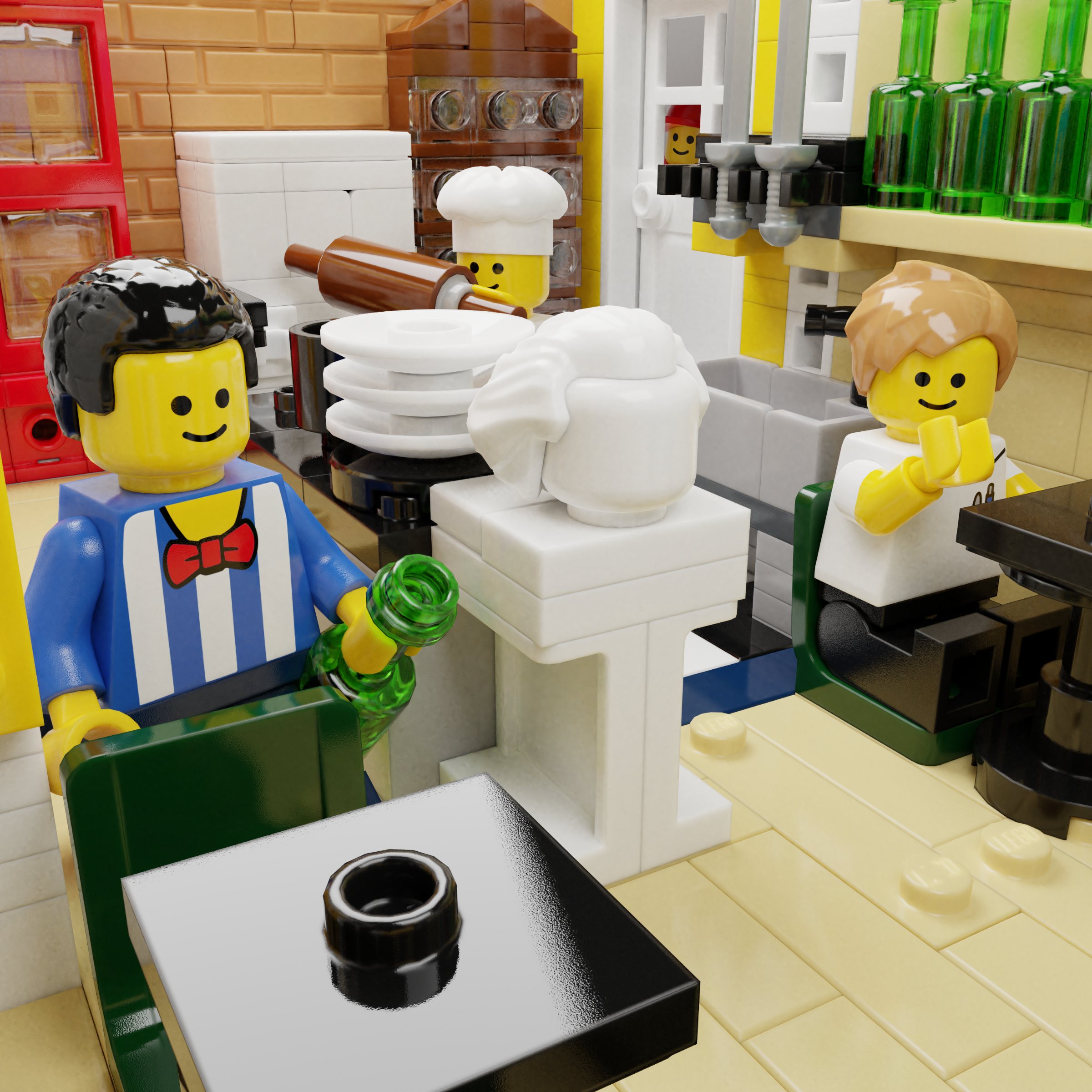
Ideally, the restaurant would extend to the upper levels as well but forcing the waiters up and down that exterior staircase didn’t quite seem right. The first and second floor do link up on the inside, so I thought about what I could fit into the little and dark attic space of the second floor.
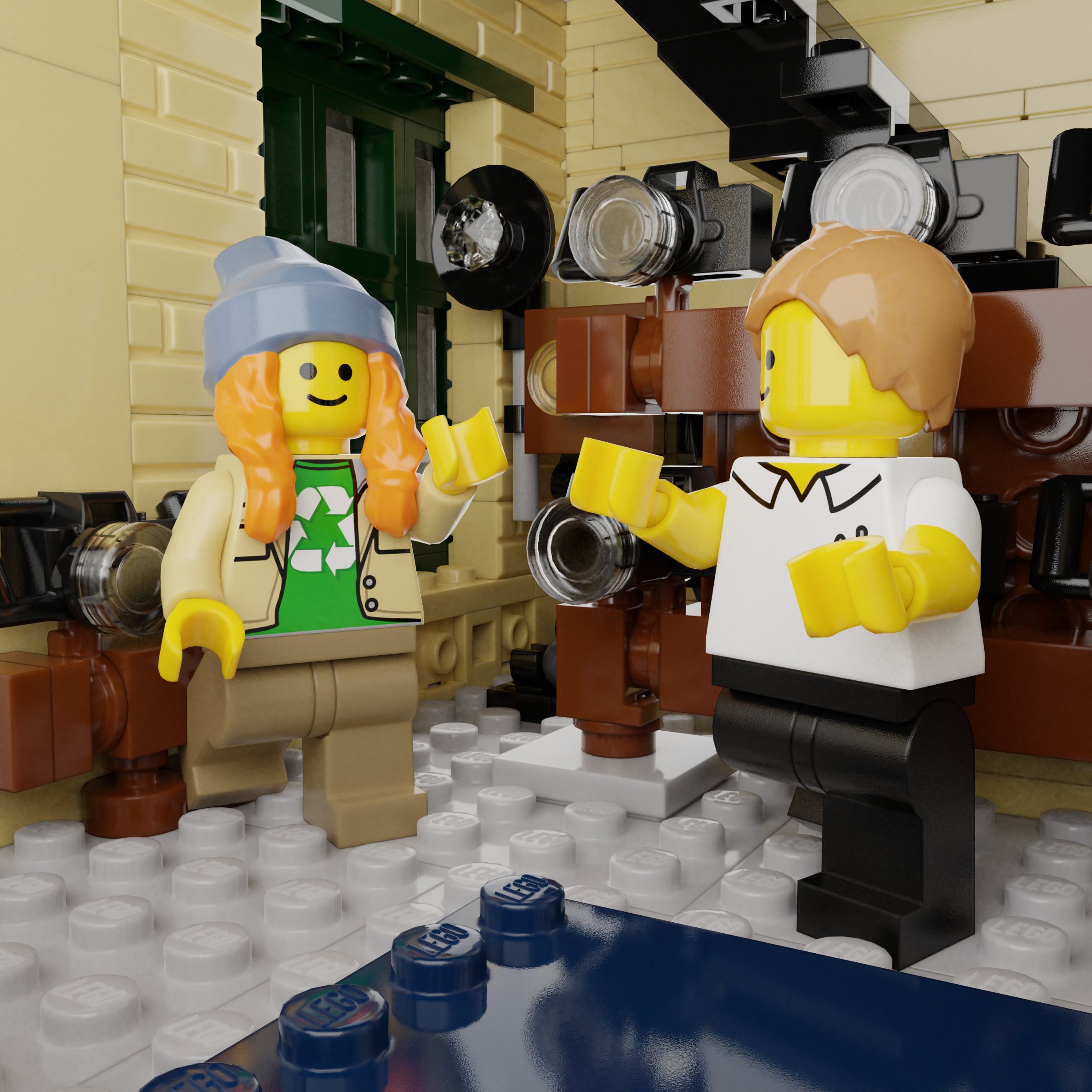
A dark room for developing photographs seemed like a nice choice. Relatively uncommon subject-matter, which makes sense for the space it fills. Check! Oh, if you are wondering “but where are the wires for hanging the freshly developed pictures?”. Studio, where I make the instructions, is awful with flexible parts, so, after much pain, I removed from the model. Then that left the first floor to be the photography shop and studio for the photos to be taken. Plus, it closes the loophole: where did all the cameras in previous modulars come from? Sure, there was a studio in Assembly Square, but that moustached dude surely wasn’t selling the cameras… From the Grand Emporium maybe? No. It would seem like they were all coming from here.
Conclusion
So now you know what the process behind creating one of my modulars is like. It is quite unorthodox and can differ quite a lot from what other people do, but I hope you got some ideas and tricks to apply to your own projects!
Sometimes, when seeing a large build such as the one here mentioned, one might feel a bit taken aback and not really know how to start or get disheartened when things start going wrong. I know I felt like that with my first builds. My advice is: don’t worry! Allow yourself time to learn, explore things that excite you and keep trying different things. And it’s not that steep a learning curve as it may seem at first too. Everyone can build amazing things!
Remember that you can get completely free instructions for this build at Rebrickable.
You can take a look at all my modulars and various other MOCs both on Instagram @paupadrosrios, and on Flickr.
Thank you for reading!
156 likes
24 comments on this article
Most important rule: Make the building in a European style or else people will get ANGEREY about the inconsistency with the rest of them!
@Trigger_
idk man lets see some more non-european architecture for once! it could be fun.
@R1_Drift said:
" @Trigger_
idk man lets see some more non-european architecture for once! it could be fun."
Indeed. My post wasn’t supposed to be taken that seriously but it was the reception some of the more American-looking Modulars got.
Great article.
@Trigger_ said:
"Most important rule: Make the building in a European style or else people will get ANGEREY about the inconsistency with the rest of them!"
ehm... Downtown Diner and Corner Garage? DD was my first modular and I adorated it!
It's the second most beautfiful for me, after only the wonderful Assembly Square
@pazza_inter said:
"Downtown Diner and Corner Garage? DD was my first modular and I adorated it!"
Love the Corner Garage. Just wish 'Joe's Garage' was spelt properly.... if only to keep the Central Scrutinizer happy!
I'm still hoping that one day, the official modular designers will tell us what's the secret ingredient. All those fan modulars look great, but they're missing the little something extra that makes the main line so attractive.
The closest is the new fan-made bowling alley from the Brickset Designer program, but in the end it copied the palette of Downtown Diner.
@Phoenixio said:
"I'm still hoping that one day, the official modular designers will tell us what's the secret ingredient."
The secret ingredient is one Jamie Berard. He gave life to the first several buildings, plus the best of the more recent ones. The complex half-stud offsets in the Detective's Office are genius.
@Mandalorian6285 said:
"Impressive! Were those pictures taken with stud.io? "
The screenshots with the bottom grid are LEGO Digital Designer, but the rest are probably stud.io.
@Mandalorian6285 said:
"Impressive! Were those pictures taken with stud.io? "
Hi! The screenshots are LDD, except for one that is from Mecabricks. The renderings are done in Blender, exporiting from Mecabricks :)
On your next Google Maps trip check out Oamaru, New Zealand, especially the south end of the main street - there's some inspiration to be found there!
@Phoenixio said:
"I'm still hoping that one day, the official modular designers will tell us what's the secret ingredient. All those fan modulars look great, but they're missing the little something extra that makes the main line so attractive.
The closest is the new fan-made bowling alley from the Brickset Designer program, but in the end it copied the palette of Downtown Diner."
I've been wondering this myself. I have one custom modular on my modular street, and I certainly notice how it's missing that special something.
After looking at a bunch of the post-Parisian modulars, I think a focal segment of the facade is one of the secret ingredients. Here are some exaples of what I am talking about: The teal arch section of the diner, the two forward facades of the Detective's office, the tower of assemby square, the balcony window in the middle of the Parisian Restaurant (with the Whole building being smaller than it's footrpint, I could say that the building itself is the focal point), etc . . .
In my eyes, these give the official modulars a "face", not in the sense of pareidolia, but in the sense that they have personality and distinct features that can be recognized at a glance before looking into the deeper details. You could doodle the key lines of the building and someone would look at it and say - Oh! That's downtown diner! I think many fan-made ones miss this, and I'm strongly considering refreshing mine to add this feeling to it.
I'm also noticing something of a "diverse corners" effect, where you divide the building with a horizontal line between the first and second floors, and a vertical line down the middle. No two quadrants are quite the same - they may share some baselines, but they each have one key difference that makes them stand out from the other 3 quads.
I'd love to put more heads together to figure out the other secret ingredients and throughlines that make those official ones so charming!
Beautiful! It actually reminds me of the buildings in Lisbon. They love their pastel colored buildings. Thanks for the article
Really interesting article and a lovely looking modular! Thanks, @Paupadros!
@sjr60 said:
" @pazza_inter said:
"Downtown Diner and Corner Garage? DD was my first modular and I adorated it!"
Love the Corner Garage. Just wish 'Joe's Garage' was spelt properly.... if only to keep the Central Scrutinizer happy!"
He used to cut the grass. He was a very nice boy.
@Phoenixio said:
"I'm still hoping that one day, the official modular designers will tell us what's the secret ingredient. All those fan modulars look great, but they're missing the little something extra that makes the main line so attractive.
The closest is the new fan-made bowling alley from the Brickset Designer program, but in the end it copied the palette of Downtown Diner."
I feel the same, it's hard to describe the secret ingredient, the finishing touch the offical modulars have and the fan ones not.
The fan ones either feel a bit plain in design and color when reflecting the real life sample way too much or sometimes too rich in design and color on the other side. Or you can just see the color palette mirroring something from the past or being way off when compared to standard Lego modular sets.
When you see an official modular it's clear on the first view it has been designed by Lego, there is no doubt about it. Lego also introduces new building techniques, but they never use them too much to gain real focus. Fan modulars very often either use already introduced building techniques, use them way too much or try to introduce new ones which are usually considered forbidden techniques.
Very interesting. Thanks for taking the time to take us along in this process
Great article, like most art projects an exhausting process. Love the stairs, fountain and building squeezed behind. To obtain the detailed effect there seems to be a lot of sideways plate building, but the number of pieces rapidly increases to 3490! Will be interesting to see if any photos appear on Rebrickable although their calculator says 300 to 400 euros will obtain 80%-88% of the parts from a particular Brickowl shop, depending on which country you are in. So the last 10% will be tricky and require multiple shops, unless you have a vast spares selection already.
@Phoenixio said:
"I'm still hoping that one day, the official modular designers will tell us what's the secret ingredient. All those fan modulars look great, but they're missing the little something extra that makes the main line so attractive.
The closest is the new fan-made bowling alley from the Brickset Designer program, but in the end it copied the palette of Downtown Diner."
I've found that the designs by Brickative https://brickative.shoplo.com/ and Bricks & Tiles https://bricksandtiles.jimdo.com/about-1/ are pretty spectacular. So far I've built the Cuba Hotel and Chrystal Shop, and I love them, though some parts (Cuba) or the sheer quantity of them (CS) got pretty expensive.
@Trigger_ said:
"Most important rule: Make the building in a European style or else people will get ANGEREY about the inconsistency with the rest of them!"
So true, so very true.
Excellent article, which generates excellent discussions. Thank you.
It's so impressive that there are people who put in this much effort and then offer their designs for free, absolutely amazing.
Great article, thank you!
Interesting and long read! Thank you.
People have different tastes, I'm not particularly a fan of modern building styles and do prefer the European style. I don't get angry, and the modern styles are ok, but for me personally they're not really to my taste.
However, I've recently discovered Brickcrafts (I'm a bit slow on the uptake) and his buildings and indeed city, is mindblowing.