Disney Advent Calendar - Day 4
Posted by MeganL,
Yesterday we met Ariel, our second princess of the calendar. I thought I was the only one who had issues with the Disney font. However, I've always thought the last letter looked like an "x" rather than a "p".
Getting back to the issue at hand, I expect we'll find something relating to The Little Mermaid story behind Dax 4.
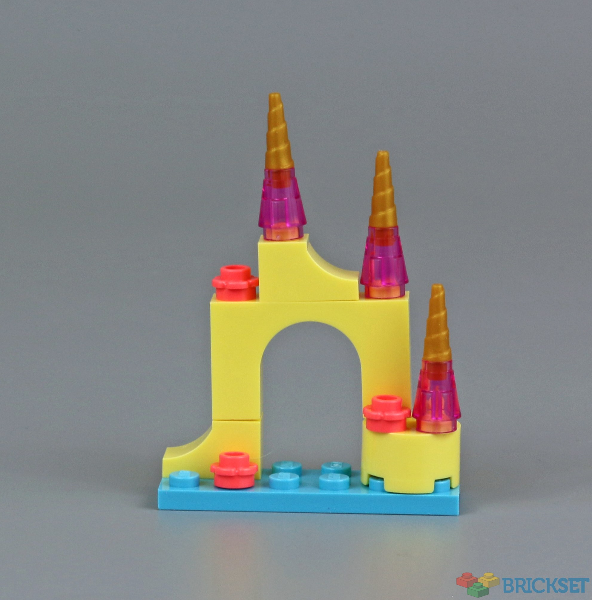
It's a miniature version of Ariel's castle! Several key details are included, and I really like the use of the gold horn pieces for the castle spires. The blue plate at the base certainly set the tone for this being a castle in the sea.
It looks like the calendar will be focused on items from the various movies - I hope there will be some festive builds in here somewhere!
40 likes
20 comments on this article
Where is the phallic spire?
Works for background scenery I suppose but it’s more like ruins than an actual palace
It *does* look like a dancing X...
Looks like someone pressed publish a little prematurely today. That, or there's a bigger announcement due later today instead.
I understand that previous days advent articles are removed from the homepage to reduce clutter, but would it be possible to include a direct link to the previous day somewhere in the article for people to refresh their memory or catch up if they missed a day? Currently we have to browse the advent countdown tag to find them.
The Disney font is certainly unique, but I suppose that's the point. The Y bares a stronger resemblance to a P to me, although, with it now pointed out, I can see the X at a push. Even the 4 looks more like a lower case q, or, fittingly for today's build, a warped trident.
Conversely, the D has always been a D to my eyes.
I really liked it. I love the pastel yellow and the transparent pink pieces, and I thought, even with the limitations of advent calendar builds, that they gave us a pretty decent approximation of an undersea palace in miniature scale.
@BrickBob09 said:
"I understand that previous days advent articles are removed from the homepage to reduce clutter…"
Not today they haven’t. I’ve still got all six Day 3 Advent Calendar articles, plus Day 4 for Disney and Friends showing on the front page together. @Huw? @MeganL?
@PurpleDave said:
" @BrickBob09 said:
"I understand that previous days advent articles are removed from the homepage to reduce clutter…"
Not today they haven’t. I’ve still got all six Day 3 Advent Calendar articles, plus Day 4 for Disney and Friends showing on the front page together. @Huw? @MeganL?"
Possibly due to today's being posted early?
@b2_O said:
"Where is the phallic spire?"
Nice reference. Most epic notice ever given by a graphic designer to date.
You could always mod yours with:
https://brickset.com/parts/4501535/technic-crossblock-2x3
That's a big hole in the middle for the scale
This is so pretty; love the colours!
This reminds me of Magic Rocks.
https://www.thoughtco.com/make-your-own-magic-rocks-607653
Oops, once you have seen it as a hockey goal, it becomes impossible to unsee it.
@StyleCounselor said:
" @b2_O said:
"Where is the phallic spire?"
Nice reference. Most epic notice ever given by a graphic designer to date.
You could always mod yours with:
https://brickset.com/parts/4501535/technic-crossblock-2x3
"
I thought of the phallus as well, but the "disgruntled artist" thing is an urban legend.
https://www.snopes.com/fact-check/phallus-purposely-added-artwork-little-mermaid-vhs-cover/
@Prairiebricker: You're right, it does look like Magic Rocks.
@BrickBob09 said:
"Looks like someone pressed publish a little prematurely today. That, or there's a bigger announcement due later today instead.
I understand that previous days advent articles are removed from the homepage to reduce clutter, but would it be possible to include a direct link to the previous day somewhere in the article for people to refresh their memory or catch up if they missed a day? Currently we have to browse the advent countdown tag to find them.
The Disney font is certainly unique, but I suppose that's the point. The Y bares a stronger resemblance to a P to me, although, with it now pointed out, I can see the X at a push. Even the 4 looks more like a lower case q, or, fittingly for today's build, a warped trident.
Conversely, the D has always been a D to my eyes."
I will add the previous three days to related articles at the bottom of the page, under the comments section.
@PurpleDave said:
" @BrickBob09 said:
"I understand that previous days advent articles are removed from the homepage to reduce clutter…"
Not today they haven’t. I’ve still got all six Day 3 Advent Calendar articles, plus Day 4 for Disney and Friends showing on the front page together. @Huw ? @MeganL ?"
Yes, we are publishing early today to accommodate a review later. Advent Countdown articles are normally published on the homepage for 24 hours, so one disappears when the next is published, but there is a bit of overlap today because we moved the articles forward.
@CapnRex101:
Got it. It’s just that inconsistency on this site is often the first sign that something went wrong in the background, so you had us freaking out a bit.
@TheOtherMike said:
" @StyleCounselor said:
" @b2_O said:
"Where is the phallic spire?"
Nice reference. Most epic notice ever given by a graphic designer to date.
You could always mod yours with:
https://brickset.com/parts/4501535/technic-crossblock-2x3
"
I thought of the phallus as well, but the "disgruntled artist" thing is an urban legend.
https://www.snopes.com/fact-check/phallus-purposely-added-artwork-little-mermaid-vhs-cover/
@Prairiebricker : You're right, it does look like Magic Rocks."
The citations in that article are dubious at best. Worse, the article provides no specifics or even proper names, like John, Thomas, or Richard.
My brother has been deeply inside the graphic design community (including movie poster and ad production) since that time. Back then, it wasn't very large. He sticks with the original ballsey tale.
There's another stronger and harder version with better sources that admits the design was intentional but not spiteful. The artist is now dead and limp, so the phallus with have to stand up firm for itself.
https://entertainment.inquirer.net/318789/phallic-symbol-in-the-little-mermaid-artwork-was-approved-by-execs-disney-artist-says
@CapnRex101 said:
" @BrickBob09 said:
"Looks like someone pressed publish a little prematurely today. That, or there's a bigger announcement due later today instead.
I understand that previous days advent articles are removed from the homepage to reduce clutter, but would it be possible to include a direct link to the previous day somewhere in the article for people to refresh their memory or catch up if they missed a day? Currently we have to browse the advent countdown tag to find them.
The Disney font is certainly unique, but I suppose that's the point. The Y bares a stronger resemblance to a P to me, although, with it now pointed out, I can see the X at a push. Even the 4 looks more like a lower case q, or, fittingly for today's build, a warped trident.
Conversely, the D has always been a D to my eyes."
I will add the previous three days to related articles at the bottom of the page, under the comments section.
@PurpleDave said:
" @BrickBob09 said:
"I understand that previous days advent articles are removed from the homepage to reduce clutter…"
Not today they haven’t. I’ve still got all six Day 3 Advent Calendar articles, plus Day 4 for Disney and Friends showing on the front page together. @Huw ? @MeganL ?"
Yes, we are publishing early today to accommodate a review later. Advent Countdown articles are normally published on the homepage for 24 hours, so one disappears when the next is published, but there is a bit of overlap today because we moved the articles forward. "
Thanks Cap, this is why I love this site.
Walt Disney: Writes a sloppy signature on some random document
The timeline in 100 years:
(Seriously, though. Have you seen his normal signature? Who decided to use the sloppiest one ever for the Disney font?)
@Username28 said:
"Walt Disney: Writes a sloppy signature on some random document
The timeline in 100 years:
(Seriously, though. Have you seen his normal signature? Who decided to use the sloppiest one ever for the Disney font?)"
Probably the guy whose name is in the company logo.
@PurpleDave said:
" @Username28 said:
"Walt Disney: Writes a sloppy signature on some random document
The timeline in 100 years:
(Seriously, though. Have you seen his normal signature? Who decided to use the sloppiest one ever for the Disney font?)"
Probably the guy whose name is in the company logo."
While he was alive, the logo was a perfectly normal signature. It was only six years after he died that they decided to replace it with the stupid one!
Gisnep, Disnex, doesn't matter. It's been a bad font/logo since it's inception.