LEGO Ideas: Original Projects vs. Final Sets (2022 update)
Posted by CapnRex101,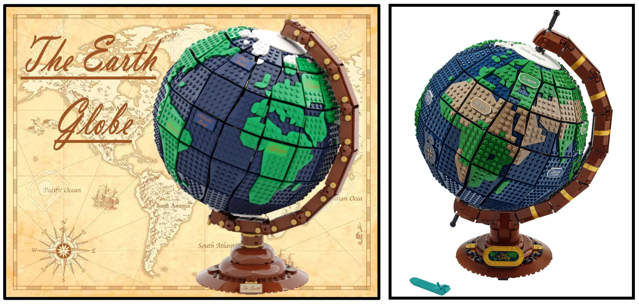
Differences between LEGO Ideas submissions and official products are consistently discussed whenever new Ideas designs are revealed, thus we published an article which documents such changes during 2021.
Seven further Ideas products have been announced since that article was published, inviting comparison between each official set and the original Ideas submission which inspired them.
21326 Winnie the Pooh
Winnie the Pooh by benlouisa
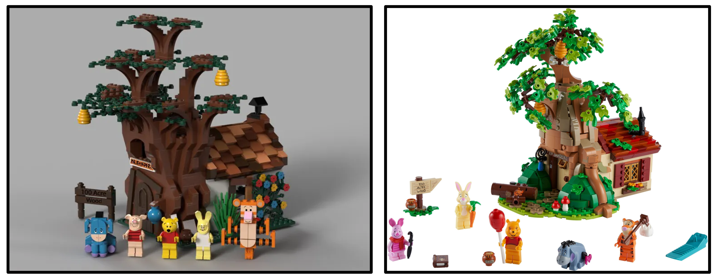
Similarity Score - 6/10 - Ben Alder's rendition of Winnie the Pooh's charming house evidently influenced the eventual design. However, the official model features brighter colours and more elaborate building techniques, recalling changes implemented during the development of 21318 Tree House. Nevertheless, the fundamental layout and size remained broadly intact.
21327 Typewriter
LEGO Typewriter by Steve Guinness
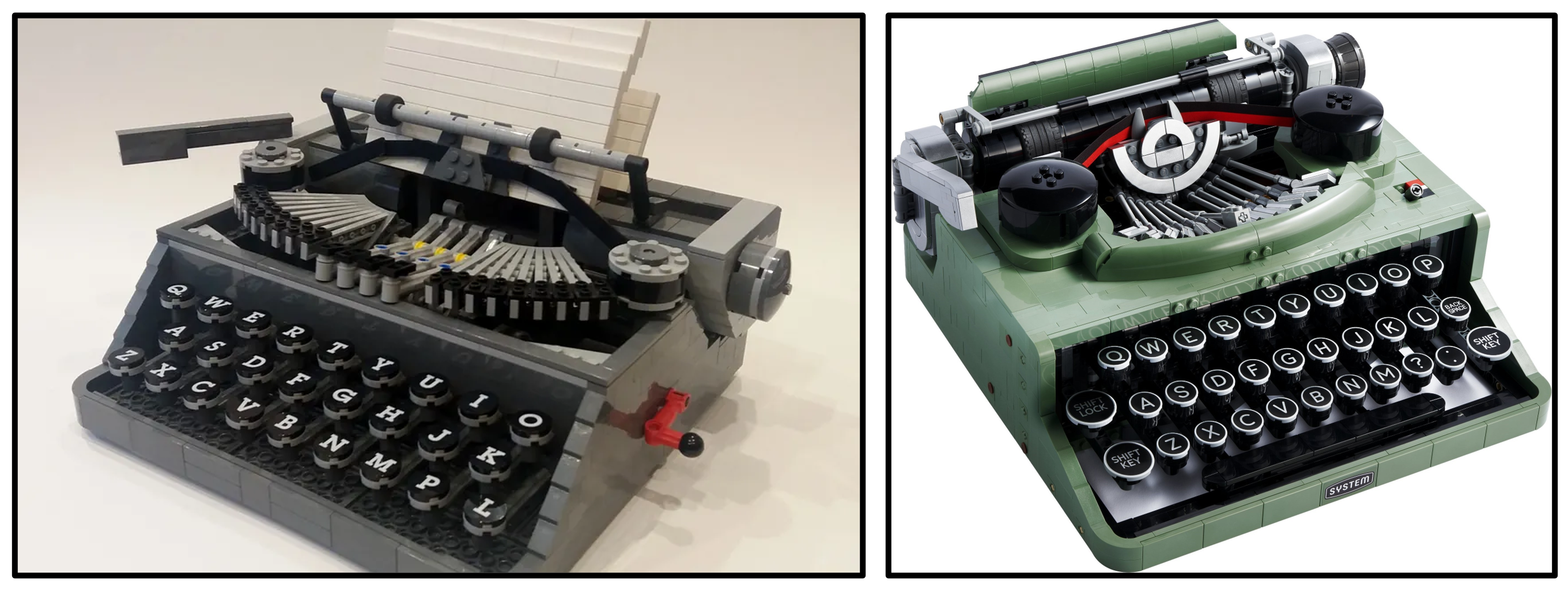
Similarity Score - 4/10 - While the realistic scale and proportions of Steve Guinness' typewriter were maintained for the final model, considerable alterations are also apparent. Beyond the cosmetic changes to colour and mechanical detailing, the internal mechanism became much more advanced and introduced the 'functional' keys. However, it should be acknowledged that Steve did present a sand green typewriter as an update on LEGO Ideas.
21328 Seinfeld
Seinfeld 30th Anniversary by BrentWaller
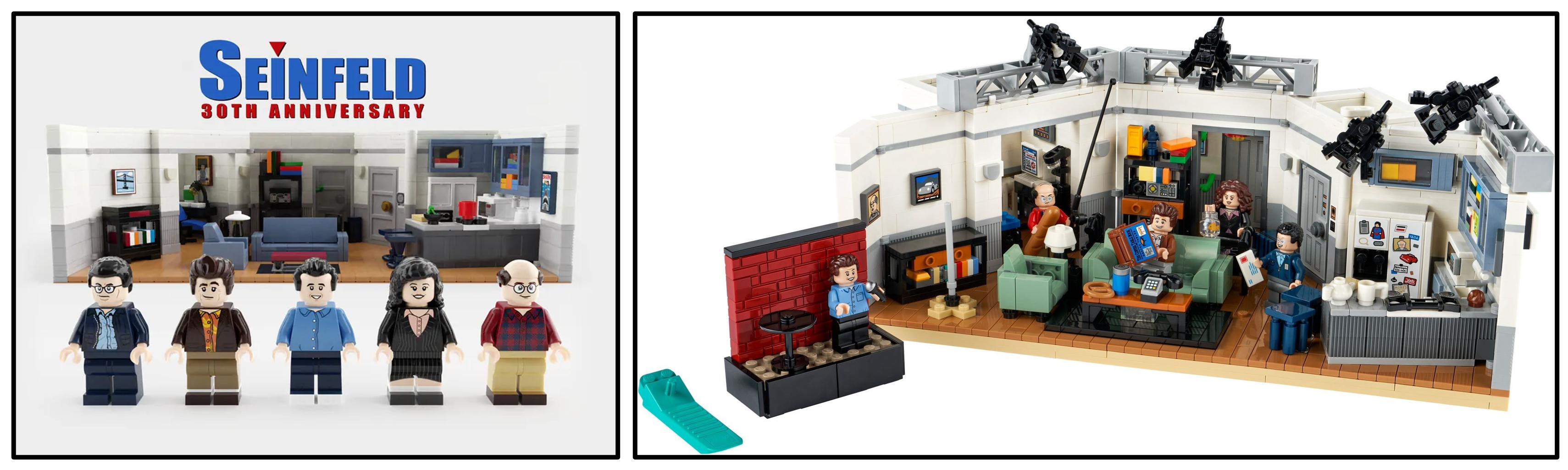
Similarity Score - 9/10 - Brent Waller's fantastic Seinfeld submission required exceptionally few updates to become an official product, exhibiting exactly the same layout and nearly identical furnishings. The only significant alterations include the addition of stage lights above the walls and Jerry Seinfeld's stand-up comedy stage, although some tiny details have also been added.
21329 Fender Stratocaster
Legendary Stratocaster by TOMOELL

Similarity Score - 8/10 - The original Legendary Stratocaster competition entry presented this famous guitar in several potential colours, each accompanied by an amplifier and guitar stand. 21329 Fender Stratocaster features the same items and even maintains the colour alternatives, albeit narrowed to red or black. The structure of the guitar's body was updated, but the revised design otherwise closely resembles the fan model.
21330 Home Alone
Home Alone McCallister's House by Adwind
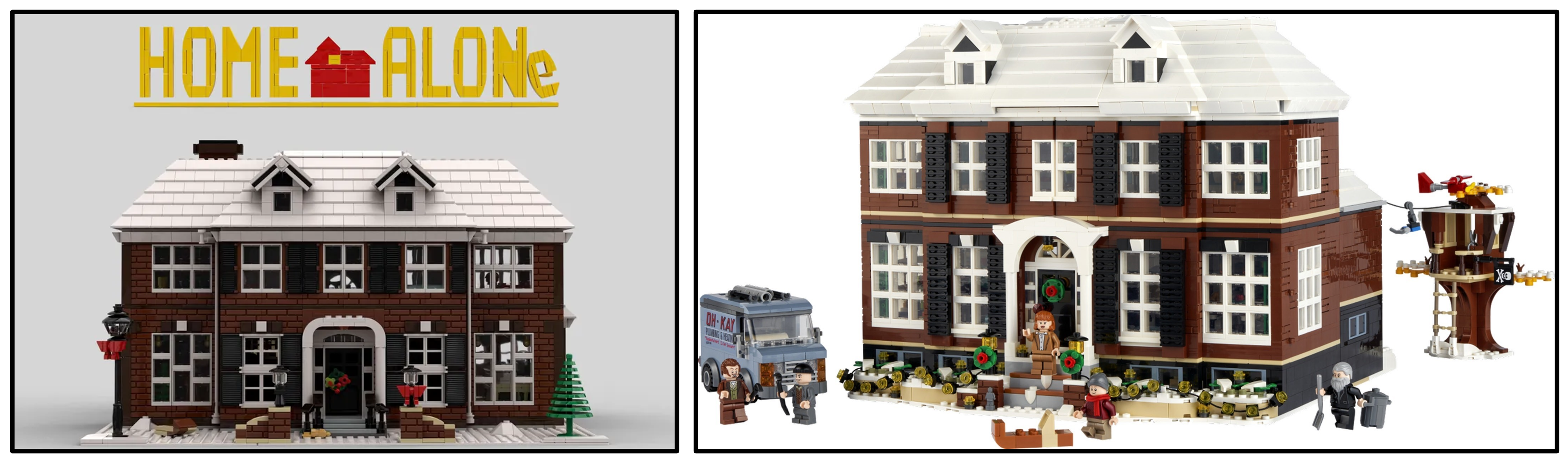
Similarity Score - 7/10 - When it was revealed that Alex Storozhuk's Home Alone project had passed review, I envisaged the official version would be substantially smaller than the original model. 21330 Home Alone was therefore a surprise, remaining faithful to the Ideas submission in both scale and design! The method for accessing the interior was updated though, while the Wet Bandits' van was an addition from LEGO.
21331 Sonic the Hedgehog - Green Hill Zone
Sonic Mania - Green Hill Zone by toastergrl
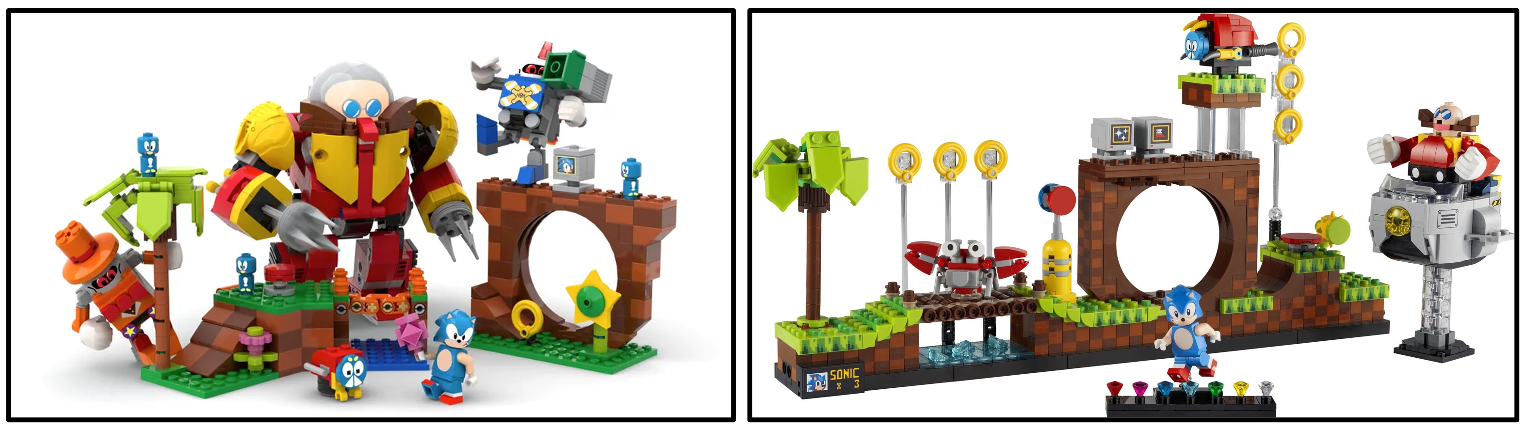
Similarity Score - 2/10 - 21331 Sonic the Hedgehog - Green Hill Zone introduces substantial changes from the original project, depicting the same recognisable location but originating from an entirely different game. The unique Egg Robot mech and various characters were therefore omitted. In fact, the only features which remained relatively intact are the loop and the stylised palm tree.
21332 The Globe
Earth Globe by Disneybrick55
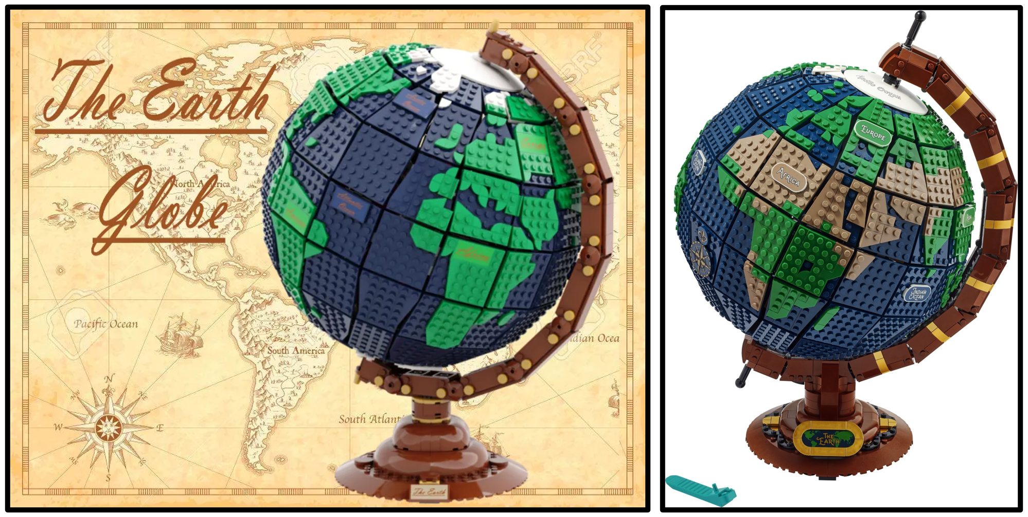
Similarity Score - 8/10 - Unlike the previous set, 21332 The Globe appears remarkably close to the model which inspired it. Almost identical construction methods were employed to create the spherical shape, also establishing a consistent scale. The only noticeable adjustments relate to the display base and frame, while the shapes of certain landmasses were altered too.
Our previous analysis of the changes made to LEGO Ideas projects revealed certain repeated trends, including a preference for brighter colours and inevitable changes to building methods. Those trends remain, while the increasing focus upon adults has introduced another apparent priority for LEGO. Products which could have proven suitable for children, including 21326 Winnie the Pooh and 21331 Sonic the Hedgehog - Green Hill Zone, now focus exclusively upon adults.
However, another reason for changes to earlier projects has seemingly subsided, as reaching adults enables LEGO Ideas to create bigger sets. Reducing the size of Ideas submissions has therefore become less important, most clearly exemplified by the enormous 21330 Home Alone which contains 3955 pieces and exceeds all other LEGO Ideas sets in that regard!
Are you satisfied with the changes made to LEGO Ideas projects during the past year? Let us know in the comments.
The previous article, examining earlier LEGO Ideas sets, is available here.
165 likes
48 comments on this article
Europe looked so much better on the ideas globe. Generally I feel the changes improved each model whilst maintaining the feel of each.
I think the official set is an improvement in every case except Sonic the Hedgehog. For that set, the build of the official set is much more complex and detailed, but the focus is changed from a playset for kids to a display set for adults, and I don't agree with that change in target audience.
As was noted in other reviews, Europe was completely out of scale in the original submission. It had to be shrunk to make a geographically accurate map. I agree it doesn't look great, but not sure how much improvement could be made at that scale. Maybe people can add a 1x1 tile here and there and see if it improves the look
I'm glad that relatively affordable sets such as Winnie-the-Pooh and Sonic the Hedgehog continue to exist, though I fear these will soon become a thing of the past, and Ideas will end up being mainly a "fan-conceived 18+" product line, since Ideas is already committed to 18+ branding for 100% of its products moving forward, leveraging the buying power of those with disposable income. Like @iwybs, I lament this direction that Ideas has committed to — an idea I'd had tossing around for a number of years can no longer be developed into an Ideas project as it was inherently meant to be a playset for kids, not a display piece for adults (granted, you can still play with 21331 in its current form the classic way as well as using the play features it does include).
Honestly, I wouldn't have been as satisfied if they kept Sonic Mania even if I would've bought it anyway, and I really believe the change to Sonic 1 was for the better, as harsh as it has been for Mania fans (I don't dislike Mania, but many people I spoke to who remember Sonic 1, 2 and 3 had never heard of Mania or indeed anything after 3). Should they decide to develop more Sonic sets, the Death Egg Robot might have a chance at being (re-)introduced as a Sonic 2 boss, alongside a potential Tails minifig. But I just don't see the Hard Boiled Heavies, I mean, really? Even the Deadly Six from Lost World are more well-known than the Heavies.
I'd like to quote the following excerpt of the written IGN review for the set (https://www.ign.com/articles/we-build-lego-sonic-the-hedgehog-green-hill-zone-throwback-16-bit):
"In a practical sense, the destigmatizing "Adults Welcome" approach amounts to more black, "adult" presentation on the set boxes, and a rebranding of the 15+ Creator Expert age to 18+. But there's been another, more subtle change in the last year or so. Increasingly, what LEGO considers "adult" is no longer tied to challenge or complexity. Instead, it's tied to the life experiences of an age group, regardless of the builder's experience. Clearly, the target audience for this set is 18+; people in their late '30s and early '40s would have come of age in 1991 when Sonic first debuted."
They’re all all IDEAS. No one single submission will ever be perfect and require no modifications by a LEGO designer. After all, TLG is a complex business model and if a set is to go into production it needs to utilise the current element inventory as much as possible and be a robust build - this will sometimes affect the aesthetic from the original submission but, better to get the set than not at all
A hill I am willing to die on: The move to brighter colors in the finished models has been almost universally a good choice and proved to enhance the final product and not detract from the spirit of the original Ideas, regardless of how other changes to the original submission have effected the finished model.
More often than not, LEGO butchers the original submission. Unfortunately, the end result is seldom better.
So far, Pirates of Barracuda Bay seems to be the only one that got changed for the better as it gave us 2 great sets in 1, which the original submission didn't. But apart from that, the end result is always a step (or several) down from the original.
The globe looks great even though Europe looks atrocious and will need fixing.
It's not the worst offender.
So far, that is the Medieval Blacksmith where LEGO completely ruined the original submission by clown-ifying it with the horrendous colour pallet used (reddish brown instead of dark brown and the hideous blue and sand green roof rather than dark blue and black)
People seem to forget that Lego Ideas isn't about turning fan-designed models into sets, it's about turning the idea behind a fan-made model into a set. The project submission just illustrates the concept. I would suggest that 21317 Steamboat Willie is the best example of this, turning a great idea and a lacklustre model into a truly special set. So as a general rule, I quite like the changes that Lego make.
I don't like the font on the Earth labels, but other than that, most of them I'd say were improvements (some by a lot!).
I don't know what the people who think Europe looks better on the original submission for the glove want: would you really rather have an inaccurate, downscaled Africa so Europe can be bigger and more detailed? Do you seriously think that would have been an acceptable compromise?
Great article, interesting as always. While size restrictions and new mould restrictions seem to have been relaxed somewhat (especially for licenced characters as on Sesame Street and Winnie the Pooh) I think there's an unwritten Ideas rule that if you use a lot of dark colours, especially dark brown, these will be altered in the final product. I don't think this is to the detriment of any of sets released.
I believe the main problem with the modifications by the Lego designers has to do with: textures. The blacksmith shop had a lot of texture, plates all over giving a totally different feel to the "juniorized" final version. It is very likely that some people voted for the set to learn about these techniques on how to make a building old and weathered. Since these sets are "aimed" at 18+ people and will most likely only been displayed and not played with, the loose plates (attached with only one stud) should not be a problem. Old fisherman store managed to do that and is one of the favourites amongst idea sets. I believe the "adult experience" is all about NPUs (nice part usage), interesting techniques and how to achieve a given look with a square building system. I think brighter colours is not an issue because they make models stand out better.
I think, at least one Idea set per year should be produced just because it brings forward a particularly interesting building technique - but that's just me.
Overall, I believe Lego do a good job with the sets but as mentioned before, we lose the textures and the new techniques. Disclaimer: I only own the Saturn V, the ISS station and the Pirates of Barracuda Bay - looking at the piano.
@djcbs
I think one prominent difference between the look of a “MOC” and an official Lego set is the color palette. The former is more "realistic" which is great. But an official Lego set should have a certain amount of fun in the overall color scheme.
I don’t really understand the scoring here. Giving scores suggests that staying as close as possible to the fan submission is the goal. That isn’t the goal. Turning the idea into a great set is the goal.
Is there actually an instruction for the original medieval blacksmith somewhere, published by an author?
I enjoy these comparison articles a lot, thanks! Putting the two Winne the Pooh models next to one another doesn't half make the first one look bleak. AFOLs love their muted colours for some reason!
@legoapprentice said:
"I don’t really understand the scoring here. Giving scores suggests that staying as close as possible to the fan submission is the goal. That isn’t the goal. Turning the idea into a great set is the goal."
Well, you miss the point of the article then. The scores are how close to the original submission the actual produced sets are, not whether it’s a good set or not.
The article is merely a comparison, not an actual review.
@NatureBricks said:
" @wasatchbuilder said:
"As was noted in other reviews, Europe was completely out of scale in the original submission. It had to be shrunk to make a geographically accurate map. I agree it doesn't look great, but not sure how much improvement could be made at that scale. Maybe people can add a 1x1 tile here and there and see if it improves the look"
It's a $200 set. LEGO couldn't include 3 more 1x1 tile pieces?
Those pieces will even be in extras most likely. The fact LEGO didn't just include them in the directions is shocking and inexcusable. "
I think you miss the point of the post you're replying to. The design of the shape of the continent of Europe is not well done, it's not even recognizable. Fans might be able to improve it slightly by adding or substituting a tiny piece here and there, but the scale of the shape and gaps in the globe make it difficult to fit in the proper detail.
I'm glad for the recent trend to stay with larger sets. The Sesame Street reduction was very disappointing and designed with NO thought to display. Hope they continue.
As others have mentioned, the original designs are often bleakly coloured in comparison to the final release, and are basically MOCs that don’t resemble an actual Lego set.
Overall I think Lego have done a fantastic job converting them to an actual product on the shelf people will buy. The only miss for me in terms of the final product was Flinstones, which although I appreciate was actually released, lacked a few things in the final design from the submission.
@djcbs said:
"More often than not, LEGO butchers the original submission. Unfortunately, the end result is seldom better.
So far, Pirates of Barracuda Bay seems to be the only one that got changed for the better as it gave us 2 great sets in 1, which the original submission didn't. But apart from that, the end result is always a step (or several) down from the original.
The globe looks great even though Europe looks atrocious and will need fixing.
It's not the worst offender.
So far, that is the Medieval Blacksmith where LEGO completely ruined the original submission by clown-ifying it with the horrendous colour pallet used (reddish brown instead of dark brown and the hideous blue and sand green roof rather than dark blue and black)"
Ah yes, the colors I associate most with clowns—deep blue, moss green, and brown. It's like practically being there at the circus... if the circus is actually a forest or swamp and the clowns are a couple of lizards or toads.
In all seriousness I'm glad Lego took the original color scheme and made it into something that would actually look better. Among other things, the original was a digital model. In reality dark brown can be VERY dark and as such can make details you want to be visible practically vanish in a real-life build, especially in non-professional lighting conditions like most people's sets would be displayed in. Dark blue has the same issue, and the complex detailing of the roof (even the simplified version to make it less fragile) would be wasted if it all blended together into one monochrome mass. Brightening and varying the colors makes for a better-looking and less boring product, regardless of what age range it's targeted toward.
Does this need to involve numerical scoring? The side-to-side comparison is interesting enough, the score seems quite tacked on. It makes it look like you’re implying less similarity means it’s a worse set which I wouldn’t say is the case
@Brickalili said:
"Does this need to involve numerical scoring? The side-to-side comparison is interesting enough, the score seems quite tacked on. It makes it look like you’re implying less similarity means it’s a worse set which I wouldn’t say is the case"
I don't get that implication at all. The score represents how similar the final set is to the original. I see no judgement in which is better, either in the number or the descriptions given.
@Brickalili said:
"Does this need to involve numerical scoring? The side-to-side comparison is interesting enough, the score seems quite tacked on. It makes it look like you’re implying less similarity means it’s a worse set which I wouldn’t say is the case"
I mean, if you read the article you know that it’s merely a comparison score, not a review or implying anything otherwise. I see what you mean, but I just don’t think it’s an issue.
@NatureBricks said:
" @wasatchbuilder said:
"As was noted in other reviews, Europe was completely out of scale in the original submission. It had to be shrunk to make a geographically accurate map. I agree it doesn't look great, but not sure how much improvement could be made at that scale. Maybe people can add a 1x1 tile here and there and see if it improves the look"
It's a $200 set. LEGO couldn't include 3 more 1x1 tile pieces?
Those pieces will even be in extras most likely. The fact LEGO didn't just include them in the directions is shocking and inexcusable. "
I can't tell if you're being serious.
I’d love to see people’s suggestions on how to improve the look of Europe while keeping the correct scale (i.e. not butchering the scale like in the fan submission)
I'm happy with the changes Lego has made in this batch. Some stayed close to the original and that's fine. Others had major changes, but in each of these I think they all improved the final model. (Complain about Europe all you want, but look at that out-of-scale Africa on the fan-submitted one and you can't possibly tell me that it's better.)
Blacksmith shop was a major change and I don't think all those changes improved the set...but these all seem okay. However, this does make me wonder what changes Lego might have made to the fan-created Ideas sets that are being sold as-is via BrickLink. Like, if Lego had a Master Builder take a couple passes at them, what might the improved sets look like? From feedback from people that have received the first round, it seems like there's a few things that could have been improved (beyond the terrible instructions).
I love that Lego uses the full range of colors available when tweaking the sets. Lego would need to introduce more muted colors for a muted-colored set to look decent imo.
Anyway, it boggles my mind that anyone would choose Lego when looking for something with drab colors
40487 Sailboat Adventure 9/10
Not sure why that one's not on the list.
@NatureBricks said:
" @Nytmare said:
" @NatureBricks said:
" @wasatchbuilder said:
"As was noted in other reviews, Europe was completely out of scale in the original submission. It had to be shrunk to make a geographically accurate map. I agree it doesn't look great, but not sure how much improvement could be made at that scale. Maybe people can add a 1x1 tile here and there and see if it improves the look"
It's a $200 set. LEGO couldn't include 3 more 1x1 tile pieces?
Those pieces will even be in extras most likely. The fact LEGO didn't just include them in the directions is shocking and inexcusable. "
I think you miss the point of the post you're replying to. The design of the shape of the continent of Europe is not well done, it's not even recognizable. Fans might be able to improve it slightly by adding or substituting a tiny piece here and there, but the scale of the shape and gaps in the globe make it difficult to fit in the proper detail."
Yeah. So? Your point is...?
As others have pointed out for hundreds of years Europe was made to look bigger as Africa looked smaller. I rather LEGO get Africa right than Europe. But even with the gaps Europe could have looked better. Nothing would have looked perfect. The Ideas model is waaaaayyyy out of scale. Others here have been pointing out that Europe still looks bad. Even minor things could have improved it greatly."
My point is OP was discussing ways to improve the design of the continent, but instead of agreeing the design was bad you decided to rail about parts instead which doesn't make a lot of sense.
I love putting together the Seinfeld set. So fun and I enjoyed some new building techniques. That set is so alike the original submission.
This is an accurate analysis and I agree. Thanks, CapnRex!
@Nytmare said:
"40487 Sailboat Adventure 9/10
Not sure why that one's not on the list."
I think because it's not a numbered Ideas release set and is part of the Ideas GWP sets.
They didn't include 40335 Space Rocket Ride in the previous article and have also not included 40448 Vintage Car in this article which is why I think they're omitted.
There's a chance that like me most don't remember the original design entry or never saw the original design since from what I recall all were competition entries rather than reliant on 10K people to support.
I love both the Sailboat and Rocket Ride, but don't recall their original design and my only complaint with Vintage Car was the surfboard attachment being flimsy and it looked better attached in the original entry.
Great article, thank you.
I think all the ones in this article are improvements, or at least necessary compromises. The only change I dislike in a recent Ideas set is the bright blue roof on the medieval blacksmith. It just looks plastic to me. Lovely set all the same.
To me Lego models look more stable and coherent. Most of the time I can see the necessity for the change or improvement.
@DoonsterBuildsLego said:
" @Brickalili said:
"Does this need to involve numerical scoring? The side-to-side comparison is interesting enough, the score seems quite tacked on. It makes it look like you’re implying less similarity means it’s a worse set which I wouldn’t say is the case"
I don't get that implication at all. The score represents how similar the final set is to the original. I see no judgement in which is better, either in the number or the descriptions given."
Yeah but why does the similarity need a score? What makes something specifically a 6/10 than a 7/10? We get whether something is similar to its original or not through the text, adding a score at the end looks like sets are being judged favourably or poorly purely on accuracy rather than quality
A problem with Ideas is that people vote for the set that is submitted, expecting to get just that. Some designers put a lot of effort into a set that looks great, but it not the set that Lego will produce. This leads to disappointment for the voters. Designers need to get inside the mind who those work at Lego and make a set as they would.
I actually like most of the ideas set produced. Only got a few because I would rather spend my money on other themes. If I could, I would buy them all!
While the Home Alone house is the only one I actually own, I think for the most part these changes, while significant in some cases (typewriter), still manage to maintain the feel and aesthetic of the original submissions. Polished and more structurally sound, but still recognizable. Winnie the Pooh is drastically different, and I think it is absolutely improved. The original tree is incredibly bland and simplistic, and the new version is a much nicer build. Sonic though, is an astonishingly different build. It is virtually unrecognizable from the original project, with basically nothing in common. I don't know Sonic, so I can't say which is more accurate, but they are so different I wonder why Lego bothered making it an Ideas project at all.
@Brickalili said:
"Yeah but why does the similarity need a score? What makes something specifically a 6/10 than a 7/10? We get whether something is similar to its original or not through the text, adding a score at the end looks like sets are being judged favourably or poorly purely on accuracy rather than quality "
This is exacly why we are not adding ratings to reviews. They derail the discussion as people argue about them.
The rating applied here is an attempt to quantify how similar the end product is to the original idea, and it's clearly labelled as such. I don't see where the confusion is.
It is of course subjective, so feel free to disagree.
Overall Ideas is my favourite theme, and the production sets always seem to me, to be an improvement over the original submission.
I do wish though that they would produce more smaller sets (I.e cheaper!)
@Djblythe05 said:
"Europe looked so much better on the ideas globe. Generally I feel the changes improved each model whilst maintaining the feel of each. "
While Europe may have looked better (because bigger) the final model is WAAY more accurate.
I'm glad LEGO changed this to be more realistic!
I'd say with most of these sets, the changes were an improvement. Especially with the typewriter, that one went from a great idea to an even greater set, and also the Fender, that not only profited from new parts but also got that fantastic amp added. For most others, the differences are a bit more subtle, but overall I still feel mostly for the better.
The one obvious exception on that rule is the Sonic set, of which basically only the IP from the original idea was taken and everything else became different. And I do like the original design a lot more.
With earlier Ideas sets I've often felt that if the submission was a great *idea*, Lego would usually improve on that with the final design. If the submission was a great *MOC*, there often had to be made quite a lot of compromises to get it up to Lego standards. The Blacksmith is probably the best example of that, even when the final design wasn't bad (not bad at all!), it is a rather far cry from the original submission.
So far, I would say LEGO has always improved the final design with their changes. Not everyone likes it, that's the way the world works.
Brighter colors on a child's toy...who would've thunk it?!
I realize 18+ is running rampant these days with some of these sets, so brighter colors can also appeal to an adult. Not everyone loves the dreary dark colors of some of the submissions (well maybe they do because they voted for it). But being an "idea", you should assume the idea will change in design or color.
Or don't. I don't care :)
I think LEGO's changes are necessary and have enhanced the set each time. I likely would not have purchased the submitted idea on most.
My main problem with the Blacksmith's shop has always been size. It's as big as the average castle, in height if not girth. Even if you presuppose a second story a personal house/workspace shouldn't be that big. I regretted the loss of the "weathering" but not the color changes, and I haven't bought the set--nor do I expect to.
I pretty much agree with CapnRex's evaluation of the sets covered here, except for one minor point on the Globe. Unlike most other people, I don't find the original version of Europe much better than the final one--just bigger, and forcing a terrible distortion of Africa. Well, except for Italy. The Iberian peninsula, which is critical to recognizing Europe, is equally awful in both versions, and as a person of Greek origin I don't really object to having Italy and Greece represented by the same pieces, differently oriented! The final version, which I notice is usually photographed to allow Africa to dominate, looks much more realistic than the original one.
Where I think TLG has definitely succeeded is in capturing the essence of each chosen set--even the Sonic set which was so much altered. Given that the contest is really for the *Idea* rather than the proposed set, I think this is exactly as it should be.
@sklamb said:
"I pretty much agree with CapnRex's evaluation of the sets covered here, except for one minor point on the Globe. Unlike most other people, I don't find the original version of Europe much better than the final one--just bigger, and forcing a terrible distortion of Africa. Well, except for Italy. The Iberian peninsula, which is critical to recognizing Europe, is equally awful in both versions, and as a person of Greek origin I don't really object to having Italy and Greece represented by the same pieces, differently oriented! The final version, which I notice is usually photographed to allow Africa to dominate, looks much more realistic than the original one."
I completely agree. The updated design for Europe is not ideal, but nor was the original and the improved shaping of Africa was definitely worthwhile.
Looks like the original Sonic build was better.
The design of Europe sucks in both. Not worth its price at all, that's for sure.
@NatureBricks said:
As others have pointed out for hundreds of years Europe was made to look bigger as Africa looked smaller. I rather LEGO get Africa right than Europe. But even with the gaps Europe could have looked better. Nothing would have looked perfect. The Ideas model is waaaaayyyy out of scale. Others here have been pointing out that Europe still looks bad. Even minor things could have improved it greatly.]]
ah, thank you for sticking up for Africa! to often Africa is portrayed as smaller than it actually is.
living in Africa I am glad with how the globe turned out (not that I have anything against Europe)
((also compare Madagascar from the submission to the actual set))
@LegoSonicBoy:
I prefer a range of price points. Since I don’t play with the sets, play features don’t hold a lot of weight for me, but some of my favorite Ideas sets were sub-$60, and a lower price means I can buy multiple copies if I want. I can also more easily buy what interests me, where I let Barracuda Bay slip by, and I’m not sure if I’ll end up buying any of the three unreleased sets that interest me.
@HOBBES:
The Blacksmith had a roof that looked like it wouldn’t stand up to a raised eyebrow, so there was no way that structure was getting through without a ground-up rebuild.
@chrisaw:
The Flintstones submitter said the project included way more stuff than he figured would end up in the final set, just so they had options on what to include. Dino’s the main gripe people have about the set. Even if the ban on new molds had been lifted in time, he would have been a huge ask.
@PDelahanty:
One major change I can think of is they wouldn’t intentionally hinder the play function to get past the Design Department, and have a fix using an illegal technique ready to post the day after people receive their copies.
@MartyMcFly:
If voters expect the project to be boxed up and released unchanged, they haven’t read the rules, any of the results announcements, any of the reveal announcements, any of the set reviews, or any article or comment section that even mentions an Ideas set.
@magnumsalyer:
Forget about being smaller, the original Africa looked like a toddler drew it. Or like it was based on one of those really old maps where they couldn’t even get Europe right. The fact that this was only done to give more room to Europe is really awkward.
I find generally Lego not only nails it but surpasses the original submitted idea.
Now and then, I think the original submission is cool, and shouldn't be changed too much, but as others noted, people submitted ideas knowing full well it was never going to be the final product.
The final product has to meet very high standards, and I'm more than ok with that, for Lego to be the premium product it certainly prices itself at, it needs to consistently maintain its high standard, which I think it does for the Ideas sets, while often promoting a bright joyful colour palette - which I really like.
The only thing I didn't like was that the Barracuda set could be displayed two ways, and since Flagships are something I tend to collect, it meant I "had" to purchase two; both look stunning.
I really like the Ideas theme, I certainly pick and choose what I buy and they seem to be electric enough to have something that appeals to someone, even if that someone isn't always me (thank bloody goodness).