Interview with Anderson Ward Grubb, designer of 10312 Jazz Club
Posted by Huw,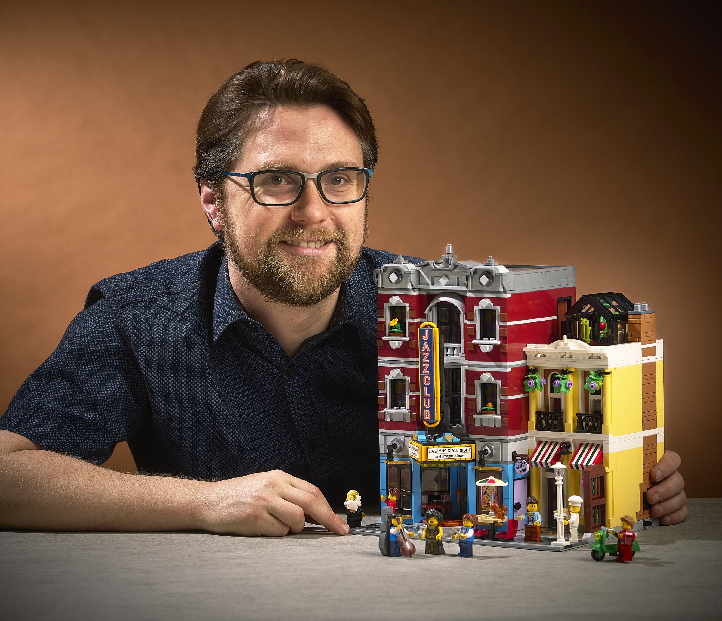
At the LEGO Fan Media Days in September CapnRex101 and I had the opportunity to sit down and talk to the designer of 10312 Jazz Club, Andserson Ward Grubb, shortly after he revealed it to us.
We had a lengthy chat, which covered everything from how he came to design it, where the idea for a jazz club came from, what's inside the building, why it's the colour that it is, who's playing in the venue and, most importantly, how there came to be sausages used on the club's sign!
It's a long and fascinating read, so make yourself comfortable...
Brickset: How did you come to design this set given that you also designed last year's modular, 10297 Boutique Hotel?
Anderson: It was purely the luck of the calendar, I suppose! I was available at the right time to start working on the concept for a bunch of models, including this one, and I was able to take it all the way through to completion. It's an incredible privilege.
You've probably seen that there's been speculation that it's going to be a music venue because of the poster on the side of the hotel. Is Andy Sax, mentioned in the poster, playing tonight?
No! In Jamie Berard's thinking of the modular street is that everything is happening at the same time. So the poster is advertising an Andy Sax concert that's sometime in the future.
Actually, it did not start out as a start out as a jazz club, although a music hall was something we talked about doing. We hadn't thought it through much more than that, but no thoughts about the size of the building or what that would look like.
When I first started doing some sketches for it, we were exploring things like a shopping street, where the layout might have been completely different with an aisle down the middle. That wasn't really working for us, partly because we were trying to fit too many things into a space and physically getting your hands into one building, fitting in a street and a second building was a little too much.
So we came back and asked what else could we do? What about that other idea, something related to music or live entertainment venue? Music halls or opera houses tend to be in big buildings, but there was something about the intimacy of a jazz club, it could fit into smaller space, as well as being very evocative of the time period of the modular street.
Compared to the Boutique Hotel, it's less ambitious in its geometry, and it's returned to a more traditional square format. Was there a reason for doing that?
Yes the hotel was ambitious in its geometry, and because of that geometry it challenged us in many ways, its building techniques, as well as the pricing of elements. Plus, combining it with a novel colour, it was a push!
That's not to say we wouldn't ever try something like that again, but there was also just a call to think about where to spend our budget. We could put interesting geometry inside a building like this and, just thinking about the architecture of where a jazz club may belong, the exterior really didn't need to be incredibly complicated.
Also, we decided early on that this one was not going to be a corner building, so that naturally helped keep the facade relatively straightforward.
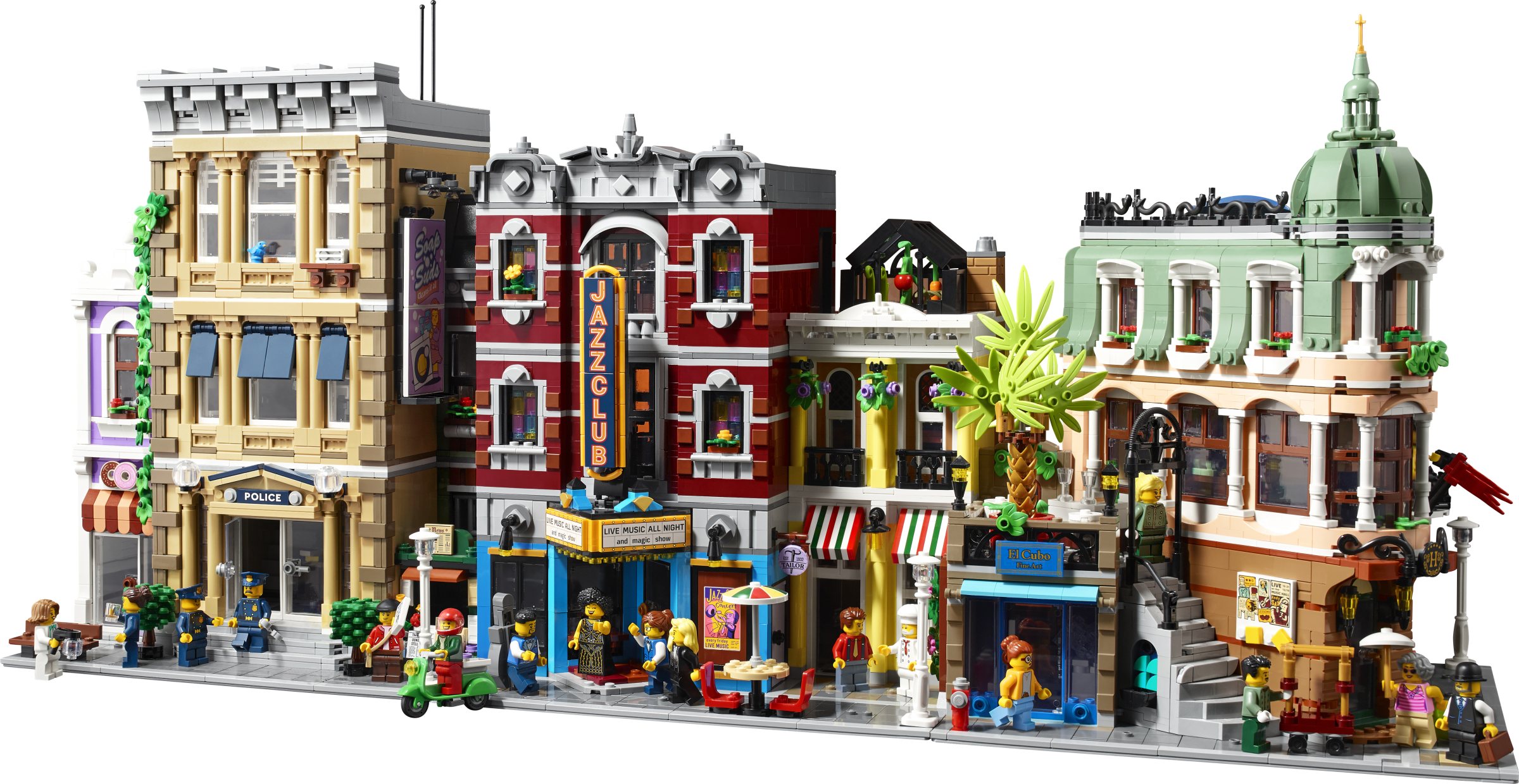
Please talk us through the layout, starting on the ground floor.
So you have the main jazz club on the left, with a little ticket booth at the front. The main stage is in the corner. I've chosen 45 degrees as a motif throughout the build, so a lot of things are oriented towards 45 degrees, including that stage. There's also a little tiny bathroom under the stairs.

There's an opening to the pizza place next door. So you could buy a ticket at the jazz club and grab a pizza, but if you go in for a pizza you also have easy access into the jazz club! Maybe there's a deal they have arranged: I think people can figure that one out! There's a brick-built stone oven in the kitchen, which incorporates a new wheel arch piece.

Was it created for this set?
No. The Modular Buildings, as far as I know, have never had an element specifically developed for them, but because they are released at the start of the year we sometimes get to debut new elements before they appear elsewhere.
Finally, on the ground floor we have a door leading to some stairs to the next level. I think this is the first time we've done a staircase that's accessed from the exterior of the building like that.
On the second floor we have the club manager's office with desk and chairs, and a phonograph in the corner for playing the latest records. The balcony overlooking the stage, so they can listen to the band rehearsing or performing.

Next door, above the pizzeria, is the tailor's workshop where there are spools of fabric, a mannequin, and an old-school sewing machine on a workbench.
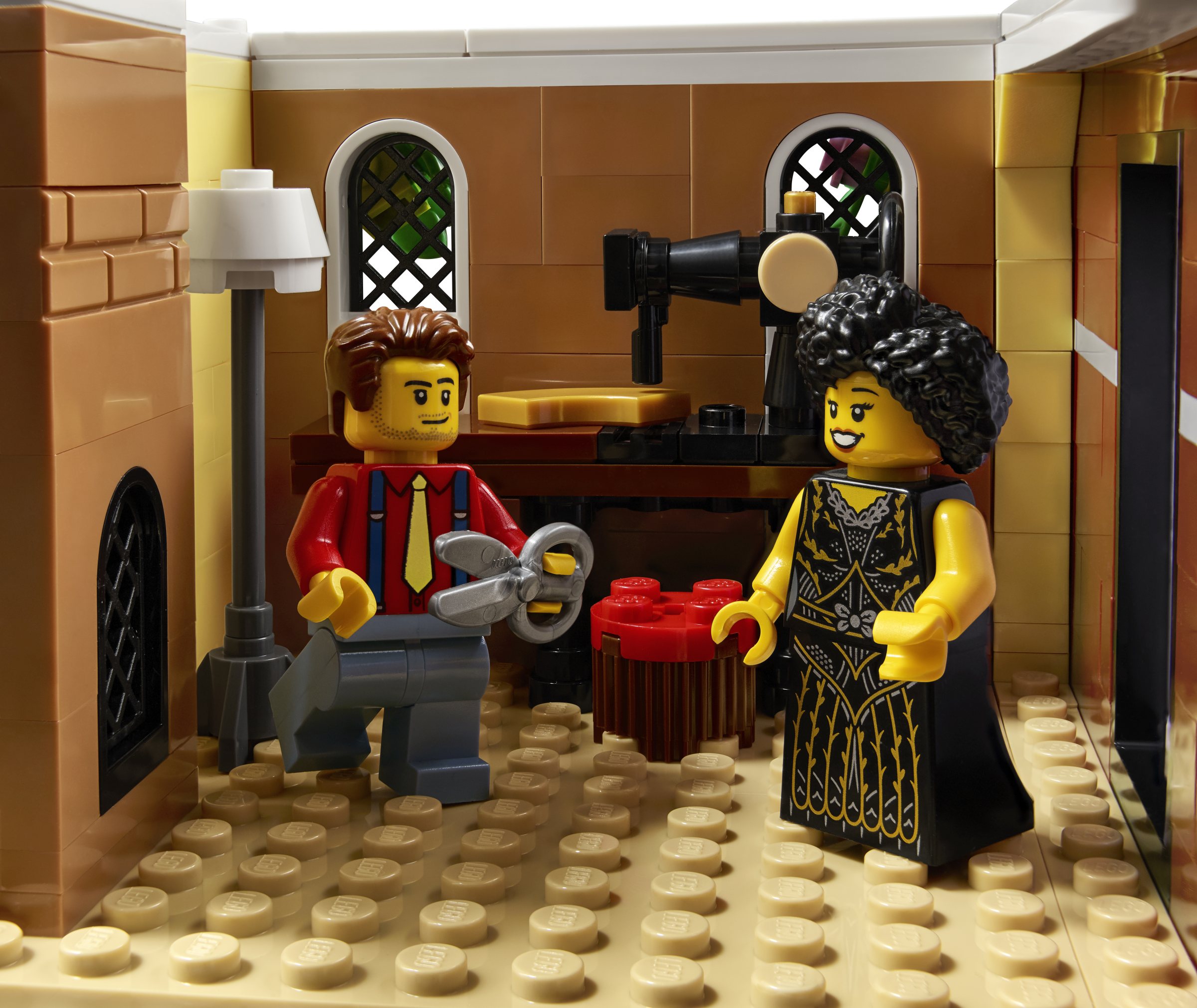
It reminds me of the Detective's Office in that it feels like there might be some sinister things going on in here! Maybe the kind of scene where it's smoky, with music wafting from downstairs and a meeting on the balcony above.
We actually did a lot of thinking through the stories of this building, about how far we should go with it, because a lot of people associate the heyday of Jazz, the 1940s, with prohibition and gangsters and so on, which is obviously a bit too dark! So it was actually quite a balancing act to try to avoid that if we could, by brightening up the other half of the building, and putting some fun stuff in.
The light yellow has not been used on modular buildings before, right?
I don't think we've used yellow in any significant amount in a modular and this colour maybe is a highlight. It might have shown up in a few bricks in the bookstore, but that's about all.
How do you decide what colours to use?
That's quite a long process, actually. One of the biggest changes during development was that everything you see in dark red was dark blue at one point. We really wanted to emphasise the blues and make that visual connection to the music, but it was making the building seem very cold and people were not responding positively to it. So we switched to another dark colour, that still gave that nighttime feel, but with a warmer tone.
On with the tour of the building...
The top floor of the main building is a dressing room with a couch and makeup table with a silver tile to represent a mirror, and a music stand. On the wall is a piece of abstract art, which was a fun opportunity to make a nice connection with the art gallery next to the Boutique Hotel.

In the corridor there are steps leading onto the roof where there's a greenhouse, which can be completely removed to see what's growing inside.

Like some other Modular Buildings, the structure has two different architectural styles. Why did you design it like that?
For a lot of reasons, but mainly so that it helps create that feeling of building a city street within a smaller space.
We know people still like bigger buildings that occupy the entire width; they've not gone or been forgotten. But we really have to find the right reason for them, we have to make sure we use the real estate as effectively as possible. If we tried to make this one huge building, I don't know if it would necessarily have been a jazz club. It probably would have become something more than that.
I notice some new minifigures too.
Yes, the band consists of a double bass player, a drummer and a singer, who also plays the saxophone. There's also a magician who's the warm-up act, along with the club manager. The double bass element was actually designed for VIDIYO, but never used. The accessory went all the way through to mould development, so it was just there for the taking. It would be a shame to have it come all that way and then for it never to see the light of day!
Next door in the pizzeria, there's the chef and the delivery guy, with the tailor in his workshop upstairs.

There are no customers then?
No customers -perhaps it's shut at this moment in time!
I notice the sides and back are very 'clean', with no odd patches of colour.
Right, I really focused on that here. We've had feedback confirming that people want very tidy sides and a neat back to display. So for me, it was a challenge to see how clean I could keep everything on the outside, even to the point where we have the colour split down the full height of the building, even though they needed to be tied together.
You'll see at the back there's a storage box for firewood for the pizza oven. So, you build the oven and get a little sense of the texture that represents the firewood, and then you build the box outside. The reason it was introduced into the model was to hide the connection that joins the two halves of the building. Further up the wall I've used 1x1 Technic bricks and pins to keep the colour break perfect.
Generally though, we know these are display models for people, which are mostly presented facing forward, so the balance of the attention is into the front of the building.
Did you consider making the model split in two, like some of the other buildings in the series?
No, it was always going to be on one baseplate, partly because the Bookshop is still available, and we wanted to differentiate the Jazz Club from that.
Modular Buildings frequently incorporate novel and creative building techniques in their facades. Is this something where you challenge yourself to do something as inventive as possible?
Actually, it tends to go the other way! We have a lot of enthusiasm for detail and it can show up in first drafts, but we find we are overdoing it. Perhaps we've tried to use an interesting new piece everywhere and the intricacy of the texture just becomes too much, relative to other sections of the model or the wider series.
Sometimes you have to step back and say: OK, what really makes sense in this architecture? How do we keep an interesting building experience for you without overwhelming the visual of the building's frontage.
This model has brick-built stained-glass windows. That's a first for the series, right?
Yes, I don't think we've had them on front windows before. It's just another way to bring a little bit of variety into the building experience. Unsurprisingly, we attempt lots of window designs in Modular Buildings, so we try and offer something new. It just seemed like a good place to use a new technique and bring some colour in!
How long would you say it takes to develop a Modular Building, on average?
It's about six months. We started in summer 2021 and ended design development pretty close to the end of the year, or early in 2022.

Given their iconic status within the product range, do you find there's competition to be the Modular Building designer?
Yes. I don't know if it's as as as competitive as you might imagine it to be, but it is definitely recognised as an iconic model to work on, and a privilege to do so.
Our challenge is that the company is always very busy and sometimes the people who want to build one aren't necessarily available for the required amount of time, or at the right time, to do so. Going back to your first question, the fact that I got to make a second building was exciting and I was keen to go again! But, yes, there are so many people waiting for their turn!
Did other designers contribute little details?
Yes, back in Jamie Berard's day [of designing the Modular Buildings], he talks a lot about how people would just come by and drop off little notes on his desk with suggestions. I don't think I've seen too many people do that with mine, but there are small things that designers have offered suggestions for.
For example, I remember having conversations with Mike Psiaki about the best way to build this triangle for the awning outside the club. Of course, Mike has always got something to say about LEGO triangles!
Also, I remember I came in one day and noticed that the top and bottom of the Jazz Club sign looked different. It turned out that Chris McVeigh had stopped by and reassembled them using the sausage piece! It looked perfect, and including the sausage in different colours has become a bit of a meme.
In fact, it's a little bit frustrating as a LEGO designer that a piece that we have to call a sausage or hot dog has become one of the most versatile elements for different purposes because of its geometry!
Thank you for your time, Anderson.
You're welcome. I hope you enjoy building the model as much as I did designing it.
We'll be publishing our review of the set on December 21st at 2pm GMT.
184 likes
70 comments on this article
I love the use of the sausage in the sign! I have one in an MOC grill, as the smile of a rotating head on top. It might be a little creepy, but eh...
The Brick Bank has brick built stained glass windows... Admittedly just the top bits, but still :)
I have to say, a printed sign feels a bit like a cheat move, given all the previously used innovative ways of building those.
And while I'm not sure about the azure/dark red combo, it will eventually grow on me, I guess.
Overall, a definite must have for adding some buzzing nightlife in my city. Just need to brand the pizzeria a bit, to match the vans and form a proper chain
I love it, great interview.
New cool music instrument piece!
@vjossifov said:
" Just need to brand the pizzeria a bit, to match the vans and form a proper chain"
White, green, and red: is it pizza, or is it Octan? Maybe they're branching out in terms of business models.
What a fantastic and fascinating interview. Love it! Beautiful building, day one purchase even at the new price point.
I have a random question I am super curious about. How do the designers choose which color baseplate to put the building on? My strange little quasi-OCD brain likes having even numbers of things and that includes especially baseplates. So I’m thrilled the last two models have LBG, haha.
I’m sure that’s not even slightly a consideration, but other than selecting from what is currently available in production, is there strong reasoning to the choice?
I only dare to raise this silly question because of the mention of the dark blue themes early on in design and seeing the dark blue baseplate in the light house had me thinking since it’s reveal the new modular would use that color just because I know LEGO likes to put some of their rarer part/colors into wider usage when they can.
Finally, thank you for saving the double bass! Strange choice for the vidiyo line, but now I can have a little LEGO Charles Mingus!
It is not an “official” modular, but the big D2C Diagon Alley set, which is compatible, uses “cool yellow” to nice effect. I also like it on the pizzeria here, but will probably mod the restaurant into a Cafe Du Monde look-alike, in order to better complement the jazz club.
Another cool Modular Building I'm simply too poor to buy.
That was a fascinating read! Thanks very much, and I appreciate the very precise heads up on the review:)
Great interview, love the information! Also interesting to learn the development timeline for modulars. Cool to think that the 2024 modular is most likely being completed right now as we speak.
Actually looks better now than the single leaked images. It very much depends on the context. Fits well.
@vjossifov said:
"The Brick Bank has brick built stained glass windows... Admittedly just the top bits, but still :)
I have to say, a printed sign feels a bit like a cheat move, given all the previously used innovative ways of building those.
And while I'm not sure about the azure/dark red combo, it will eventually grow on me, I guess.
Overall, a definite must have for adding some buzzing nightlife in my city. Just need to brand the pizzeria a bit, to match the vans and form a proper chain"
Also...
10218 Pet Shop has orange and blue stained-glass window on the back of the third floor of the brownstone apartment.
10255 Assembly Square has green and clear stained-glass transom windows above the door to the florist's shop and along the top of the back wall.
I'm glad they stuck with dark red (and unlike most people, I really enjoy the combination of dark red and dark azure). I agree dark blue would be too cold and uninviting. Besides, there's going to be an Orient Express set...
I love the 45-degree motif they have going on.
The designers should continue to uphold this between bright colors and more grounded colors. A big part of why Modular Buildings historically didn't appeal to me was the lack of bright colors. The light yellow is perfect for this pizzeria, like some of the establishments before it in LEGO Friends.
And I'm really happy that they really thought about the complexity of these models and decided not to overengineer things. It feels like most people rate the quality of a MOC by how greebled it is. It's just too much for me. Less really is more sometimes. It also allows buildings from other, non-18+ themes to fit better with these ones (baseplates notwithstanding).
Love the stained glass windows which were also a prominent feature of the Gingerbread House.
@Huw Interesting interview but I am surprised that You didn't ask about stickers in this set! Everything on the front of the building is a print?
I do like colours choice. It's more intensive than in last two modulars (even though I do love Police composition).
I dislike windowsills at red building. It really misses some extra details in my opinion.
The minifigure selection is a missed opportunity, not sure why they didn't recreate the Jazz Quartet in 21334.
"Finally, on the ground floor we have a door leading to some stairs to the next level. I think this is the first time we've done a staircase that's accessed from the exterior of the building like that."
Uh...
Cafe Corner's side door under the hotel sign leads directly to the the stairs to the next level, and Green Grocer has a more slightly enclosed vestibule area on the right but the stairs up are directly inside.
The modular looks cool, maybe not most eye catching but definitely a worthy addition to the lineup. I would like to see that dark blue version! I'm also amazed how well the secret of the new modular has been kept since September!
@Briczk said:
" @Huw Interesting interview but I am surprised that You didn't ask about stickers in this set! Everything on the front of the building is a print? "
I think that might have been missed from the transcription: yes, evertyhing is printed. No stickers!
Funny he speaks of budget restraints when the price has gone up from €150 to €160 to €180 to €200 to €230 in recent years.
@MrJackson said:
""Finally, on the ground floor we have a door leading to some stairs to the next level. I think this is the first time we've done a staircase that's accessed from the exterior of the building like that."
Uh...
Cafe Corner's side door under the hotel sign leads directly to the the stairs to the next level, and Green Grocer has a more slightly enclosed vestibule area on the right but the stairs up are directly inside. "
The Downtown Diner has exterior stairs for the second floor, and only a sort of fire escape ladder thing for the upper floors!
Shoulda named it "Grubb's Club"
...but for real: great set!
I remember the Pet Shop has a tiny stained glass window overlooking the apartment half’s balcony. It’s only 4 1x1 bricks of stained glass but it’s not the main windows in the front.
I love this part:
"I came in one day and noticed that the top and bottom of the Jazz Club sign looked different. It turned out that Chris McVeigh had stopped by and reassembled them"
It's like they can't help themselves from tinkering to improve the design. Awesome.
I really like the beatnik aesthetic. The photo of the manager’s office reminds me of a scene from The Marvelous Mrs. Maisel. Put more masculine clothing on the agent and you have Suzie, and more feminine clothing on the act and you have Midge. Come to think of it, this would be a perfect comedy club. The tailor’s torso is the perfect stand up comedian outfit.
The jazz club having an opening to the pizzeria ruins the vibe for me. It’s always bothered me how they have one ‘building’ with two facades. I’ve only seen that once in real life.
It also feels like they’re cramming too much into a single modular. A modular is never just one business anymore, there’s always sonething extra that’s given a tiny nook of space when it deserves more: the hotel had the art venue, police station had the donut shop, etc.
I dunno, I’ve never understood why they do it like this and it will always bother me
Also:
“Finally, on the ground floor we have a door leading to some stairs to the next level. I think this is the first time we've done a staircase that's accessed from the exterior of the building like that.”
No, it isn’t. Cafe Corner, Green Grocer, Corner Garage, and the Pet Shop all did it. I don’t know why he would say that
Thank you for rescuing the string bass from the VIDIYO garbage heap!
I like this a lot. Only weirdness to me is it seems oddly lacking in musicians! Think it needs at least one more player…trumpet, piano
They should have kept it dark. It’s a 18+ set, innit?
The singer is definitely giving me a Cleo Laine vibe.
Great set and minifigure selection.
@deathmoth said:
"I like this a lot. Only weirdness to me is it seems oddly lacking in musicians! Think it needs at least one more player…trumpet, piano"
The IDEAS jazz quartet in minifig form!
@Brickodillo said:
"They should have kept it dark. It’s a 18+ set, innit?"
Last I checked, grown-ups aren't allergic to varied color-palettes.
@Spritetoggle said:
" @Brickodillo said:
"They should have kept it dark. It’s a 18+ set, innit?"
Last I checked, grown-ups aren't allergic to varied color-palettes."
I wasn’t talking about the colors actually. The designer mentioned the 40’s, the era of gangsters and prohibition
@Brickodillo said:
" @Spritetoggle said:
" @Brickodillo said:
"They should have kept it dark. It’s a 18+ set, innit?"
Last I checked, grown-ups aren't allergic to varied color-palettes."
I wasn’t talking about the colors actually. The designer mentioned the 40’s, the era of gangsters and prohibition
"
Oh! Apologies. I've been a little too on the defensive today, I think.
@Spritetoggle said:
" @Brickodillo said:
" @Spritetoggle said:
" @Brickodillo said:
"They should have kept it dark. It’s a 18+ set, innit?"
Last I checked, grown-ups aren't allergic to varied color-palettes."
I wasn’t talking about the colors actually. The designer mentioned the 40’s, the era of gangsters and prohibition
"
Oh! Apologies. I've been a little too on the defensive today, I think."
No worries. Nothing wrong with some discussion of course. That’s part of writing comments overhere :-D
Its neat that the double bass (intended for Vidiyo) was far enough along in development/mold production that they were able to use it in this set.
I like it! Don't get wat's with all the negativity around this modular like I'll never understand why BH is so beloved.
I’m most bummed by it turning from dark blue to dark red! It would make the blue on the bottom floor stick out less as those blue colors go well together.
Side note...Why is there a “session timer” anyways?
@Sandinista said:
"Also:
“Finally, on the ground floor we have a door leading to some stairs to the next level. I think this is the first time we've done a staircase that's accessed from the exterior of the building like that.”
No, it isn’t. Cafe Corner, Green Grocer, Corner Garage, and the Pet Shop all did it. I don’t know why he would say that "
Because I’m sure the designers have other things on their minds other than a catalogic knowledge of every set released, unlike us Lego nerds.
So he is saying they could have done interesting building techniques, but chose not to. Yeah, right.
Not even the sign is brick-built. That often was one of the highlights in terms of a cool build.
And what's with "there's no customers, perhaps it's shut at the moment"?
In other words, even at 230 Euros there wasn't enough budget left for a couple more minifigs. Greed turned up to eleven if you ask me.
Nothing about this building makes me want it.
I miss the days when Jamie designed the Modulars. Every one of them was special, and a highlight of the year. This one is such a let-down to me that I have trouble concealing my hate for this set. Then again, I have only had one highlight in terms of LEGO this past year, and that was 10497. That set is so awesome it can make up for quite a lot of let-downs, but it can only go so far.
And lastly, why did we have to wait ages for the reveal this time? He said the set was basically finished at the beginning of 2022. Why wait until the last moment? To build up even more anticipation, just to destroy said anticipation with the anticlimactic end-result?
Great interview! Thanks!!
@AustinPowers said:
"So he is saying they could have done interesting building techniques, but chose not to. Yeah, right.
Not even the sign is brick-built. That often was one of the highlights in terms of a cool build.
And what's with "there's no customers, perhaps it's shut at the moment"?
In other words, even at 230 Euros there wasn't enough budget left for a couple more minifigs. Greed turned up to eleven if you ask me.
Nothing about this building makes me want it.
I miss the days when Jamie designed the Modulars. Every one of them was special, and a highlight of the year. This one is such a let-down to me that I have trouble concealing my hate for this set. Then again, I have only had one highlight in terms of LEGO this past year, and that was 10497. That set is so awesome it can make up for quite a lot of let-downs, but it can only go so far. "
There are several interesting techniques here, if you take the time to look for them. The 45° angled marquee and entryway is the most obvious, but there's plenty of other interesting (if not revolutionary) uses of SNOT techniques, angles, and offsets as well.
As for minifigures, the set already has eight of them (equal to the Town Hall and second only to Assembly Square), so acting like they were cheaping out by not including more is a little ridiculous.
I see so many people wishing Jamie designed every modular, but I don't think that's either practical or ideal. For starters, Jamie is no longer the young upstart designer he was when he first started with Lego more than a decade and a half ago. Not to cast any aspersions on his health, but no one stays young forever, and eventually he's going to want to retire. Considering that, his current role as design lead is not just a step up for him in the company but also an important role in terms of mentoring and guiding other newer Lego designers, so that others will be able to carry the torch in the future. Also, as great of a designer as Jamie is, I don't think the past decade of modular buildings would be as varied and interesting as they've been if other designers with their own fresh ideas and perspectives hadn't been able to put their own spin on them.
And don't forget that Jamie has been busy judging Lego Masters the last 3 years.
@Brickodillo said:
" @Spritetoggle said:
" @Brickodillo said:
"They should have kept it dark. It’s a 18+ set, innit?"
Last I checked, grown-ups aren't allergic to varied color-palettes."
I wasn’t talking about the colors actually. The designer mentioned the 40’s, the era of gangsters and prohibition
"
Prohibition and gangsters running liquor is 1920s. 1940s is Nazis. You'd think people would know this.
@chrisaw said:
" @Sandinista said:
"Also:
“Finally, on the ground floor we have a door leading to some stairs to the next level. I think this is the first time we've done a staircase that's accessed from the exterior of the building like that.”
No, it isn’t. Cafe Corner, Green Grocer, Corner Garage, and the Pet Shop all did it. I don’t know why he would say that "
Because I’m sure the designers have other things on their minds other than a catalogic knowledge of every set released, unlike us Lego nerds.
"
I don't think anyone _expects_ the designer(s) to have an encyclopedic knowledge of every set released. But if the designer makes such an assertion (that would be quite easy to verify, as there are less than 20 modular buildings to look at), then it's totally fair to call out the error.
"Finally, on the ground floor we have a door leading to some stairs to the next level. I think this is the first time we've done a staircase that's accessed from the exterior of the building like that."
No? Not at all. you`ll find that in both the Pet Shop and Corner Garage. And Parisian Restaurant.
"This model has brick-built stained-glass windows. That's a first for the series, right?
Yes, I don't think we've had them on front windows before."
OMG, do your homework. Brick Bank had stained-glass windows, smaller made by 1x1 tiles but still.
@Rimefang said:
" @Brickodillo said:
"I wasn’t talking about the colors actually. The designer mentioned the 40’s, the era of gangsters and prohibition"
Prohibition and gangsters running liquor is 1920s. 1940s is Nazis. You'd think people would know this."
Gangsters/the mafia was rife until the 60s; The Godfather films begin in the 40s, the Mafia game series 30s (1), 40s & early 50s (2) and 60s (3). The "mafia era" most commonly associated with alcohol but they were also involved in a lot of other shady dealings, like dope.
The more I have seen of this set today, the more I am thinking it looks like a Lego Friends jazz club with a Creator 3-in-1 pizzeria next to it. That is partly due to the colour choices, but also the fact that the architecture looks made-up rather than based on any style from history. Oh, and the "expert" level table and chairs which could be from could be from any 1980s set. I'm looking forward to seeing the back, in the hope it will change my mind, but fear that it will look equally unimpressive.
The only picture I have seen that makes it look in keeping with other modulars is when it is placed to the left of "El Cubo" making me think the designer planned it that way all along. A strategy that might end up making every Lego city around the world look pretty similar. I wonder what 2024 will bring?
@ForestMenOfEndor said:
" @chrisaw said:
" @Sandinista said:
"Also:
“Finally, on the ground floor we have a door leading to some stairs to the next level. I think this is the first time we've done a staircase that's accessed from the exterior of the building like that.”
No, it isn’t. Cafe Corner, Green Grocer, Corner Garage, and the Pet Shop all did it. I don’t know why he would say that "
Because I’m sure the designers have other things on their minds other than a catalogic knowledge of every set released, unlike us Lego nerds.
"
I don't think anyone _expects_ the designer(s) to have an encyclopedic knowledge of every set released. But if the designer makes such an assertion (that would be quite easy to verify, as there are less than 20 modular buildings to look at), then it's totally fair to call out the error."
Indeed. You don't need LEGO nerd knowledge to know that. It just goes to show how little they care about such things. It's just another job like designing any other set. He even admitted that he just got to design it more or less by coincidence, because he was free at the time.
What better way of showing that it doesn't matter who designs a Modular nowadays. And it shows in the end result. It looks more like a larger version of a Creator 3in1 set than what a Modular used to be.
Even Jang wasn't overly impressed, and that is saying something, since he is not only highly knowledgeable about anything LEGO but also very fair in his assertions, and I value his opinions very much.
"Definitely not my favorite" he said. And from his mouth that's like me calling it one of the worst Modulars ever.
I think this is a good addition to the modular cityscapes.
Not the best one, could use some more details BUT still a music club is very welcome.
I got the Firehouse vibes at first but putting in the blue at the bottom and pairing it with the smaller yellow walk-up seems to work.
And it does work great with the Police Station and corner Boutique Hotel flanking it.
I didn't read all through, what is the hidden 'story' for the set? Like a prohibition thing hiding alcohol somewhere in the model?
@KaiserCoaster said:
"Great interview, love the information! Also interesting to learn the development timeline for modulars. Cool to think that the 2024 modular is most likely being completed right now as we speak."
Sets are normally finalized 18-24 months before production. TLG must have either had to cancel or delay whatever modular was being worked on originally.
@Vindicare said:
"I’m most bummed by it turning from dark blue to dark red! It would make the blue on the bottom floor stick out less as those blue colors go well together.
Side note...Why is there a “session timer” anyways? "
I think it has to do with Brickset's implementation of sessions such that, rather than figure out a way to keep sessions alive for comments or at the very least not irreversibly erase the comment form on failed submission (which is incredibly trivial to prevent), the user is asked to clipboard their comment manually. The excuse given is that hardly anyone takes long enough to write a comment to even hit this limitation. I don't know, I've never seen a single other comment form with such an actively hostile UX. You have to go quite out of your way to make your users do such things.
"a lot of people associate the heyday of Jazz, the 1940s, with prohibition and gangsters and so on, which is obviously a bit too dark! "
I'm probably not the only one who noticed the error here. Prohibition was 1920-1933. Al Capone was convicted in 1931. The designer is off by 10-20 years.
@AustinPowers said:
"It just goes to show how little they care about such things. It's just another job like designing any other set. He even admitted that he just got to design it more or less by coincidence, because he was free at the time.
What better way of showing that it doesn't matter who designs a Modular nowadays. And it shows in the end result."
I don't see how you can discredit someone simply because you don't like what they've designed.
@guachi said:
"I'm probably not the only one who noticed the error here. Prohibition was 1920-1933. Al Capone was convicted in 1931. The designer is off by 10-20 years."
Does it matter? It seems pointless to get hung up over something like this.
Last days of the Fillmore.....
I like it.
@CartoonKid said:
" @guachi said:
"I'm probably not the only one who noticed the error here. Prohibition was 1920-1933. Al Capone was convicted in 1931. The designer is off by 10-20 years."
Does it matter? It seems pointless to get hung up over something like this."
Look what went got here. It's the comment police. Here to ensure that only certain parts (the "correct" parts) of the interview get commented on.
@ForestMenOfEndor said:
"It is not an “official” modular, but the big D2C Diagon Alley set, which is compatible, uses “cool yellow” to nice effect. I also like it on the pizzeria here, but will probably mod the restaurant into a Cafe Du Monde look-alike, in order to better complement the jazz club."
Café au lait and beignets. I can almost smell the stale perfume and cigarette smoke after a night out. It's been too long. Need to get back.
@AustinPowers said:
" @ForestMenOfEndor said:
" @chrisaw said:
" @Sandinista said:
"Also:
“Finally, on the ground floor we have a door leading to some stairs to the next level. I think this is the first time we've done a staircase that's accessed from the exterior of the building like that.”
No, it isn’t. Cafe Corner, Green Grocer, Corner Garage, and the Pet Shop all did it. I don’t know why he would say that "
Because I’m sure the designers have other things on their minds other than a catalogic knowledge of every set released, unlike us Lego nerds.
"
I don't think anyone _expects_ the designer(s) to have an encyclopedic knowledge of every set released. But if the designer makes such an assertion (that would be quite easy to verify, as there are less than 20 modular buildings to look at), then it's totally fair to call out the error."
Indeed. You don't need LEGO nerd knowledge to know that. It just goes to show how little they care about such things. It's just another job like designing any other set. He even admitted that he just got to design it more or less by coincidence, because he was free at the time.
What better way of showing that it doesn't matter who designs a Modular nowadays. And it shows in the end result. It looks more like a larger version of a Creator 3in1 set than what a Modular used to be. "
I think it's a bit of a bad-faith interpretation to call the designer a heartless opportunist. Sure, he mentions that he was able to design the set because his schedule was open, but also describes multiple times how he's excited to have had the privilege to design two, and how much thought was put into the design.
Thanks for this interview.
I'll replace the magician with a minifig version of my favorite magician, Brian Brushwood. :)
@CartoonKid said:
" @AustinPowers said:
"It just goes to show how little they care about such things. It's just another job like designing any other set. He even admitted that he just got to design it more or less by coincidence, because he was free at the time.
What better way of showing that it doesn't matter who designs a Modular nowadays. And it shows in the end result."
I don't see how you can discredit someone simply because you don't like what they've designed."
I didn't discredit him personally, I meant to criticize the way I think TLG goes about the design process, not for example having a dedicated Modular designer like Jamie used to be in the past.
By the way, I have nothing against the designer, I quite like the Boutique Hotel, which I think he also designed.
I was amused by the budget reference considering the price.
I would have preferred a darker colour scheme. A black ground floor instead of azure would have worked better, I feel. They could have made it the exterior facade and had a lighter interior.
There's couple of references to 10232 and 10197 with this set. The dark red and grey design almost matches 10197 and the sign is similar to 10232.
Great work with the interview, really appreciate how much effort you guys put in to this.(and keeping it silent for so long)
I appreciate that the attention to detail has continued onto the design of the “Jazzhall” lettering. You can see little breaks in the letters that represent the ends of a neon rod. Love that!!
@MrKoshka said:
"My strange little quasi-OCD brain likes having even numbers of things..."
You mean OCPD or Obsessive Compulsive Personality Disorder. That's when a person is obsessed with neatness, orderliness, even number of things, getting things "right," etc.
OCD or Obsessive Compulsive Disorder is when you have an irrational belief that something bad will happen if you don't do something very specific. Like you think that the moon will crash into the earth if you don't flip the light switch up and down three times before you leave a room.
Lol. Sorry, it's my OCPD brain that has to correct people on this because it's so widely misunderstood. (I'm a licensed psychotherapist.)
The vertical
J
A
Z
Z
Sign is printed - right? Worst font alignment EVAR!
Can you imagine the bosses face if that was delivered to their business??? The A and Z characters being substantially different widths is the least of the problems…
FINALLY!
No brick-built letters... how I hate that solution.
@ForestMenOfEndor said:
"It is not an “official” modular, but the big D2C Diagon Alley set, which is compatible, uses “cool yellow” to nice effect. I also like it on the pizzeria here, but will probably mod the restaurant into a Cafe Du Monde look-alike, in order to better complement the jazz club."
Love this idea!