Spider-Man Art set revealed!
Posted by Huw,
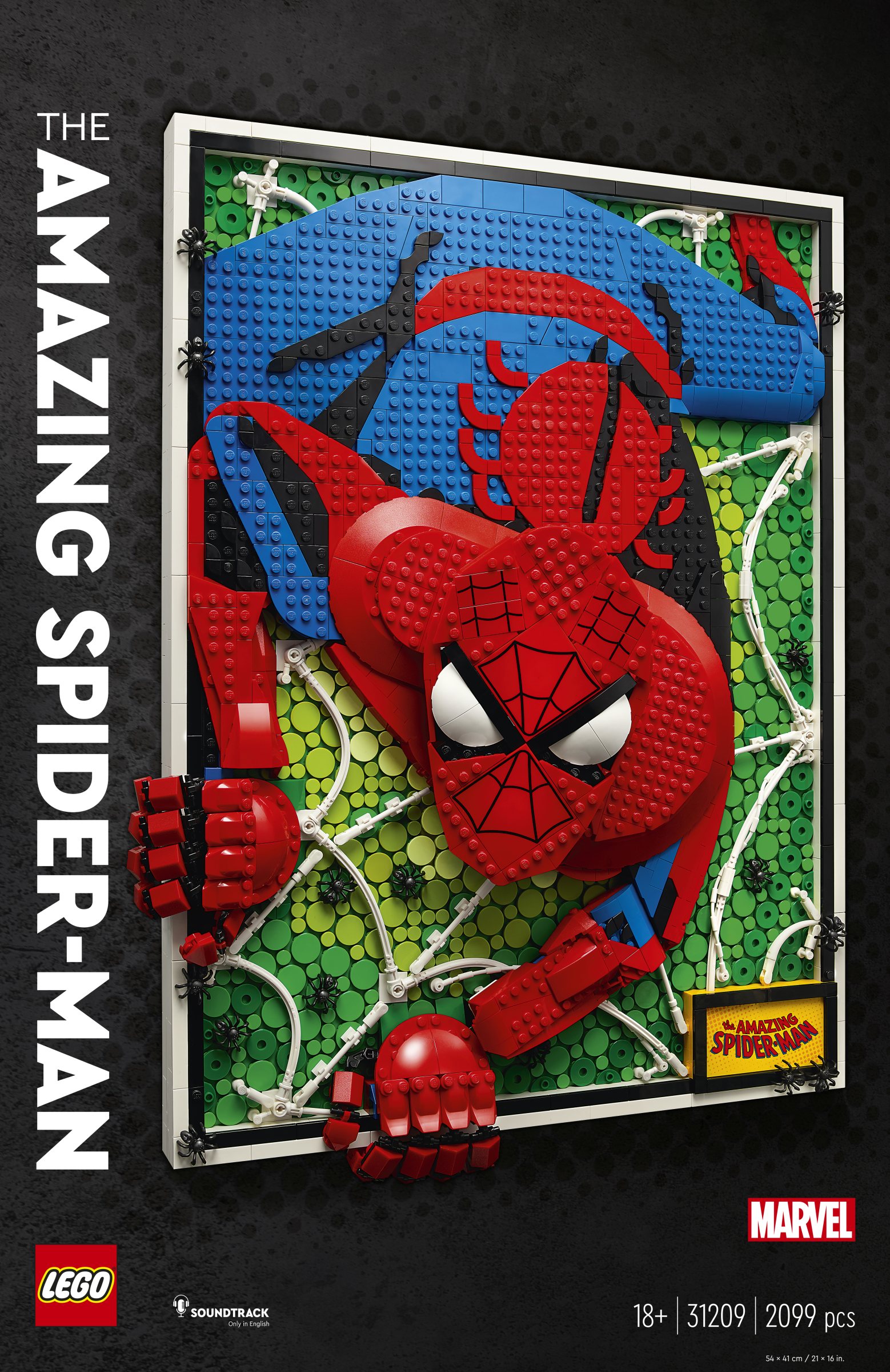
An exciting and eye-catching addition to the Art series has been unveiled at LEGO.com. The 2,099-piece 31209 The Amazing Spider-Man will be released on July 31st priced at £169.99 / $199.99 / €199.99.
Here's the product description:
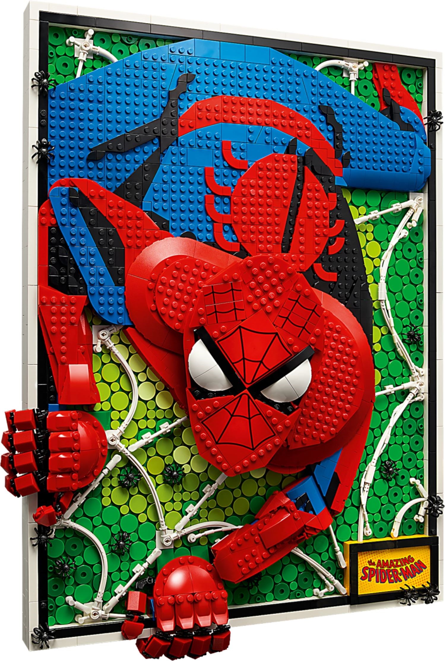
"Celebrate one of the world’s most beloved Super Heroes with The Amazing Spider-Man LEGO Art building set. This unique dimensional piece of art is made from layers of LEGO bricks in which Spider-Man breaks out from the frame and his head and fingers can be put into different poses.
"This bold artwork features several details to delight Spider-Man fans. The backdrop replicates the comic book’s Ben-Day-dot printing technique, there are 15 spiders to represent issue no. 15 of Amazing Fantasy in which Spider-Man first appeared in August 1962, and a graphic in the bottom corner contains his phrase, “With great power there must also come great responsibility"
You'll find more pictures after the break.
128 likes
85 comments on this article
He looks angry as hell!
This looks epic
Spider.
With the exception of all the green bits, it looks like an interesting build, saying that though, I would never hang this on the wall for fear of it falling and breaking.
Supaida-man!
(Screams in horror)
I wish they'd taken a cue from the Jim Lee Batman set and based this on specific credited artwork. This looks roughly like a John Romita Sr. image (who just passed away, BTW), but I can't place it.
(On the other hand, my cynical side realizes that Marvel/Disney are highly averse to crediting artists and/or paying them royalties. Jim Lee is over at Warner/DC, but he's also in a position of significant enough clout that somebody could get away with a Lee-specific Batman art set.)
No thanks. Time for some proper super heroes.... like Supergran!
“There are 780 1x1 round tiles to represent the number of bucks you’ll need to buy this and our new Technic crane.”
Looks really dynamic, I like how he’s grabbing outside the frame. Neat.
I do not like the green background. It would be cooler if they made it like the side of a building in dark red or something.
I wonder if they purposely made it 2,099 pieces as an Easter egg.. this looks amazing!
This is AMAZING (pun intended)
I really don't like this, but a fan of the shape of the eyes (which is important given the prominence of them). The differing levels don't work well for me here, whereas they do in some of the other sets that have done this.
Really disappointing to be honest.
I wish that instead of this, Black Panther Bust, Hulk Buster and Cap Shield they put the budget into display scenes capturing moments from the films and comics with high quality Minifigures.
'and a graphic in the bottom corner contains his phrase, "With great power there must also come great responsibility" '
Umm, no. It says "The Amazing Spider-Man".
TLG's marketing department needs a proofreader.
Looks kinda trippy. Not for me unfortunately, but at least it's more interesting than Cap's Shield.
I think this looks fantastic, and is something totally unique in the extensive LEGO portfolio of roughly 20,000 sets going back well over half a century!…. That’s hard to do!
I’m not a fan of the green backdrop though - I can’t place it, and it doesn’t look great to me.
Tan - like the walls of a skyscraper - would look much better to me.
But I’ll probably pick this up at some stage, on special.
I do really like this!
I think it looks bad...
Is anyone else reminded of the controversial Spider-Woman cover by comics artist Milo Manara? I'm not linking that here because I honestly don't know if it's compliant with Brickset posting guidelines.
Like others, the green is throwing me off. The design is actually quite well executed - just not sure if this is something I “need” compared to other sets coming out.
I like the look, but I can't see 200 Euro worth of value for me.
The discount that would entice me to buy it would have to be huge.
Big time kudos to the Lego designer(s). This is an amazing creation.
I like the design behind this, its eye-catching and colourful.
I'm not a fan of this genre however, so easy pass.
Okay this is one art set I might have to get.
Needs more Batman. And less…that guy.
This looks like a giant Brick Sketches model. The way he is climbing out of the frame is very effective.
Really loving this one. And it releases on my birthday!
If you look really closely you can see that graphic in the lower corner actually says, "With purchasing LEGO there must also come great expense."
Tom & Jerry vibes. Specifically when one whacks the other in the face with a frying pan and they are left with a 2D head on a 3D body.
No thanks, although it’s a cool concept. Reminds me of Phoebe’s “artwork” from the Friends TV show.
@AcademyofDrX said:
"Is anyone else reminded of the controversial Spider-Woman cover by comics artist Milo Manara? I'm not linking that here because I honestly don't know if it's compliant with Brickset posting guidelines."
Not going to lie, I wondered if this set designer used that as a template. o_O
This is already in some stores according to Instagram posts I’ve seen.
I really like the green background because it looks like a spiderweb. I'd be tempted to get this.
@graymattr said:
" @AcademyofDrX said:
"Is anyone else reminded of the controversial Spider-Woman cover by comics artist Milo Manara? I'm not linking that here because I honestly don't know if it's compliant with Brickset posting guidelines."
Not going to lie, I wondered if this set designer used that as a template. o_O
"
Yeah, it reminded me of … something, and that’s definitely it. Hmm.
@ForestMenOfEndor said:
" @graymattr said:
" @AcademyofDrX said:
"Is anyone else reminded of the controversial Spider-Woman cover by comics artist Milo Manara? I'm not linking that here because I honestly don't know if it's compliant with Brickset posting guidelines."
Not going to lie, I wondered if this set designer used that as a template. o_O
"
Yeah, it reminded me of … something, and that’s definitely it. Hmm."
There are a LOT of covers with Spider-people in a downward-crouch like position. If your brain is going to the Manara cover, well, okay, but it's not nearly at the same angle, let alone sex, as that cover was. Like I said, this is closer to any number of John Romita Sr. covers that he made over the years.
Wish they made the butt 3D.
I don't really like the dot-based Art sets, but this looks quite cool. Price is a bit high though.
Very cool but I'd like a Miles Morales one.
@jedijason1138 said:
"I really like the green background because it looks like a spiderweb. I'd be tempted to get this. "
Also something of a reference to his Rogue's Gallery, almost all of whom sport green in their outfits because green contrasts against red and blue.
@Kokan said:
"Wish they made the butt 3D."
LOL I noticed this too! It's very flat! I know Peter is a white nerd but he's gotta have glutes of steel.
This Art set really stands out from the rest (or should I say crawls out?)
Jokes aside, I think I prefer this style to the mosaic sets!
I like the idea, but I'm not sold on the execution.
'a graphic in the bottom corner contains his phrase, “With great power there must also come great responsibility"'
...Does it though?
I always wonder how they go about determining the footprint of these type sets. I suspect that they identify the largest desired piece / design element and then work backwards. If so, then I would guess that they started with the eyes and then reverse engineered the rest.
IT looks neat, but I would never hang it up. I like the 3D effect/depth so that is a unique selling point. I don't mind the green background, I like the two tone. But I agree maybe a building/window or something to make it look like actually crawling. But I do really like the webbing look. That's top notch.
@Desbug said:
"Tom & Jerry vibes."
Mrs Robinson?
@Inkomi said:
"He looks angry as hell!"
I'd be grumpy too if I had to deal with supervillains on a daily basis for 60 years on end.
Definitely looks like the design is based off of a John Romita piece.
The pose and build look interesting but the green doesn’t work. Should’ve used lavenders and purple elements to push the foreground and recede the background.
@graymattr said:
" @AcademyofDrX said:
"Is anyone else reminded of the controversial Spider-Woman cover by comics artist Milo Manara? I'm not linking that here because I honestly don't know if it's compliant with Brickset posting guidelines."
Not going to lie, I wondered if this set designer used that as a template. o_O
This is already in some stores according to Instagram posts I’ve seen.
"
Not the Manara cover but the Romita Sr. classic pose from the 60s.
This is not for me, but wow, the design is wonderful! I love the hands breaking the frame (and the smaller spiders), the use of the rubber technic to create the web, and so much more. Very cool, innovative display piece. Even the price seems pretty reasonable given licensed content and the size. I wonder if the phone with the microphone icon on it is telling us something--is there some kind of app-enabled feature?
@ra226 said:
"This is not for me, but wow, the design is wonderful! I love the hands breaking the frame (and the smaller spiders), the use of the rubber technic to create the web, and so much more. Very cool, innovative display piece. Even the price seems pretty reasonable given licensed content and the size. I wonder if the phone with the microphone icon on it is telling us something--is there some kind of app-enabled feature?"
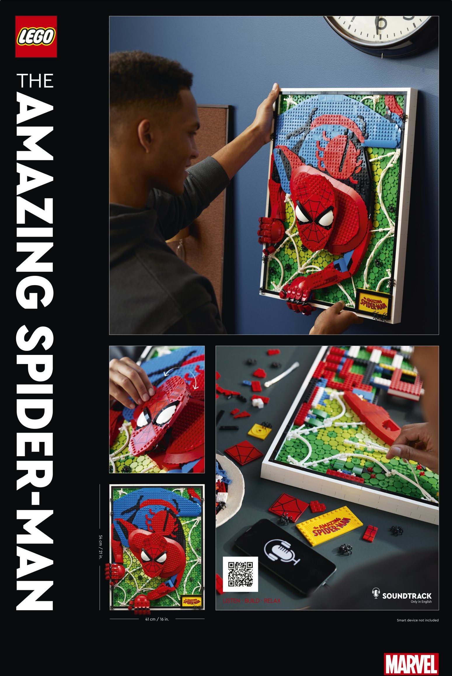
The art sets come with an audiotrack to listen to while building.
Finally Lego gets the potential of Lego Art. Whoever thought, that keeping it 2D was a good idea with a product, that has so many possibilities in 3D, should not be in a lead position.
The fact that this set has exactly 2099 pieces is definitely a canon event
@WemWem:
Someone did a study once that claimed most superheroes have primary colored costumes (red/blue/yellow), while most villains have secondary colors (purple/orange/green). Obviously there are exceptions (The Phantom wears solid purple), and it ignored greyscale completely (which covers a lot of Batman costumes).
It is actually a cool idea.. I think that the Spider-man itself could be in a better pose. will it have several different images to choose from? Like the Ironman and Star Wars ones?
@PjtorXmos said:
"Finally Lego gets the potential of Lego Art. Whoever thought, that keeping it 2D was a good idea with a product, that has so many possibilities in 3D, should not be in a lead position. "
I think it's clear that developing new ideas and themes is an iterative process. They had a decent idea to start, ran with it for a while, then took feedback and refined it, resulting in something better. The Art theme had to walk before it could run.
Angery
> <
I wasn't so keen on the Art sets, until now. Looks epic. Wish they did the same with Batman.
@Ridgeheart said:
" @ResIpsaLoquitur said:
"(Screams in horror)"
--Error 616, user avatar does not check out, please amend statement and try again--
I don't know. I kind of like it? I do think the eyes should just be flattened out, this is a bit too much. All in all though - mayyyybe if there's some money left in the Lego-budget at the end of the year*?
*There absolutely will be no money left in the Lego- budget at the end of the year"
Yes, there is an irony in my photo.
I think it looks okay from a distance, but horrible in the closer shots. Something about the image playing with the whole "comic book popping off the page" thing, which kind of defies how a comic book works (good ones give the illusion of time, depth and sound without actually doing it).
Granted, ALL Lego art looks weird up close. I have the full 3x9 grid Darth Vader art on my wall; looks terrific across the room, weird up close. But even up close, it at least looks like a consistent pattern of colored 1x1 plates. Spidey here looks like a mess of spaghtetti.
I like the 3D effect and what the set is going for but still, this is not an attractive product. Huge shaping issues.
Interesting! At first glance this looks pretty great, I love the 3-dimensional aspect of it. And think the green offers a good contrast. But it very much depends from what angle you look at it. The flat face makes it look a bit weird when viewed more from the side, and the different textures (and how those catch the light) don't help either. Oh, and the price isn't great either.
Still, I do very much like the idea itself, and hope they will do more art sets like this. It might eventually convince me to buy one....
@darkstonegrey said:
" @ra226 said:
"This is not for me, but wow, the design is wonderful! I love the hands breaking the frame (and the smaller spiders), the use of the rubber technic to create the web, and so much more. Very cool, innovative display piece. Even the price seems pretty reasonable given licensed content and the size. I wonder if the phone with the microphone icon on it is telling us something--is there some kind of app-enabled feature?"
The art sets come with an audiotrack to listen to while building."
Has anyone actually listed to these when building?
Also, I recall collecting a series of 2099 offshoot series back in the day.
https://en.wikipedia.org/wiki/Spider-Man_2099
@ResIpsaLoquitur said:
" @ForestMenOfEndor said:
" @graymattr said:
" @AcademyofDrX said:
"Is anyone else reminded of the controversial Spider-Woman cover by comics artist Milo Manara? I'm not linking that here because I honestly don't know if it's compliant with Brickset posting guidelines."
Not going to lie, I wondered if this set designer used that as a template. o_O
"
Yeah, it reminded me of … something, and that’s definitely it. Hmm."
There are a LOT of covers with Spider-people in a downward-crouch like position. If your brain is going to the Manara cover, well, okay, but it's not nearly at the same angle, let alone sex, as that cover was. Like I said, this is closer to any number of John Romita Sr. covers that he made over the years. "
Sure, but Manara likely used Romita for a reference point, so there is connective webbing between the two. What makes Manara's work stick out is the extreme emphasis on the posterior. Romita's was much less pronounced (and more anatomically appropriate). This reminds me more of Manara, but potato/potato. If I owned this piece, I'd be tempted to moc up some webs shooting out of his ***.
Peter Parker jumpscare!!!
He's ready to beat the tar out of ya.
@darkstonegrey said:
" @ra226 said:
"...is there some kind of app-enabled feature?"
The art sets come with an audiotrack to listen to while building."
I never knew that, but that's a fun idea. Is a song list part of the database here? And are they long enough to account for build time without having to repeat? I guess I don't actually have any "Art" sets--I consider both 21334 and 21340 to be works of art but they're not part of the Art theme.
@ForestMenOfEndor said:
" @ResIpsaLoquitur said:
" @ForestMenOfEndor said:
" @graymattr said:
" @AcademyofDrX said:
"Is anyone else reminded of the controversial Spider-Woman cover by comics artist Milo Manara? I'm not linking that here because I honestly don't know if it's compliant with Brickset posting guidelines."
Not going to lie, I wondered if this set designer used that as a template. o_O
"
Yeah, it reminded me of … something, and that’s definitely it. Hmm."
There are a LOT of covers with Spider-people in a downward-crouch like position. If your brain is going to the Manara cover, well, okay, but it's not nearly at the same angle, let alone sex, as that cover was. Like I said, this is closer to any number of John Romita Sr. covers that he made over the years. "
Sure, but Manara likely used Romita for a reference point, so there is connective webbing between the two. What makes Manara's work stick out is the extreme emphasis on the posterior. Romita's was much less pronounced (and more anatomically appropriate). This reminds me more of Manara, but potato/potato. If I owned this piece, I'd be tempted to moc up some webs shooting out of his ***."
I'd need to see firmer evidence that Manara explicitly copied Romita's work. There's been thousands of Spider-Man comics over 60-70 years and "Spidey crouching" is not an uncommon shot.
I am very, very familiar with the concepts of both "homaging" (making a very obvious art reference to an earlier famous work, e.g., Superman lifting the car on Action Comics 1) and "swiping" (anything drawn by Greg Land, for example). There's a host of ambiguity in the middle--sometimes two images just happen to look similar, but after 80 years of the comics industry, some stuff is just going to be duplicative. Again, I'd need to see a comparative image of Romita's that Manara's famous cover looks very obviously identical to.
As somebody once said about Captain America swipes--look, there's only so many ways to draw a guy holding a shield.
Absolutely love it. Can't wait to hang this up in our Lego room.
@ResIpsaLoquitur said:
" @ForestMenOfEndor said:
" @ResIpsaLoquitur said:
" @ForestMenOfEndor said:
" @graymattr said:
" @AcademyofDrX said:
"Is anyone else reminded of the controversial Spider-Woman cover by comics artist Milo Manara? I'm not linking that here because I honestly don't know if it's compliant with Brickset posting guidelines."
Not going to lie, I wondered if this set designer used that as a template. o_O
"
Yeah, it reminded me of … something, and that’s definitely it. Hmm."
There are a LOT of covers with Spider-people in a downward-crouch like position. If your brain is going to the Manara cover, well, okay, but it's not nearly at the same angle, let alone sex, as that cover was. Like I said, this is closer to any number of John Romita Sr. covers that he made over the years. "
Sure, but Manara likely used Romita for a reference point, so there is connective webbing between the two. What makes Manara's work stick out is the extreme emphasis on the posterior. Romita's was much less pronounced (and more anatomically appropriate). This reminds me more of Manara, but potato/potato. If I owned this piece, I'd be tempted to moc up some webs shooting out of his ***."
I'd need to see firmer evidence that Manara explicitly copied Romita's work. There's been thousands of Spider-Man comics over 60-70 years and "Spidey crouching" is not an uncommon shot.
I am very, very familiar with the concepts of both "homaging" (making a very obvious art reference to an earlier famous work, e.g., Superman lifting the car on Action Comics 1 ) and "swiping" (anything drawn by Greg Land, for example). There's a host of ambiguity in the middle--sometimes two images just happen to look similar, but after 80 years of the comics industry, some stuff is just going to be duplicative. Again, I'd need to see a comparative image of Romita's that Manara's famous cover looks very obviously identical to.
As somebody once said about Captain America swipes--look, there's only so many ways to draw a guy holding a shield."
Just look up Amazing Spider-Man 100 which is where every artist that did a similar pose got it from.
It's Romita Sr's signature pose for Spidey. You know the pose. It's a classic. And technically, Ditko had something similar but not the iconic cover version that Romita Sr. did.
Look at Mananara's Spider Woman which is a pose he loosely got from J. Scott Campbell's Spidey with the butt pronounced and costume up the crack.
It's ALL from Romita Sr's original drawing/pose.
That's where the Lego guys got this pose from. Romita Sr.
You can do the comparative image yourself. Just google Amazing Spiderman 100 , then google Manara's Spider-Woman, then google J. Scott Campbell's Amazing Spider-Man 30 (legacy 471 ) cover to see where Manara drew some 'posterior' inspiration.
@ResIpsaLoquitur
Here's the original Ditko pose where Romita Sr. got his inspiration.
Don't know the comic issue number but it was a pinup in the back section.
Just a slight, posterior hugging costume here ;)
https://spaceshiprocket.tumblr.com/image/146302409362
The lower shoulder keeps jumping out at me but not in a good way.
@yellowcastle
Yeah, to get that foreshortening but it's a little awkward since the arm there is built too small, so it doesn't push forward enough. Limitation of space and the medium.
They pulled it off though as best they could with the size/space given.
Wanna' see how it looks in real life. Always tough to photograph Lego properly.
@legoDad42 said:
" @ResIpsaLoquitur
Here's the original Ditko pose where Romita Sr. got his inspiration.
Don't know the comic issue number but it was a pinup in the back section.
Just a slight, posterior hugging costume here ;)
https://spaceshiprocket.tumblr.com/image/146302409362 "
Looks like this is the reference panel from Romita Sr.: https://www.brickfanatics.com/lego-art-amazing-spider-man-comic-book-panel.
https://www.instagram.com/p/CuCQ2emstrB/?igshid=YzcxN2Q2NzY0OA== This post on LEGO’s Instagram shows the panel they used as a reference, definitely Romita Sr’s work on Amazing
@yellowcastle:
I may have the entire original 2099 run (I’m not sure if I kept it up when they combined every title into one). Spiderman 2099 (the only cool Spiderman), Doom 2099 (never did find out if this was the real Dr. Doom), and X-Men 2099 were the highlights of the group, and Ravage 2099 was the definite low point (and first to be cancelled).
@legoDad42 said:
" @yellowcastle
Yeah, to get that foreshortening but it's a little awkward since the arm there is built too small, so it doesn't push forward enough. Limitation of space and the medium.
They pulled it off though as best they could with the size/space given.
Wanna' see how it looks in real life. Always tough to photograph Lego properly. "
The more i look at it, the more it looks like a giant red epaulette. I think someone can do better with this with smaller, suit design pieces.
I’d have to remove all those little spiders if I got this. Those things freak me out!
Guys, I'm not contesting that this is a JRSR homage (although if it is, nuts to Lego if they didn't credit it). I'm saying the Manara Spider woman drawing is NOT explicitly a JRSR homage/copy.
Spider-people crouch. "Crouching" is not explicitly owned by Romita.
@ra226 said:
" @darkstonegrey said:
" @ra226 said:
"...is there some kind of app-enabled feature?"
The art sets come with an audiotrack to listen to while building."
I never knew that, but that's a fun idea. Is a song list part of the database here? And are they long enough to account for build time without having to repeat? I guess I don't actually have any "Art" sets--I consider both 21334 and 21340 to be works of art but they're not part of the Art theme."
I haven't listened to any of the soundtracks included with the art sets yet. Most run between 1 to 2 hours. Searching for 'lego art set audiotrack' returns quite a few of them that you can check out on youtube to get an idea of what's in store. Seems to be a combination of commentary / documentary / accompanying music to entertain you while multitasking and building.
@ForestMenOfEndor said:
" @legoDad42 said:
" @ResIpsaLoquitur
Here's the original Ditko pose where Romita Sr. got his inspiration.
Don't know the comic issue number but it was a pinup in the back section.
Just a slight, posterior hugging costume here ;)
https://spaceshiprocket.tumblr.com/image/146302409362 "
Looks like this is the reference panel from Romita Sr.: https://www.brickfanatics.com/lego-art-amazing-spider-man-comic-book-panel."
Perfect...booom. You found it. All Romita, all the time ;)
Right on Forestman.
@ResIpsaLoquitur
Sorry on that. I thought you were saying it was Manara's cover that Lego used for the inspiration pose.
@ ForestMenOfEndor found the exact shot Lego used for the pose. From John Romita Sr. in Amazing Spider-Man 67.
https://www.brickfanatics.com/lego-art-amazing-spider-man-comic-book-panel
I'm quick to criticize sets I don't like and tend to be silent on he ones that look good but I don't have much to say about.
this is nice. This is clever. beautiful. Not for me though but wow
@PurpleDave said:
" @yellowcastle:
I may have the entire original 2099 run (I’m not sure if I kept it up when they combined every title into one). Spiderman 2099 (the only cool Spiderman), Doom 2099 (never did find out if this was the real Dr. Doom), and X-Men 2099 were the highlights of the group, and Ravage 2099 was the definite low point (and first to be cancelled)."
I enjoyed the Spidey 2099 comics too!
World of Tomorrow: I did appreciate the attempt to keep the 2099 universe alive, but it was a mess.
I can recommend 2099: Manifest Destiny. That was fun to read.
@hawkeye7269 said:
" @PjtorXmos said:
"Finally Lego gets the potential of Lego Art. Whoever thought, that keeping it 2D was a good idea with a product, that has so many possibilities in 3D, should not be in a lead position. "
I think it's clear that developing new ideas and themes is an iterative process. They had a decent idea to start, ran with it for a while, then took feedback and refined it, resulting in something better. The Art theme had to walk before it could run."
Except there were subthemes before, which did 3D art. Lego Mosaic comes to mind first
Good Product. - they should continue this line with Some actual comic book covers, scaled up to about this size. Wolverine, Transformers, GI Joe. Would be awesome.
@sjr60 said:
"No thanks. Time for some proper super heroes.... like Supergran!"
Or SuperDave
@Ridgeheart:
"PAF!" *snicker*