How the museum looks with other Modular Buildings
Posted by Huw,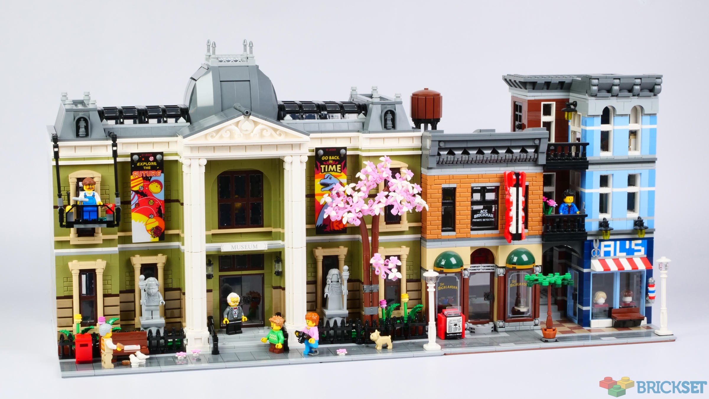
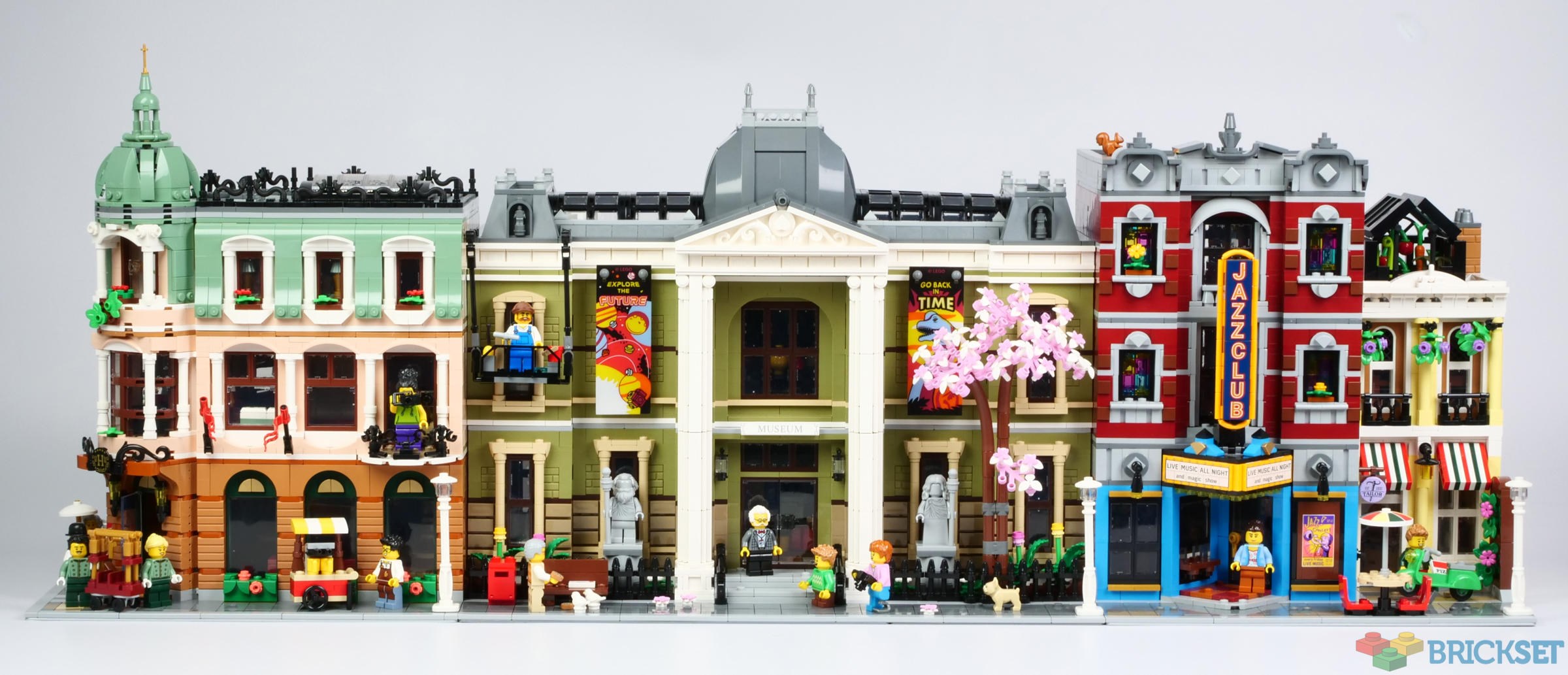
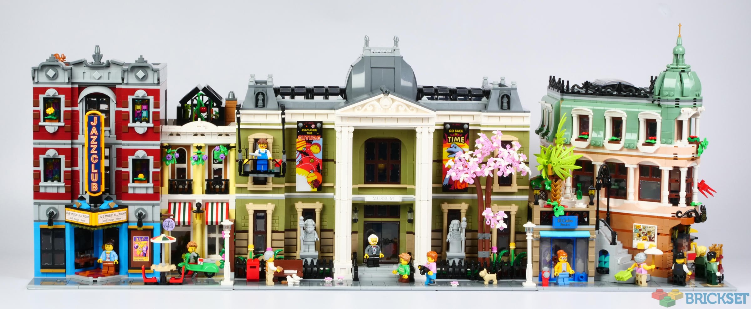
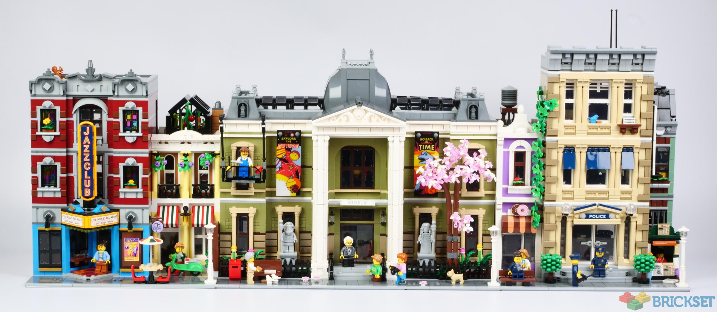
Here are a few photos showing the new 10326 Natural History Museum sandwiched between other recent modular buildings.
The facade of the museum is set back several studs further than the hotel and Jazz Club so there's an unnatural-looking transition between them.
The Boutique Hotel definitely looks better on the left because, although it's an excellent building, it does not match up particularly well with others on its left-hand side.
The wall of the Museum aligns with the wall of the light yellow dwelling next to the Jazz Club
The street looks better with the two Chris McVeigh designed buildings together.
The Detective's Office looks OK in the street as well, although as before its frontage is several studs further forward than that of the Museum.
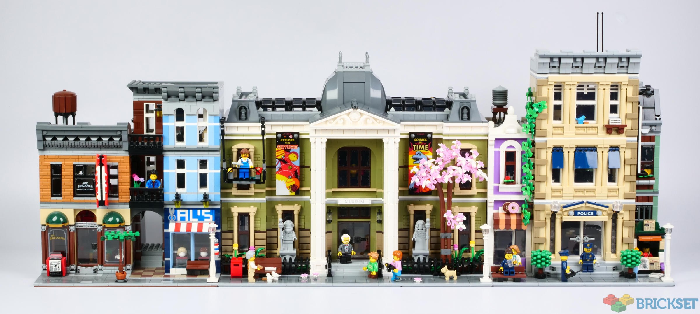
The museum looks suitably grand when nestled among other buildings, which helps disguise its drabness and relative plainness.
I am sure you will have fun coming up with your own configurations.
159 likes
61 comments on this article
It looks too “crowded “ to me. I think it would look better if there is some green space like a park in between the museum and the other buildings. Perhaps a smaller version of 80107
I agree. I'm sure there are several combinations of modulars that look 'reasonable.' But to me, there should be some open space between the museum and neighboring buildings. Not too hard to create I guess.
That olive green really hurts the model, IMO. Otherwise it looks nice. I do agree with Yrraabb with the crowdedness of the whole thing. I appreciate all the little details they put in but there's kinda a lot going on at every single building.
The official Lego city doesn't seem to have any alleys between buildings where dodgy deals, muggings, time travelling, there-can-be-only-one battles, or even regular deliveries can take place.
My brick town sure does though.
Hmm . . . not sure this looks good between other modulars. I wonder if it'd work best in its own setting, e.g., surrounded by parkland.
The Modular Buildings line could do with some "whitespace" indeed. This would have been an opportunity to put the museum on two 32 x 32 baseplates and add a park like area or even an outdoor part of the exhibit next to the building. The alternative arrangement on the baseplate is one of the things I like about the Parisian Restaurant, Assembly Square and Boutique Hotel, all part of the best sets of the line, in my opinion. I was hoping for some more variation in the footprint of the Modular Buildings.
it’s a nice set but between the color scheme and the lack of exterior detail it just sticks out like a sore thumb to me when placed against the other modulars.
My initial plan is to place it near the Parisian Restaurant and the Bookshop. Kinda fits the "fancier part of town" vibe.
A good example of “Bigger doesn’t mean better”
You were right Huw, with the rest of the sets it looks much better and the color doesn't hit as strongly. You've convinced me back!
Yeah, an 8×16 baseplate with some benches and trees would enhance the presentation. Perfect place for the hot dog cart, too.
Something that contributes to the sense of 'drab' in the Museum is that there are 2 columns instead of 4. Without those columns in the middle, there's a lot of empty space and it feels less grand. I understand the design tradeoffs here, but I think it would have been worth it to widen the triangular roof and go for 4 columns, even if it meant ditching the banners.
I said this in the Brickset discord but this may have worked best as a double corner modular, with streets separating it from other buildings on either side of it.
It definitely looks best on its own. While I'm quite pleased with the execution, it's difficult to find a good neighbor for it. It's not the kind of building that you'd see between other buildings on the street. I'd probably build a small park area around it.
I agree with the posters above; while the community may have been clamoring for a modular museum, ultimately the premise is wrong in that most museums are stand-alone buildings, set within their own landscaping (obviously there are exceptions to this, but the archetypical 'museum' is not buried in a busy street). It would have been more appropriate to have made this a "modular-adjacent" building, or a double-corner. To some extent I think the same issue exists for modular rail stations. Some buildings simply aren't meant to be directly beside their neighbors.
The designer did a good job here and the building fits its role, but I think it was doomed to never look quite right sandwiched in a modular setting. It's a museum about life - it needs space to breathe.
What about pictures with older modulars? I'd like to see those.
I just noticed this looking at the building like this:
The museum has the creative windows we'd expect in the modular series. But of the 8 in the front (4 left, 4 right of the entrance) you can only see 1.
Window washer, banners, statues and the tree block most/all of the other 7.
And this takes away from the look of the building.
I don't know why, but seeing the building in these pictures, this really sticks out to me.
I know for a set, the 48x32 layout makes sense, just as a building, a side alley or 2 would work here.
But since those modulars are bound to the "old" baseplate height, it's not easy to use plates inbetween as they are not really in the same "system".
Alternatives could be:
- moving modulars to regular plate
- having some custom building(s) on baseplate(s) that include space to the side
- corner buildings that might look a bit awkward as alleyway
- having a park on 1 or 2 sides, if using an official set like 80107: Spring Lantern Festival which can split off it's 16 wide section.
Definitely fun to include, though I don't think it works with 10297 Boutique Hotel. They just don't look right together.
I agree with the other comments calling for modular greenspace. The closest we have gotten was the Chinese garden that was released for Lunar New Year a few years back. Something more “generic” would be awesome and would actually sell quite well, I think.
Maybe they could release a modular and a “modular filler” every year to do different versions of parks, like a squash court, a dog park, or a bird sanctuary.
If only you could pick statues or no statues, banners or no banners, in a garden or in a terrace.
If only you didn't have to glue it together....
I wouldn’t mind them to release an ‘alley’ accessory pack that could fit between modulars, with the right width of baseplate (I don’t know, maybe 6 studs?) and fences, garbage bins etc.
Hmmm...a definite mixed bag as far as I'm concerned, I have zero issue with the colour however the overbearing columns, amount of clutter obscuring all but one of the windows, the lack interior details, underwhelming staircases...etc. None of these will stop me getting it, it is nice. I can't see it being available for 6 years as Assembly Square was though, which is a set absolutely packed with detail and amazing build techniques...
How about next the the friends botanical garden.
@chrisaw said:
"I wouldn’t mind them to release an ‘alley’ accessory pack that could fit between modulars, with the right width of baseplate (I don’t know, maybe 6 studs?) and fences, garbage bins etc."
At one point, next year would be just fine, they (Lego) could release two(2) Lego modulars! One would be the regular one and the second would be a 16 studs wide park. A park could be just benches and a garden with a few birds and squirrels. Another type of park could be a fountain with again some greeneries and animals. One could be a park for kids with swings and see-saws and the likes. I suppose Lego could release a 'park' every 3-5 years. we would see all sorts of new techniques for fences and it would/should be a great greeneries parts pack. Would also be good for tree designs and such. The more I think of the possibilities it offers, the more I think this idea should at least be explored.
It needs separation from the others...maybe a wrought iron fence at each side to expand the "property". Pushed together kinda looks like a mess
I think to make it breath more and look more like some larger museums, continue the iron fence all around the footprint with some more foliage within it.
That should do the trick with the crowding.
But again Lego builders...this is what the hobby is. No set or kit is fully complete. You're supposed to customize to your liking. That's the point and joy of this hobby.
@legoguy said:
"The official Lego city doesn't seem to have any alleys between buildings where dodgy deals, muggings, time travelling, there-can-be-only-one battles, or even regular deliveries can take place.
My brick town sure does though."
Muggings are my favorite LEGO city pasttime …..
This showcase just reiterates my opinion that LEGO's Modular designers must all be colour blind.
All of the most recent modular buildings have had awful colour schemes and then they are put together this is the result: a mash-up of awfully coloured sets that don't go well next to each other and that would never be seen in any actual city...unless it's Circus-Town.
It's just making me want to ditch modulars altogether if now, on top of the ridiculously overpriced tags, I still have to add an additional 100€ for extra bricks to fix LEGO's awful colour schemes...
It has two looks to it which jar when combined. The posters suggest a popular museum visited regularly, while the tree and the statues suggest an abandoned or rarely visited museum. Worth moving them into a moc park or something.
@Capybara554321 said:
"How about next the the friends botanical garden. "
Yeah, it'll take a little fiddling to get them to line up nicely, but I think they'd look good together.
I normally keep negative post-thoughts to myself. But, this all looks godawful together. I've long said that if I had to ditch all of my other LEGO sets I would keep and collect modulars only. This makes me want to completely stop and sell every single one of them.
Really looking forward to seeing how the community improves this.
My first impression was that is either should have been on dual baseplate with some park space each side, and the images has more or less convinced me that will have to MOC it when get around to building… as if space for 1.5 wasn’t enough of an issue (using IKEA Eket)
Still a great addition to the overall line, nice with some variation
@chrisaw said:
"I wouldn’t mind them to release an ‘alley’ accessory pack that could fit between modulars, with the right width of baseplate (I don’t know, maybe 6 studs?) and fences, garbage bins etc."
Funny, i just watched a vid on youtube how to cut a baseplate (i want a 6 studs wide baseplate :-D)
It looks more like a library to me than a museum. Maybe its the color or lack of park areas around it?
this kind of building wouldn’t be sharing walls with other buildings tho, look at the museums in the real world, they stand alone - I think this one shouldn’t have been modular, it needs grounds
Hm, this really doesn't look that good. It's just so far out of scale. Most modulars take up maybe half a baseplate with a single colour block. This is just so overbearing
It’s an ugly looking building anyway. Doesn’t matter what you put next to it. Adding another level will help.
Thanks for taking the time to do this! I noticed as well that the building doesn't look quite right between the most recent modulars (I do understand this is a practice with every new modular).
I think what hurts the museum against the other buildings, isn't so much the olive color, but the center/upper design of the building. There is no attention-grabbing thing at the peak, no fancy banner or hokey "museum" sign. The big gray dome doesn't do any favors, I think an elevated section of the skylight build would have been much better (especially for heists!)
Is just me that color makes me think puke.
quite ugly street
If I had it on display, I'd ditch the window washer banners and tree, place it between the two halves of the bookshop and have it look like a stately home. Or even an upscale apartment block with the elderly guy in the suit as a doorman!
Personally the colour does not bother me, but it would be nice if they stuck to a consistent spacing for the sidewalk on buildings that are supposed to be side by side. The hotel really threw things out by compromising the sidewalk to accommodate an unnecessary art gallery that looks like something from another set was tacked onto the side of an otherwise fantastic build.
Thank-you Huw for both the review and the pictures above, much appreciated :)
@legoguy said:
"The official Lego city doesn't seem to have any alleys between buildings where dodgy deals, muggings, time travelling, there-can-be-only-one battles, or even regular deliveries can take place.
My brick town sure does though."
10190 : [waves from the old part of town]
@chrisaw said:
"I wouldn’t mind them to release an ‘alley’ accessory pack that could fit between modulars, with the right width of baseplate (I don’t know, maybe 6 studs?) and fences, garbage bins etc."
Muggers, prostitutes, rats, brown bananas, etc.
I do think 'modular fillers' is a good idea. Besides alleys and parks Lego could make a graveyard, and what else/ Parking lots are not much fun...
Personally I really like this modular and I like the colour scheme as the Parisian Restaurant is one my favourites. However, I do this works best as a stand alone.
Moving both banners to the center should help it, the missing upper windows hinder a better sight at the building.
41757 Botanical Garden might work well next to it, if adapted as modular. That is what I will be doing.
Needs open space to the left and right, maybe add a second exit and/or windows? Could also use a bit more height. That said, I like it overall, and plan to get it. I’ll just add the parks on the sides and maybe a little extra height myself.
@kdu2814 said:
"I do think 'modular fillers' is a good idea. Besides alleys and parks Lego could make a graveyard, and what else/ Parking lots are not much fun..."
LEGO does that with the smaller scale 3-in-1 sets, and more recent City/Friends, sometimes has a removable corner park or some place to sit/eat as attached or side build, but it's much easier to implement there due to being built with regular plates, and not rely on baseplate height.
16x32 is the smallest LEGO can do , at least when it comes with baseplates that are in production.
I think LEGO tries to avoid baseplates as much as possible where it can these days, but 21335: Motorized Lighthouse was still a set that got a new color introduced a year ago.
Still, I think this might've worked better on 2 32x32 baseplates with 8 studs of extra space on each side.
Seeing it next to all the other Modulars REALLY solidifies the fact that it looks best on its own.
As others have said it looks odd cramped between other buildings and the 1.5 footprint messes with my street layout anyway. So I might build it on two green 32x32 baseplates to fix these two problems.
@Yrraabb said:
"It looks too “crowded “ to me. I think it would look better if there is some green space like a park in between the museum and the other buildings. Perhaps a smaller version of 80107"
Or maybe put two corner buildings on either end with the buildings facing the sides of the museum, so the sidewalk is between the buildings.
Might work. Could we get some pictures of this configuration?
I'm think I'm gonna go with this
https://www.flickr.com/photos/191353191 @N05/53313394320/in/datetaken-public/
Unfortunately, this only made me want to go further from buying it.
I will have to agree that it looks less imposing when surrounded by other narrow buildings but similar height. It doesn't stand out. Olive green is a strong color for the size of the building. I like a lot of details of the building, but I don't know if I can justify the cost.
I have a MOC Clocktower from BTTF built and it looks significantly more imposing and museum like than this. I may have to create my own museum with some design choices here and there.
I am a few modulars behind and seeing them together confirms why I am a few behind. I don't feel the theme is very cohesive (I guess I don't know if it ever was).
@Yrraabb said:
"It looks too “crowded “ to me. I think it would look better if there is some green space like a park in between the museum and the other buildings. Perhaps a smaller version of 80107"
I agree. I think a Museum complex area will be in the works in my city with a modular botanical center and park space.
I plan on putting mine to the left of the Daily Bugle & an 8x8 area of open plaza on its opposite side. It won’t exactly be a standalone but will have room to breathe on both sides.
First time I build this, it will definitely be on a 48x48 XL baseplate with space either side, and set back enough to take a fountain similar to that in Assembly Square. A museum, as far as I am aware, is almost never connected to other buildings. I'm also toying with the idea of raising it up so a storage basement can be included. This should help with the disappointing height, without the need to add an extra floor of olive green. You have to love the fact that Lego-building let's us do whatever we want! :)
Shorter and shorter. I wish it was taller, not wider.
@Sethro3 said:
"Unfortunately, this only made me want to go further from buying it.
I will have to agree that it looks less imposing when surrounded by other narrow buildings but similar height. It doesn't stand out. Olive green is a strong color for the size of the building. I like a lot of details of the building, but I don't know if I can justify the cost.
I have a MOC Clocktower from BTTF built and it looks significantly more imposing and museum like than this. I may have to create my own museum with some design choices here and there.
I am a few modulars behind and seeing them together confirms why I am a few behind. I don't feel the theme is very cohesive (I guess I don't know if it ever was)."
Totally agreed. I think it looks even more bland, boring, even somewhat run-down next to its siblings. Even the Jazz Club is more pleasing on the eyes. Hard pass on this one.